


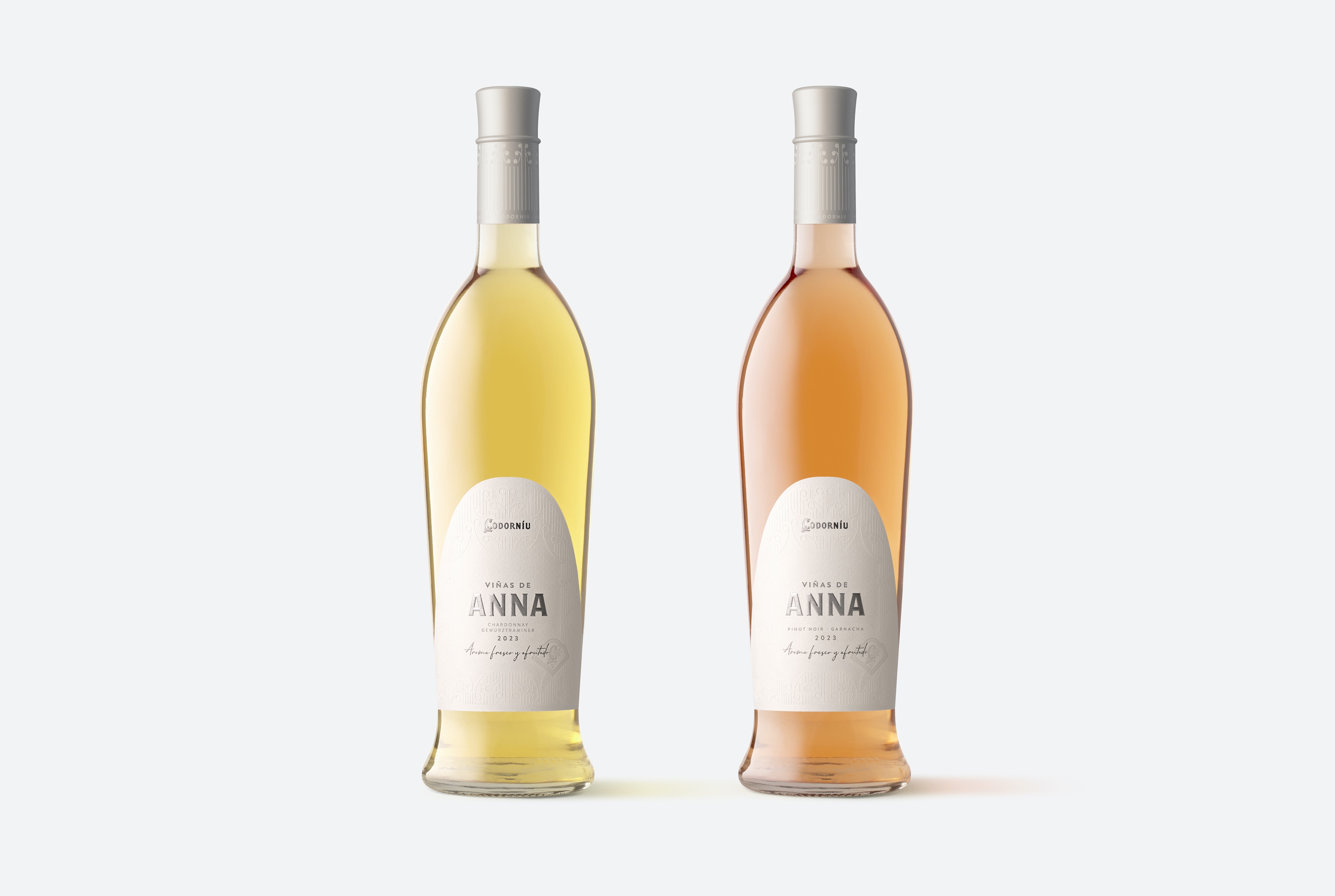
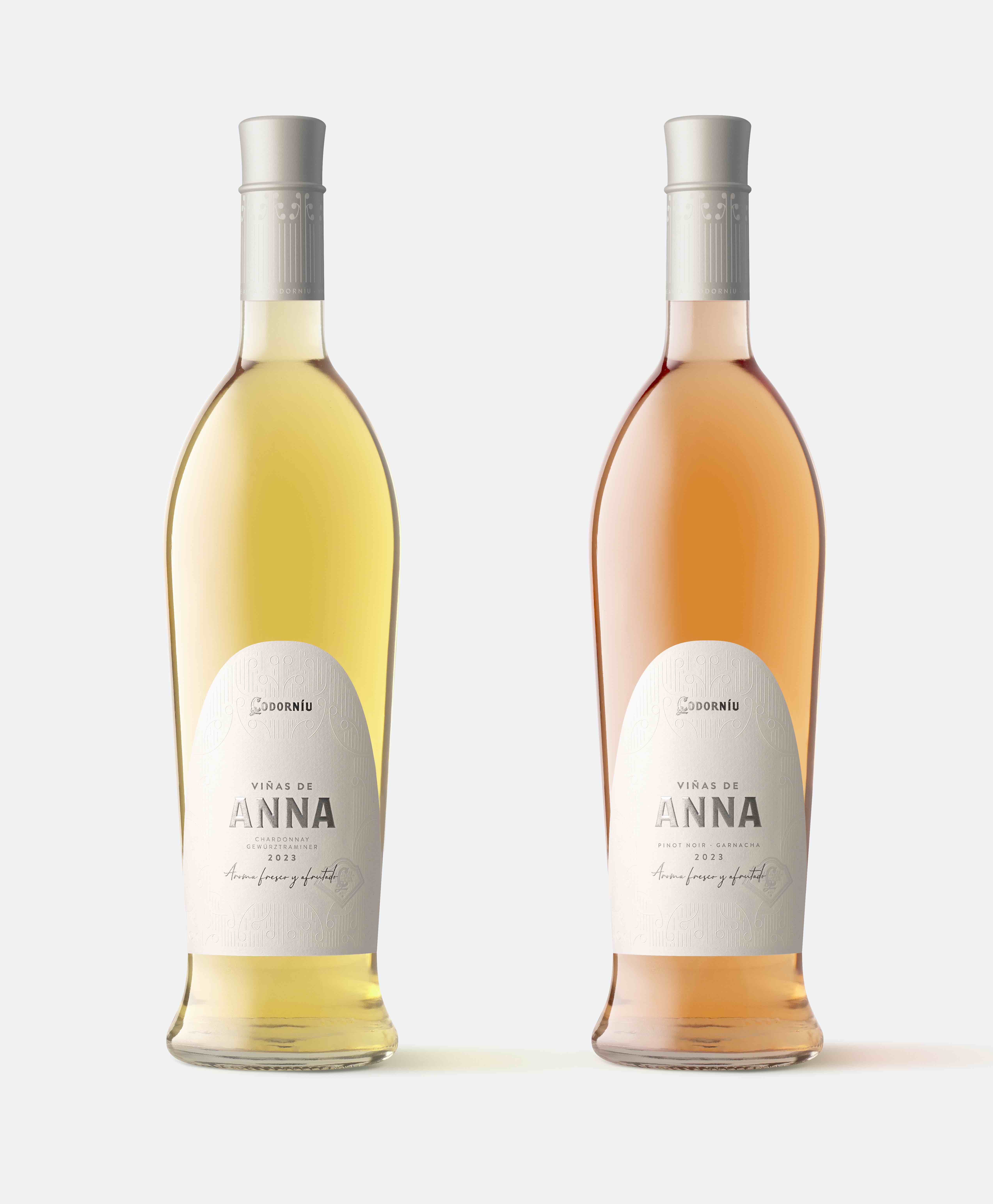
Viñas de Anna. Graphic for wine label. Codorníu. 2024
The redesign of the Viñas de Anna label has been an exciting and rewarding project for our studio, Lavernia & Cienfuegos. Since its launch in 2015, this wine from Codorníu has been recognized for its elegance, freshness, and distinctive personality. Our challenge was to update its visual identity while respecting its essence, ensuring that it remained true to its origins while embracing a more contemporary and sophisticated aesthetic.
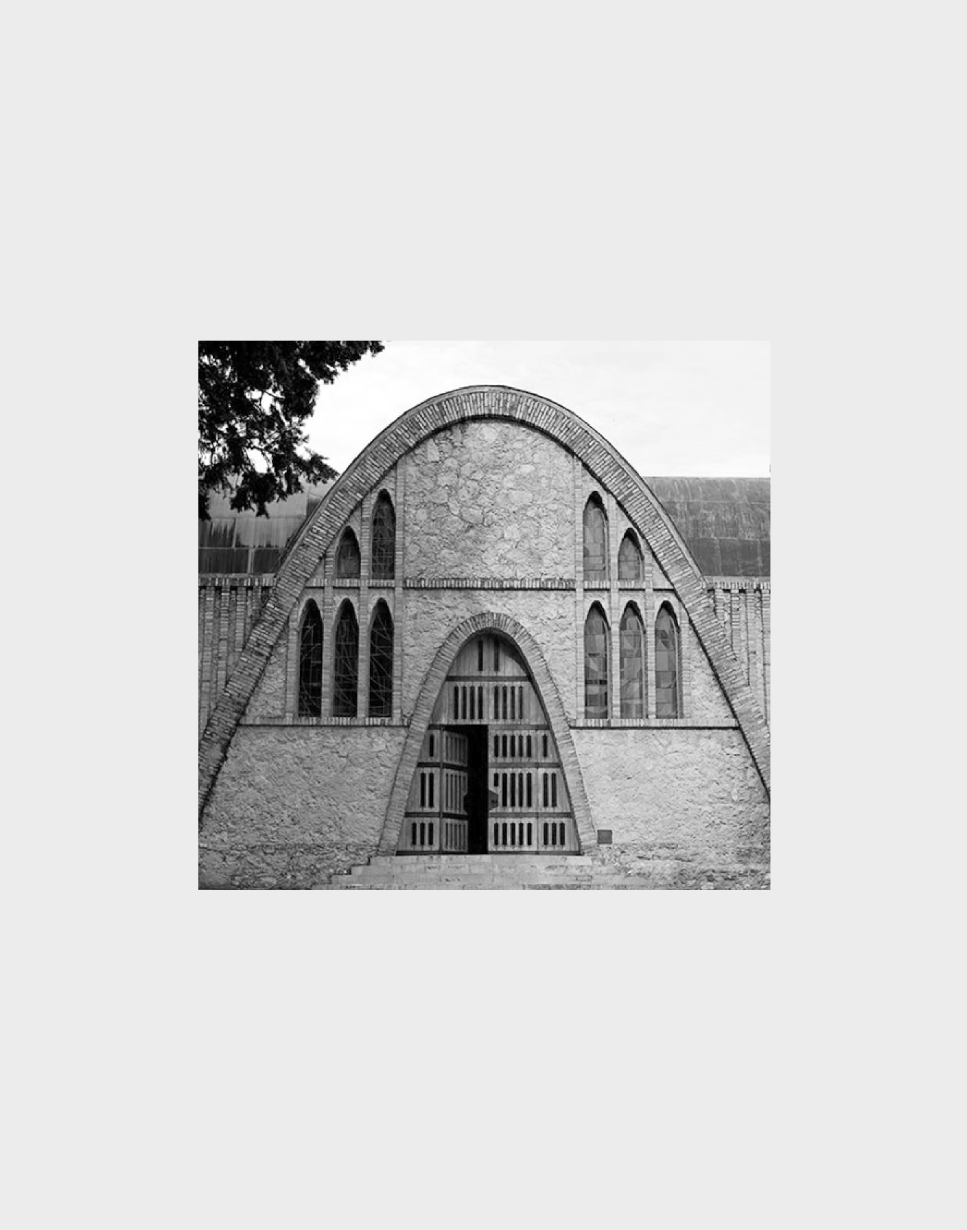
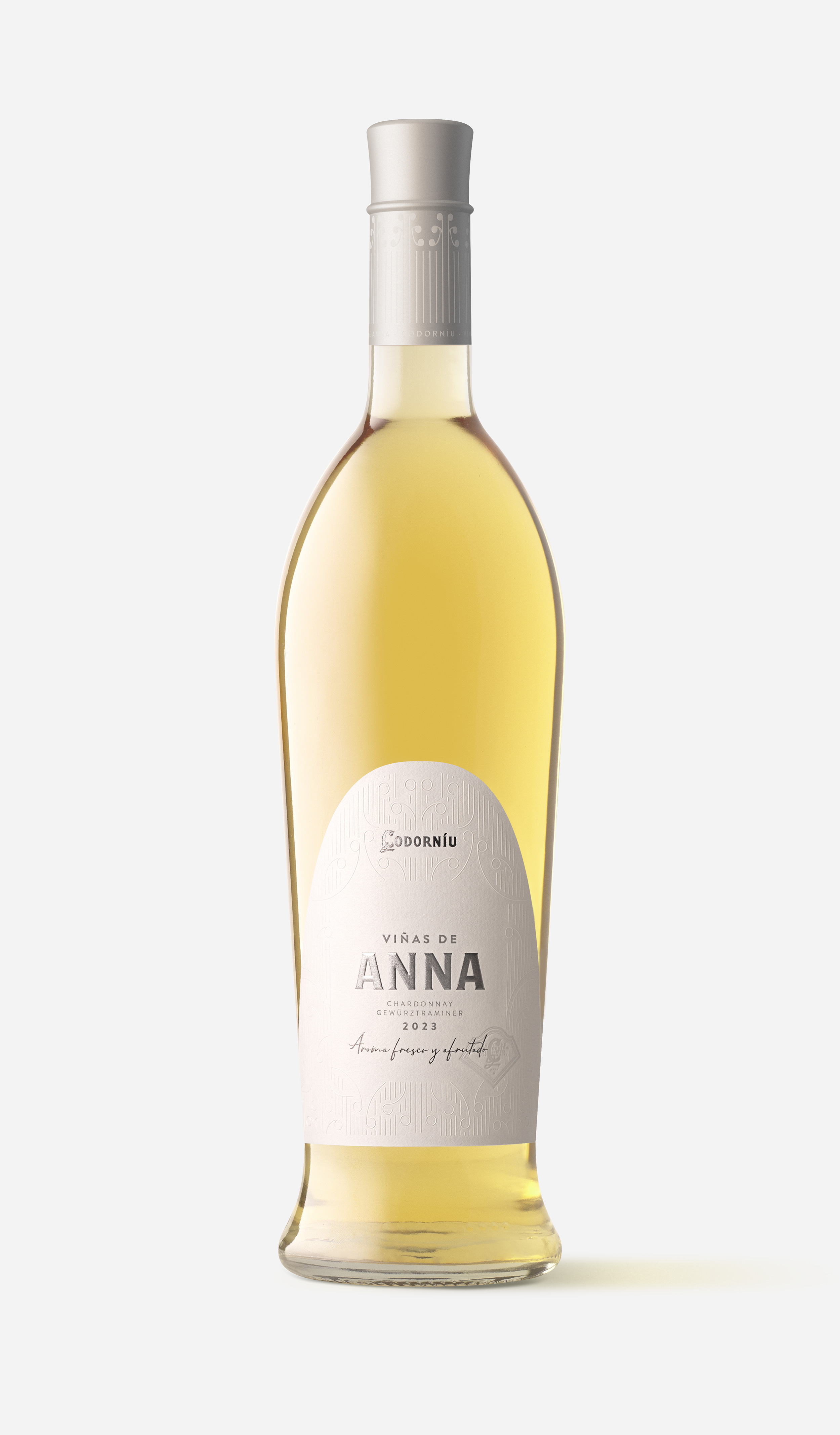
The new design had to capture the defining qualities of Viñas de Anna: delicacy, femininity, luminosity, and freshness. To achieve this, we immersed ourselves in the history and architectural heritage of Codorníu, one of the oldest wineries in Spain. We drew inspiration from its modernist architecture, designed by Puig i Cadafalch, a key figure of Catalan modernism. This iconic winery, with its impressive brickwork and flowing organic forms, provided the perfect reference to infuse the label with a sense of tradition and artistry.
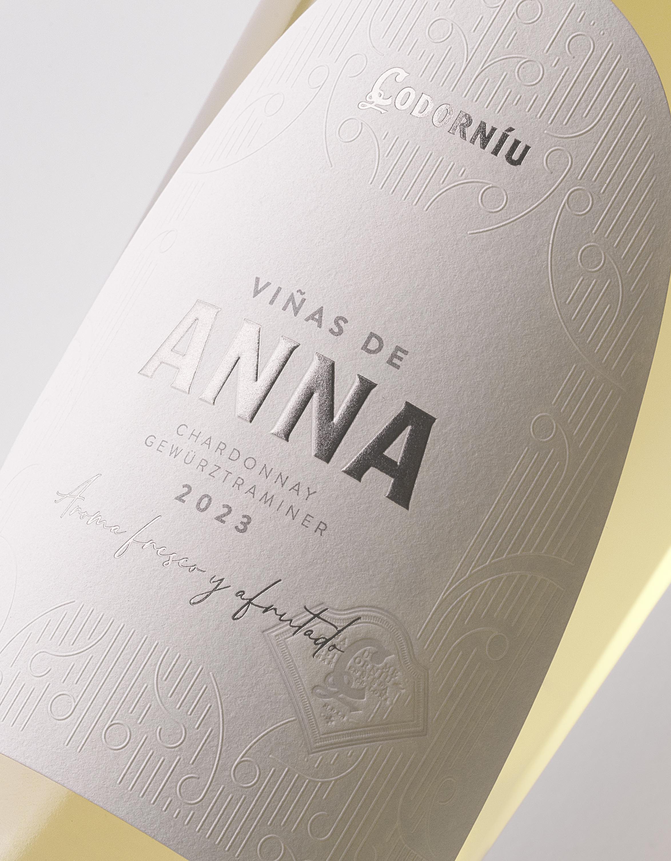
One of the most distinctive features we incorporated was the use of parabolic arches, a hallmark of Puig i Cadafalch’s architectural style, which we integrated into the label’s die-cut design. This subtle yet meaningful detail creates an immediate visual connection to the winery, reinforcing the brand’s heritage. Additionally, we recreated ornamental elements found in the winery’s façades through intricate embossing, adding texture and depth to the label.
Every aspect of the label was carefully considered to enhance the overall perception of Viñas de Anna. From the composition and typography to the selection of materials, stamping, and embossing, each element was meticulously chosen to convey an image of elegance, quality, and innovation. The refined color palette and premium finishes further emphasize the sophistication of this wine, making it stand out on the shelf while maintaining a sense of timeless beauty.
For us at Lavernia & Cienfuegos, this project has been an opportunity to seamlessly merge tradition with modernity, elevating the visual identity of Viñas de Anna for the future. By reinterpreting the winery’s architectural heritage and applying it to a contemporary label, we have crafted a design that not only respects the brand’s legacy but also enhances its presence in today’s market. The result is a label that tells a story—one of craftsmanship, elegance, and the enduring beauty of great design.
CREDIT
- Agency/Creative: Lavernia & Cienfuegos
- Article Title: Lavernia & Cienfuegos Redefines Elegance in Viñas de Anna’s Wine Label Redesign
- Organisation/Entity: Agency
- Project Type: Graphic
- Project Status: Published
- Agency/Creative Country: Spain
- Agency/Creative City: Lavernia & Cienfuegos
- Market Region: Europe
- Project Deliverables: Label Design
- Industry: Food/Beverage
- Keywords: label, packaging, wine, design
-
Credits:
Studio: Lavernia Cienfuegos


