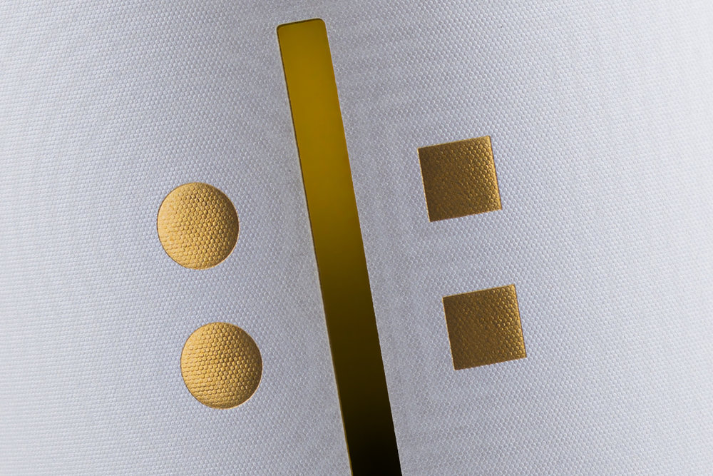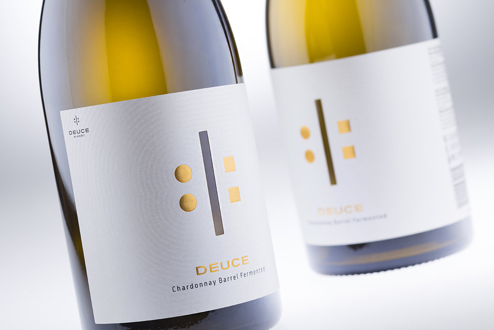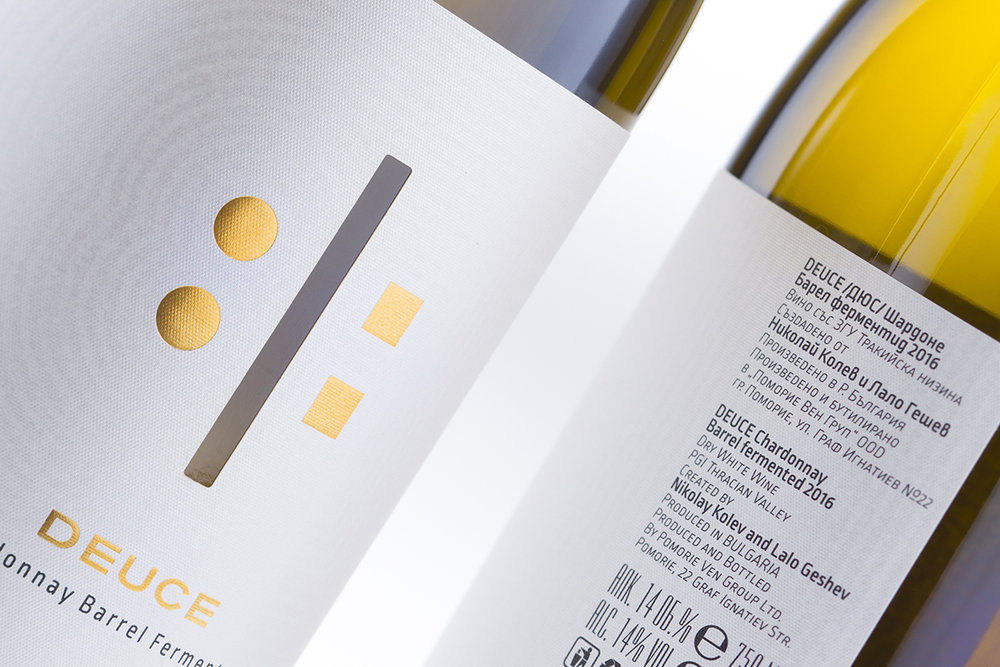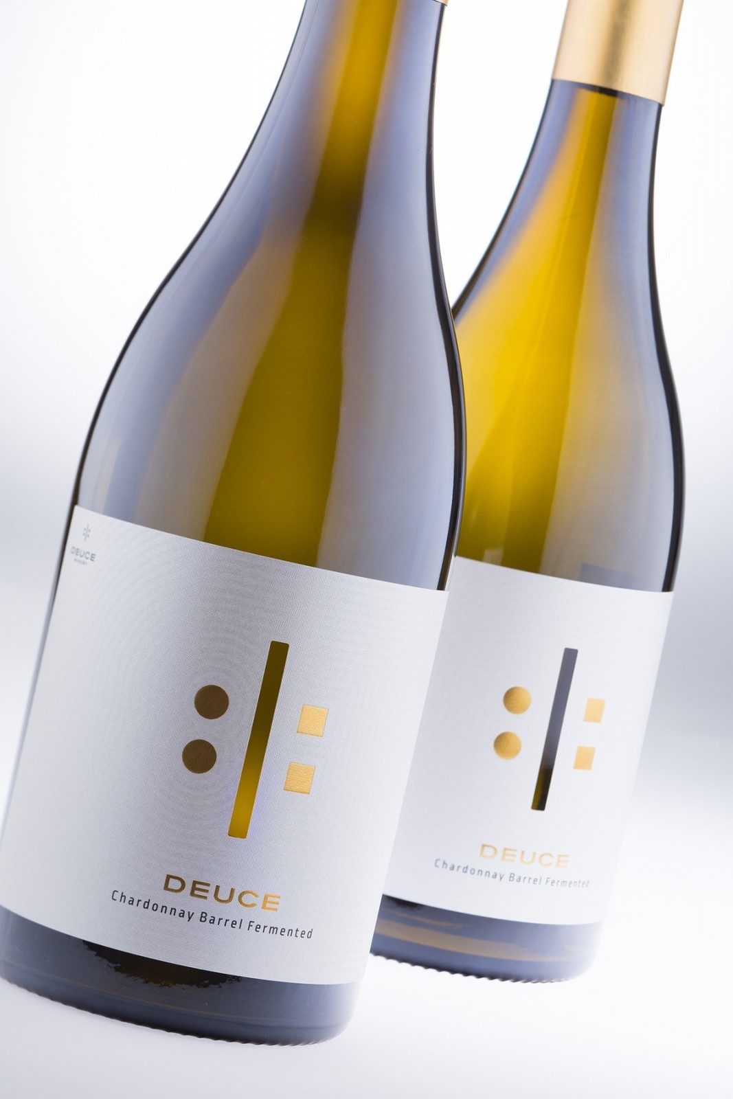
” A Wine Court for Two PlayersThe Deuce Brand Design story starts somewhere in the middle of 2016 when I met Lalo Geshev and after a few months Nikolay Kolev. Lalo is bass player and Nikolay is a drummer. Both are winemakers. Both are very different – Lalo is often floating up in the clouds while Nikolay is fully grounded. Lalo is making the reds, Nikolay – whites. They are friends, partners and they even play in the same band and what was quite evident to me that everything they do together was absolutely 50/50! Well after this portrait of their team I really had no other choice but name their new project the Deuce Winery. They are deuce as number and deuce as relations – no one is taking over the other!So this is the story behind the name. I really felt it was a real hit and Lalo & Nikolay agreed 100% (50% Lalo and 50% Nikolay).Designing the label for this new brand was a real pleasure. It is always easy, challenging and exciting when you have a strong brand name with interesting story behind – they are really essential to create an outstanding label.I did not think much here – I was inspired! I wanted large label, beautiful paper, balanced embellishments and serious bottle. The label is wrapping more than half of the bottle and I used one of my favorite Constellation Jade Raster paper because this is one of those papers that really shines for itself alone. You don’t need to do anything special with it (though I did!) – it is amazing. Now after I made my choice for ‘the canvas’ I decided to cut off rectangular vertical stripe in the center of the label – this was just to split the label in two fields – left and right. As you know I love to take two rabbits with one shot – so splitting was just one of the goals I achieved. The second one was the fact that you actually could see the wine through the label – after all it was all because of the wine. It is so important that everyone should see it!”

” So after having two fields I needed two players on the court – Lalo stands behind the two circles and the squares are for Nikolay – again 50/50. Deuce in every aspect – nothing more nothing less! Along with the DEUCE brand they were stamped with rich gold hot-foil by Lemaco and they really shine on the label. My final and favorite touch on the label was a contour pattern on the whole surface of the label mixing the two figures of Lalo and Nikolay in abstract shape transition from circles to squares. I did this not just to personalize the paper and make it more attractive but to show that these two individuals, though being very different, are united in one thing on their way through wine.Deuce Brand Design is one of my dream projects. I will probably never have second chance to create another label like this and I am really happy to be part of this project.Their first wine is Chardonnay Barrel Fermented and experts here say it is incredible – I hope that my work is as good as their wine is!”


CREDIT
- Agency/Creative: the Labelmaker
- Article Title: the Labelmaker – Deuce Brand Design
- Project Type: Packaging
- Format: Bottle
- Substrate: Glass


