


The Music Week Poland music showcase combines a professional, industry-driven character with a wide range of musical discoveries and experiences, creating a unique platform for knowledge exchange and collaboration between artists and representatives of the music industry. The event’s goal is to promote talented musicians with international potential, providing them with the space to grow and expand onto the global music market. This initiative evolves in line with the trends and needs of the contemporary music landscape, with music at its core, shaping its identity.
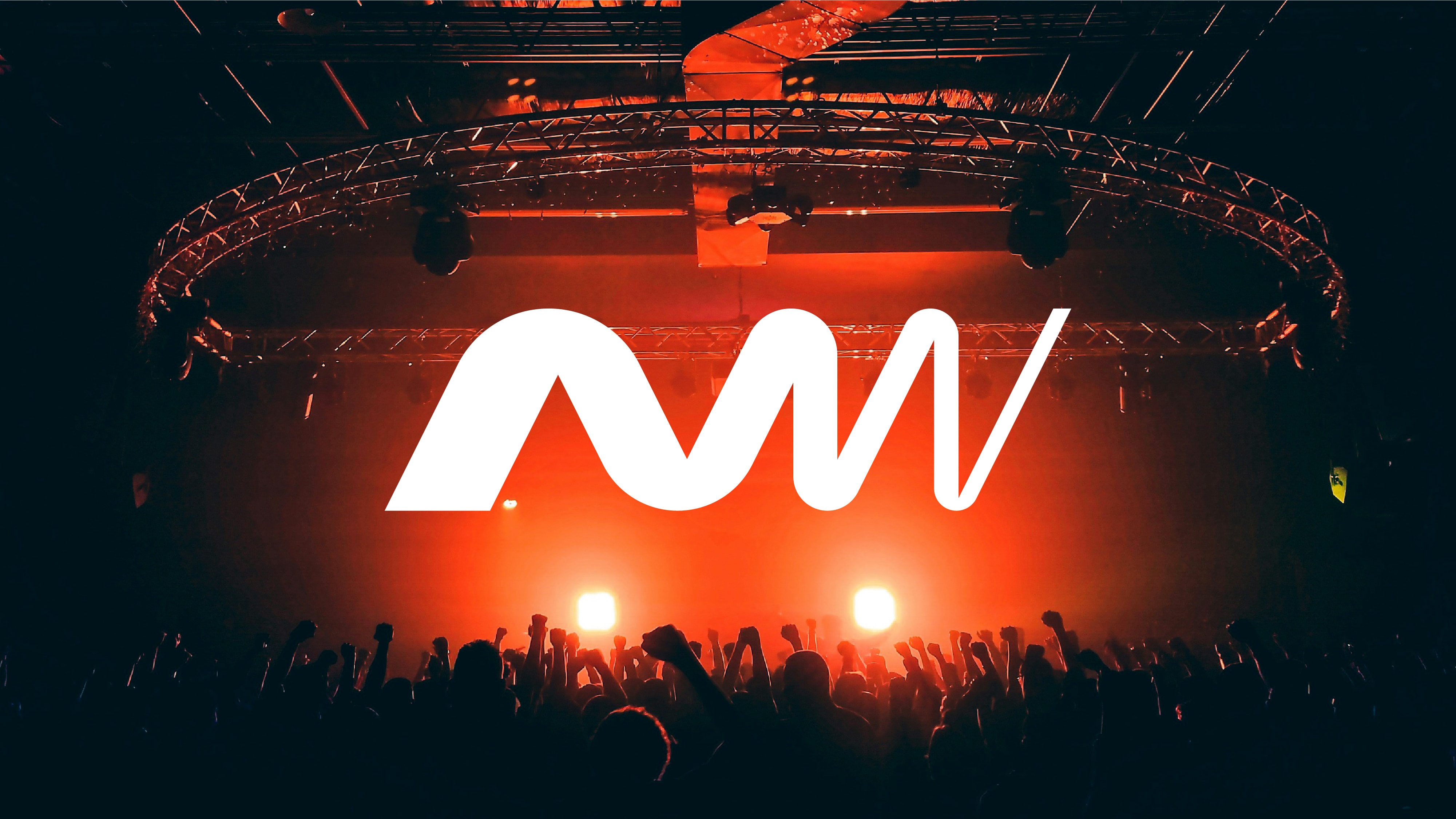
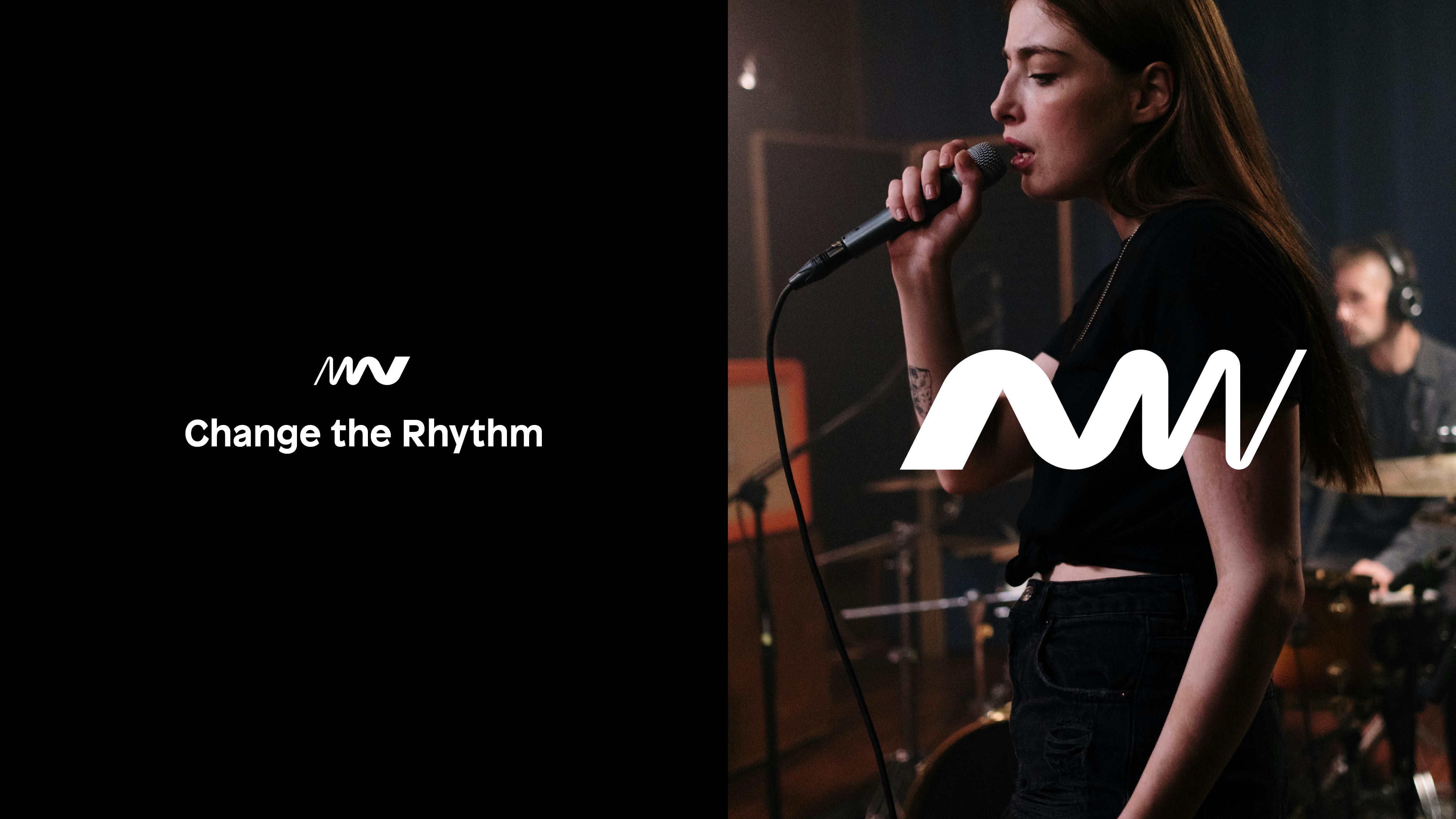
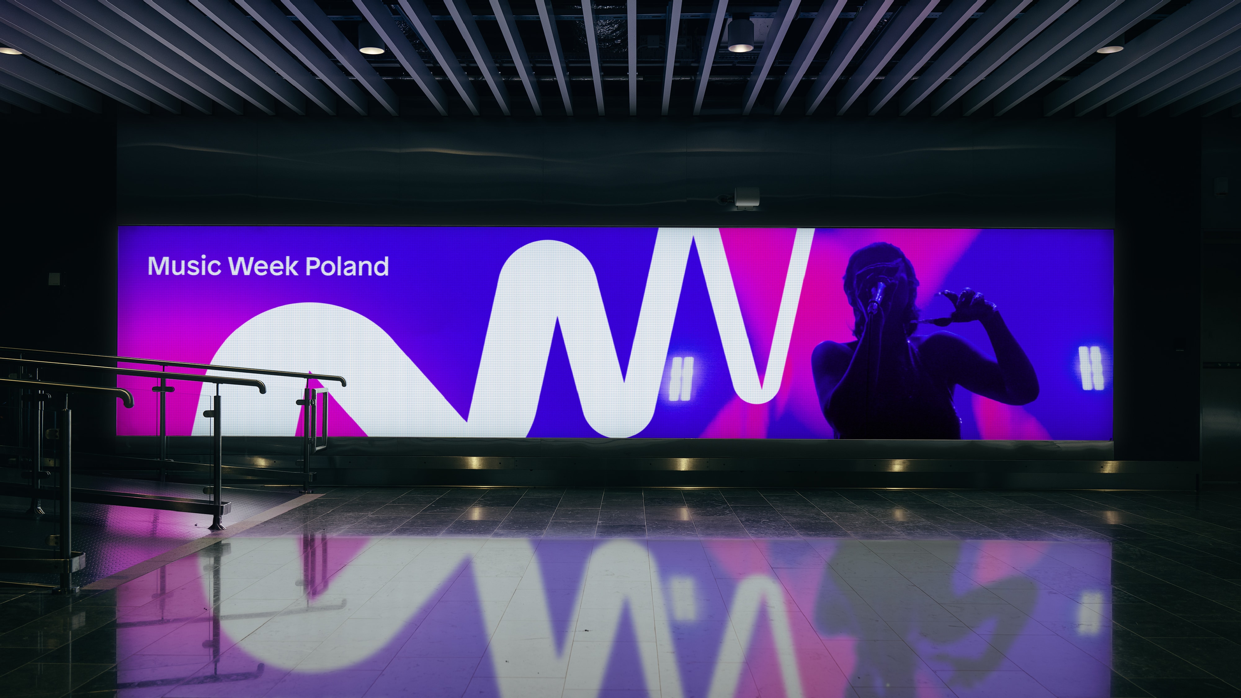
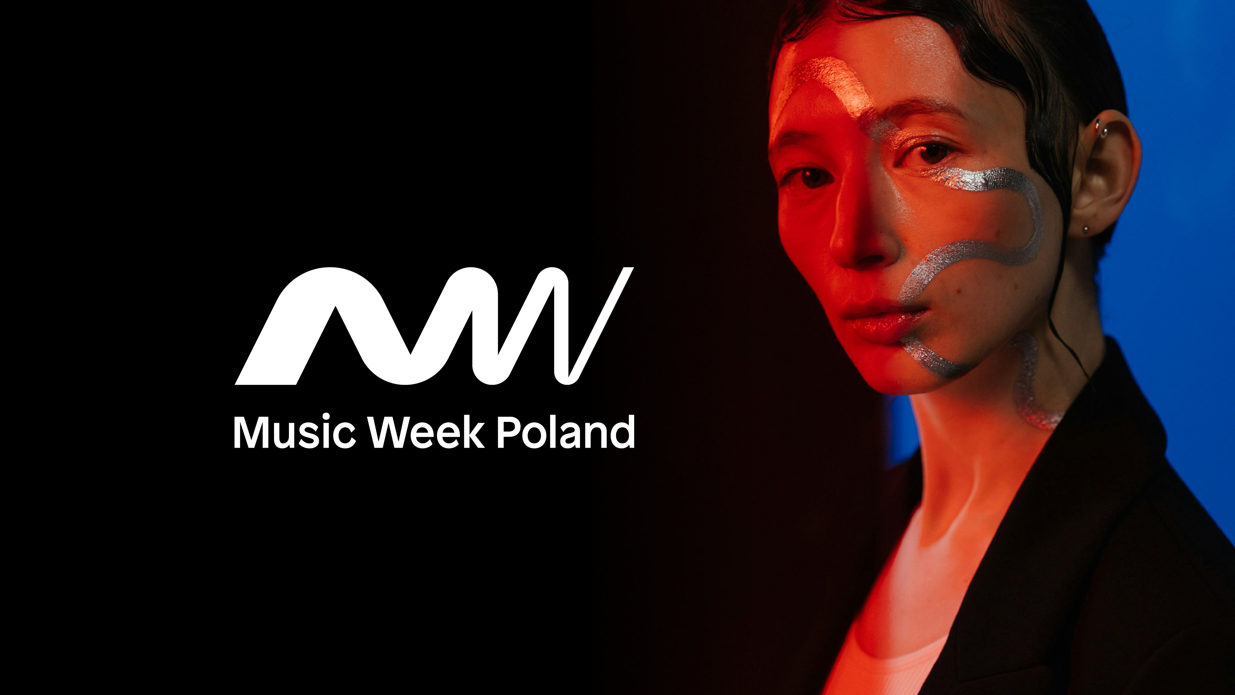
The concept behind the logo and visual identity of Music Week Poland highlights the key strengths that define the brand’s unique character and mission. Through its distinctive design, the logo captures the essence of connection and collaboration that lies at the heart of the event. The logo design draws inspiration from the idea of a network and hub – a place where diverse elements come together and amplify one another. It also references the image of a soundwave, a universal symbol of music that reflects its variability, diversity, and dynamism. Just as music continually evolves and adapts, the design reflects the energy and transformation of the music industry itself. This serves as a metaphor for a space that foster artistic development, accelerates careers, and helps gain wider recognition, offering a dynamic environment for both performers and industry professionals.
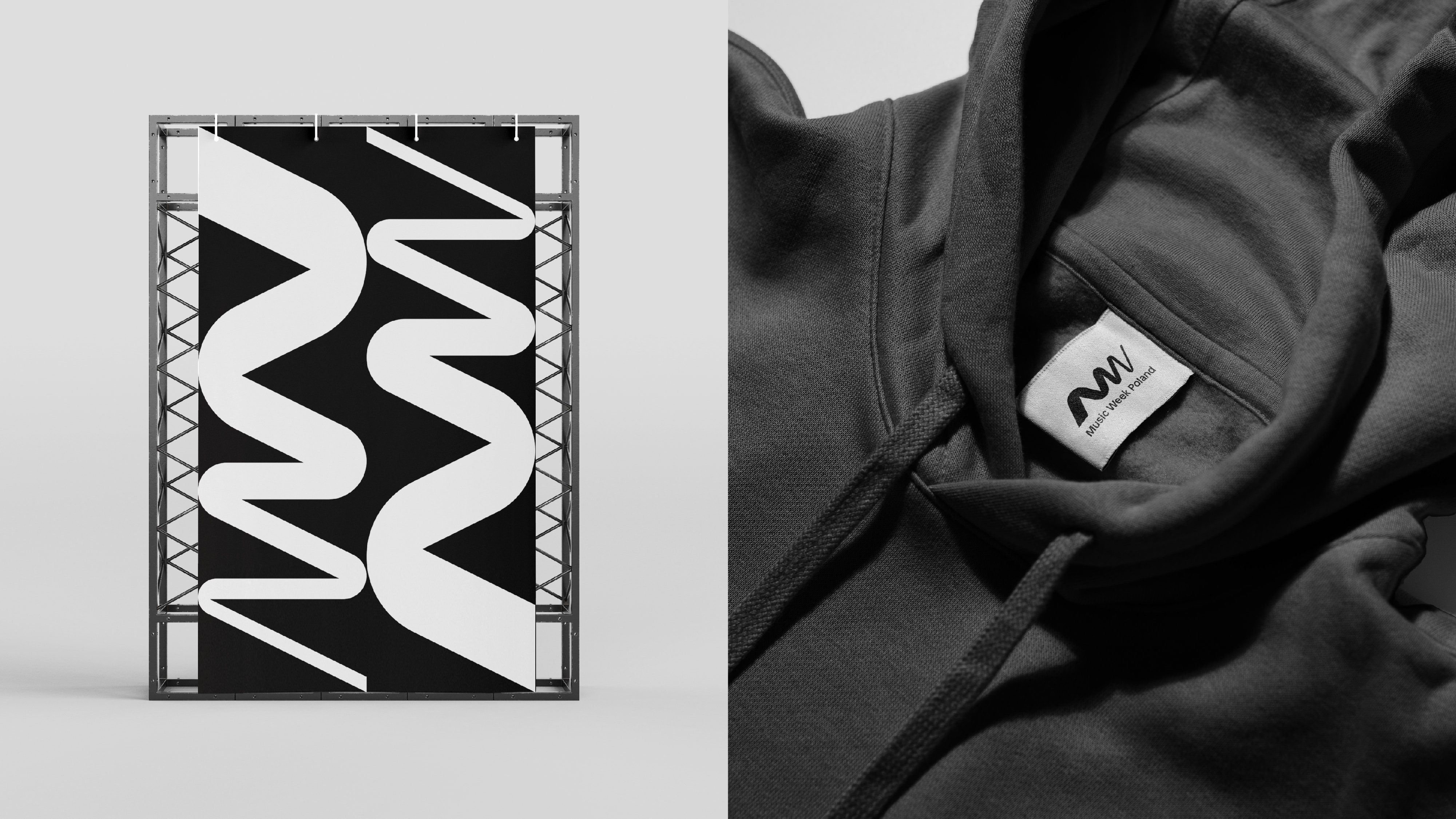
The emblem features the monogram M + W, representing the initials of the showcase’s name. The logo blends the dynamism and expression of music with a minimalist, professional aesthetic, creating a distinctive symbol that strengthens the recognition of the Music Week Poland brand and highlights its unique character.
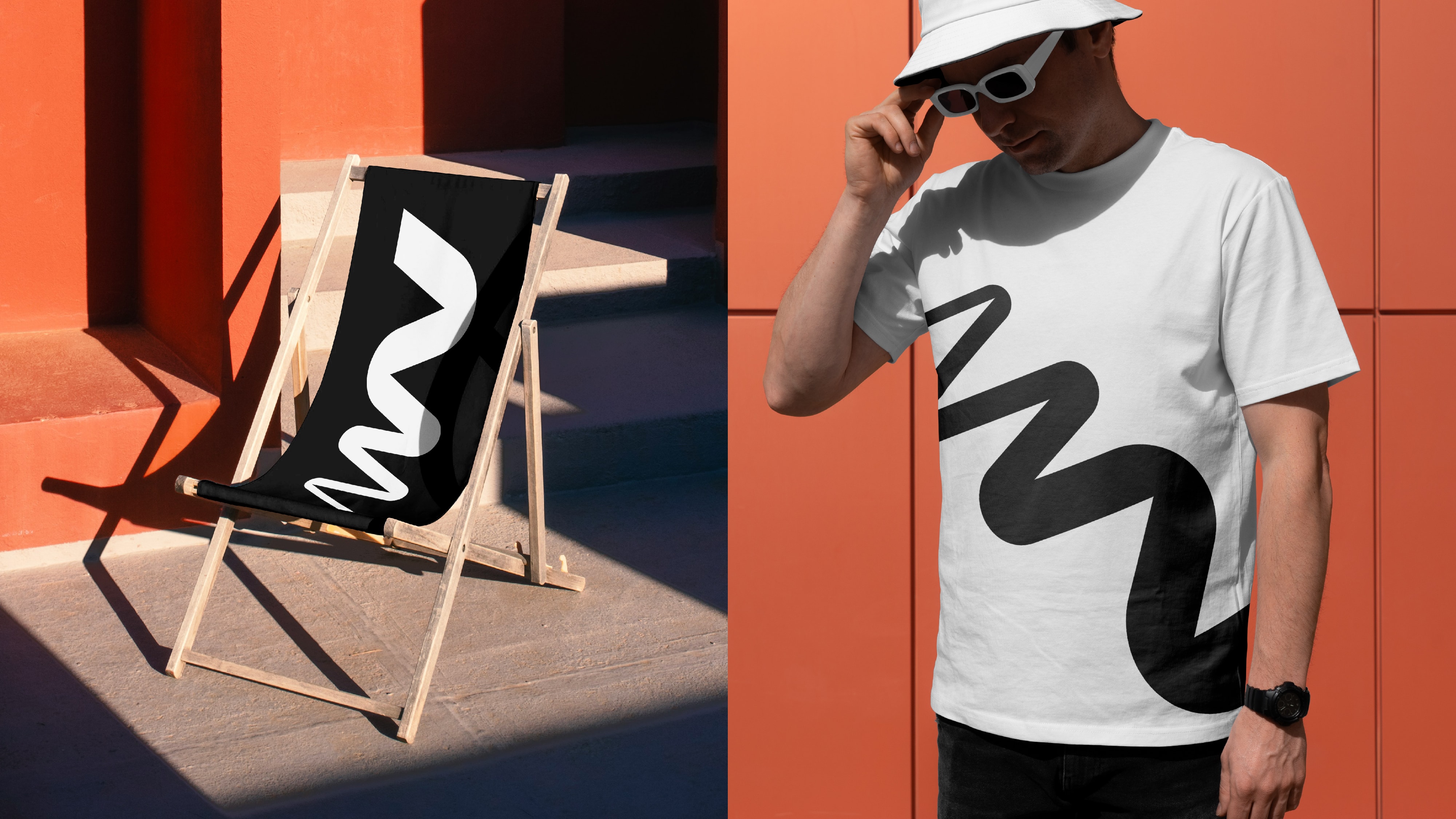
The logo also forms the basis for the Key Visual, which, through its simplicity, offers flexibility and potential for further development in future editions of the showcase. Its universal nature allows for various adaptations and modifications, ensuring visual coherence while providing the flexibility to evolve with future needs.

CREDIT
- Agency/Creative: Tofu Studio
- Article Title: Music Week Poland Visual Identity by Tofu Studio
- Organisation/Entity: Agency
- Project Type: Identity
- Project Status: Published
- Agency/Creative Country: Poland
- Agency/Creative City: Gdansk
- Market Region: Europe
- Project Deliverables: Brand Design
- Industry: Entertainment
- Keywords: brand, logo, logos, branding, visual, music, showcase, live, shows,
-
Credits:
Art: Weronika Cyganik
Design: Weronika Cyganik
Design: Krystian Tyrański
Design: Ola Misztela
Motion: Adam Chyliński
Motion: Ola Misztela
Business: Daniel Naborowski


