


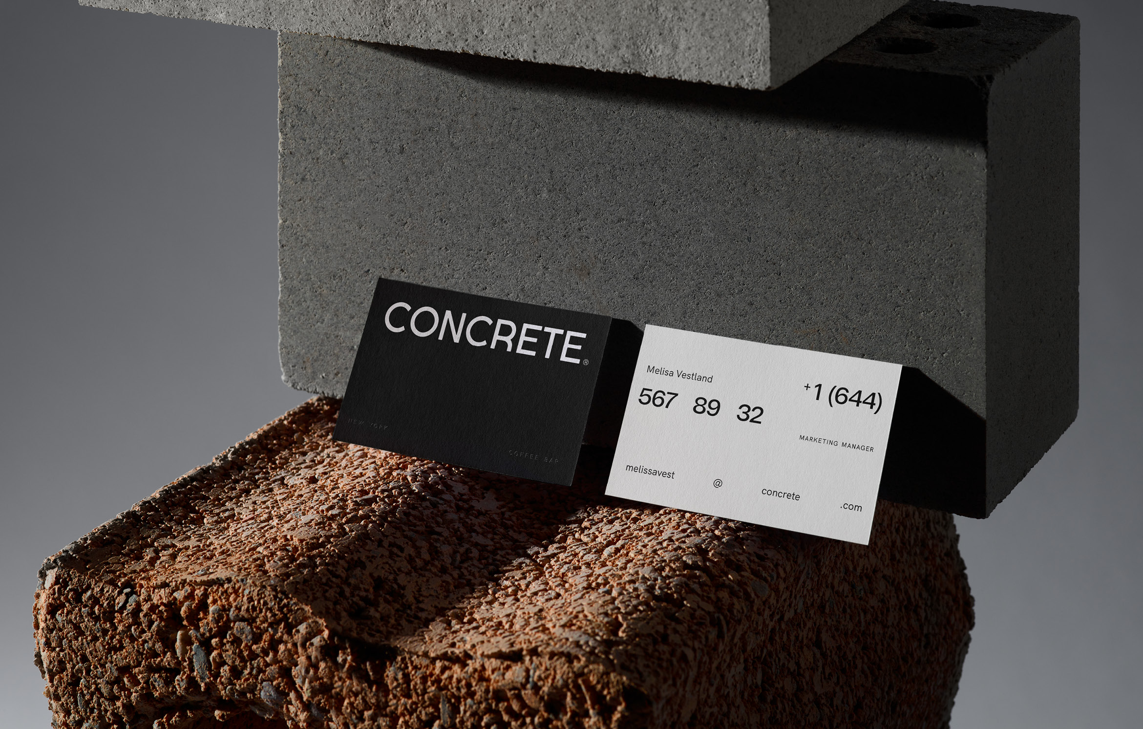
Concrete is a coffee bar in New York. Designed as a space where anyone can feel at home, it welcomes those seeking solitude, new friendships, or to blend into the city’s fast-paced rhythm.
Built upon the Concrete philosophy, this brand’s visual narrative lays its foundation in a concept designed to drive and balance individuality with human connection, in an easy, minimalistic yet powerful way.
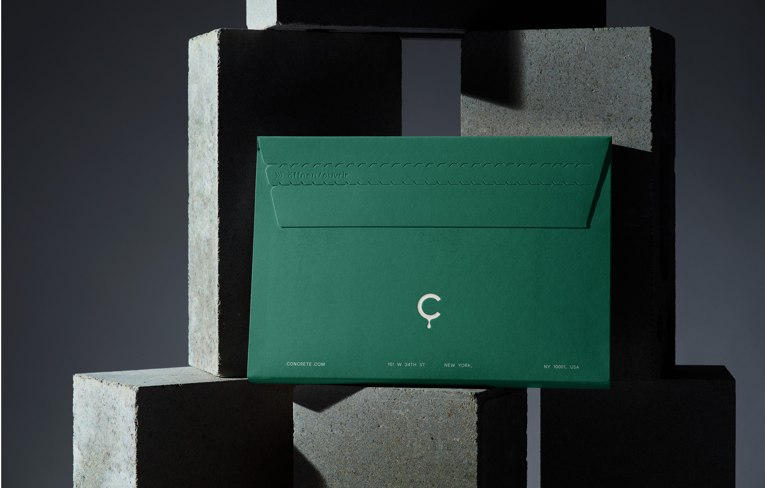
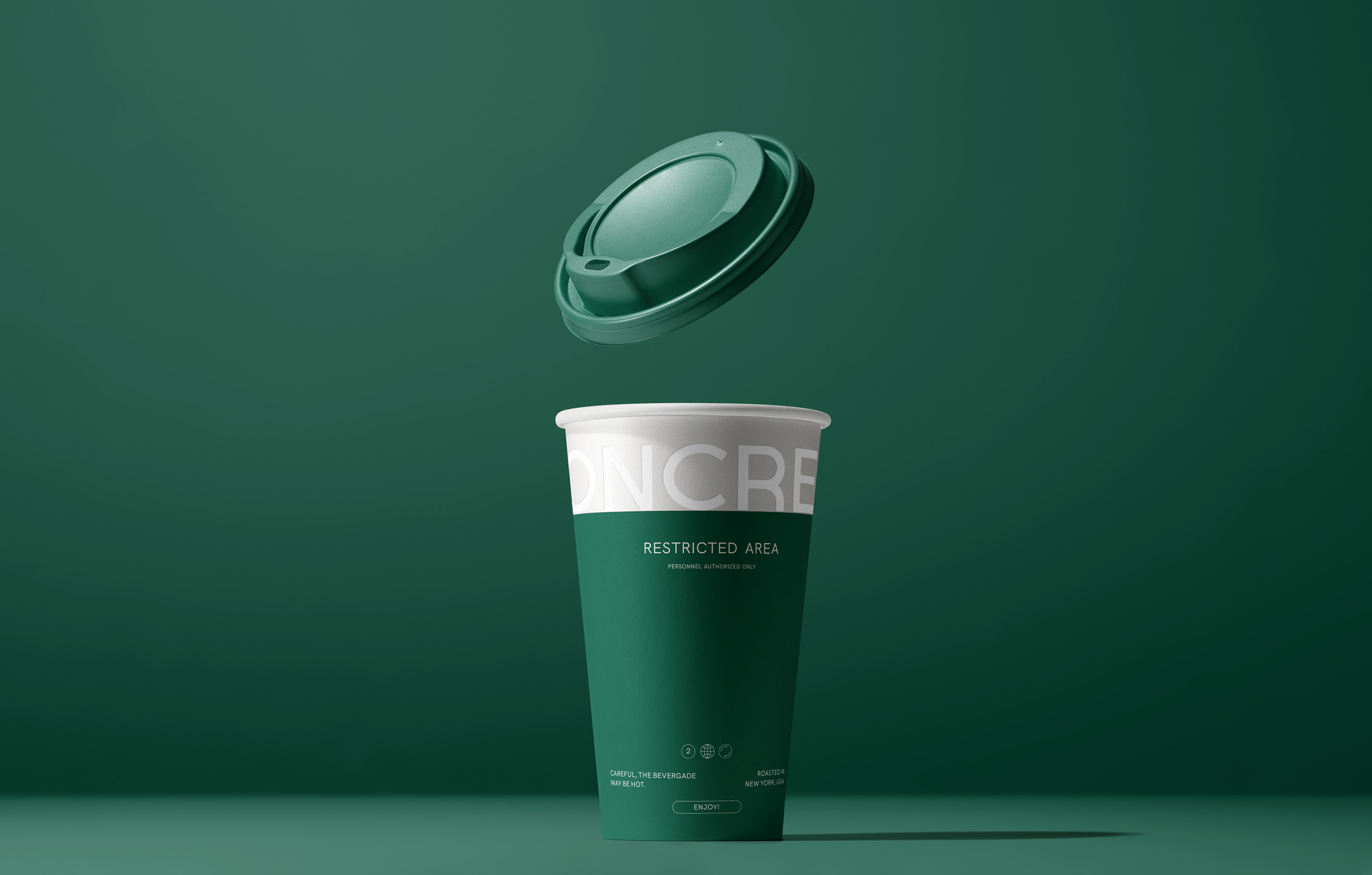
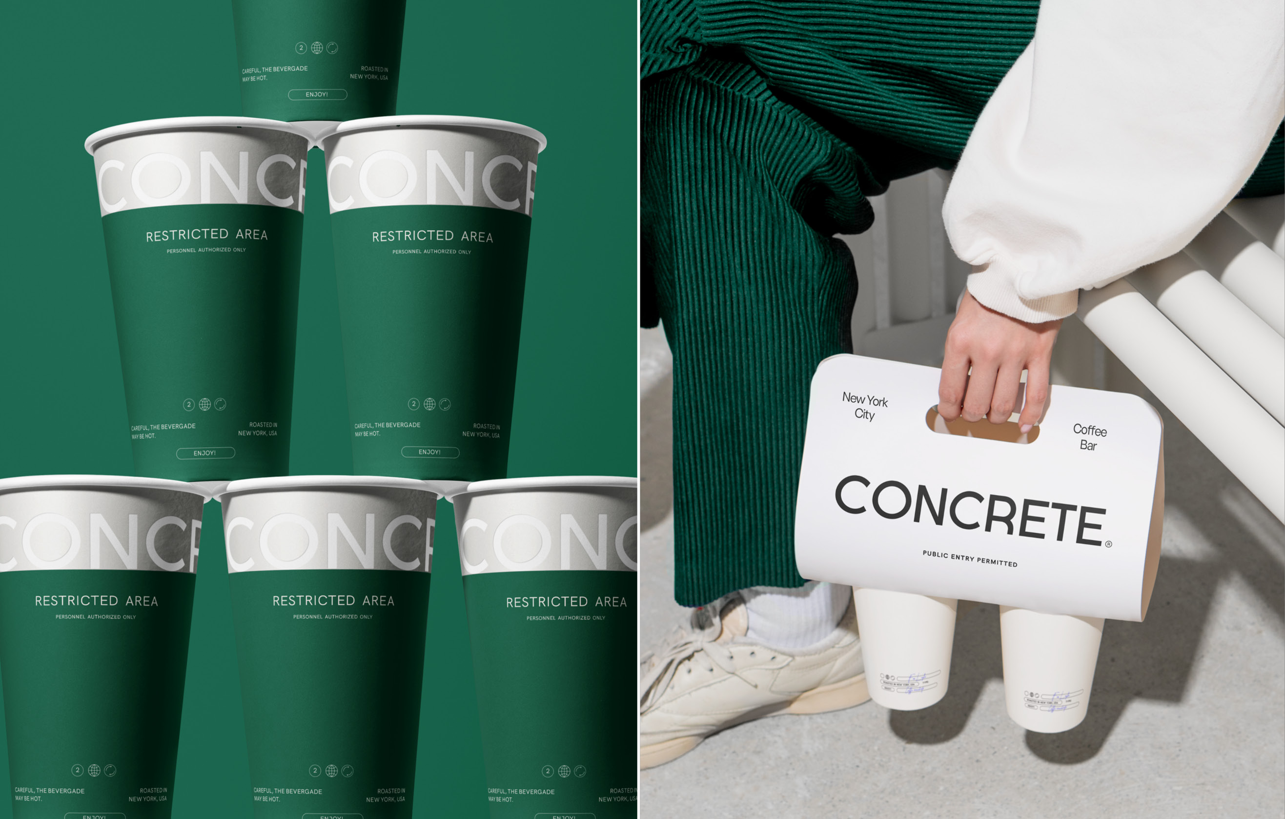
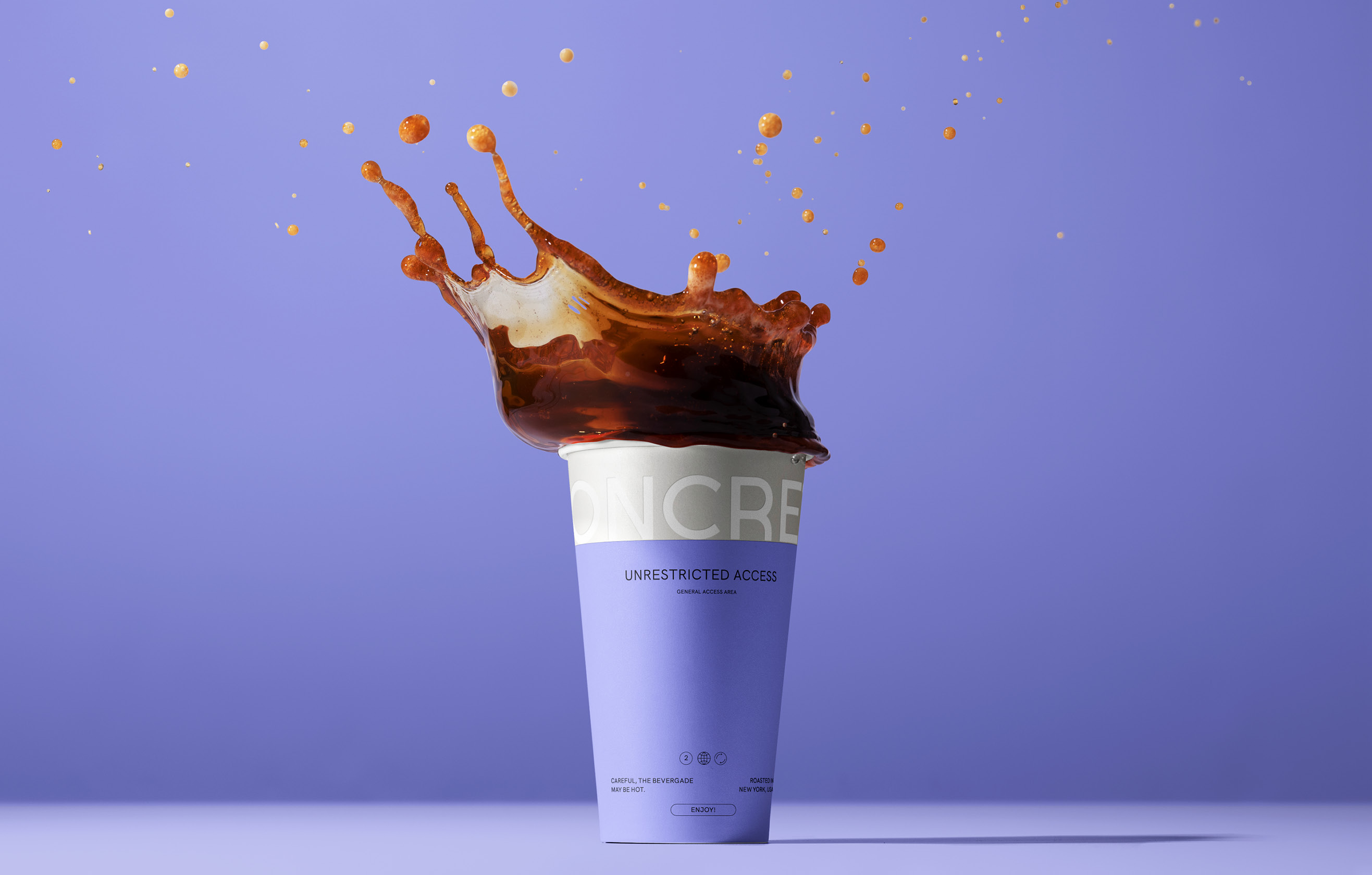
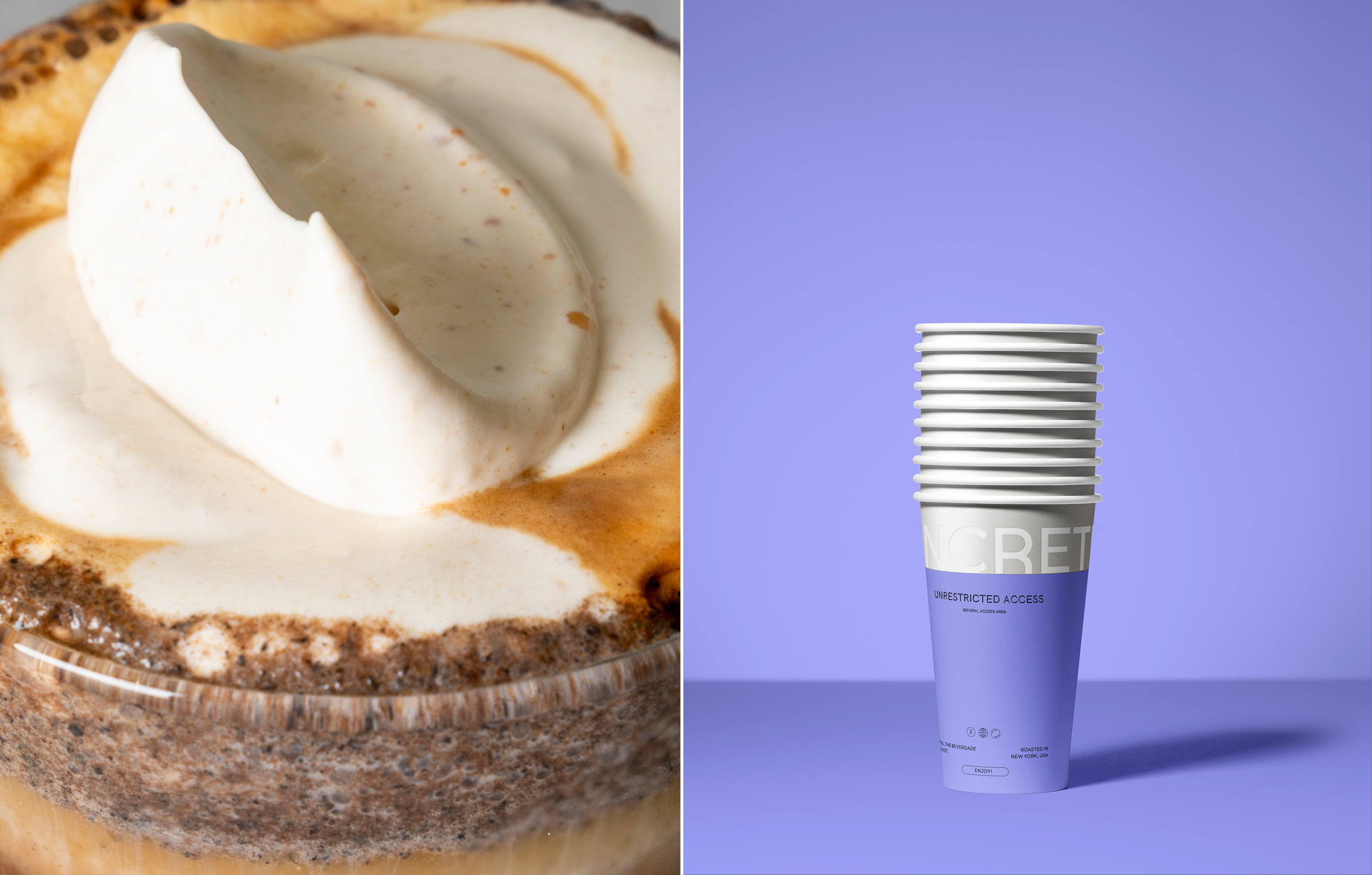
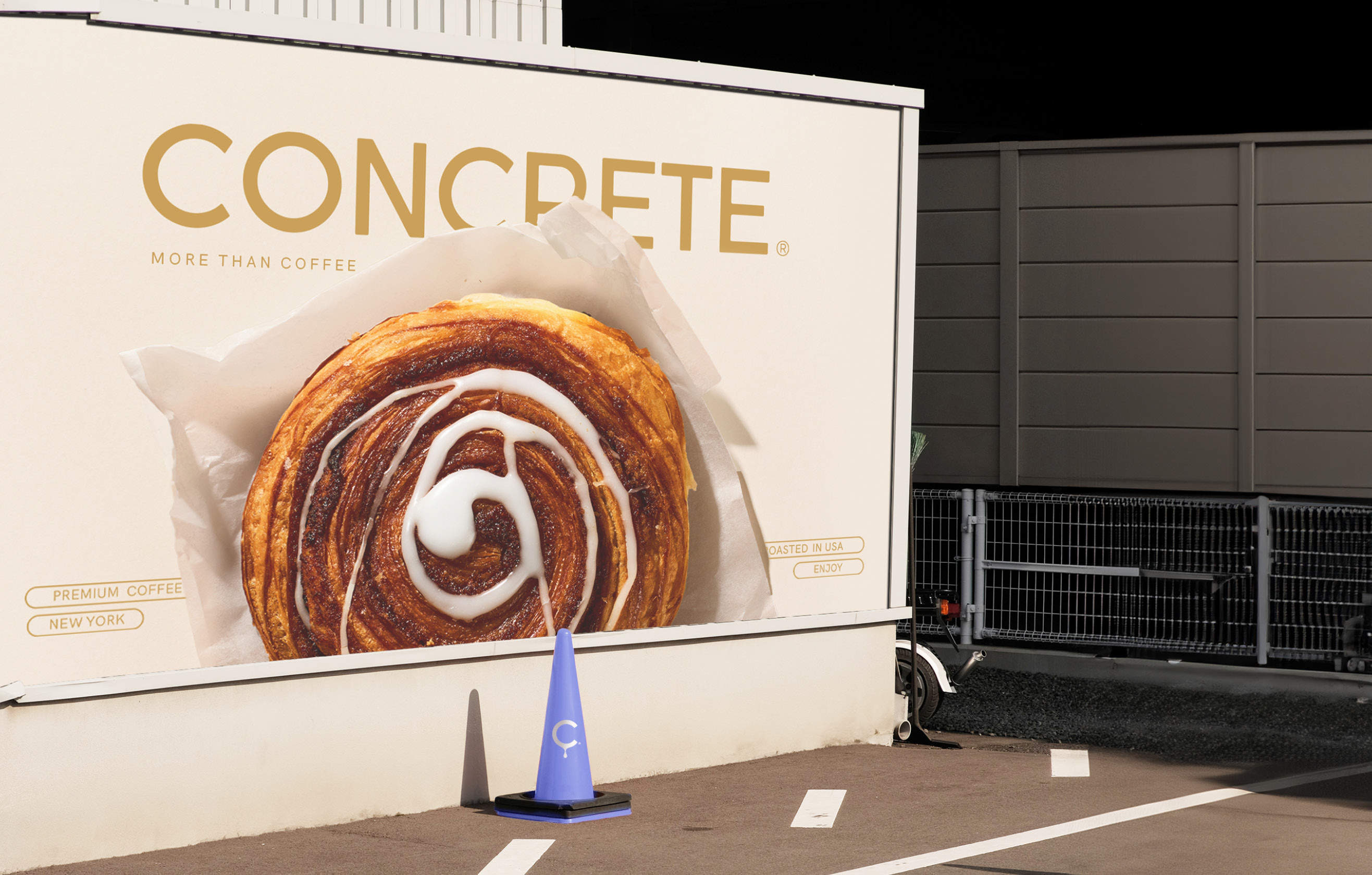
The selection of color palettes not only constitutes the brand’s story but also reflects how the coffee bar operates and presents itself through photography. This visual cue system makes it easy for patrons to instinctively choose whether they want to be part of a lively conversation or enjoy some peaceful solitude. Lilac, fosters connection, and inclusivity, in shared spaces within the coffee bar, where social interactions thrive. Earth Green, on the other hand, promotes inner peace, offering moments of solitude that align with the tranquil spaces within the coffee bar, providing an environment for those seeking solitude or a moment of reflection. Coffee Gold, a color that encapsulates the robust warmth of freshly brewed coffee, is prominently featured in advertisements and social media, reinforcing the central role coffee plays in the brand. White and Black tones capture the rhythm of city life, these tones are used for general information, providing clarity and balance while allowing the more vibrant colors to shine. Having Silver reinterpreted concrete material with a modern industrial twist. Together, these colors construct a narrative of belonging.
This color distinction also extends to internal communication: green indicates private information, while lilac marks shared information, ensuring clear and effective categorization. This approach guarantees that each message is visually aligned with its purpose. The typography combines neutrality and modernity, featuring a clean and accessible design, while the tone of voice is direct, industrial, and personal.
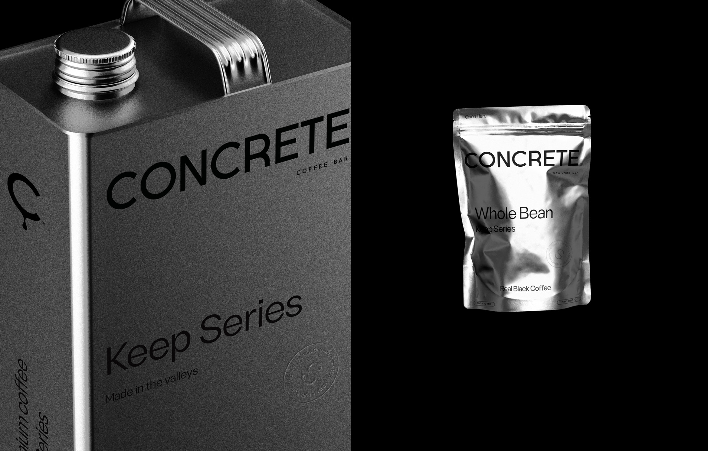
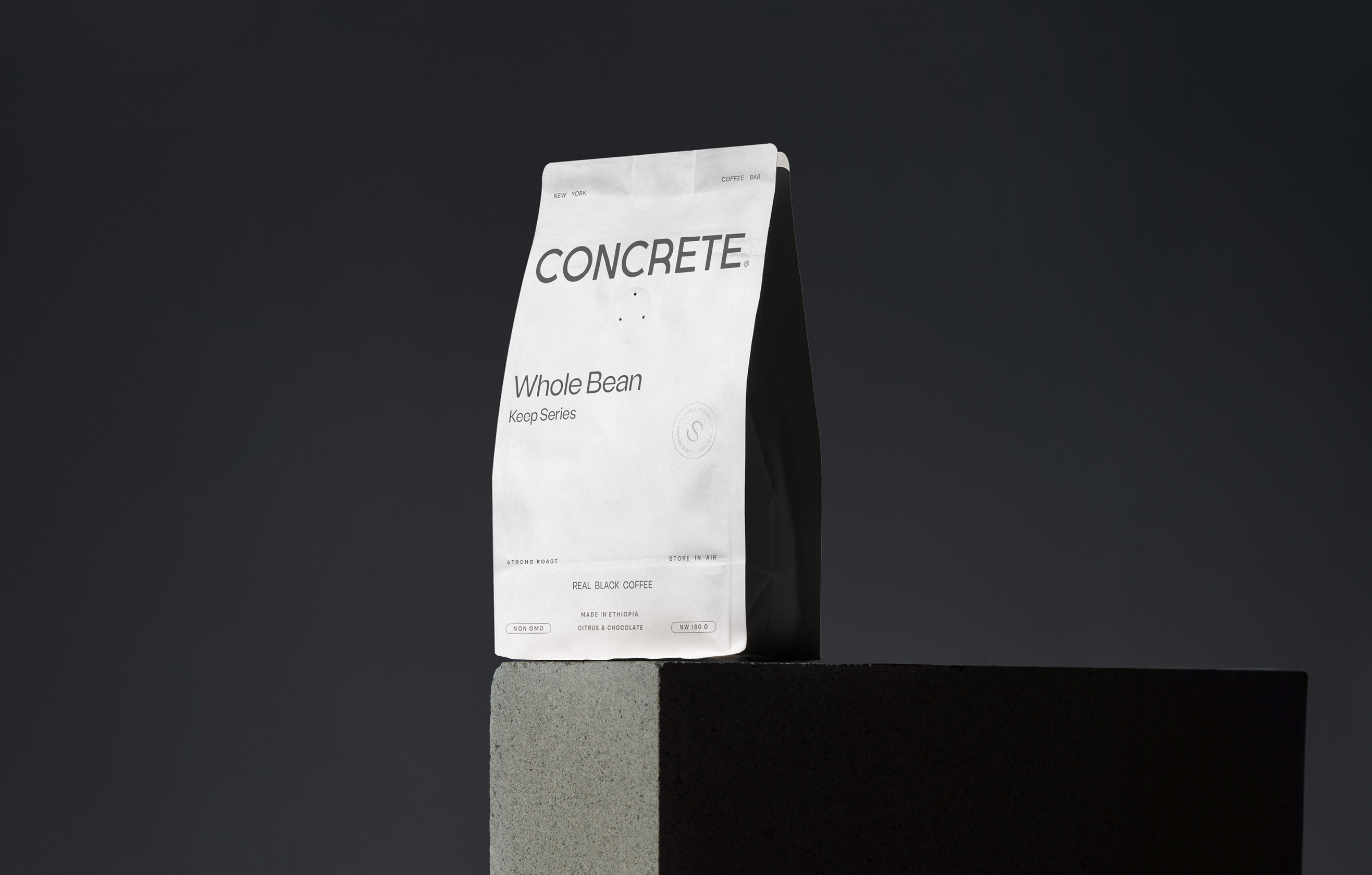
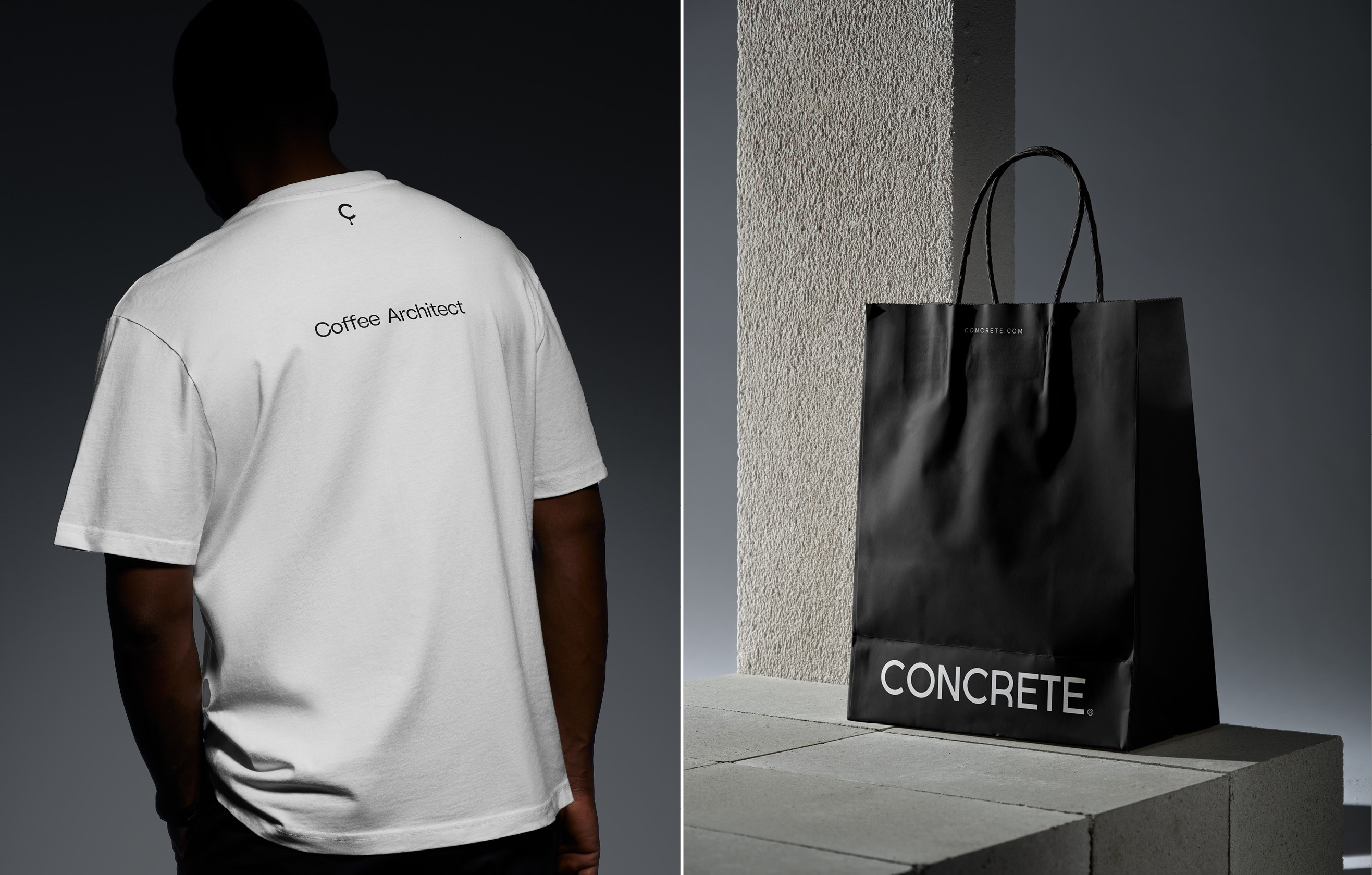
Finally, this visual identity integrates illustrations with modern design elements, akin to a well-built structure that stands the test of time. The minimalist packaging draws inspiration from the construction industry, giving a touch of organic elegance.
CREDIT
- Agency/Creative: Tiare Payano
- Article Title: Tiare Payano Creates Concept for Concrete Coffee Bar
- Organisation/Entity: Freelance
- Project Type: Identity
- Project Status: Published
- Agency/Creative Country: Spain
- Agency/Creative City: Tiare Payano
- Market Region: North America
- Project Deliverables: Brand Creation, Brand Design, Brand Guidelines, Brand Identity, Identity System, Insight, Logo Design
- Industry: Food/Beverage
- Keywords: Coffee, Identity, coffee shop, concrete, drinks
-
Credits:
Designer & Art director: Tiare Payano


