
Louise Agency – Mates Rates Mortgage Brokers
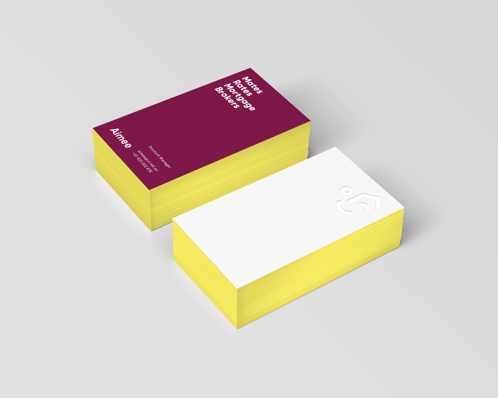
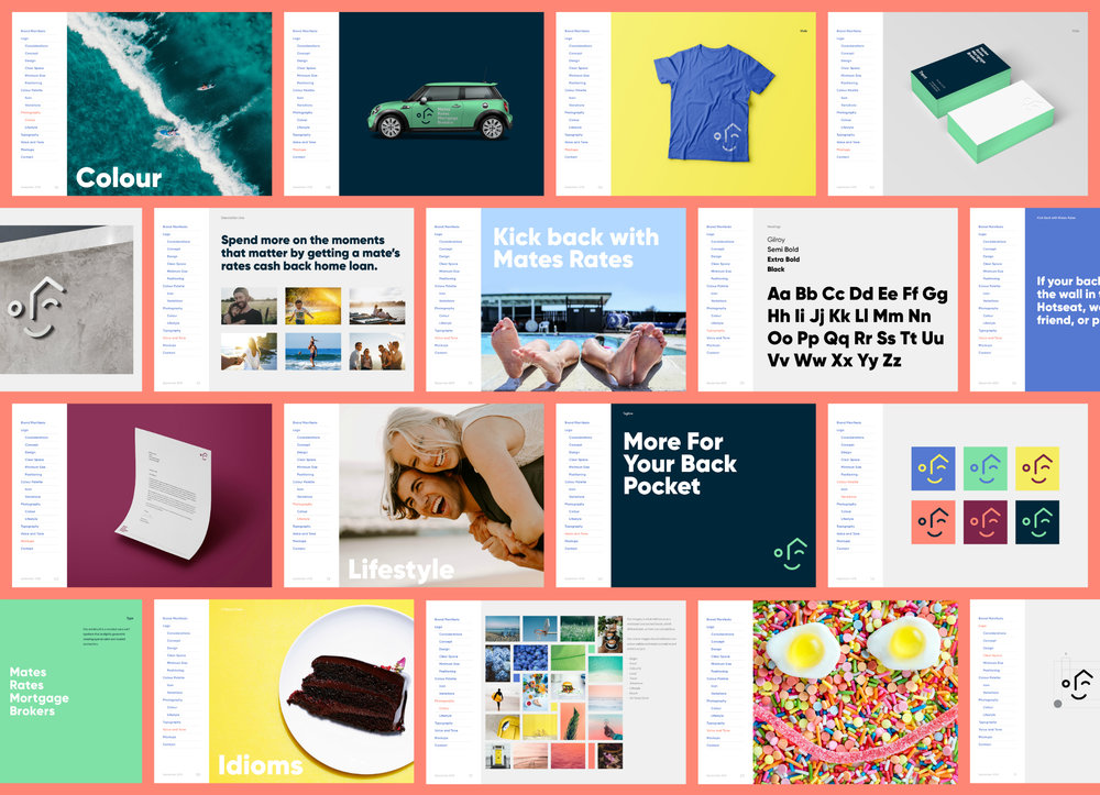
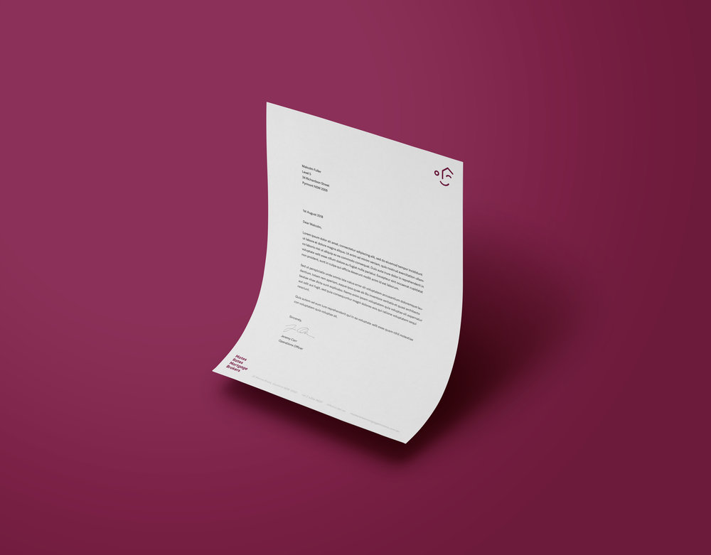
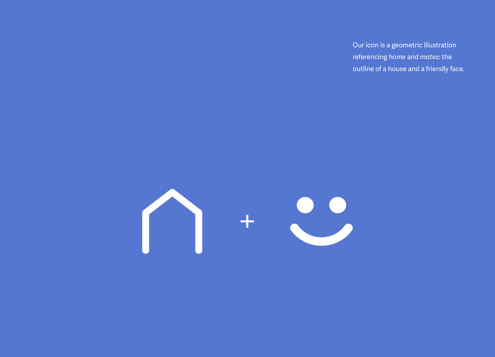
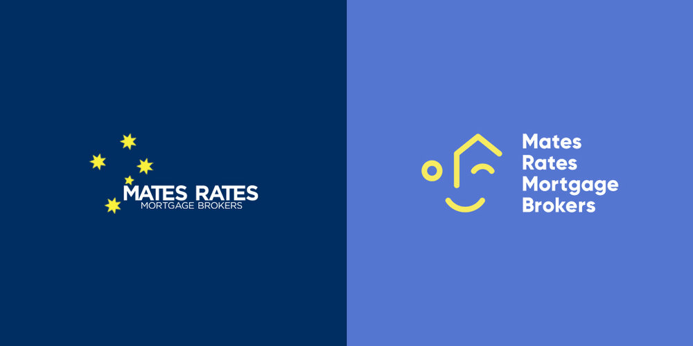
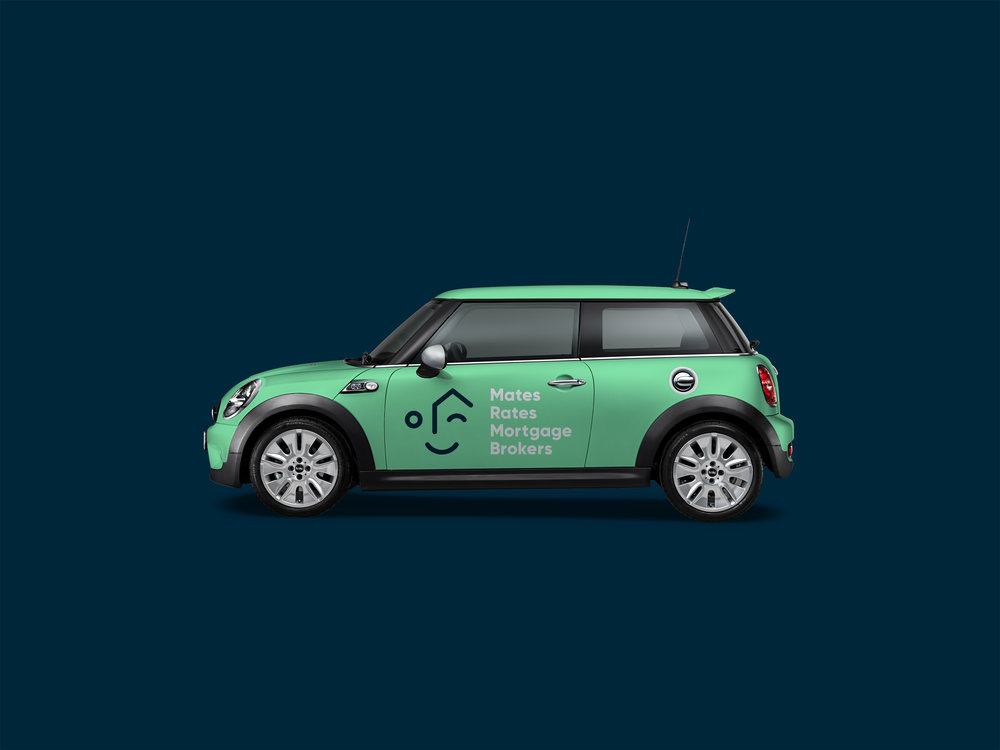
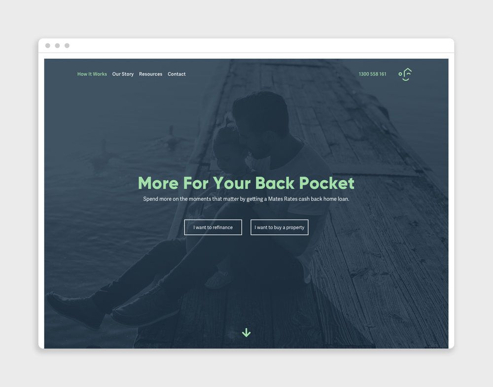
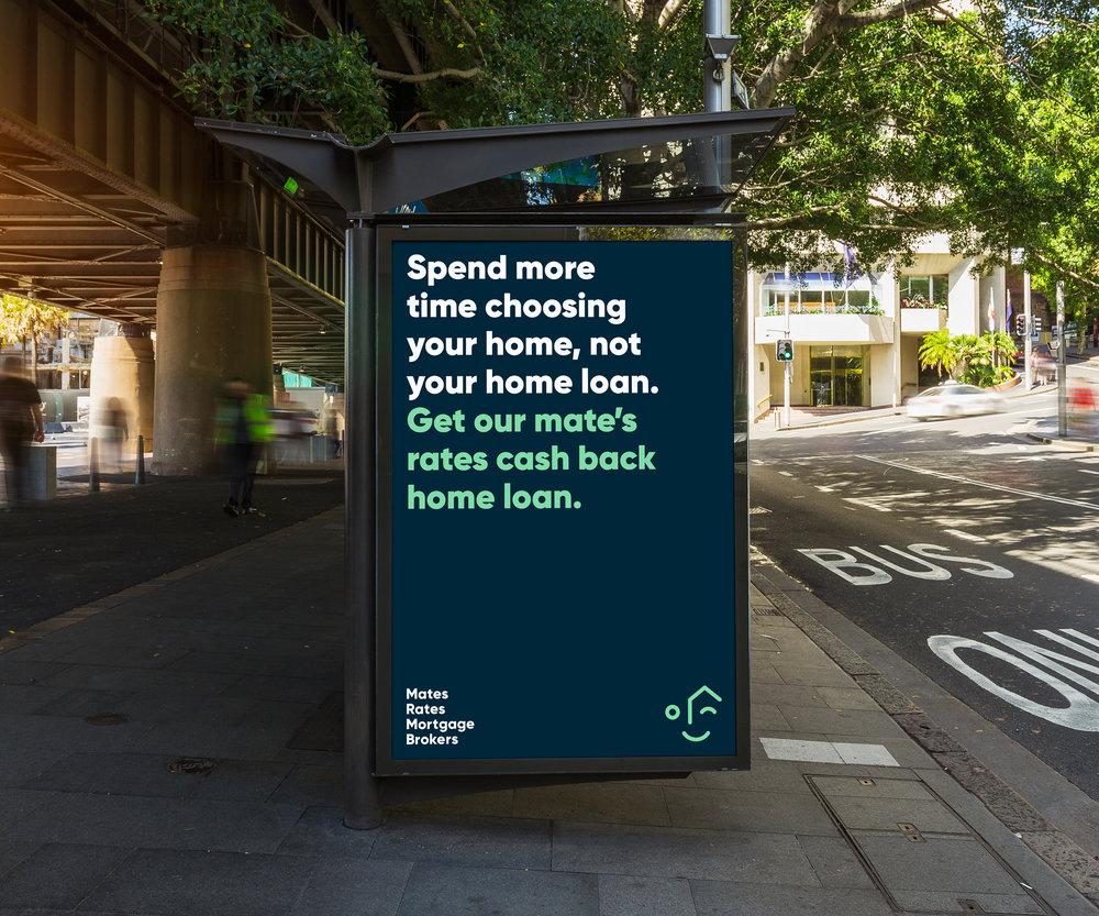
“ Previously, as with many brokers, Mates Rates’ branding focused on the ‘what’ and the ‘how’: the facts and figures. The new personality now connects its audience to their ‘why’.A complete brand overhaul was required along with a new tagline that could help explain their ‘why’. Their cash back philosophy affords their mates, old and new, the luxury of spending more on the moments that matter, getting you ‘More For Your Back Pocket’.Meet Arlo. The new geometric icon that reflects everything in the company name – a house and a friendly face, aka a mate. The new identity oozes motivation and excitement with a fair dinkum relatable look and feel.The brand personality is a blend of corporate intelligence with subtle hints of the Australian tongue – reliable, direct, honest, relatable and humorous. The bright colour palette is a modern take on the Australian red, blue, green and gold national colours. Every colour can be coupled with another constituting a belief that each can belong – there is something for everyone.With the ‘why’ starting to come to life, it was crucial that the imagery was artistic and emotional to support this. Therefore, two separate image directions were taken to support this idea. This amalgamation then formed the basis behind the bright and colourful illustrations used within the social media strategy – the creation of visual double entendres.The website design brings the tone of voice to life using a clear explanation pattern that was written in layman’s terms with an added pinch of spunk.”








CREDIT
- Agency/Creative: Louise Agency
- Article Title: Rebranding for Trusted Mates Rates Mortgage Brokers
- Organisation/Entity: Agency Commercial, Published
- Project Type: Packaging
- Agency/Creative Country: Australia
- Market Region: Oceania
- Industry: Financial


