About
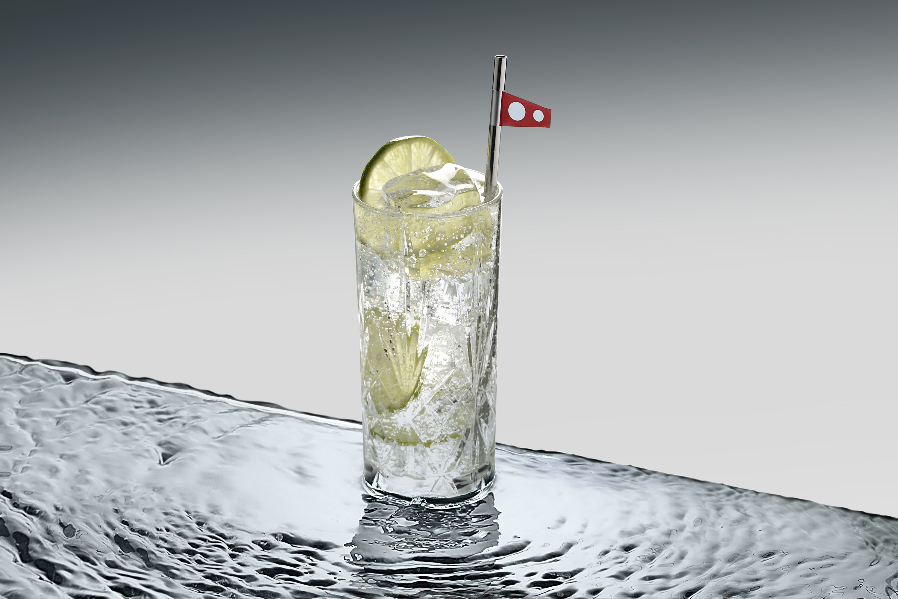
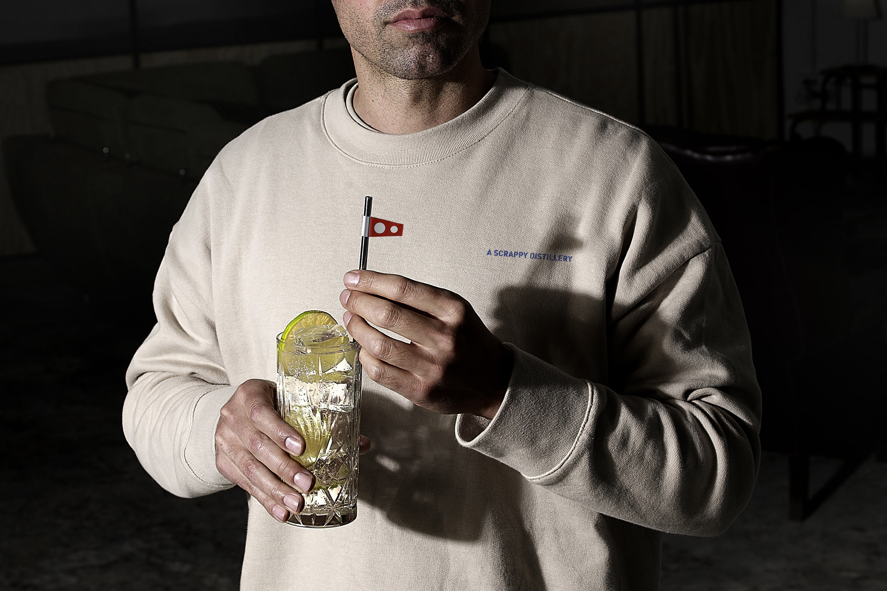
Flag signals represent one of the oldest forms of communication known to humanity, and remarkably, they continue to be utilized today by navies around the globe. These colorful flags serve as vital tools for conveying important messages and instructions at sea. Corpen Gin derives its name from a specific naval flag that signifies a change in direction, a crucial signal for ships navigating together in formation. When a fleet of ships is on the move, the lead vessel will raise the “corpen” flag to alert the other ships in the formation about an impending change in course. This practice not only ensures the safety and coordination of the fleet but also serves as a powerful metaphor for the founding of the artisanal distillery, Corpen Gin. The founder, Brian, who has a background as an officer in the U.S. Navy, experienced several pivotal moments that prompted him to alter his life’s course and ultimately bring his unique artisanal spirit to the vibrant city of Barcelona.
The Project
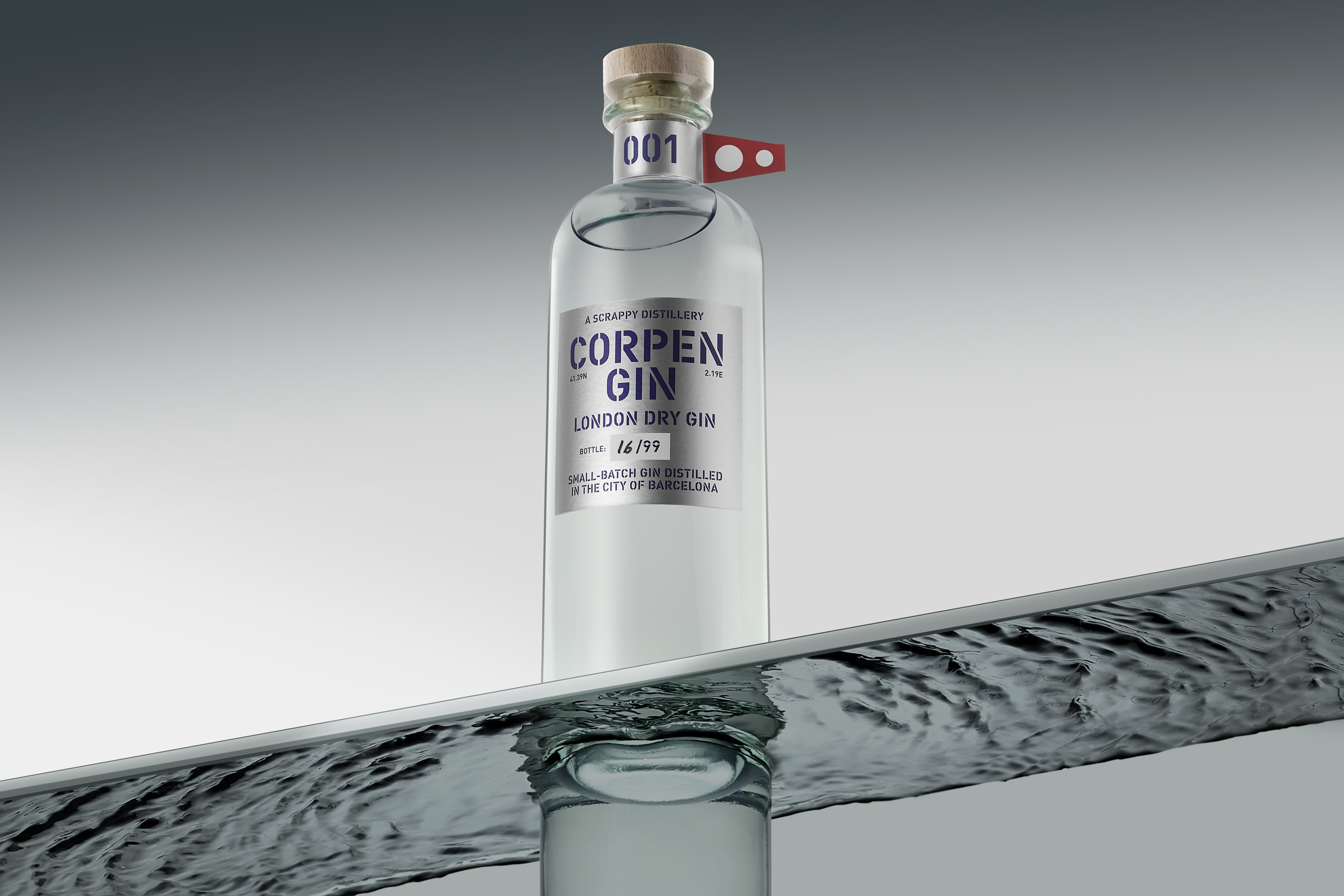
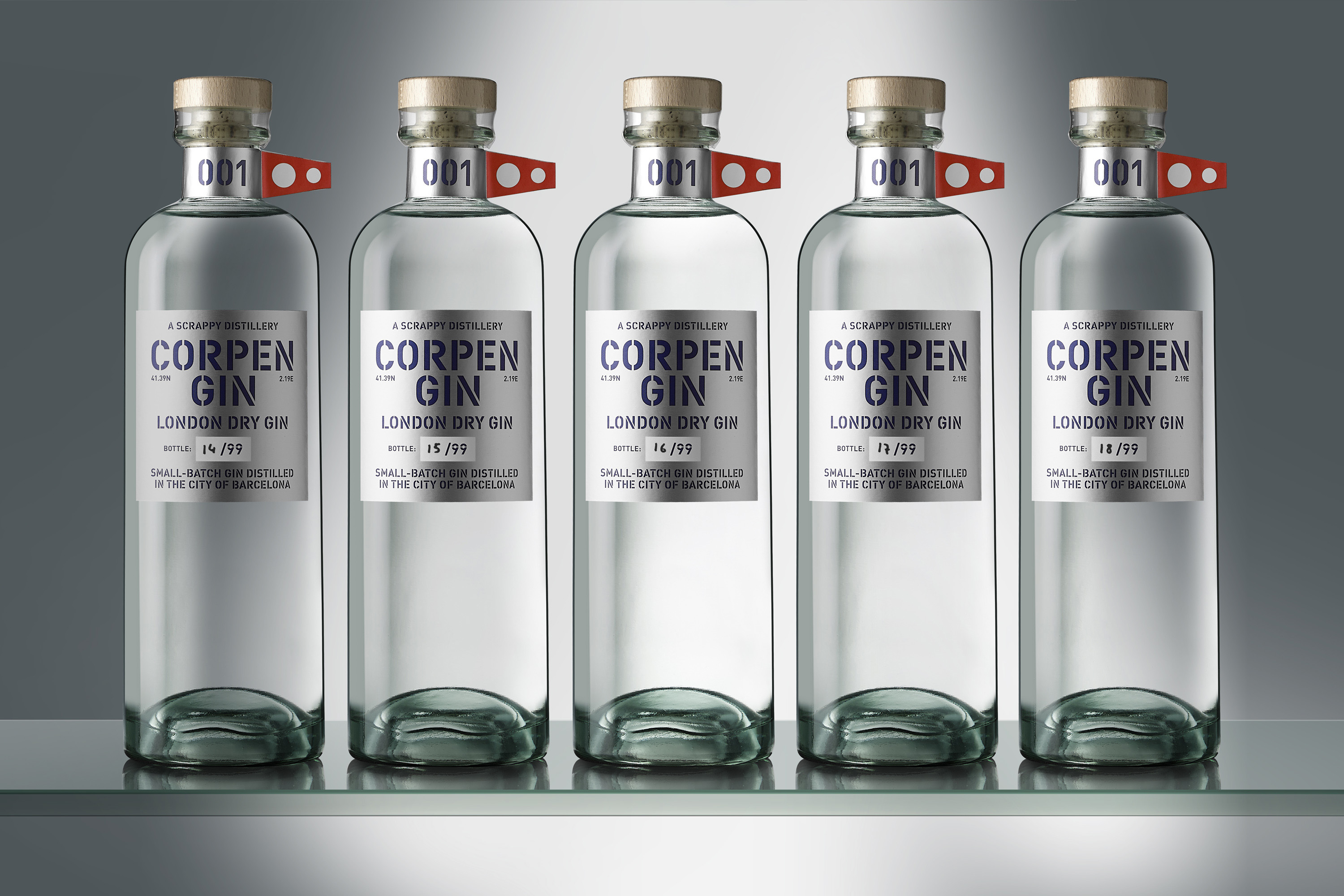
With this limited edition release, we aim to pay homage to all individuals who courageously embark on a journey of change in their lives, facing new challenges and opportunities head-on. This theme of transformation and direction is why the flag icon has been chosen as the central focus of our communication strategy. Typically, the central label on a product is responsible for conveying the core concept of the story behind it, where the strength and intention of the brand lie. However, in this particular project, we have intentionally reversed this hierarchy. Instead of the central label taking precedence, we have drawn all attention to the neck label, reminiscent of a ship at sea proudly displaying its flag aloft.
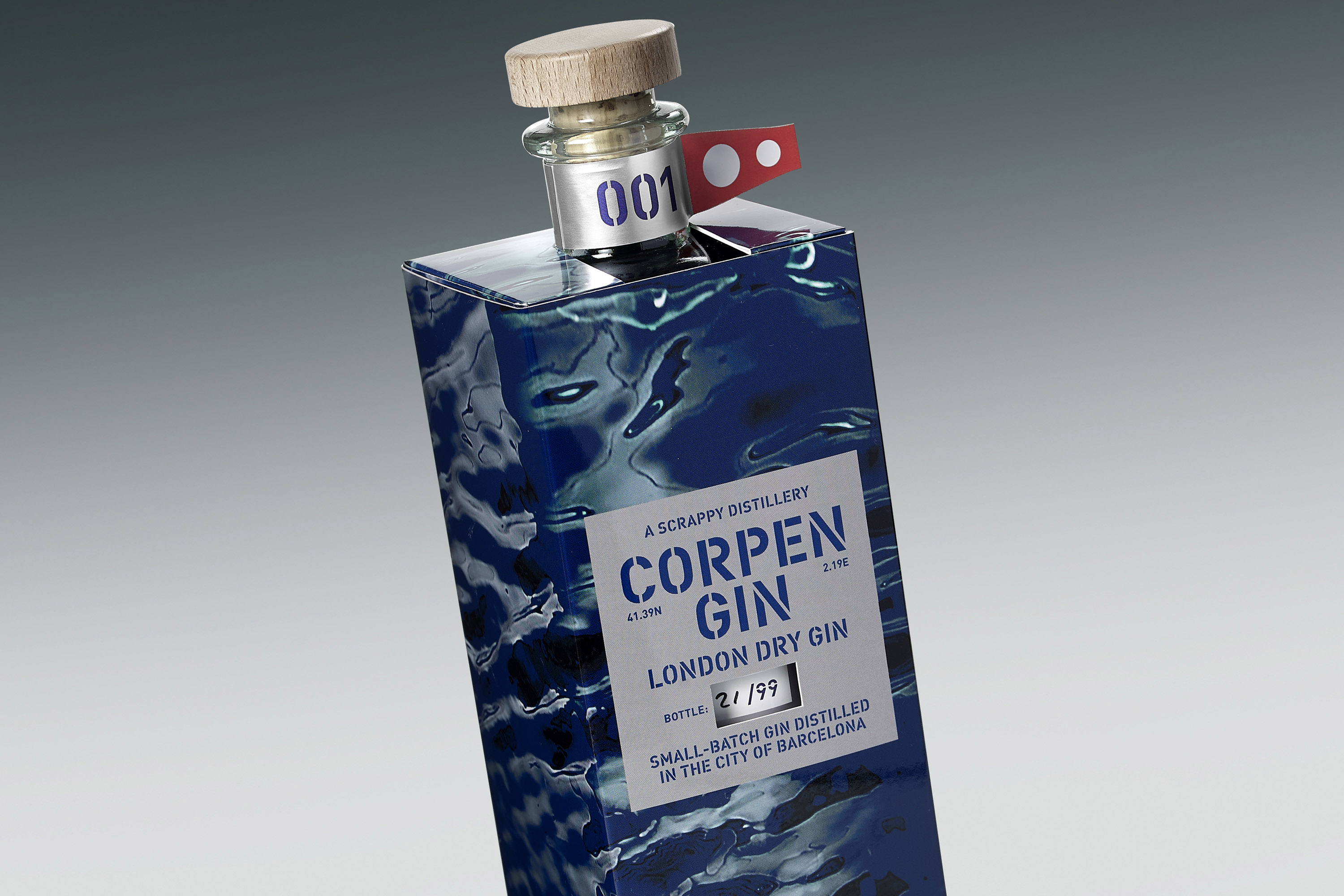
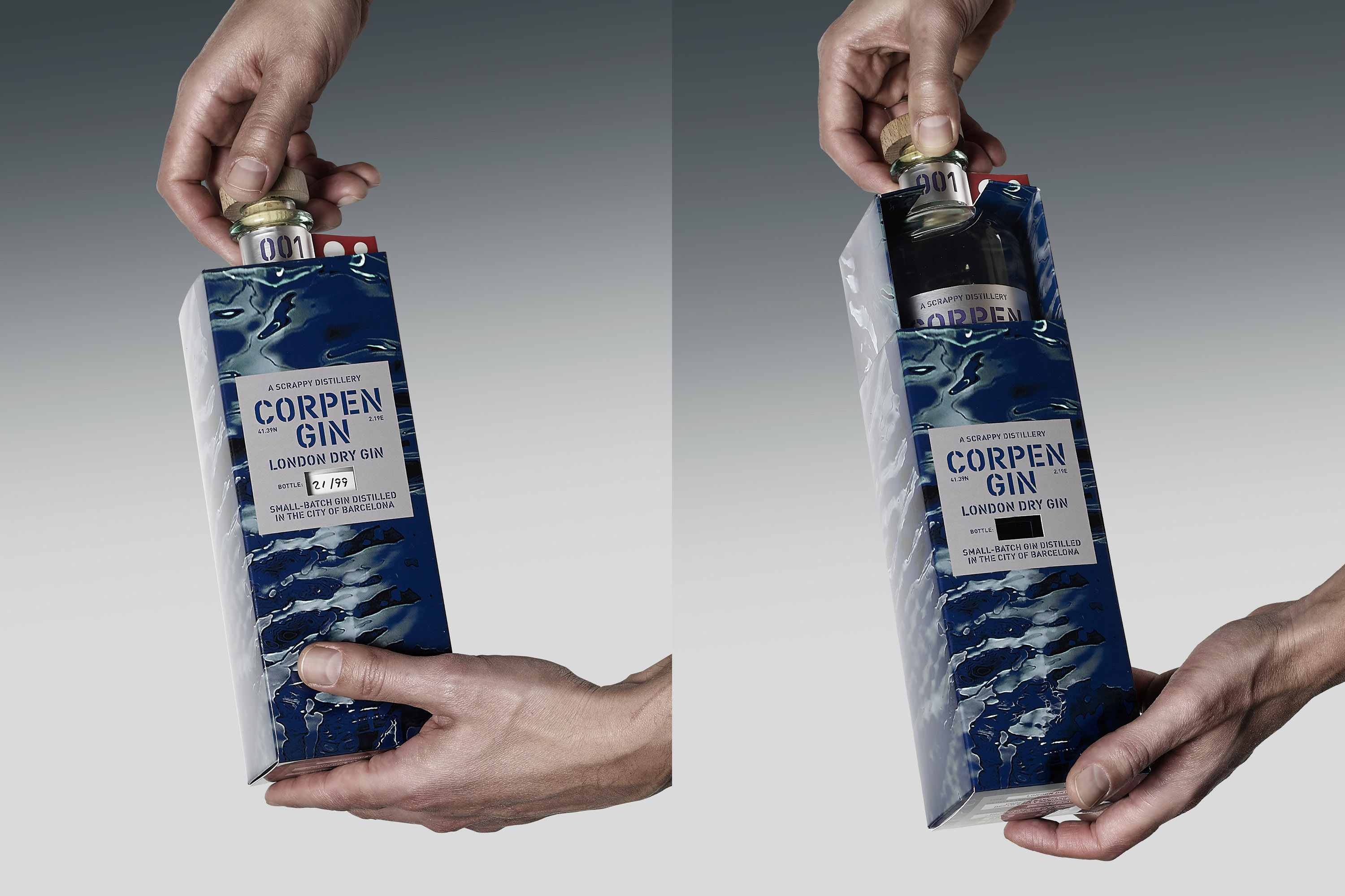
To further enhance this concept and create a more immersive experience, we have developed a custom-designed box that allows you to prominently view this neck label. This thoughtful design choice not only highlights the significance of the flag but also serves to close the circle of the Corpen universe, creating a cohesive narrative that resonates with our audience. We invite you to join us in celebrating this journey of change and the spirit of adventure that it embodies. Cheers!



CREDIT
- Agency/Creative: Simple Packaging Studio
- Article Title: Simple Packaging Studio Highlights the Journey of Transformation with Corpen Gin Limited Edition
- Organisation/Entity: Agency
- Project Type: Packaging
- Project Status: Published
- Agency/Creative Country: Spain
- Agency/Creative City: BARCELONA
- Market Region: Europe
- Project Deliverables: Art Direction, Brand Design, Industrial Design, Packaging Design
- Format: Bottle, Box
- Industry: Food/Beverage
- Keywords: Gin, Custom Box
-
Credits:
Creative Director: Gaizka Ruiz Madrazo


