Eat ‘Em By The Fistful
Crunchits Makes Its Rugged Appearance Its Whole Personality
Earthling Studio develops a new identity for Crunchits, a high-protein, low calorie snack brand by The Savourists.
The Savourists approached Earthling Studio to reimagine its flagship snack brand, Crunchits. With a lumpy appearance and made of edamame, black beans and rice, Crunchits had a comprehension problem.
Rather than try to give Crunchits a clean shave and put it in a suit, the Earthling team decided to wholly embrace the product’s distinctive shape, colour and texture in the brand’s external messaging and character. This approach represents a bold departure from a healthy snacking category that increasingly feels puffed, posh, and perfectly symmetrical. In the words of Earthling, “snacks you can hardly feel sitting in the palm of your hand.” Ultimately healthy snacking doesn’t need to be boring or worthy, it can be about big bold flavours and epic crunch. For snackers who want more, not less.
Rough Around the Edges
Crunchits may be one of the healthiest options in the snack aisle, but its health credentials are intentionally a secondary proposition within the brand experience. While it provides a good reason for people to come back to the brand, Crunchits believed it needed a more emotional and creative approach to spark trial and earn fans.
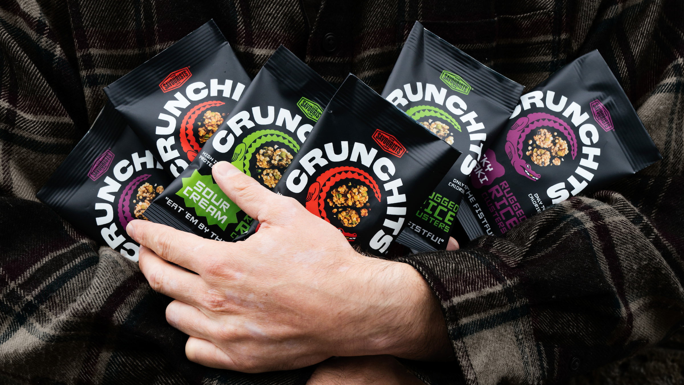
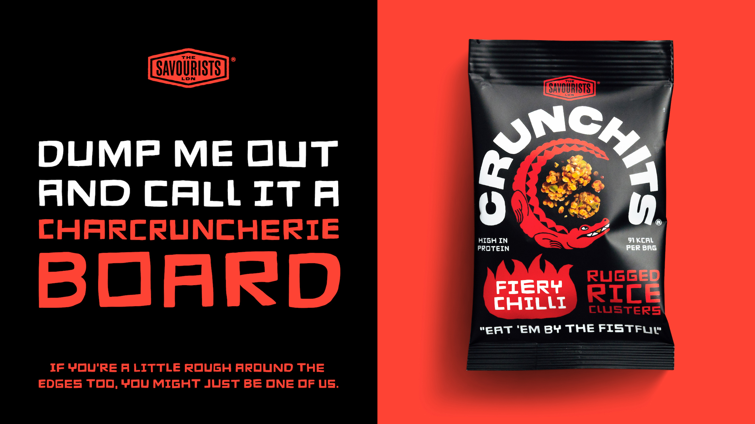
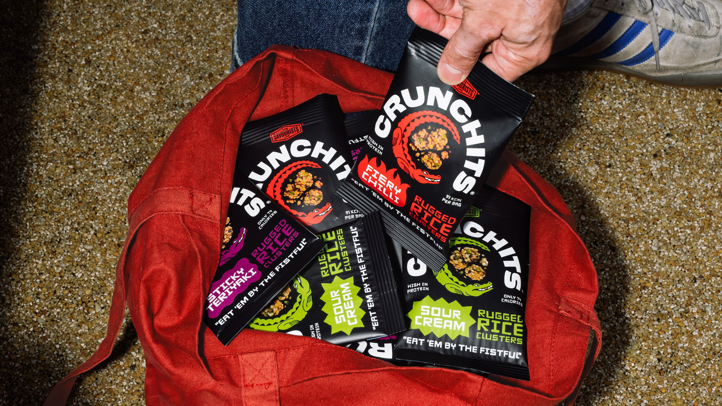
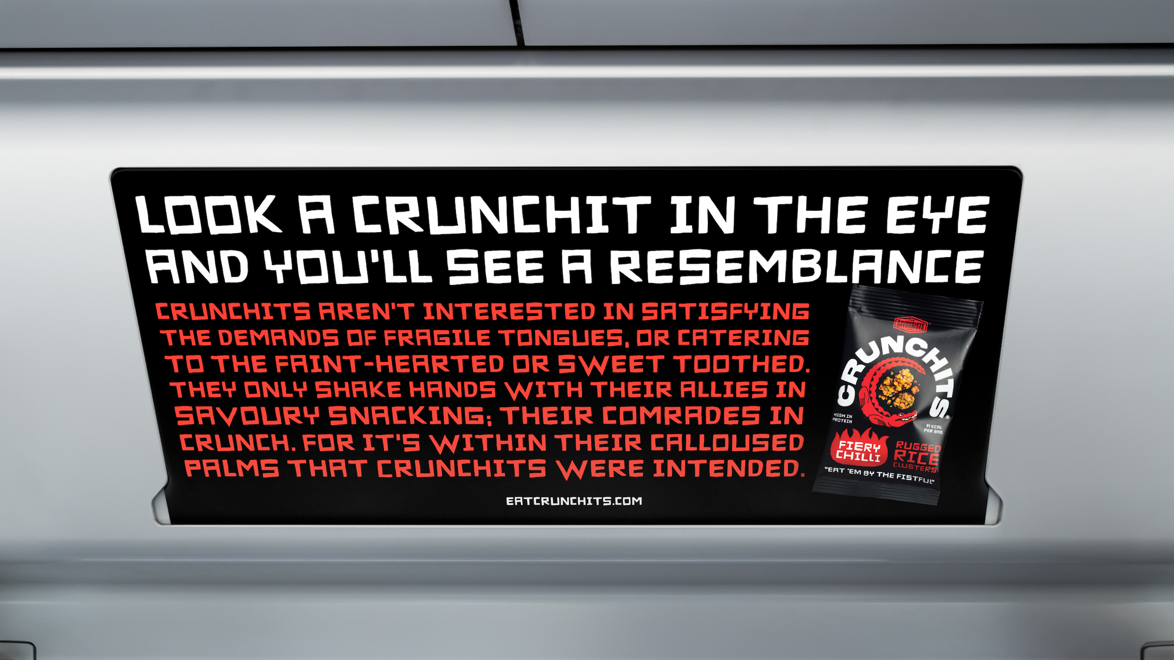
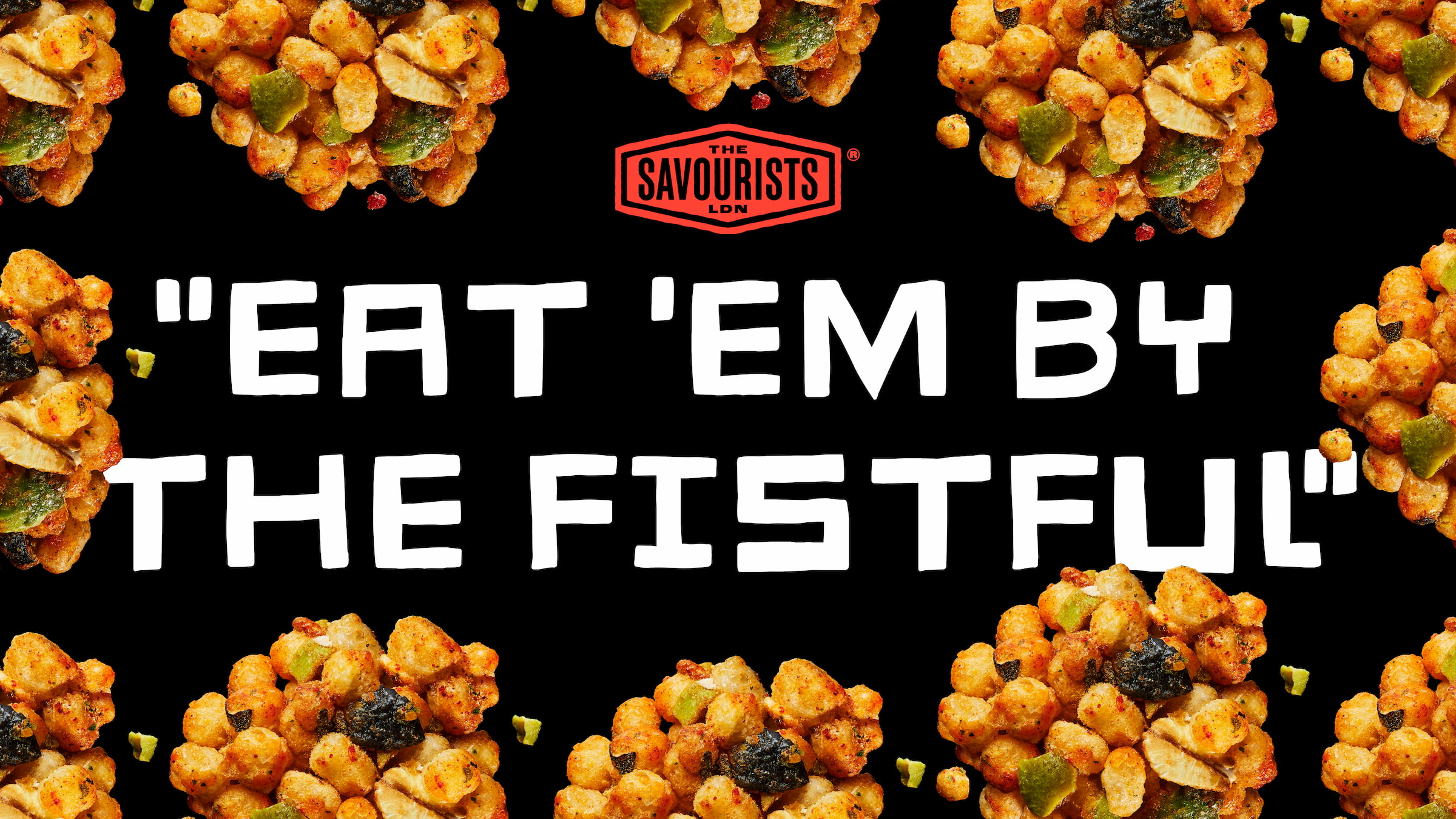
Based on the brand idea ‘Rough Around The Edges’, Crunchits’ verbal identity is defined by a rugged, down-to-earth tone of voice and messaging, including a recurring theme of physicality and toughness. As they say right on the bag: “Eat ‘em by the fistful.”
Rugged Snacks for Seasoned Snackers
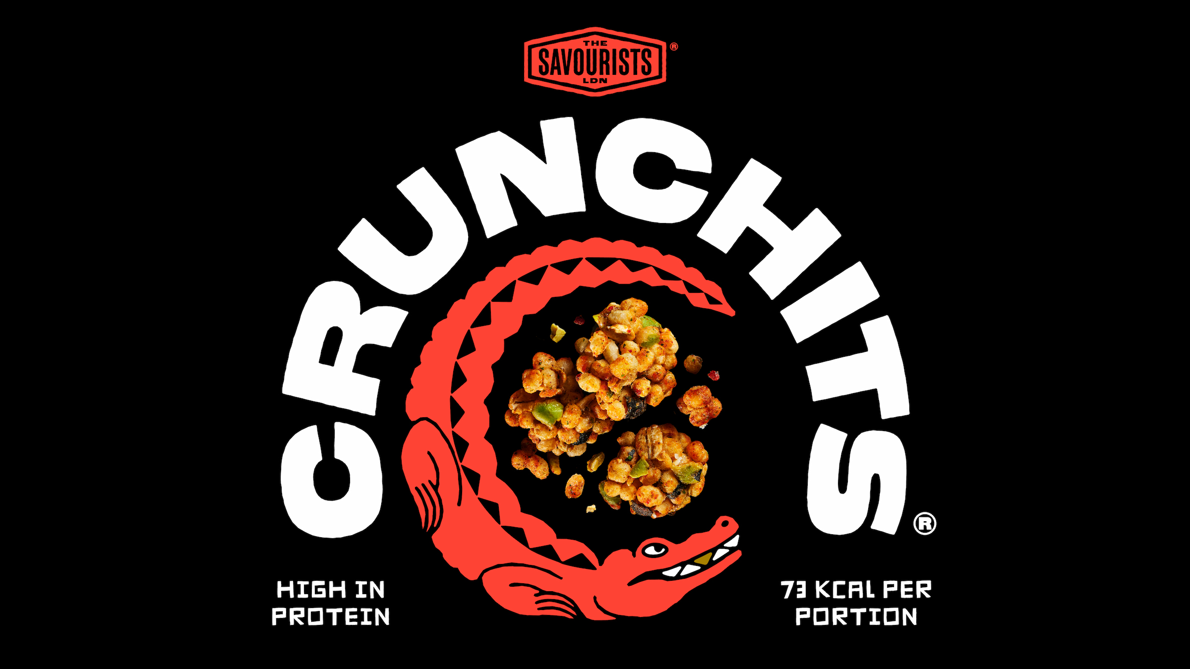
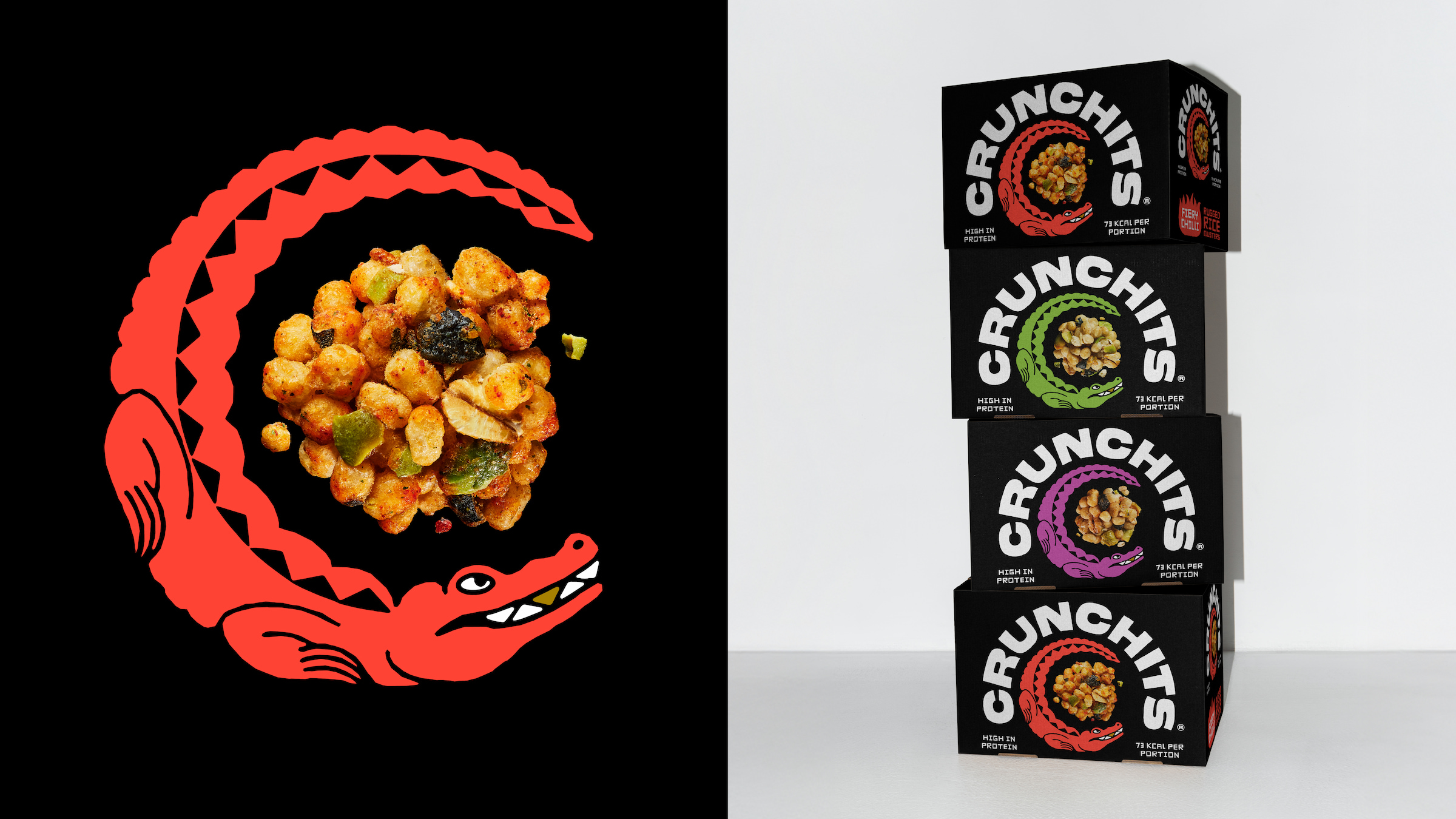
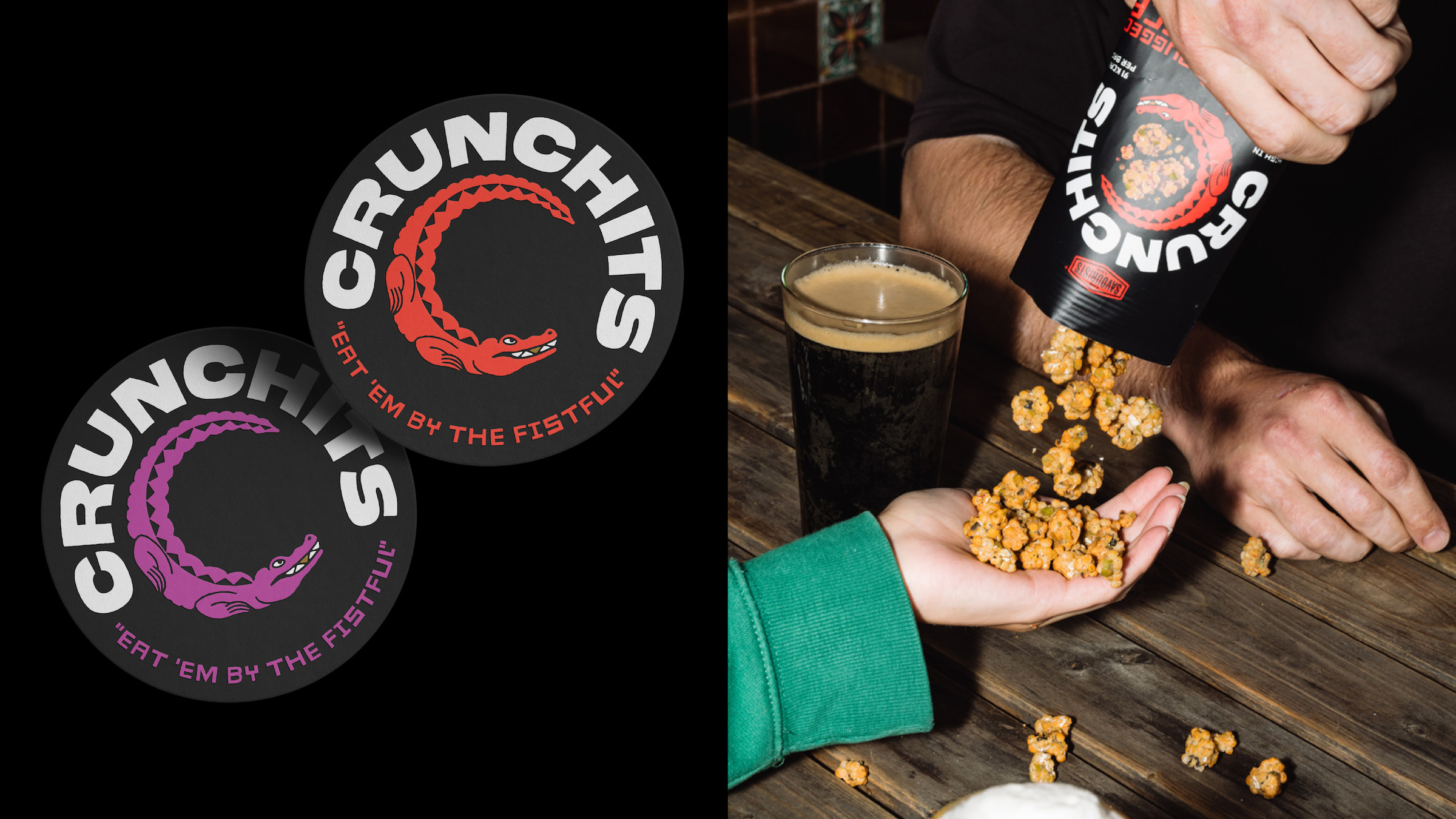
Visually the brand leans into the promise of bold crunch with a new crocodile icon, as well as giving the product name more prominence on pack than the parent company. And in true Crunchits style, the identity doesn’t shy away from the product’s appearance, with a big chunky cluster taking centre stage for which the croc circles as its prey. With black as the primary colour on pack, Earthling hoped to embody a feeling of masculinity that stands opposed to so many of today’s brightly coloured snack startups. With this rebrand, Crunchits is positioned to become a classic snack for savoury snackers; a no-fuss option that’s healthier than crisps and more badass than whatever it is you’re chewing on right now.
Earthling Creative Partner, Stephen McDavid
“Early meetings with the founder unearthed his ambition to create a disruptive brand that inspired seasoned snackers to ‘come for the attitude and stay for the goodness’ was music to our ears. This coupled with his desire to ensure Crunchits felt like a future staple that bucked the trend of meek healthy snacking aesthetics led to an identity that feels timeless and unapologetically bold. The new croc icon, which also doubles as a letter ‘C’, was inspired by the crunch of the product and it’s rugged appearance, whilst the typography was inspired by its proud London roots.”
The Savourists Founder, Harry Turpin
“Crunchits is all about pushing boundaries in the healthy snack market with bold flavours, banging crunch and real nutrition. Healthy snacks in pretty packs don’t speak our language. We’re not for the fragile tongued or the sweet- toothed. We’re for the everyday snacker who, like us, want more, not less. The response to the rebrand has been epic. We’re excited for 2025.”
Earthling is a creatively led studio, building super-powered brandsTM that people need, and the world can’t ignore. On a mission to partner with courageous brands to unlock their super-power and go beyond the ordinary.
CREDIT
- Agency/Creative: Earthling Studio
- Article Title: Crunchits and Earthling Studio Challenge Snack Norms with Bold Branding
- Organisation/Entity: Agency
- Project Type: Packaging
- Project Status: Published
- Agency/Creative Country: United Kingdom
- Agency/Creative City: London
- Market Region: Europe
- Project Deliverables: Brand Design, Brand Identity, Brand Redesign, Brand Strategy, Brand Tone of Voice, Brand World, Branding, Identity System, Illustration, Logo Design, Packaging Design, Packaging Guidelines, Tone of Voice
- Format: Pouch
- Industry: Food/Beverage
- Keywords: Crunchits
-
Credits:
Creative Partner: Stephen McDavid
Managing Partner: Tom Bruce
Senior Designer: Tom Mitchell
Designer: Zita Nagy
Typographer: Rob Clarke
Illustrator: Luke Harrison


