Merci Banh Mi
Visual Brand Identity Design
Introduction
Merci Banh Mi is a new and aspiring brand in the F&B industry, dedicated to crafting high-quality banh mi and baked goods. The brand aims to bring authentic Vietnamese culinary experiences to its customers, with a heartfelt focus on gratitude and respect for Vietnam’s rich food culture. The tagline “Bao niềm vui, trọn hạnh phúc” encapsulates Merci’s mission to create unforgettable moments for every customer.
Challenge
To develop a visual identity that captures the essence of Merci Banh Mi: a harmonious blend of traditional Vietnamese culinary values and modern design aesthetics. The identity must convey gratitude, authenticity, and an inviting, premium experience for a diverse audience.
Solution
Logo Design:
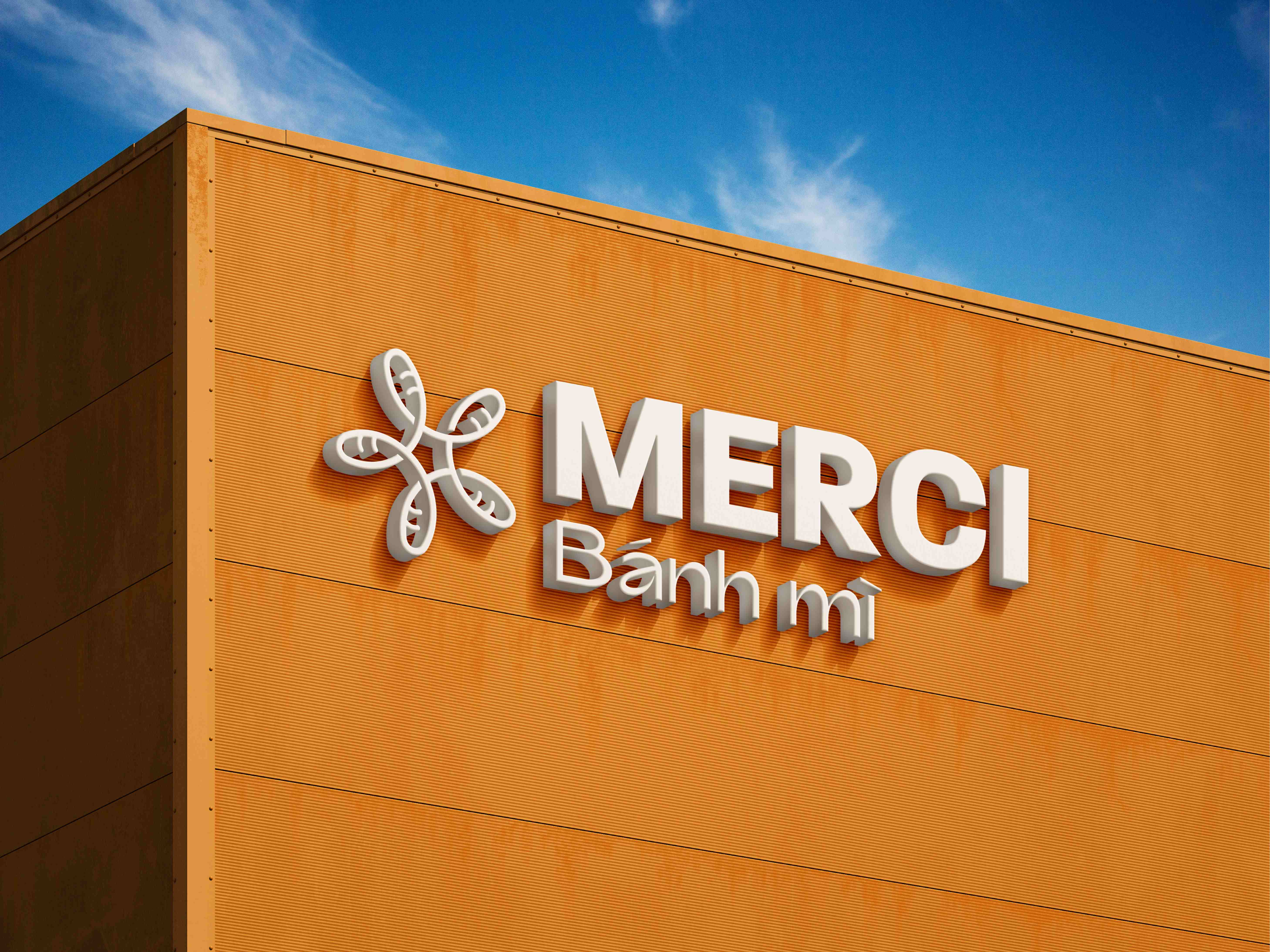
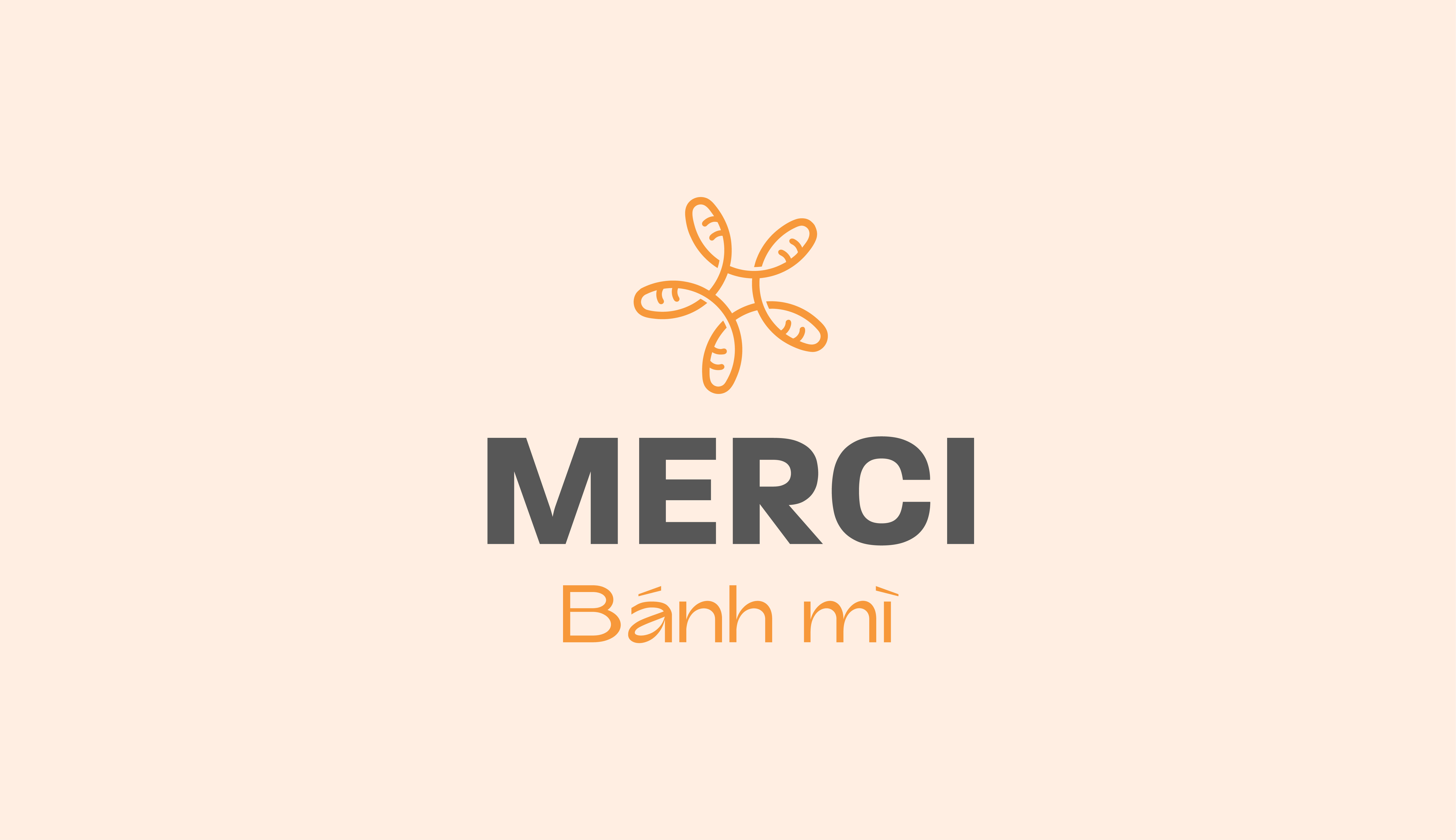
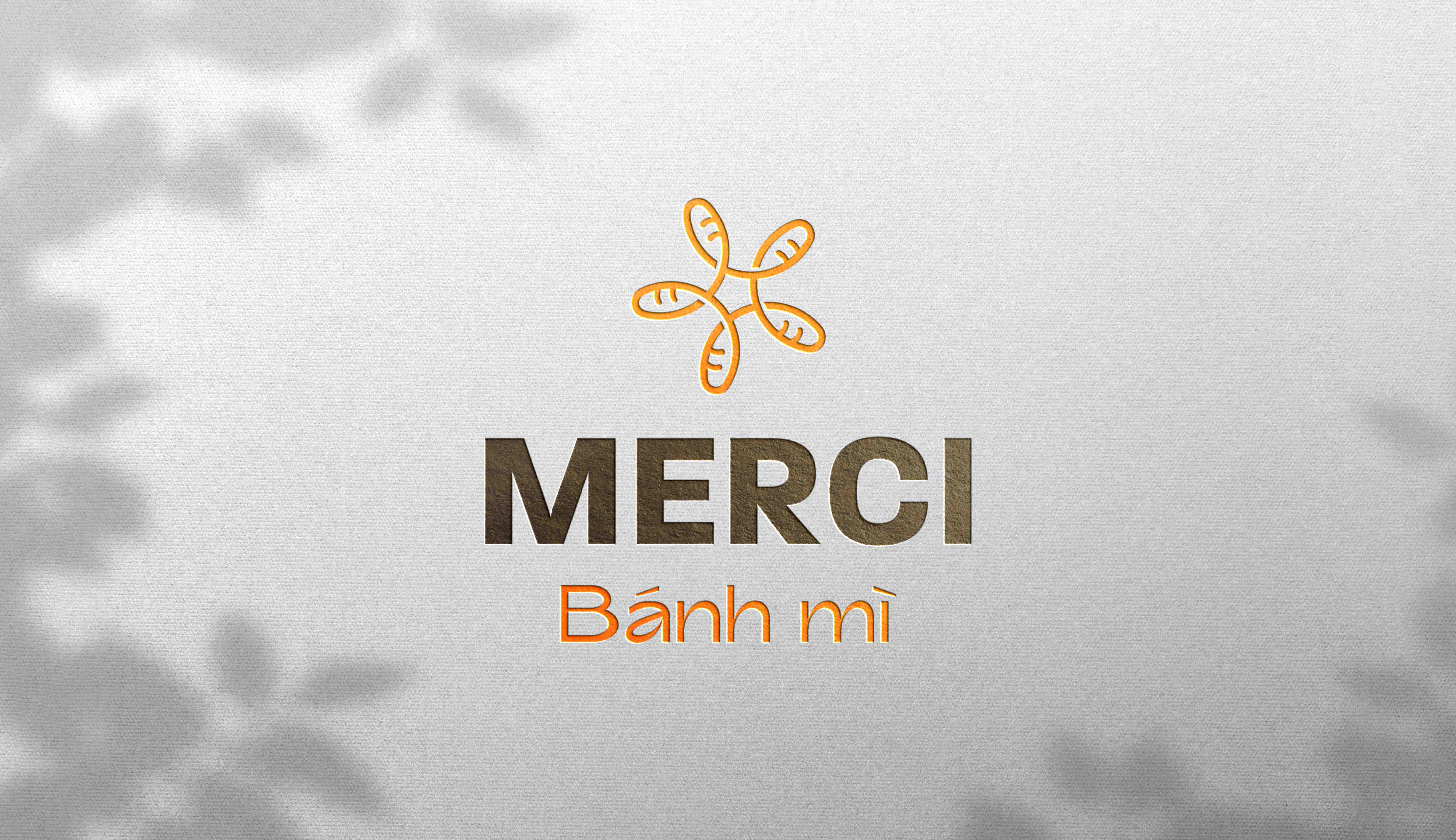
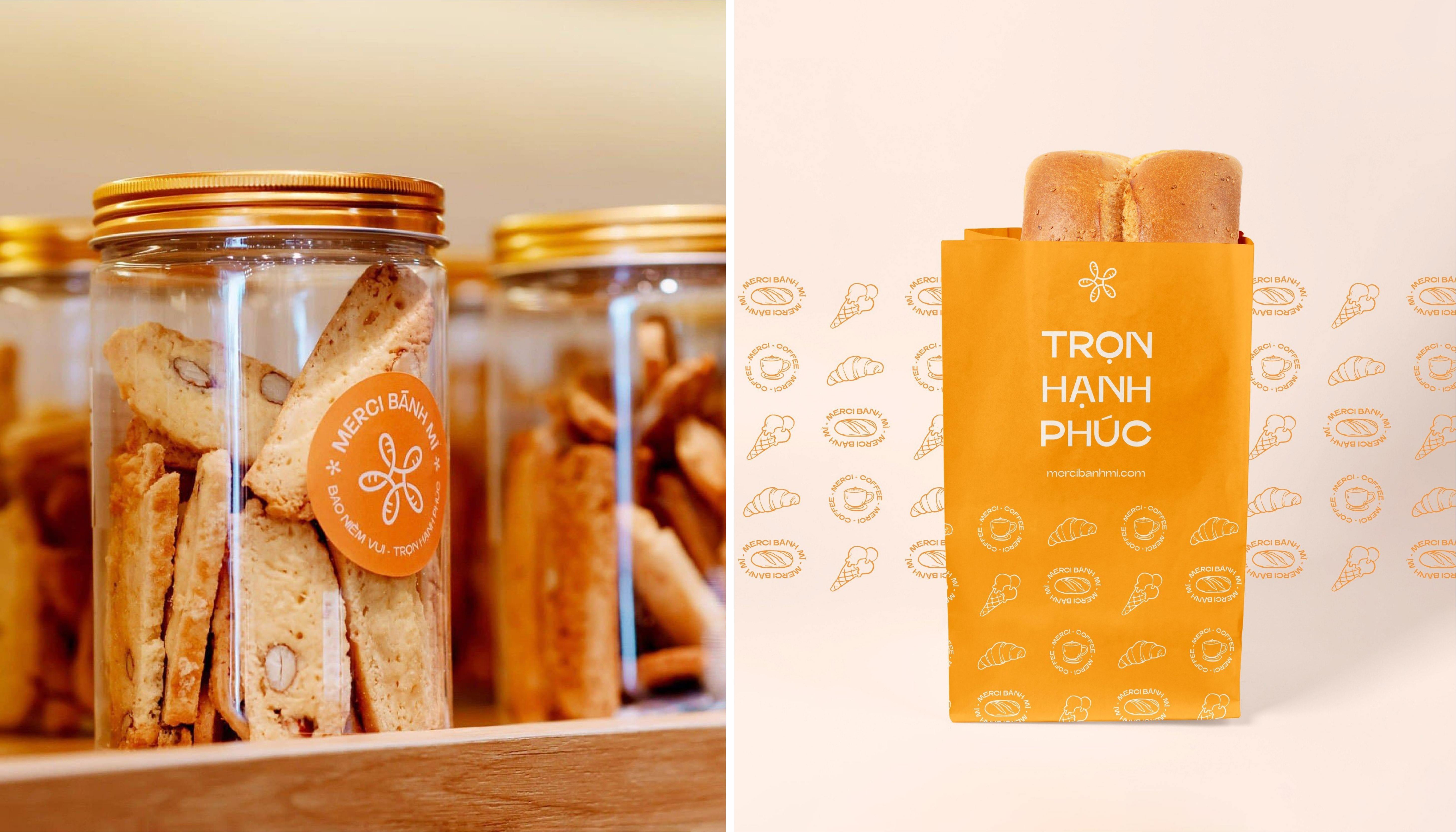
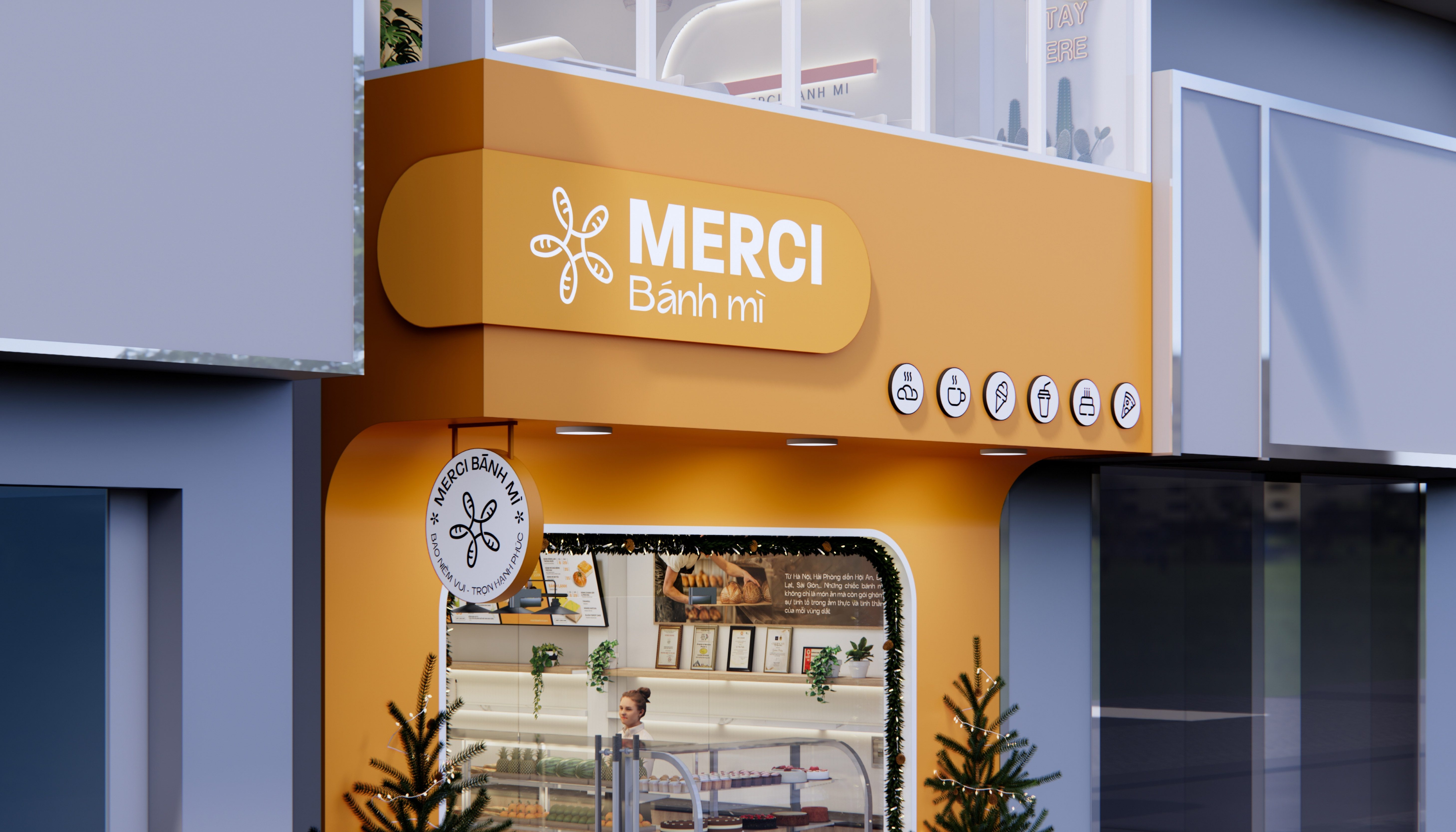
The logo features a 5-degree tilt in its flower-shaped symbol, adding a subtle dynamic quality to the design. This gentle tilt represents Merci’s progressive approach to innovation while staying deeply rooted in tradition. The flower, inspired by the form of bread, symbolizes gratitude and respect—core values of the brand.
Symbolic Meaning:
The bread-inspired flower: Represents Merci Banh Mi’s primary product and its role as a symbol of Vietnamese culture.
The 5-degree tilt: Adds movement and energy to the design, reflecting Merci’s aspiration to grow and evolve while maintaining stability and balance.
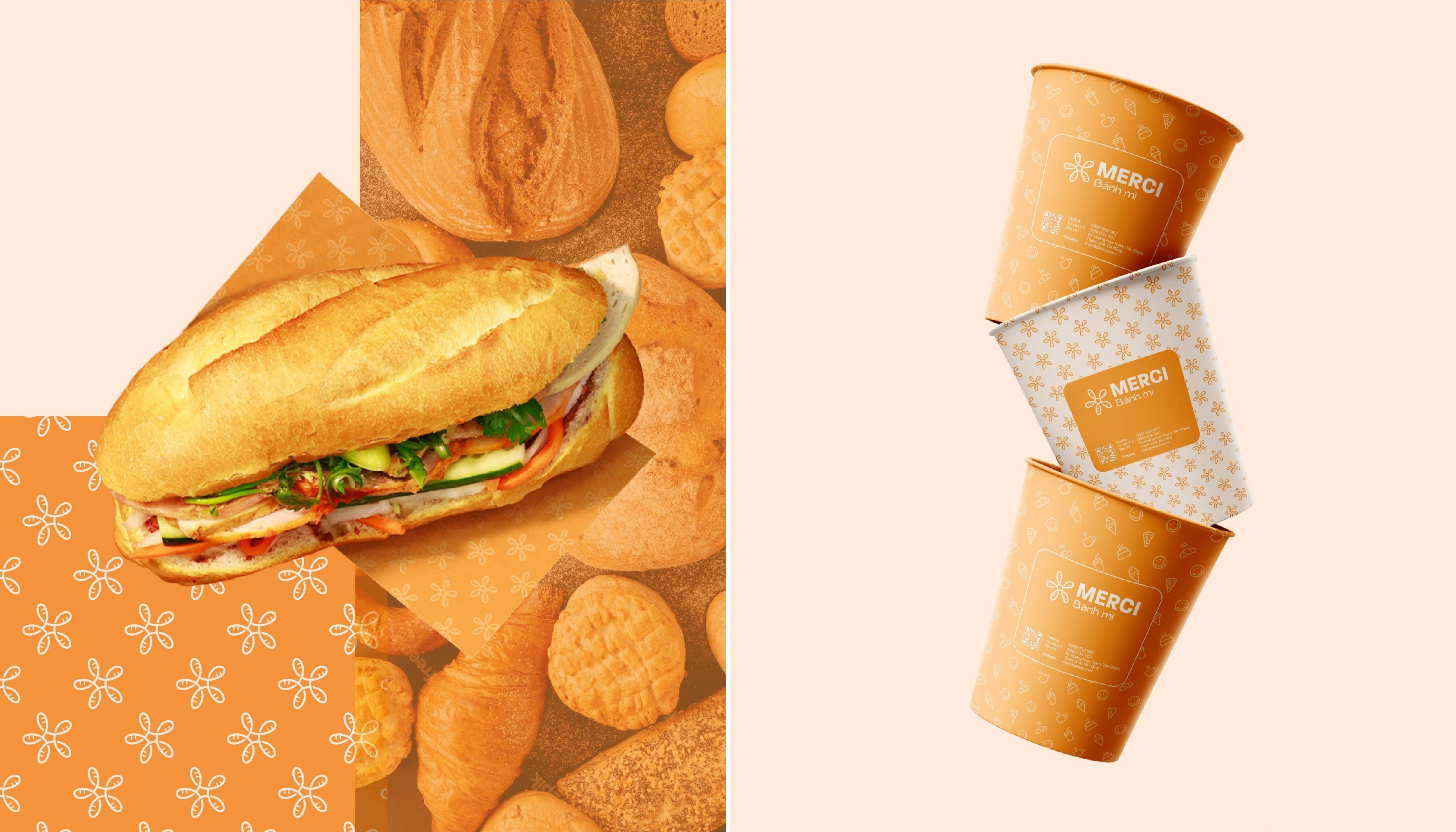
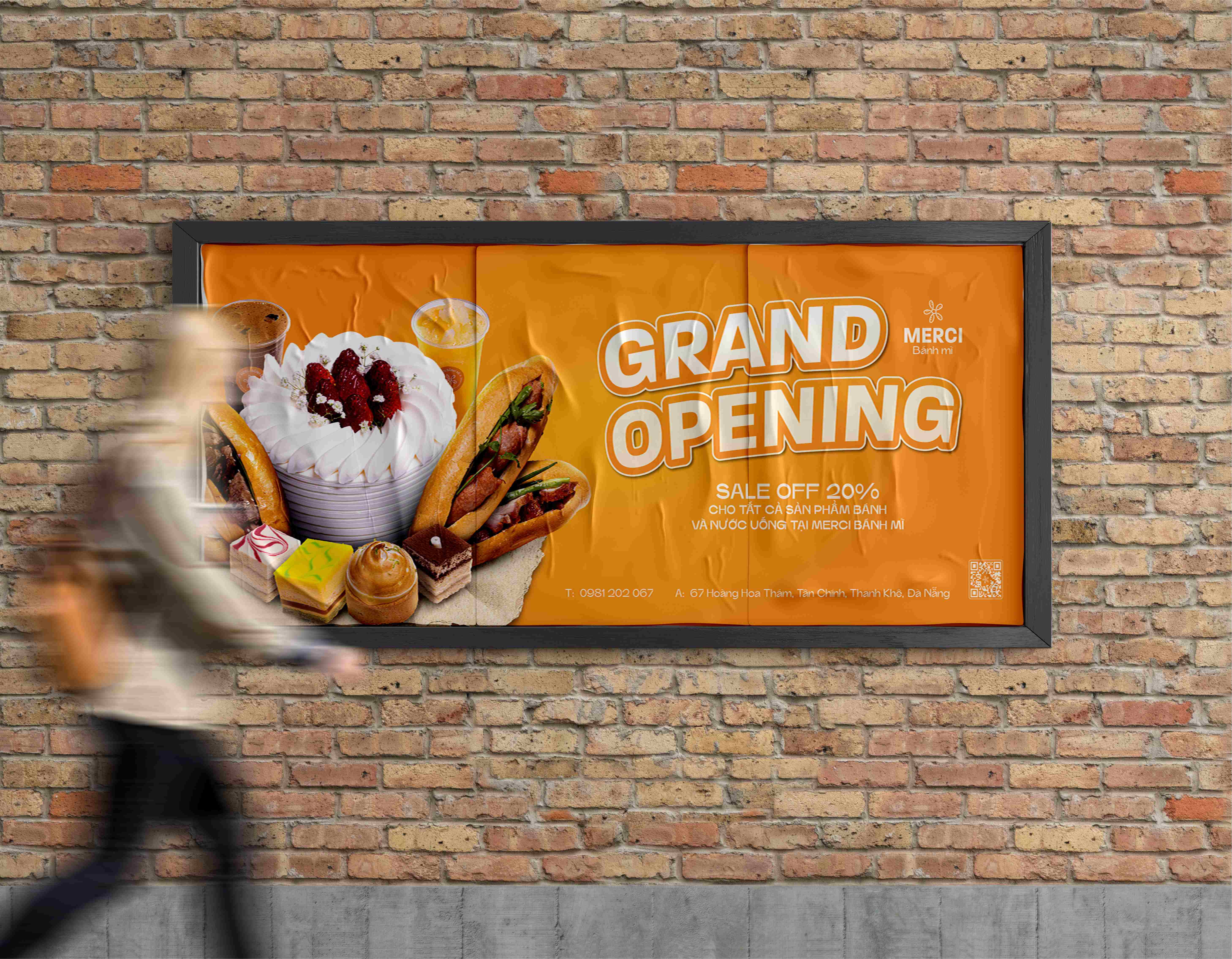
The warm orange and neutral gray color palette: Orange conveys energy, happiness, and freshness, while gray represents reliability and modernity.
Typography:
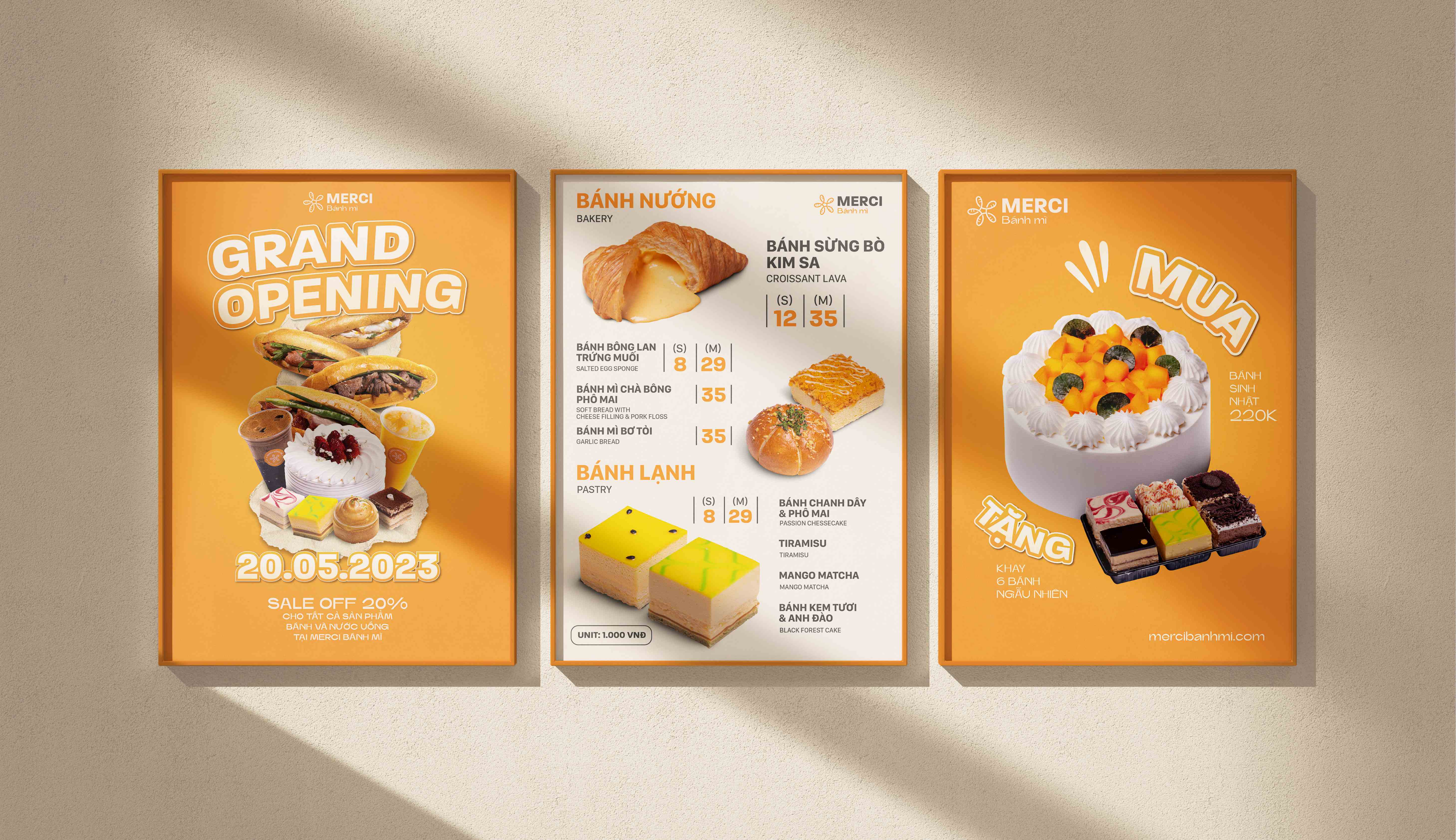
The bold, modern typography of “MERCI” paired with the approachable and softer “Banh mi” font creates a balance between sophistication and friendliness, appealing to both local and international customers.
Contextual Message:
Merci Banh Mi embodies the spirit of giving thanks to Vietnamese culinary traditions. Its visual identity, inspired by banh mi and a blooming flower, conveys a heartfelt message of gratitude, appreciation, and joy. Each design element reflects the brand’s desire to provide a memorable experience for every customer, staying true to the mission of “spreading happiness with every bite.”
Conclusion
Merci Banh Mi’s identity is not just about selling food; it’s about creating meaningful connections through culinary art. The 5-degree tilt and flower-inspired logo bring the brand to life, symbolizing movement, growth, and respect for tradition. Through this vibrant and thoughtful design, Merci Banh Mi takes its first steps toward becoming a cherished name in the F&B industry.

CREDIT
- Agency/Creative: ADP Brand
- Article Title: Merci Banh Mi Brand Identity by ADP Brand
- Organisation/Entity: Agency
- Project Type: Identity
- Project Status: Published
- Agency/Creative Country: Vietnam
- Agency/Creative City: Da Nang
- Market Region: Asia
- Project Deliverables: 2D Design, Brand Identity, Brand Strategy
- Industry: Food/Beverage
- Keywords: adpbrand, vietnam, branding, brand identity, food,
-
Credits:
Creative Director: Le Thanh Tu
Graphic Design: Lens Tran
Motion Graphic: Junie Ngo
Architect: Nhien Archi
Graphic Design: Tin Bui


