Adema Laboratories, a cosmeceutical medical brand based in Algeria, introduces its innovative product line designed to meet dermatological standards while offering effective skincare solutions. The project includes two primary products: the Whitening Cream and the Sensitive Area Cream. The design and art direction of the packaging reflect a harmonious balance between clinical precision and aesthetic appeal, reinforcing the brand’s scientific roots and premium positioning.
Design Concept
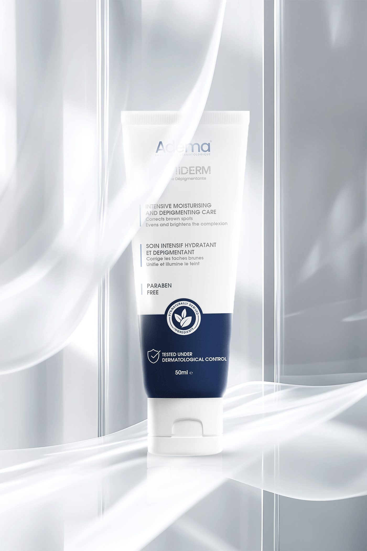
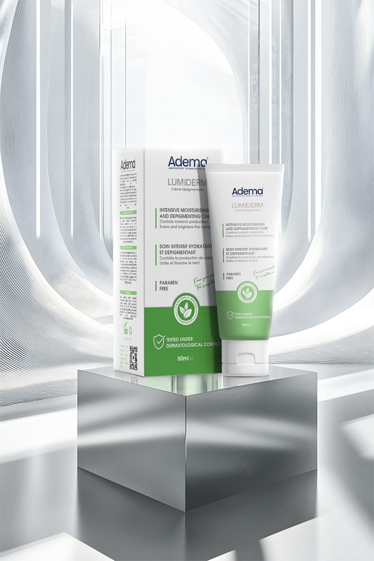
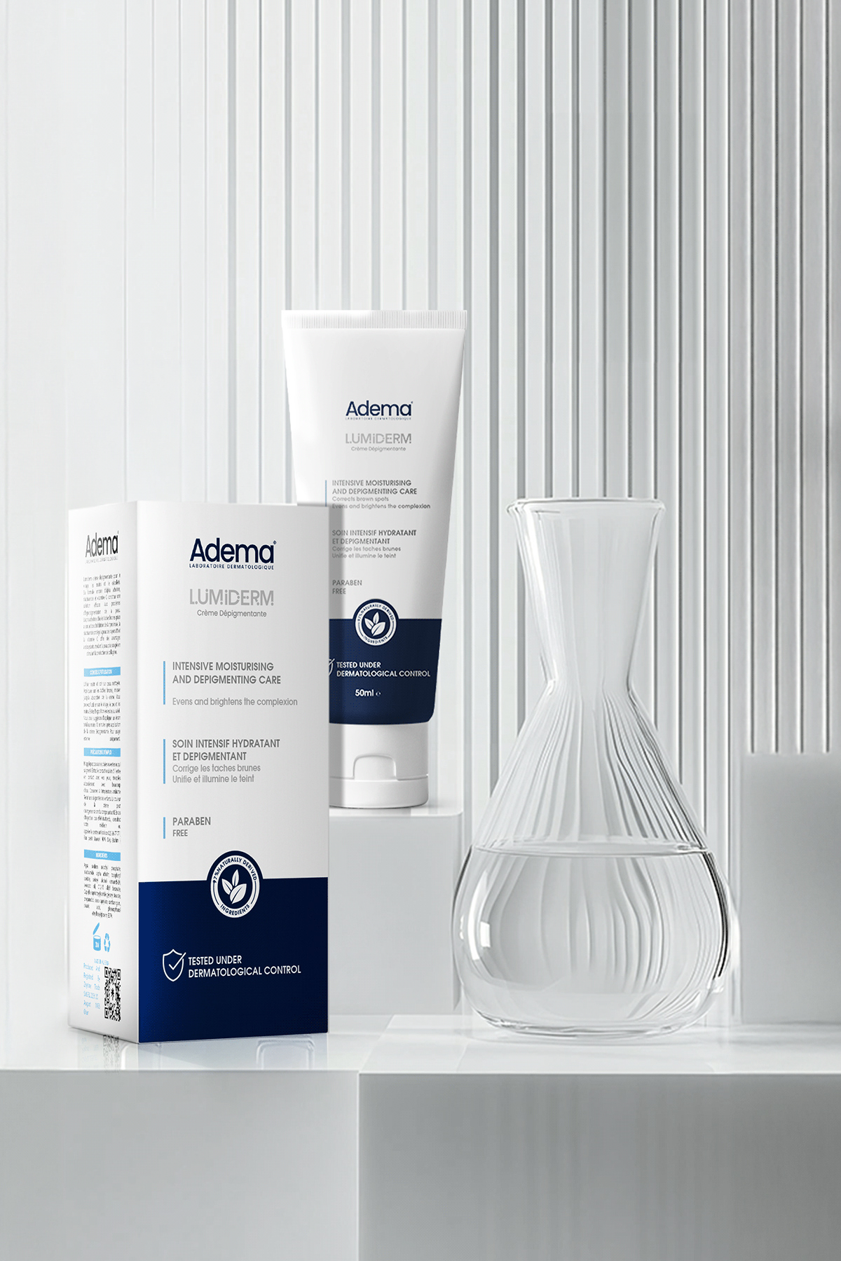
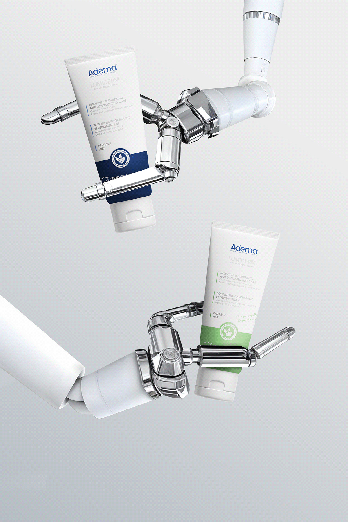
The packaging design features a clean, minimalistic layout, emphasizing clarity and trust. The color palette combines clinical tones of white, deep blue, and fresh green, symbolizing purity, efficacy, and nature-driven care. The use of soft curves and delicate typography adds a modern, approachable feel, ensuring the brand resonates with both healthcare professionals and end-users.
Key highlights of the design:
Natural Yet Clinical Identity: The logo and product information are presented prominently against a white backdrop, establishing a professional, dermatological look. The natural elements are highlighted through icons that represent dermatologically tested, paraben-free, and plant-based ingredients.
Color Differentiation:
The Whitening Cream employs a combination of blue and white tones to signify clarity, skin lightening, and dermatological care.
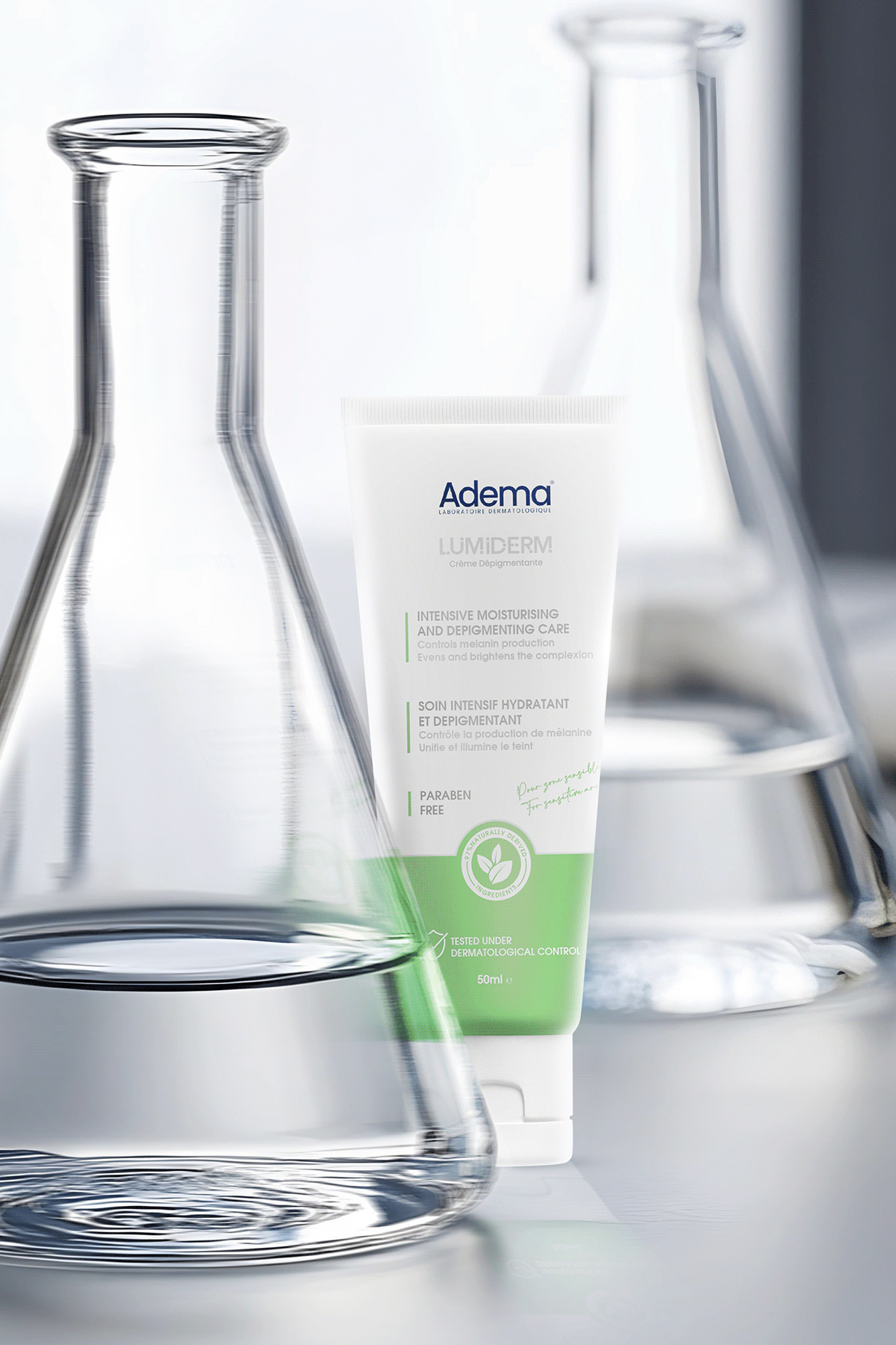
The Sensitive Area Cream incorporates green and white tones to evoke a sense of soothing care and freshness, ideal for delicate skin.
Structured Typography: The font choice is clean and legible, reinforcing the medical nature of the brand. Bilingual labeling (French and English) ensures that the products cater to the diverse Algerian market.
Art Direction
The art direction centers around a futuristic, high-tech look that complements the cosmeceutical positioning of the brand. The products are showcased in sleek, modern environments featuring metallic and glass elements, symbolizing precision, innovation, and the laboratory expertise behind Adema. Soft, flowing light effects create a sense of purity and dynamic energy, highlighting the brand’s promise of advanced skincare solutions.
Key Features Communicated:
Paraben-Free Formula: Clearly indicated on the packaging to attract health-conscious consumers.
Dermatologically Tested: A prominent icon assures customers of the product’s safety and effectiveness.
Natural Ingredients: Represented through an elegant leaf icon, reinforcing Adema’s commitment to nature-driven science.
This project captures the essence of a high-end cosmeceutical brand, balancing clinical efficacy with a refined visual appeal that builds trust and enhances brand recognition in a competitive market.
CREDIT
- Agency/Creative: Marklinica
- Article Title: The Art and Science of Lumiderm’s Next-Gen Packaging by Marklinica
- Organisation/Entity: Agency
- Project Type: Packaging
- Project Status: Published
- Agency/Creative Country: Egypt
- Agency/Creative City: Alexandria
- Market Region: Africa
- Project Deliverables: Art Direction, Brand Creation, Packaging Design, Product Design
- Format: Box, Tube
- Industry: Pharmaceutical
- Keywords: Cosmeceutical, Cosmetics, Whitening Cream, Medical, Pharmaceutical, Packaging
-
Credits:
Art Director: Dr. Rana Mohsen
Presentation Designer: Rowan Hamada


