What started as a passion for olive oil and Italian craftsmanship has grown into a way to showcase what we do best: bringing brands to life.
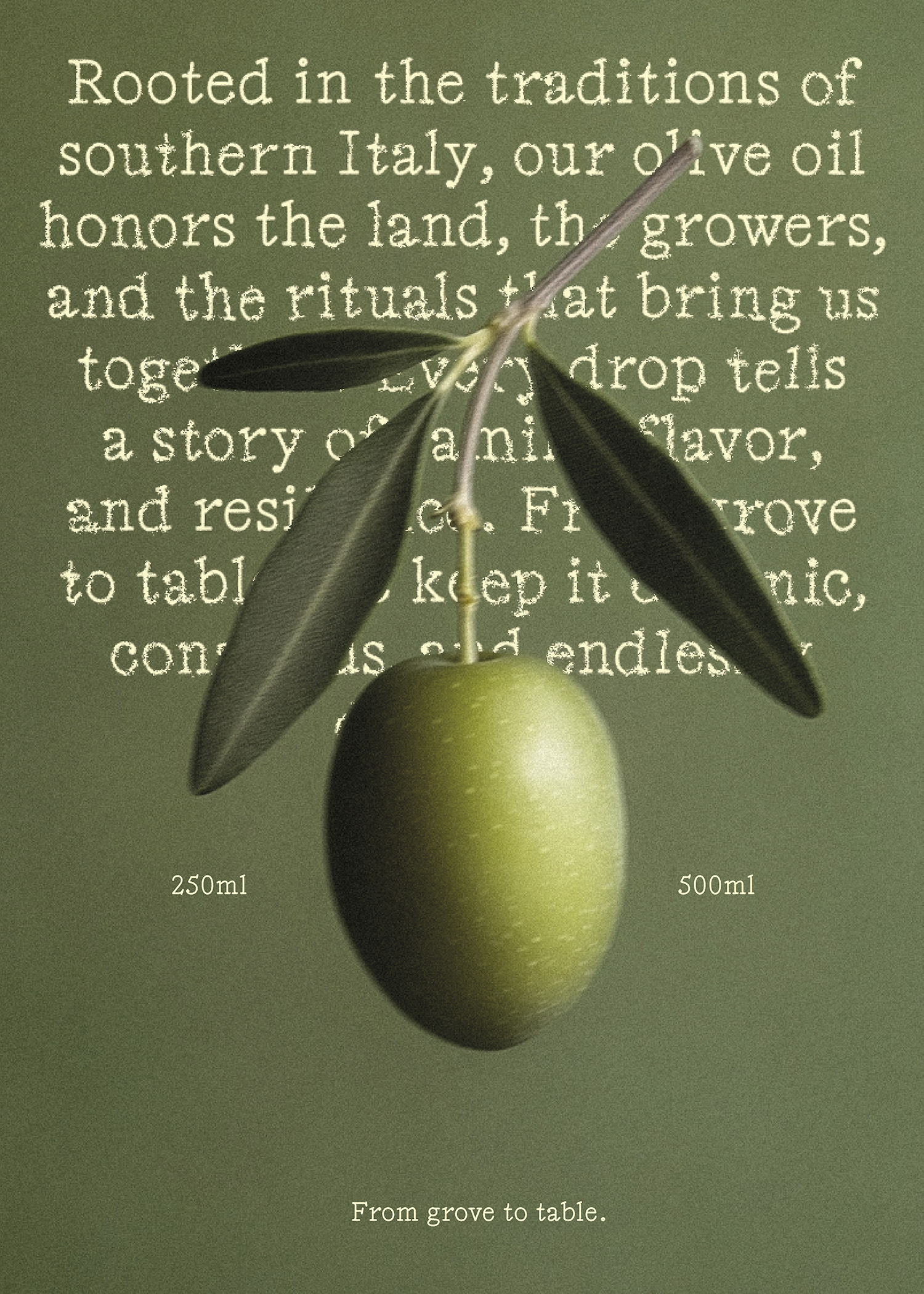
OTTIMO celebrates the art of simple pleasures—pouring, sharing, and savoring. Rooted in the traditions of southern Italy, this olive oil honors the land, the growers, and the rituals that bring us together. Every drop tells a story of family, flavor, and resilience. From grove to table, OTTIMO keeps it organic, conscious, and endlessly delicious.
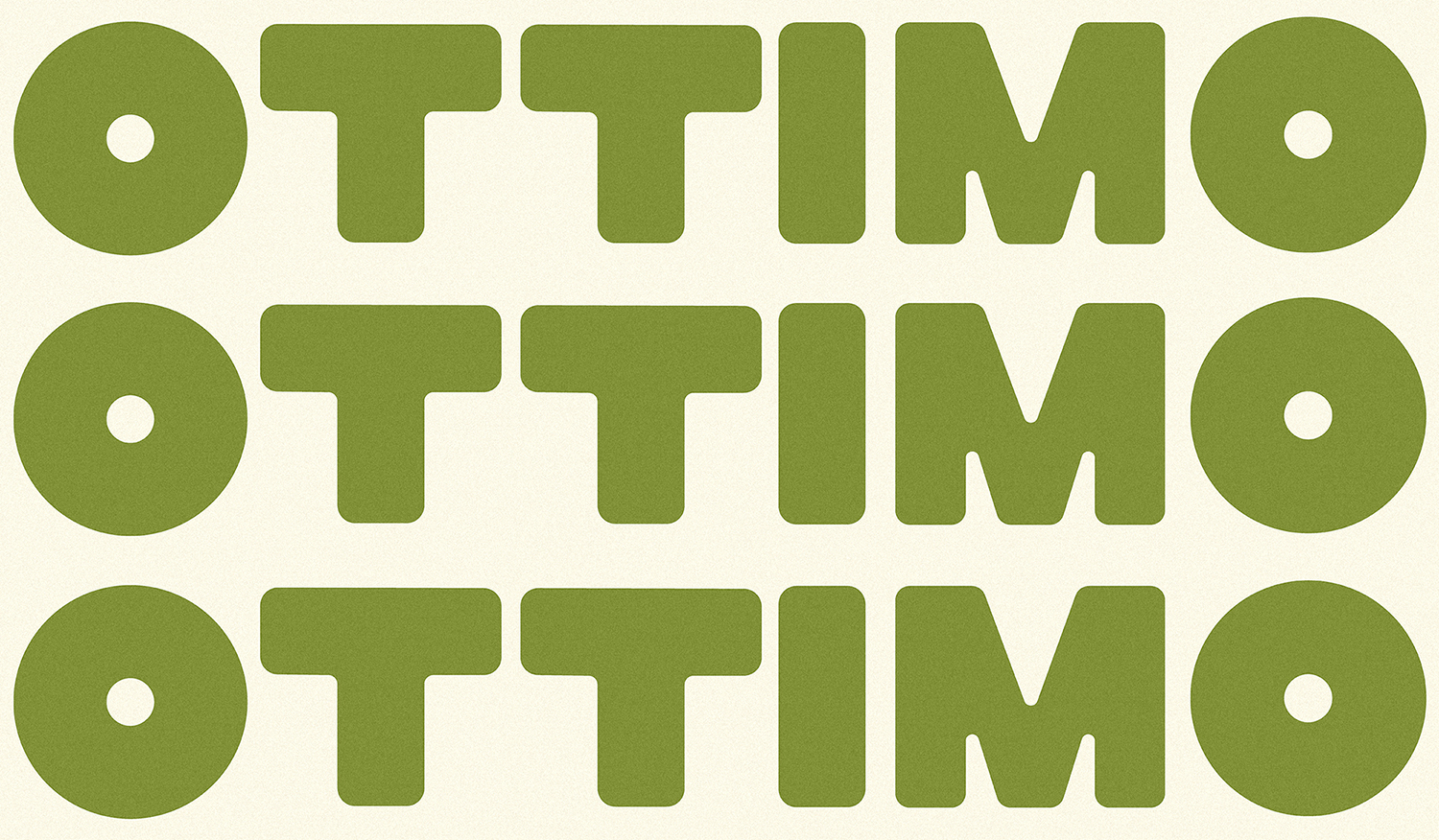
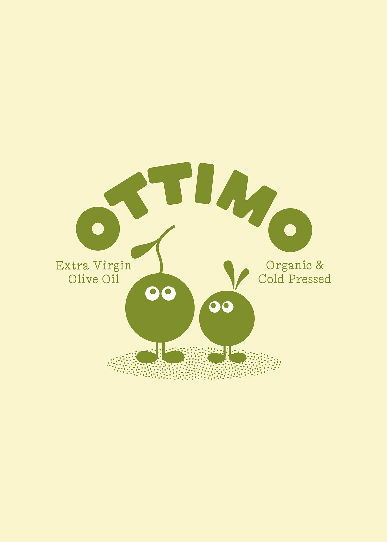
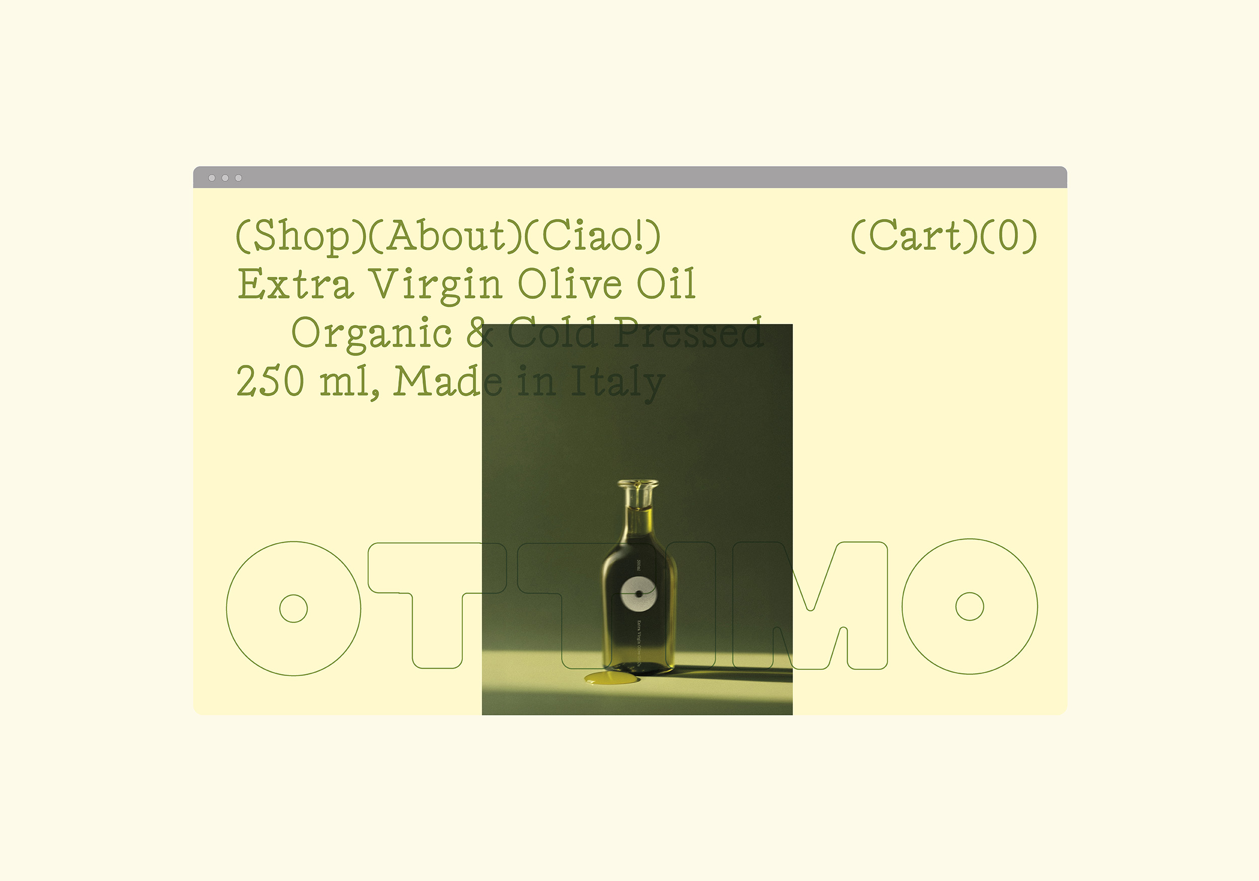
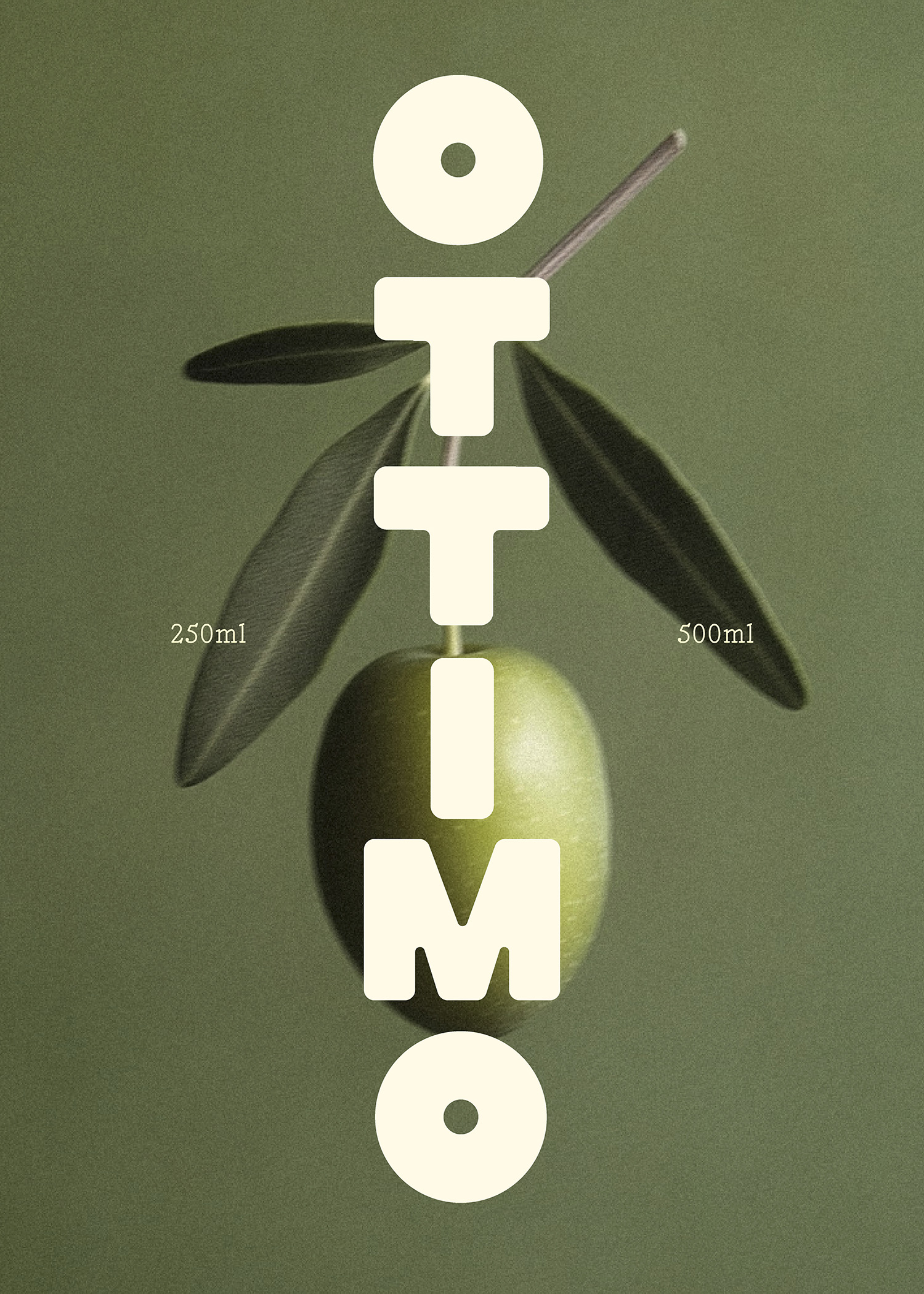
To bring the brand to life, we started with a custom wordmark that reflects the product itself. The curvy, bold letters reference Ottimo’s full-bodied and well-rounded flavor profile, creating an immediate connection between the product’s taste and its visual identity.
Custom fonts are one of our favorite ways to bring a brand’s character to life. At Somekind, we create bespoke typefaces for logos, ensuring every curve and line reflects the spirit of the brand while giving us full creative freedom to shape its identity.
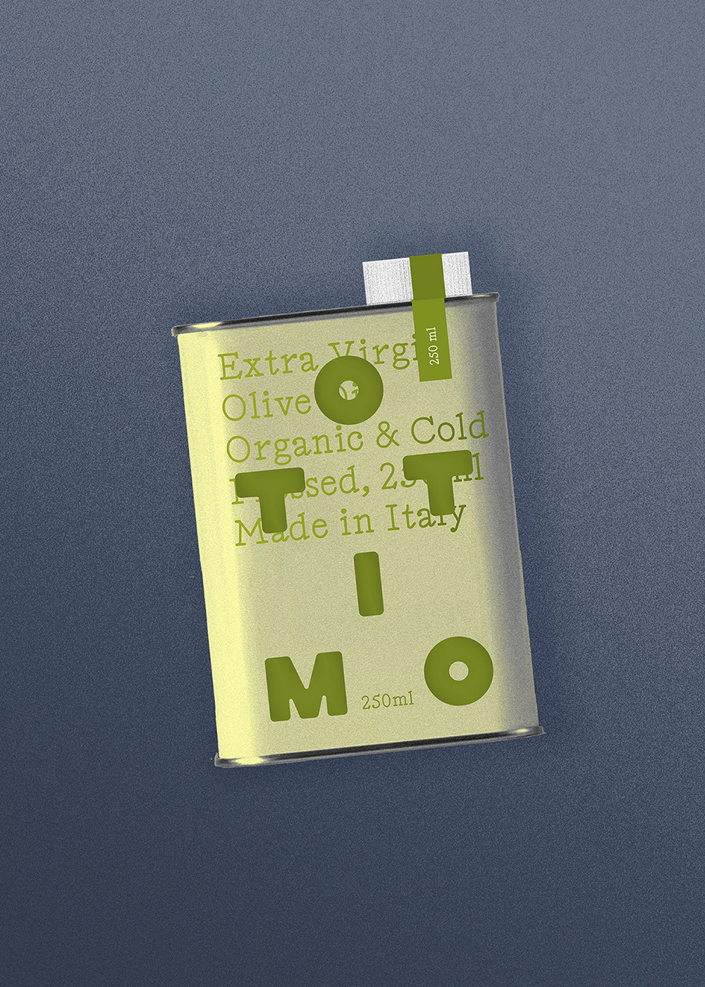
We balanced the custom workmark with a playful secondary typeface, Edition Contextual, whose light serif contrasts with the bold logo and adds a sense of refinement. This pairing mirrors the balance found in Ottimo olive oil between fruitiness and a peppery bite.
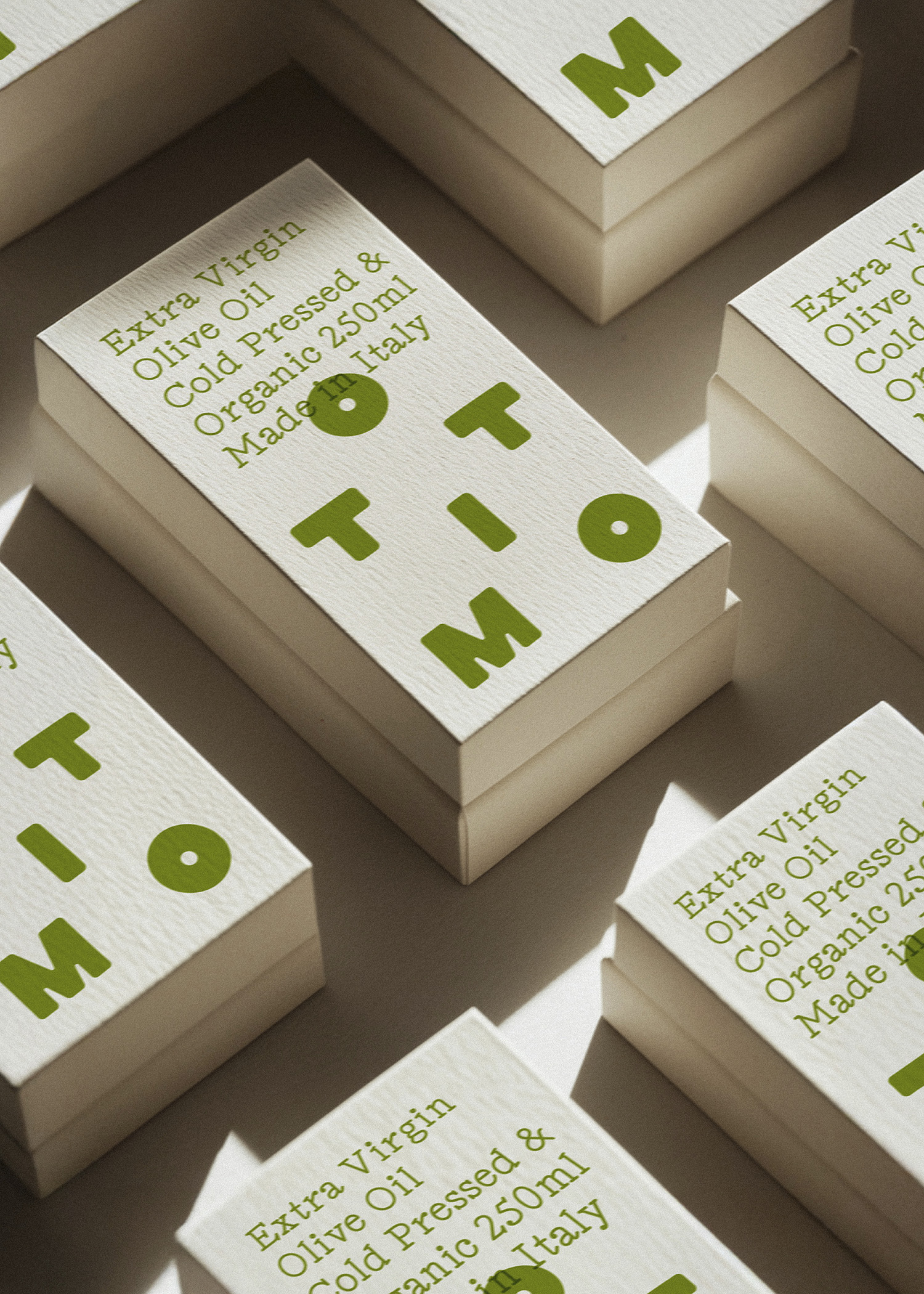
Strategic design elements included vibrant, nostalgic colors inspired by Italy’s landscapes and traditions, and packaging that highlights the artisanal quality of the product while being practical and eco-conscious. The entire branding story ties back to the idea of enjoying simple, wholesome moments around the table—celebrating tradition in a modern way.
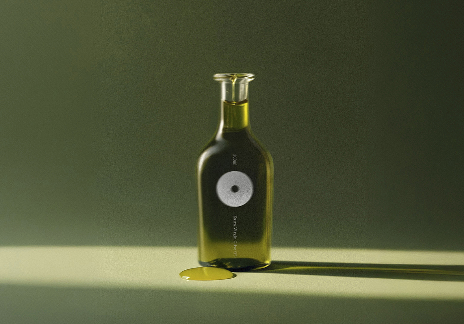
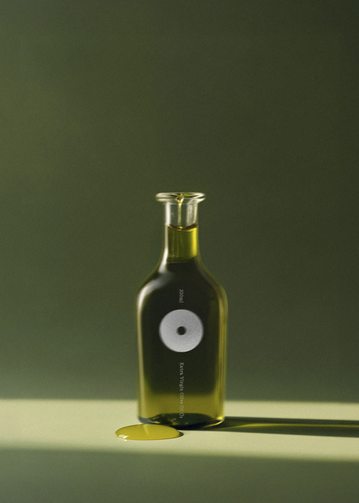
The glass bottle is designed for premium table use—it’s a nod to the elegance and heritage of olive oil, perfect for pouring directly at the table or gifting to someone who values high-quality ingredients. Its branding is more minimal, emphasizing sophistication and timelessness.
The aluminum tin, on the other hand, is practical and robust, ideal for the kitchen. It protects the olive oil from light and heat, ensuring freshness. The tin’s branding is more playful and bold, echoing the approachable personality of Ottimo and encouraging daily use in cooking. Together, they reflect the versatility of olive oil and the balance between functionality and tradition.
CREDIT
- Agency/Creative: Somekind studio
- Article Title: Somekind Designs Ottimo Olive Oil Packaging to Honor Italian Craftsmanship
- Organisation/Entity: Agency
- Project Type: Graphic
- Project Status: Published
- Agency/Creative Country: Belgium
- Agency/Creative City: Brussels
- Market Region: Europe
- Project Deliverables: Brand Guidelines, Branding, Packaging Design
- Industry: Food/Beverage
- Keywords: Branding, Olive Oil, Packaging
-
Credits:
Founder Somekind studio: Kristel Posen


