GTS Trading, a leader in promoting the circular economy, plays a vital role in helping businesses reduce their carbon footprint by offering low-carbon products such as TPO and Raw Recovered Carbon Black. These products serve as both fuel alternatives and material inputs, offering clients sustainable solutions for their manufacturing processes. GTS Trading’s mission is clear: to reduce the negative impact of climate change by providing recyclates from waste, ultimately contributing to the global value chain.
When GTS Trading approached BEAN CREATIVE®, the brief was clear: they needed a bold, modern identity that would set them apart from the typical, often green-centric, recycling branding. As a B2B brand operating on a global scale, GTS Trading sought a brand identity that reflected its innovation, international reach, and commitment to sustainability, all while breaking away from traditional recycling imagery.
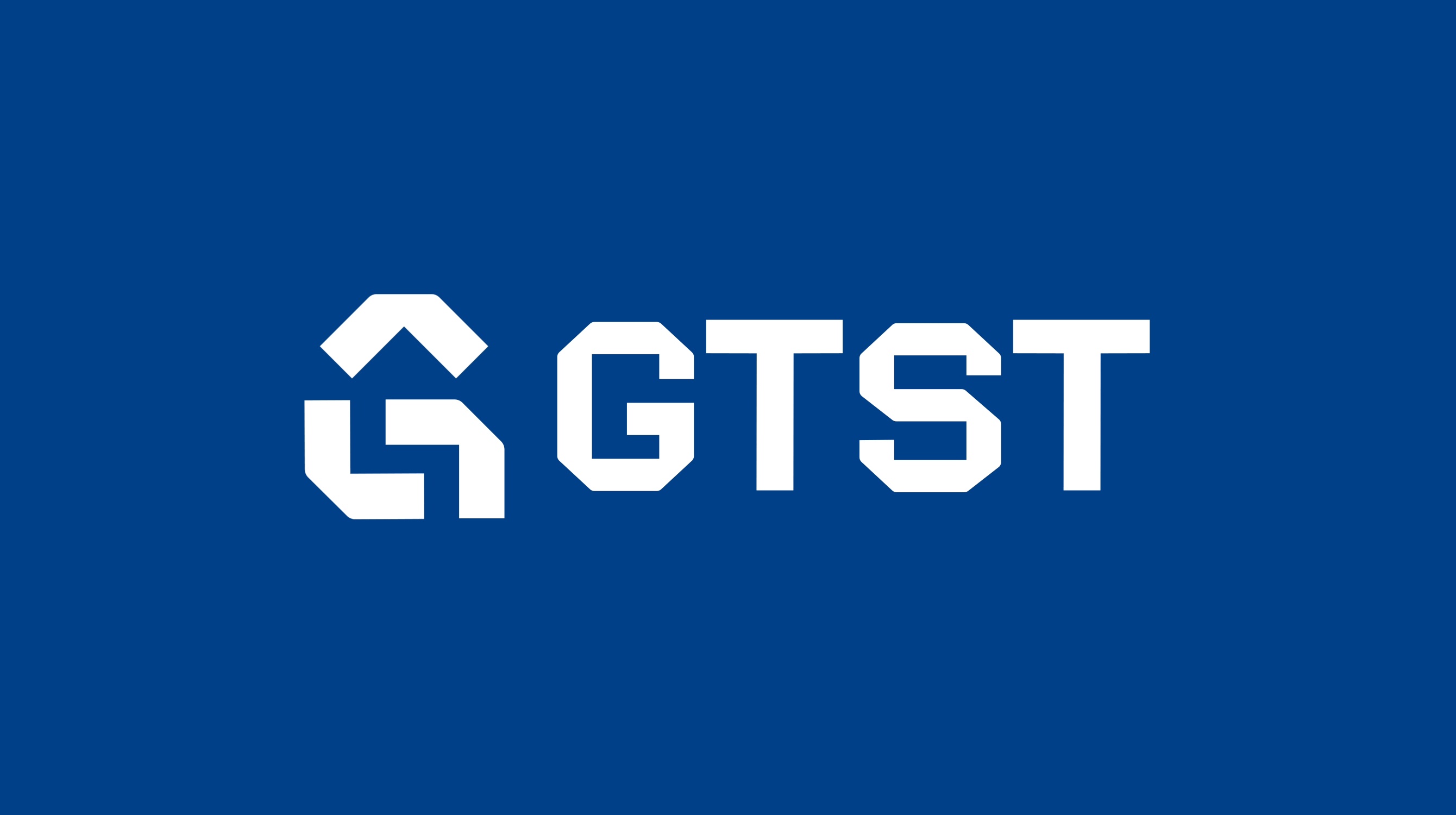
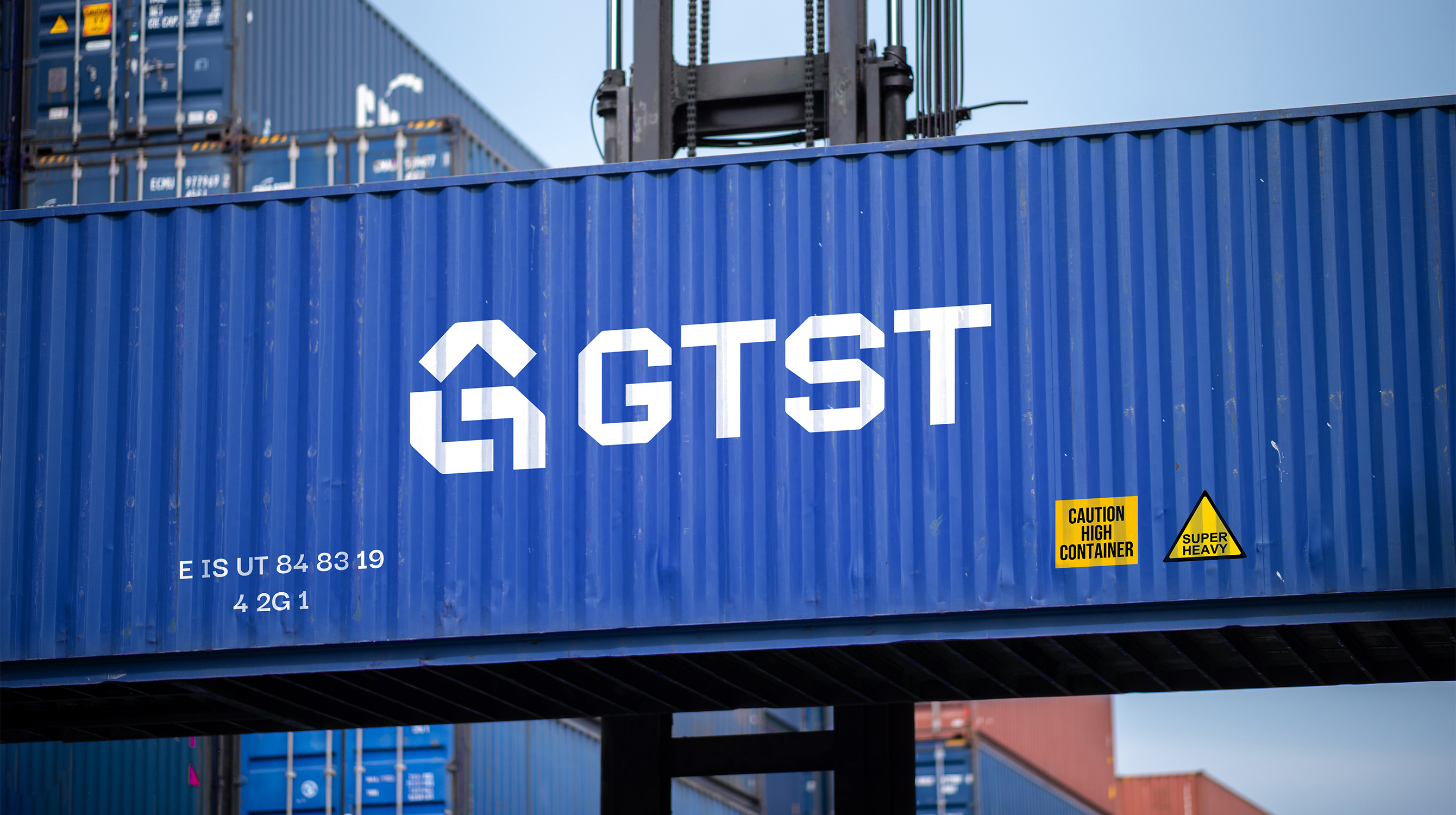
BEAN CREATIVE® embraced the challenge and reimagined GTS Trading’s brand from the ground up, starting with the logo. Drawing inspiration from the universally recognized recycling symbol, the logo was redesigned to incorporate elements that communicated unity in sustainability and progress toward a greener future. Instead of the traditional arrows, the new logo features the shape of a house, symbolizing unity, and an upward arrow, representing growth.
The brand’s color palette was intentionally chosen to move away from the typical green that dominates recycling branding. Blue became the primary color, symbolizing GTS Trading’s core as a global trading company and its connection to the innovation of solar energy. Green was incorporated as an accent, balancing the brand’s vitality with its commitment to environmental responsibility.
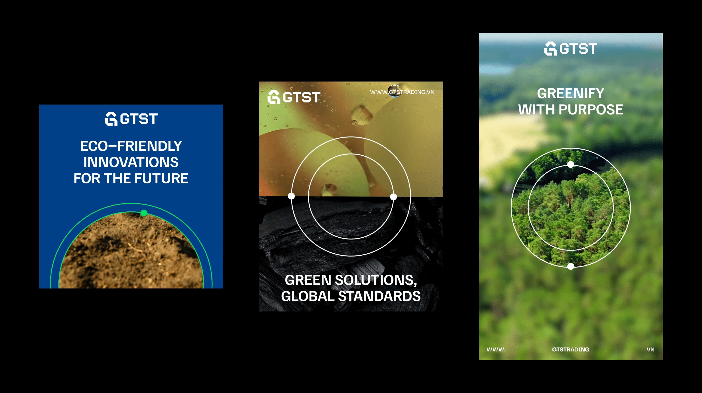
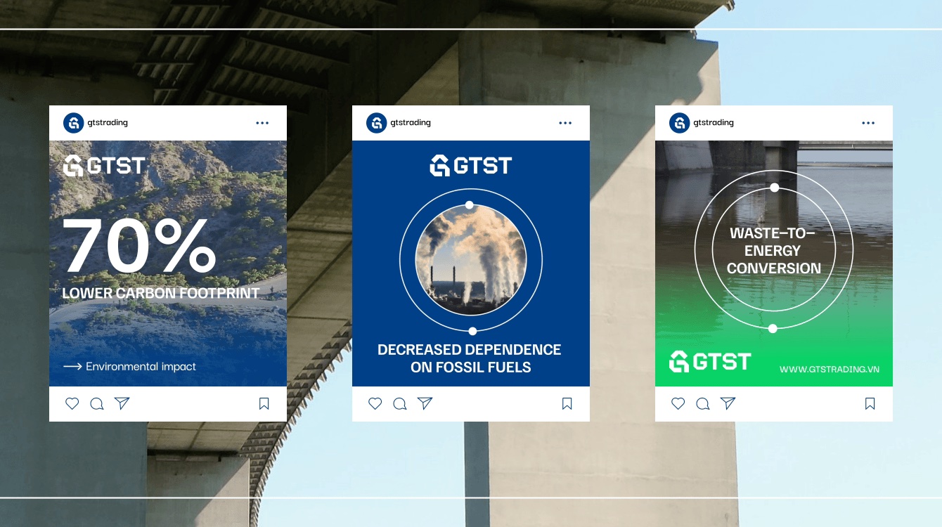
To complement the logo, a key visual element was introduced in the form of a circle, symbolizing the cyclical nature of the circular economy. This visual was integrated across various touchpoints, including print media, social media, and billboards, creating a distinctive and cohesive brand identity.
GTS Trading’s rebrand has led to a stronger, more unified presence across all platforms, from their website and social media to marketing materials. The new identity reflects the company’s values of sustainability, innovation, and growth while ensuring the brand is positioned to confidently expand into both local and international markets.
Through this rebrand, GTS Trading has enhanced its ability to communicate its mission of promoting a circular economy while maintaining a modern, bold identity that resonates with clients and partners around the world.


CREDIT
- Agency/Creative: Bean Creative
- Article Title: Bean Creative’s New Brand Identity for GTS Trading: a Fresh Take on Recycling
- Organisation/Entity: Agency
- Project Type: Identity
- Project Status: Published
- Agency/Creative Country: Vietnam
- Agency/Creative City: Ho Chi Minh City
- Market Region: Asia
- Project Deliverables: Art Direction, Brand Design, Brand Experience, Brand Guidelines, Brand Identity, Branding, Copywriting, Design, Graphic Design, Icon Design
- Industry: Chemical
- Keywords: BEAN CREATIVE, Brand Identity, Brand Design, Client-centric Branding Agency, Vietnam
-
Credits:
Brand Director: Linh Phan
Brand Designer: Dat Tudo
Brand Designer: K Bui
Brand Designer: Vy Luong
Account Lead: Thuan Nguyen
Brand Manager: Jei Nguyen
Content and Strategy Specialist: Haqi Nguyen
Business Director: Mash Pham


