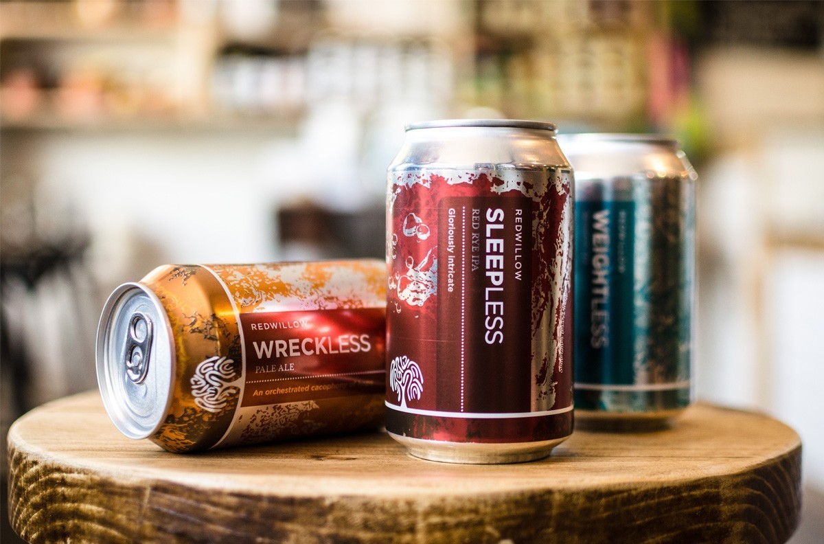
” We were tasked by RedWillow Brewery, Macclesfield to work with their existing brand marque and reimagine the perception of what a beer can should look like.
In a saturated market, the quality and the craftsmanship of this particular beer brand needed to be reflected in the design concept of the can. The cans were required to have powerful shelf impact and be irresistible to pick up and engage with.
The process of moving from initial sketched ideas through various design iterations to a finalised solution is always a fascinating one. This project saw the final can design align very closely to one of the original design concepts – it’s satisfying and encouraging when a client fully embraces the value of a design concept and doesn’t veer far from the original idea as the design journey progresses.
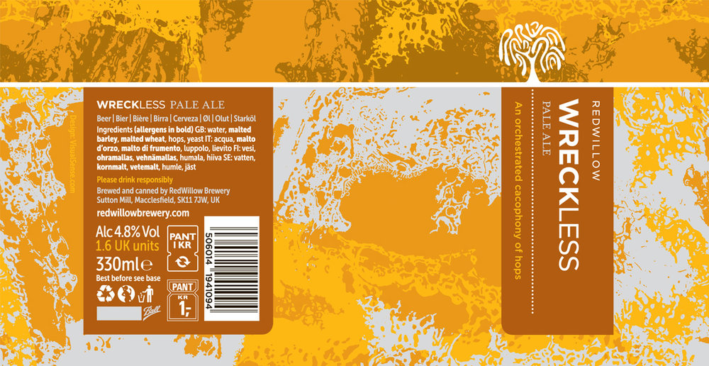
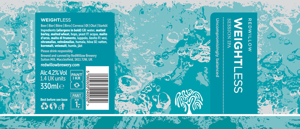
The concept of replicating the fluid nature of the beer in an abstract way, led us to pour freshly opened beer into various receptacles. The swirling, foaming patterns and shapes were visually intriguing and provided the basis for the abstract nature of the chosen design route.”

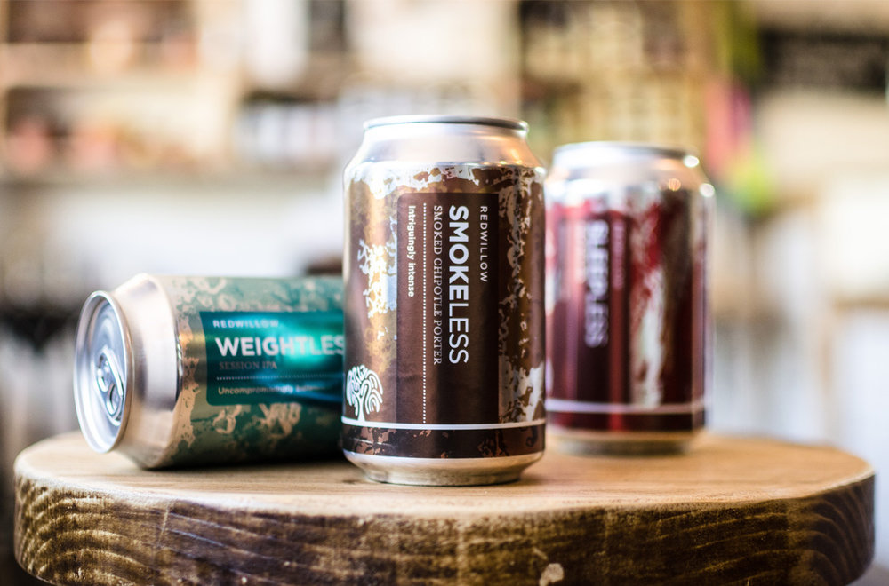
” Our research proved that cans don’t always stay perfectly positioned on supermarket shelves and in pub fridges. To allow for this and to ensure the can looked as enticing as it could from all angles, the liquid pattern runs around the circumference of the can – the whole can is treated as a canvas. Toby McKenzie, Director of RedWillow ‘… we wanted to be able to rotate the can in our hands to appreciate the whole design. There is real intrigue in the design and the textures that have been created and how they both relate to the beer inside. I don’t think you see this attention to detail in many other can designs.’
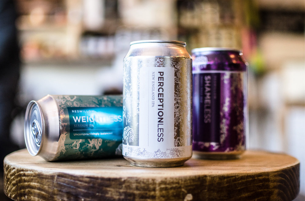
We worked closely with both the client and the can manufacturers to ensure colour was accurately realised. The interplay of colour and the raw aluminium silver of the can were an important part of the design, we worked tirelessly to ensure this wasn’t compromised.
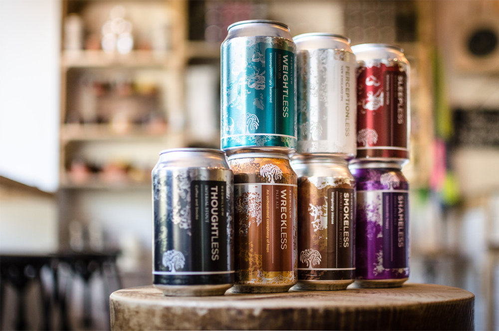
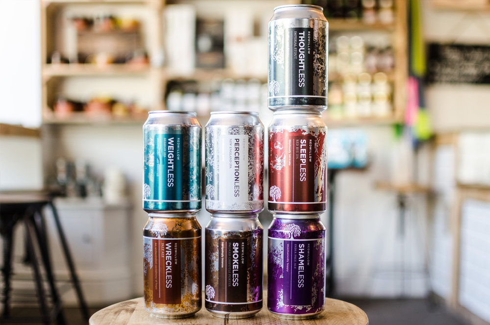
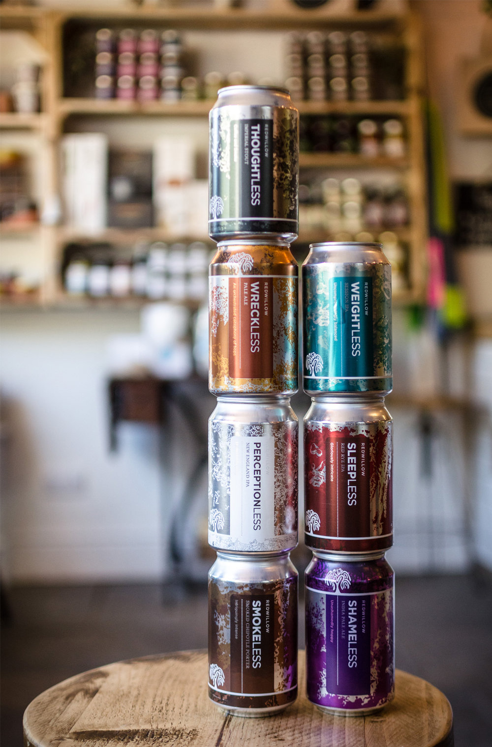
We were encouraged by the extensibility of the design concept – a suite of liquid textures and colours would allow us to create a range of different cans for different beers, all of which held together as a product family.
The range of beers has grown over the last year to include new lines and the original design concept has been more than capable of flexing and growing with it. We’ve been able to push the original idea in new directions without loosing the link to the original concept.
The increasing range of cans is visually satisfying, we’re thrilled the original design concept was robust enough to grow with the brand.
Toby of RedWillow echoes our lasting thoughts – ‘… the final result is something we are very proud of.’”



CREDIT
- Agency/Creative: Visual Sense
- Article Title: Visual Sense – RedWillow Brewery Beer Cans
- Project Type: Packaging
- Format: Can
- Substrate: Metal


