Lumin: Fill your room with light.
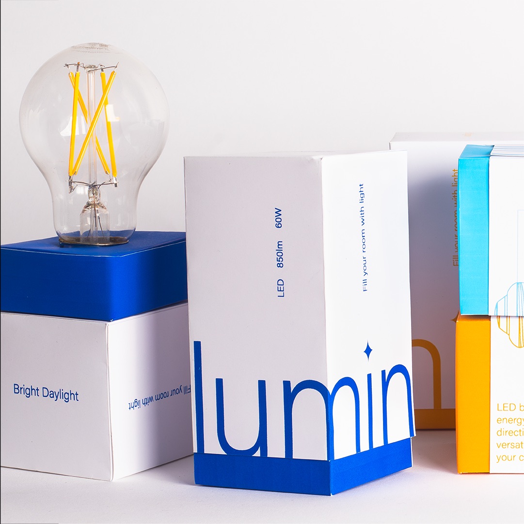
Lighting brings the interior together, sets the ambiance and accentuates the space, yet the questions around which light to choose are indefinite. The packaging for LED bulbs are overloaded with information and confusing to navigate. Lumin simplifies the process of understanding the Wattage and Lumen equivalence.
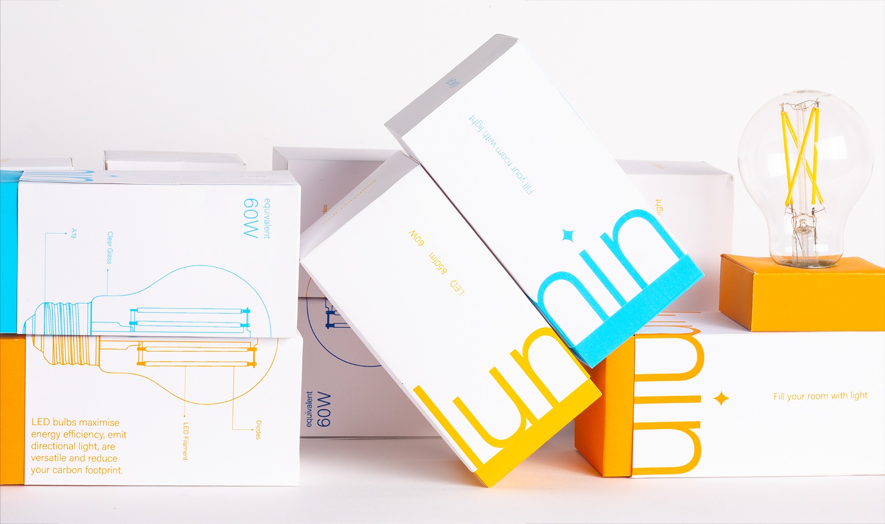
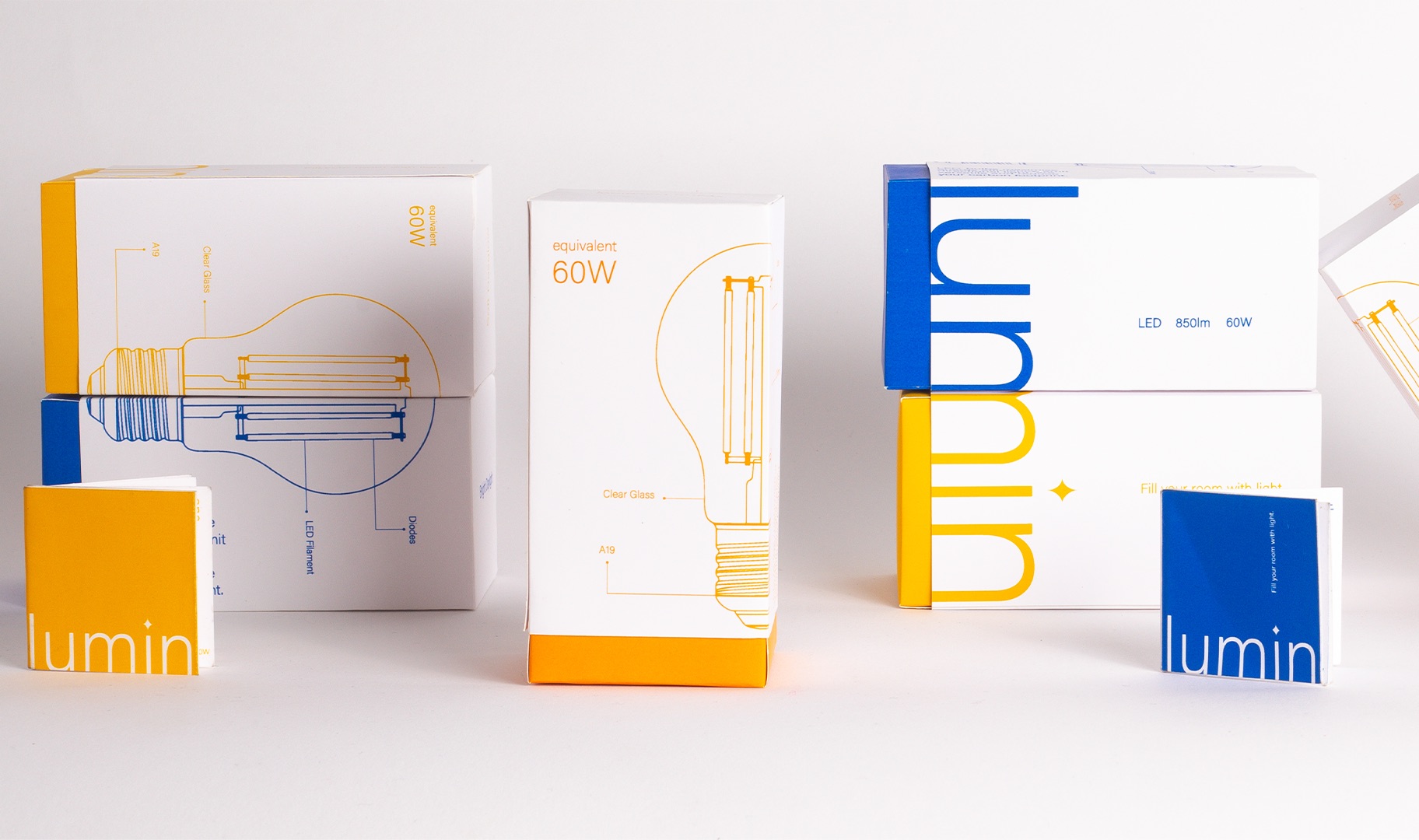
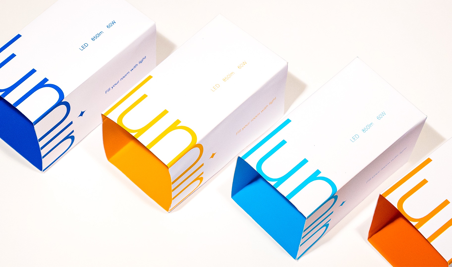
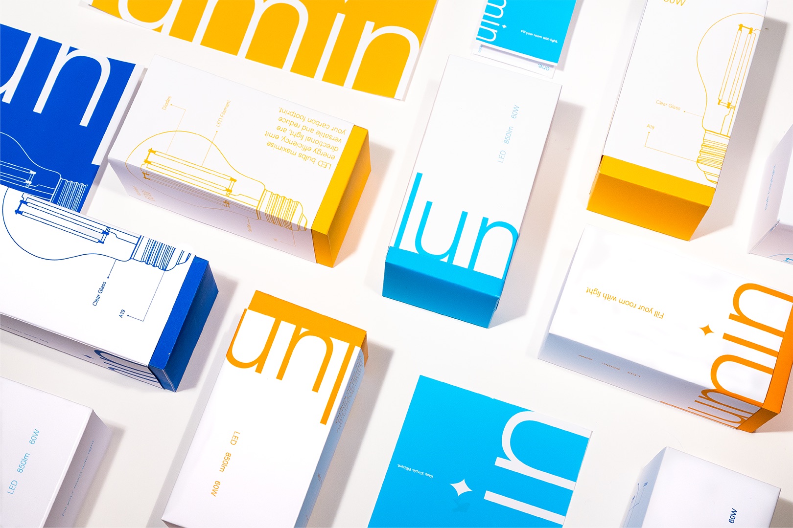
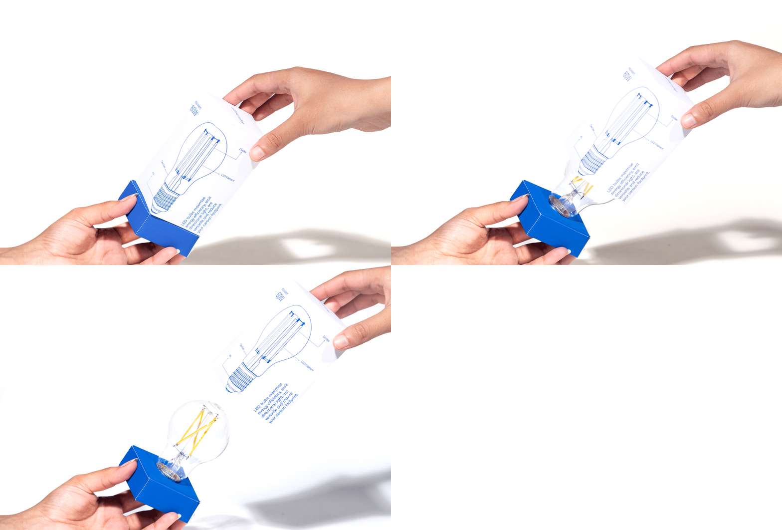
Besides the connotation of illuminating the space, the name “Lumin” works as a wordplay to emphasize on Lumens as the new lighting measurement. The packaging reinforces the minimal technical aesthetic and strips away the extraneous details. Inspired by the delicate structure of an LED bulb Lumin’s packaging is a balance of minimal and informative design. The design on the outside is supported with a technical illustration of the bulb highlighting details like the type of socket and the inside is illuminated with the corresponding color.
The questions that customers usually find themselves stuck at while buying light bulbs are regarding the equivalence of Lumens to Wattage, the type of socket and the brightness. The light bulbs are categorized in 4 colors, Soft Daylight, Bright Daylight, Soft Dayglow and Warm Dayglow to correspond with the Keliving temperature. The names are built on the current vocabulary of “bright light” vs “warm light.”
Lumin is a conceptual packaging for LED light bulbs inspired by swiss design. In Lumin’s packaging, form and function work together to evoke the feeling of illuminating a room with light.

CREDIT
- Agency/Creative: Navya Arora
- Article Title: Lumin Packaging Design Concept by Student Navya Arora
- Organisation/Entity: Student
- Project Type: Packaging
- Project Status: Published
- Agency/Creative Country: United States
- Agency/Creative City: Baltimore
- Market Region: North America
- Project Deliverables: Brand Identity, Packaging Design
- Format: Box
- Industry: Energy
- Keywords: Light Bulb, Swiss Design, Technical
-
Credits:
Designer: Navya Arora
Educational Institution: Maryland Institute College of Art


