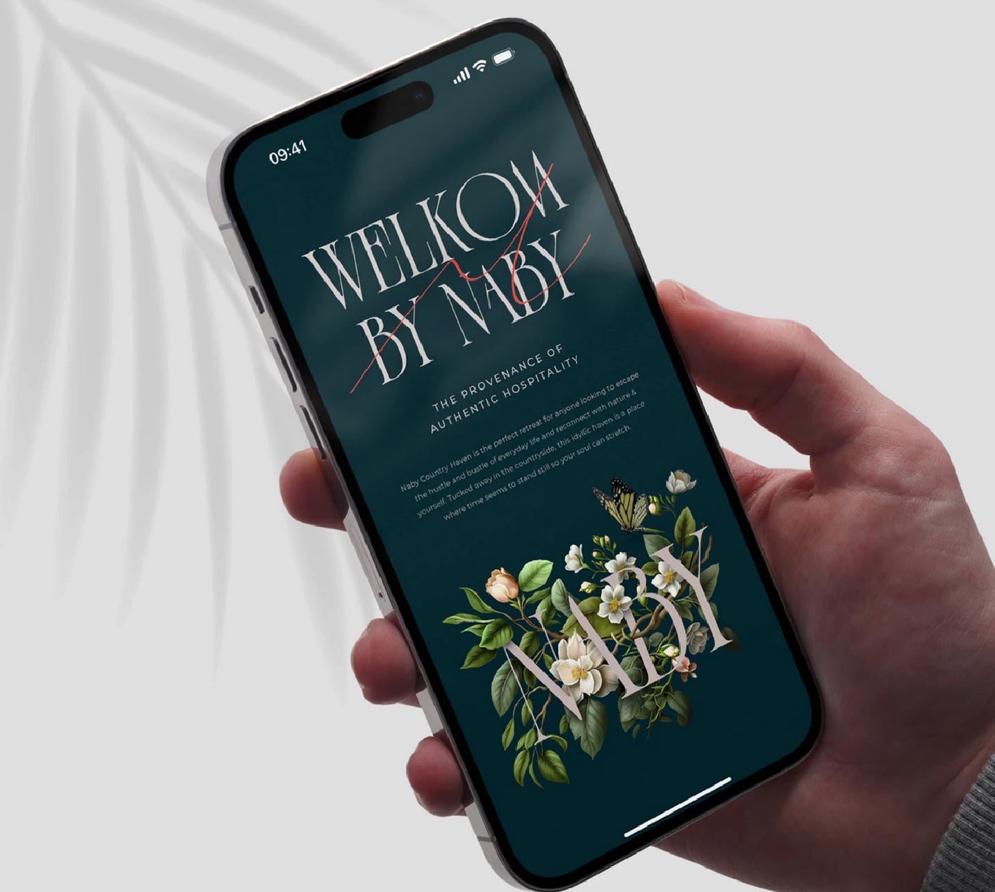
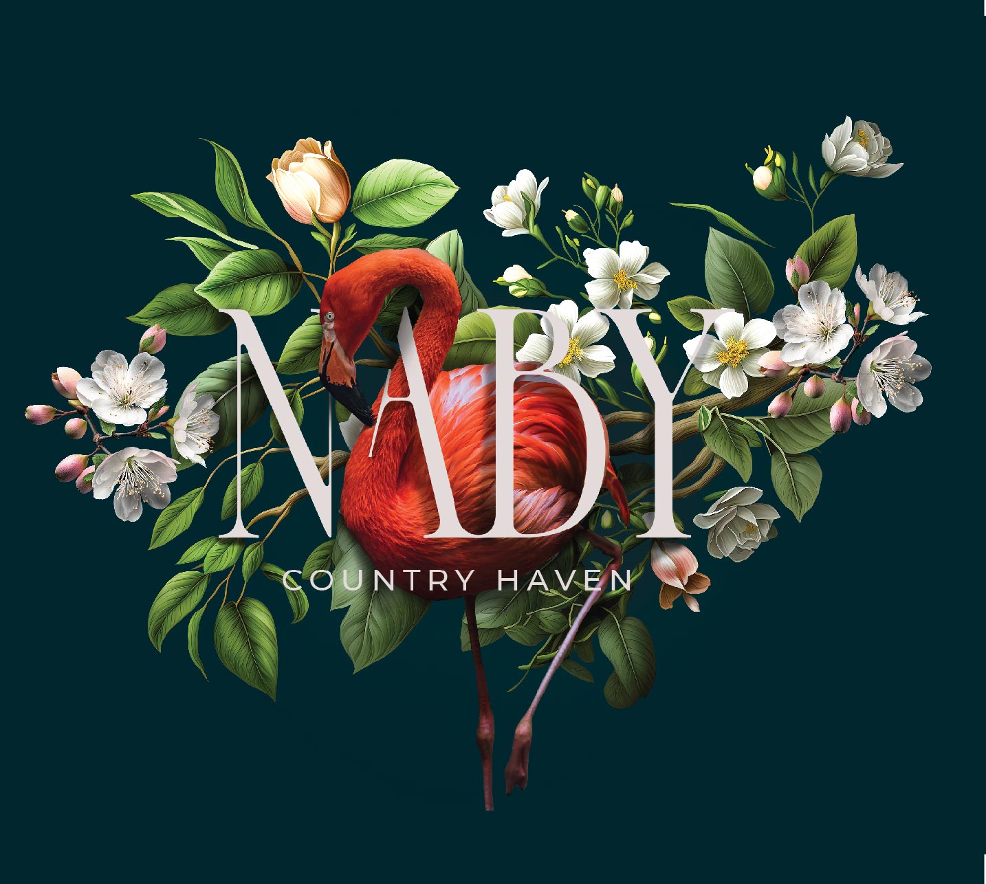
From a brand design perspective, Naby Country Haven embodies a harmonious blend of historical elegance and modern sophistication, creating a visual identity that connects deeply with its audience. Drawing inspiration from its Victorian Cape Dutch heritage, the brand’s design is rooted in timeless charm while remaining fresh and relevant.
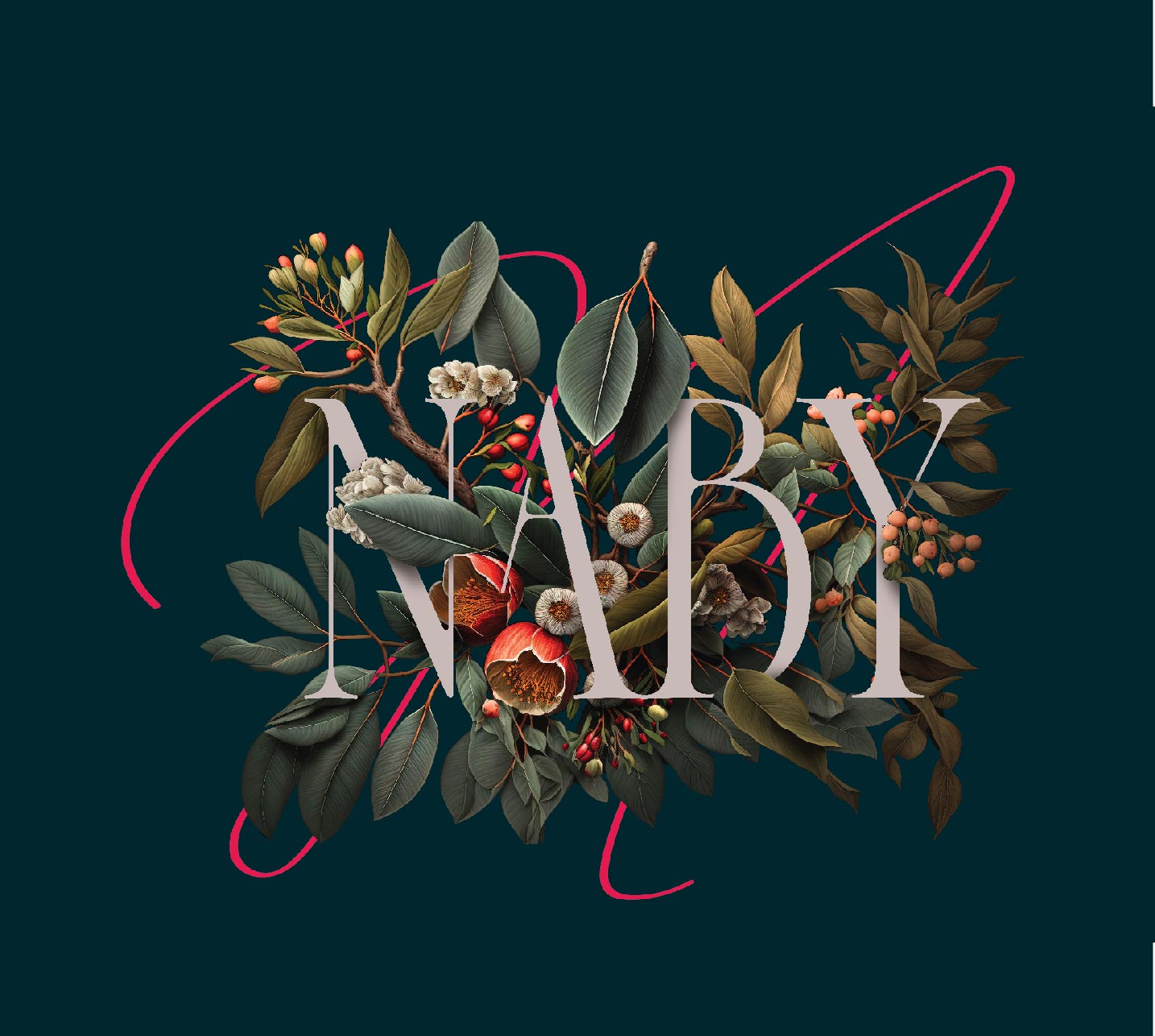
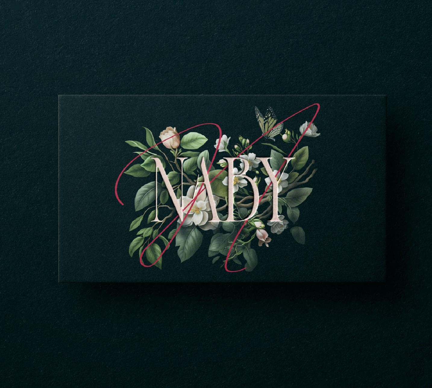
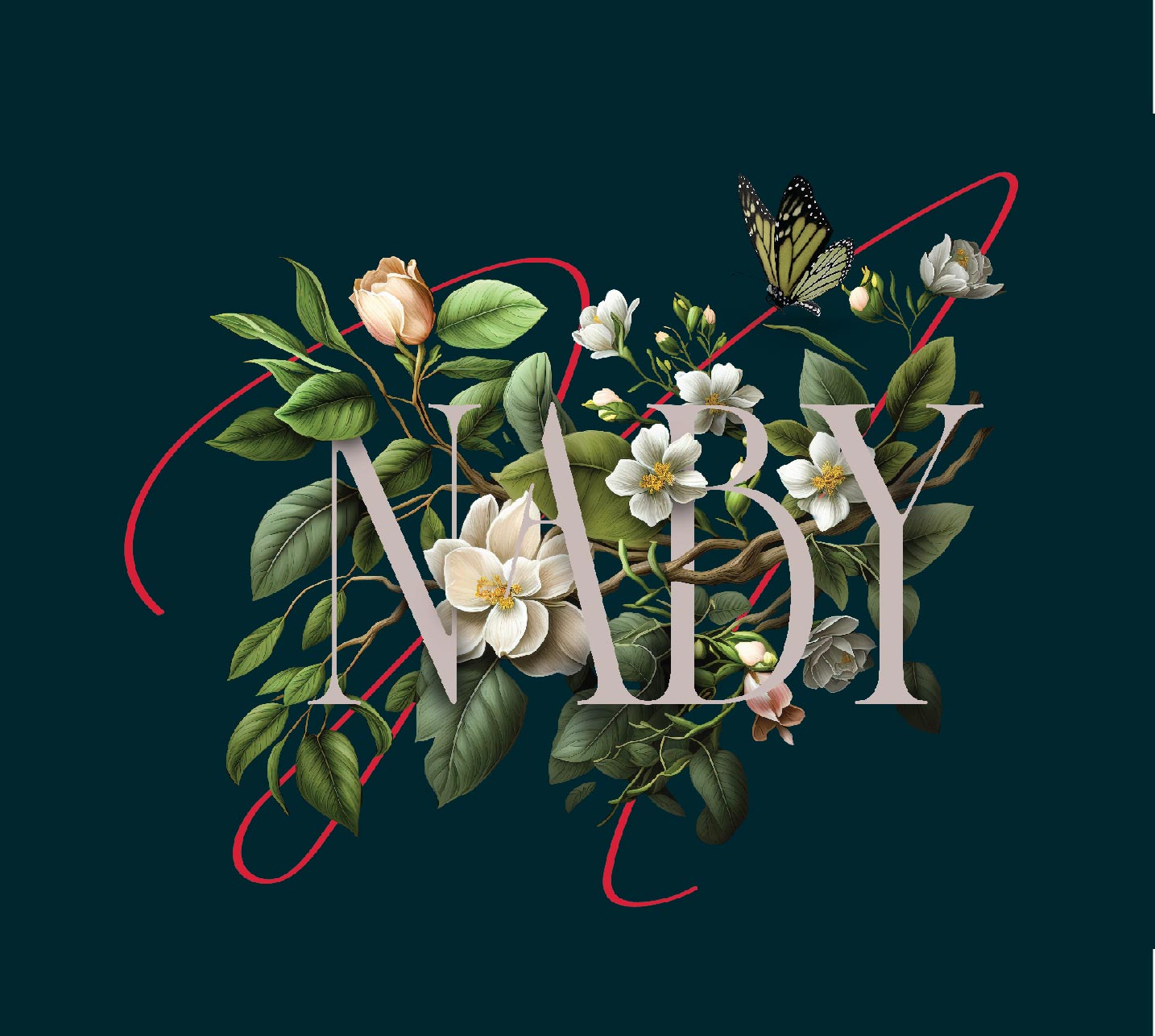
At its core is a Victorian-inspired typeface that exudes refinement and class, complemented by the distinctive red-thread “N.” This element serves as both a visual and symbolic anchor, representing connection, warmth, and heritage. Its subtle dynamism ensures memorability and adds a layer of storytelling that resonates emotionally.
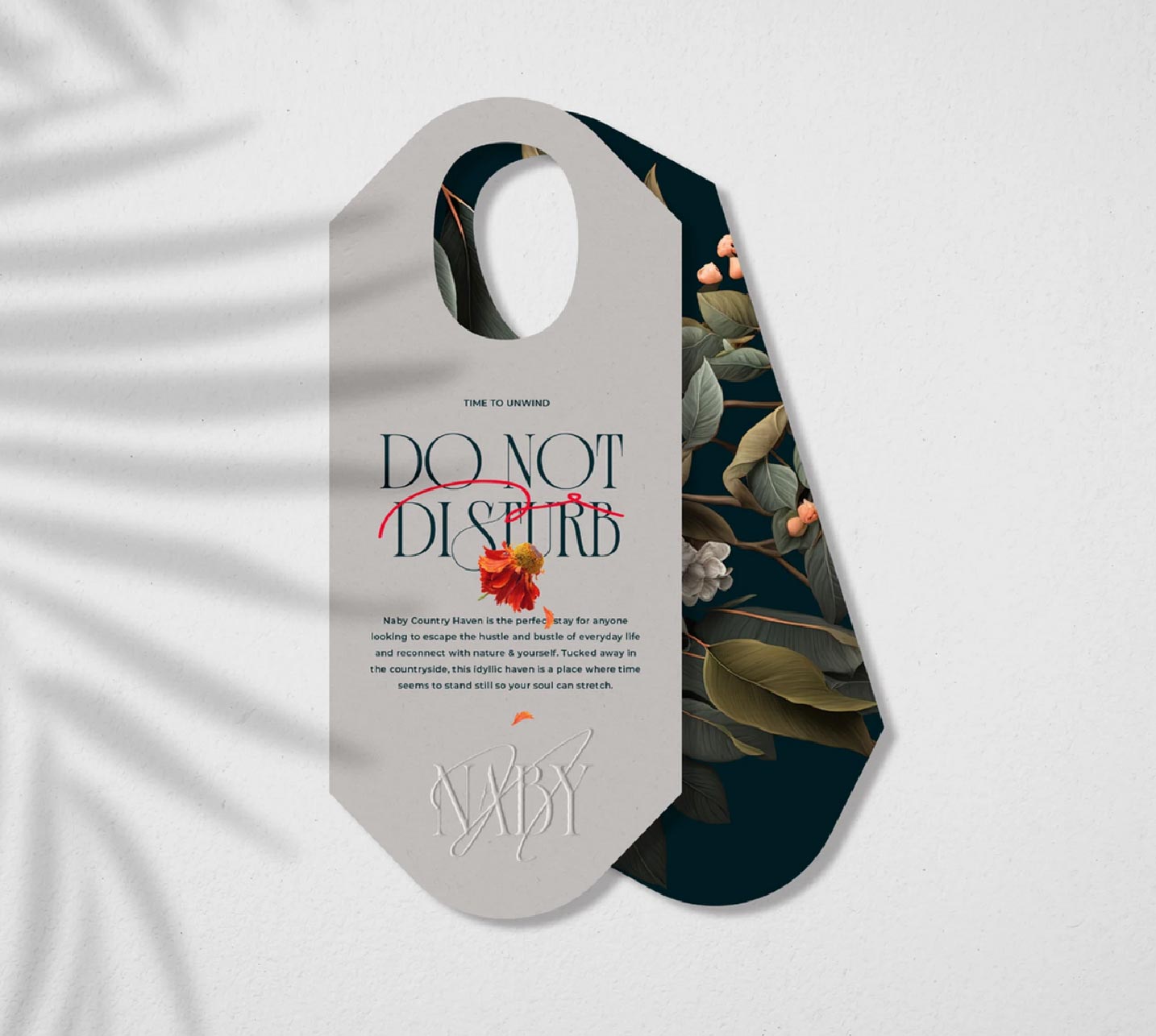
Intricate floral illustrations further enrich the identity, offering a dynamic connection to the homestead’s natural surroundings. Evolving with the seasons, these florals reflect the ever-changing beauty of the environment, ensuring the brand remains visually fresh and deeply tied to its setting.
A deep green palette grounds the brand in luxury and nature, evoking feelings of stability, growth, and tranquility. This rich hue, paired with the evolving florals and elegant typography, creates a flexible system that adapts seamlessly across applications, from digital platforms to signage and print collateral.
Naby Country Haven’s brand identity is designed to be more than just a logo—it’s an experience. Each element is thoughtfully crafted to reflect the homestead’s refined charm, timeless heritage, and authentic connection to its surroundings, leaving a lasting impression of elegance and authenticity.
CREDIT
- Agency/Creative: Supernova Co
- Article Title: Naby Country Haven Brand Identity by Supernova Co
- Organisation/Entity: Agency
- Project Type: Identity
- Project Status: Published
- Agency/Creative Country: South Africa
- Agency/Creative City: Cape Town
- Market Region: Africa
- Project Deliverables: Art Direction, Brand Creation, Brand Guidelines, Digital Art, Graphic Design, Illustration, Logo Design, Typography
- Industry: Hospitality
- Keywords: Modern Victorian, Cape Dutch, timeless elegance, red-thread detail, sophisticated logo typography, seasonal floral illustrations, deep green palette, heritage-inspired, luxury homestead, connection and warmth, authenticity, visual storytelling
-
Credits:
Creative Director: Joanne Sagrestano


