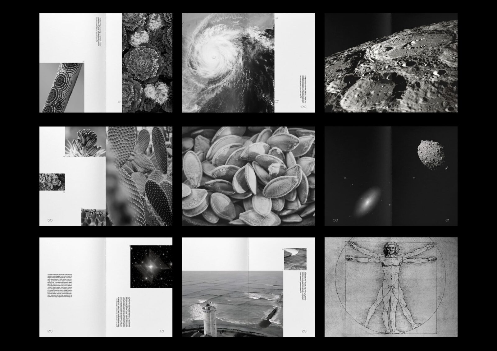
Introduction The visual research project titled Geometry of Nature explores the presence of geometric shapes and compositions in nature, inspired by the works of Kazimir Malevich. The aim is to investigate whether nature inherently reflects the clear geometric forms often depicted in Malevich’s art. For instance, compositions like Malevich’s Red Square and Black Square find parallels under a microscope when examining salt crystals.
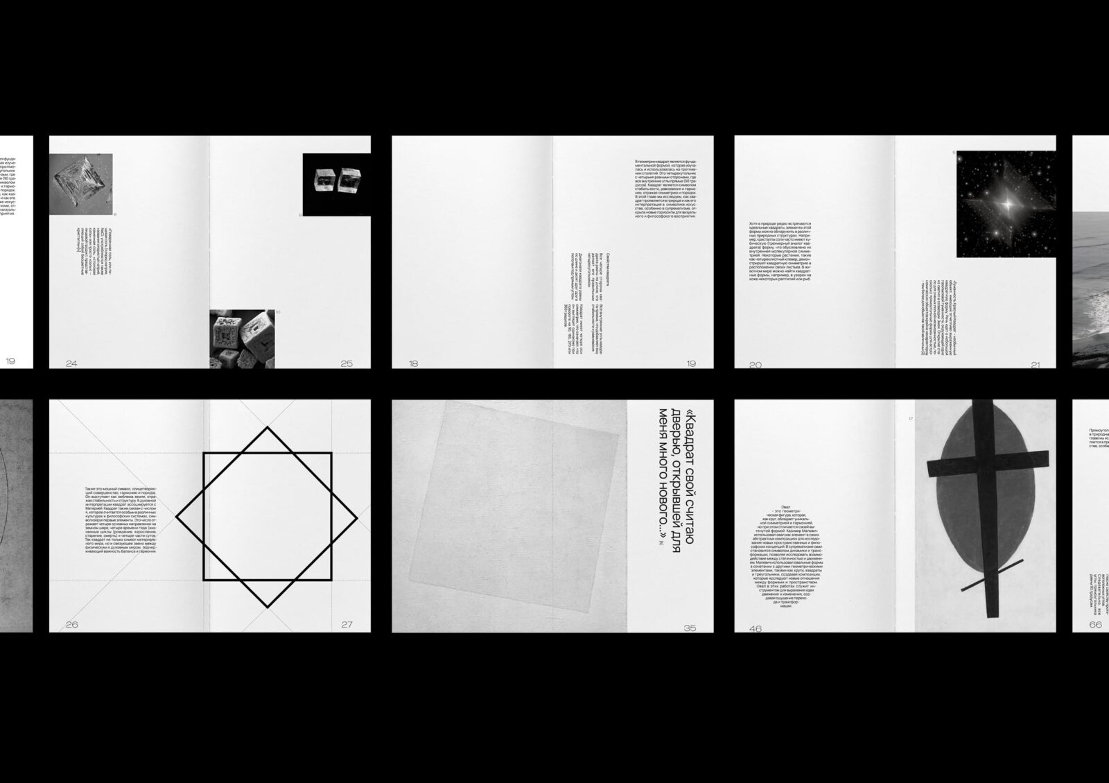
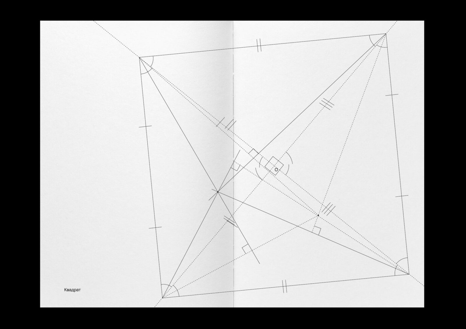
Structure and Chapters This research is organized into five chapters, each dedicated to a geometric shape frequently seen in Malevich’s works: square, rectangle, circle, oval, and triangle. The book’s structure mirrors the format and style of a 1920s geometry textbook, serving as a metaphor for the study of shapes.
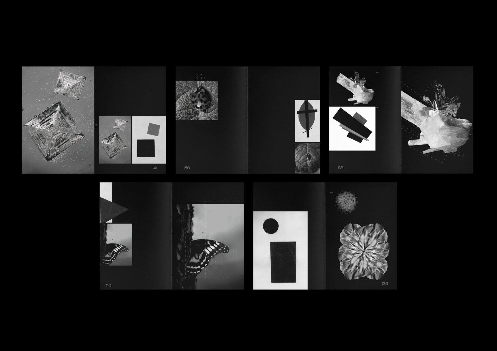
The first chapter explores natural objects resembling squares, provides examples of Malevich’s works, and discusses the significance of squares in his art. The second chapter examines the oval as a symbol of fertility, inspired by plant forms, and includes collages comparing Malevich’s compositions and nature. The third chapter focuses on rectangles in nature, with monochrome illustrations directing attention solely to the shape. The fourth chapter discusses triangles as symbols of upward movement, inspired by mountains and dunes. The fifth chapter analyzes circular forms in nature and integrates text navigation shaped around the discussed figures.
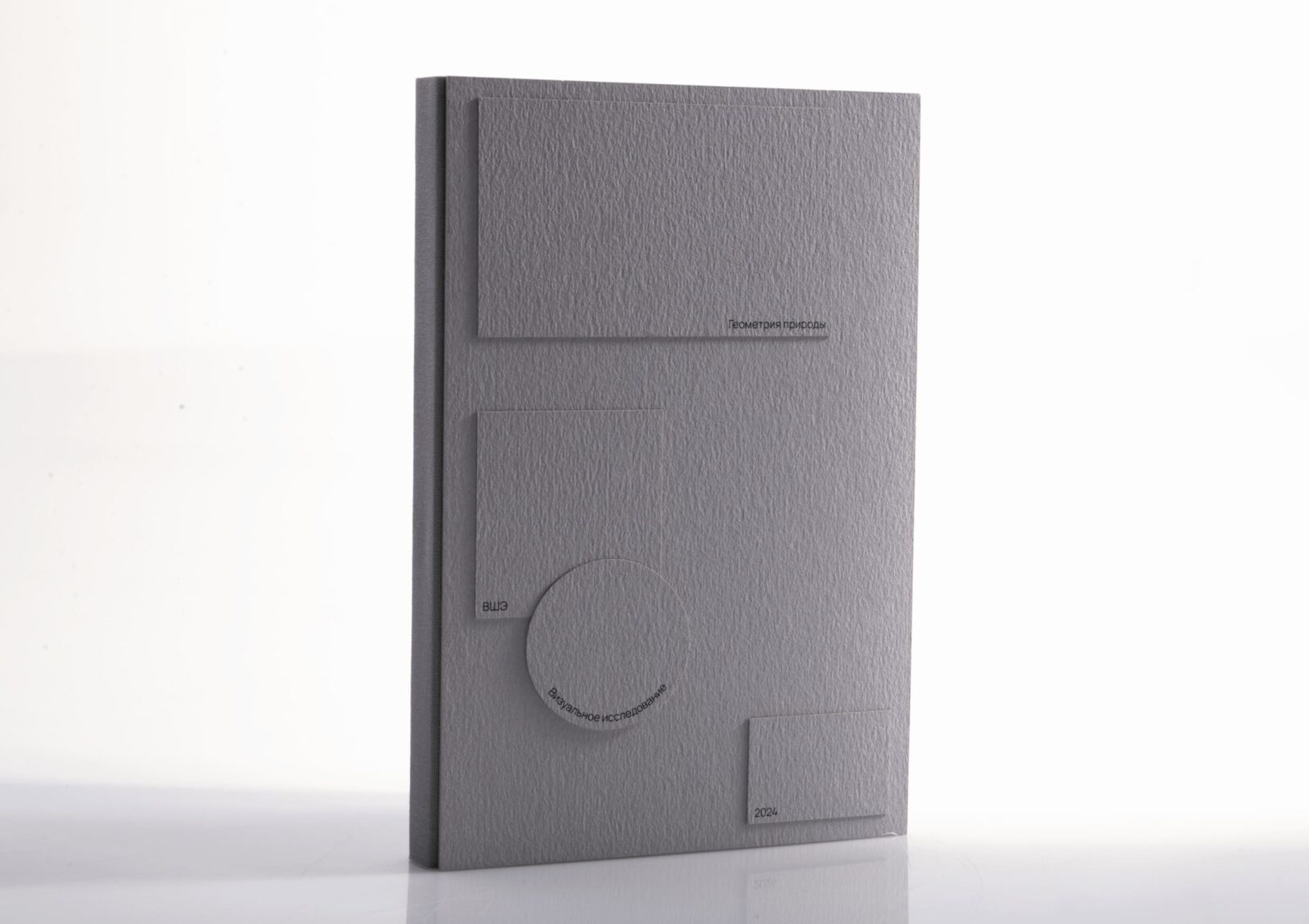
Design and Methodology The book replicates the size and binding of a 1920s geometry textbook, featuring a soft fabric-covered spine and hardcovers. The cover comprises white and gray geometric shapes on a gray background, paying homage to Malevich’s aesthetic. A 10-column modular grid supports the design, and two fonts with four styles are used: one for text and another for numerical data. Each chapter opens with a geometric half-title representing the shape discussed. Text is formatted to reflect the shape of the figures, enhancing both aesthetics and usability.
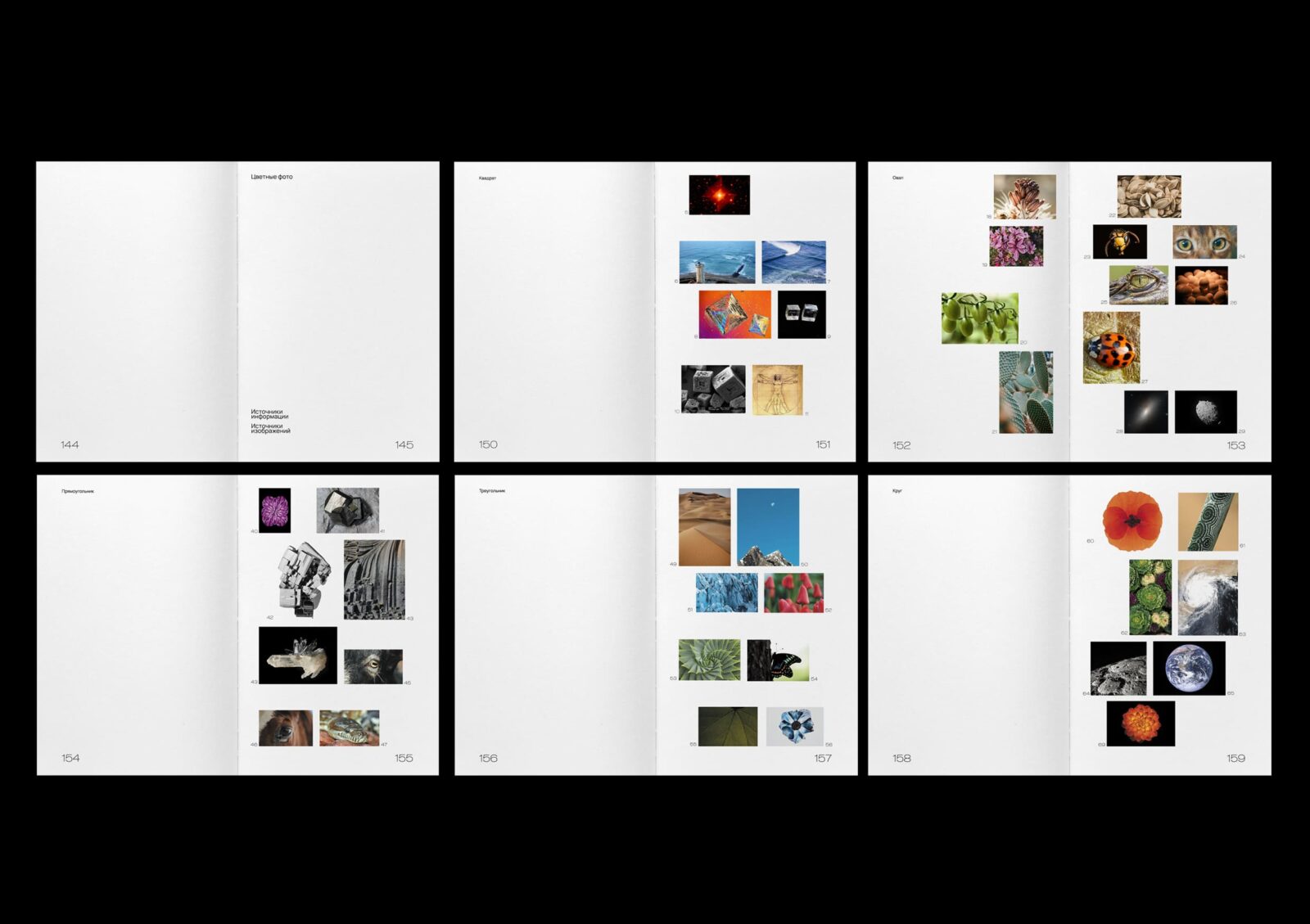
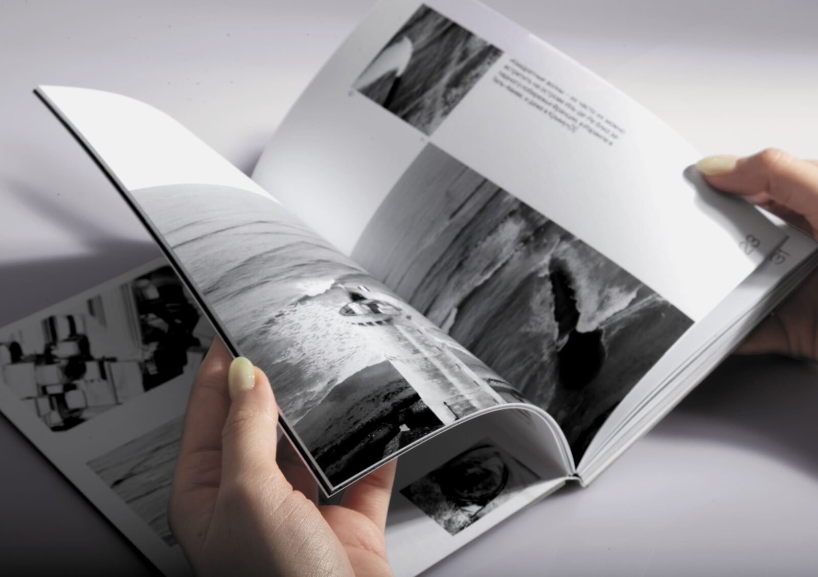
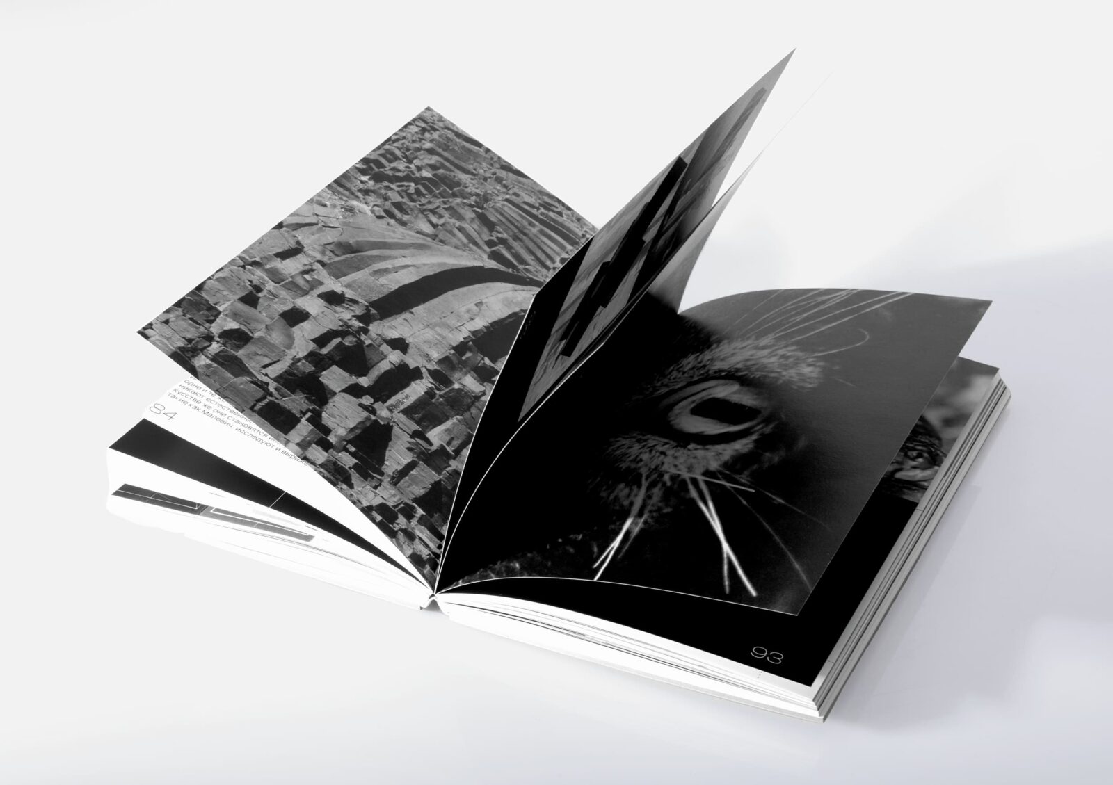
Content and Features The book begins with an overview of Kazimir Malevich’s life and work. Each chapter contains collages juxtaposing Malevich’s compositions with natural forms. Problems related to constructing and defining shapes are included, fostering a deeper understanding of geometric principles. Captions are placed at the chapter’s end, while additional information is rotated to distinguish content types. A dedicated block at the book’s conclusion presents all color photographs and works. Gradual transitions from light to dark indicate the end of each chapter.
Conclusion Geometry of Nature bridges art, nature, and geometry through a meticulously designed visual research book. By aligning Malevich’s abstract compositions with natural shapes, the project not only celebrates geometric forms but also offers a unique perspective on their universal presence.


CREDIT
- Agency/Creative: yanina kuznetsova
- Article Title: Geometry of Nature: Book Typography by Student Yanina Kuznetsova
- Organisation/Entity: Student
- Project Type: Typography
- Project Status: Non Published
- Agency/Creative Country: Russia
- Agency/Creative City: moscow
- Market Region: Global
- Project Deliverables: Typography
- Industry: Information
- Keywords: book, yanina, kuznetsova, typography, art, malevich, nature
-
Credits:
designer: Yanina Kuznetsova


