Firstbase Redefines Elegance with Royal Black – A Cut Above the Rest
At Firstbase, we believe that great design doesn’t just package a product—it tells a story, creates an experience, and leaves a lasting impression. With Royal Black, we set out to craft a whisky that truly lives up to its tagline, “A cut above the rest.” The result is a design that seamlessly blends elegance, boldness, and innovation, capturing the essence of the brand while setting it apart from the competition.
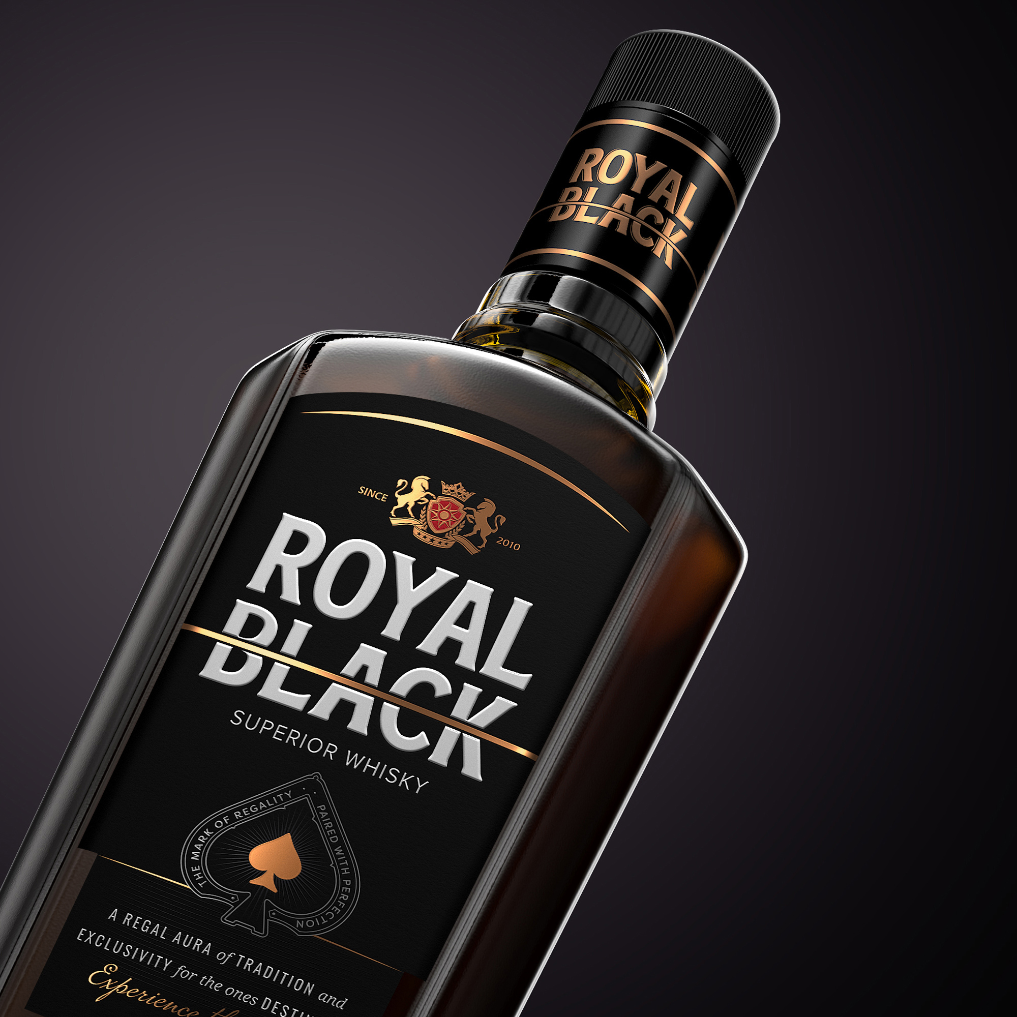
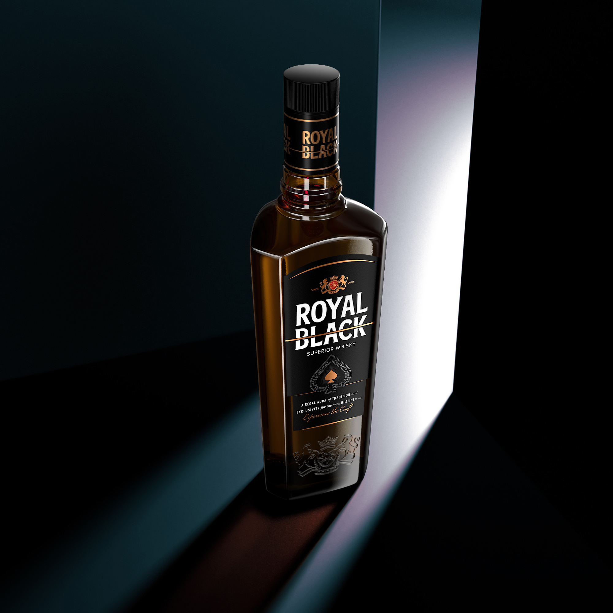
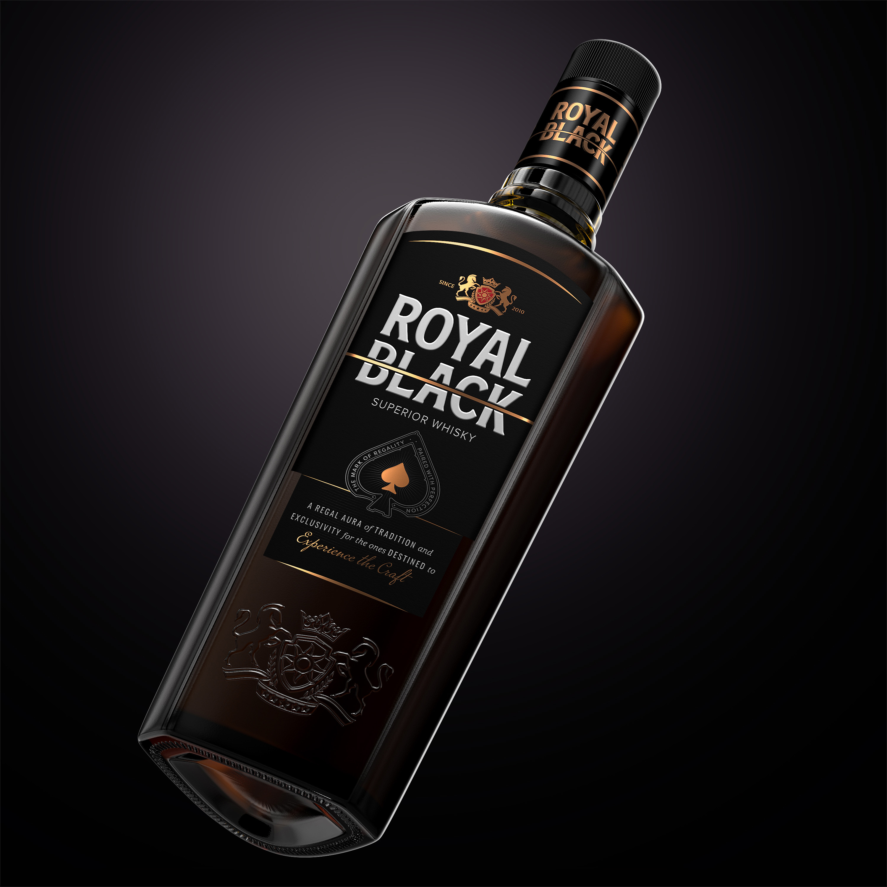
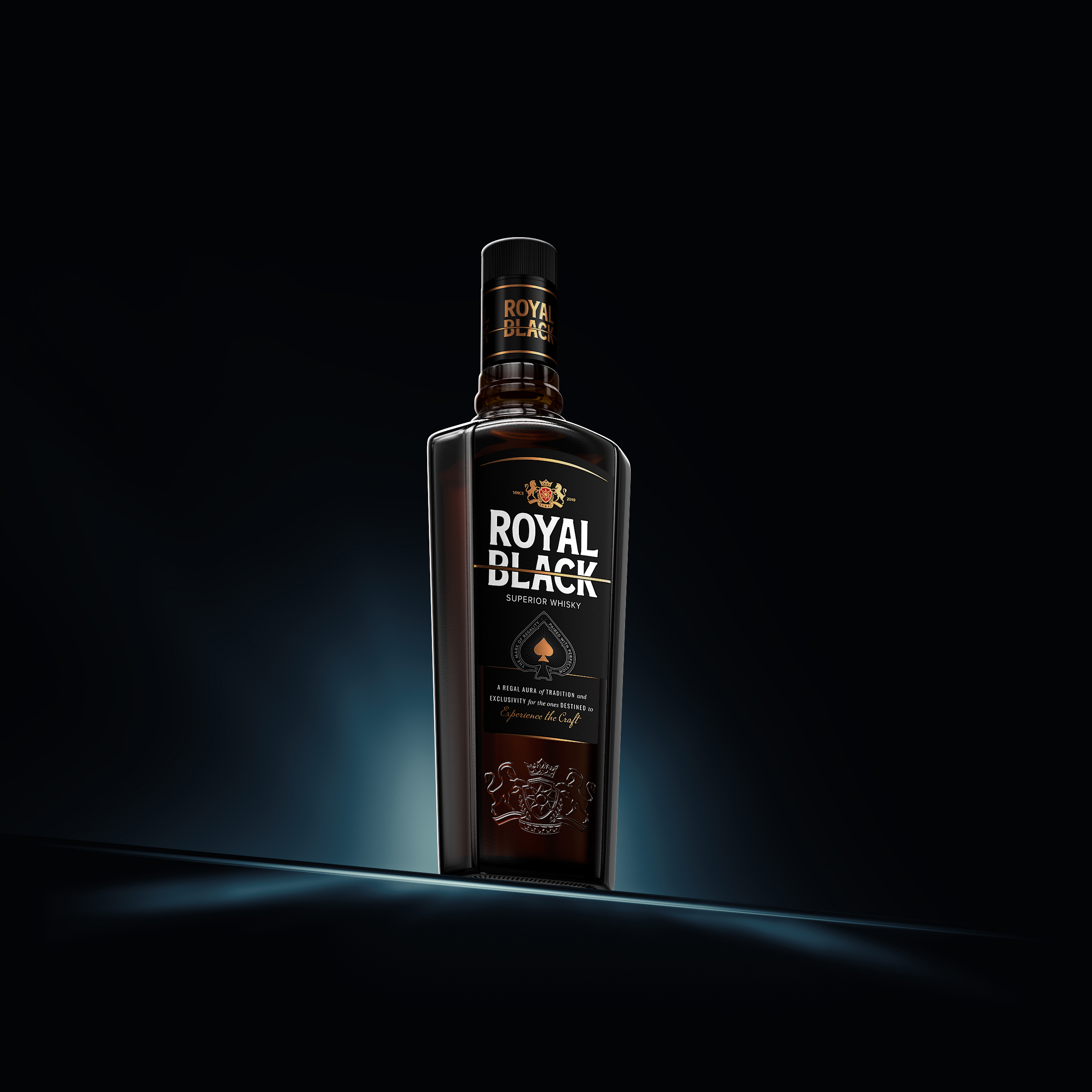
The unique bottle shape was designed with a vision of commanding presence and sophistication. Its clean, masculine silhouette exudes confidence while maintaining an ergonomic structure for an effortless hold and pour. The design team at Firstbase meticulously refined every curve and angle to create a bottle that not only looks striking but also feels exceptional in hand. At the heart of this design is the gold slash cutting through the word “BLACK,” a powerful visual metaphor for the brand’s uncompromising commitment to precision and excellence.
The clean branding, featuring bold typography and a luxurious black-and-gold color palette, reflects Royal Black’s premium ethos. The Ace of Spades icon—a symbol of power, distinction, and sophistication—adds an additional layer of meaning, making a bold statement on the label. The regal crest and gold accents further elevate the design, offering a nod to tradition while maintaining a contemporary aesthetic.
One of the standout elements is the textured embossing on the bottle’s surface, a tactile feature that enhances the overall experience. This attention to detail is echoed in the clean, minimalist branding, which balances visual impact with timeless elegance. The bottle’s base was designed with a distinctive contour to ensure stability while adding visual intrigue, a testament to the brand’s commitment to both form and function.
Every aspect of the packaging was carefully considered to reflect the ethos of Royal Black. The bold slash, the interplay of matte and glossy finishes, and the detailed crest all work together to create a design that feels premium and unforgettable. It’s a bottle that demands attention and invites admiration, embodying the spirit of exclusivity that Royal Black stands for.


CREDIT
- Agency/Creative: Firstbase
- Article Title: Royal Black Stands Out with Sophisticated Design by Firstbase
- Organisation/Entity: Agency
- Project Type: Packaging
- Project Status: Published
- Agency/Creative Country: India
- Agency/Creative City: New Delhi
- Market Region: Global
- Project Deliverables: Brand Design, Brand Identity, Brand Mark, Design, Packaging Design
- Format: Bottle, Sleeve
- Industry: Food/Beverage
- Keywords: Royal Black, Indian Whisky, Branding, Whisky Packaging
-
Credits:
Agency: Firstbase


