Peroni Nastro Azzurro was born in Rome in 1963 and exists to elevates life’s moments with passion and flair in true Italian style. The brand has always challenged the conventions of the beer category with a more stylish, better quality offer and has a global ambition to become a top 10 beer brand by 2030, with packaging a key driver for that growth.
Last redesigned in 2018, the brand’s secondary packaging was born of the ‘old’ codes of premium and had become recessive on shelf vs. competitors with bolder, more impactful packs and greater product appeal. Even Peroni Nastro Azzurro’s own 0.0% and ‘Stile Capri’ launches had overshadowed its core packaging.
With presence across 70 global markets, a better-performing pack design represented a huge commercial opportunity for the brand. The brief was therefore to strengthen Peroni Nastro Azzurro’s standout and findability on shelf, increasing penetration and rate of sale while also improving the brand’s premium perceptions.
Distinctive asset research had identified the visual elements of the brand which had most power and potential in consumers’ eyes. So Outlaw began by exploring these assets across early design concepts which were tested in three key markets, with results demonstrating improved shelf impact, purchase intent and premium perceptions.
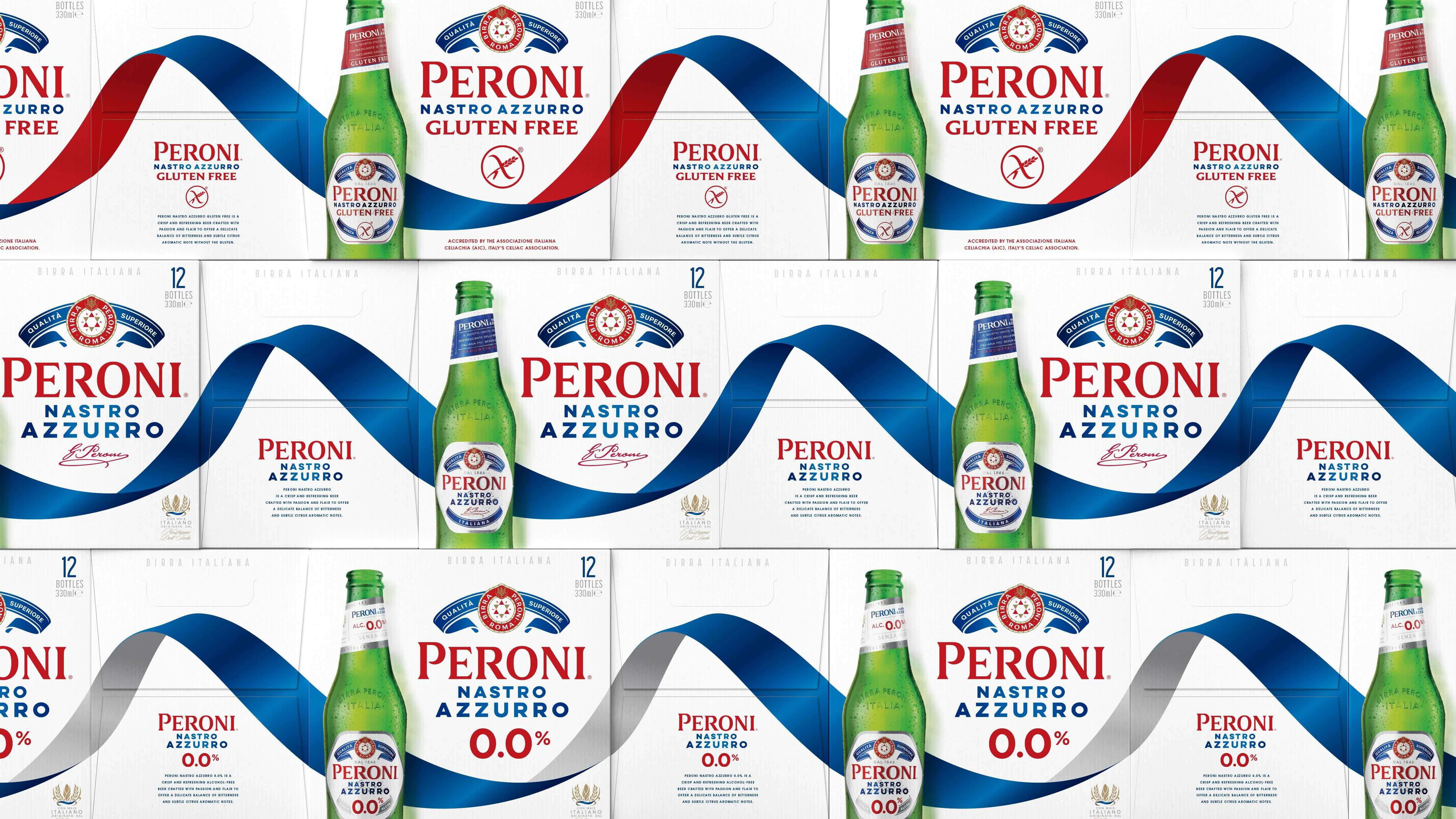
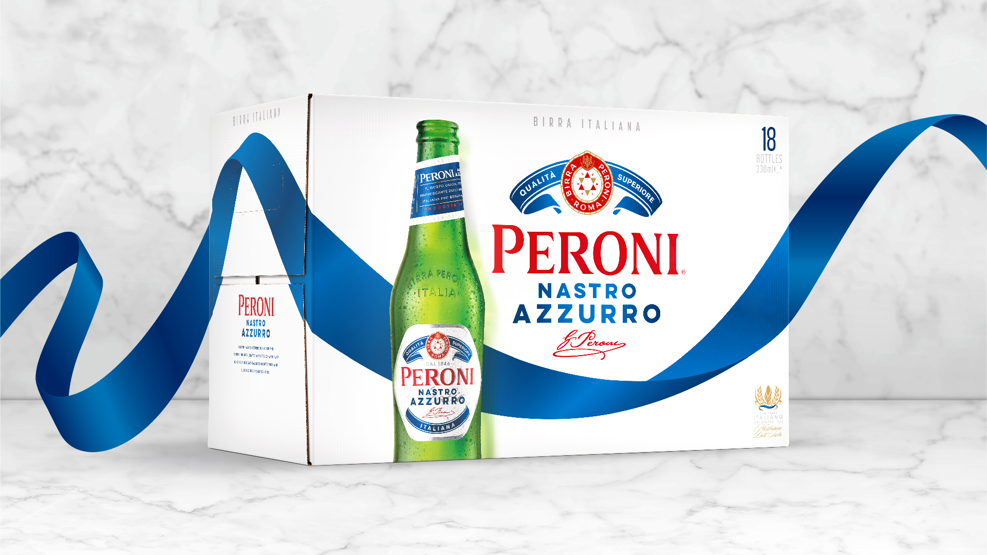
Taking those research learnings forward, Outlaw’s design solution unleashes the brand’s key asset – the blue ribbon (‘Nastro Azzurro’) – and makes it the hero of the story. Sweeping across every canvas it embodies the passion and flair of the brand while also providing a distinctive shape and colour that’s unmissable in store. And with this key asset wrapping all four sides of every pack format, the design creates an ‘endless ribbon’ wherever packs are seen together, whether that’s at shelf or via off-shelf feature.
The main logo lock-up – known as ‘the Amaretti’ – remains familiar but has been refreshed and rebalanced to drive standout and better findability without losing any premium detailing.
The new design also incorporates Peroni Nastro Azzurro’s bespoke bottle, with the Italian sunlight captured through its fresh green glass. While driving greater product appeal and making the crisp white pack canvas feel more approachable, the bottle also clearly signposts Peroni Nastro Azzurro as a beer in markets where the brand is new or less established.
Alongside the creative challenge of the project came the complexity of a global rollout. Outlaw first extended the core design to 0.0% and Gluten Free variants to establish a consistent design system, then built key master packaging templates and detailed guidance which enabled seamless rollout to local market formats and specifications.
Peroni Nastro Azzurro’s new secondary packaging is launching across local markets now.
Alex Rexworthy, Design Director at Outlaw, said: ‘Peroni Nastro Azzurro is an icon of Italian style but the existing secondary packaging was restricting consumers’ access to that world. It was an honour to unleash the ‘Nastro Azzurro’ and send it rippling around the world in this redesign, bringing more people into this pioneering brand more often, and contributing to its ambitious growth.’
Mike O’Donoghue, Global Head of Brand at Peroni Nastro Azzurro, said: ‘Outlaw rose to the creative challenge of moving our proud Italian brand forwards with boldness and care, while also navigating the unique complexity of a global business with multiple market stakeholders. We’re delighted with the result – as are our local teams – and we can’t wait to see the blue ribbon on shelf everywhere.’
For more information about Outlaw’s redesign of Peroni Nastro Azzurro’s secondary packaging please visit www.beoutlaw.com
For all media enquiries:
[email protected]


CREDIT
- Agency/Creative: outlaw
- Article Title: Peroni Nastro Azzurro Brings Italian Passion and Flair Back to the Shelf With New Packaging by Outlaw
- Organisation/Entity: Agency
- Project Type: Packaging
- Project Status: Published
- Agency/Creative Country: United Kingdom
- Agency/Creative City: Bristol
- Market Region: Global
- Project Deliverables: Design, Graphic Design, Packaging Design, Packaging Guidelines
- Format: Bottle, Box
- Industry: Food/Beverage
- Keywords: Beer Packaging
-
Credits:
Business Director: Tim Dalton
Creative Director: Brett Stabler


