The children’s speech therapy office “Lamaped”, opened by speech therapist Olga Lamalkova, is located in Novocheboksarsk. I was faced with the task of developing a kind, funny, memorable identity and name from scratch. The starting point was the client’s wish to connect the identity with the image of a lama, which was a reference to her last name.
logo
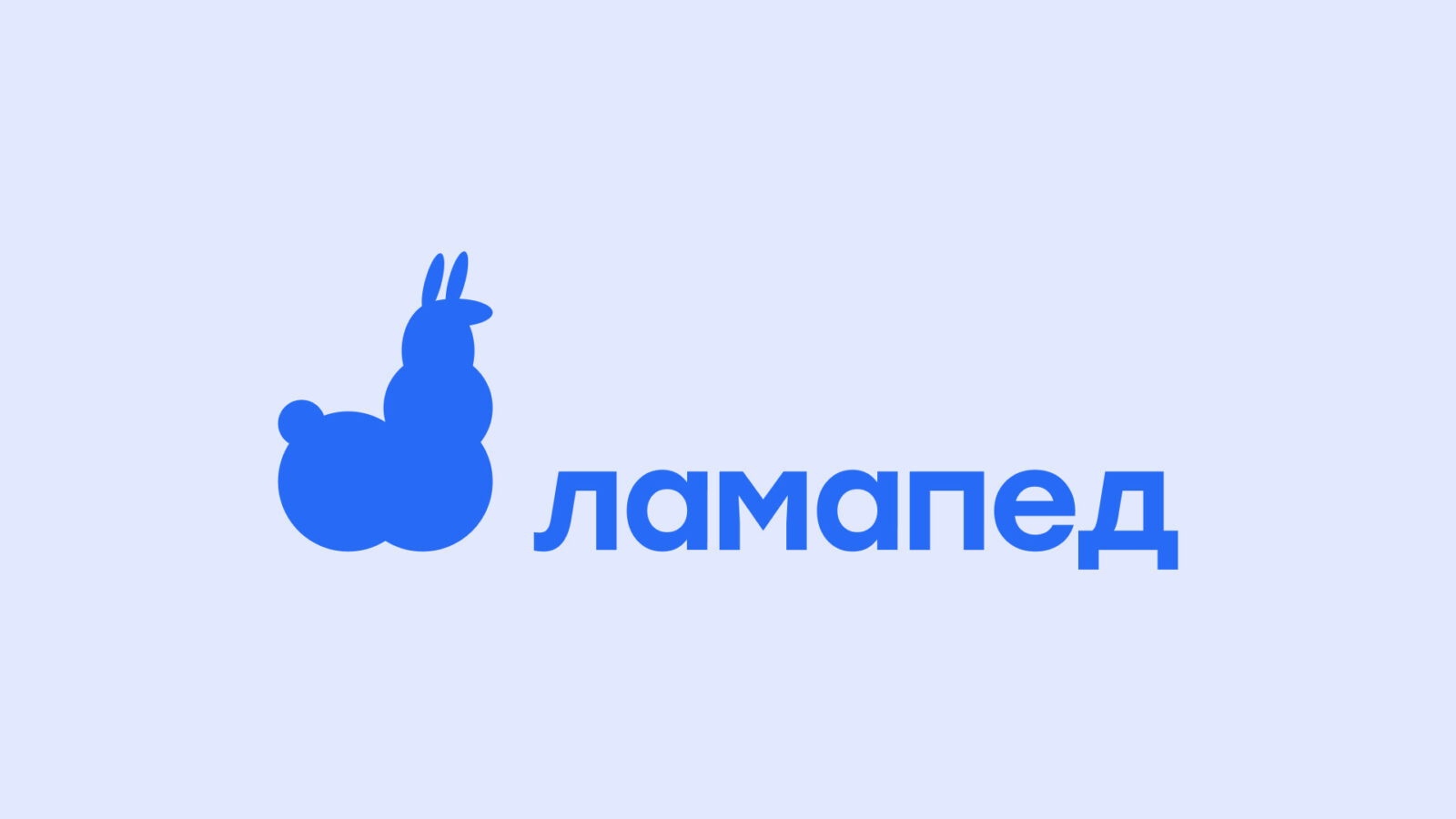
In the logo, I decided to immediately include the image of a llama. However, it would not be entirely correct to dwell only on this image; this lama would not be unique among other lamas and would not be memorable among the audience. Stopping at this decision could lead to the creation of an icon rather than a corporate logo. Ultimately, I decided to put a special and subtle metaphor into the image of the llama.
I see and perceive speech therapists as people, after whose help patients forget about discomfort in their speech and begin to feel lightness and relief in their communication with other people. Feelings of relief and lightness are associated with air, clouds and sky.
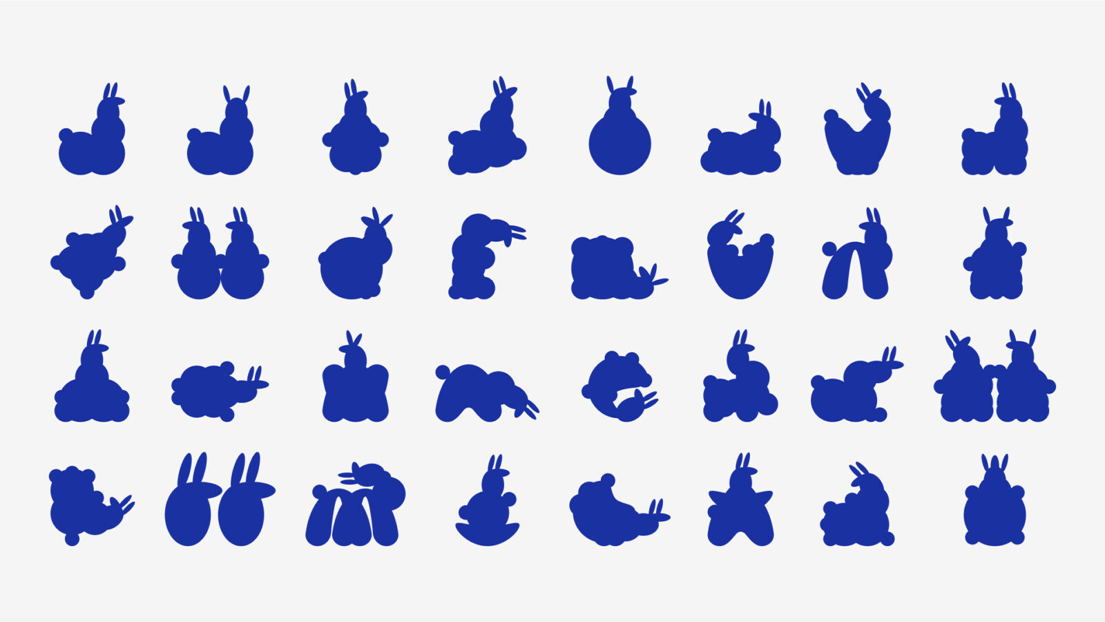
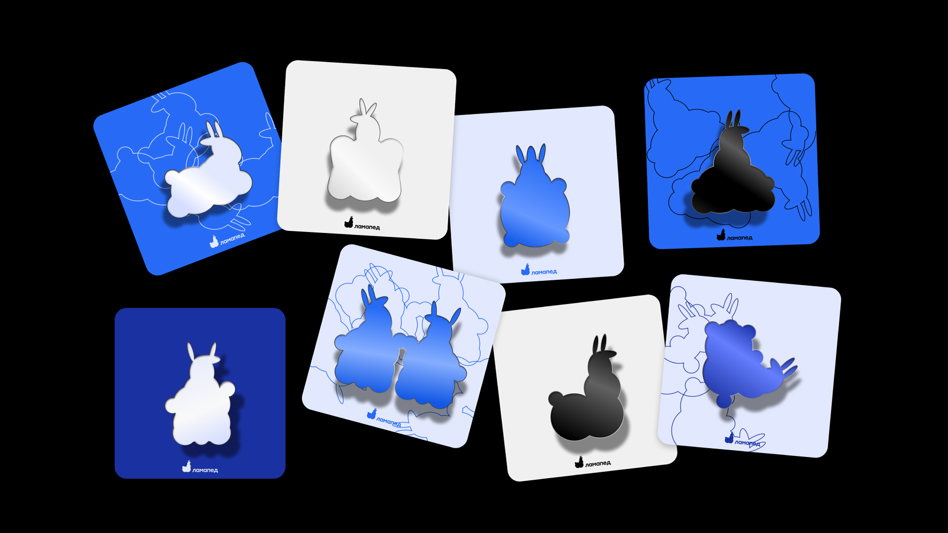
Based on all of the above, I decided to depict the llama as a cloud. In this metaphor you can also see the similarity of the two images, namely the pimply structure of the cloud and the pimply fur of the llama.
identity
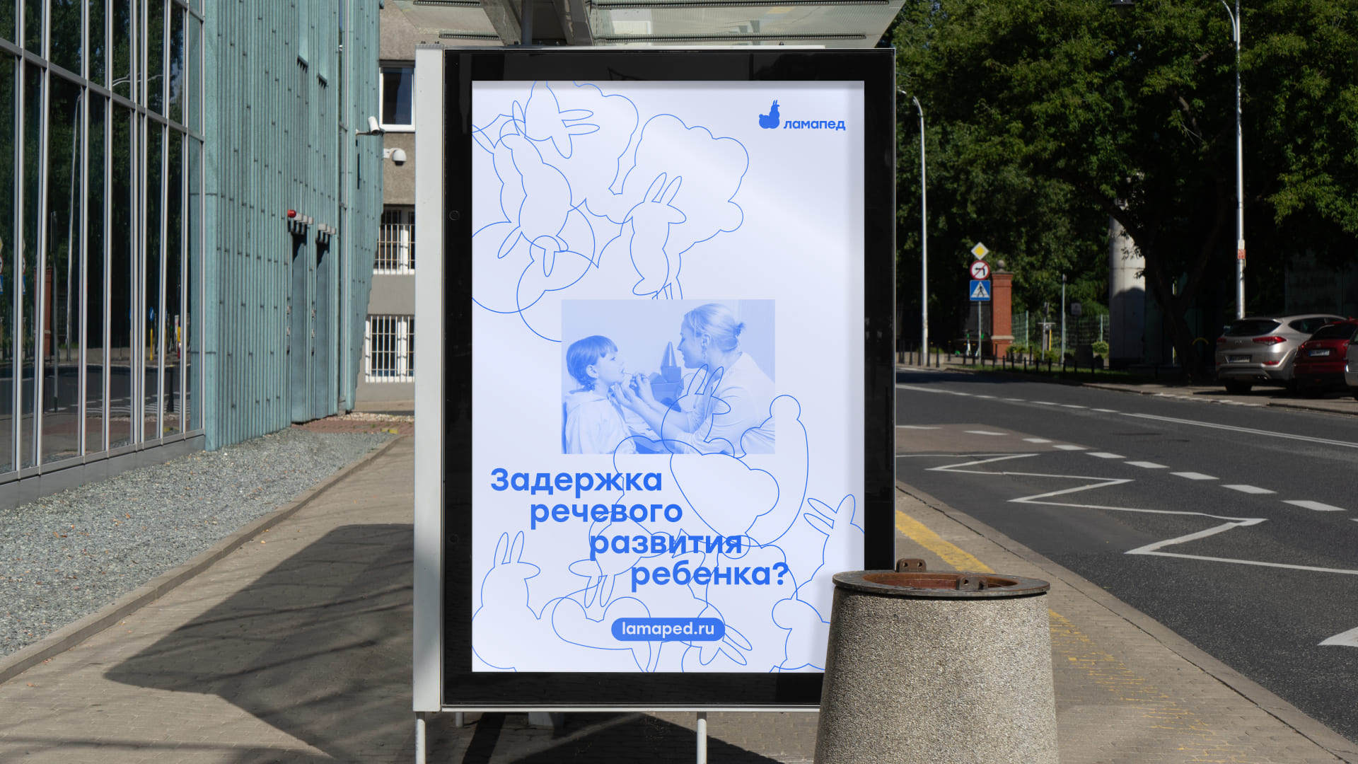
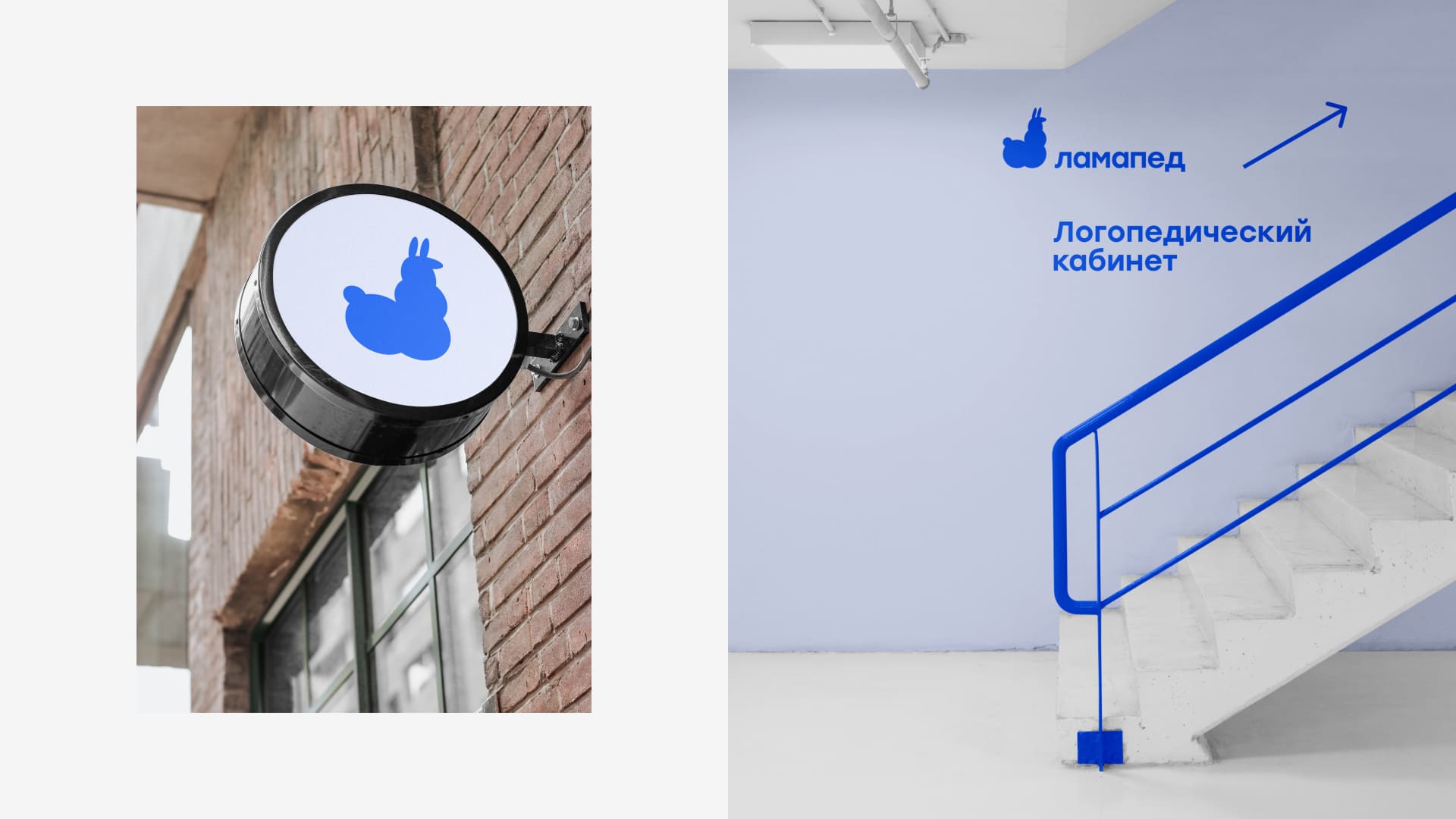
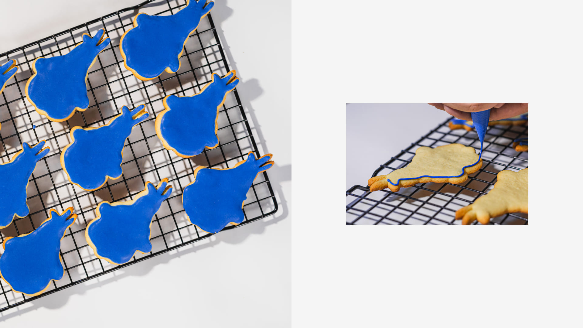
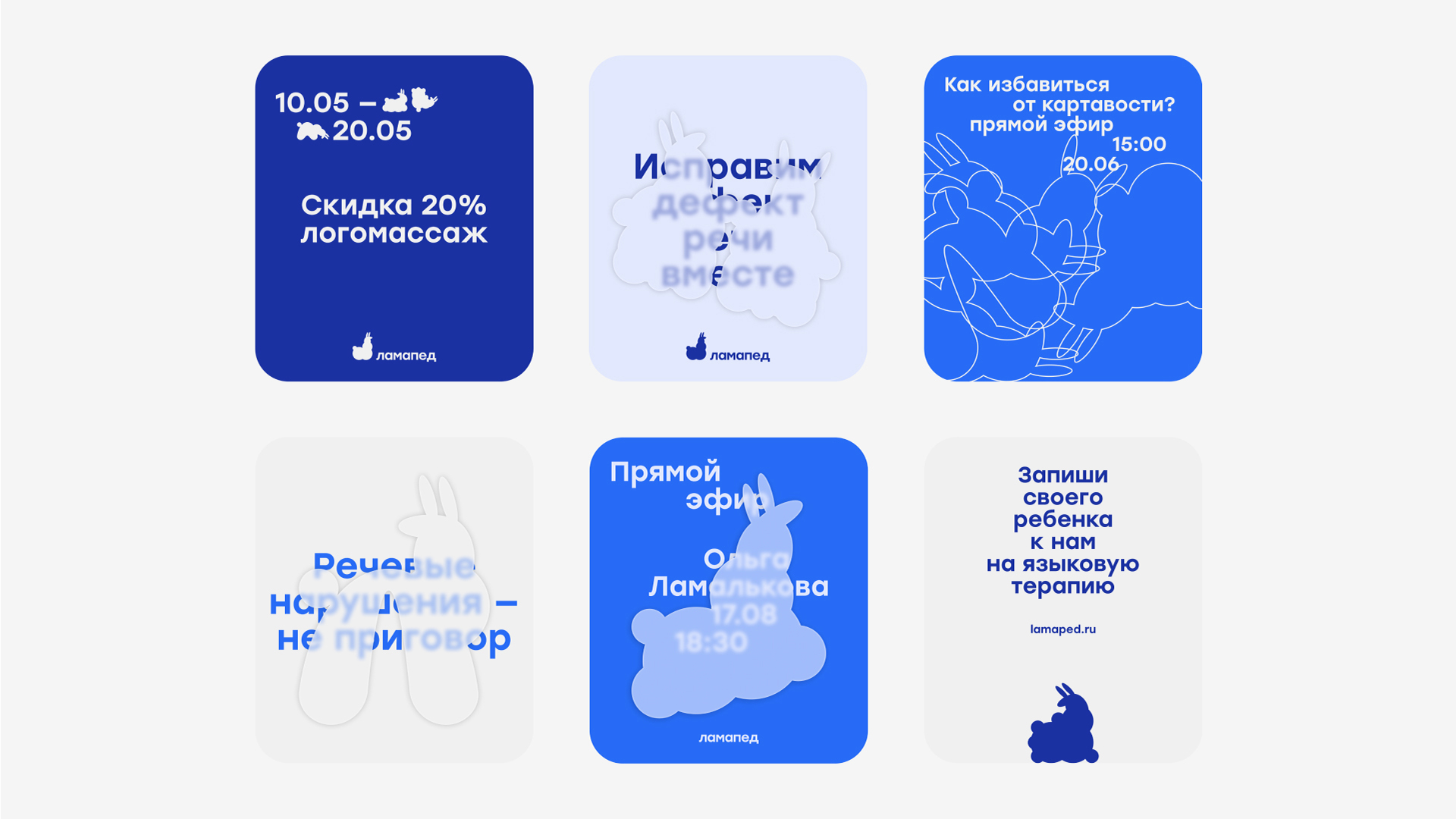
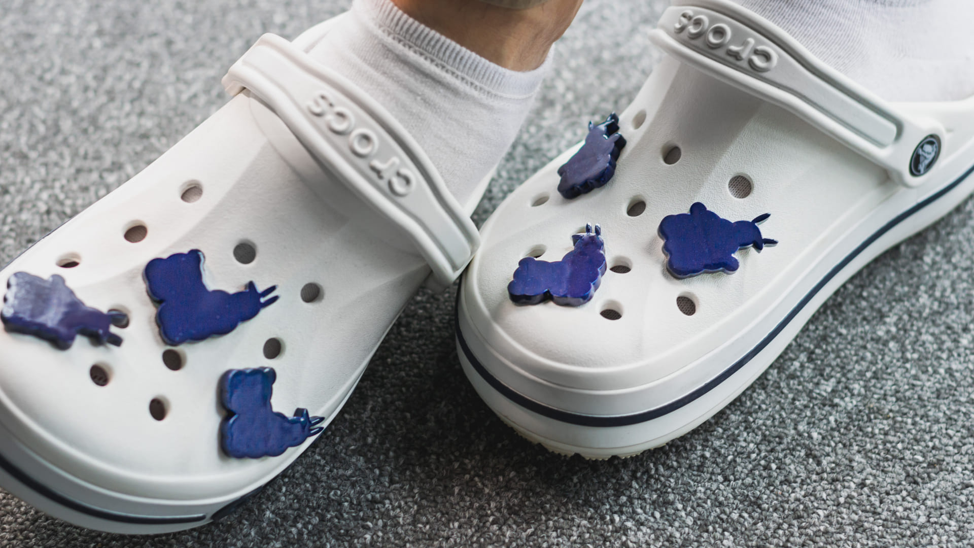
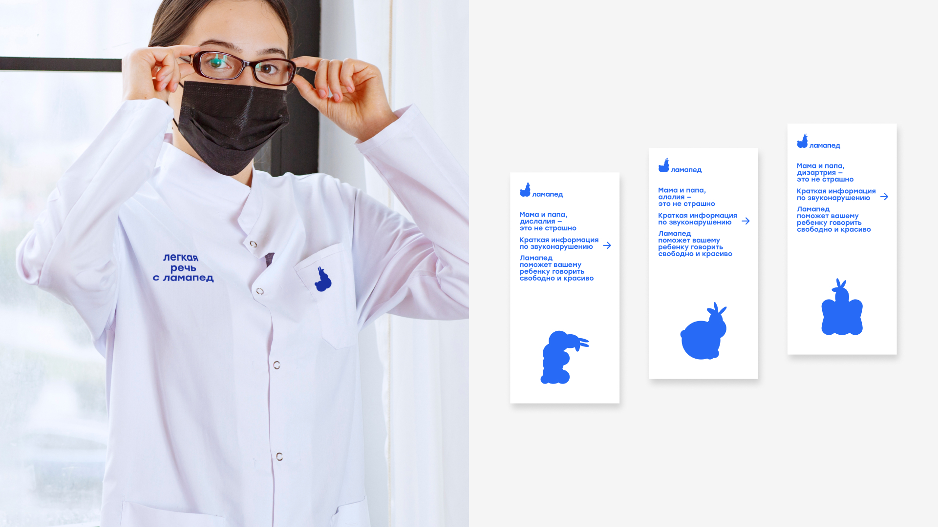
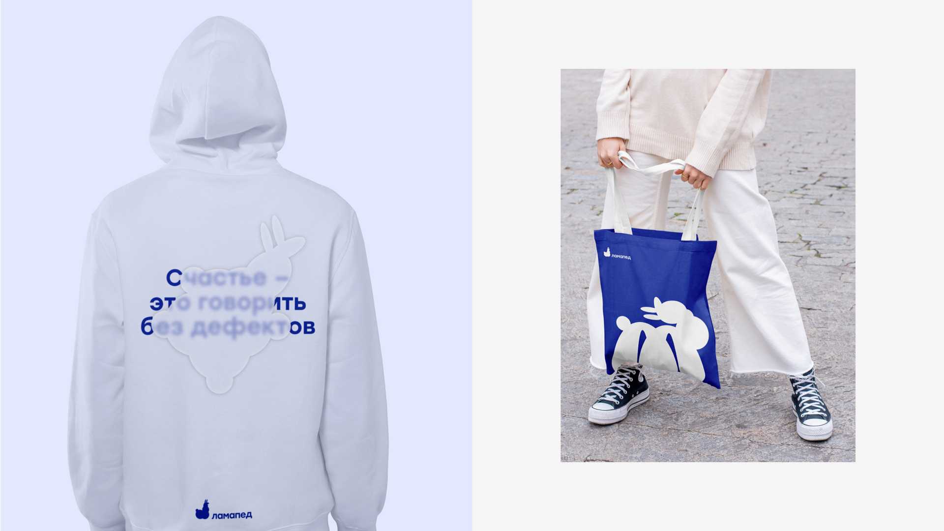
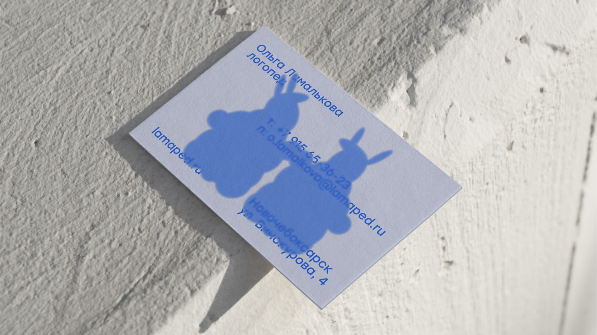
Not just a logo was developed, but a system of cloud llama logos, which became a visual system for the corporate identity of the speech therapy room.
name
Lamaped is a combination of two words: “lama” and “logoped”. In addition, this name is a reference to children’s pronunciation of the word “speech therapist” with a violation of sound pronunciation, thereby resulting in the word “lamaped”.
colors
The identity uses three primary colors of blue, which visually refer to the sky and evoke a feeling of reliability and trust. In addition to the primary colors, there are additional colors: black, white and gray.

CREDIT
- Agency/Creative: Ivan Polysaev
- Article Title: Ivan Polysaev Creates Identity of the Speech Therapy Office “Lamaped”
- Organisation/Entity: Freelance
- Project Type: Identity
- Project Status: Non Published
- Agency/Creative Country: Russia
- Agency/Creative City: Moscow
- Market Region: Asia, Europe, Global
- Project Deliverables: 2D Design, Art, Art Direction, Brand Creation, Brand Design, Brand Experience, Brand Identity, Brand Naming, Brand Strategy, Branding, Design, Drawing, Graphic Design, Identity System, Illustration, Logo Design
- Industry: Health Care
- Keywords: WBDS Creative Design Awards 2025/26 , branding, logo design, design, identity, art direction, naming, design system, graphic design
-
Credits:
art-director/designer: ivan polysaev
food-bloger/photographer: ilya polysaev
3D printing engineer: dmitriy dankin


