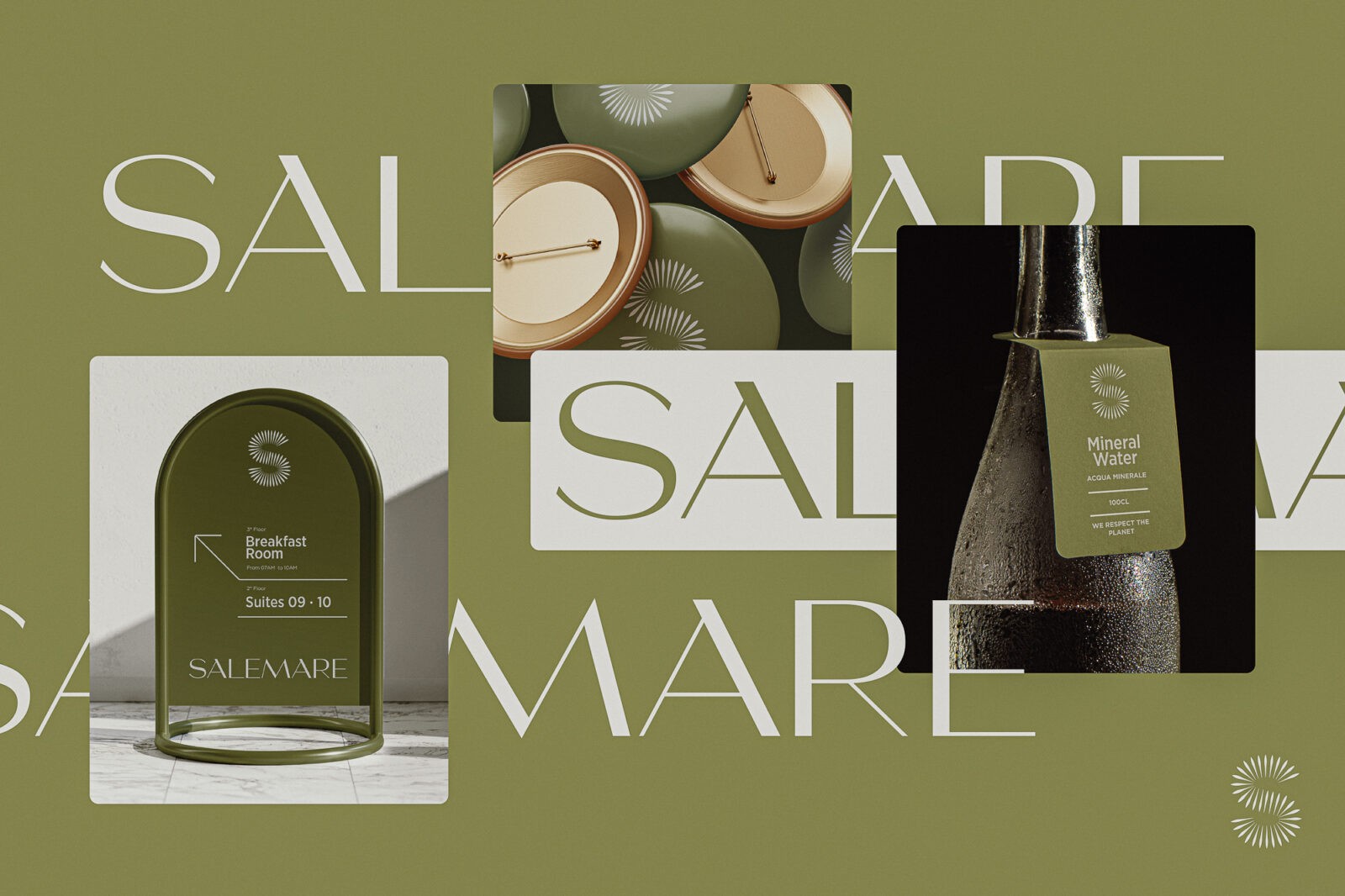
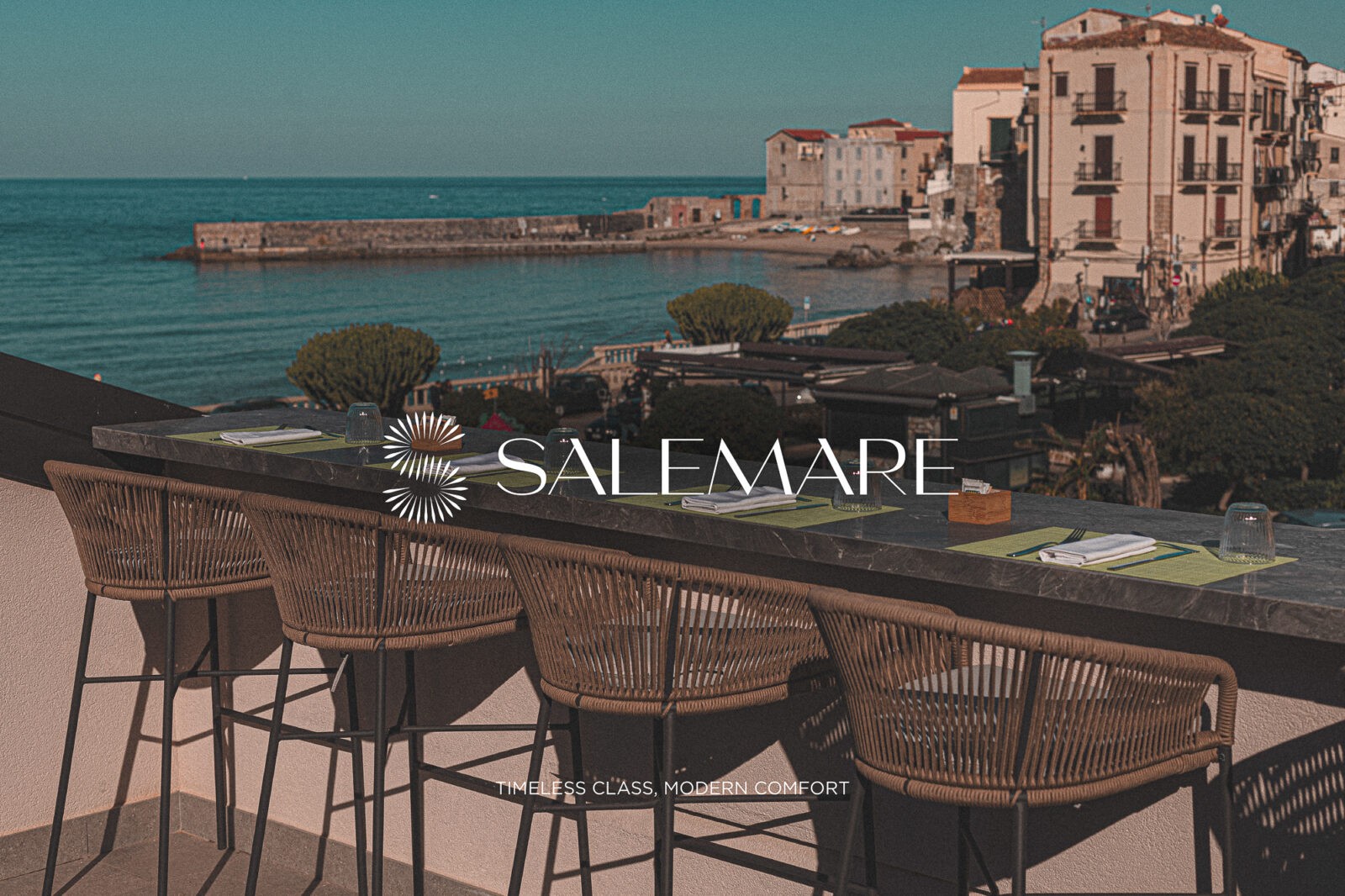
The brand design project for Salemare Suites was born with the goal of enhancing a place of rare beauty: Cefalù, a true jewel of the Mediterranean. The visual and narrative identity of the brand is deeply intertwined with the unique atmosphere of this Sicilian town, renowned for its crystal-clear sea, millennia-old history, and the charm of its ancient village, a UNESCO World Heritage Site.
Salemare is the evolution of a family tradition deeply rooted in the hospitality sector. Domenico and Giuseppe manage Salemare with passion and dedication, following the path set by their parents, Santo and Giovanna, who are still actively involved in the business, keeping the family tradition and its values alive
The name Salemare encapsulates the essence of Cefalù: “sale” (salt) represents the Mediterranean soul, filled with the scents and breezes of the sea, while “mare” (sea) celebrates the inseparable connection to the pristine waters that embrace the village.
This simple yet sophisticated name communicates a perfect balance between local authenticity and refinement, inviting guests to experience a connection deeply rooted in the land.
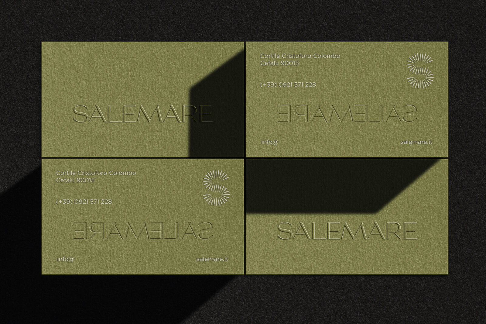
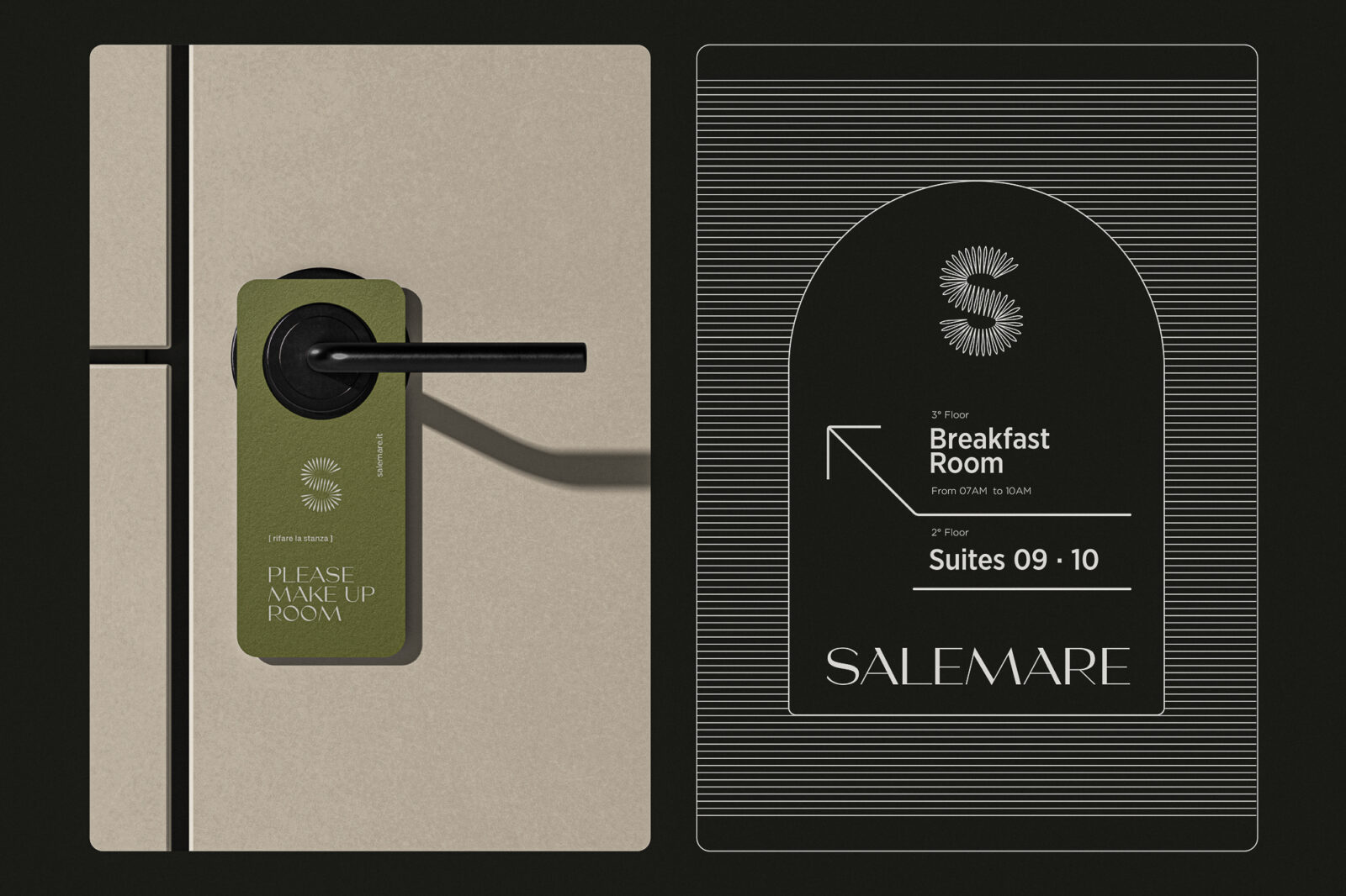
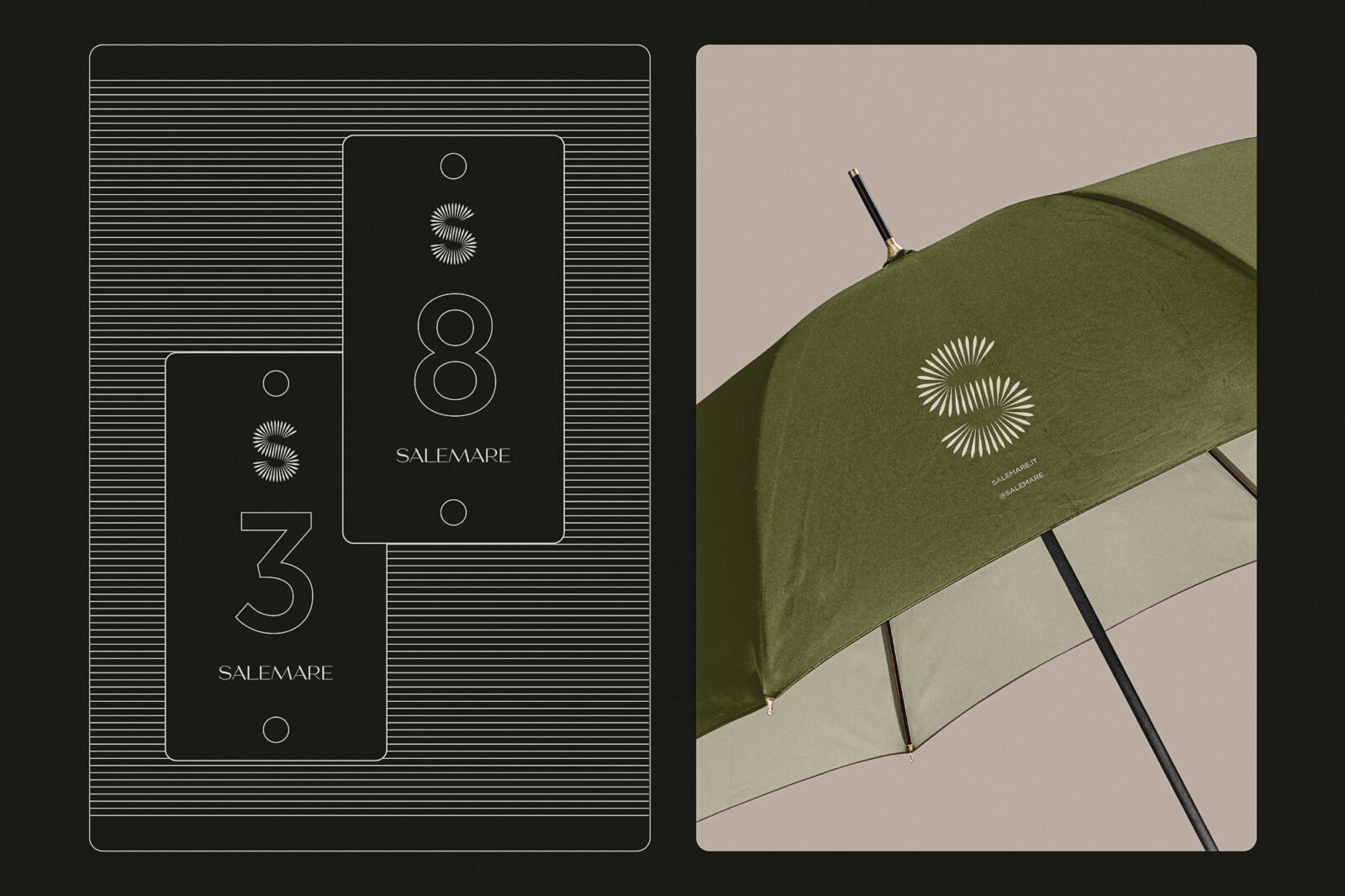
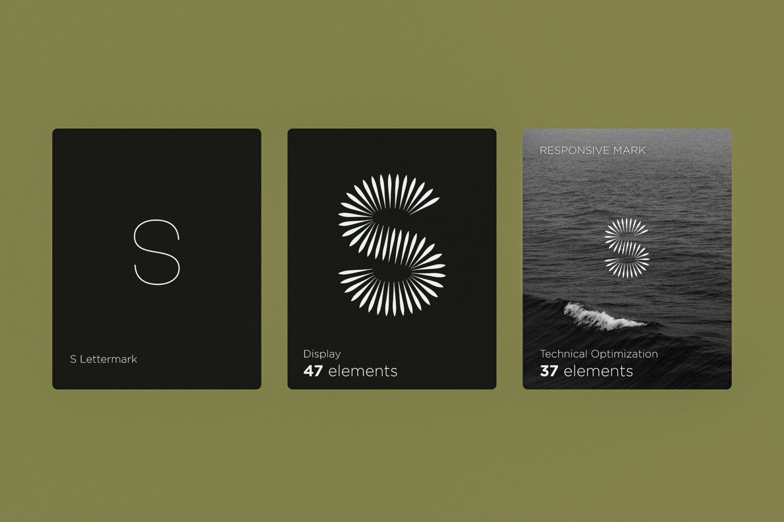
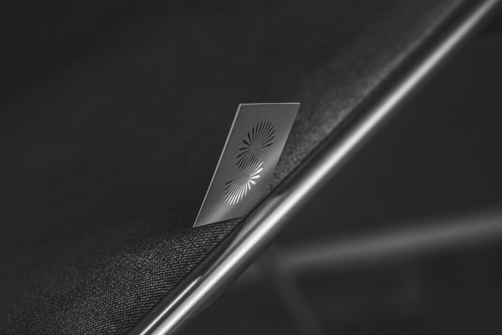
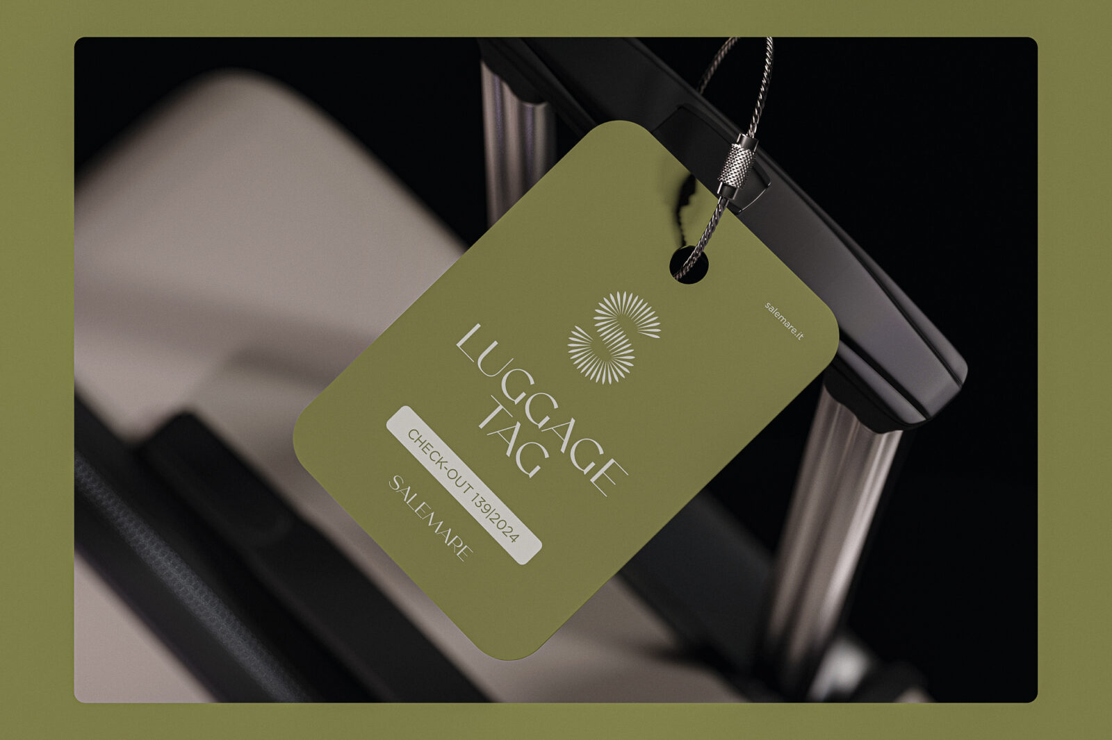
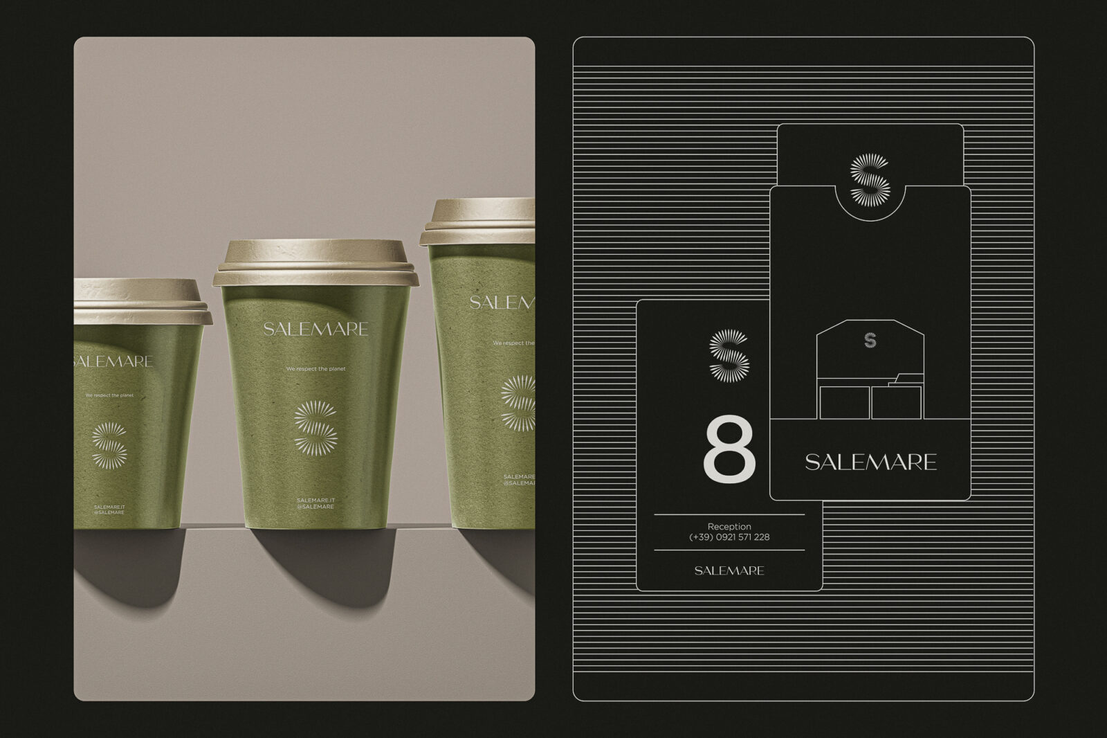
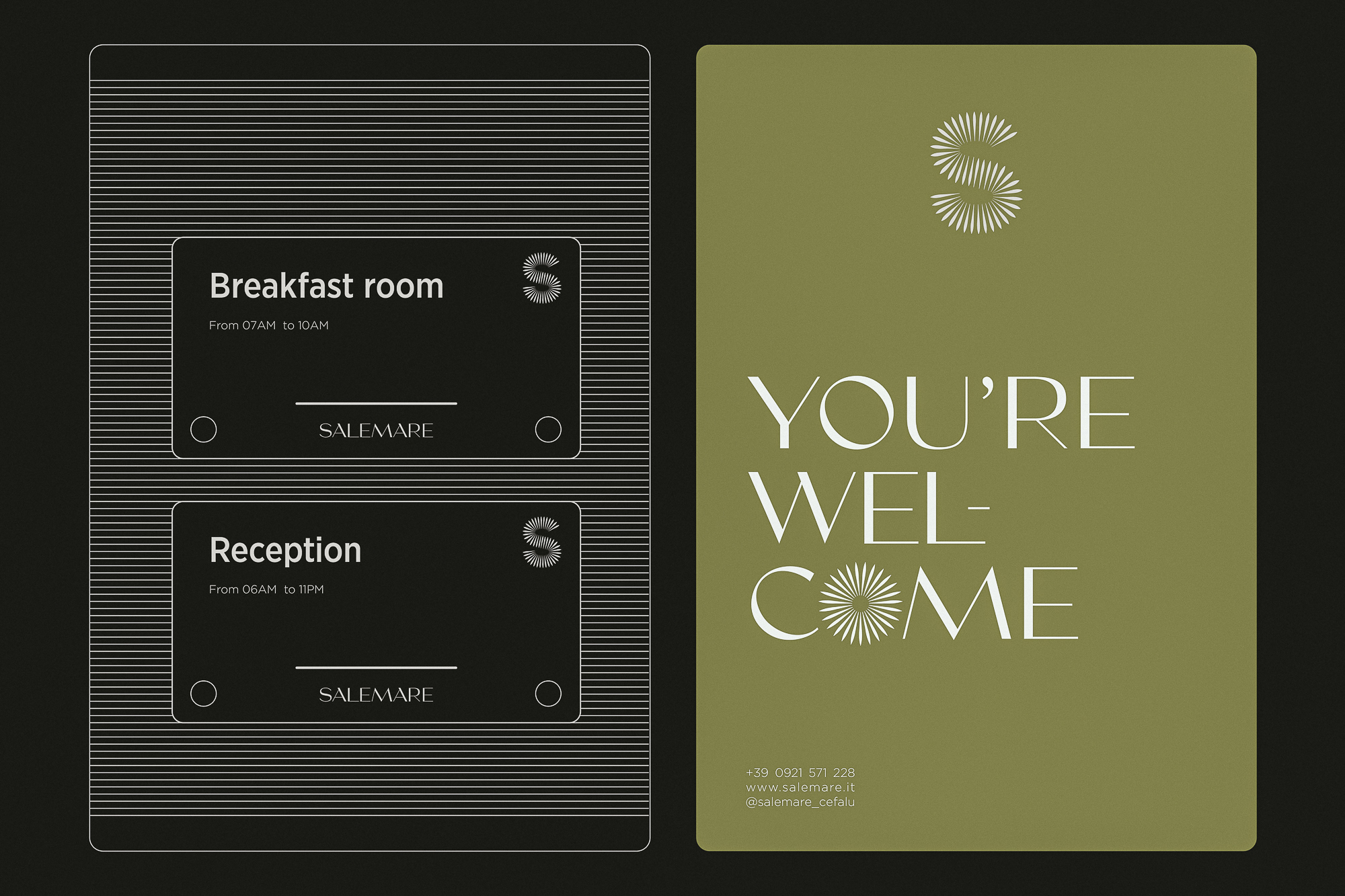
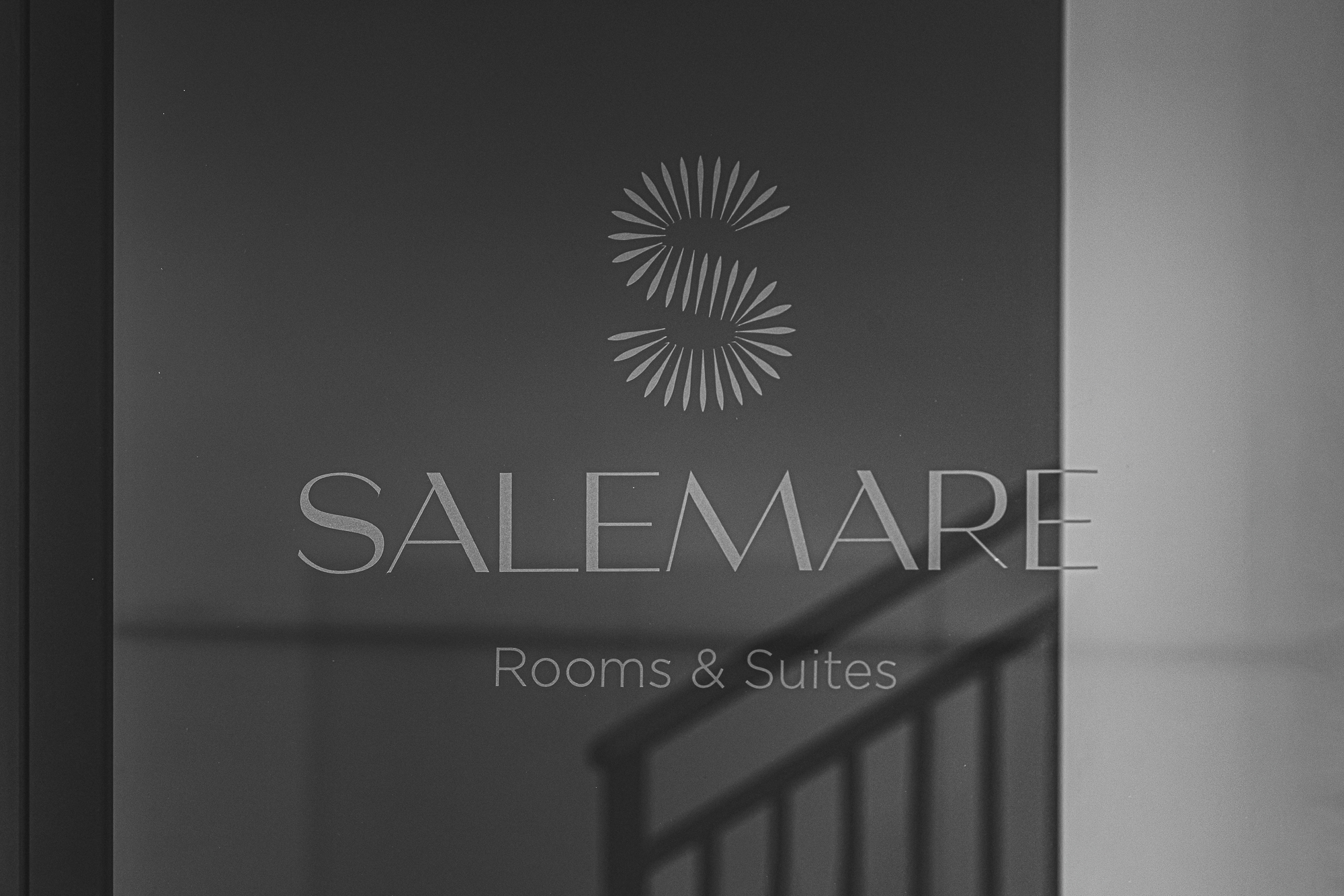
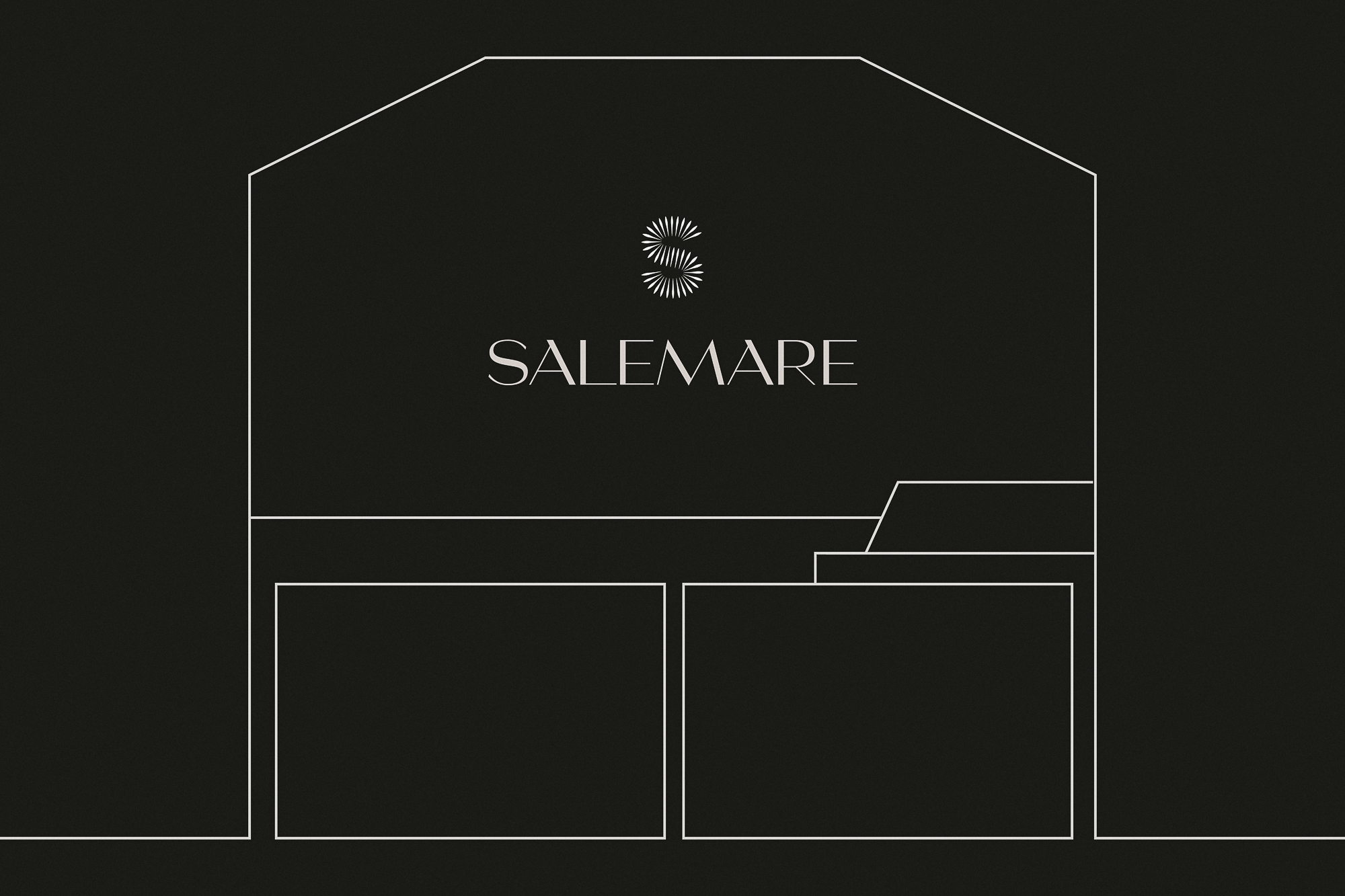
The logo, a stylized “S” composed of radial shapes, evokes the sun’s rays and the gentle strokes of fingers drawing patterns in the sand. This visual symbol conveys warmth, tranquility, and the essence of vacation, perfectly aligned with the spirit of Cefalù.
Initially I created a version with 47 elements but through careful refinement I optimized it to a version with 37 elements without compromising its visual appeal. This allowed me to maintain aesthetic integrity as both versions look identical at a glance, streamline functionality since the optimized version is lighter and ideal for digital use and print, and ensure brand consistency as the core message and recognizability of the brand remain unchanged.
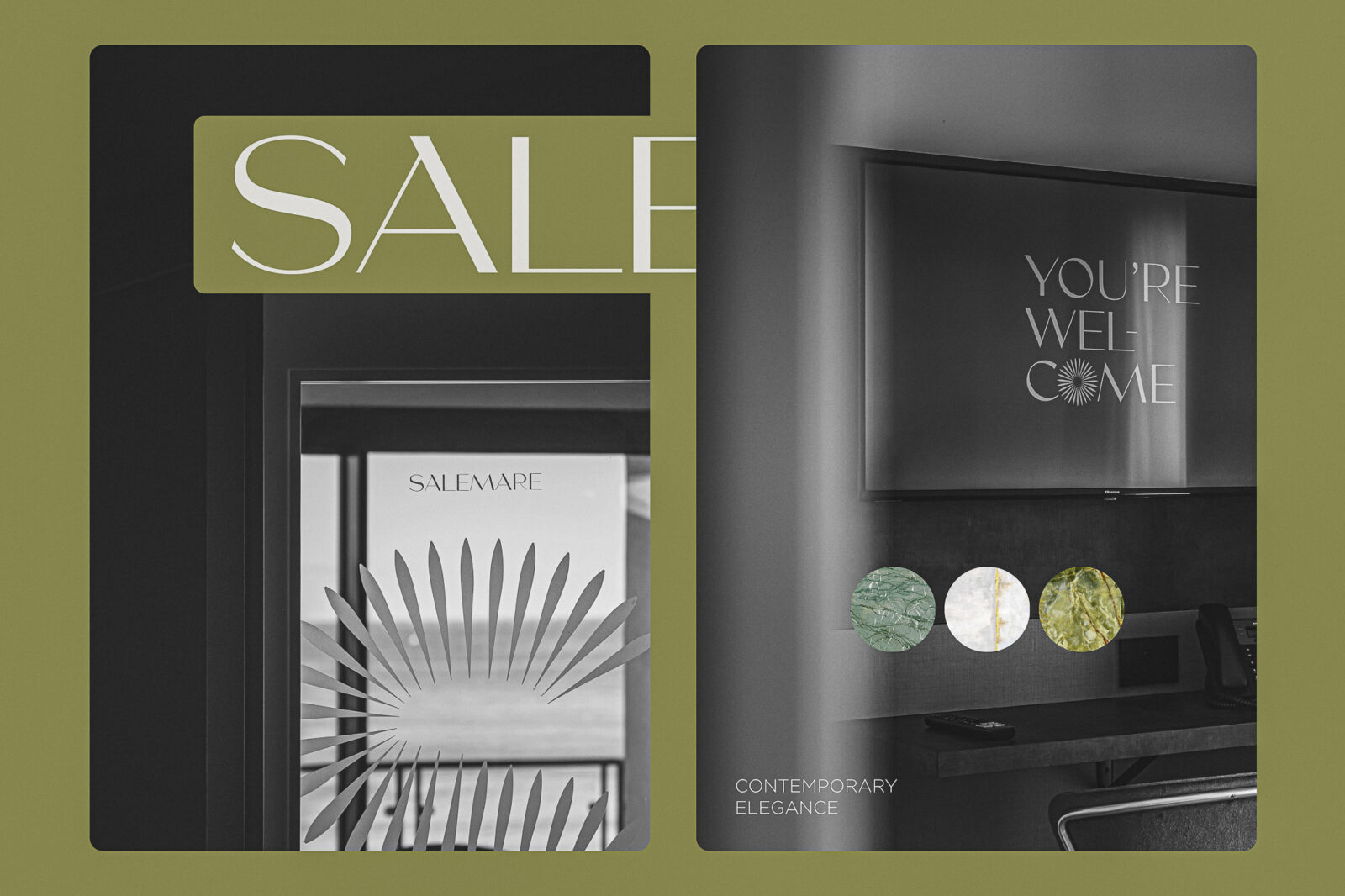
The olive green color palette, complemented by pure white accents, mirrors the natural hues of the Mediterranean landscape, harmonizing with the materials chosen for the suites’ interior design.
The typography, an elegant modern serif font, combines refined details with harmonious proportions. This choice reflects the distinctive style of the suites: a fusion of contemporary comfort and timeless tradition.
Salemare Suites caters to a discerning and sophisticated audience: an international and Italian clientele composed of couples, professionals, and luxury travelers seeking an exclusive retreat. These guests value refined design, modern comfort, and the opportunity to enjoy an authentic experience immersed in a unique cultural and natural setting.
“Timeless Class, Modern Comfort” encapsulates the essence of Salemare: a place where the timeless charm of Cefalù meets contemporary comfort and the beauty of exclusive design.
Salemare Suites is more than just a destination; it is an experience. A place that celebrates the magnificence of Cefalù and its extraordinary ability to rejuvenate the soul through its authentic and timeless beauty.



CREDIT
- Agency/Creative: HUB87 - Logo & Creative Studio
- Article Title: Salemare Suites Brand Design Creation by HUB87 Logo & Creative Studio
- Organisation/Entity: Creative
- Project Status: Published
- Agency/Creative Country: Italy
- Agency/Creative City: Rome
- Project Deliverables: Brand Creation, Brand Identity
- Industry: Hospitality
- Keywords: WBDS Creative Design Awards 2024/25 , Identity , Brand Design Creation , Logo, Typography, Color palette, Symbolism, Iconography, Textures, Layout
- Keywords: WBDS Creative Design Awards 2024/25 , Identity , Brand Design Creation , Logo, Typography, Color palette, Symbolism, Iconography, Textures, Layout


