To commemorate the 15th Anniversary of Big Peat, the award-winning Islay Blended Malt Scotch Whisky, a unique limited edition was designed to honour the brand’s heritage while offering a bold, innovative twist. This special release, finished in Red Wine Casks, was bottled at 50% ABV, presenting a rich and distinctive Whisky profile. The packaging design aimed to encapsulate the spirit of Big Peat and its remarkable journey over the last 15 years, balancing tradition, innovation, and visual appeal.
The project brief called for a packaging solution that would celebrate Big Peat’s milestone with a blend of premium aesthetics and an interactive, engaging customer experience. The design needed to emphasise the Whisky’s unique Red Wine Cask finish and its rich, deep colour while reflecting Big Peat’s bold, approachable character and its strong connection to Islay. The aim was to create a collectible, giftable pack with high shelf appeal, utilising premium finishes such as black and gold foil to highlight the Whisky’s limited edition status and exceptional quality. Additionally, the packaging was tasked with incorporating storytelling elements to immerse customers in Big Peat’s history and the spirit of Islay.
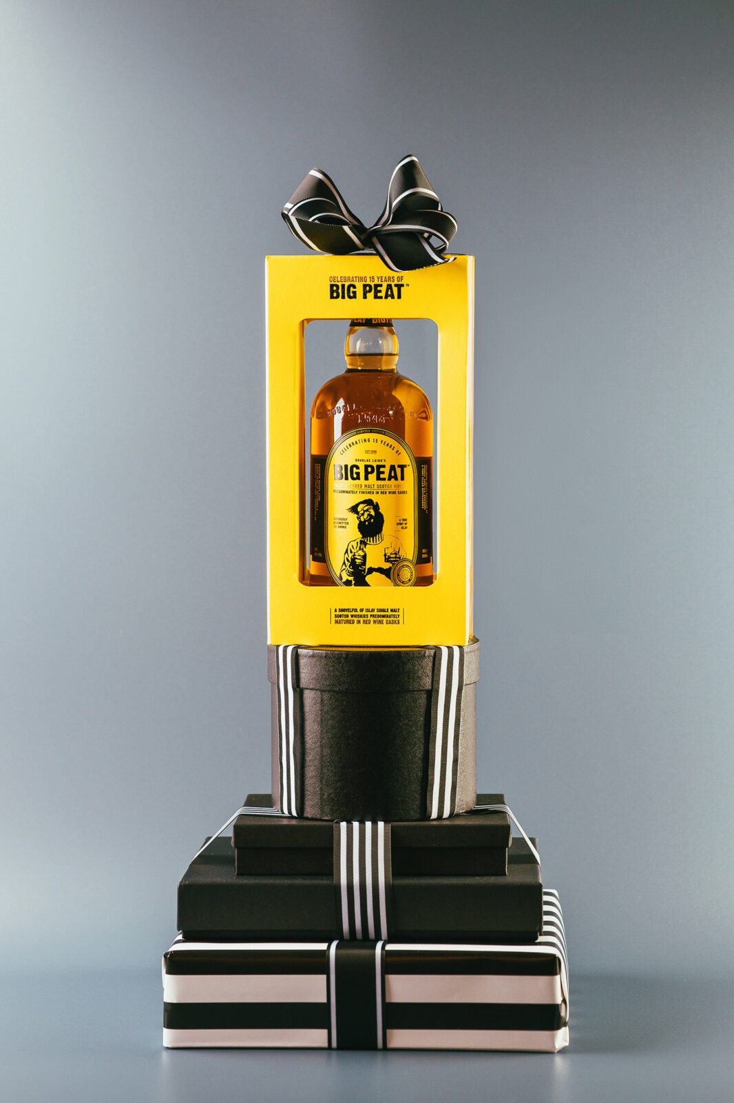
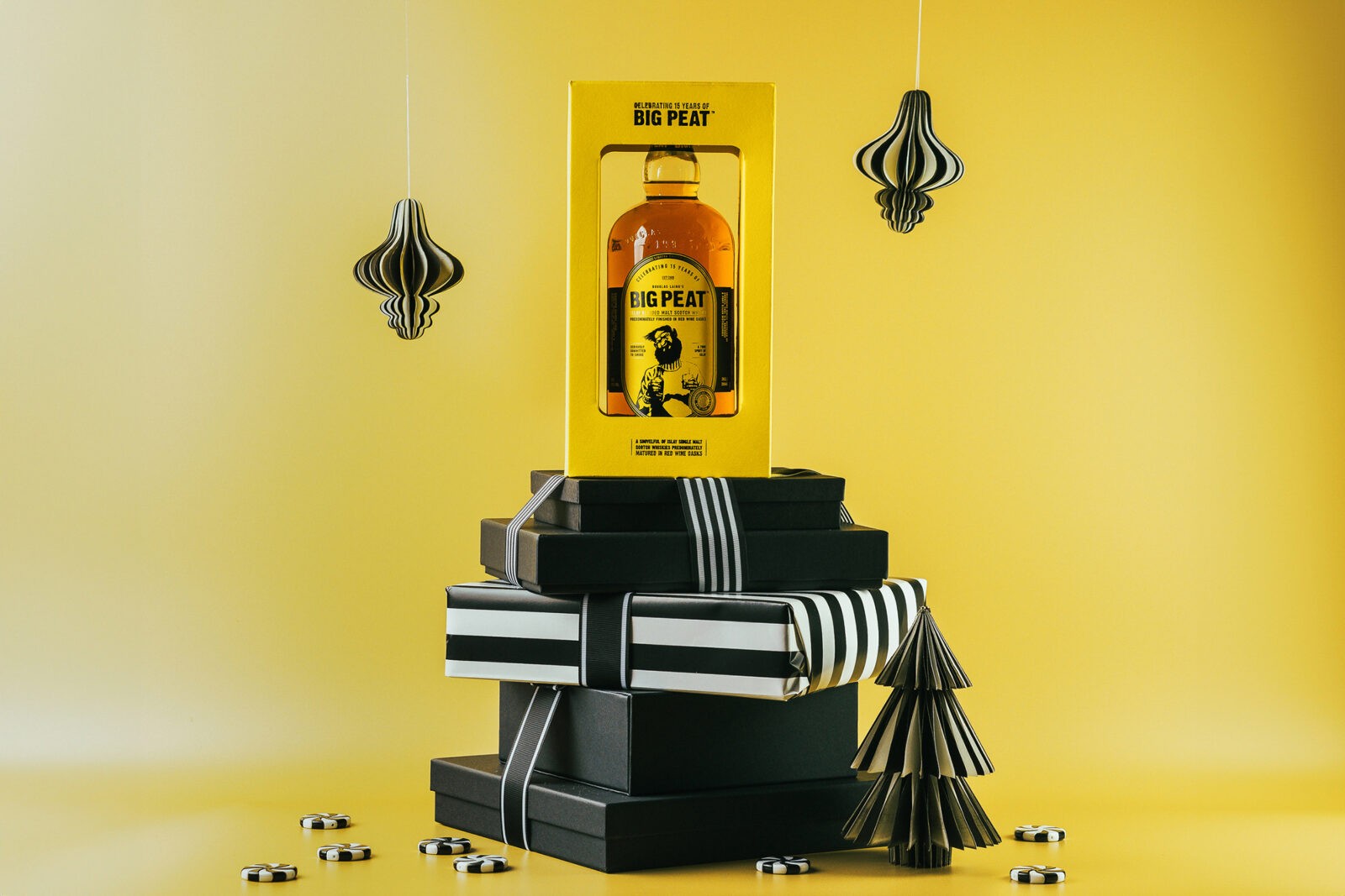
The design was built around the iconic yellow and black brand colours, using a particularly vibrant yellow to ensure strong visual impact on retail shelves. This palette, synonymous with Big Peat, was elevated with premium finishes and innovative design details.
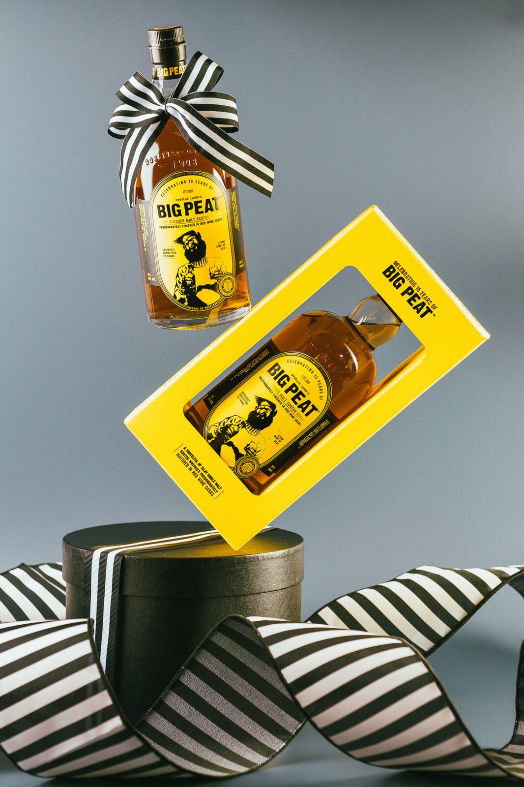
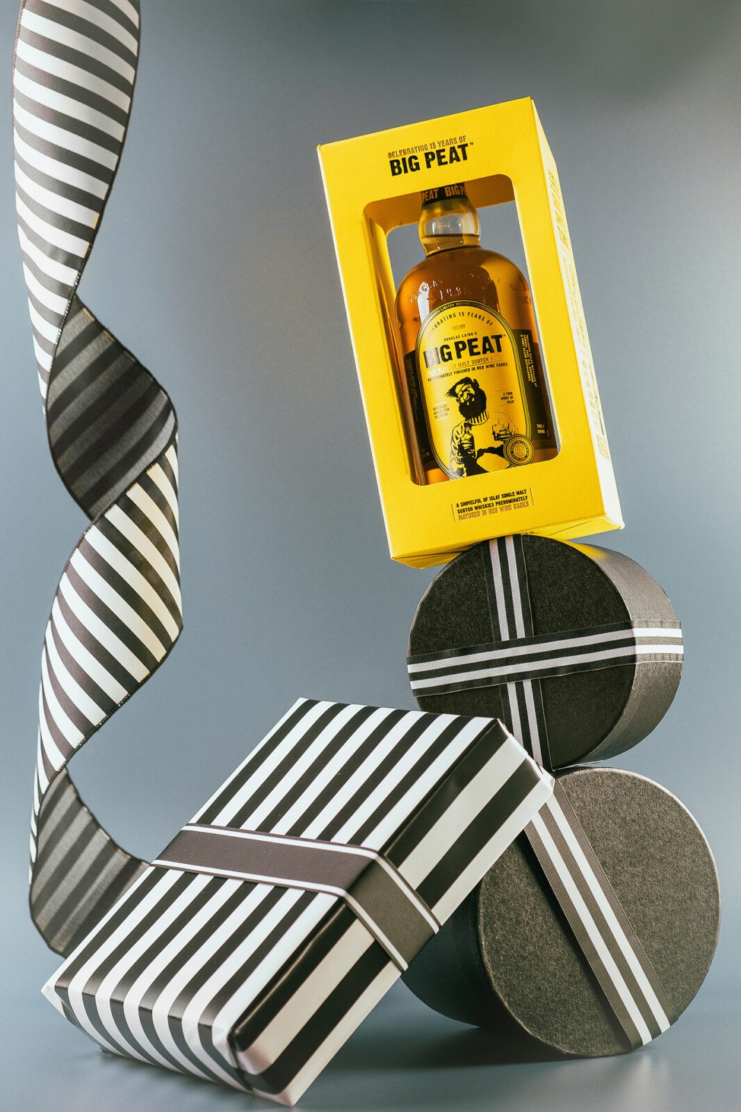
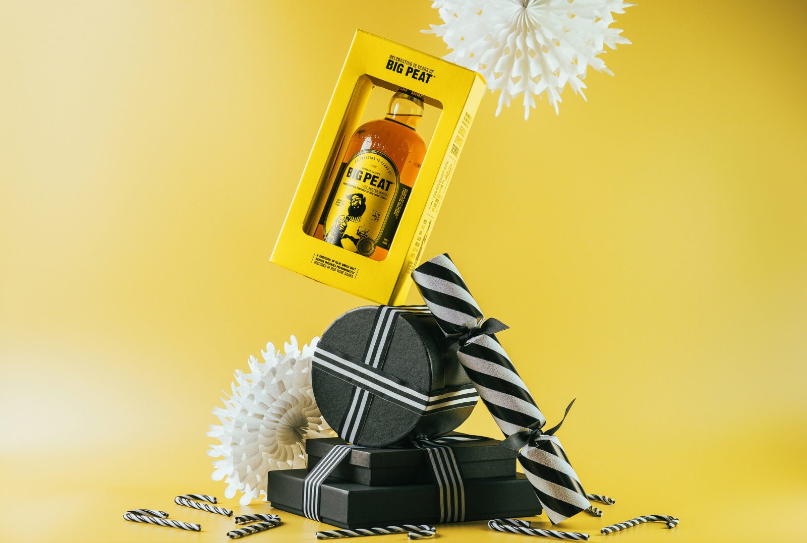
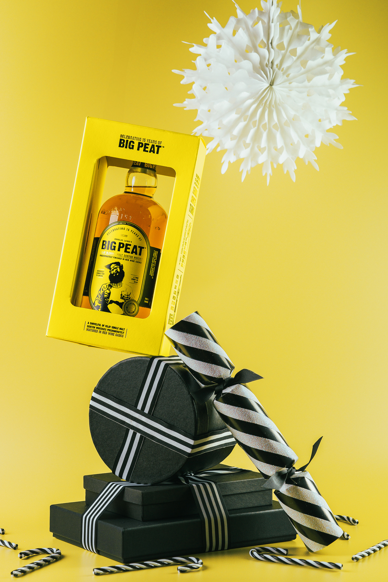
The bespoke carton was engineered as both a protective and an interactive display piece. A windowed design showcases the bottle and the liquid’s beautiful deep hue colour, giving a glimpse of the Whisky’s Red Wine Cask finish. Black and gold foil details enhanced the premium aesthetic while creating a tactile experience. The carton features 15 discoverable points, each revealing a unique fact or story about Big Peat, the Isle of Islay, or the Whisky itself. These elements were strategically placed to be revealed as the carton is opened, adding an engaging, narrative-driven unboxing experience.
The bottle label was crafted in a unique shape, further distinguishing it as a limited edition. The design prominently features Big Peat himself, rendered in black foil, and other key elements highlighted in gold foil. These finishes give the label a luxurious texture while maintaining the approachable, quirky character that Big Peat is known for. The label and windowed carton work together harmoniously to spotlight the Whisky’s deep, red wine-enhanced colour, inviting customers to appreciate the product’s craftsmanship before they even open the bottle.
The combination of a vibrant yellow base, intricate black and gold foil details, and the interactive narrative elements ensure that the packaging commands attention both on the shelf and in the hands of customers. The premium finishes and thoughtful design elevate the Anniversary release as a keepsake for collectors and a memorable gift option.
The packaging effectively communicates the premium nature of the product through its elegant yet playful design, captures the essence of Big Peat’s bold and approachable personality while commemorating a significant brand milestone, and engages customers with a multi-layered storytelling experience that fosters brand loyalty.
Cara Laing, Managing Director at Douglas Laing commented, “At the heart of every great Scotch Whisky is a story waiting to be told. Our new Big Peat 15th Anniversary packaging captures the essence of that story perfectly. The yellow and black impactful, premium design is sleek, bold, and timeless – creating a lasting impression before the first sip of Big Peat is ever taken. We are delighted with the packaging design created – it is bang-on brief and has ensured amazing shelf-standout and presence. We could not have hoped for more.”

CREDIT
- Agency/Creative: Douglas Laing & Co.
- Article Title: Douglas Laing Celebrates 15 Years of Big Peat with Stunning Anniversary Packaging
- Organisation/Entity: In-House
- Project Status: Published
- Agency/Creative Country: United Kingdom
- Agency/Creative City: Glasgow
- Project Deliverables: Packaging Design
- Industry: Food/Beverage
- Keywords: WBDS In-House Design Awards 2024/25 Packaging Design , Packaging Design , Product Extension
- Keywords: WBDS In-House Design Awards 2024/25 Packaging Design
-
Credits:
Designer: Claire Coetzee
Big Peat Brand Manager: Chloe Wood
Carton production: J. Thomson Colour Printers
Label printing: CCL Label
Photographer: Daniel McAvoy
Render Video: Vijay Jethwa


