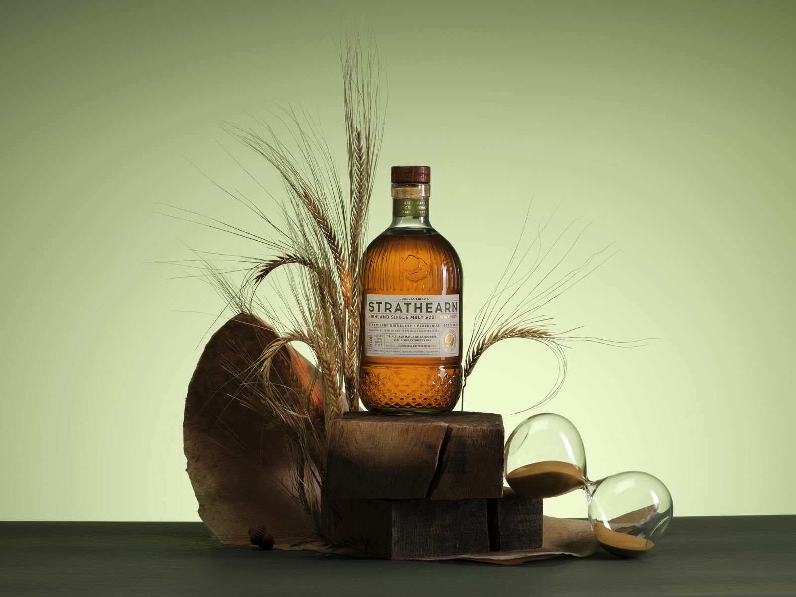
The Strathearn Single Malt bottle design is a masterclass in fusing nature-inspired aesthetics with masterful craftsmanship, creating a visual and sensory experience within the Whisky packaging world. By channelling the organic elegance of the acorn, the design captures the spirit of growth, resilience, and authenticity, establishing a benchmark in the art of packaging for premium spirits.
At the heart of the design is the ethos: “From small acorns, great oaks grow.” This guiding principle underscores the journey from humble beginnings to extraordinary achievements. It is a philosophy that resonates not only with the crafting of the Whisky itself but also with the meticulous attention to detail that defines every aspect of the packaging. The bottle, with its acorn-inspired shape and intricate embossing, is a celebration of nature’s beauty and a reflection of this exceptional Whisky.
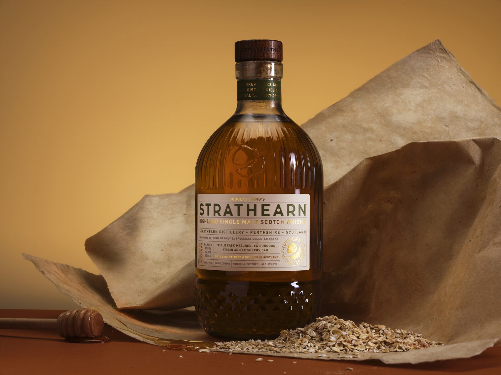
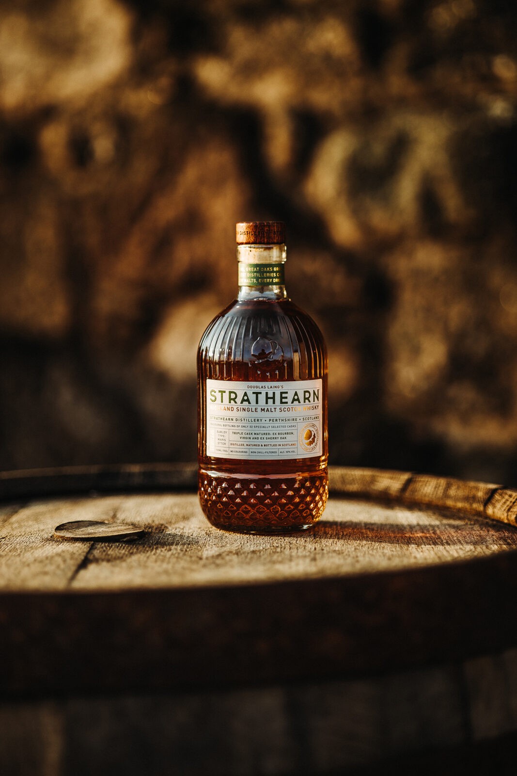
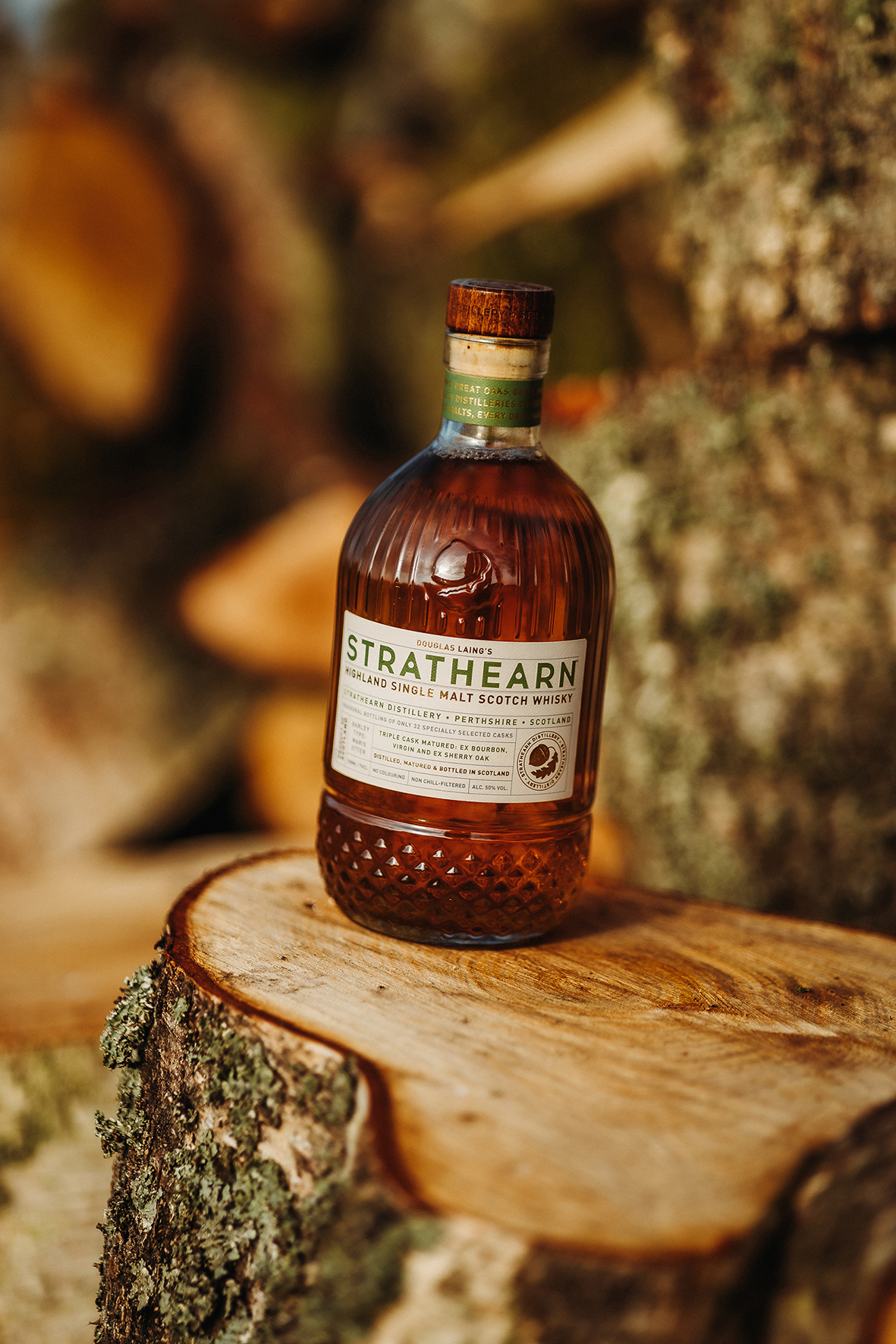
The design process began with a deep dive into the symbolism of the acorn. Representing potential, growth, and the promise of greatness, the acorn became the perfect muse for Strathearn’s vision. The bottle’s distinctive silhouette, sculpted to echo the smooth curves of an acorn, creates a timeless and organic aesthetic. This unique form sets Strathearn apart in a crowded market, offering a visual identity that is instantly recognisable and evocative.
Adding to the authenticity of the design is the bottle’s embossing, which subtly mirrors the textured surface of an acorn. This tactile detail invites consumers to engage with the bottle on a deeper level, forging a connection that extends beyond sight. The embossed elements add dimension and depth, further enhancing the premium feel of the design.
The label of the Strathearn Single Malt bottle is another triumph of design ingenuity. Carefully textured to mimic the surface of an acorn, the label transforms a visual element into a multi-sensory experience. Touch becomes an integral part of the journey, evoking curiosity and delight as consumers run their fingers across its surface. The texture not only reflects the natural inspiration behind the brand but also reinforces its commitment to authenticity.
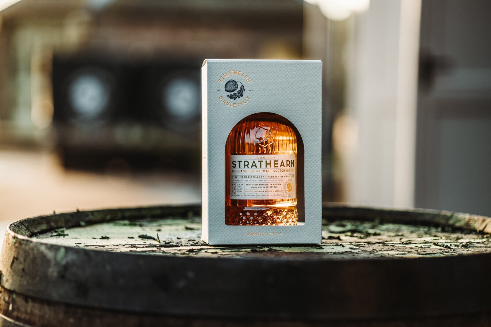
The outer packaging, designed to complement the bottle’s elegance, includes a thoughtfully positioned window that offers a preview of the treasure within. This feature strikes a balance between subtlety and intrigue, allowing the bottle to shine as the focal point. Gold foil accents, applied with precision, elevate both the label and the outer packaging, exuding sophistication and signalling the premium quality of the Whisky inside.
The Strathearn Single Malt bottle is not just a vessel for whisky – it is a celebration of the craftsmanship and heritage that define the brand. Inside this beautifully designed bottle lies a Whisky crafted with exceptional care, using only the finest ingredients and techniques honed over generations. Aged to perfection, each drop offers a nuanced and unforgettable sensory experience that mirrors the artistry of the packaging.
The acorn metaphor extends to the Whisky itself, representing the dedication and patience required to nurture greatness. Just as an oak grows from a single acorn, the Whisky’s journey from grain to glass is a testament to Strathearn’s unwavering pursuit of excellence.
Exclusivity is a defining characteristic of the Strathearn Single Malt. With a limited production, the Whisky is positioned as a rare and treasured offering, appealing to connoisseurs and collectors alike. This sense of rarity is amplified by the bottle’s extraordinary design, which feels as precious as the spirit it contains.
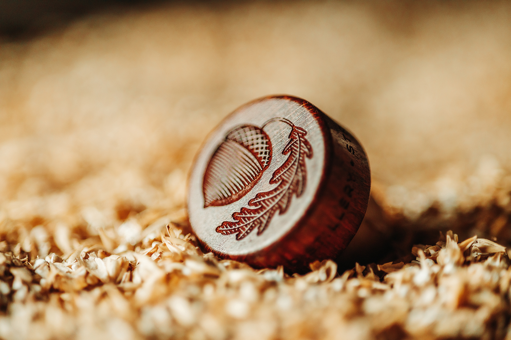
Cara Laing, Managing Director at Douglas Laing commented, “We believe that truly special Single Malt Scotch Whisky deserves packaging as extraordinary as the spirit inside. Our new Strathearn Single Malt design reflects our commitment to genuine craftsmanship and innovation, offering an experience that is as visually stunning as it is unforgettable. From the acorn glass bottle to the premium, textured labels and debossed natural wood stopper, our obsession for quality and attention to detail is perfectly brought to life via the packaging design. This has been reflected in the market response with the entire first batch selling out within 8 months – something we did not expect to achieve – but is testament to the quality of the design.”

CREDIT
- Agency/Creative: Douglas Laing & Co.
- Article Title: Douglas Laing & Co Elevates Whisky Branding with Strathearn’s Nature-Inspired Packaging
- Organisation/Entity: In-House
- Project Status: Published
- Agency/Creative Country: United Kingdom
- Agency/Creative City: Glasgow
- Project Deliverables: Packaging Design
- Industry: Food/Beverage
- Keywords: WBDS In-House Design Awards 2024/25 , Packaging Design , Product Creation
- Keywords: WBDS In-House Design Awards 2024/25 , Packaging Design , Product Creation
-
Credits:
Designer: Claire Coetzee
Strathearn Brand Manager: Chloe Wood
Glass bottle Production: Vetreria Etrusca
Carton Production: Compack Cartons
Label Printing: Eurostampa
Bottle Closure: Guala Closures
Photographer: Daniel McAvoy
Render Video: Vijay Jethwa


