Ambition: Establishing Saudi Arabia as a global logistics hub
Diversifying the economy
Saudi’s Vision 2030 is a blueprint to diversify the economy and empower citizens, creating a vibrant environment for both local and international investors, and establishing Saudi Arabia as a global leader. The ambitious roadmap leverages the Kingdom’s unique strengths – its pivotal role in the Arab and Islamic worlds, its strong investment capabilities, and its strategic geographical position.
Sitting between three continents (Europe, Africa and Asia) Saudi Arabia is in a prime position to establish new, safe, and efficient maritime routes and for logistics through existing ports within the Gulf and Red Sea.
To assist in fulfilling increased demand for fast access to materials and products, and address supply chain issues highlighted and enhanced by the Covid-19 pandemic, Folk was established.
A new regional champion
Meaning ‘to travel the sea’, Folk’s initial operations would initially focus on the region with the launch of three new shipping routes for its container feeders and short-sea shipping service. Yet its long-term strategy is globally focused.
Combining a compelling product offer with an efficient, customer-centric and cost-effective service, its goal is to be operational across c.17 ports within 13 countries by 2025, and to take the number one market share position in the Middle East. Our job was to create a brand that would help them do just that.
Fast, flexible and fit-for-purpose
Targeting multiple audiences spanning B2B, B2G and regulatory entities, Folk needed a powerful, differentiating and flexible brand to ensure it would find its place in the market quickly, building credibility and positioning them for future growth – both regionally and internationally.
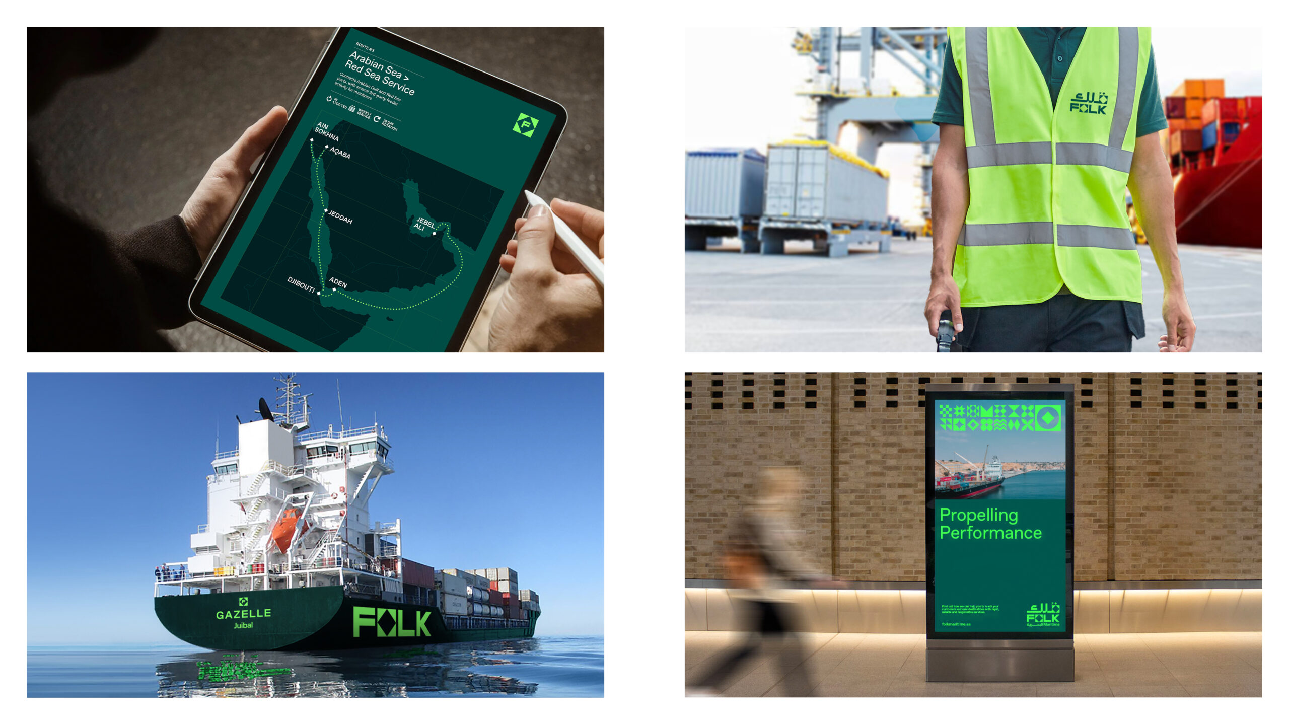
The brand needed to be equally fit-for-purpose on monumental physical executions to digital platforms, delivering a coherent brand experience at all scales, across all channels.
Key objectives
1. Proudly represent its Saudi roots
2. Credibly differentiate in a competitive market
3. Engage multiple audience groups, regionally and internationally
4. Address the safety needs of the brand
Insight: Delivering enhanced value for Saudi Arabia
A credible, differentiated positioning
Global competitors such as Maersk, COSCO and Hapag-Lloyd place reputation at the centre of their brand, leveraging both longevity and international reputation to maintain market share.
To carve out its place in the market and position itself for global success, Folk needed to stand out and differentiate itself, clearly highlighting its ‘why’ – helping to build credibility and leverage the business’ proof points to create brand value ahead of having a solid reputation within the industry.
Our audit identified key territories within the market, most of which were either saturated (service and leadership) or a pre-requisite for the sector (competitive pricing and service). ‘Innovators’ offered up an opportunity but with a constantly evolving market, it would be challenging to maintain and own. Instead, we identified a clear, new space to own within the market – ‘delivering enhanced value’.
We worked closely with the client team to define a robust strategic framework that would deliver on its business ambitions and support its commitment to outstanding service and delivery.
A bold, modern edge
Folk’s brand identity needed to be bold and vibrant, as a reflection of the Vision 2030 and the reputation that the brand and country wanted to build.
It needed to be flexible enough to engage diverse audiences and stakeholders while showcasing a modern, innovative edge that differentiated Folk from its competitors.
Idea: Drawing on visual language from the past to create a brand fit for the future
A symbolic identity
At the heart of Folk Maritime’s brand identity is a celebration of its dual provenance, combining its nautical roots with its deep Saudi cultural ties.
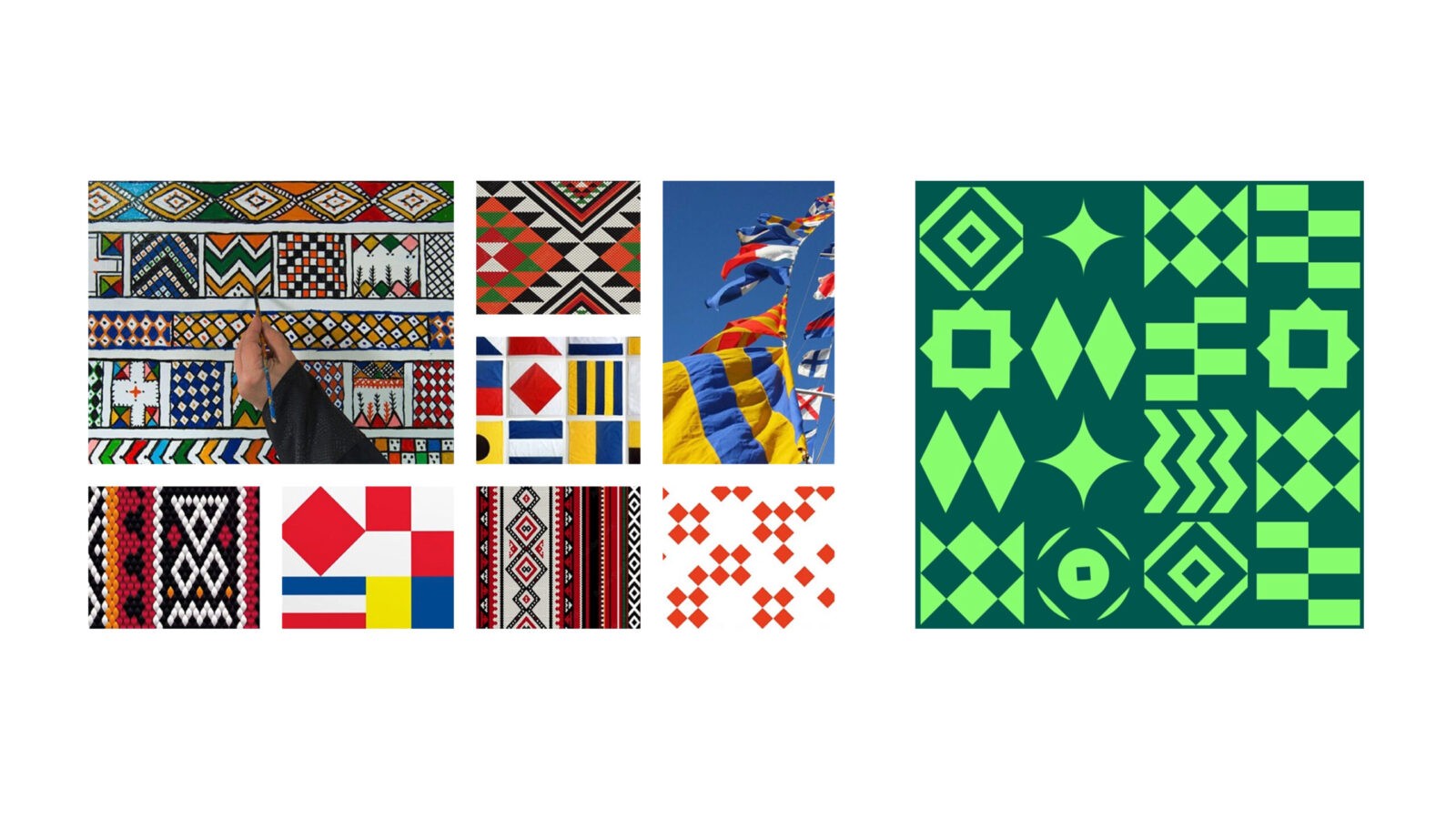
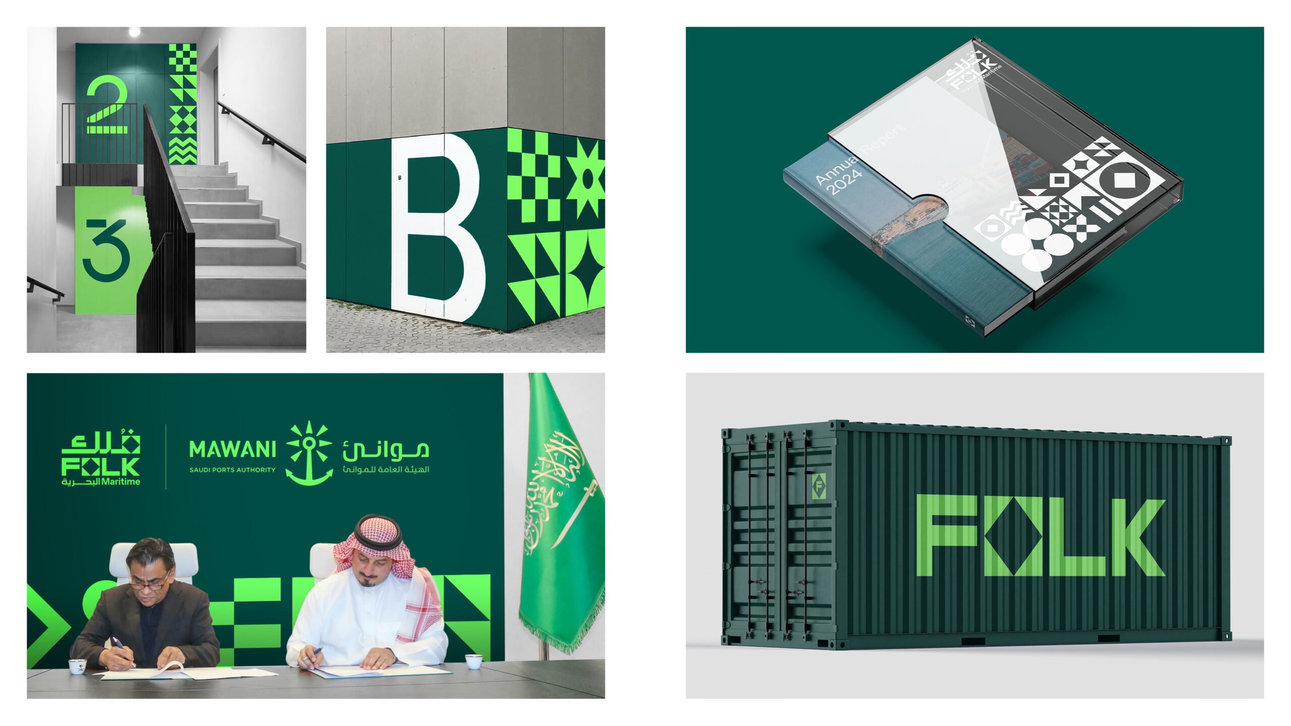
Semaphore flags, historically used to convey clear and efficient communication across seas, serve as the inspiration for the brand’s modular design system. Each semaphore-inspired element, when combined, creates bold, dynamic shapes that evoke movement, agility, and connection – all essential qualities for a leader in the logistics sector.
To complement this, geometric patterns inspired by Al-Qatt Al-Asiri, a style of Saudi Arabian art listed in UNESCO’s List of Intangible Cultural Heritage, are intricately woven into the design system. These patterns draw on the Kingdom’s rich cultural heritage and lend a sense of authenticity and locality while harmonising with the modern, progressive maritime motifs. Together, these elements create a unique, ownable brand language that bridges tradition and innovation.
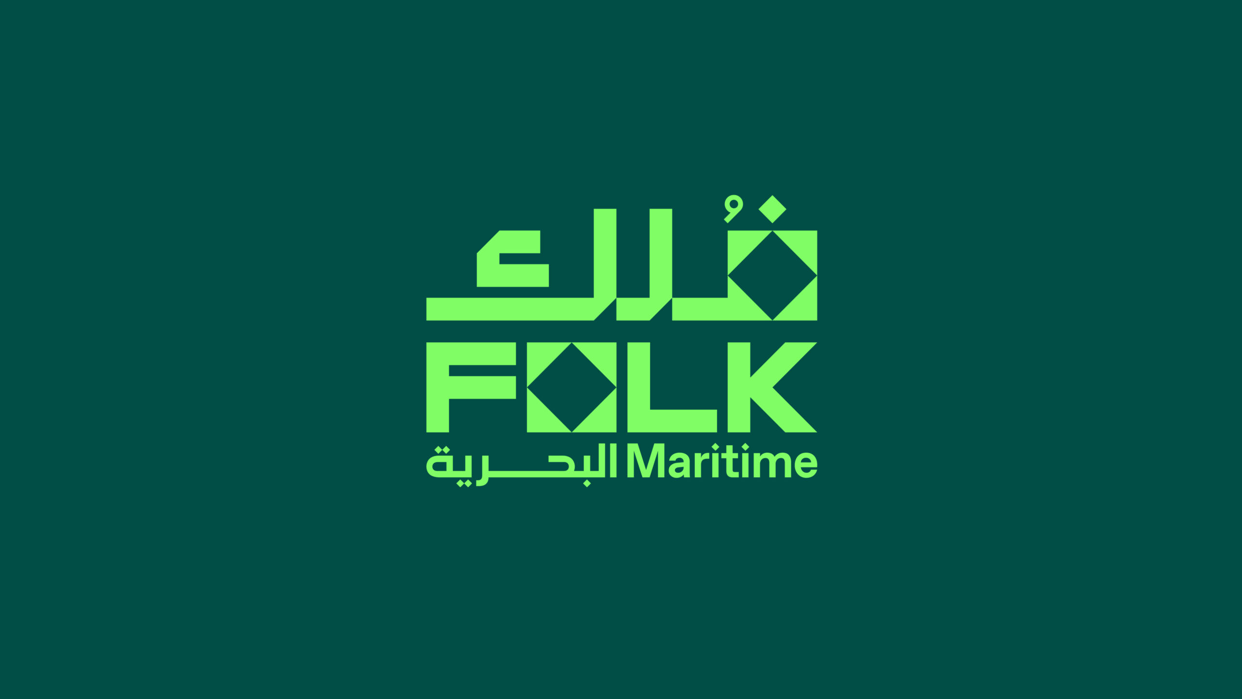
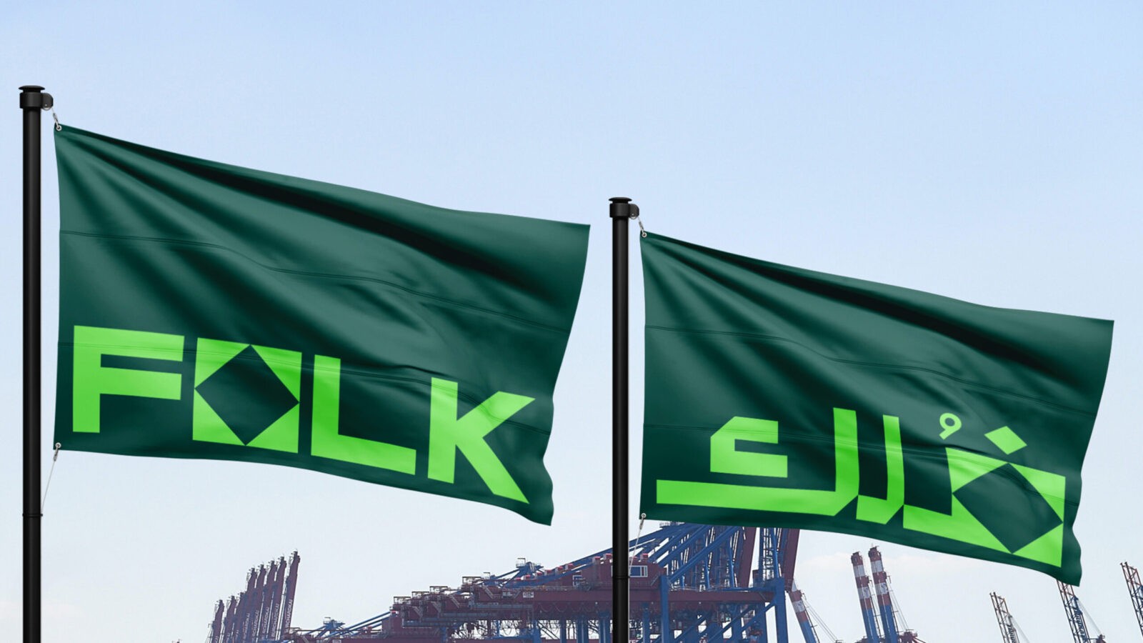
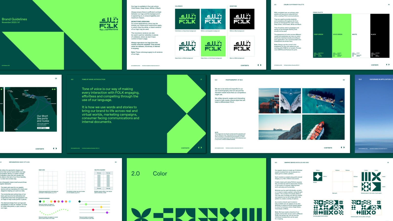
The dual-language logo design is a standout feature, seamlessly integrating the bespoke semaphore shape with carefully crafted letterforms. This thoughtful composition ensures the logo remains clear and legible in both English and Arabic, while maintaining a distinctly unique and cohesive identity.
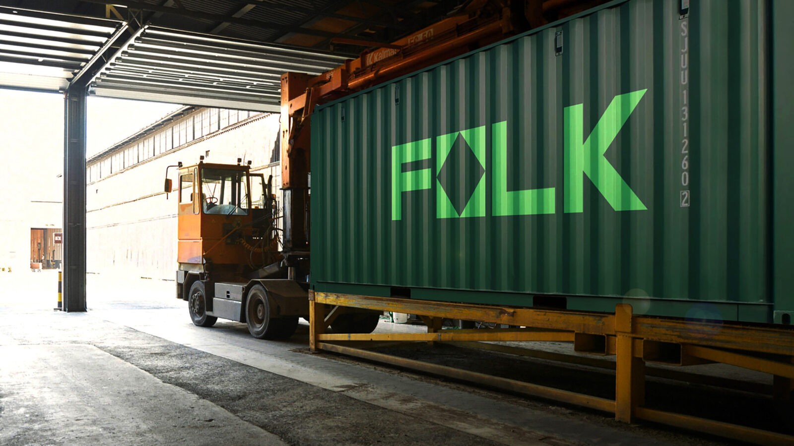
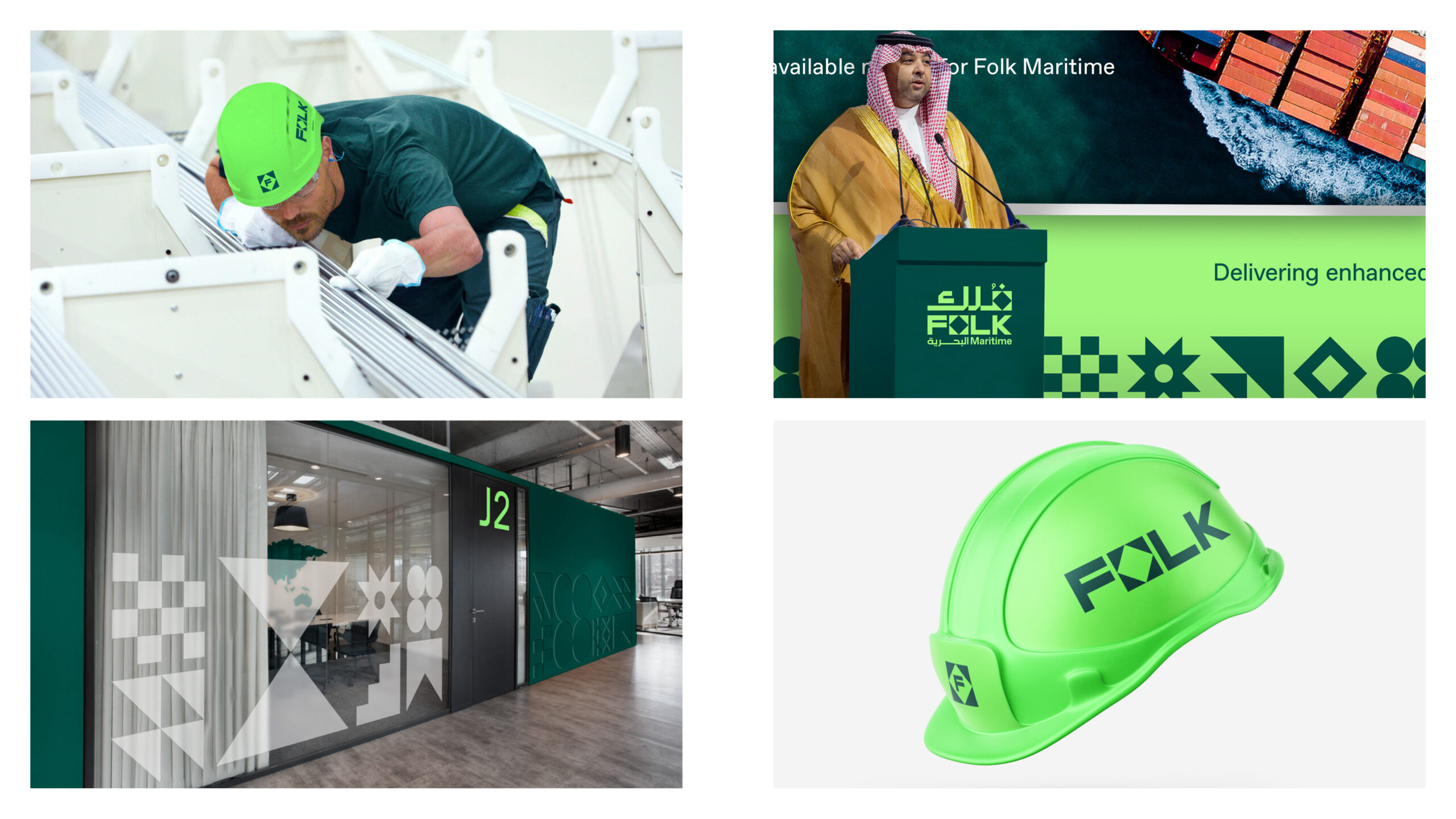
The colour palette was crafted to emphasize safety, a cornerstone of the sector, while also drawing inspiration from the vibrant greens of Saudi Arabia’s national colours and the rich hues of the seas surrounding the region. The vibrant green tone not only provides the brand with a bold and modern aesthetic but also reinforces safety as a core value. This connection ensures that key health and safety elements – such as hi-visibility gear, hard hats, and other equipment – are both highly functional and closely tied to the brand identity, creating a seamless blend of practicality and cultural resonance.
Epic scale to human action
Photography principles showcase the flexibility and stretch of the brand across its three key operational areas – At Sea, Ports & Operations and People. And a strong and ownable art direction style creates stand out in the market – using selective focus, asymmetry, and unexpected angles to reflect movement, innovation, and real-world moments. From vast seascapes to intimate human-scale actions, the photography encapsulates Folk’s commitment to progress and connection.
Smooth sailing
Reflective of the brand’s purpose, its tone of voice is succinct, delivers personality and cuts-through the category norms. With its ‘smooth sailing’ and ‘flying the flag for customers’ principles, it is positive, professional and informative.
Impact: Navigating Folk to success
Folk Maritime’s identity is a striking visual representation of its vision and purpose, combining maritime roots with cultural relevance to resonate across diverse audiences. The modular design system ensures consistency and adaptability across all brand touchpoints, from monumental installations to digital media.
By integrating innovative design elements, authentic photography, and culturally rich iconography, the robust and flexible identity provides stand out in a crowded marketplace. It positions Folk as a modern, forward-thinking leader in maritime logistics and enables the business to make meaningful connections with its audiences.
Not only does it deliver on the brand’s mission to support Saudi Arabia’s role as a global logistics hub by reflecting Folk’s commitment to excellence and innovation, but it also firmly establishes its place as a vital player in the maritime sector, driving growth for years to come.
“Thanks to TQ, we now have a brand that meets the demands of our varied audiences and positions us strongly for growth. Their expertise allowed us to quickly build visibility in the marketplace and pursue our goal to support Saudi Arabia Vision 2030 to position Saudi Arabia as a leading logistics hub.”
Raied Abu Himed, General Manager of Corporate Communications at Folk Maritime

![]()
CREDIT
- Agency/Creative: TQ Branding
- Article Title: TQ Branding Redefines Folk Maritime for Saudi Arabia’s Vision 2030
- Organisation/Entity: Agency
- Project Status: Published
- Agency/Creative Country: United Kingdom
- Agency/Creative City: London
- Industry: Transport
- Keywords: WBDS Agency Design Awards 2024/25 Brand Strategy , Brand Identity , Brand Guidelines , Tone of Voice , Corporate Comms , Brand Film
- Keywords: WBDS Agency Design Awards 2024/25 Brand Strategy , Brand Identity , Brand Guidelines , Tone of Voice , Corporate Comms , Brand Film
-
Credits:
Agency Credit: TQ Branding
Client Team Credit: Folk Maritime


