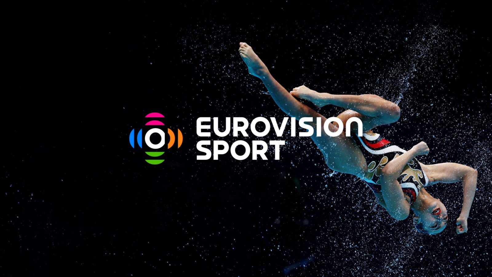
100+ European Broadcasters + 35 Sports Federations = THE best destination for free digital sport consumption across Europe
Uniting a plethora of complex stakeholders with a surprisingly simple solution.
The Challenge
A broadcasting powerhouse
The European Broadcasting Union (EBU) is the world’s largest association of public service broadcasters, representing over 100 broadcasters across more than 50 countries, including the BBC, ARD, France Télévisions, and RAI.
Known for organising the iconic Eurovision Song Contest, the EBU also acts as an important facilitator of sports broadcasting. It provides its members with cost effective access to a wide portfolio of sports rights with 35 federation contracts including World Athletics, Tour de France and FIFA World Cups.
A plethora of unaired sports content
Through its relationships with these federations, the EBU found that much of their sports content remained inaccessible to audiences, as broadcasters focused mainly on major events like the World Athletics Championships, while regular competitions such as the Diamond League went unaired.
But at the same time, the highly competitive sports streaming industry was seeing a growing desire for on-demand access to a wide range of content, from major events to niche sports.
A missed opportunity
With more platforms putting content behind paywalls, despite a potential worldwide audience of 800 million seeking consolidated, free viewing options, the EBU saw an opportunity to pool resources – to create a platform that would democratise access to sports content, providing free and inclusive coverage across Europe and beyond.
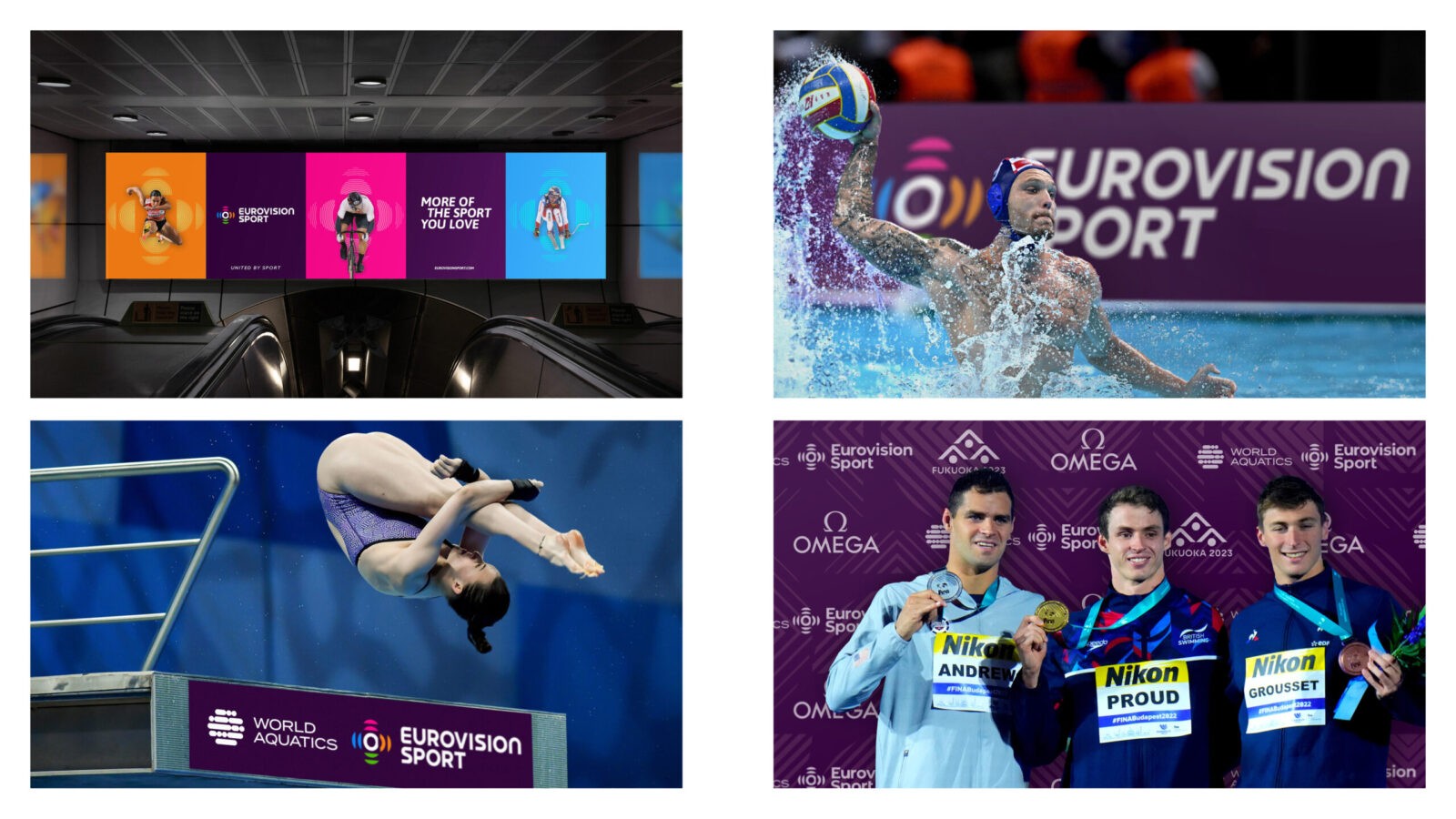
Targeting sports fans of all backgrounds, from casual viewers to dedicated followers of niche activities, the new platform ‘Eurovision Sport’ would also be the first sports streaming service to provide true gender equality across all its live sports content.
Key objectives:
1. Expand the reach and visibility of sports content from its federations
2. Enable members to connect with wider and harder-to-reach audiences by leveraging more sports content
3. Democratise access to sport across Europe
Our challenge was to create a robust brand strategy and visual identity that would land the key themes of inclusivity and accessibility, while resonating with a broad audience across a variety of sports in a multitude of countries, cultures and languages.
The Insight
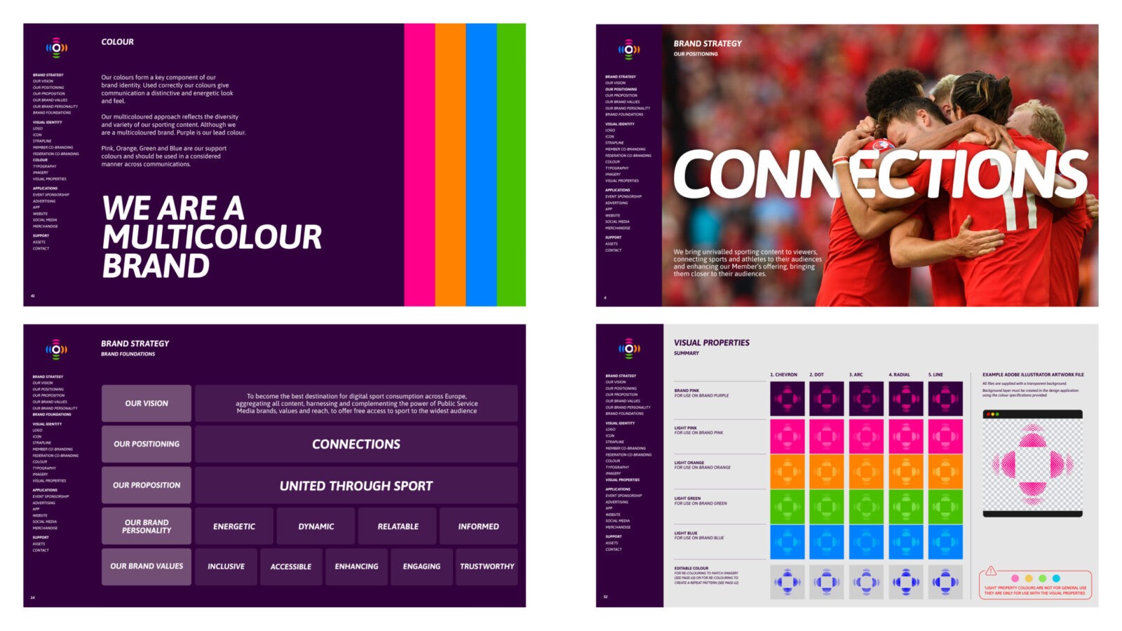
Following an analysis of audience demographics, competitor branding, digital trends, and a SWOT assessment, it was clear that competitor platforms leveraged positionings based on ‘the best or most’ or ‘for you’. We needed to differentiate Eurovision Sport and position it in a way that felt authentic to the platform’s vision – around connection.
Making the complex simple
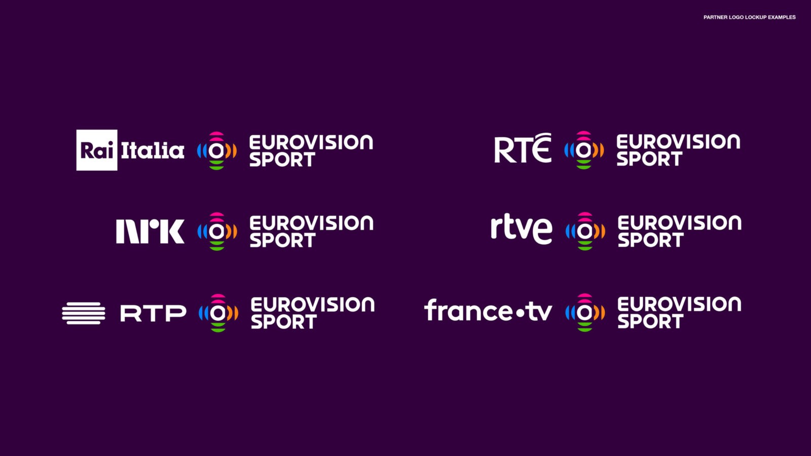
In addition to being a standalone platform, Eurovision Sport would also be accessed through individual broadcaster platforms, so the brand needed to work in tandem with their existing identities. To gain buy-in and engagement from so many broadcasters we needed to make our proposition as simple as possible. By stripping everything back to the core goal of connection, we not only carved out a unique position in the market, but the basis for a system that ultimately works with a diverse range of partner logos.
The Idea
The themes of simplicity, inclusivity and connection are carried through into the brand identity.
A universal language of connection
The plus sign as a logo is beautifully simple as it seamlessly works across countries, cultures and languages. It’s easy to understand and is literally the visual connector between the platform, its broadcasters and the sports federations.
Building on existing strengths
The plus icon uses multiple colours to acknowledge the diversity of sports, audiences, federations and broadcasters. The name ‘Eurovision Sport’ and its tagline ‘United by Sport’ also build on the equity in the EBU’s most famous asset, The Eurovision Song Contest, which carries the tagline ‘United by Music’.
Dynamic imagery to bring fans closer to the action
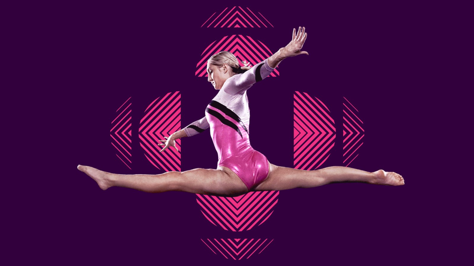
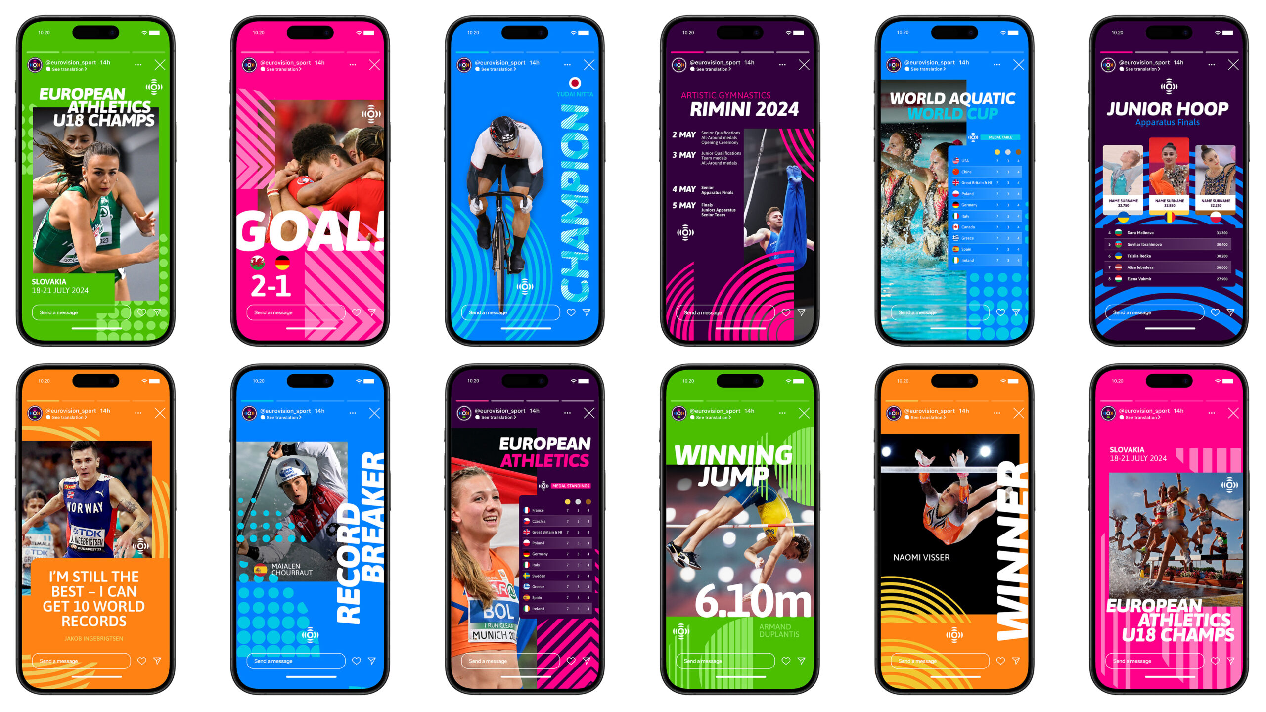
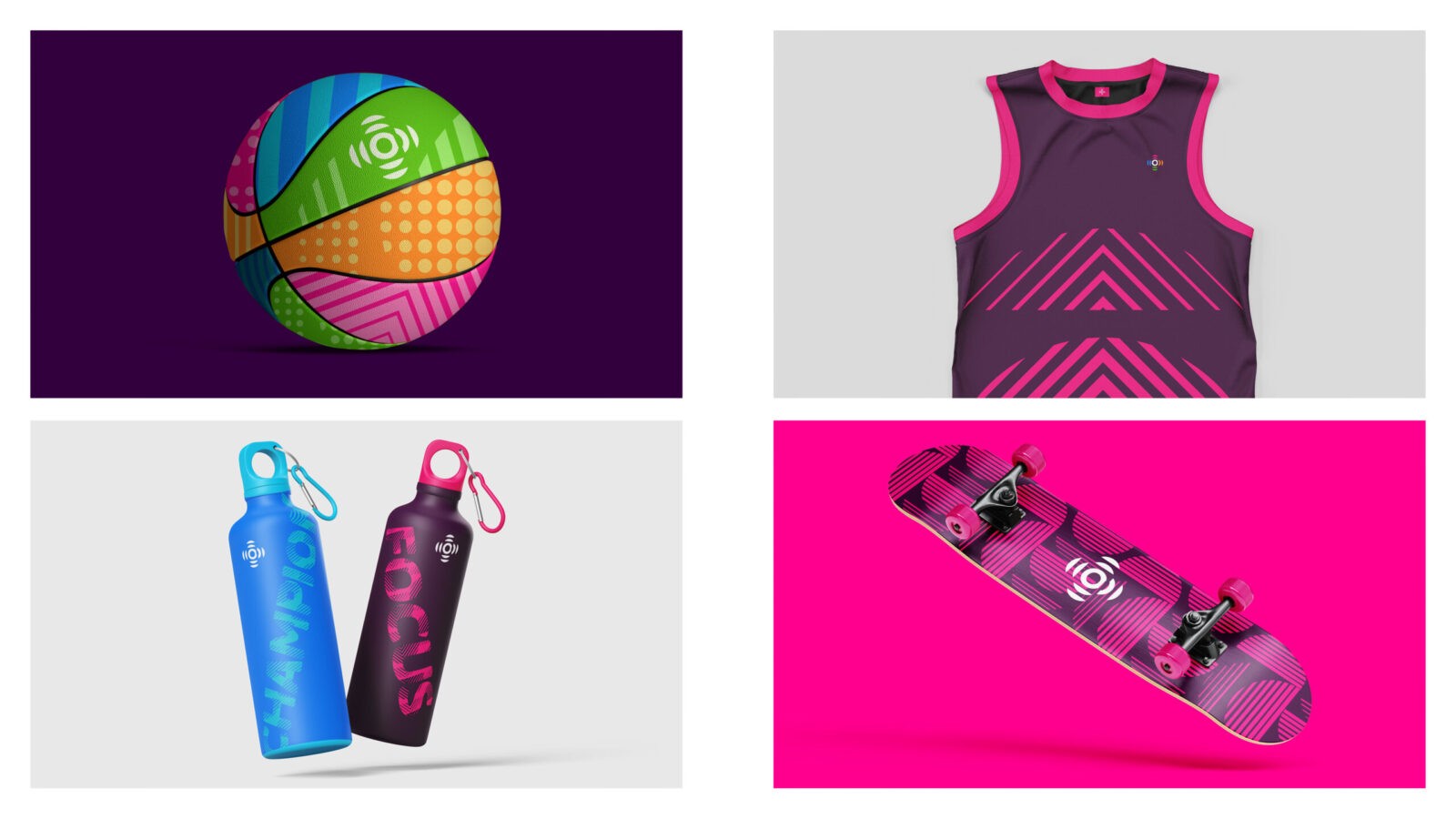
The new brand’s energetic personality is brought to life through a radiating pulse in the icon, as well as bold visual properties coupled with dynamic imagery to reflect the energy within the sports.
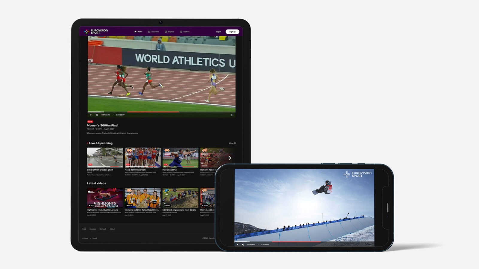
It was rolled out across the digital platform, social media, event sponsorship, advertising, etc. and extensive promotion of content by members and federations, in addition to comprehensive guidelines, ensured smooth adoption and a cohesive brand experience – whether it’s used as a stand-alone brand or in partnership.
The Impact
Both the strategy and identity were unanimously bought into by all members, as they not only represented the inclusivity and diversity required but were also greater than the sum of its parts. A robust logo lock-up system gives equal prominence to broadcasters’ and sports federations’ logos while ensuring that Eurovision Sport maintains a consistent brand presence. A win-win for all involved.
Our goals were to:
1. Provide individual sports federations with greater reach and visibility
2. Provide its members with a wider portfolio of sports content to reach broader audiences
3. Democratise access to sport across Europe
In just 8 months, Eurovision Sport has showcased 100 events from 30 sports, delivering 3,000 hours of seamless sports content, which has helped to increase visibility and provide inclusive access to wider range of sports.
Increased reach & visibility for federations
Eurovision Sport’s content has been accessed directly through its platform and via broadcasters worldwide. And monthly engagement across both has exceeded targets, with 1.3 million hours viewed.
Access to wider audiences for members
Through the sheer variety of federations involved, broadcasters have had access to a regular stream of content from both mainstream and more niche sports. And it’s attracting a younger audience with 37% of registered users on the site aged 17-24 and +50% aged under 35.
Democratised access to sport
Eurovision Sport operates the most gender-balanced portfolio of sports in the world and has carved out an ownable space in the sports broadcasting market as ‘THE best destination for free digital sport consumption across Europe’.
The platform is clearly positioned as a connector between sports and fans, federations and broadcasters alike, with an identity that emphasises the brand’s commitment to a wide range of under-represented sports that speaks to diverse audiences.
A distinctive identity that incorporates flexibility
“From the very beginning of this project TQ understood the huge potential of Eurovision Sport and the opportunity to transform the sports streaming and broadcasting landscape in Europe and beyond. The brand needed to appeal to female and male sports fans, and as the only fully-free sports platform it needed to be different to anything else in the market, as well as incorporate the brands of over 50 different EBU members.
“We are really proud of the work that TQ did on Eurovision Sport – they’ve created a truly distinctive, contemporary and warm identity which manages to incorporate huge flexibility.” – Glen Killane – Executive Director, EBU Sport


CREDIT
- Agency/Creative: TQ Branding
- Article Title: TQ Branding Creates Inclusive Identity for Eurovision Sport Connecting Fans, Broadcasters, and Federations
- Organisation/Entity: Agency
- Project Status: Published
- Agency/Creative Country: United Kingdom
- Agency/Creative City: London
- Project Deliverables: Brand Architecture, Brand Guidelines, Brand Identity, Brand Strategy
- Industry: Mass Media
- Keywords: WBDS Agency Design Awards 2024/25 , Identity: Brand Design Creation
- Keywords: WBDS Agency Design Awards 2024/25 Brand Strategy | Brand Architecture | Brand Identity | Brand Guidelines
-
Credits:
Agency Credit: TQ Branding
Client Team Credit: European Broadcasting Union


