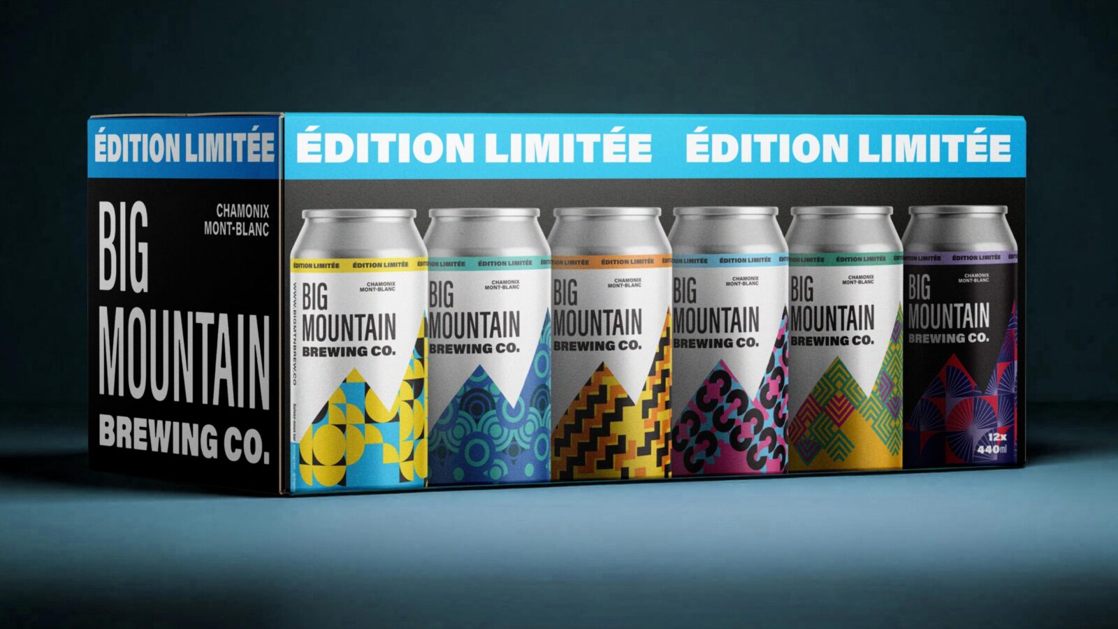
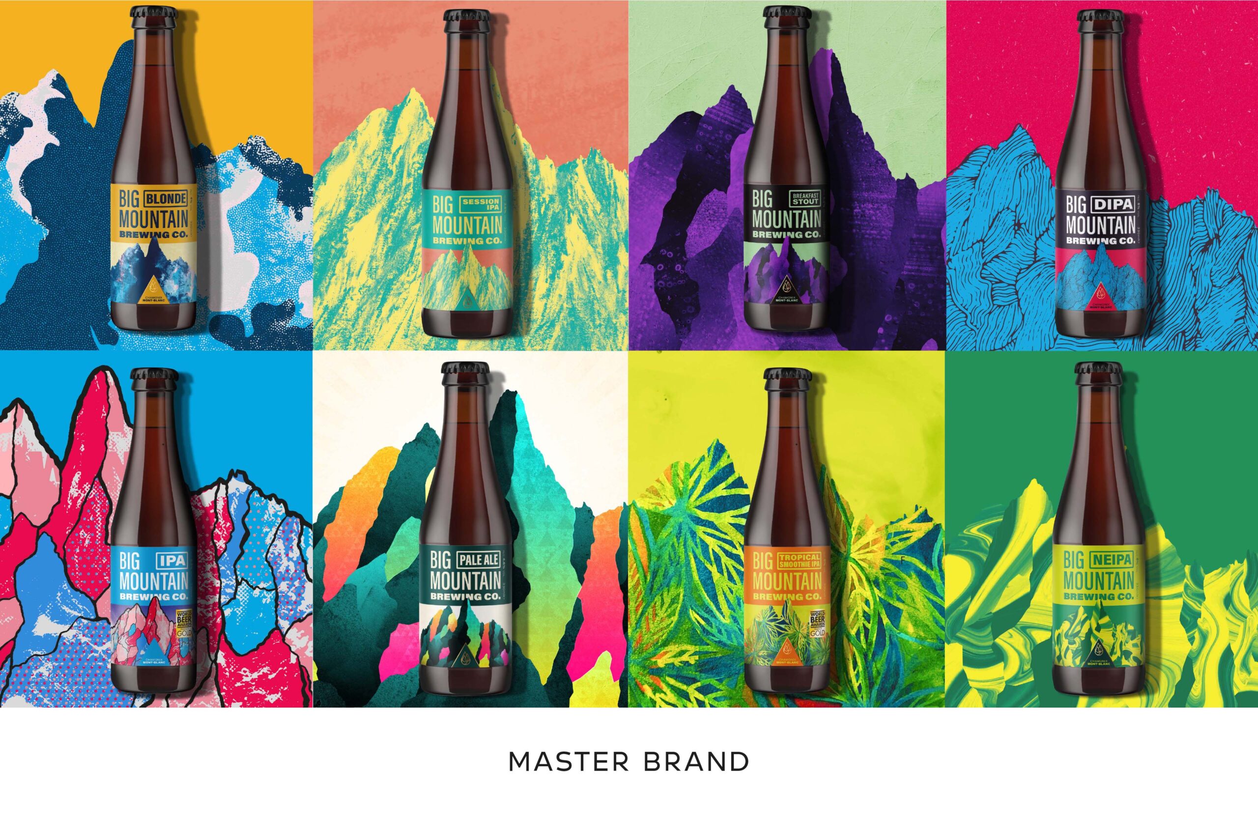
Big Mountain is an award-winning craft beer brewery in Chamonix, based in the heart of the spectacular French Alps. As a brand, Big Mountain are all about outdoor adventure and the thrill of the alpine mountains, whether that’s skiing, climbing or mountain biking. Every year, they release a range of limited-edition beers.
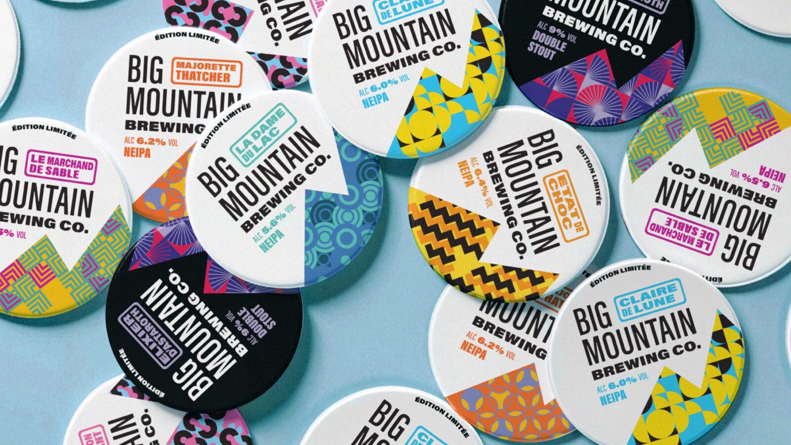
For their 2025 Single Release range, Big Mountain have gone back to their origins, with eight limited-edition releases inspired by adventurous rock climbs high in the mountains of Chamonix. The brief contained stories of individual climbs, each trail with a French name. Often these stories came from local sportspeople who told of their unique relationship with a particular trail. The client wanted each design to speak to the loyal, local consumer by telling their stories back to them with discoverable features in the design which would remind them of their favourite trail. Chamonix isn’t just a place for skiing, and across the seasons, Big Mountain’s customers hike, wild swim and climb through the landscape. The trails the Single Release range features gives a broad and textural depiction of the mountains. The fragmented, jagged lines of Etat de Choc (State of Shock) play against the glimmer of Clair de Lune (Moonlight), while Le Dame du Lac (The Lady of the Lake) calmly ripples like droplets on the still water of a mountain lake. Each pattern is designed with movement in mind, and can be brought to life through animation which reflects the nature of the trail.
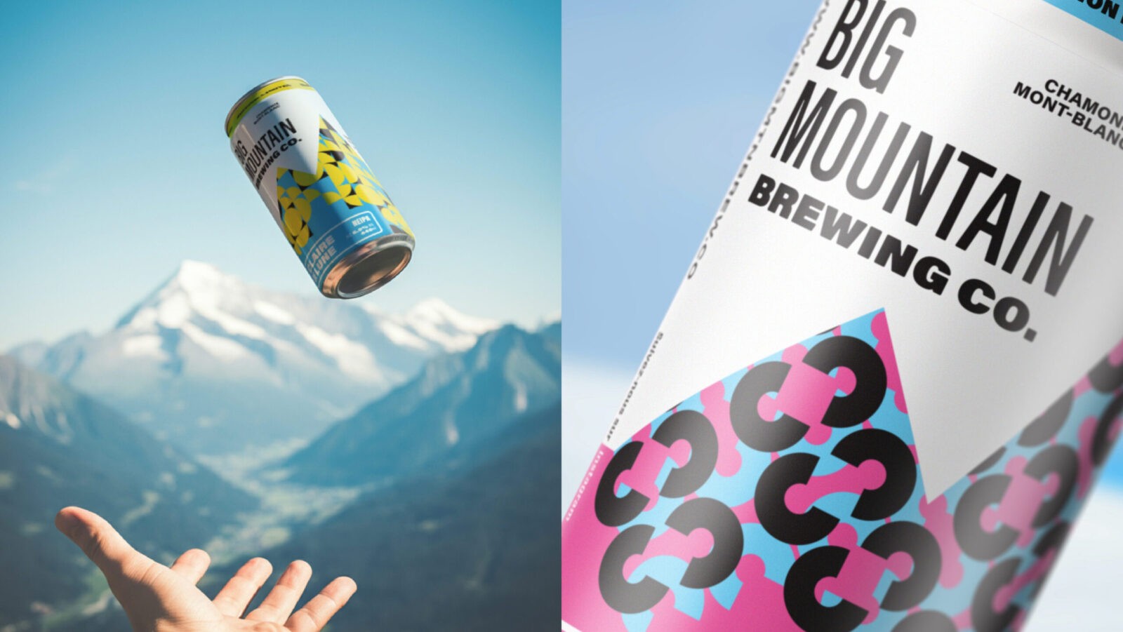
As this is a brand extension piece which needed to sit within the Big Mountain range, the challenge was to create a fresh new can design that felt as exciting as the trails, but remained instantly recognisable as part of the Big Mountain brand, which uses the Big Mountain word mark, and Les Drus skyline as its core assets. To differentiate these limited-editions from the core range, we employed a stylised and graphical approach to represent the Les Drus mountain skyline, taking out the bulk of the detail and instead using the gestural and strong shape of the mountain as a holding device for the pattern-work. Taking the client’s lead on the unique sports fashion found in their particular part of the alps, the geometric patterns reference vintage skiwear and use an impactful colour palette that reflects the flavour profile of each beer. The use of ticker-tape style messaging at the top of the can reminds the consumer of ski lift signage and complements assets from the master brand, which are utilised throughout, and capitalise on the brand which has cemented Big Mountain as one of the Alps’ most trusted drinks brands.
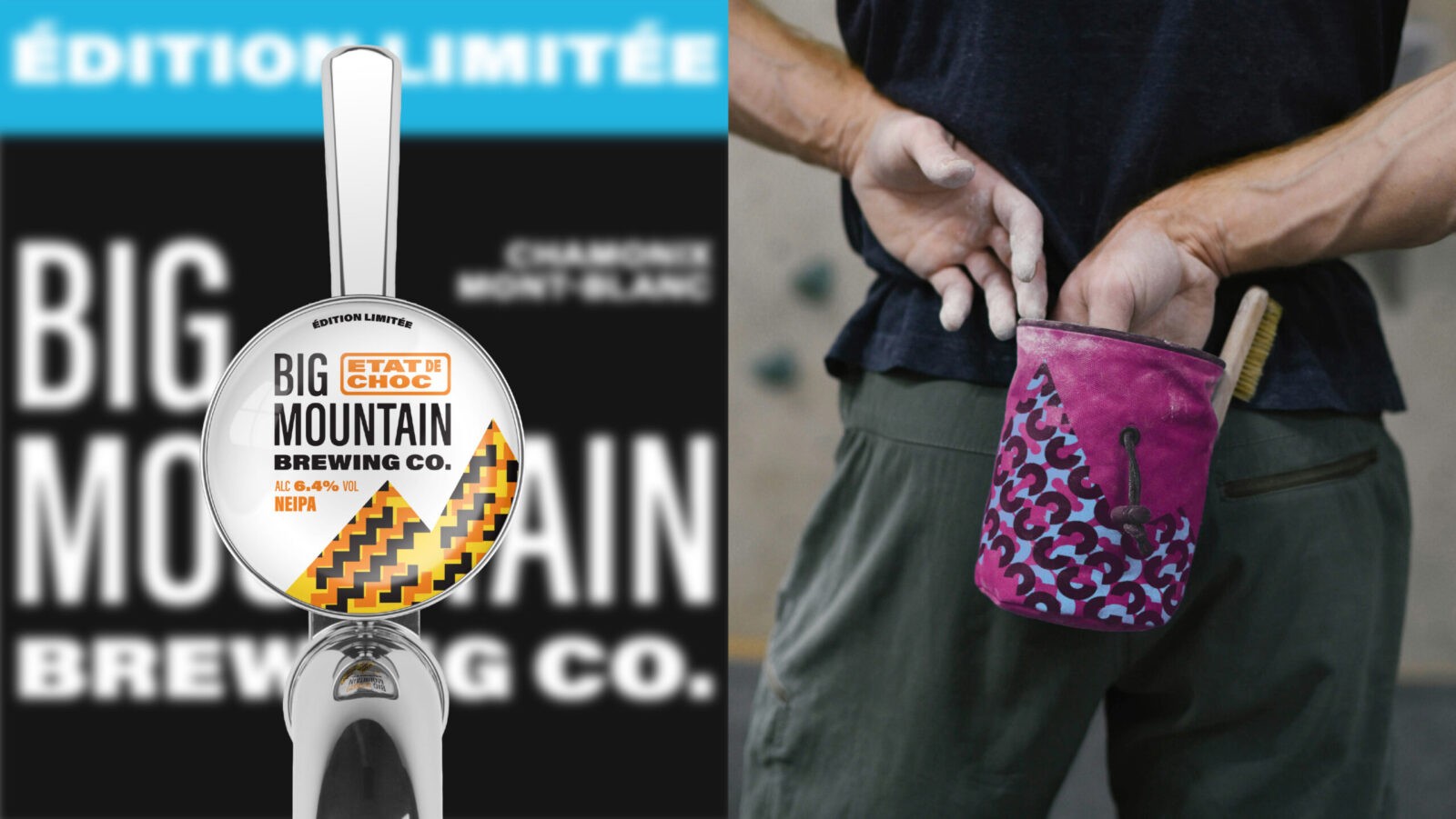
As a sports-adjacent brand, Big Mountain is all about the merch, and the use of bold pattern and the storytelling connection to the consumer takes these designs out of the transient realm of seasonal products. With patterns that lend themselves to broad off-pack brand roll out, these assets become something Big Mountain can continue to take advantage of, way beyond 2025.

CREDIT
- Agency/Creative: Kingdom & Sparrow
- Article Title: Kingdom & Sparrow Elevates Big Mountain Beer with Alpine-Inspired Designs for 2025
- Organisation/Entity: Agency
- Project Status: Published
- Agency/Creative Country: United Kingdom
- Agency/Creative City: Falmouth
- Market Region: France
- Project Deliverables: Animation, Brand World, Branding, Graphic Design, Identity System, Label Design, Packaging Design
- Industry: Food/Beverage
- Keywords: WBDS Agency Design Awards 2024/25 brand branding beer packaging can design , Identity: Brand Design Extension
- Keywords: WBDS Agency Design Awards 2024/25 brand branding beer packaging can design


