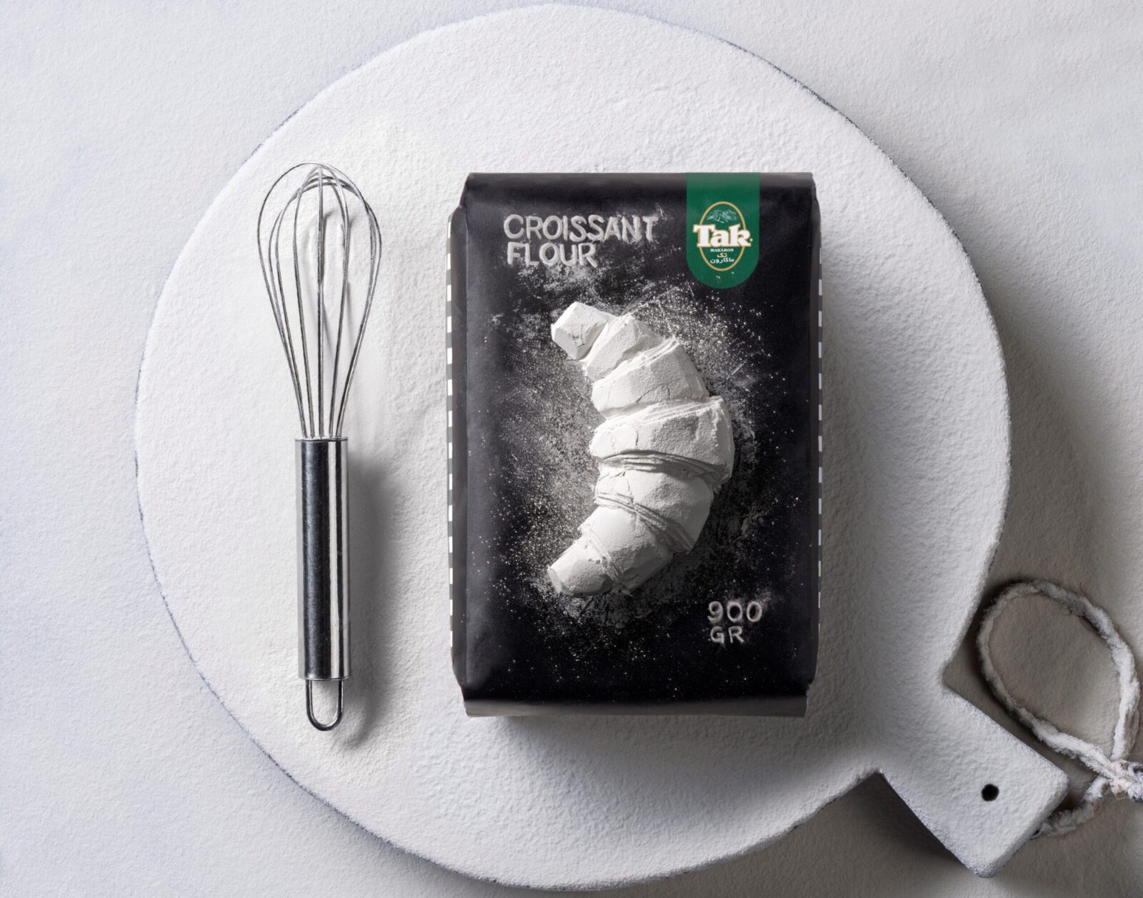
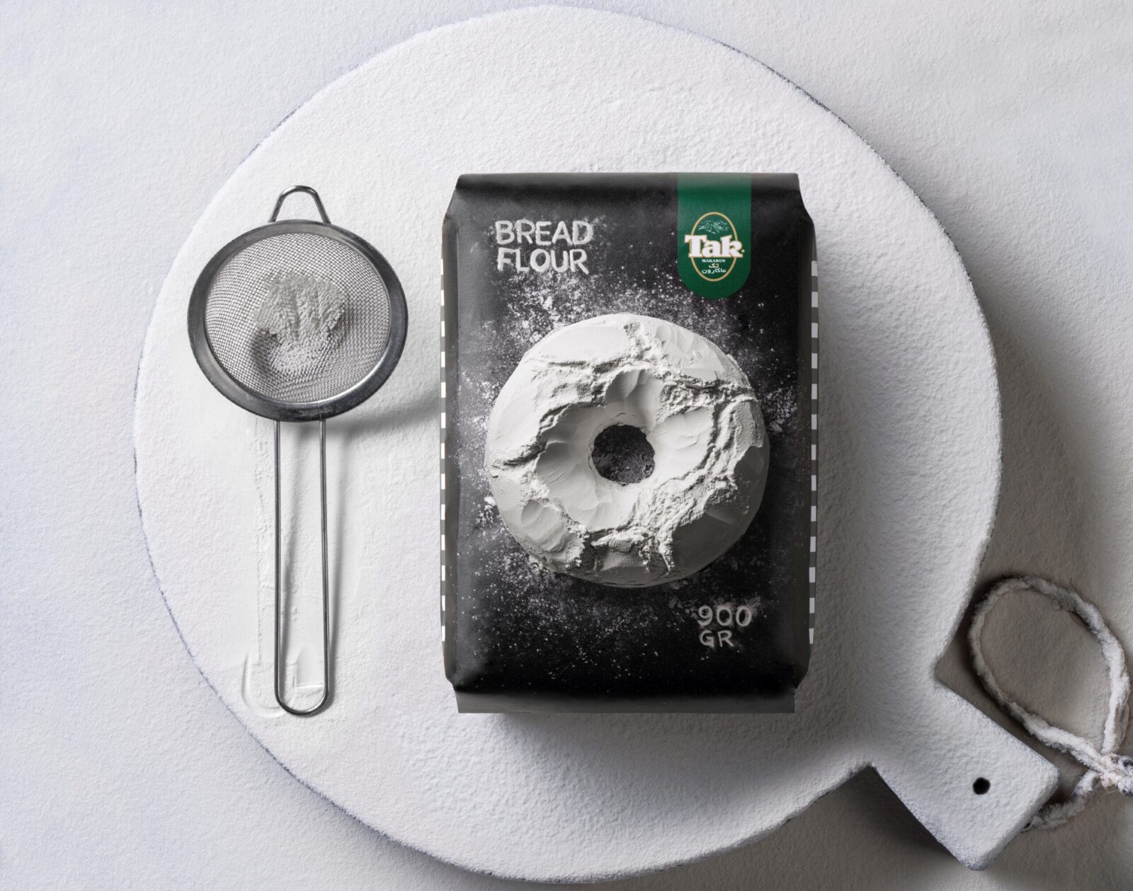
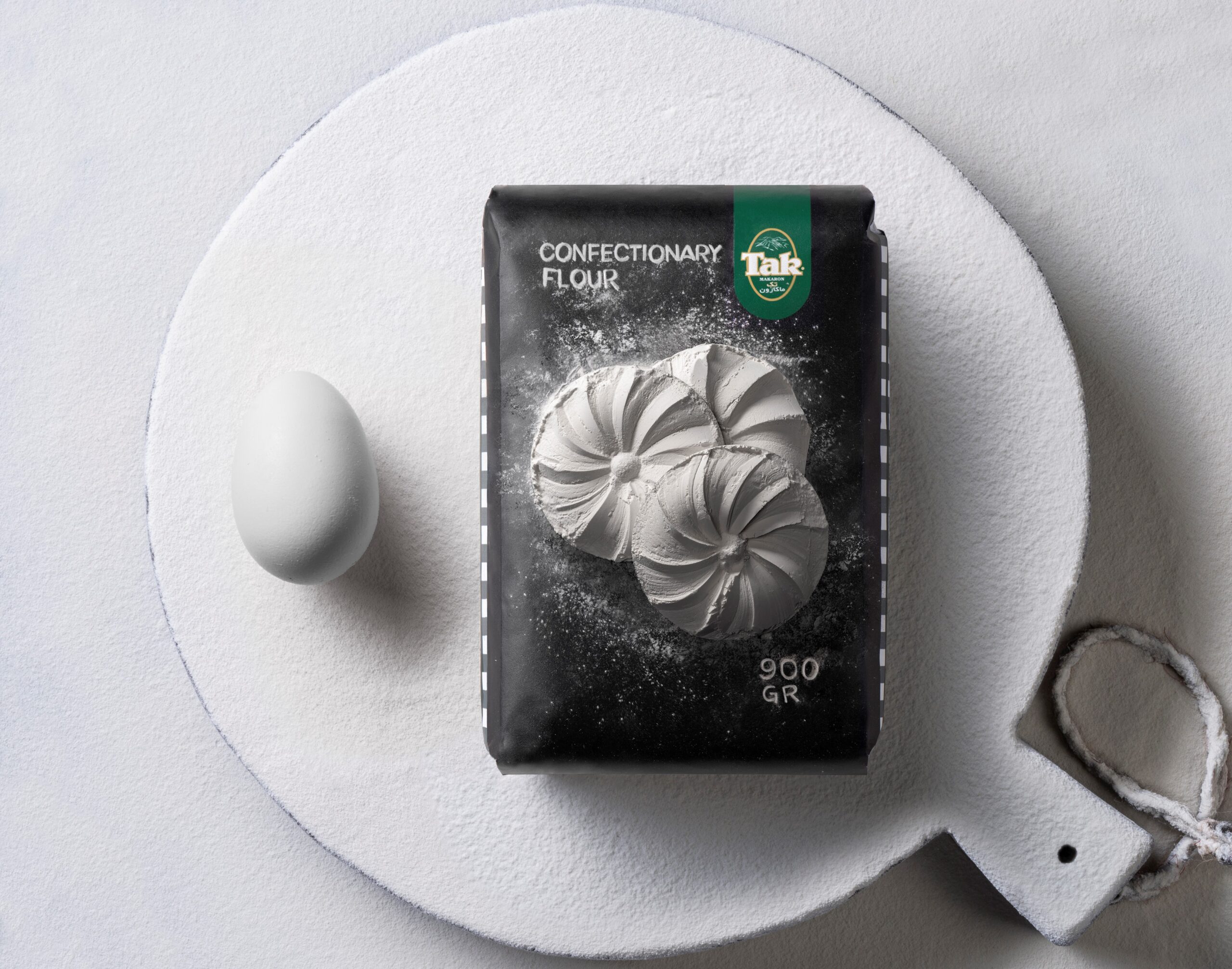
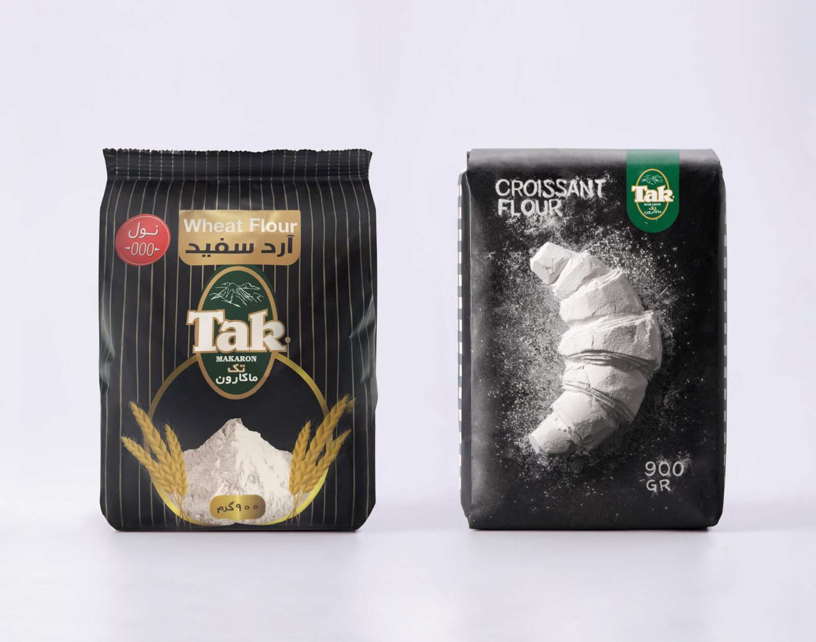
The goal of the redesign of “Tak” flour packaging was to increase its on-shelf attractiveness while maintaining the brand’s identity and ensuring its easy recognition by consumers. Flour, being a basic and simple product with a limited variety of packaging possibilities, posed a unique challenge. To overcome this, we employed a clever marketing strategy that revolved around creating distinct designs for each flour variant, incorporating unique product illustrations that would set each package apart from the competition.
The core of the new design concept is the bold black packaging, which serves as a striking background, enhancing the overall visual appeal and acting as a canvas for creativity. On this dark backdrop, the flour is represented in an innovative and artistic way – its sculptural qualities are highlighted as it is transformed into intricate designs resembling bakery products like bread, croissants, and pastries. These flour sculptures are not only visually captivating, but they also evoke a sense of artisanal craftsmanship, connecting the product with quality and tradition. By transforming the simple ingredient into works of art, we create a connection between the product and the skilled craftsmanship behind each baked good.
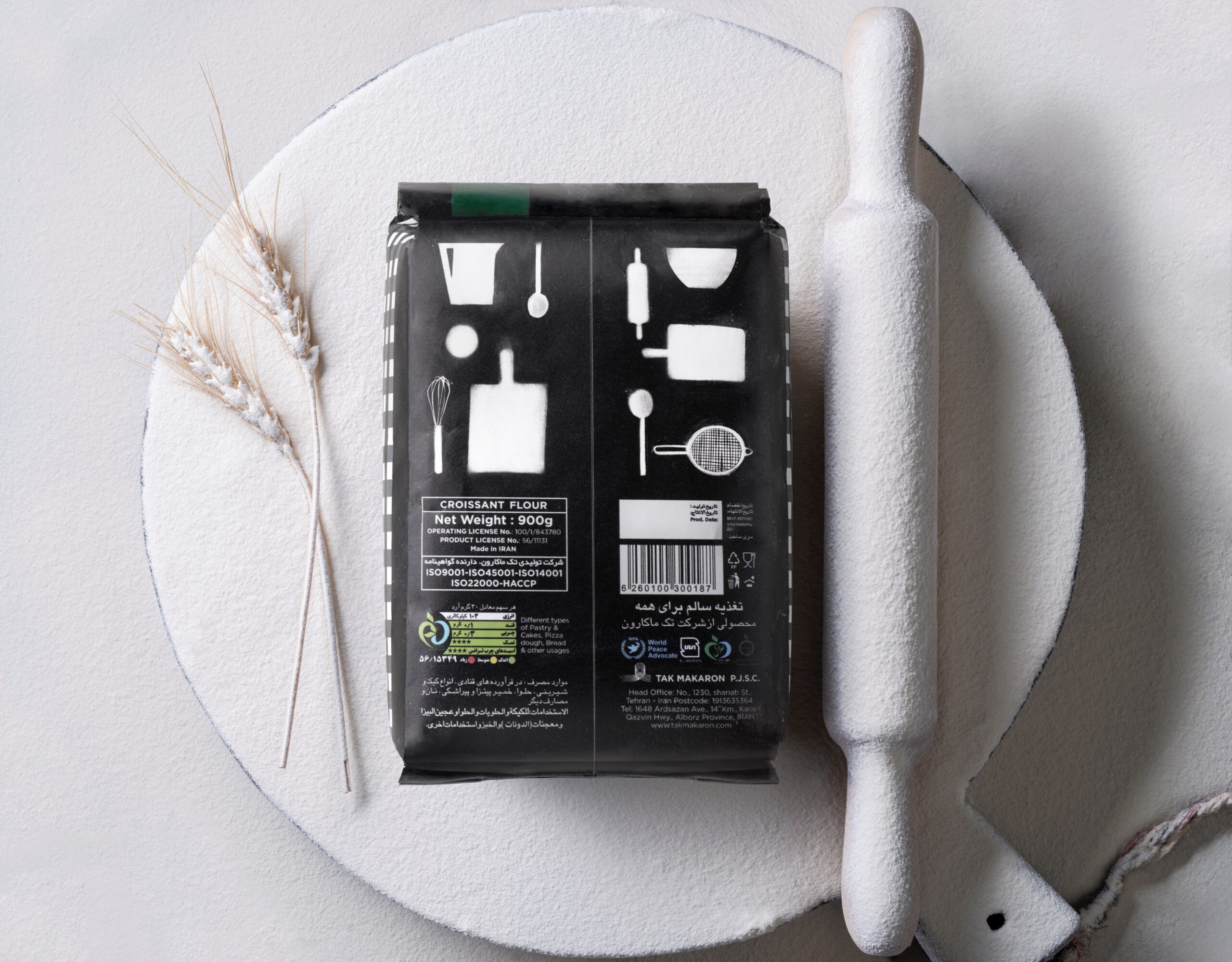
A key aspect of the design is the prominence of the “Tak” logo, which is placed in a visible location on the packaging. This ensures that the brand remains immediately recognizable to consumers, even when displayed alongside other products. In addition, the signature pattern of the “Tak” brand adorns the sides of the packaging, adding an extra layer of brand reinforcement. This cohesive approach ensures that every angle of the packaging is designed to strengthen the brand’s visual identity, making it stand out on the shelf.
This combination of bold design choices, artistic flour illustrations, and strong brand presence successfully elevates the appeal of “Tak” flour, making it more likely to catch the consumer’s eye and stay memorable long after the product is purchased. Ultimately, the new packaging is not just about showcasing the product, but also about reinforcing the brand’s identity and the quality of its offerings.
CREDIT
- Agency/Creative: Backbone Branding
- Article Title: Tak Flour Packaging Gets a Bold Makeover by Backbone Branding to Stand Out
- Organisation/Entity: Agency
- Project Status: Published
- Agency/Creative Country: Armenia
- Agency/Creative City: Yerevan
- Market Region: Global
- Industry: Food/Beverage
- Keywords: WBDS Agency Design Awards 2024/25 TAK, Packaging Design, Sculpture, Product Photography , Packaging Design: Product Redesign
- Keywords: WBDS Agency Design Awards 2024/25 TAK, Packaging Design, Sculpture, Product Photography
-
Credits:
Creative Direction: Stepan Azaryan
Illustration: Elina Barseghyan
Design Team Leading: Gevorg Abrahamyan
Design: Ashot Hayrapetyan
Sculpturer: Edgar Grigoryan


