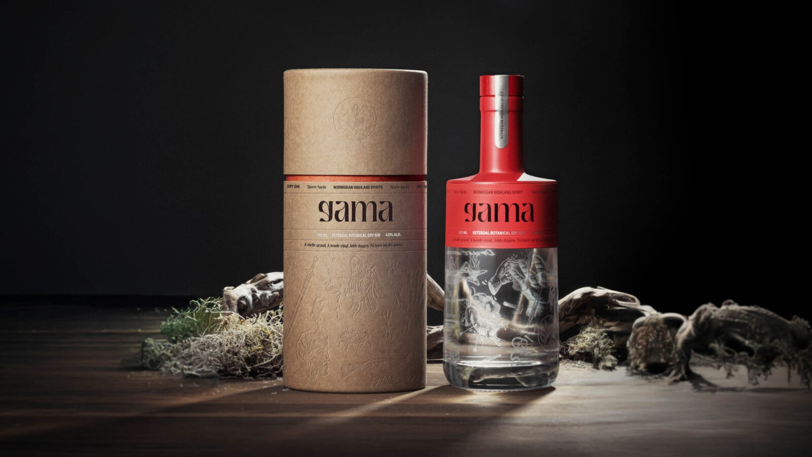
Branding a Splash of Fun and a Sip of Madness
Deep in the highlands of Norway lies Setesdal, a village seemingly untouched by time and home to a culture all its own. Known for its music, craft, dance, and boundless humour, Setesdal is a place of unique spirit and mystery. Here, people speak Vallemål, a language so distinct that even other Norwegians are left in confusion. It’s a region rich with myths and legends, tales of underground creatures, wild brawls, and a drinking culture as spirited as the gin it inspired.
The Concept: In Good Spirit
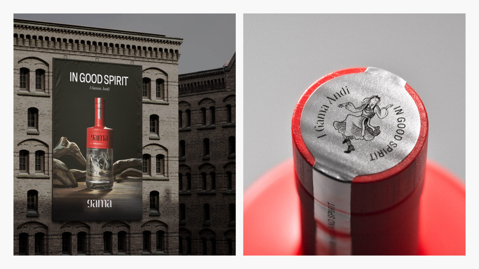
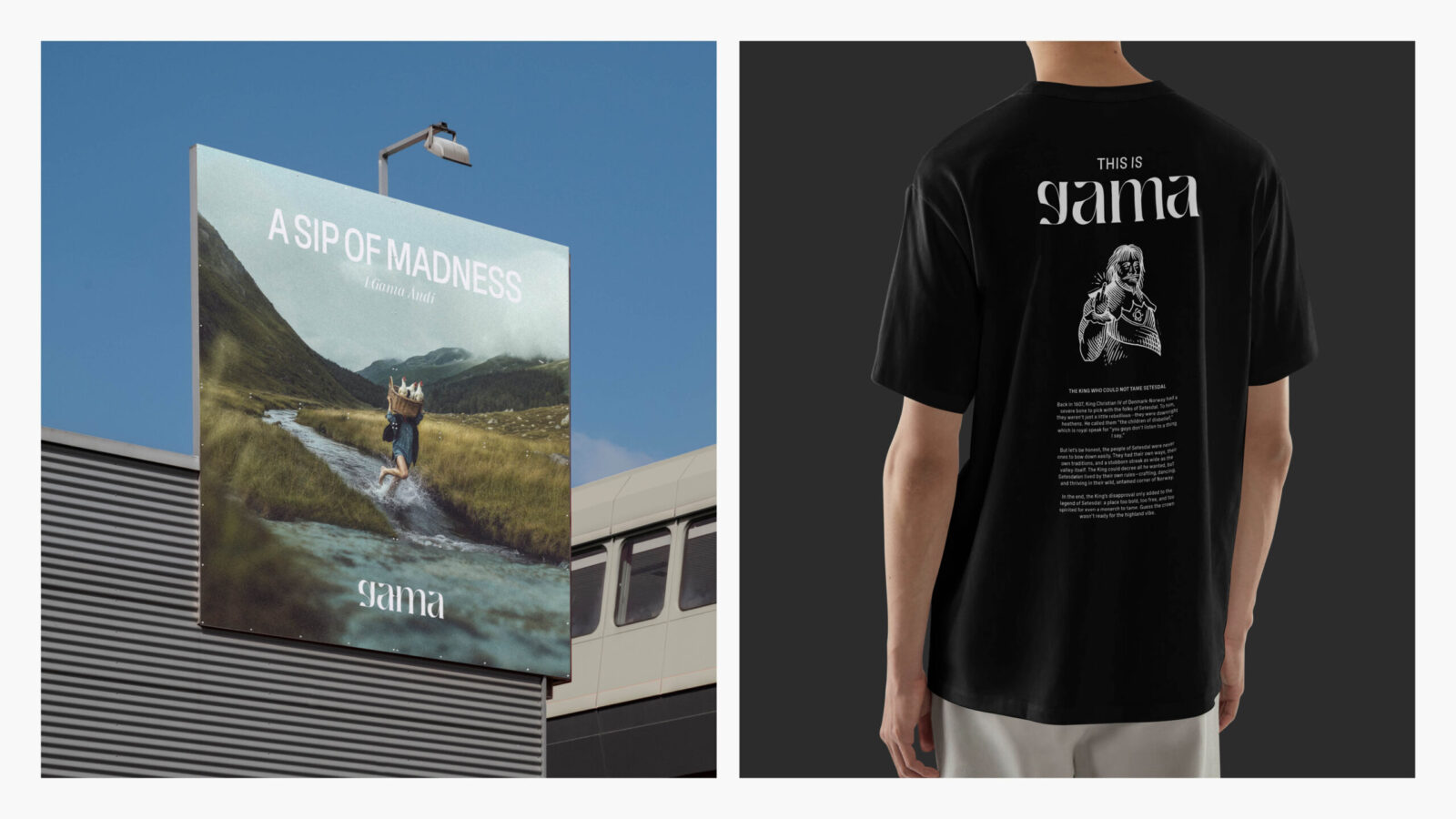
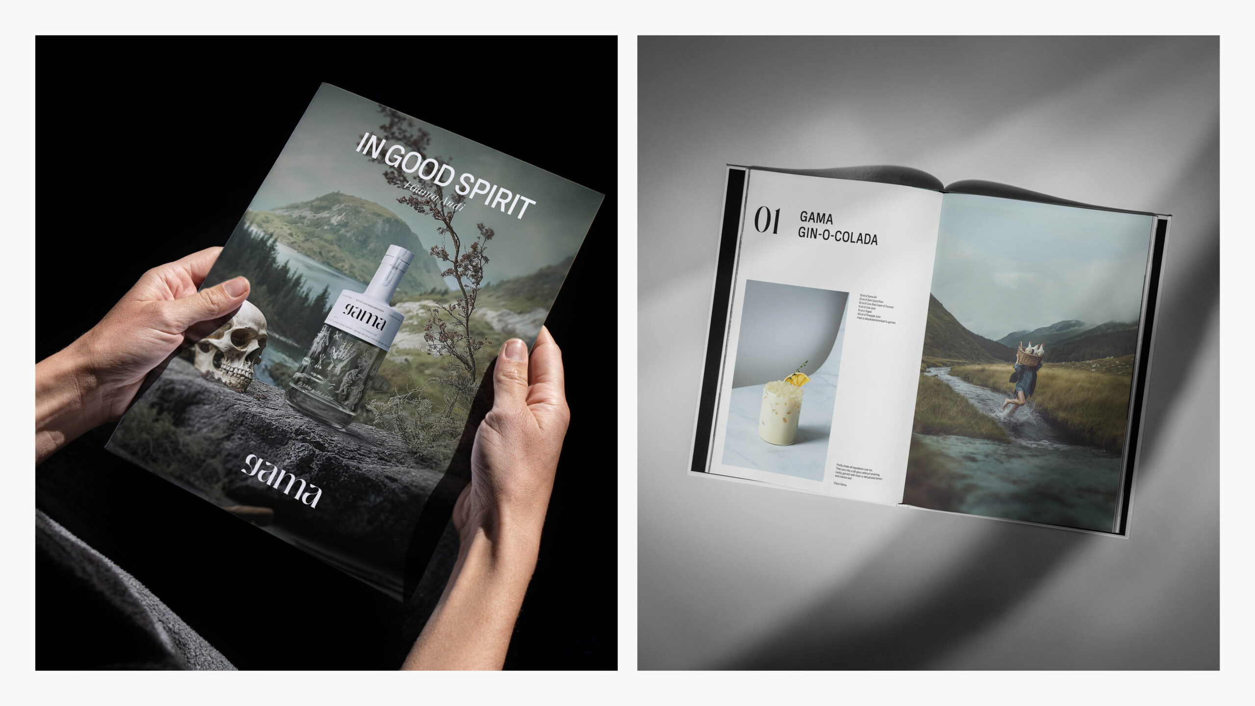
In collaboration with the essence of Setesdal, Kind developed the brand identity for Gama Gin. Named after the Vallemål word for “having fun,” Gama celebrates the joyful, slightly chaotic spirit of Setesdal. The slogan “In Good Spirit” plays on the dual meanings of a well-lived life and a gin crafted with care. It’s a nod to the community’s boundless zest for life, where having fun is just as important as the high standards of their craftsmanship. Gama is a sip of madness, a splash of joy, distilled and bottled from a world of tradition and mischief.
Design and Identity
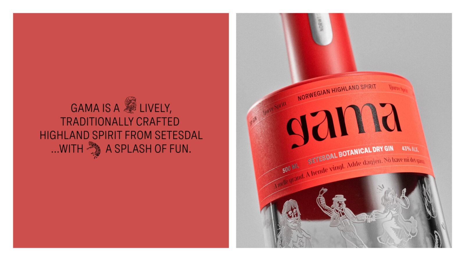
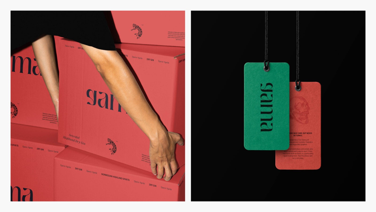
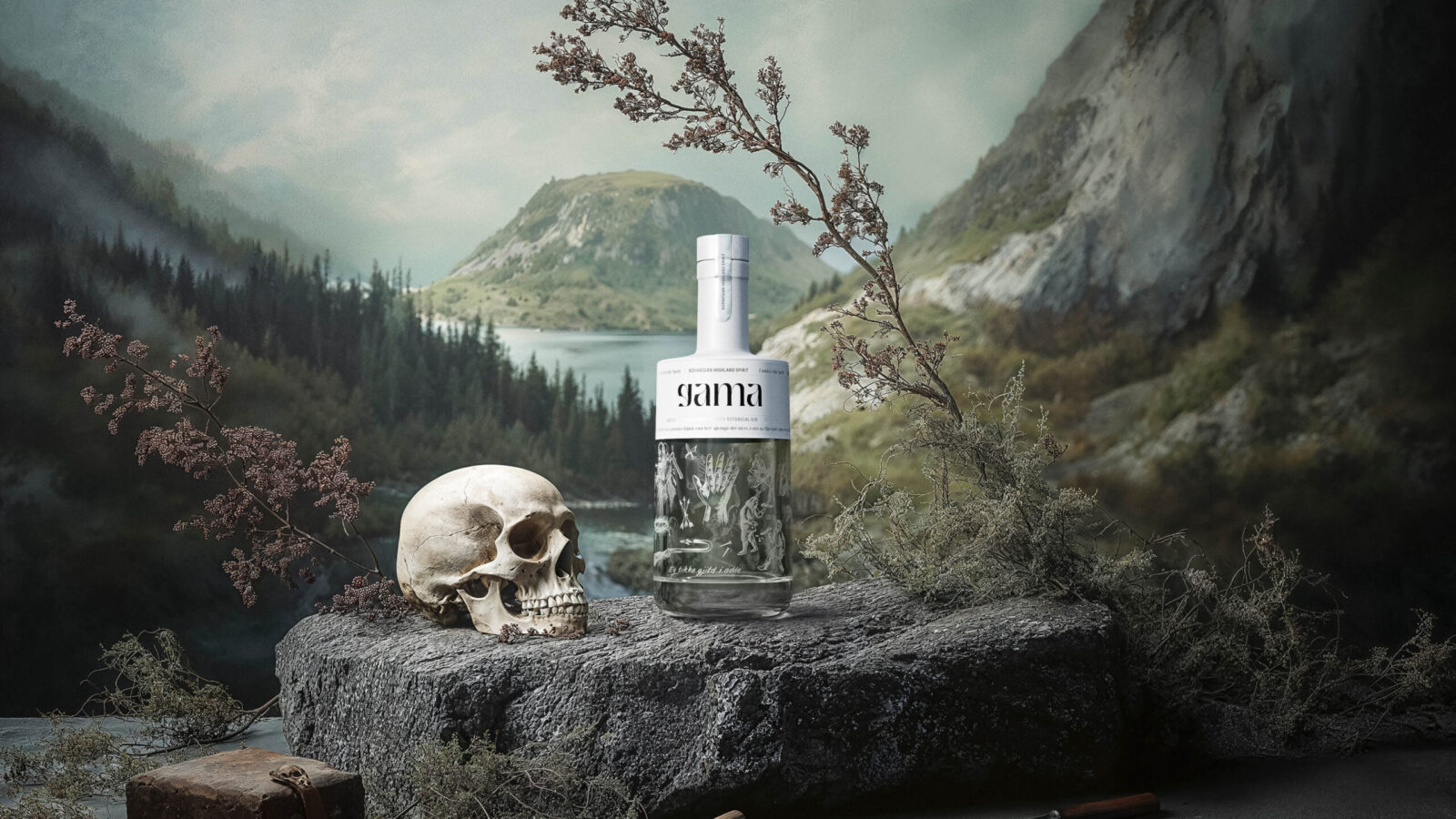
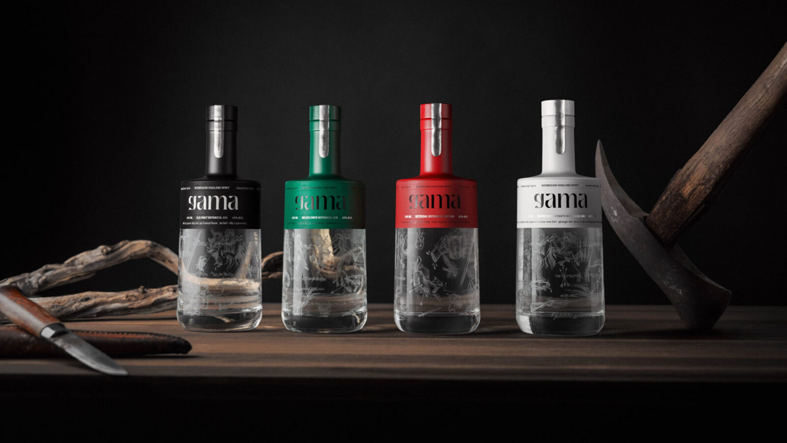
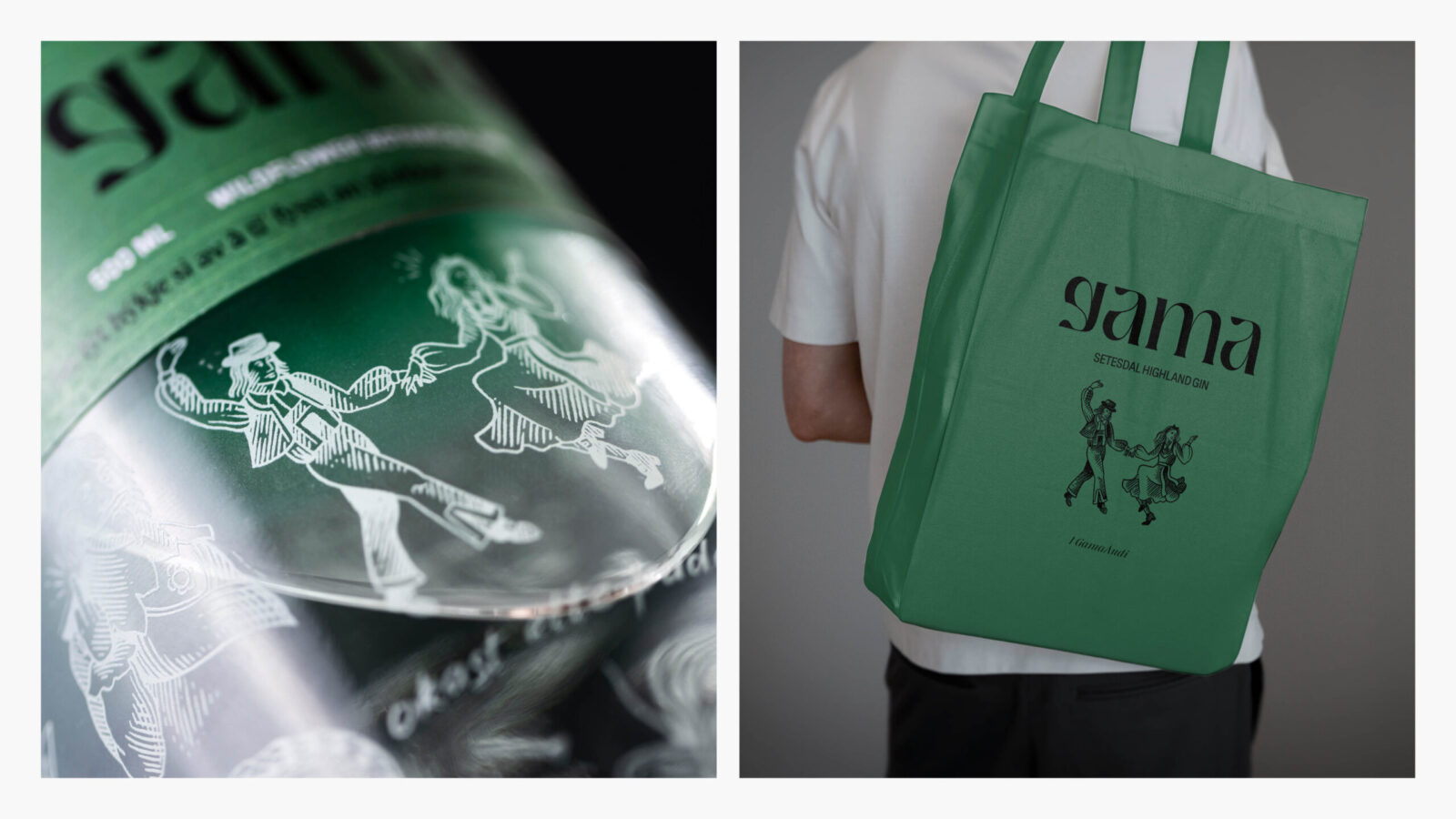
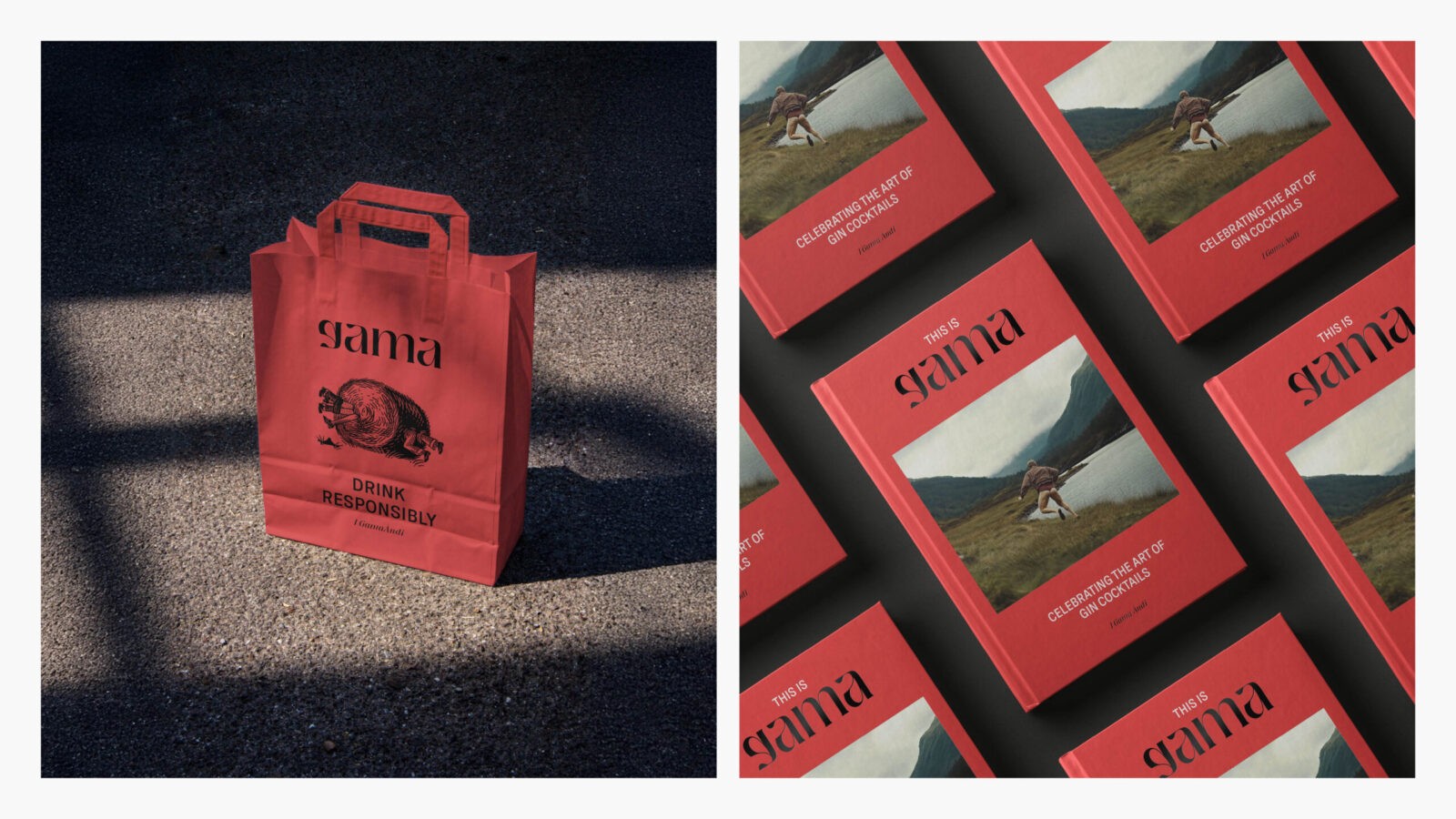
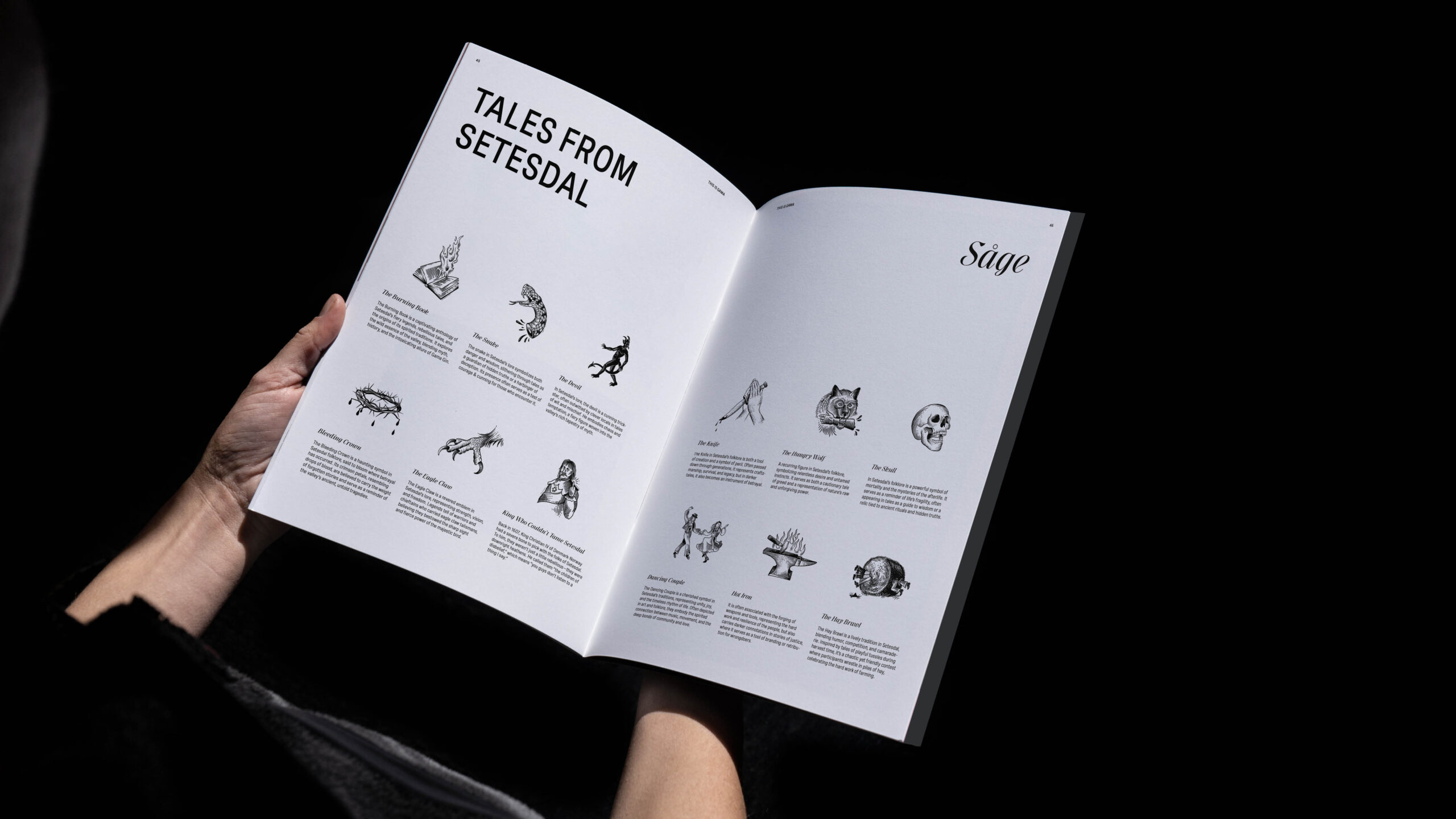
The Gama logo is crafted with respect for the village’s typographic heritage, reflecting the historical character of Setesdal. Delicate botanical illustrations with quirky, mysterious details glimpse the tales and myths that linger in the valley. Each illustration hints at the legends that have shaped Setesdal’s culture, inviting drinkers to experience a piece of its magic.
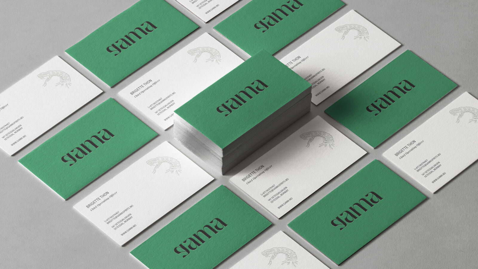
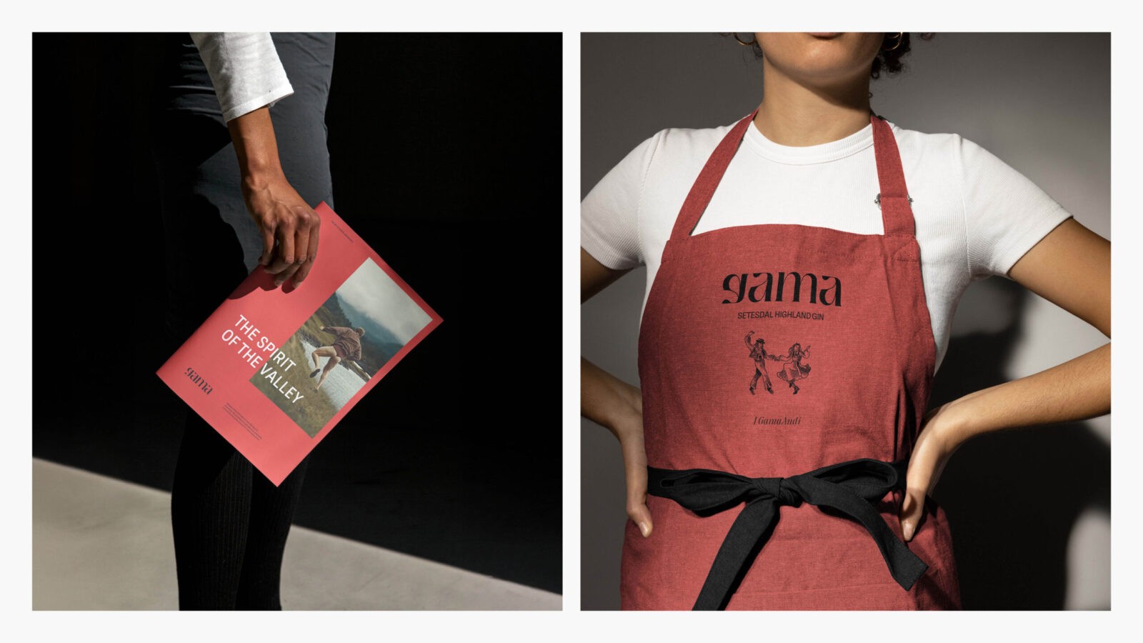
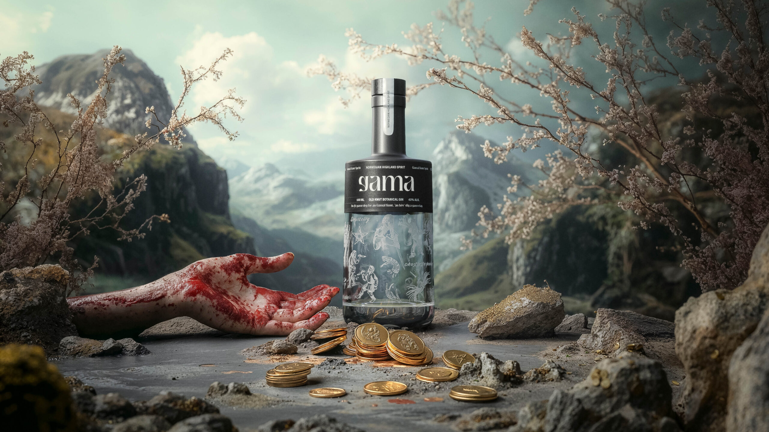
The colour palette is inspired by the local bunad, or traditional folk costume—vibrant reds, greens, black, and white, adorned with silver accents. This connection to local dress and customs ensures that every element of Gama, from the bottle’s visual design to the drink within, is a tribute to Setesdal’s heritage.
Highland Gin: The Taste of Setesdal
Gama is a Highland Gin, distilled with an old local recipe, using the unique flavours of kveik yeast and native botanicals found only in Setesdal’s highland terrain. This gin reflects the region’s landscape and soul, representing place and tradition. A taste of the wild highlands crafted to honour the land and its people.
Communication in Vallemål
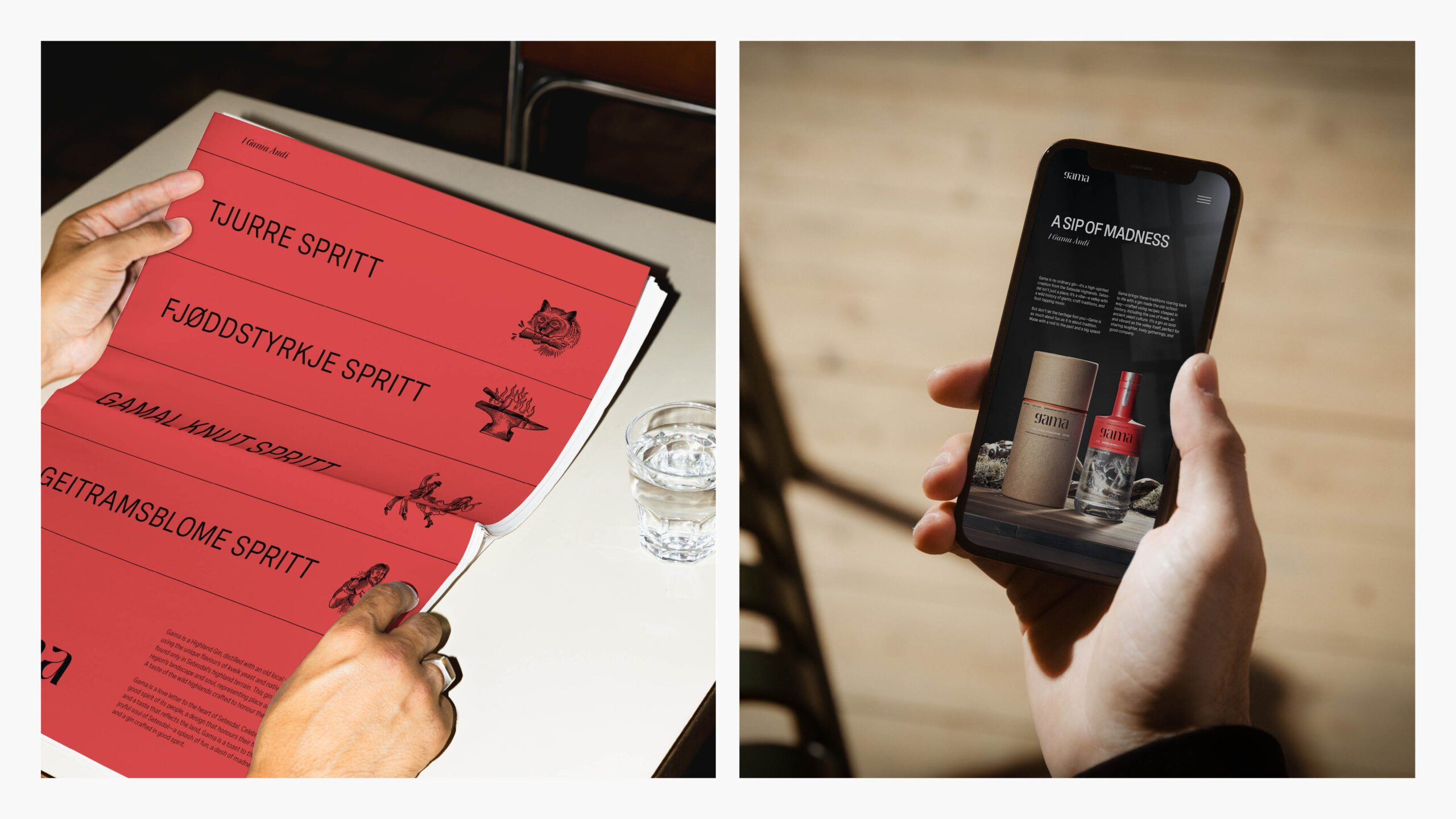
Gama’s marketing language combines English with a playful touch of Vallemål, capturing the sense of mystery and intrigue this dialect brings. It’s a language unlike any other, and by infusing it into Gama’s messaging, we invite drinkers to discover a hidden world full of charm, wit, and wild stories.
Conclusion
Gama is a love letter to the heart of Setesdal. Celebrating the good spirit of its people, a design that honours their heritage, and a taste that reflects the land, Gama is a toast to the wild, joyful soul of Setesdal—a splash of fun, a dash of madness, and a gin crafted in good spirit.

CREDIT
- Agency/Creative: KIND (Conceptual Branding AS)
- Article Title: Gama: Branding a Splash of Fun and a Sip of Madness by Kind
- Organisation/Entity: Agency
- Project Status: Published
- Agency/Creative Country: Norway
- Agency/Creative City: Bergen
- Project Deliverables: Brand Design
- Industry: Food/Beverage
- Keywords: WBDS Agency Design Awards 2024/25 , Spirits
- Keywords: WBDS Agency Design Awards 2024/25 , Spirits
-
Credits:
Chief Creative Director: Tom Emil Olsen
Design Director: Knut Harald Longva
Senior Designer: Emil Olsen
Senior Designer: Agnieszka Gawlik
Senior Designer: Lorenzo Galbiati
Senior Designer: Saurabh Kumar
Senior Designer: Mihail Mihaylov
Graphic Designer: Piotr Deres
Graphic Designer: Clara Auda
Director of Photography: Christoffer Meyer
Photographer & Videographer: Isak Norum
Cinematographer: Will Campbell
Key Account Manager: Beate Myren Romslo
Key Account Manager: Marianne Erdal Holm
Project Manager: Laure Mediavilla
Strategic Brand Director: Thomas Danielsen
Strategic Brand Consultant: Brede Lie Reime
Graphic Designer: Kristine Flatland Larsen


