Wrapped in Tradition: The Story of Gama’s Packaging
Deep in the highlands of Norway lies Setesdal, a region steeped in tradition and alive with a culture all its own. Known for its music, craftsmanship, dance, and boundless humour, Setesdal is a place where myths meet reality. Its residents speak Vallemål, a unique dialect that confuses even other Norwegians. It’s a land of legends—tales of underground creatures, brawls that forged friendships, and a drinking culture as spirited as the gin it inspired.
The Concept: In Good Spirit
Drawing from Setesdal’s essence, Kind developed the brand identity for Gama Gin. Named after the Vallemål word for “fun,” Gama celebrates the valley’s joyful, slightly chaotic spirit. The slogan “In Good Spirit” reflects a well-lived life and a gin expertly crafted. It embodies the community’s passion for life, where humour, craftsmanship, and tradition intertwine to create something truly unique. Gama is a sip of madness and a splash of joy, distilled straight from the highlands.
Packaging Design
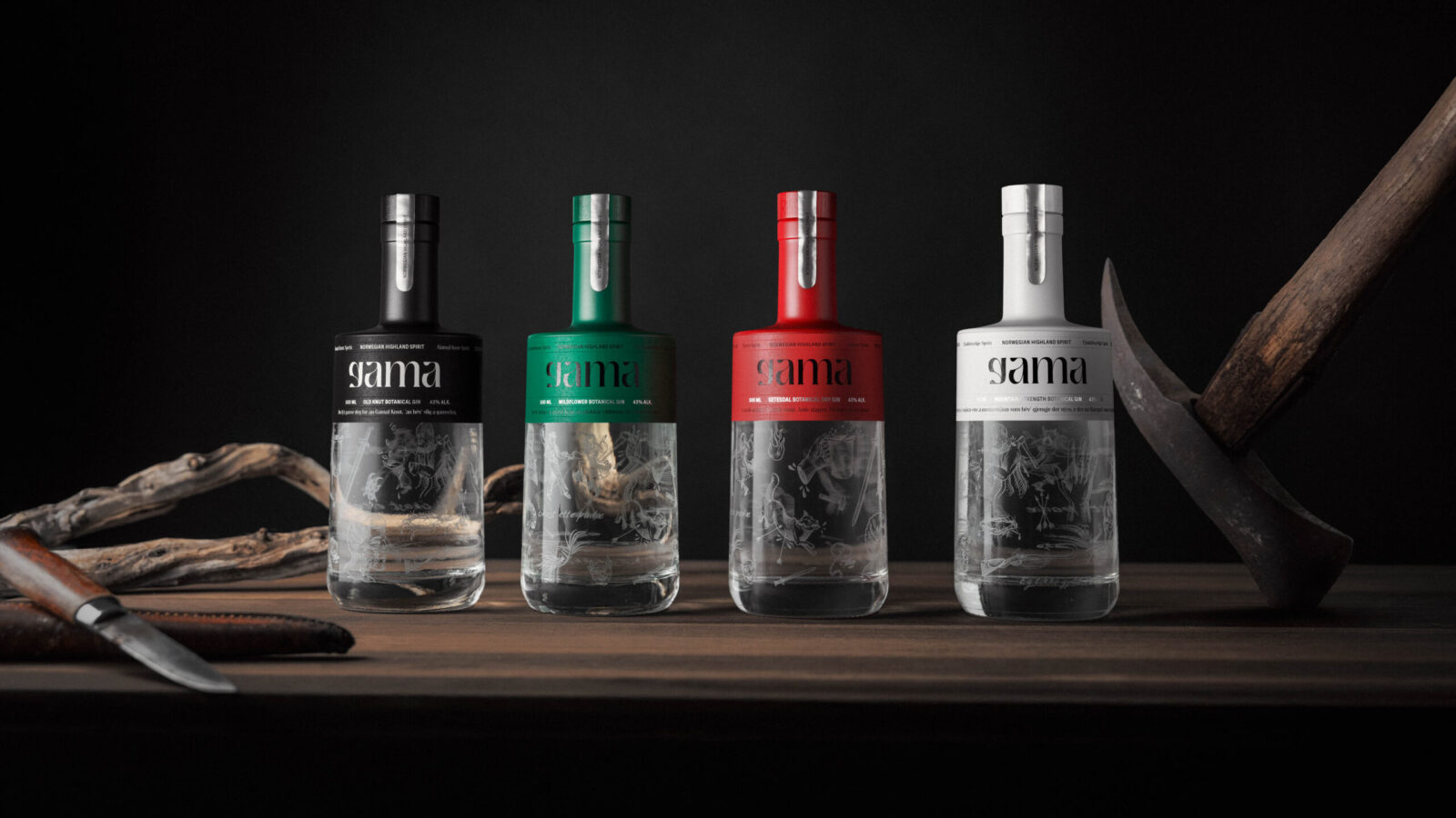
Gama’s packaging design is as much a tribute to Setesdal as the gin itself. Inspired by the region’s vibrant bunads (traditional folk costumes), the colour palette features bold reds, greens, black, and white, accented with silver. The bottle design subtly mimics the silhouette of a bunad bodice, tying the product back to its cultural roots.
The details are where Gama truly shines. The bottle’s cork is sealed with a silver label, and intricate silver debossed elements weave through the main label, paying homage to Setesdal’s rich silversmithing traditions. Delicate, frosted illustrations etched into the bottle tell the stories and sagas of the valley—myths passed down through generations. Each illustration represents a tale from Setesdal, some true, some exaggerated, but all capturing the wild, spirited essence of the valley.
Highland Gin: The Taste of Setesdal
Gama’s Highland Gin is crafted with an old local recipe, using kveik yeast and botanicals native to the Setesdal highlands. Every sip is a reflection of the land itself—a taste of its rugged terrain, deep traditions, and untamed spirit.
Communication in Vallemål
Gama’s marketing combines English with playful touches of Vallemål, inviting drinkers into the valley’s unique world. This mix of languages reflects the mystery and charm of Setesdal’s culture, sparking curiosity and a sense of discovery.
Conclusion
Gama is a love letter to Setesdal. Its design honors its heritage, its taste embodies its wild landscapes, and its spirit celebrates its people. Gama is more than a gin. It’s a toast to the vibrant soul of Setesdal—a splash of fun, a dash of madness, and a creation Made in Good Spirit.


CREDIT
- Agency/Creative: KIND (Conceptual Branding AS)
- Article Title: Gama Gin’s Vibrant Identity and Packaging by Kind Inspired by Norwegian Heritage
- Organisation/Entity: Agency
- Project Status: Published
- Agency/Creative Country: Norway
- Agency/Creative City: Bergen
- Project Deliverables: Brand Design, Packaging Design, Product Design
- Industry: Food/Beverage
- Keywords: WBDS Agency Design Awards 2024/25 Spirits , Product Creation
- Keywords: WBDS Agency Design Awards 2024/25 Spirits , Product Creation
-
Credits:
Chief Creative Director: Tom Emil Olsen
Design Director: Knut Harald Longva
Senior Designer: Emil Olsen
Senior Designer: Agnieszka Gawlik
Senior Designer: Lorenzo Galbiati
Senior Designer: Saurabh Kumar
Senior Designer: Mihail Mihaylov
Graphic Designer: Piotr Deres
Graphic Designer: Clara Auda
Director of Photography: Christoffer Meyer
Photographer & Videographer: Isak Norum
Cinematographer: Will Campbell
Key Account Manager: Beate Myren Romslo
Key Account Manager: Marianne Erdal Holm
Project Manager: Laure Mediavilla
Strategic Brand Director: Thomas Danielsen
Strategic Brand Consultant: Brede Lie Reime
Graphic Designer: Kristine Flatland Larsen


