Background
As the global population is projected to reach 9.7 billion by 2050, ensuring access to nutritious food, particularly essential proteins, has become an urgent global priority. This challenge is intensified by limited agricultural land, calling for groundbreaking solutions to secure food sources for future generations. Eyvi, a leader in Recirculating Aquaculture Systems (RAS), offers a sustainable, land-efficient approach to producing high-quality protein while conserving resources and minimising environmental impact.
Challenge
The demand for sustainable protein production methods has never been higher. The primary challenge lies in developing an efficient, eco-friendly process that uses minimal land and water resources while safeguarding animal welfare and optimising production. Eyvi needed a brand identity reflecting its innovative solutions and aligning with its mission to meet these challenges head-on.
Solution
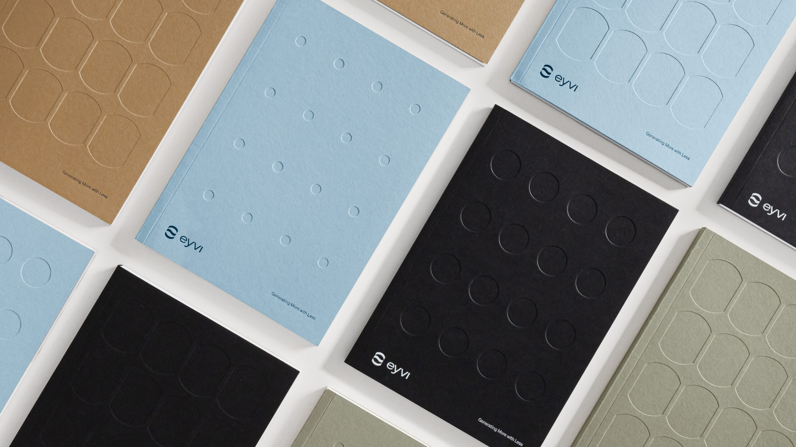
KIND developed Eyvi’s brand identity around its position as a world leader in turn-key landbased RAS and seawater Flow-through systems, emphasising Eyvi’s commitment to efficient, healthy food production. Whether RAS or Flow-through, Eyvi’s technology is designed to focus on animal welfare, ensuring solutions that benefit both people and the planet. Eyvi’s turn-key solutions encompass pre-development, complete design/engineering, and project execution, setting new standards in sustainable aquaculture.
Harvesting Unity
Eyvi derives its name from the fusion of two words: ‘Ey,’ signifying ‘Island’ in Norse and ‘Water’ in Old English, and ‘vi,’ translating to ‘we’ or ‘us’ in Norwegian and ‘force’ or ‘strength’ in Latin. Our strength lies in our people and team, while our expertise lies in Land-based Recirculatory Aquaculture Systems (RAS).
“Harvesting Unity” is a tagline that beautifully encapsulates the spirit of collaboration and synergy within Eyvi. This phrase signifies the collective effort, the strength in togetherness, and the harmonious working of the team to achieve common goals. It’s a celebration of partnership, team spirit, and the shared commitment to making a positive impact in the world of land-based aquaculture. “Harvesting Unity” signifies a journey of cooperation, where individuals come together like a well-coordinated team to reap the rewards of sustainable practices and regenerative solutions.
Eyvi Symbol
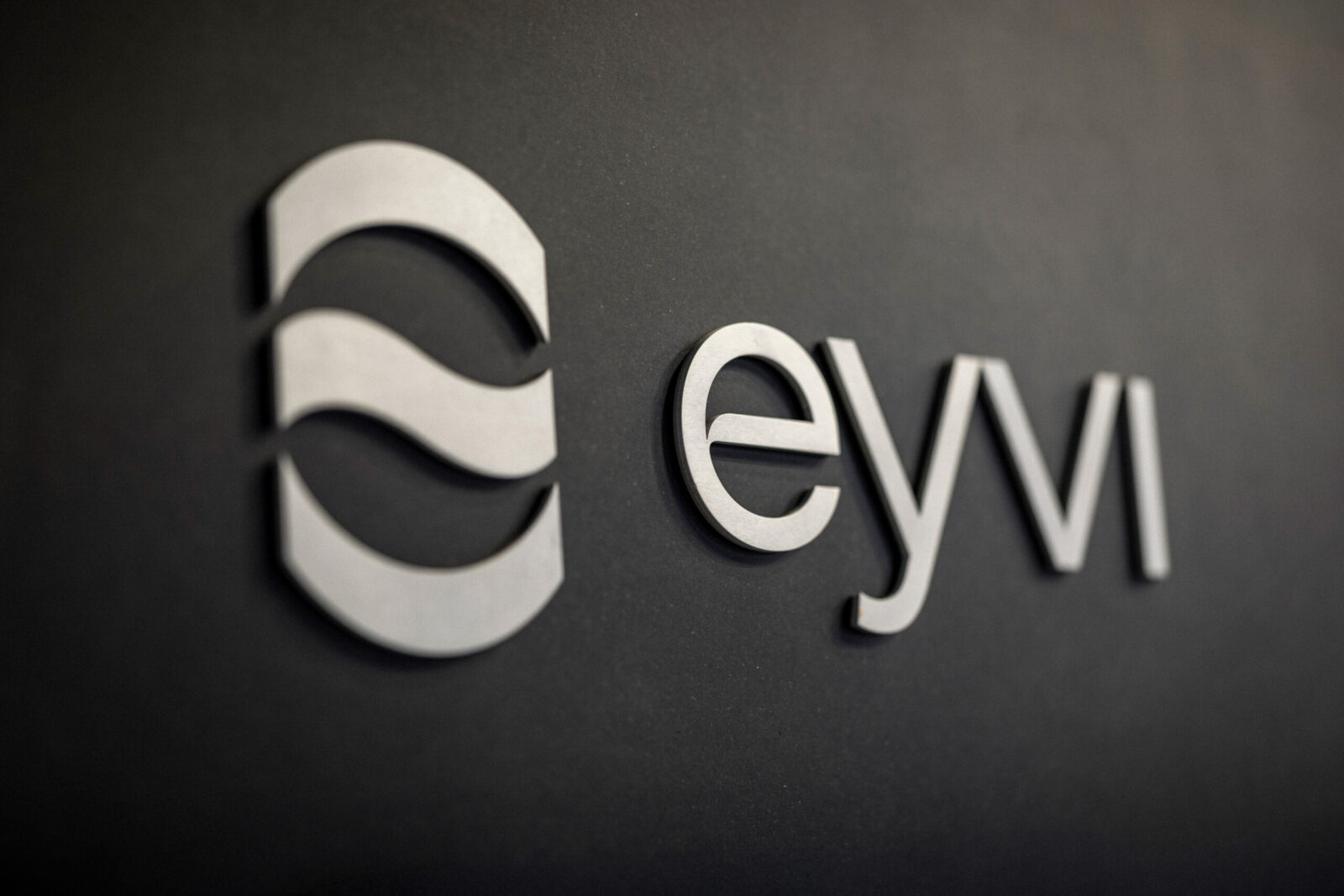
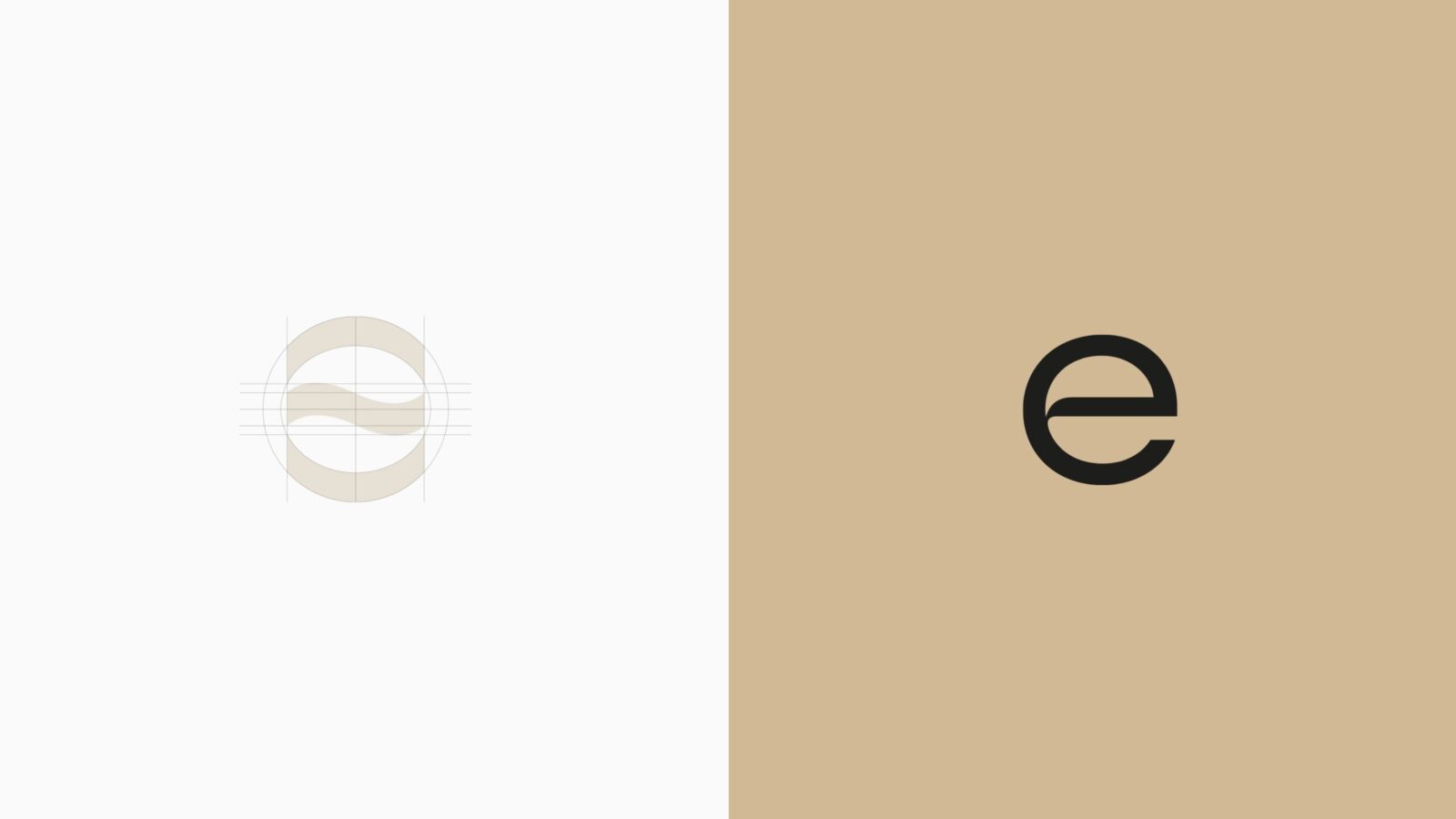
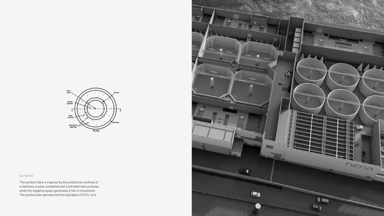
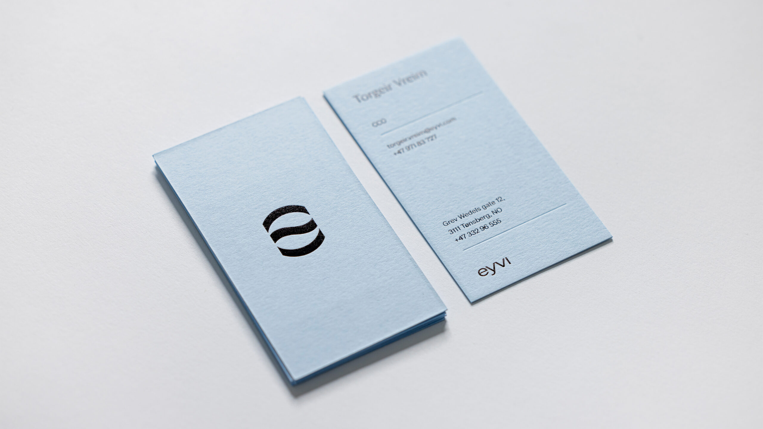
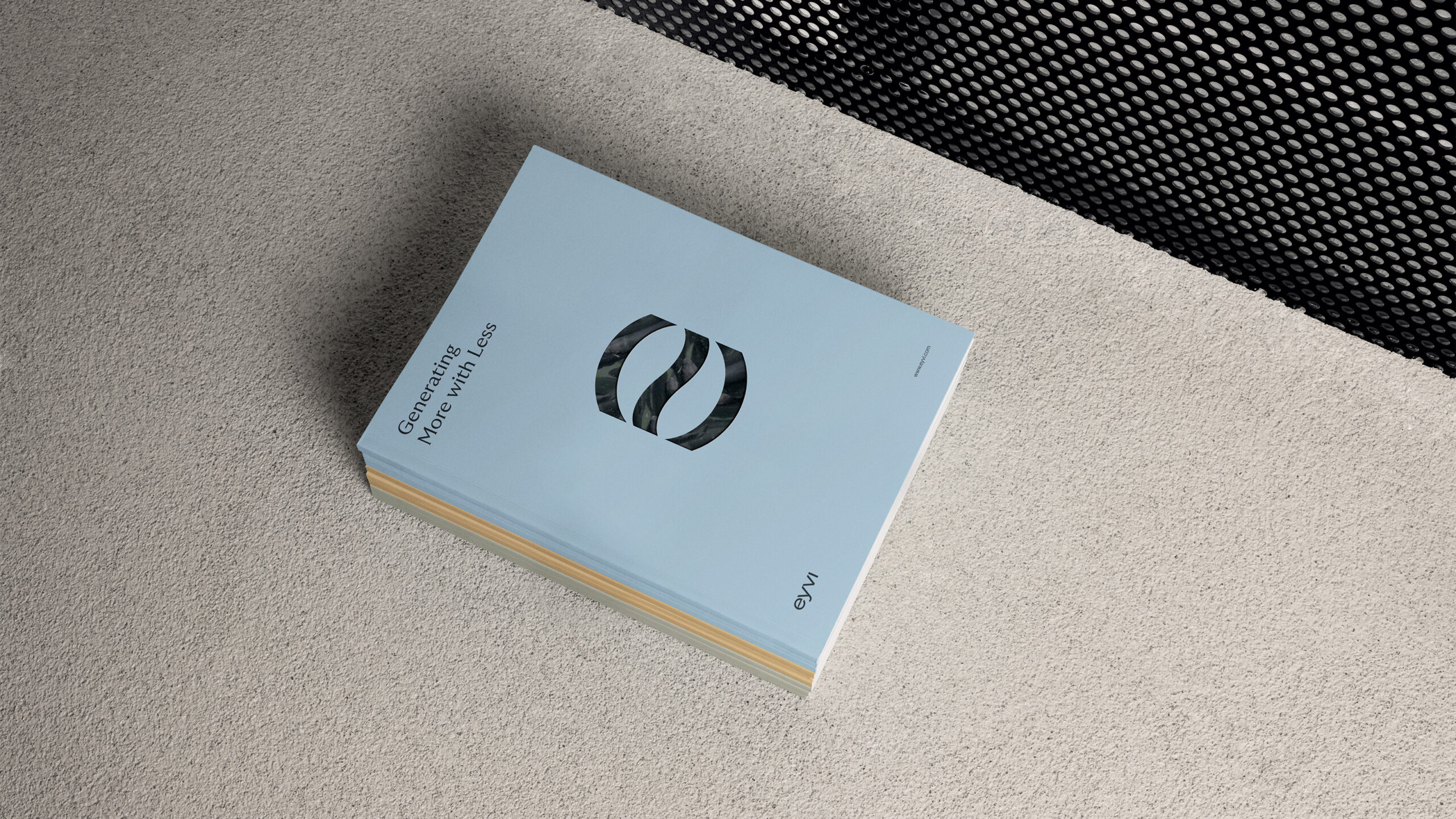
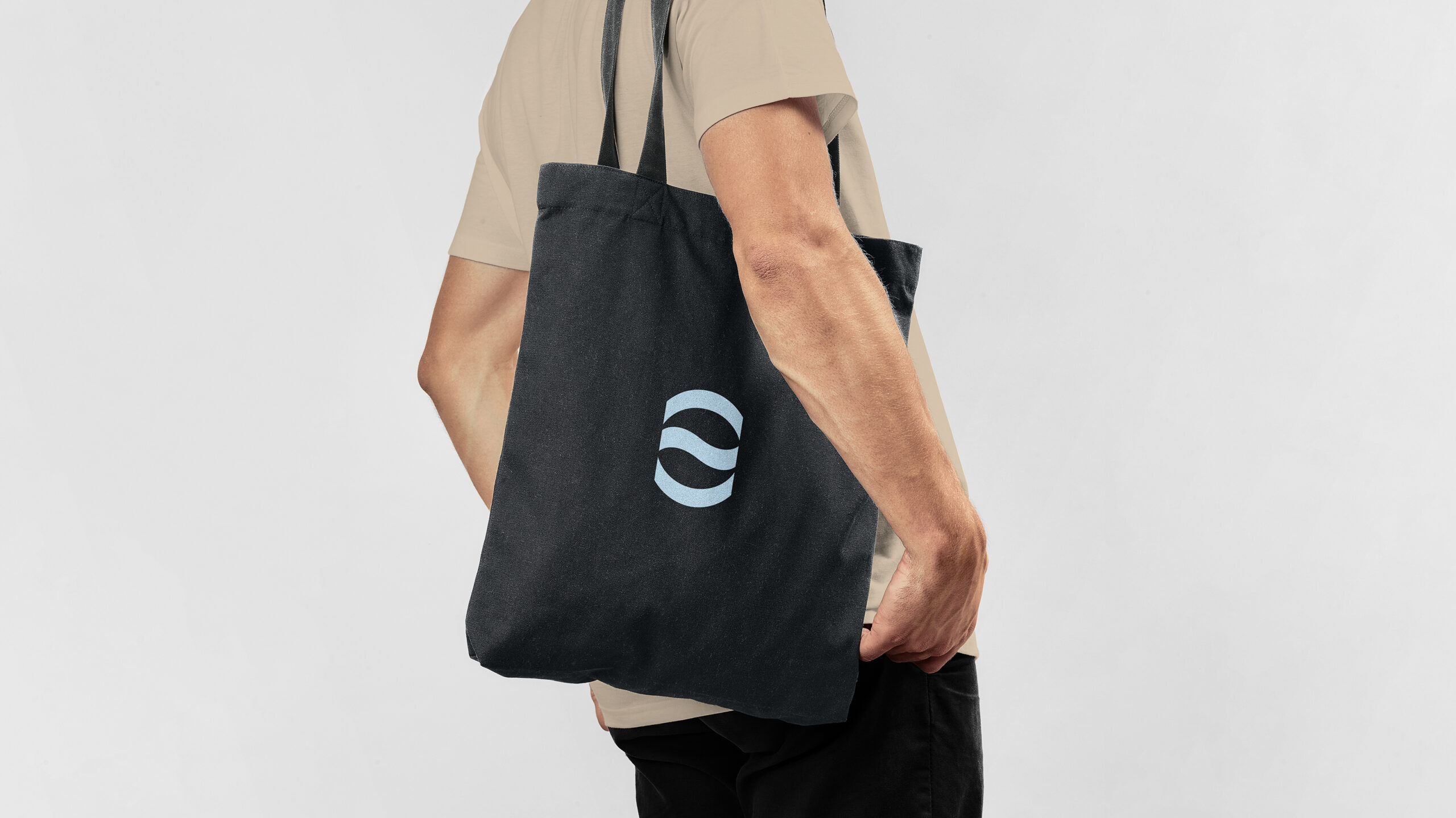
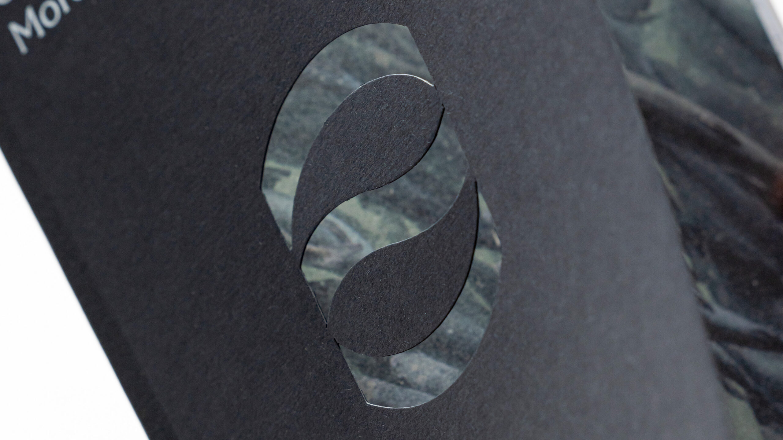
The symbol mark is inspired by the protective confines of a hatchery, a wave contained and controlled with purpose, while the negative
space generates 2 fish in movement. The symbol also denotes the first alphabet of EYVI, i.e ‘e’.
Logotype
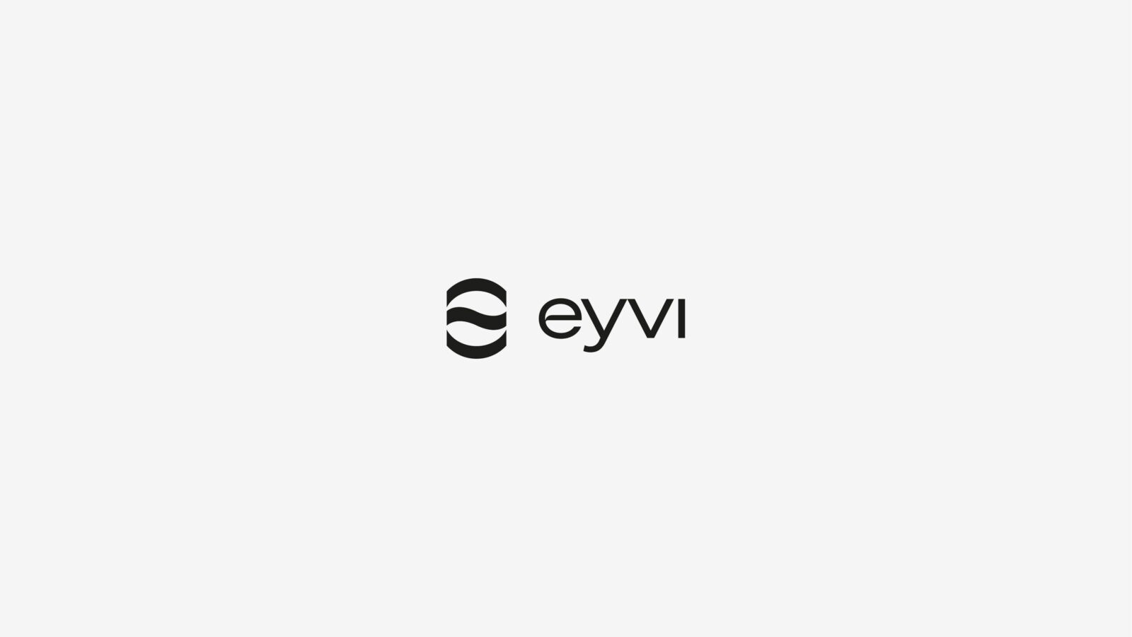
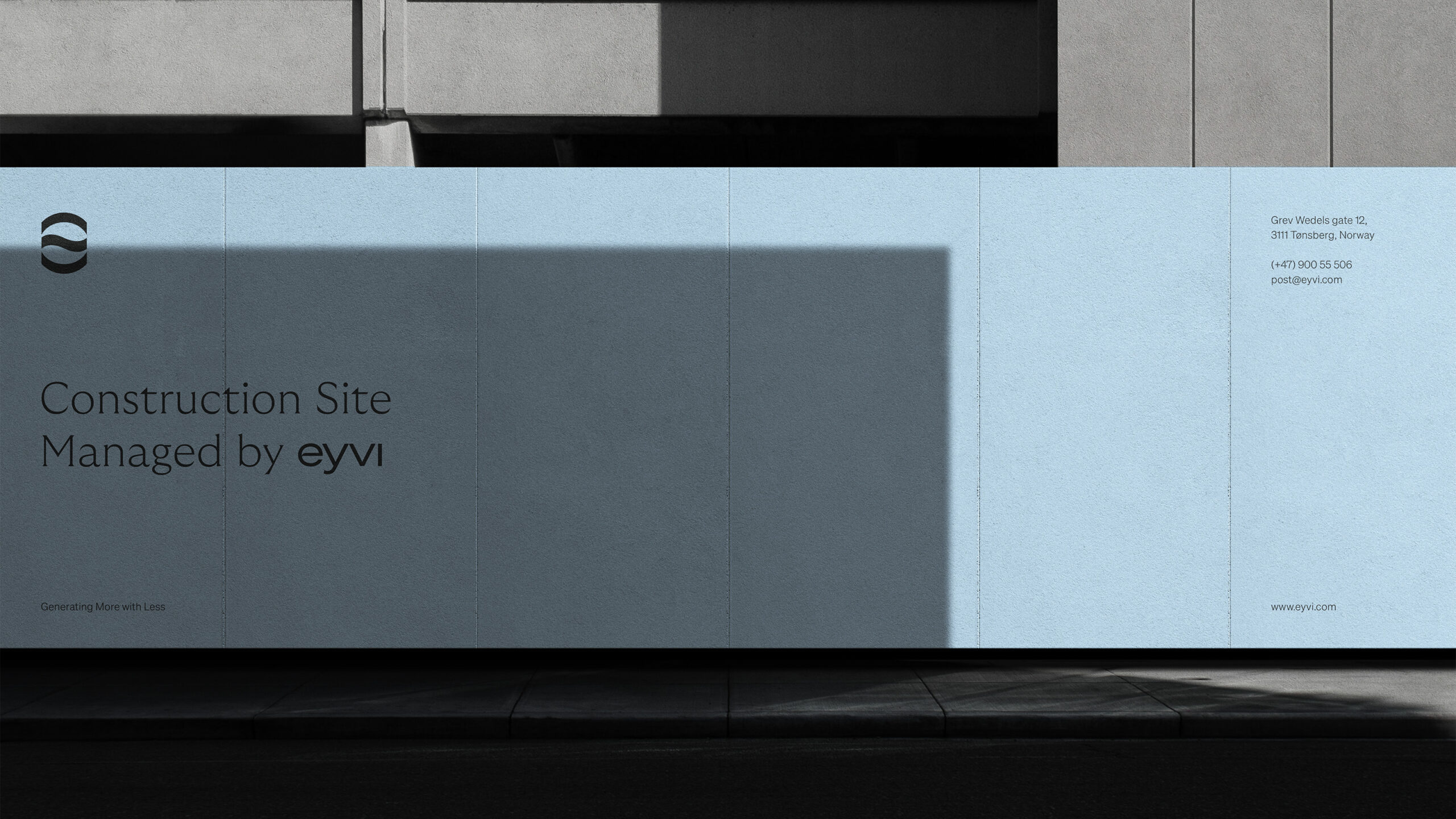
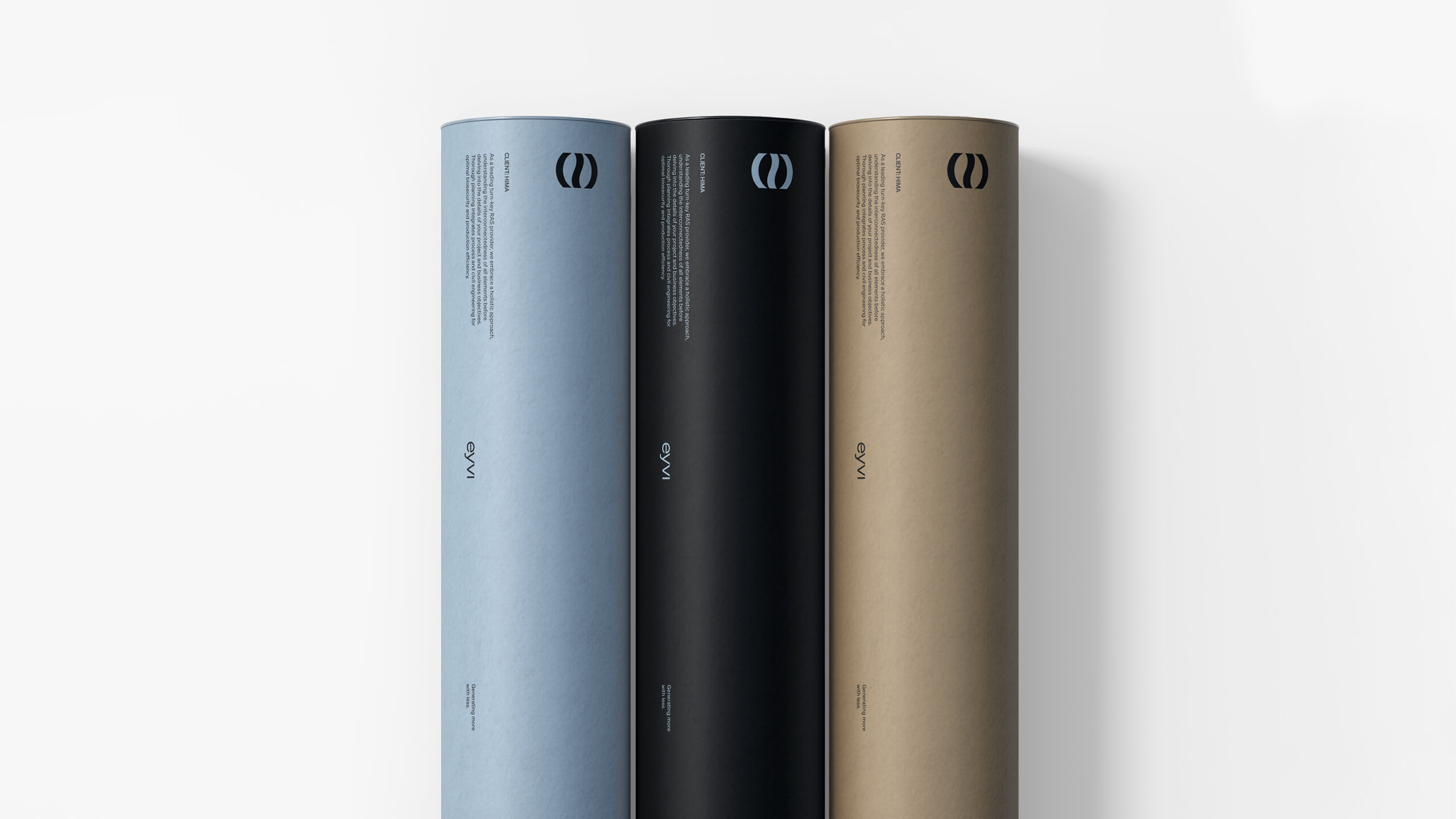
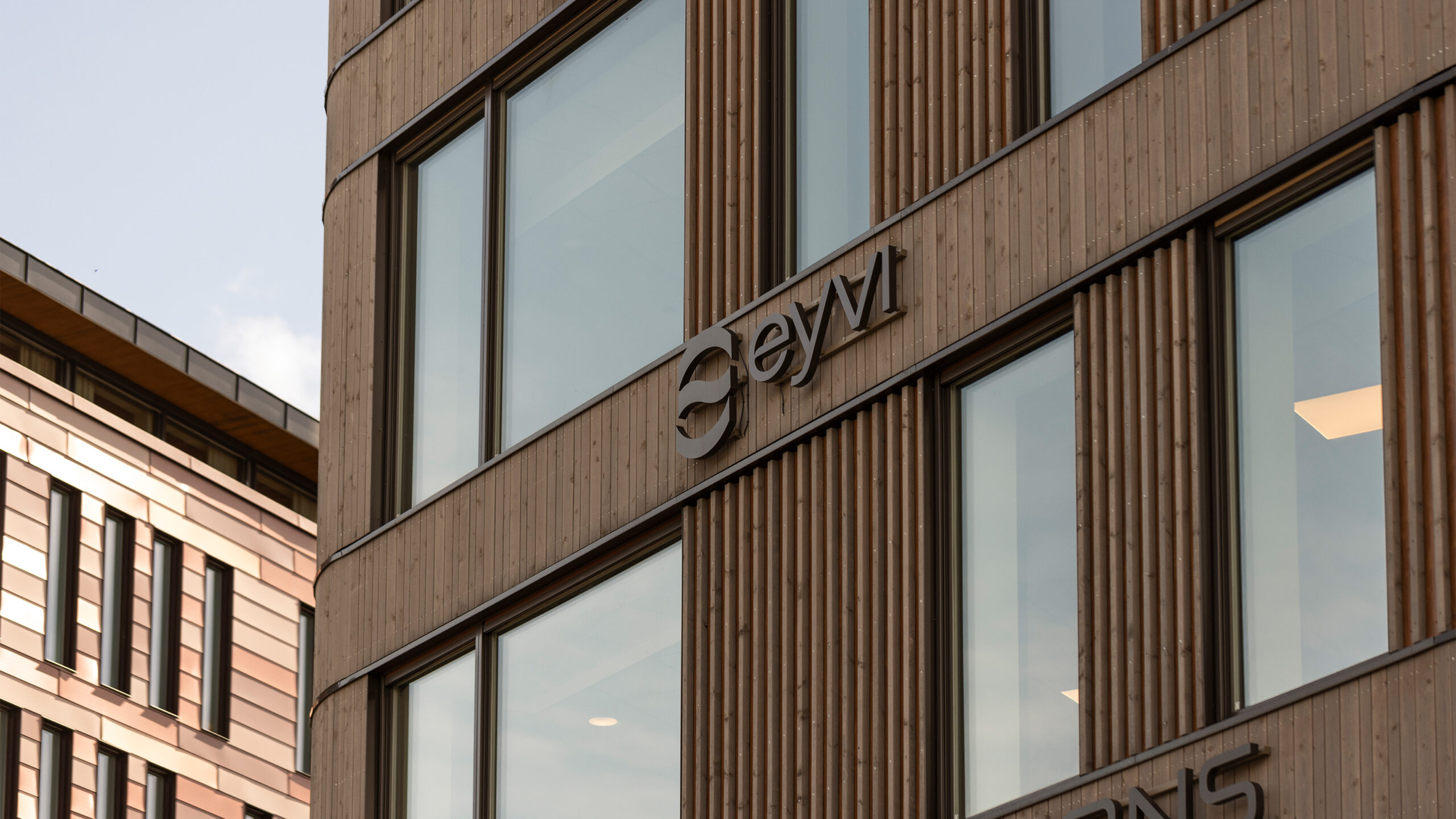
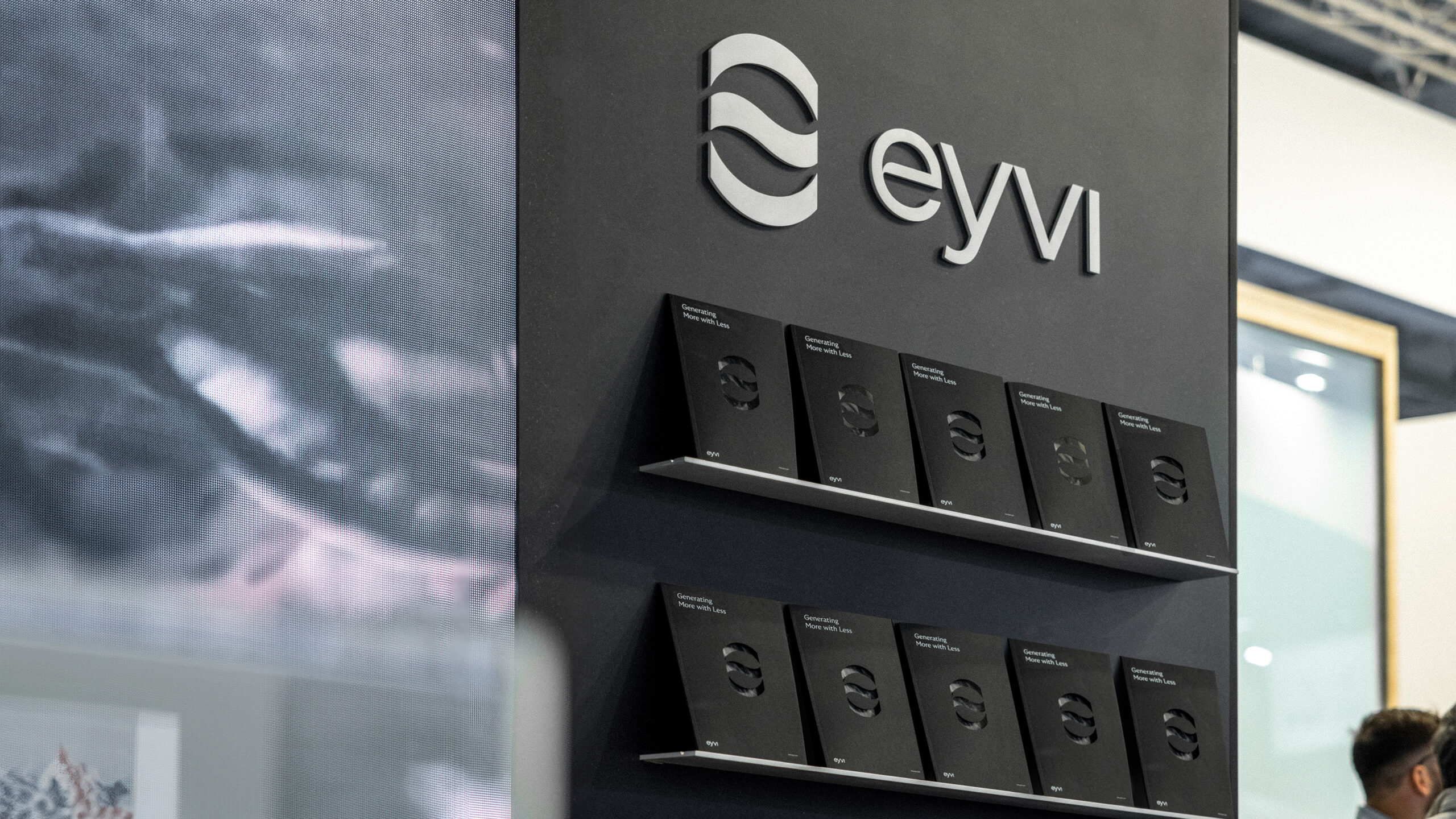
The logotype follows the structural build-up of the picture mark. Designed by building-blocks shaping an iconic wordmark. The design is contemporary and solid, providing a strong foundation for the logo to stand out. It subtly incorporates a reference to the symbol within the letter “e” of the alphabet. The negative space of the alphabet also depicts a fish like the logo.
CREDIT
- Agency/Creative: KIND (Conceptual Branding AS)
- Article Title: Eyvi’s Aquaculture Logo and Brand Identity by Kind Balances Innovation, Sustainability, and Strength
- Organisation/Entity: Agency
- Project Status: Published
- Agency/Creative Country: Norway
- Agency/Creative City: Bergen
- Project Deliverables: Brand Design
- Industry: Construction
- Keywords: WBDS Agency Design Awards 2024/25 , Aquaculture
- Keywords: WBDS Agency Design Awards 2024/25 Aquaculture
-
Credits:
Chief Creative Director: Tom Emil Olsen
Design Director: Knut Harald Longva
Senior Designer: Emil Olsen
Senior Designer: Agnieszka Gawlik
Senior Designer: Saurabh Kumar
Director of Photography: Christoffer Meyer
Photographer & Videographer: Isak Norum
Cinematographer: Will Campbell
Key Account Manager: Beate Myren Romslo
Key Account Manager: Marianne Erdal Holm
Project Manager: Laure Mediavilla
Strategic Brand Director: Thomas Danielsen
Strategic Brand Consultant: Brede Lie Reime


