Brand Overview
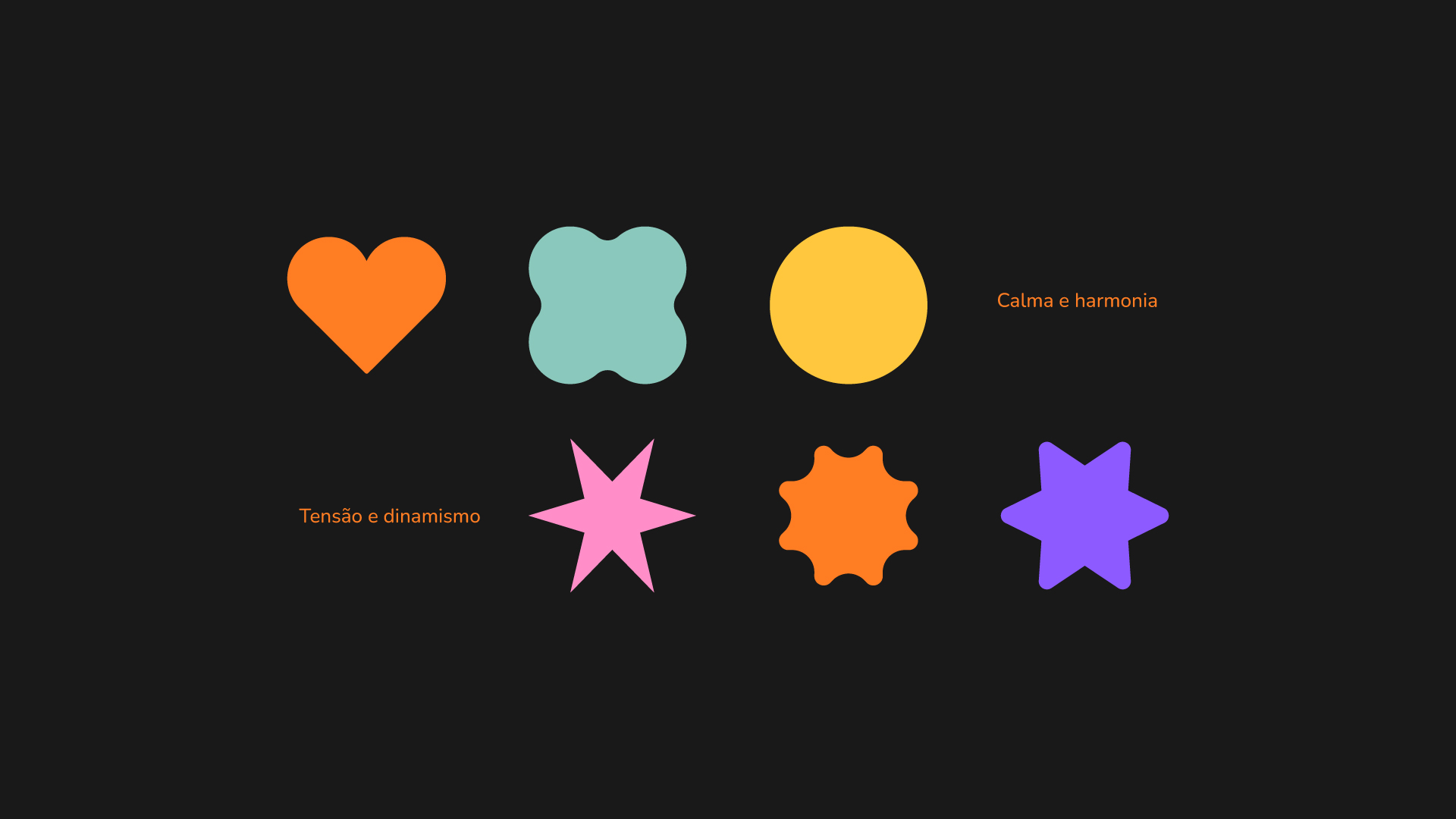
Diga! is not just a psychology clinic but an open invitation to embark on a transformative journey of self-discovery and personal growth. Based in São Paulo, Brazil, Diga! challenges conventions by offering an inclusive and dynamic space that mirrors the complexity of the human experience. Blending psychological expertise with a vibrant brand identity, Diga! fosters authentic connections, creating an environment where exploration and healing coexist. The brand’s essence captures the duality of the human condition, balancing tension and dynamism with calm and harmony.
The Challenge
To shape this unique vision, Setesete, a boutique communication agency in Brazil, was tasked with redefining the clinic’s visual identity. The challenge lay in crafting a brand that defied industry stereotypes while maintaining professionalism and approachability. The goal was to position Diga! as a beacon of authenticity and growth, resonating with individuals seeking clarity and purpose.
Strategy: A New Perspective on Emotional Well-Being
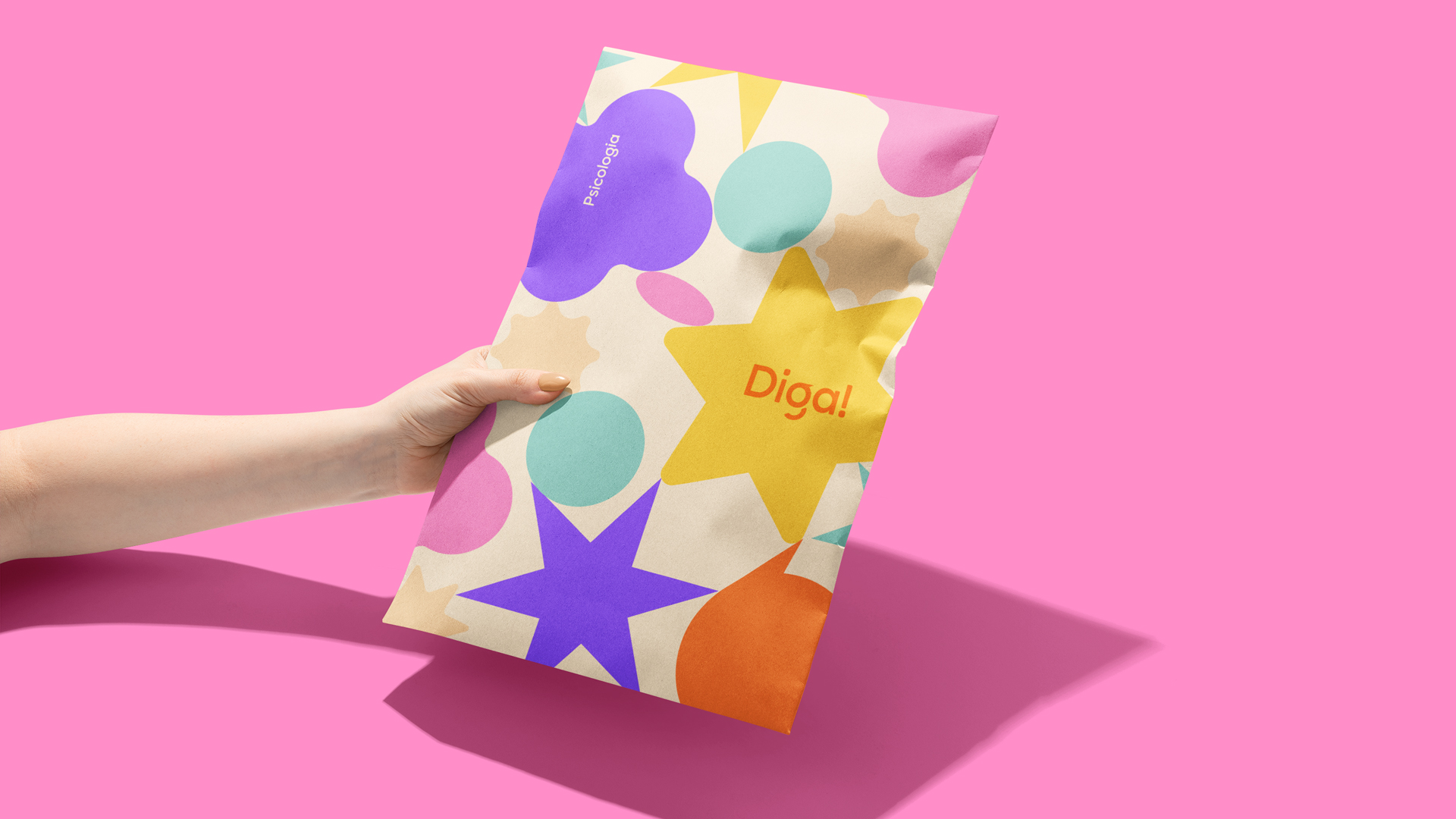
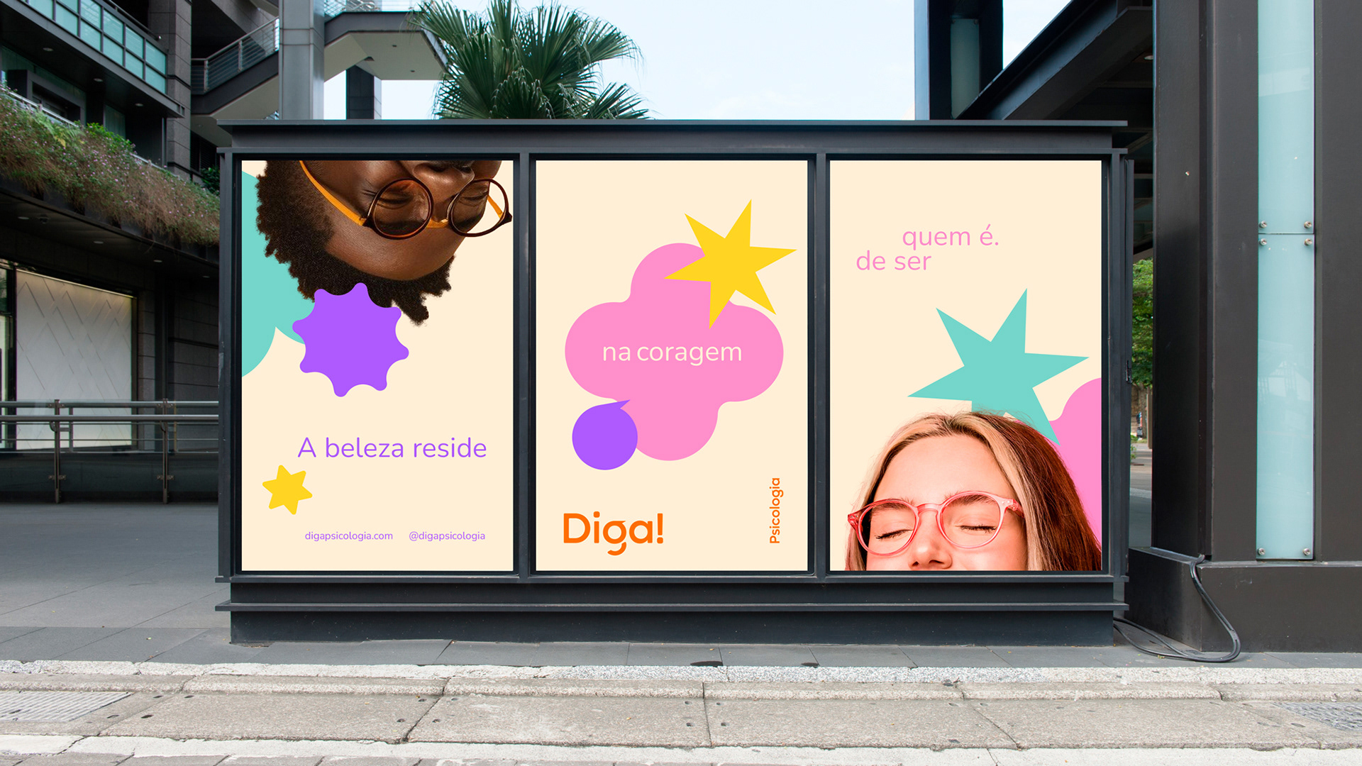
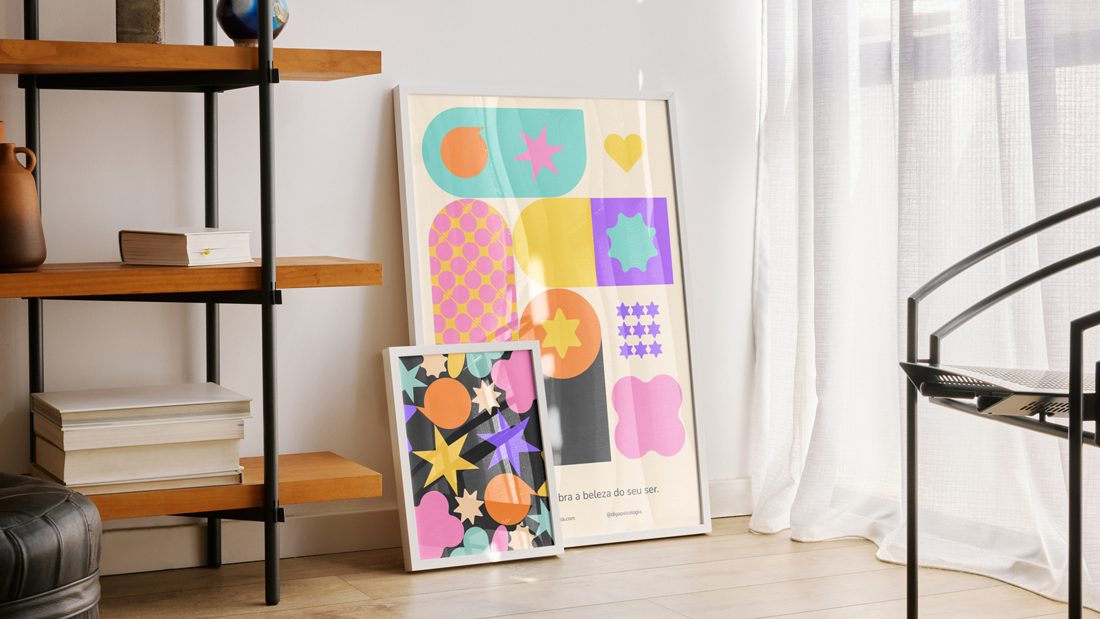
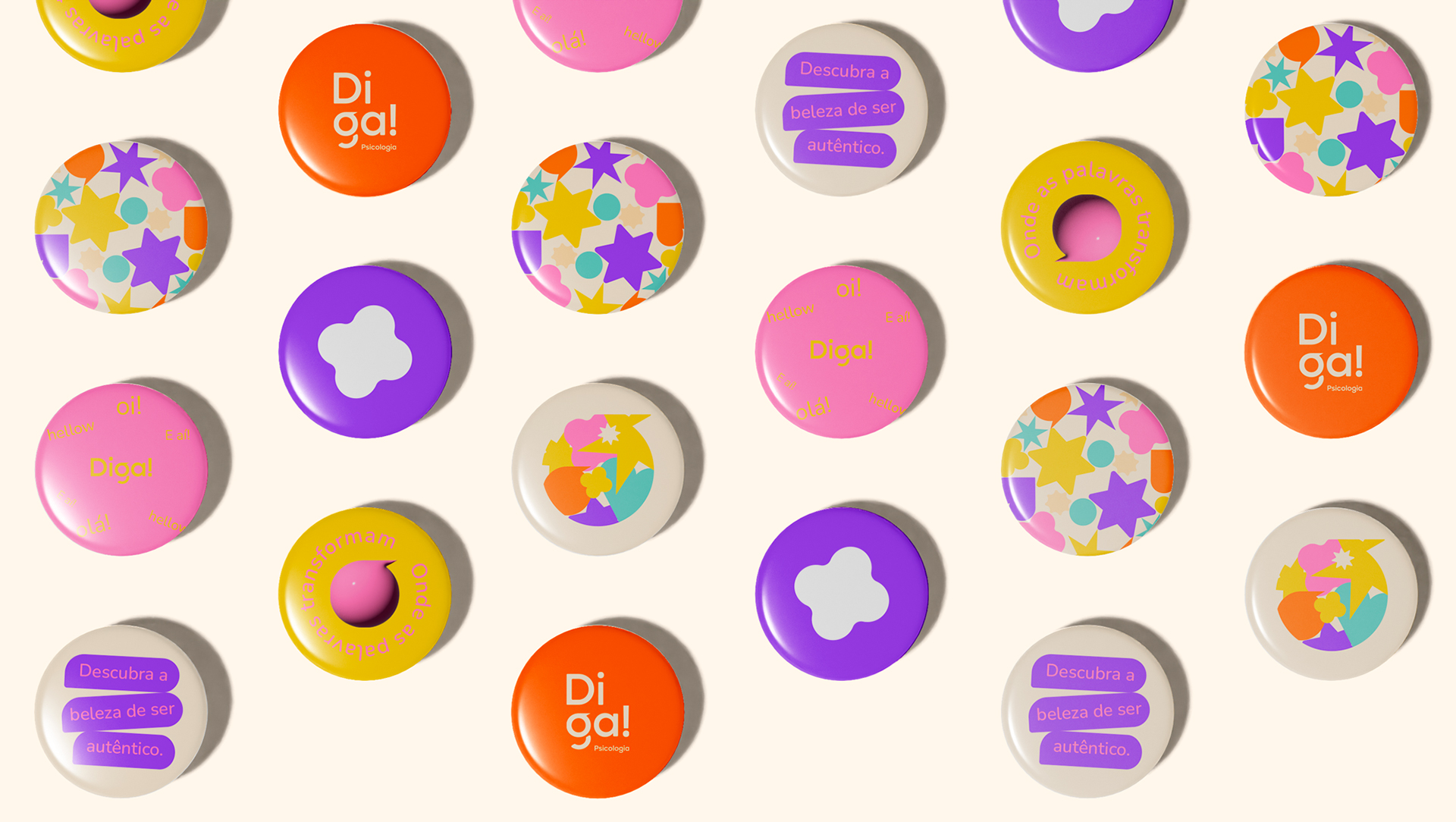
At the heart of Diga!’s rebranding was the concept of duality—embracing the multidimensional nature of human emotions. This approach involved creating a visual narrative that mirrors the richness of human experiences. The team explored synesthesia, intertwining sensory perceptions to craft an immersive brand identity. By associating visual forms with tactile sensations, Setesete established a deeper connection, sparking a network of mental and emotional associations. Key design principles emphasised: Contrasts in shape and texture to balance tension and calm, A vibrant yet grounding color palette to evoke energy and tranquility and The seamless integration of dynamic and grounding elements to create an inviting, inspiring brand environment.
Visual Identity: The Art of Duality
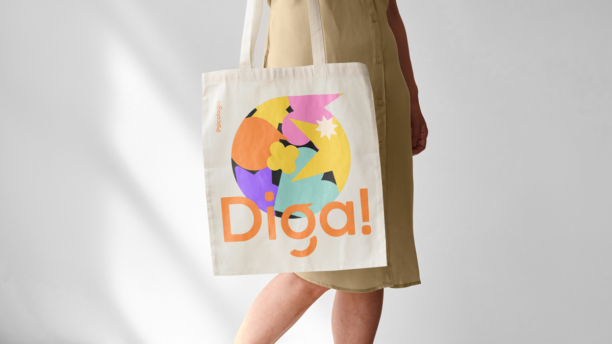
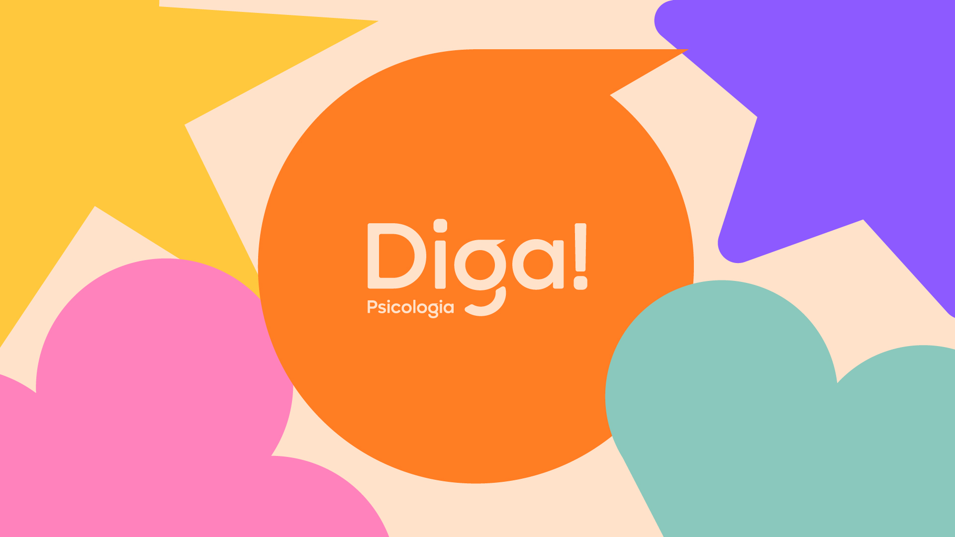
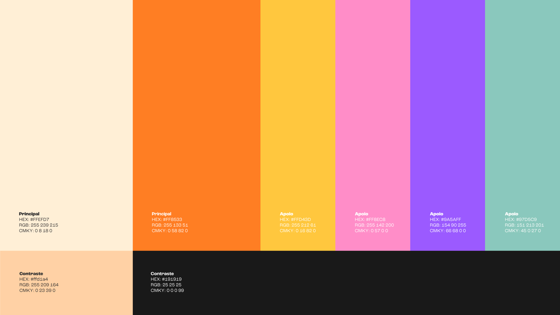
The resulting design reflected balance and depth, capturing the essence of Diga!’s mission. Typography: Modern transitional fonts were selected to combine clarity with personality, ensuring the brand maintained its professional yet approachable tone. Colour Palette: A grounding beige and deep charcoal provided the foundation, while dynamic orange and serene blue accents added vibrancy. This palette symbolizes emotional depth and vitality, inviting audiences to embrace their full spectrum of emotions. Design Elements: Contrasting shapes and textures symbolized the duality of human experiences, emphasizing balance and interconnectedness.
Results
Diga!’s rebranding has successfully established a unique identity that resonates with its audience. The clinic’s visual and messaging elements seamlessly blend professionalism with creativity, positioning it as a trusted and innovative space for mental health and personal growth. From its striking design to its inclusive and empowering message, Diga! has redefined what a multidisciplinary clinic can represent, emerging as an inspiring presence in the mental health field.

CREDIT
- Agency/Creative: Agência Setesete
- Article Title: Diga! the Clinic that said ‘Yes!’ to Brand Authenticity by Agência Setesete
- Organisation/Entity: Agency
- Project Type: Identity
- Project Status: Published
- Agency/Creative Country: Brazil
- Agency/Creative City: Curitiba - PR
- Market Region: South America
- Project Deliverables: Art Direction, Brand Creation, Brand Identity, Brand Strategy, Creative Direction
- Industry: Health Care
- Keywords: psychology clinic, clinic, brand, psychology,
-
Credits:
Agency:: Setesete
Creative Director:: Bruno Bardella
Brand Designer:: Franciele Schnem
Motion Graphics:: Jean Paulo
Copywrithing:: Bianca izidoro
Account Manager:: Milena Letu00edcia Romko


