Svegro is Sweden’s leading brand within locally grown potted greens. Existing in consumers kitchens, but not in their minds as a brand. To reinforce their presence, the rebrand needed to combine their strong heritage with an emotional setting. The target group is foodies – both flavour and sustainable conscious. Research show that their interest in local farming is huge. To make Svegro distinctive – it was crucial to bring out the flavours, quality, and origin. Drawing on their nr 1 position – and inspired by their location amidst the Swedish regal isles – we dressed them into kings and queens of greens. In Nordic countries, sustainability and environmental consciousness are deeply ingrained in the culture, which likely contributes to the widespread availability of kitchen herbs sold as small, whole plants. After consumers use the leaves and stems to make dinner, they can replant the root ball and enjoy new basil or thyme when the plant reblooms. It’s a responsible and tasty way to reduce waste.
Kings and Queens of Greens
Amidst the lush isles where the Swedish King and Queen reside lies Svegro’s greenhouse, nestled within a majestic, verdant landscape. Here, a world of organic herbs and greens is cultivated with care, embodying a bold vision to make Sweden self-sufficient in produce. For generations, Svegro has been an undisputed leader in this unbranded category, consistently championing innovation, craftsmanship, and sustainability. From leveraging AI to minimize water usage and food waste to setting new standards in organic farming, they have firmly established themselves as true pioneers. To reinforce their unparalleled role, we embraced their identity as the regal rulers of greens.
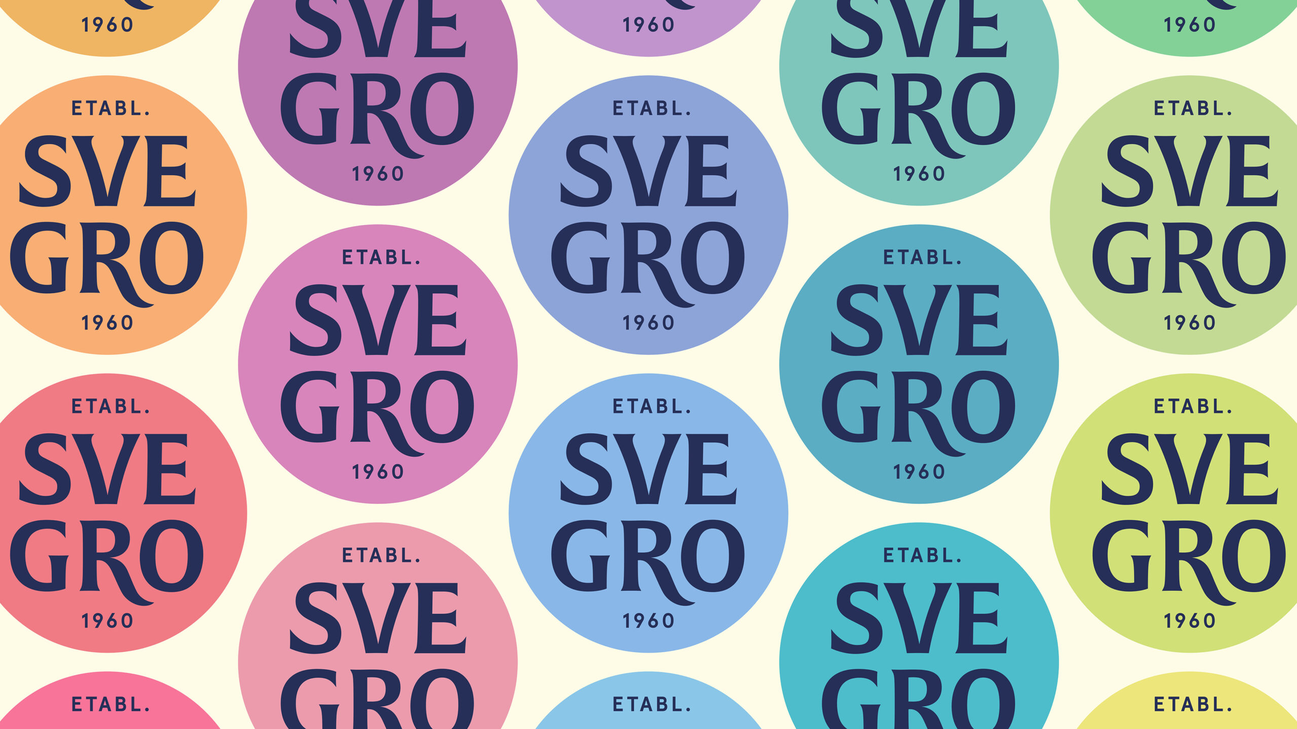
At the heart of this transformation lies the logotype, the root of their visual expression. The circular shape serves as a foundation, reflecting everything from the round openings of greenhouse pots to the plates on which their greens are served. This circle also symbolizes the crown of a plant – timeless, organic, and confidently understated.
The name “Svegro,” short for “Swedish Growth,” is ingeniously split into two components. The “R” and “V” within the logotype creatively evoke but still subtle a growing plant: the “R” with its undulating diagonal represents roots, while the “V,” with slightly curved stems and leaves, reaches upwards toward growth.
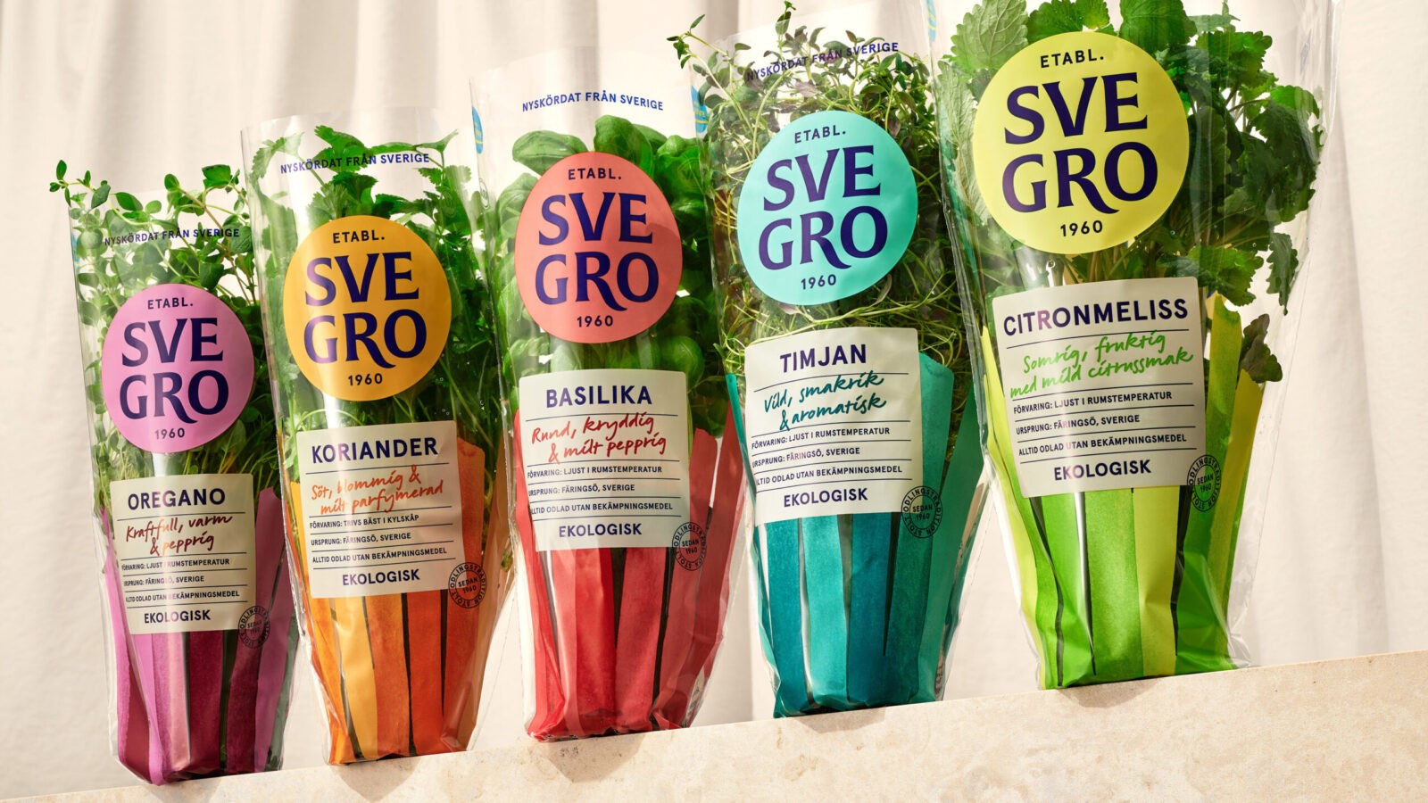
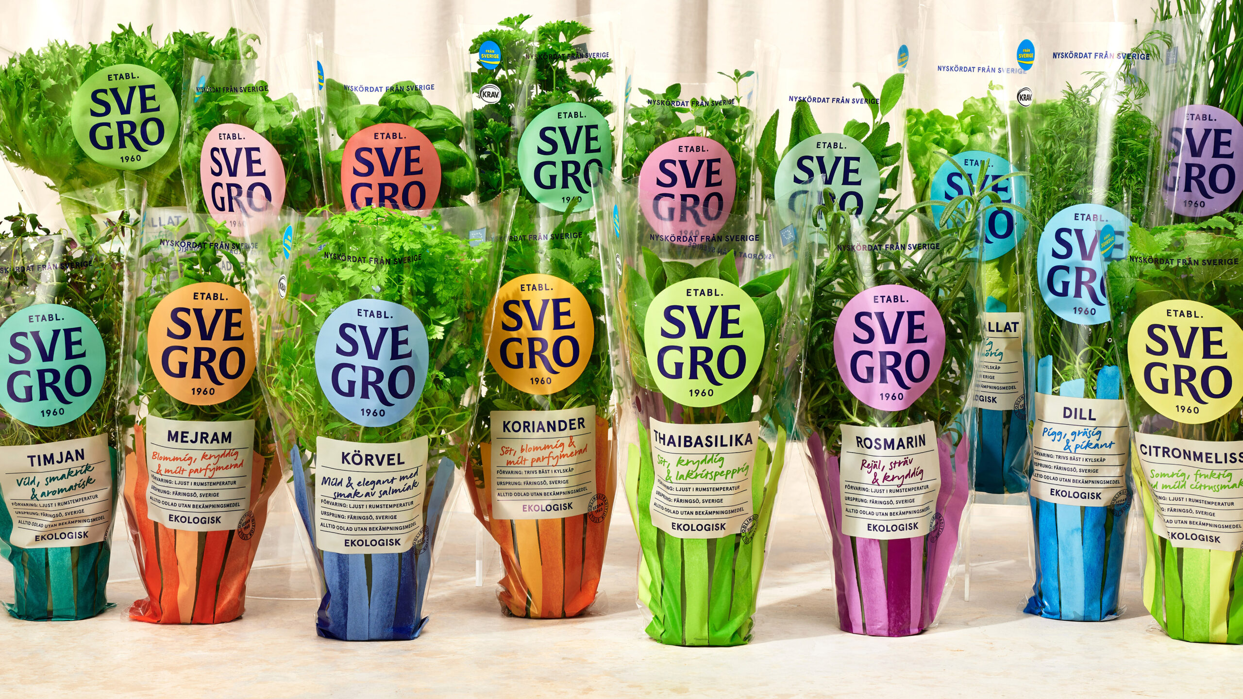
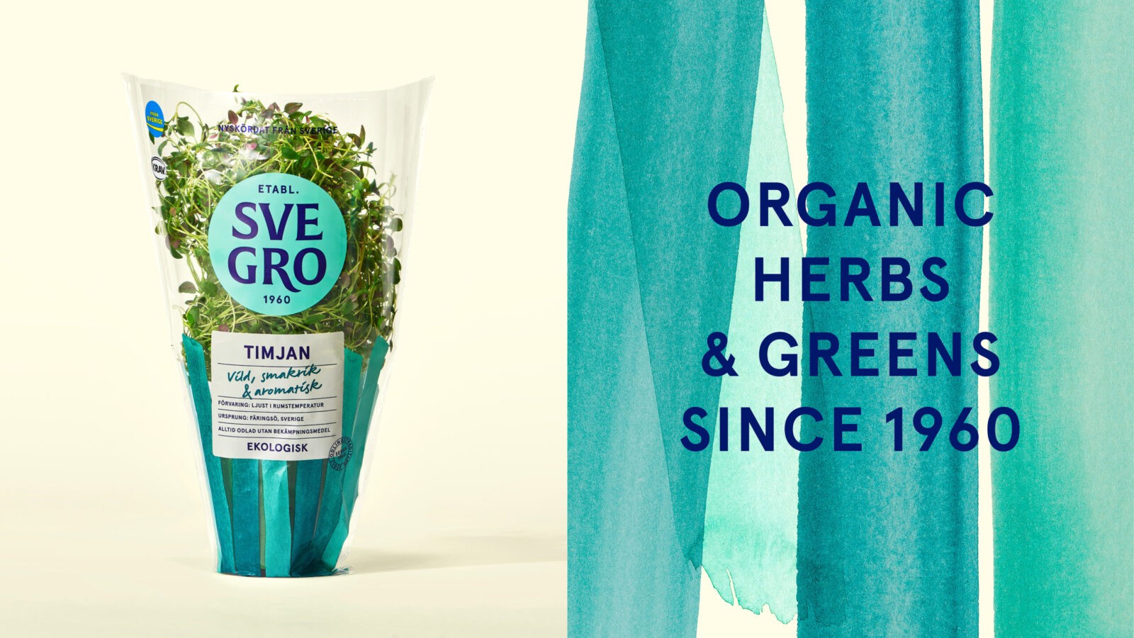
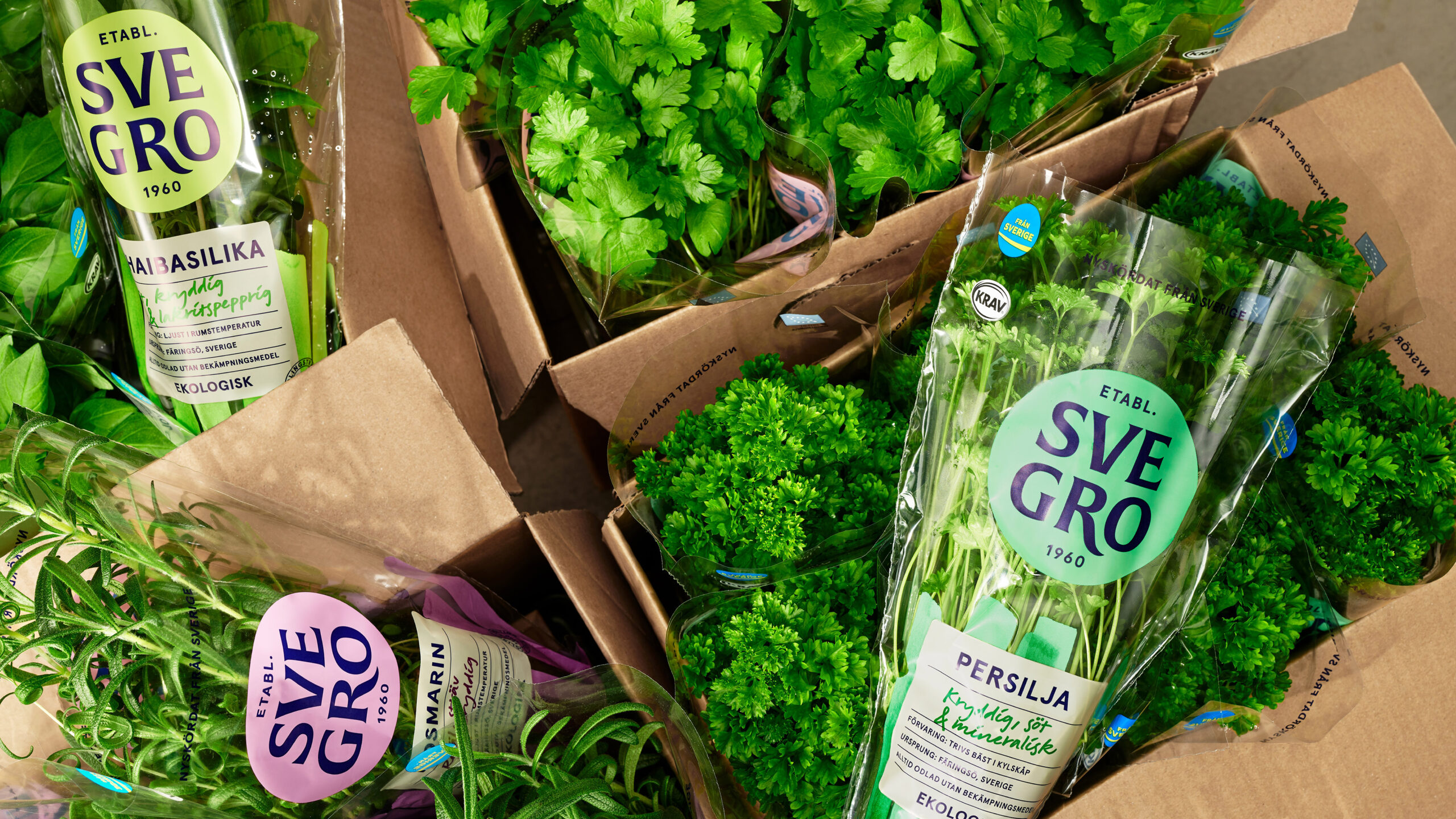
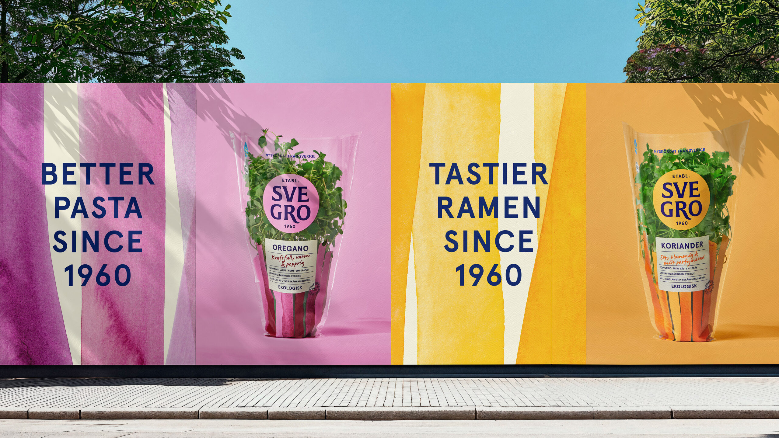
Further enhancing this visual identity is a hand-drawn ink pattern, evocative of wild vegetation. Each design element reflects the unique personality of the plants, brought to life with vibrant hues. Each herb gets to shine while building a strong brand and cohesive look.
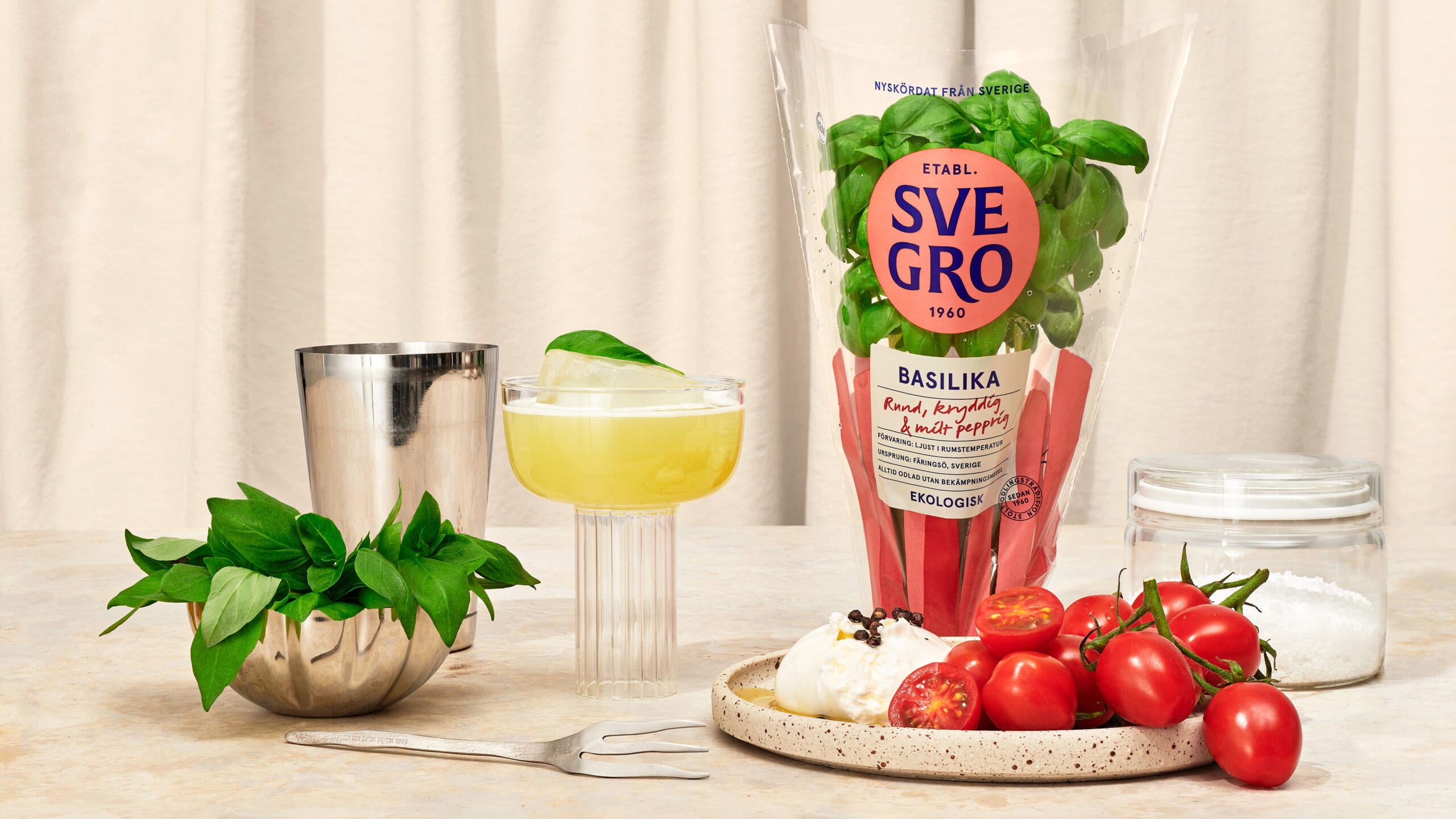
In a category where the competitor’s packaging is predominantly white, Svegro’s new design injects a great deal of flavour and energy. Paired with sensory descriptors like aromatic, spicy, crisp, and mellow, Svegro’s greens inspire new culinary adventures while celebrating freshly harvested, local produce. The result is a brand that not only brightens its category but confidently reinforces its status as the true monarch of organic greens.
CREDIT
- Agency/Creative: Pond Design AB
- Article Title: Pond Design Crowns Svegro as the Kings and Queens of Greens with Organic Elegance and Culinary Inspiration
- Organisation/Entity: Agency
- Project Status: Published
- Agency/Creative Country: Sweden
- Agency/Creative City: Stockholm
- Market Region: Sweden
- Industry: Food/Beverage
- Keywords: WBDS Agency Design Awards 2024/25 , Kings and Queens of Greens
- Keywords: WBDS Agency Design Awards 2024/25 Kings and Queens of Greens
-
Credits:
Client Director: Fredrik Svalstedt
Production Manager: Tina Lejdemyr
Senior Designer: Martin Ask
Senior Designer: Sarah Dejert
Senior Designer: Anna Tran
Junior Designer: Måns Rydh
Final Art: Anna Johansson
Visualiser: Johan Svedelius
Copywriter, Hint: Stefan Pagreus


