Barogo : Meta Logistics, Anything from Anywhere
Overview
Barogo is a South Korea’s No.1 delivery platform. The delivery and logistics industries have continued to grow due to changes in lifestyle trends after Covid-19, and the role of riders has become increasingly important. In line with these changes, Barogo has been expanding its business to include not only delivery but also various other businesses such as shared kitchens, eco-friendly bikes, micro-fulfillment centers (MFC), IT platforms, and eco-friendly packaging. Despite these advancements, Barogo’s brand was undervalued, perceived as a simple delivery service company. Additionally, its riders lacked proper social recognition.We have repositioned Barogo as a platform that enhances the quality of community life by redefining it as a ‘hyper-connected ecosystem’, rather than just a simple delivery service, This strategic shift elevated the company’s market value significantly, from $200 million to $600 million.
Brand Redesign Strategy
Barogo sought to build an ecosystem that supports business expansion while improving the lives of its riders. To align with this vision, we crafted a new design for Barogo which declares an expansion from delivery services to a logistics company, with a solution-driven approach to ensure rider safety on the road.
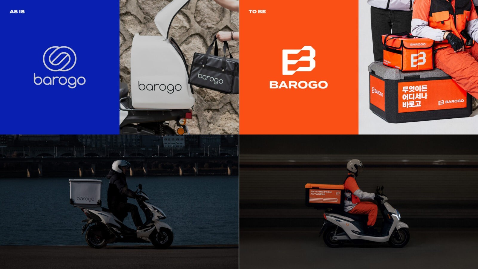
We identified that the brand’s existing blue color lacked visibility on the road due to its short wavelength, directly affecting rider safety. To address this, we introduced orange a high visibility color suitable for road safety as the new brand color. From a business perspective, orange complements Barogo’s legacy blue, making it a suitable color to represent the new Barogo.
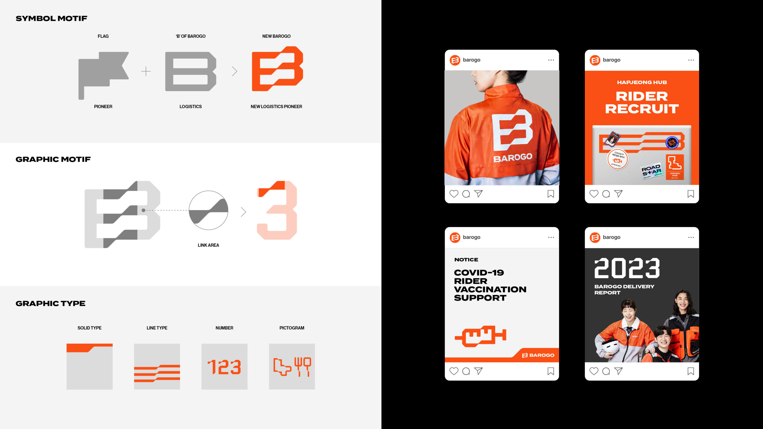
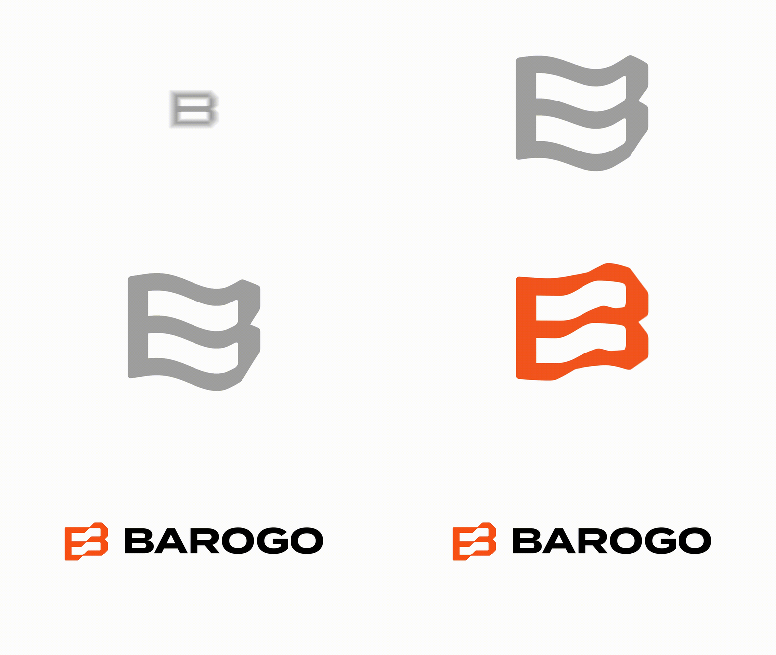
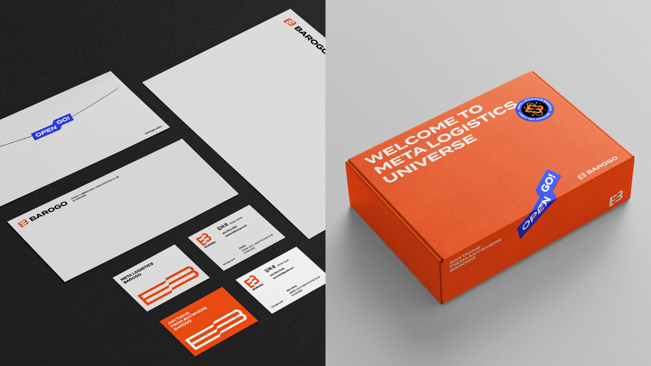
The previous logo, composed of thin fonts and line-based symbols, was insufficiently visible in practical settings. We redesigned the logo, adopting bold fonts and transforming the “B” from Barogo’s name into a powerful visual asset. This “B”, combined with a flag shape, represents Barogo’s commitment to its expansion into the logistics industry.
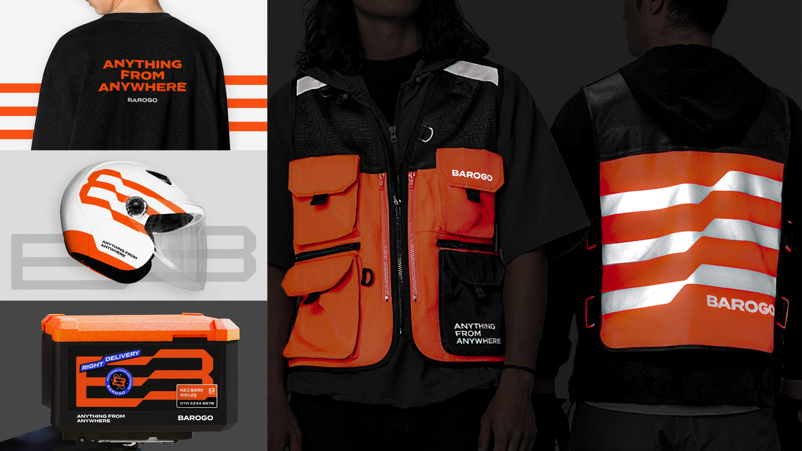
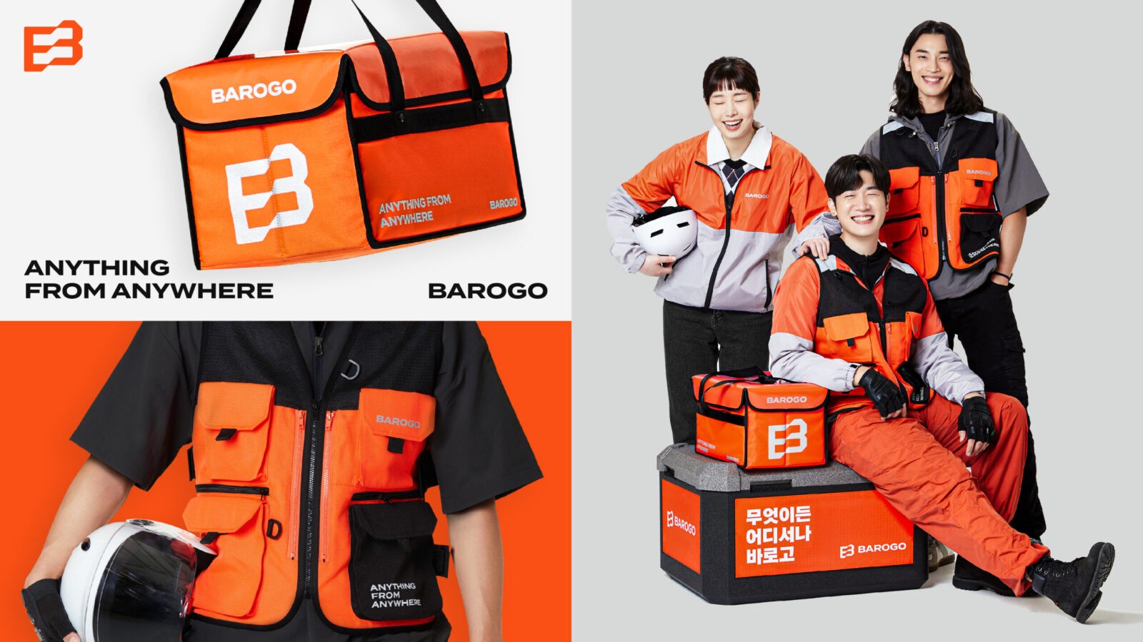
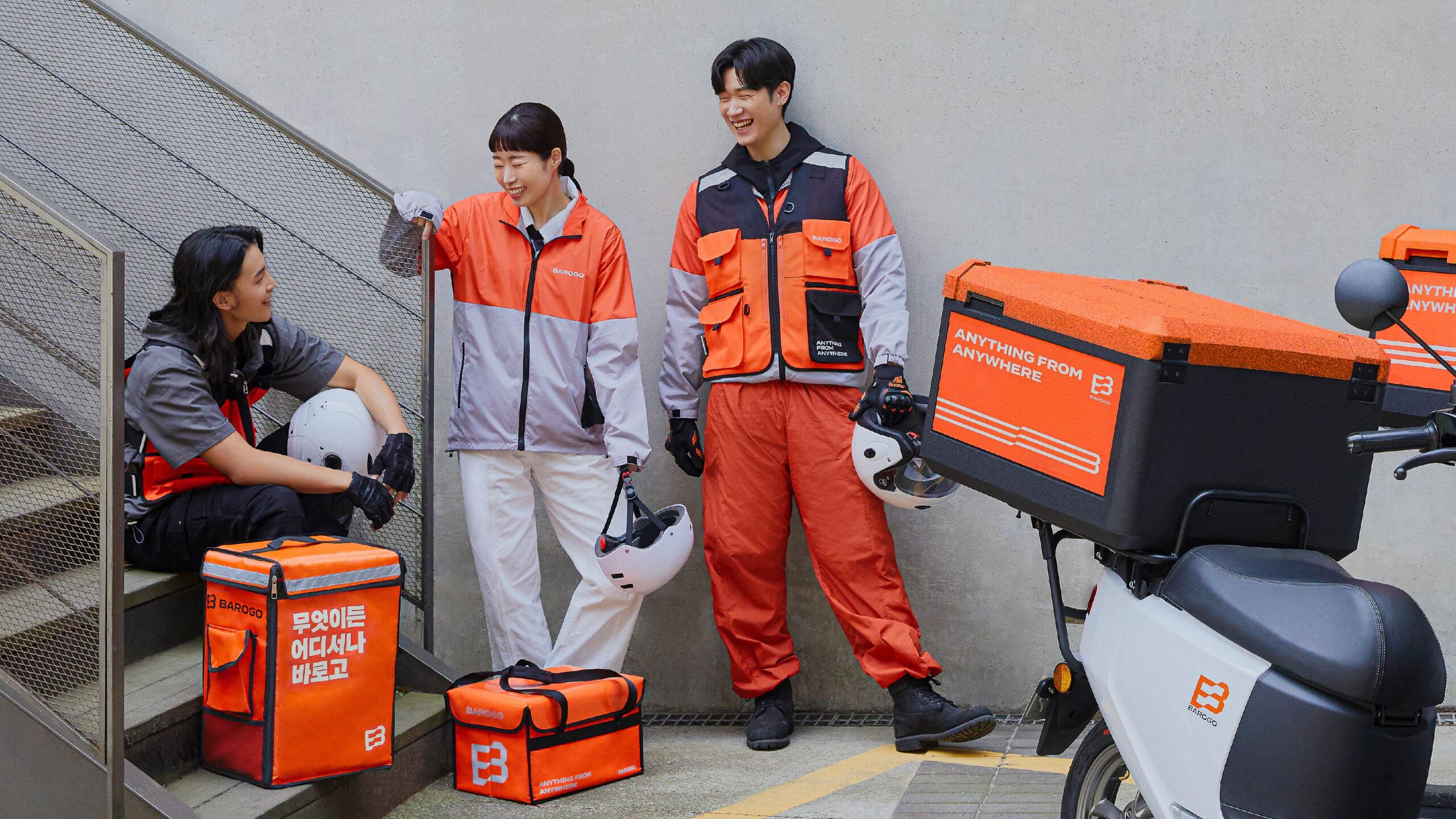
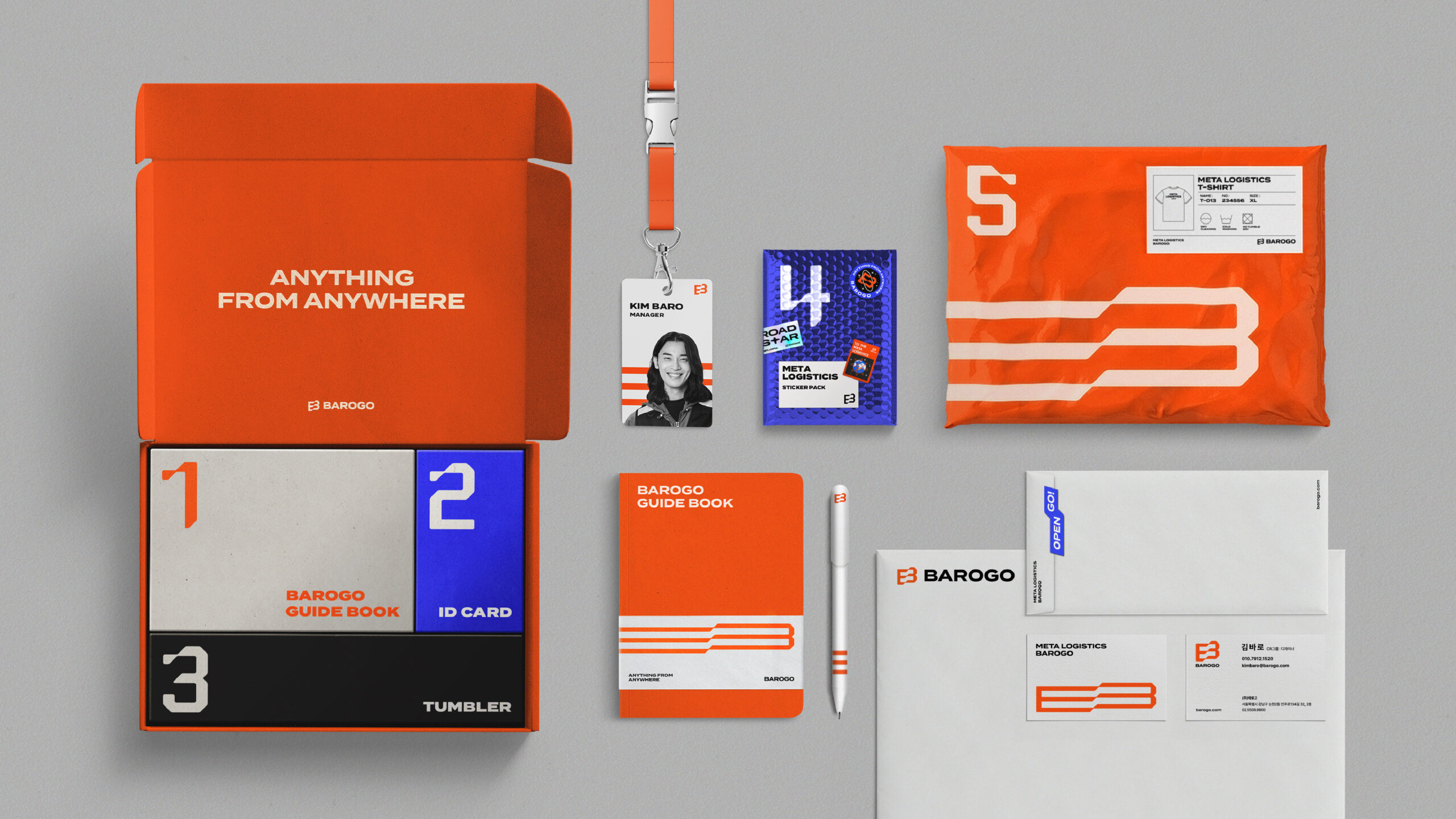
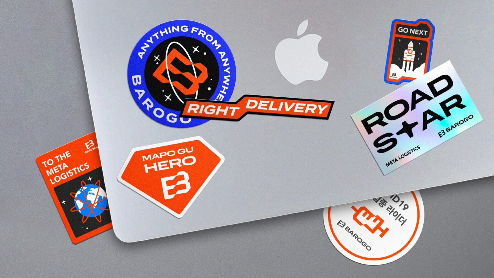
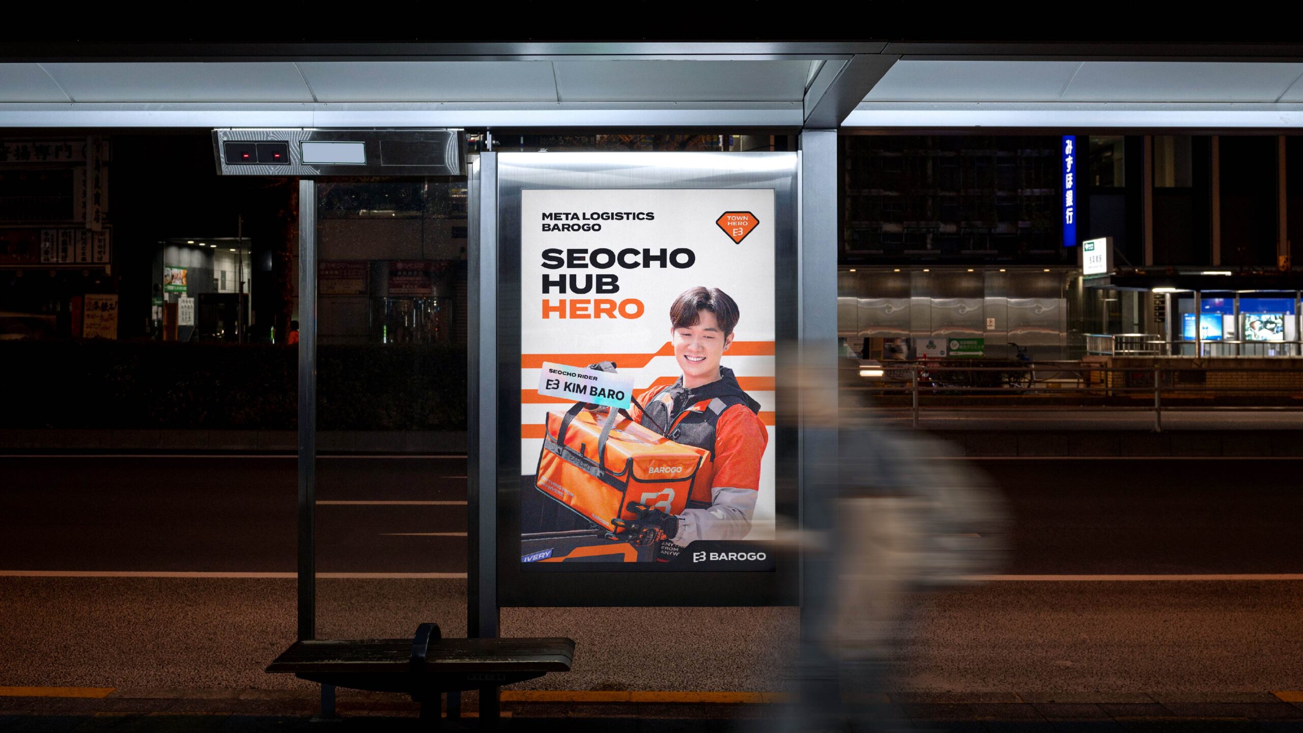
To reflect Barogo’s commitment to its riders, we developed thoughtful design applications prioritizing the safety, convenience, and individuality of the riders. We designed reflective strips on vests to be wider for better visibility on the road, and various stickers to allow riders to personalize their delivery boxes, fostering a sense of individuality and pride in their role.
Business Definition “Meta Logistics”
We redefined Barogo’s business as ‘Meta Logistics’ to reflect the company’s commitment to providing everything essential for customers’ lives beyond food delivery service.
Brand Essence “Vitality”
We defined ‘Vitality’ as the the brand essence, symbolizing an improved quality of life for its riders and economic prosperity they bring to the local communities. To bring this essence to life, we translated it into the BX principles of ‘advanced & bold’ and ‘simple & flexibility’.
Design Concept & Motif
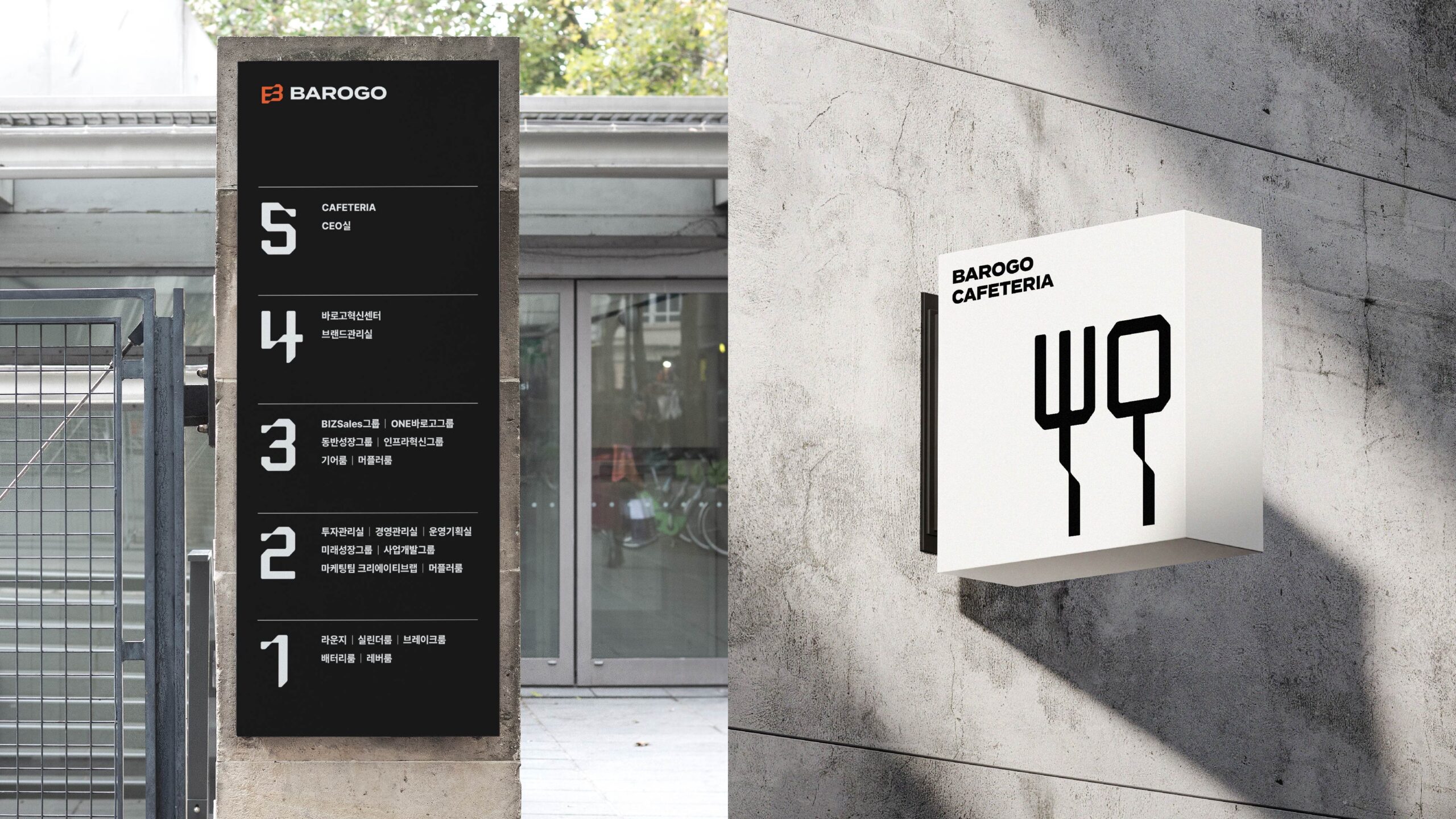
The logo features a ‘flag’ symbolizing the ‘frontier spirit’ combining the initials “B” of Barogo, and a bold typography. This design enhances visibility across a variety of brand’s touchpoints and reinforces the leadership position of Barogo in the market.
Logo & Color
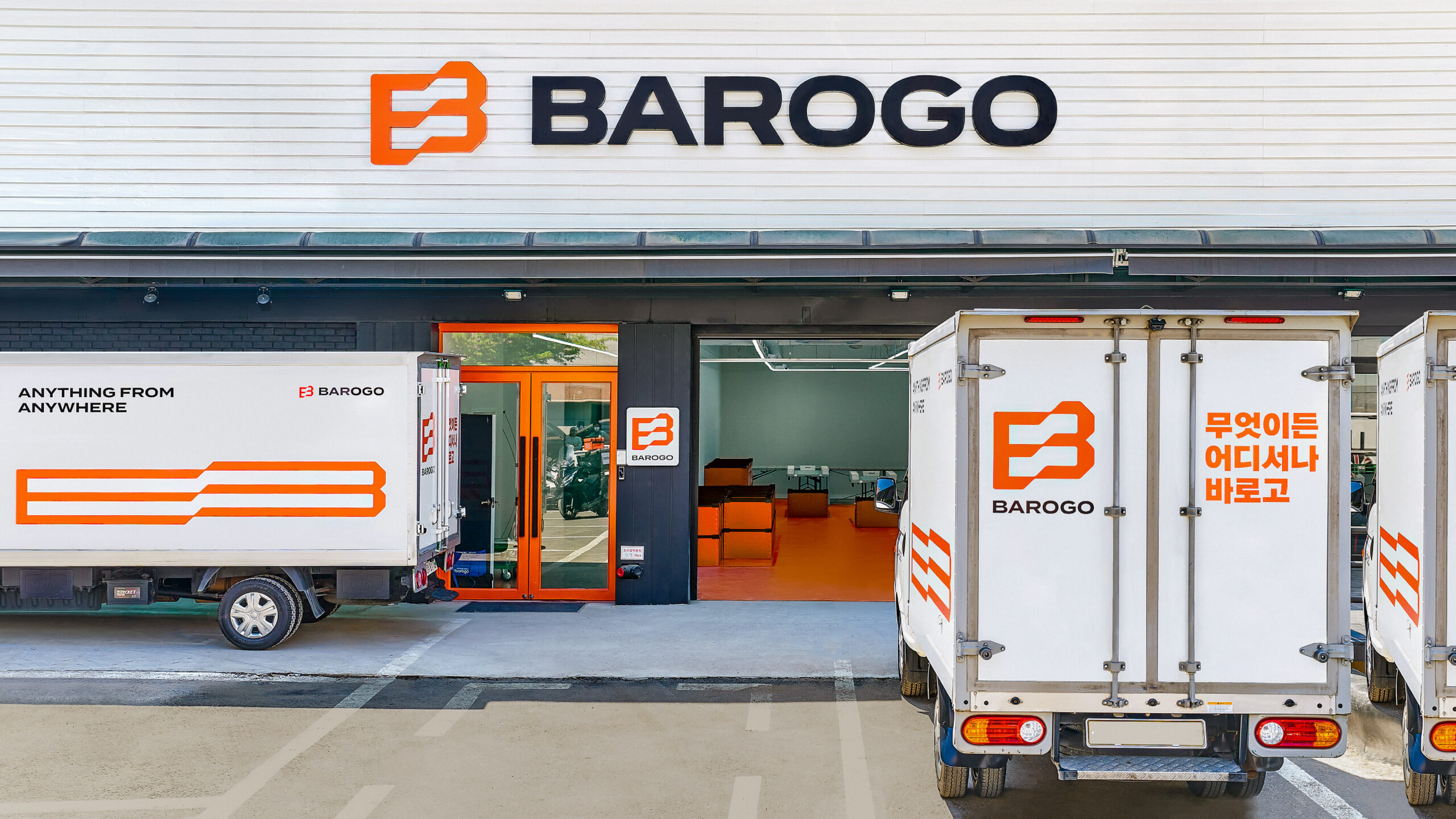
We identified that thin fonts, line-based symbol, and dark blue color resulted in challenges in recognition for the brand name Barogo. We introduced bold typography and a symbol representing the “B”. These changes improved visibility across various touchpoints and elevated Barogo’s brand Awareness.
One of the important elements of Barogo’s design is the ‘Vital Orange’, which is one of the most visible colors on the road. Along with reflective materials, it provides visibility during night driving, making it easy to identify the rider’s location even in the dark, thereby protecting the rider’s life.
Riders’ Reflective Vest
To ensure the rider safety, we designed larger reflective strips for the back of the vest. The area of reflective material on the back of the vest was increased, enhancing visibility and contributing to increased rider satisfaction.
Pictograms by Region
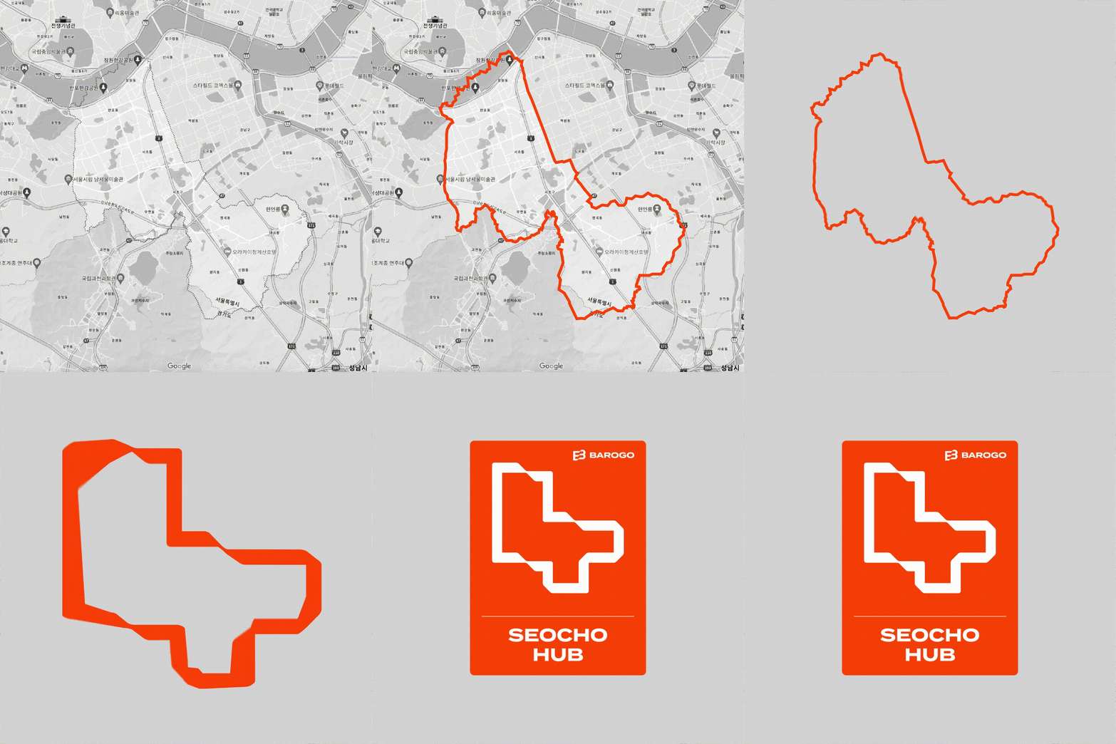
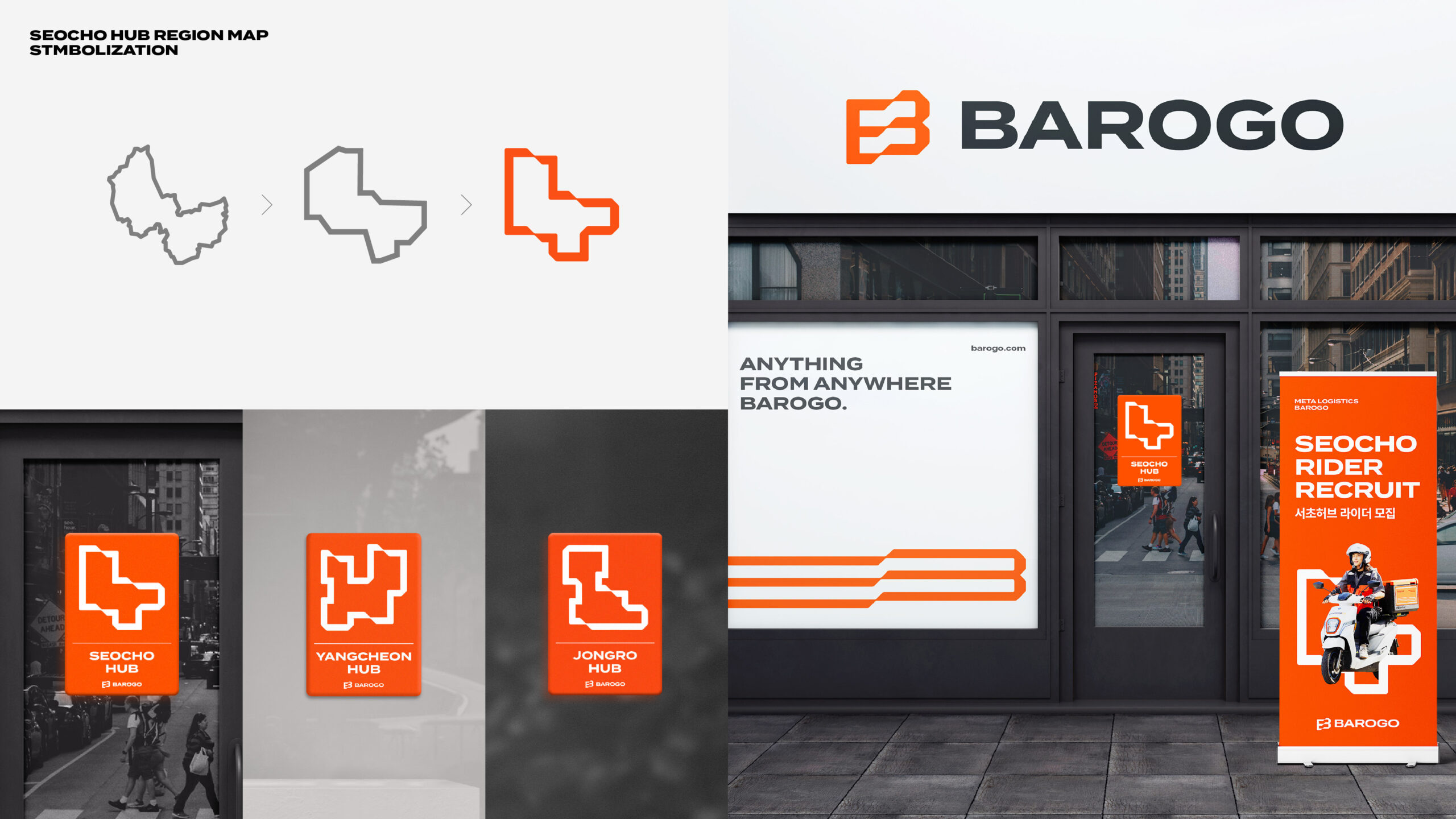
Barogo has “hubs”, rider operating organizations decentralized by region and managed as dealerships. To reflect their individuality and foster a sense of belonging within Barago’s “hyper-connected ecosystem”, we developed a Hub Regional Map System.This system has been applied to various brand experience touchpoints such as hub exteriors, X-banners, and rider recruitment posters to enhance a sense of belonging for everyone involved.
Results
The brand redesign successfully showcased Barogo’s business expansion, leading to a remarkable increase in the market value from $200 million to $600 million. Furthermore, the proactive use of Vital Orang’ as a primary color resulted in enhanced safety for riders on the road.
CREDIT
- Agency/Creative: LMNT Company
- Article Title: LMNT Company Helps Barogo Transition to Meta Logistics with Striking Branding
- Organisation/Entity: Agency
- Project Status: Published
- Agency/Creative Country: Korea, Republic of
- Agency/Creative City: Seoul
- Market Region: Seoul
- Industry: Transport
- Keywords: WBDS Agency Design Awards 2024/25 , Brand Experience, Logistics, Delivery, Rebranding, Positioning, Brand Strategy, Brand Identity, Brand Guide, Logo Design, Motion Graphic, Brand Slogan, Pictogram, Creative Direction
- Keywords: WBDS Agency Design Awards 2024/25 Brand Experience, Logistics, Delivery, Rebranding, Positioning, Brand Strategy, Brand Identity, Brand Guide, Logo Design, Motion Graphic, Brand Slogan, Pictogram, Creative Direction
-
Credits:
Creative Director: Choe Jangsoon
BX Director: Han Hyungmin
BX Strategist: Kim Joeun
BX Strategist: Park Jihye
BX Designer: Choi Sangcheol
BX Designer: Na Hyunjoo


