Background
Re-imagining an iconic brand is no easy task: it demands rigour in briefing, strategy and creative… and there are few beauty brands as iconic as POND’S.
Founded in 1846, the brand was a beacon for generations of women looking to achieve better, brighter and healthier skin through breakthrough innovations and technology.
But the beauty landscape had changed: consumers are now more informed, affluent and demanding, which meant that POND’S brand expression needed to fundamentally change to shift perceptions and re-ignite engagement.
Brief
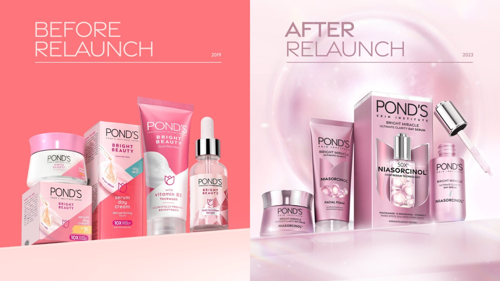
POND’S needed to re-establish its own relevance, credibility and desirability in a saturated, fast-changing category, by completely revolutionising brand and product image and perceptions… so a bold initiative was put in place: elevate POND’S from a mass brightening product to a masstige skincare brand, with a packaging relaunch to drive a bold brand re-appraisal, in order to achieve “$1Billion Brand” status by 2026.
Strategy
1HQ challenged the brand to ask just One Hard Question… POND’S reply: “How do we re-establish relevance, credibility, and desirability for our legacy brand?” This became our launchpad: establishing strategic and creative rigour for this daunting but stimulating challenge.
We knew, due to multiple re-positionings and relaunches over almost 2 decades, that POND’S and its products had struggled to maintain premium perceptions, and to consistently communicate expert appeal and scientific credibility. In addition, the brand was unable to keep pace with modern skincare trends towards affluence, experience-rich offerings and scientific innovations: leading to a decline in both brand share and power. We also realised that POND’S had spent decades straddling opposing sides of the NeedScope model: creating constantly-shifting identities that diluted equity, imagery and perceptions.
The aligned strategy: to fundamentally refresh by going back to our roots. Re-igniting the brand’s essence by distilling, revealing and celebrating nearly two centuries of heritage in skincare in a new, bold and contemporary way.
This meant that masterful innovation, technological prowess and aspirational beauty needed to take centre-stage on the new pack: so, we adopted the creative mantra “POND’S is where science meets desire”, a golden thread connecting brand purpose, skincare science and beauty desire.
Design Process
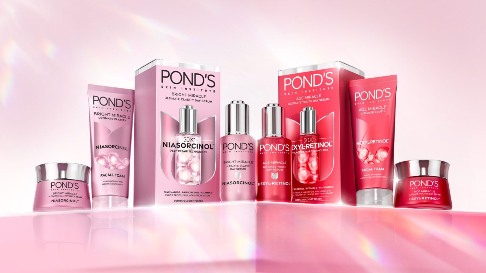
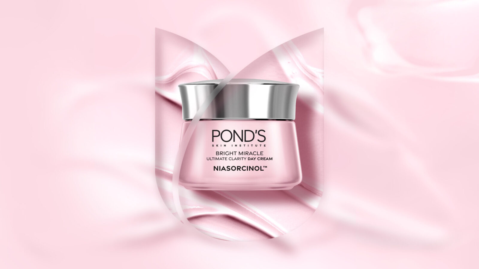
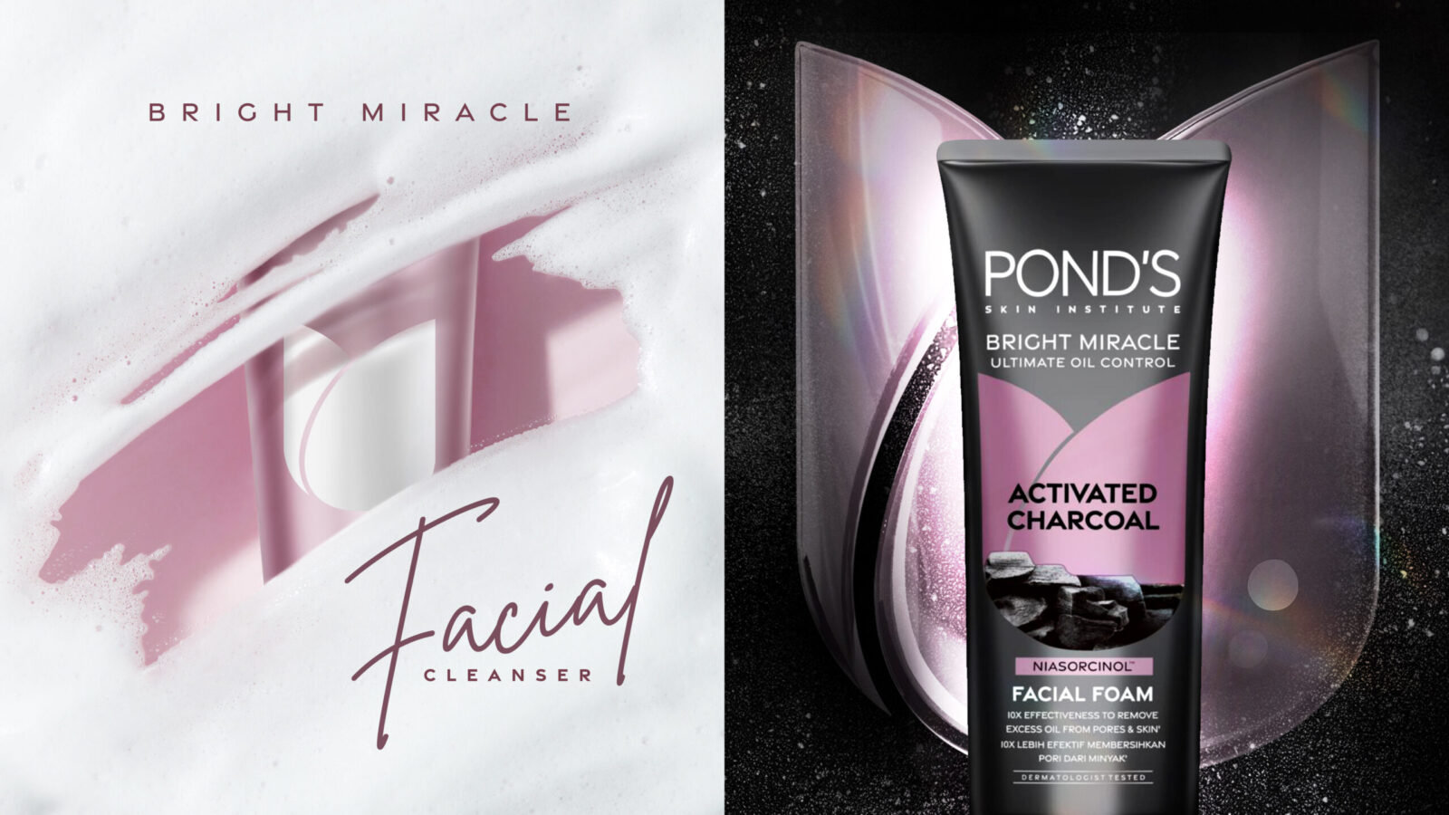
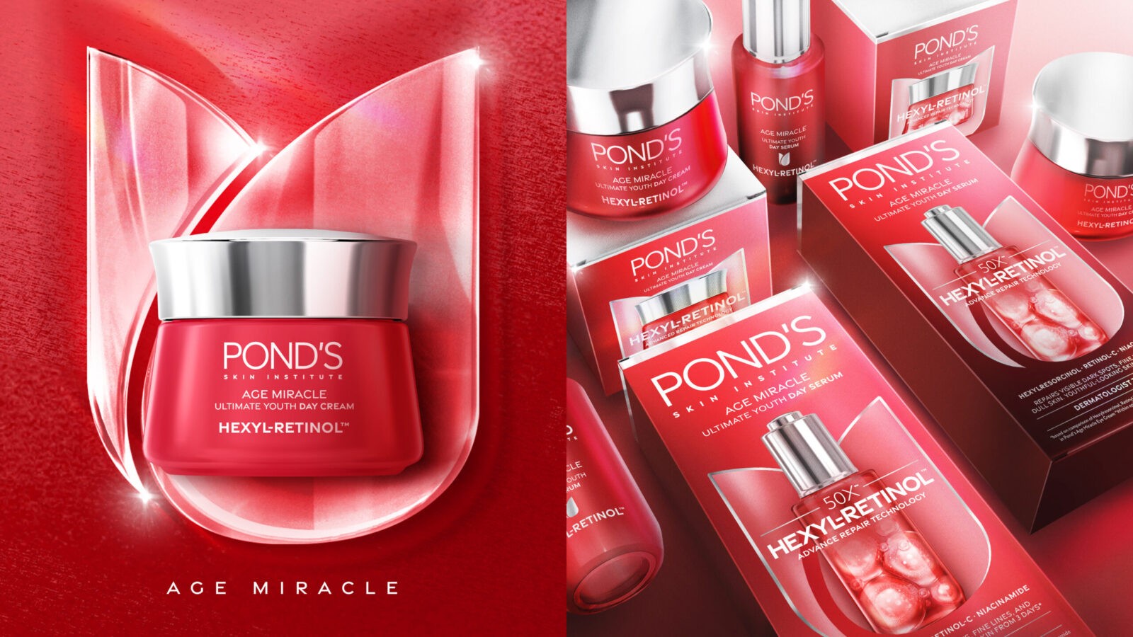
For creative: this meant re-imagining POND’S iconic assets: the pink colour, the tulip, and “science seasoned with simplicity”.
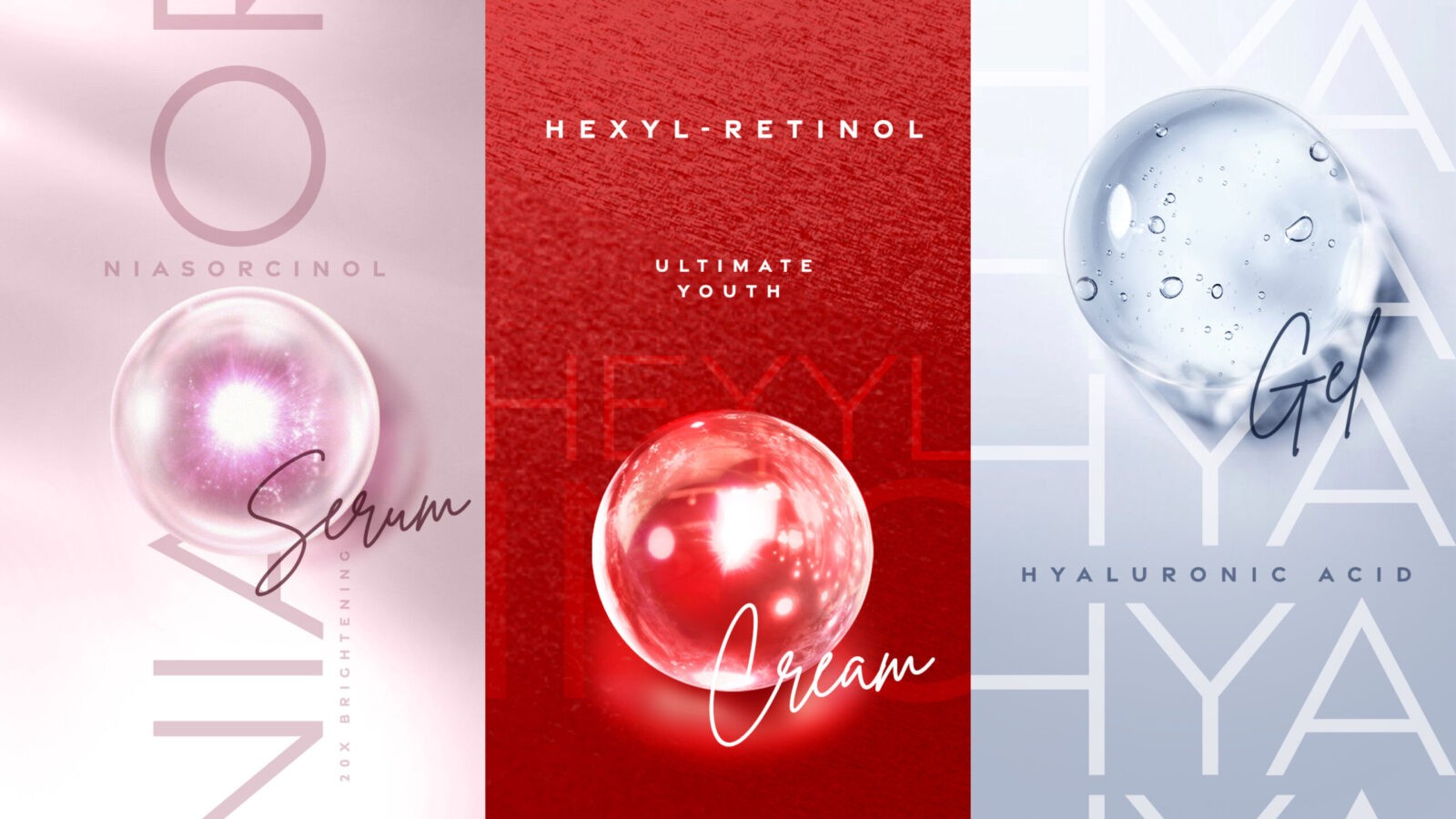
It was a rigorous rediscovery across more than 400 designs, over 50 shades of pink were carefully considered before isolating the brand’s heartbeat. The iconic tulip was reimagined as a symbol of elegance that spoke to POND’S proud heritage in beauty and grace. Trademarked ingredients NIASORCINOL™ and HEXYL-RETINOL™ were celebrated as transformative glowing droplets, while rebranding “POND’S” as “POND’S Skin Institute” boldly reasserted the brand’s position as a leader in premium skincare science.
Result
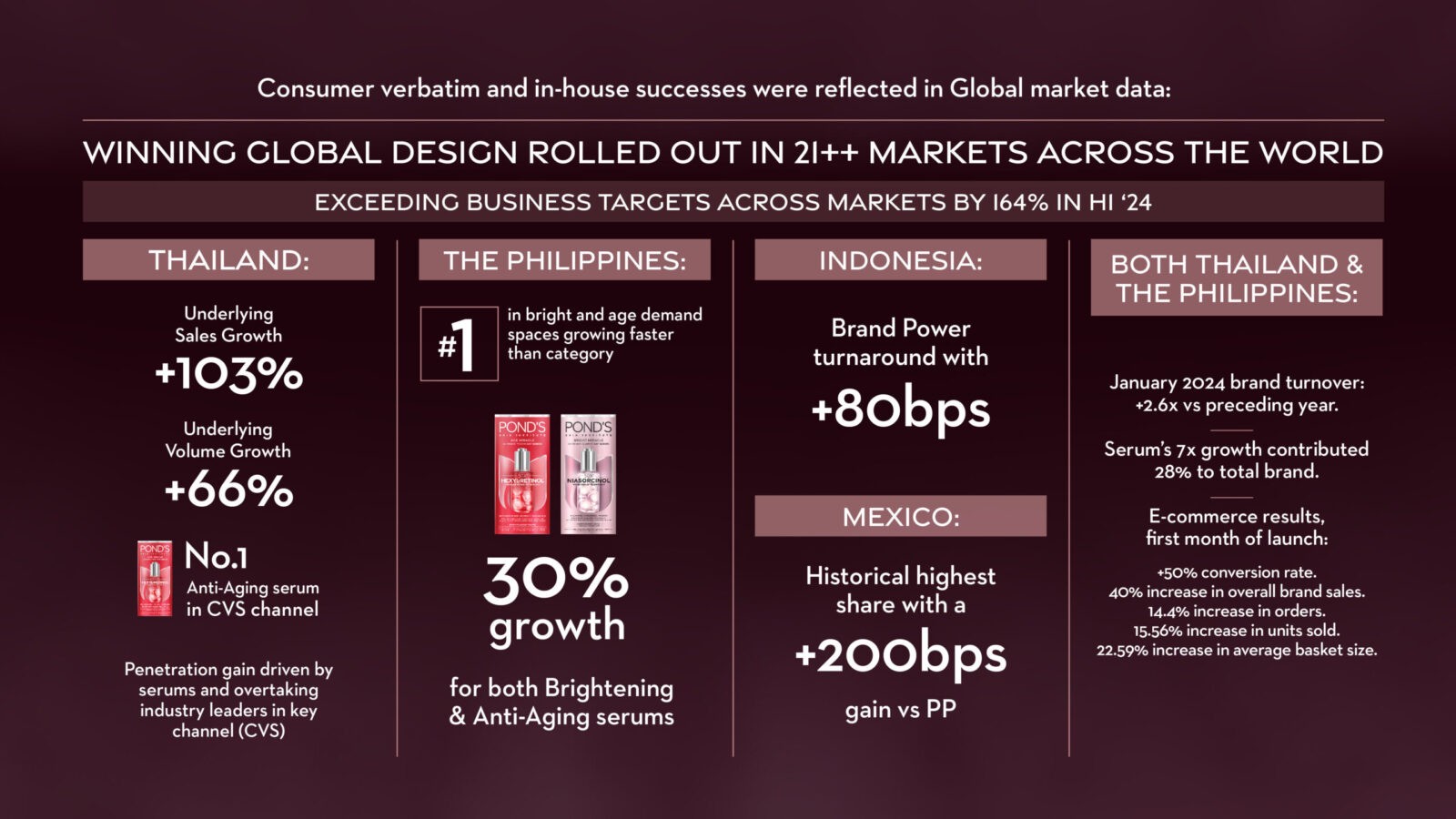
The pack revolution fundamentally shifted brand perceptions and drove engagement as the winning design rolled out to over 21 markets globally: exceeding business targets by 164% in H1’24.
Mexico achieved a record-breaking highest share with a +200bps gain vs PP, while Indonesia boasted a Brand Power turnaround at +80bps.
Thailand also showed significant turnaround with Underlying Sales Growth at +103%, and Underlying Volume Growth at +66%: with POND’S owning the #1 Anti-Aging serum in CVS channel, overtaking L’Oreal and Garnier.
The Philippines showed 30% growth for Brightening and Anti-Aging serums, while in both Thailand and The Philippines: January 2024’s brand turnover rose 2.6x vs the preceding year, with serums 7x growth contributed 28% to total brand. Explosive e-commerce growth within the first month of launch showed a +50% conversion rate, +40% in overall brand sales, 14.4% increase in orders, 15.56% increase in units sold, for an overall 22.59% rise in average basket size.
This initiative was not simply a packaging refresh: but a holistic brand revolution that has undoubtedly sent ripples through the skincare category: with POND’S now truly redefining beautiful, desirable science in facial care.
CREDIT
- Agency/Creative: 1HQ Brand Agency Singapore
- Article Title: 1HQ Brand Agency Singapore Revitalises POND’S with a Striking Packaging Revolution
- Organisation/Entity: Agency
- Project Status: Published
- Agency/Creative Country: United Kingdom
- Agency/Creative City: London
- Project Deliverables: Brand Design, Brand Redesign, Branding, Packaging Design, Rebranding
- Industry: Beauty/Cosmetics
- Keywords: WBDS Agency Design Awards 2024/25 , POND'S, UNILEVER, Brand redesign, brand evolution, visual identity, iconic brand, beauty heritage, skincare science, consumer branding, global rollout, results, growth, desirable science
- Keywords: WBDS Agency Design Awards 2024/25 POND'S, UNILEVER, Brand redesign, brand evolution, visual identity, iconic brand, beauty heritage, skincare science, consumer branding, global rollout, results, growth, desirable science
-
Credits:
Managing Creative Director: Karen Cole
Client Director: Cherie Loh
Strategy Director: Floydd Wood
Associate Creative Director: Enid Tam
Design Director: Fendy Tasman
Senior Designer: Rachel Goh


