The Visual Identity for the NIT App by General Condition Studio Embodies Seamless Connectivity and Intuitive Event Discovery Across Austria, Germany, Switzerland, and Italy
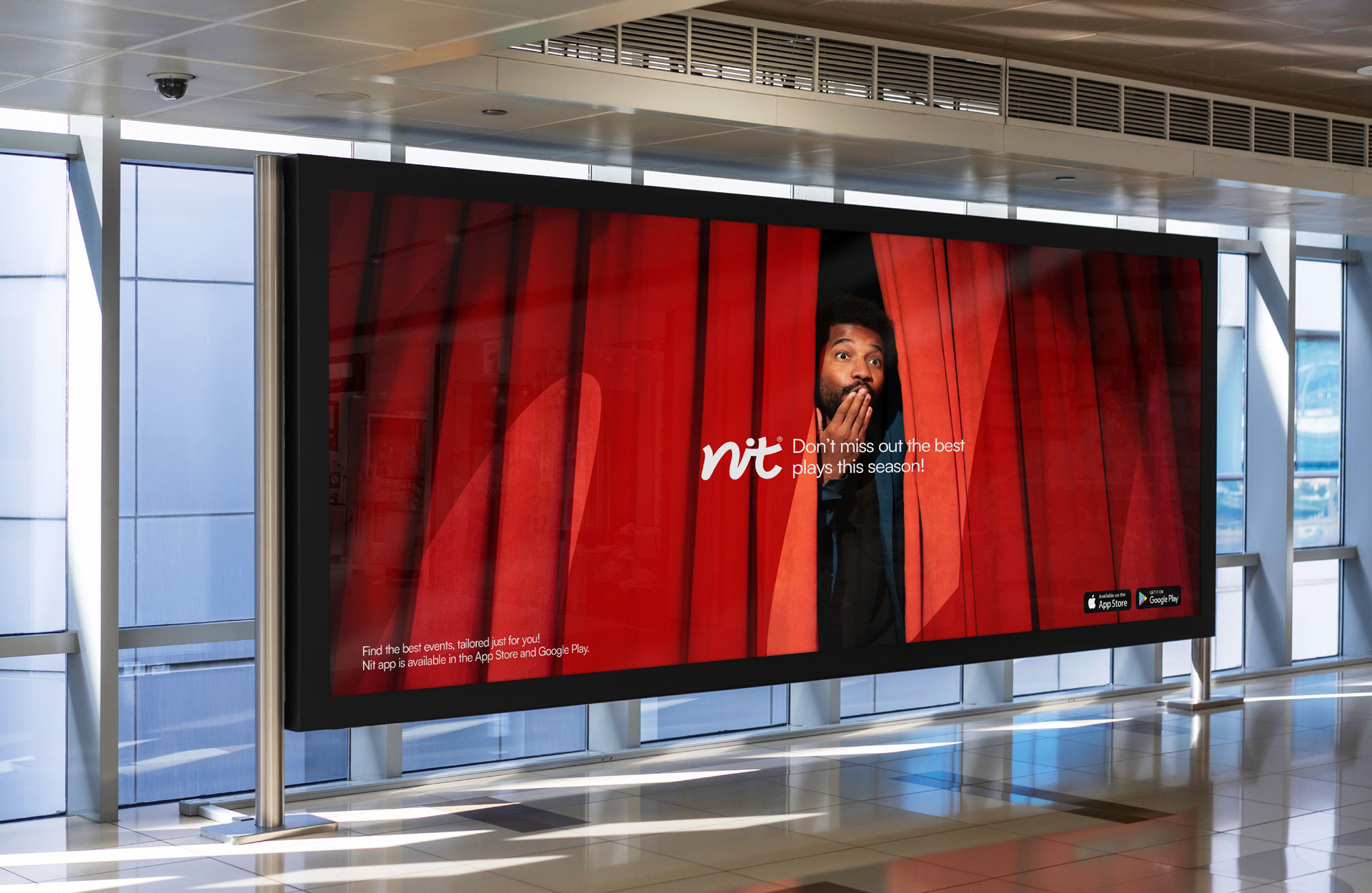
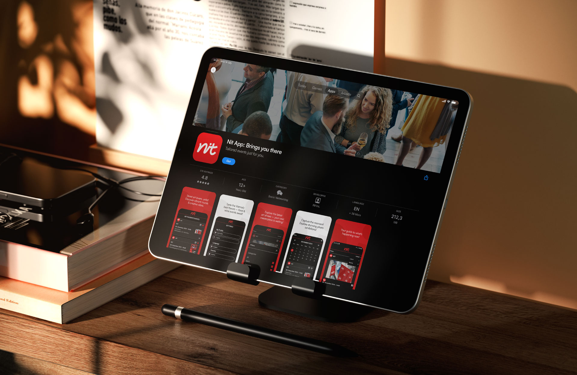
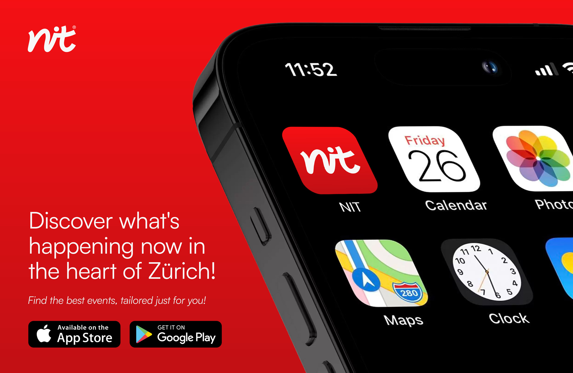
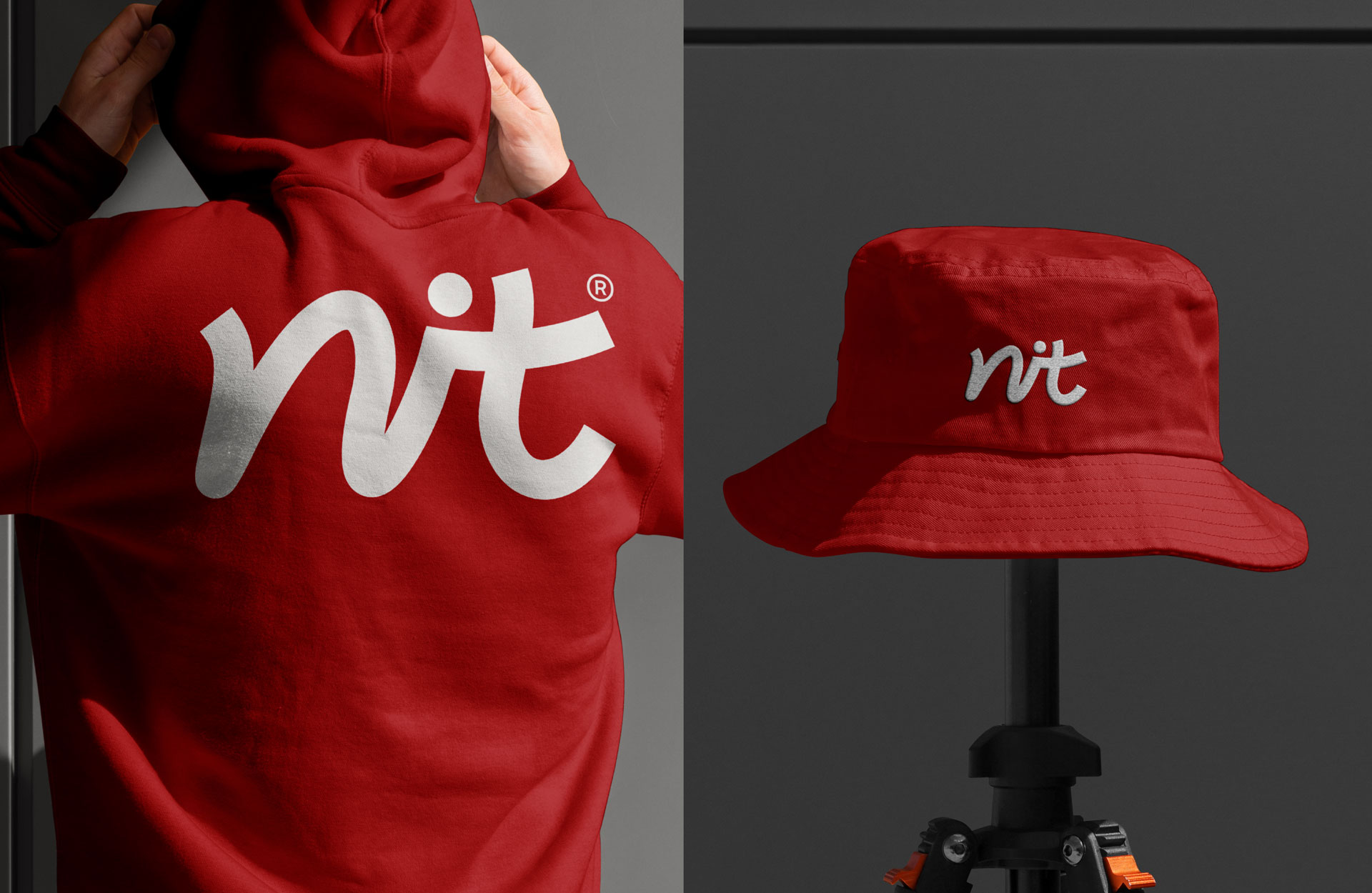
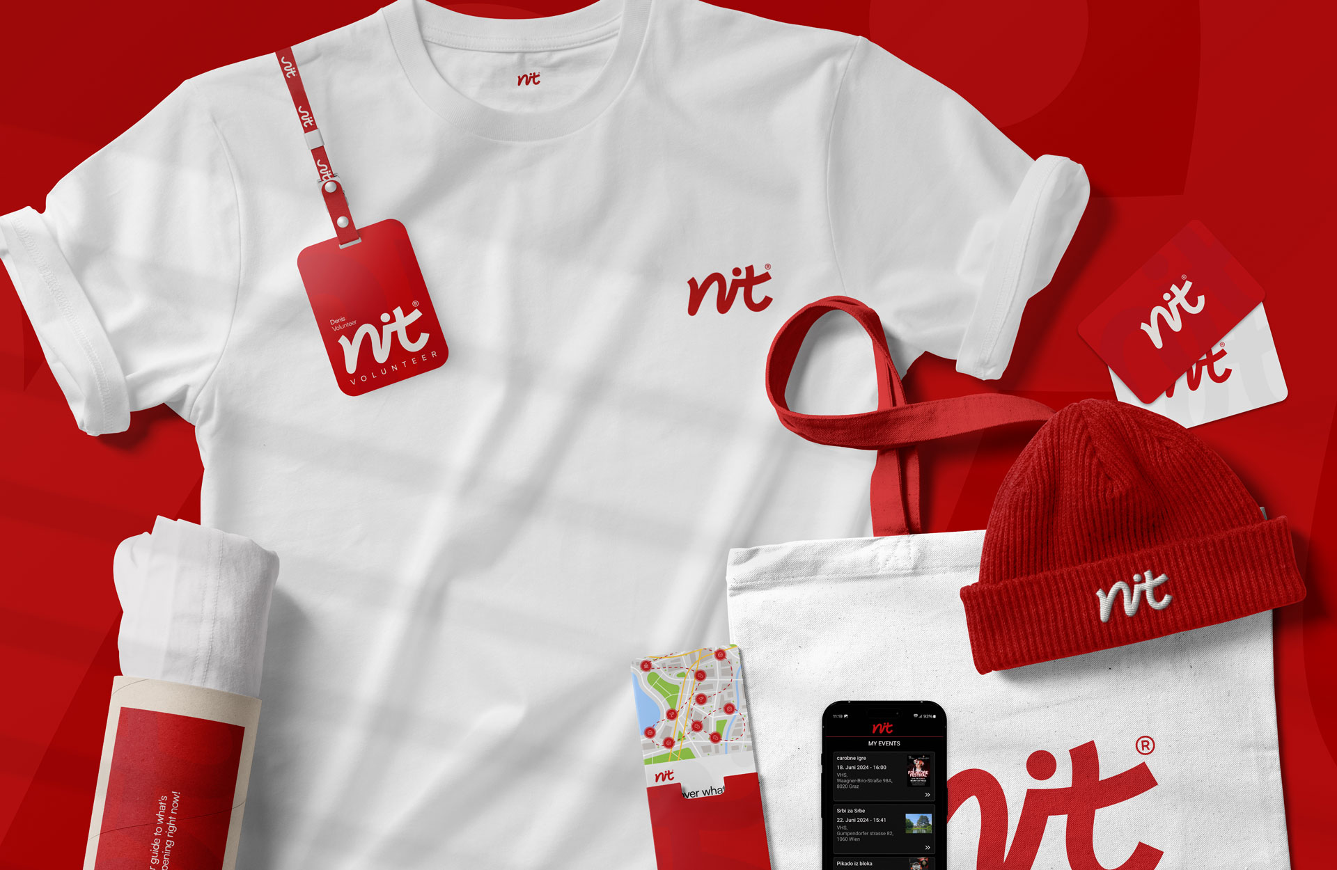
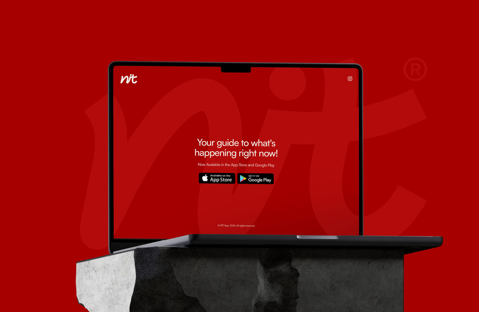
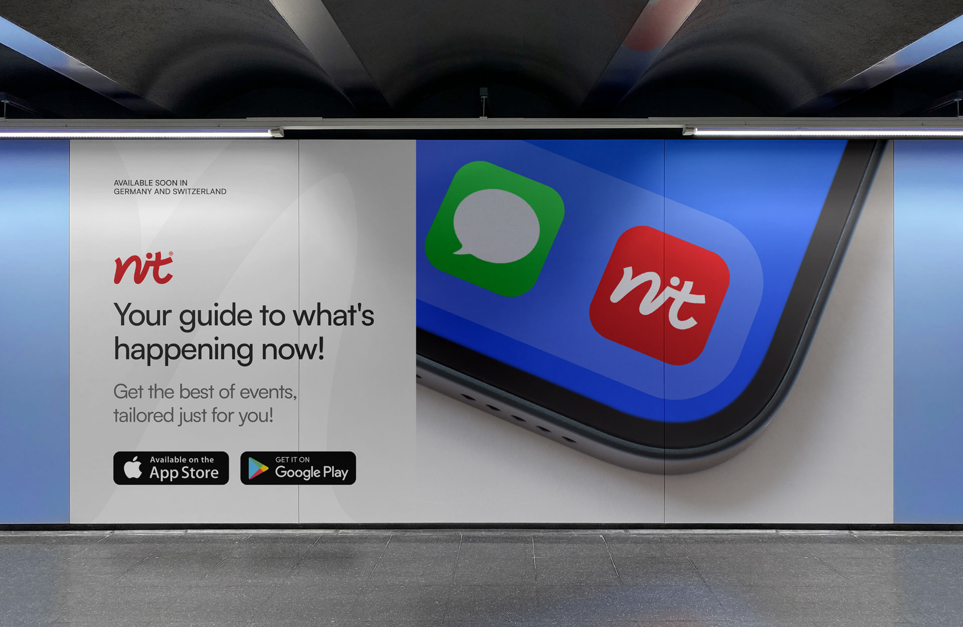
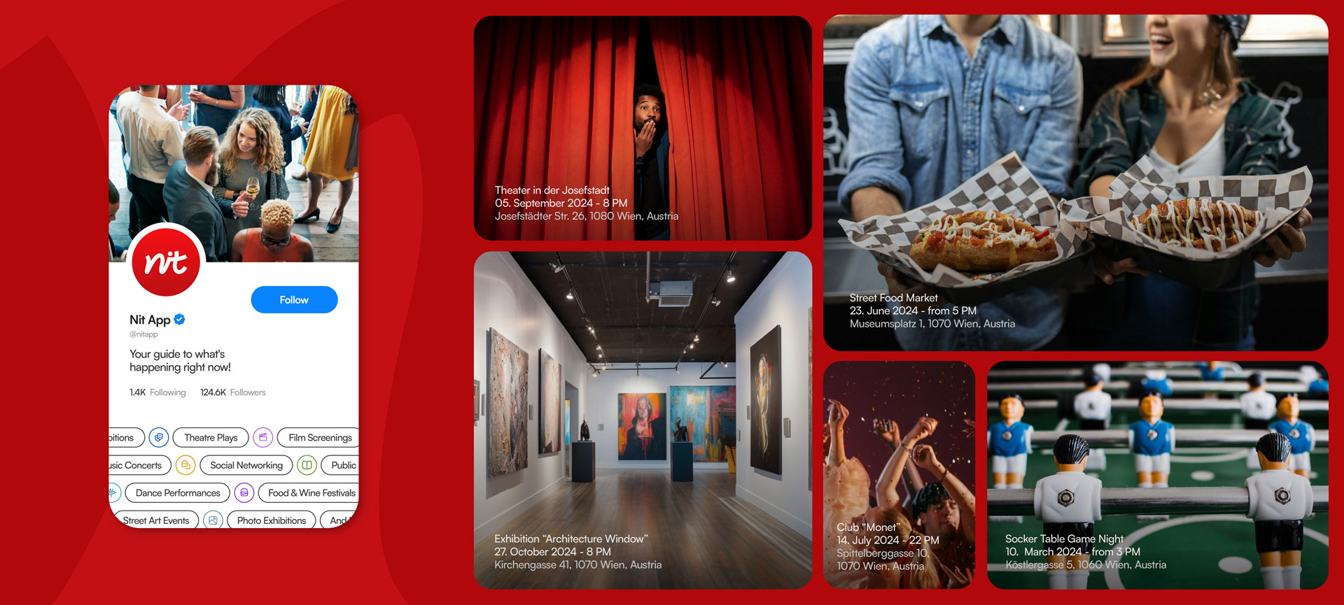
The visual identity for the NIT app, designed by General Condition Studio, embodies seamless connectivity and intuitive event discovery, catering to a diverse audience across Austria, Germany, Switzerland, and Italy. The brand’s visual narrative is grounded in simplicity and innovation, presenting a modern, dynamic aesthetic that prioritizes user accessibility and fosters effortless connections. A thoughtfully curated color palette blends vibrant yet professional tones, while clean, legible typography communicates trust, clarity, and professionalism. Together, these elements ensure a cohesive and engaging user experience across all digital and print platforms.
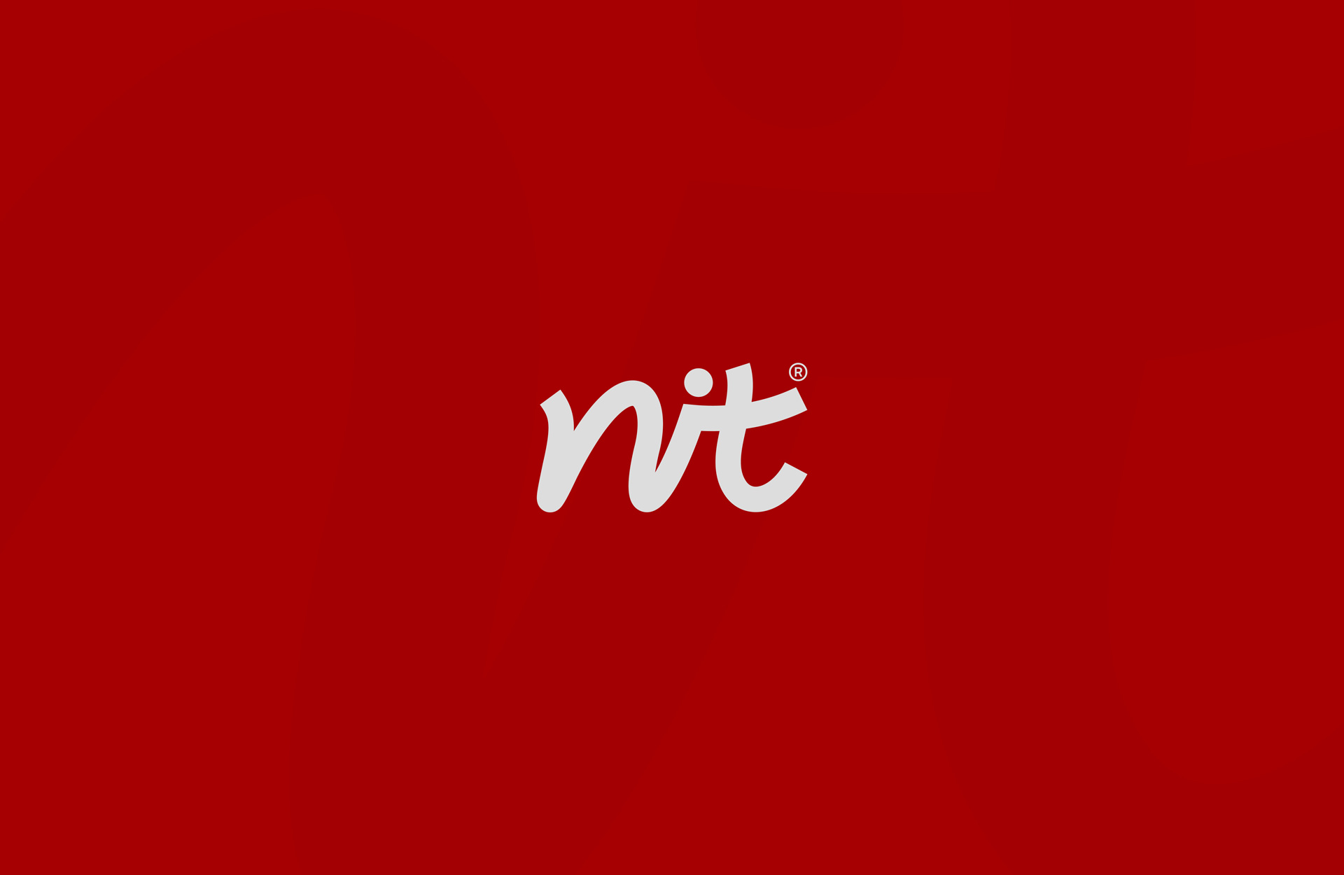
The name NIT, which translates to “Thread” from Serbian to English, inspired the app’s core branding concept. The logo captures this essence by using a custom typeface, meticulously designed to represent the fluidity and interconnectedness of threads. This symbolic approach underscores the app’s mission to weave people and events together, emphasizing the importance of connection and shared experiences.
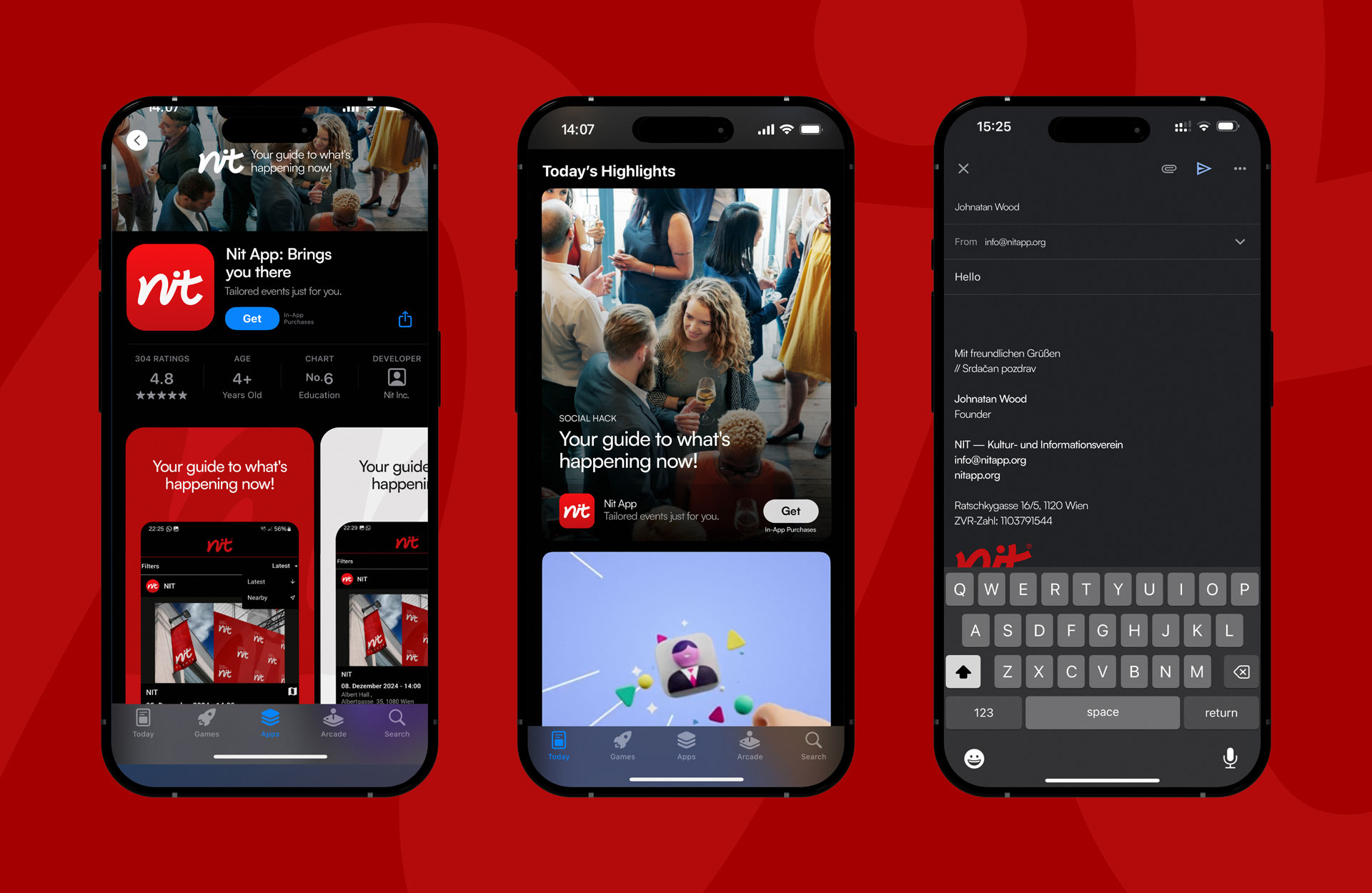
Every detail of the NIT branding solution aligns with the app’s mission: to unite users with events through intuitive and forward-thinking technology. The design philosophy reflects the app’s user-centric approach, creating an inviting and reliable interface that encourages interaction and exploration. The strategic use of visuals and functional design principles ensures the app resonates with both tech-savvy users and those new to event discovery platforms.
The branding also incorporates subtle, yet impactful, design elements that emphasize connectivity. Graphic motifs and interface designs echo the themes of networks and community, reinforcing NIT’s promise of bringing people and events closer together. This intentional cohesion across every touchpoint enhances the app’s recognition and establishes it as a trusted name in the competitive event-sharing and discovery landscape.
By merging form and function, General Condition Studio has created a visual identity that not only captures NIT’s core values but also sets it apart in the marketplace. The integration of the thread concept into the logo and broader design narrative ensures a memorable and meaningful brand presence. This comprehensive branding approach ensures NIT’s visibility as a reliable, forward-thinking tool, equipping it to thrive in an ever-evolving digital world. From its user-friendly interfaces to its modern design aesthetic, NIT exemplifies innovation, accessibility, and the transformative power of effective branding. With a focus on seamless user experiences and meaningful connections, NIT’s visual identity positions it as a standout solution in the event-sharing industry.
CREDIT
- Agency/Creative: General Condition Studio
- Article Title: NIT App Branding by General Condition Studio Connects Users to Events Across Central Europe”
- Organisation/Entity: Agency
- Project Type: Identity
- Project Status: Published
- Agency/Creative Country: Spain
- Agency/Creative City: València
- Market Region: Europe
- Project Deliverables: Brand Design, Graphic Design, Logo Design, Visualisation
- Industry: Information
- Keywords: Connectivity, Events, Discovery, Innovation, Technology, Calendar, Events
-
Credits:
Creative Director: Jovan Lakic


