A covetable cosmetic kit.
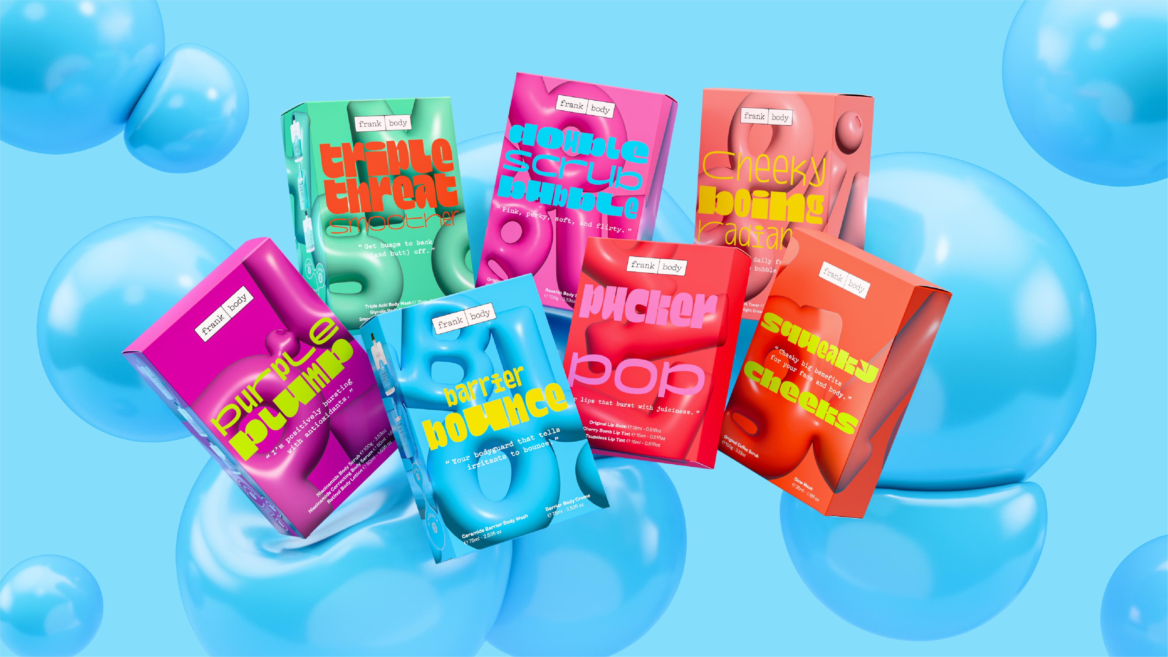
Every year, frank body requires a unique suite of packaging designs for giftable holiday skincare kits designed to capture consumer attention in a highly competitive retail environment. The design brief required a balance between product-focused communication for an increasingly educated audience and packaging that felt playful, covetable, and cool.
Nineties nostalgia.
Nostalgia, or in many cases anemoia, has become a significant force driving trends and shaping the interests of younger consumers in the internet age. frank body identified the focus of their release to be the latest barrier protection range. Since the best kind of barrier is bouncy—just like a balloon, lava lamp, or inflatable armchair—we knew the nineties had to be the source of our nostalgic stimulus.
Titillating typography.
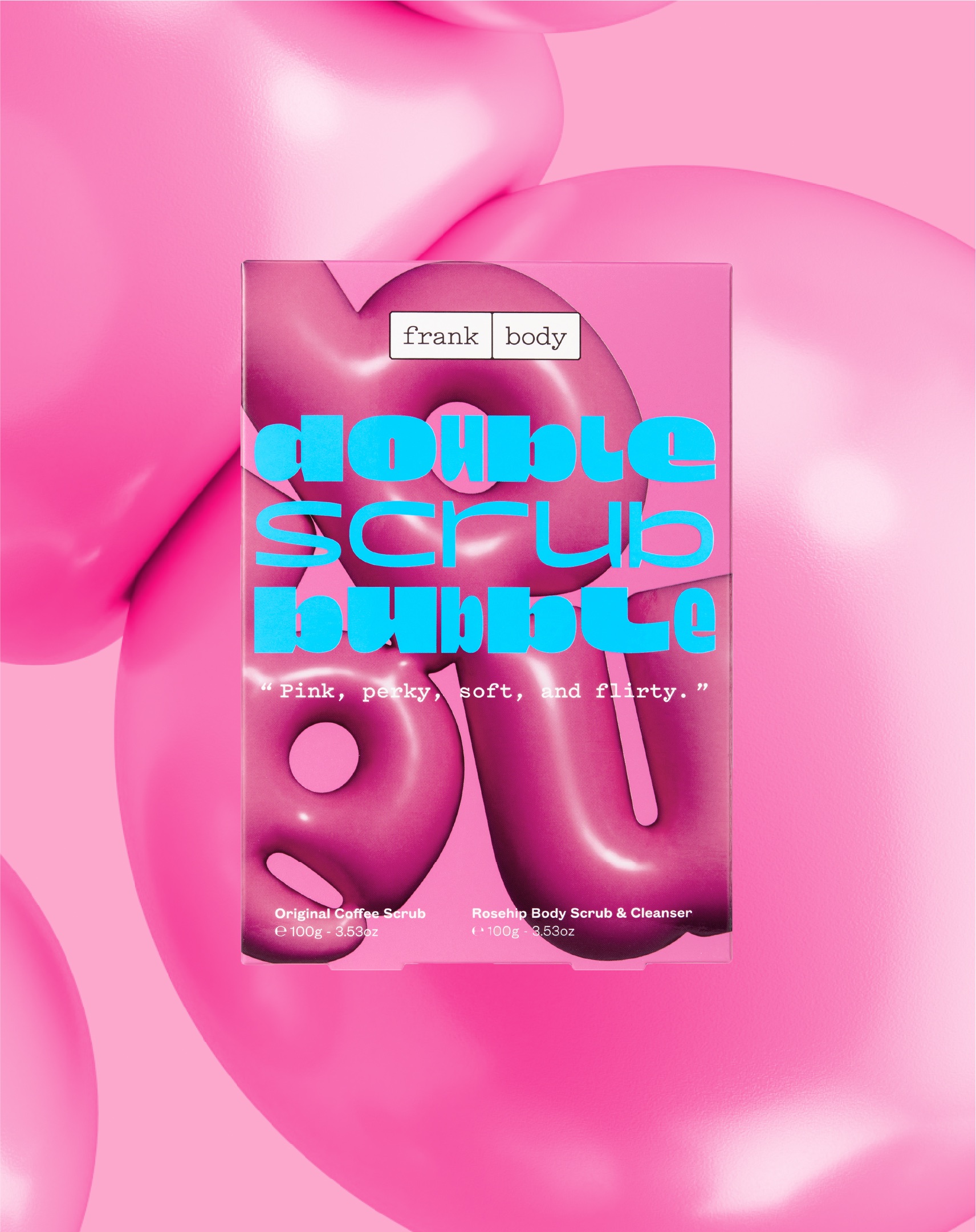
The project began with a series of typographic prints featuring the words “Plump”, “Pop”, and “Bounce” squeezed within the constraints of a rectangular artboard. We wedged bubble forms in the negative space and between the curvature of letters to increase the tension within each composition. Once rendered in 3D, we wrapped each print around a pack to further enhance the visual of an object or product bursting with compressed energy.
As a seasonal product release, we took an elastic branding approach reflected in the product names on top of the three-dimensional prints. Ultra-heavy stretched glyphs paired with compressed hairline weights render product names such as “Boom, Boom, Smooth” and “Squeaky Cheeks” as abstracted artworks in themselves. The display face Dina Chaumont by B.V.H Type provides an essential layer of maximalist intrigue, the eye-catching lowercase forms give each product name a unique presence on the packaging with the extreme proportions enhancing the range’s nineties attitude.
Finishes and features.
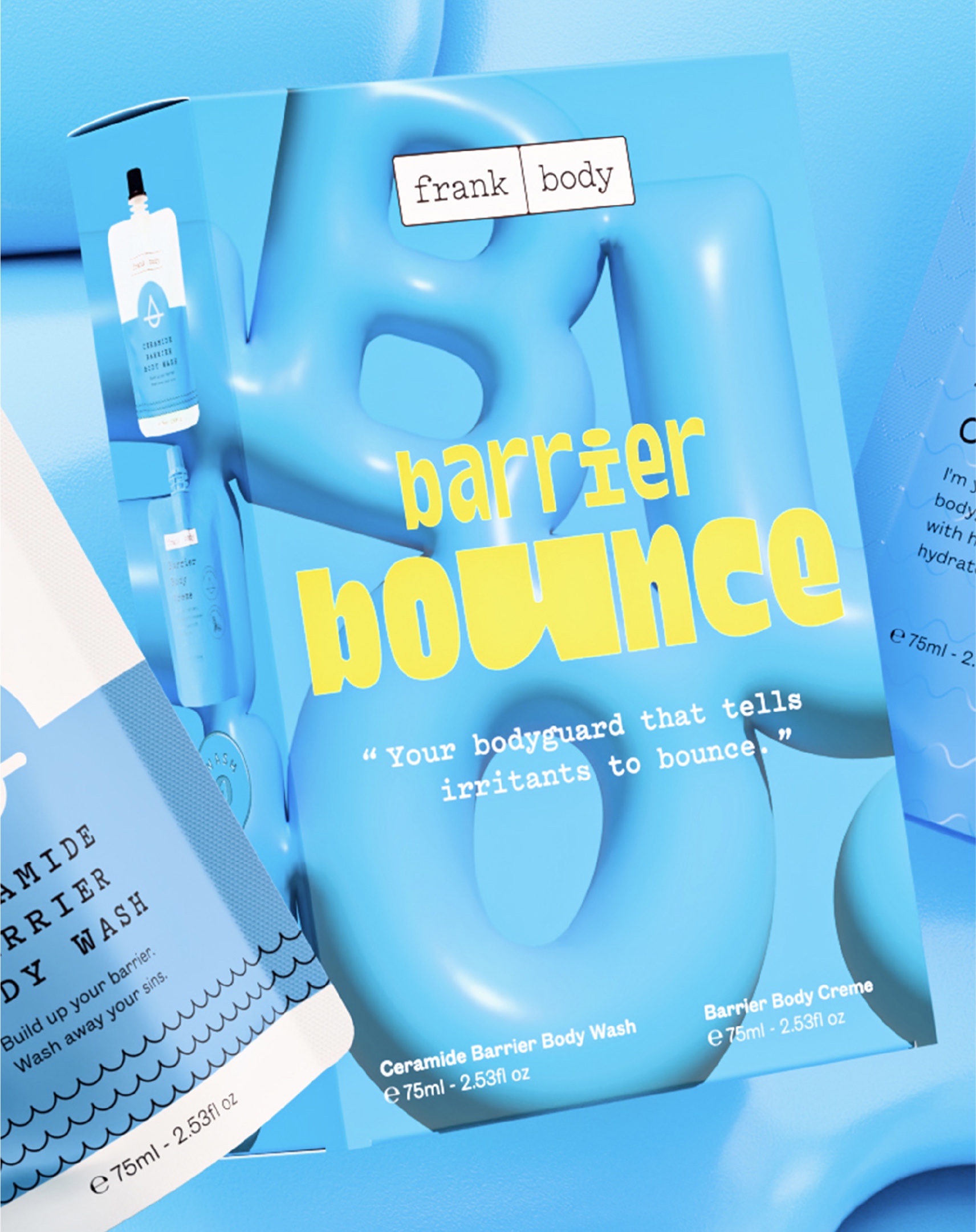
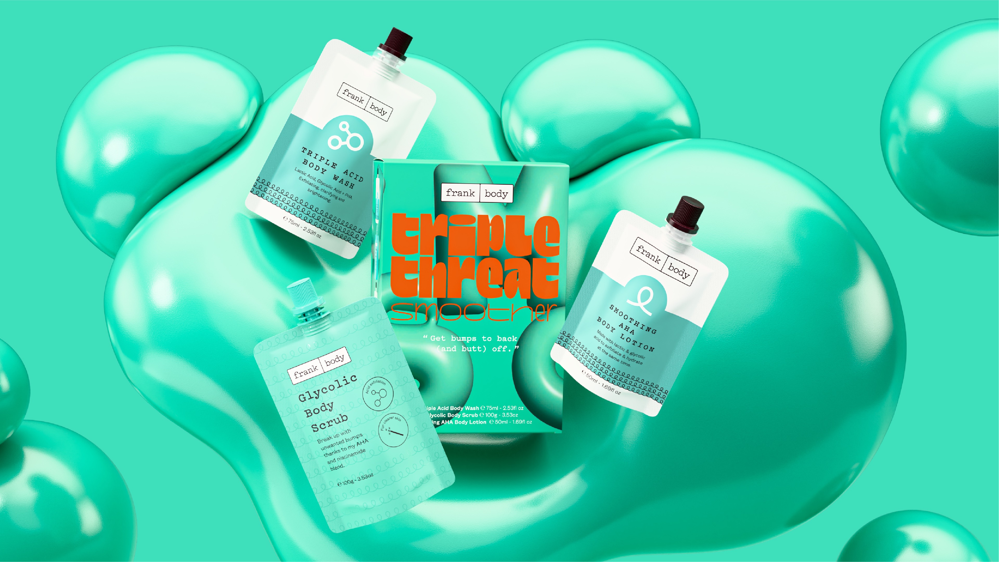
The frank body team emphasised the competitive nature of the retail environments these products would be found in, with the need for a consumer to establish the contents of a kit and its properties within seconds of noticing it on the shelf. Embracing the lava lamp nostalgia further, we designed a series of globular motifs, each housing an outline of the kit’s purpose and function while aligning with the range’s bouncy, lively appearance.
The dynamism within the product’s naming and typographic treatments needed to translate on shelf. So we used a combination of spot UV gloss across the base prints, giving each inflated letter a glistening finish accompanied by subtle hits of silver foil outlining the glob-shaped drops on the side of each pack.
frank body’s holiday kits bring the nineties back in full force, impossible to ignore, with the promise to make it bounce. Your skin that is. Wink.


CREDIT
- Agency/Creative: Willow & Blake
- Article Title: Frank Body’s Packaging That Bounces Off the Shelf by Willow & Blake
- Organisation/Entity: Agency
- Project Type: Packaging
- Project Status: Published
- Agency/Creative Country: Australia
- Agency/Creative City: Richmond
- Market Region: Oceania
- Project Deliverables: Copywriting, Design, Packaging Design
- Format: Box
- Industry: Beauty/Cosmetics
- Keywords: Holiday kits, limited edition packaging
-
Credits:
Designer: Noah Zawertailo
Creative Director & Copywriter: Bri Nixon


