SPOOX is a well-known brand within the performance Peugeot and Citroen worlds, specifically within race, rally and time attack disciplines, and has created a strong reputation by providing exceptional quality products and services to its customers in the UK and beyond.
The equity in the brand was undoubtedly strong in the minds of its core audience, but the existing identity didn’t reflect the brand’s position and reputation. Through a review of the current identity, we found that there were also a lot of inconsistencies with a range of different logos and devices being applied across a wide range of touchpoints.
We initially identified a brand persona through a definition phase which then influenced the brand development side of the project.
The key traits of the brand were identified as quality, dynamic, contemporary, distinctive and industry leader. These traits provided the cornerstone for the look and feel of identity development.
We began work on nailing down the desired look and feel and then explored branding concepts that aligned with the brief. As part of this phase, we also considered the brand name and its position within the brand hierarchy, with the decision being made to promote the name “SPOOX” as the title with “Racing Developments” sitting as a sub-line.
With the decision to use the title of SPOOX as the brand name, we then crafted a distinctive identity that aligned with the precision and performance aspects of the overarching brand.
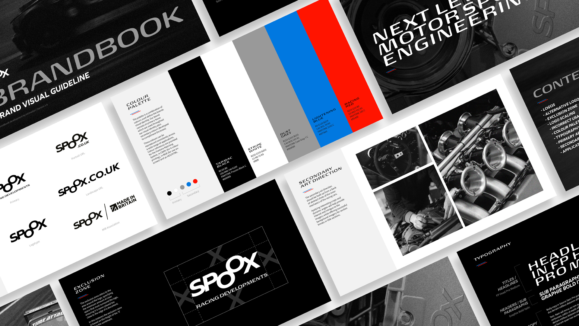
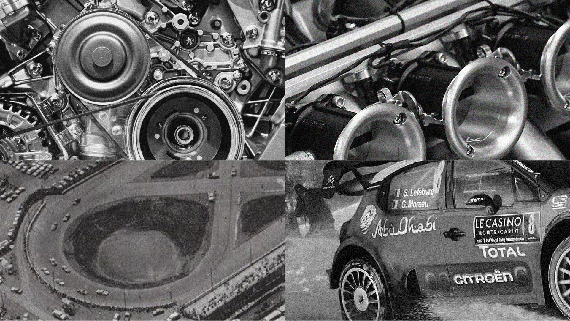
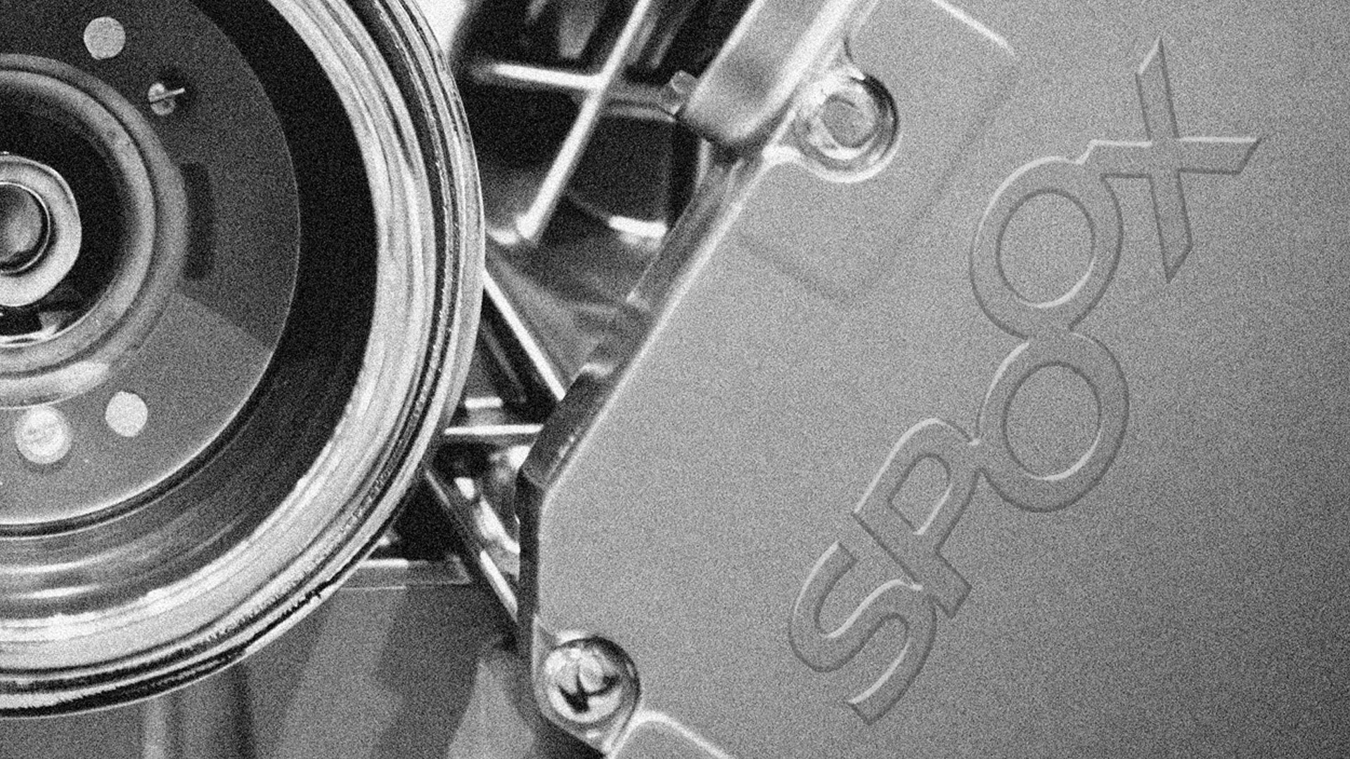
We created a wordmark that included a “figure of eight” device which was inspired by various aspects of car racing, such as a racing track, car wheels and engine components. An italicised typeface was used to offer a dynamic and energetic feel to the overall logomark with an additional italicised being used for general use across headlines, aligning the identity closer with the motorsports racing world.
To leverage the value of the”British Made” message from the old branding, we also created a specific lock-up that included both the wordmark and the recognised MIB logo that could be applied to specific touchpoints.
he figure of eight device within the “OO” of “SPOOX” became the brand mark and a device that could be used throughout the overarching design system.
This was supported by a considered art direction style of greyscale imagery that reflected the clean metallic tones of engine components, as well as a colour palette that included a secondary use of blue and red to contrast against the greyscale tones.
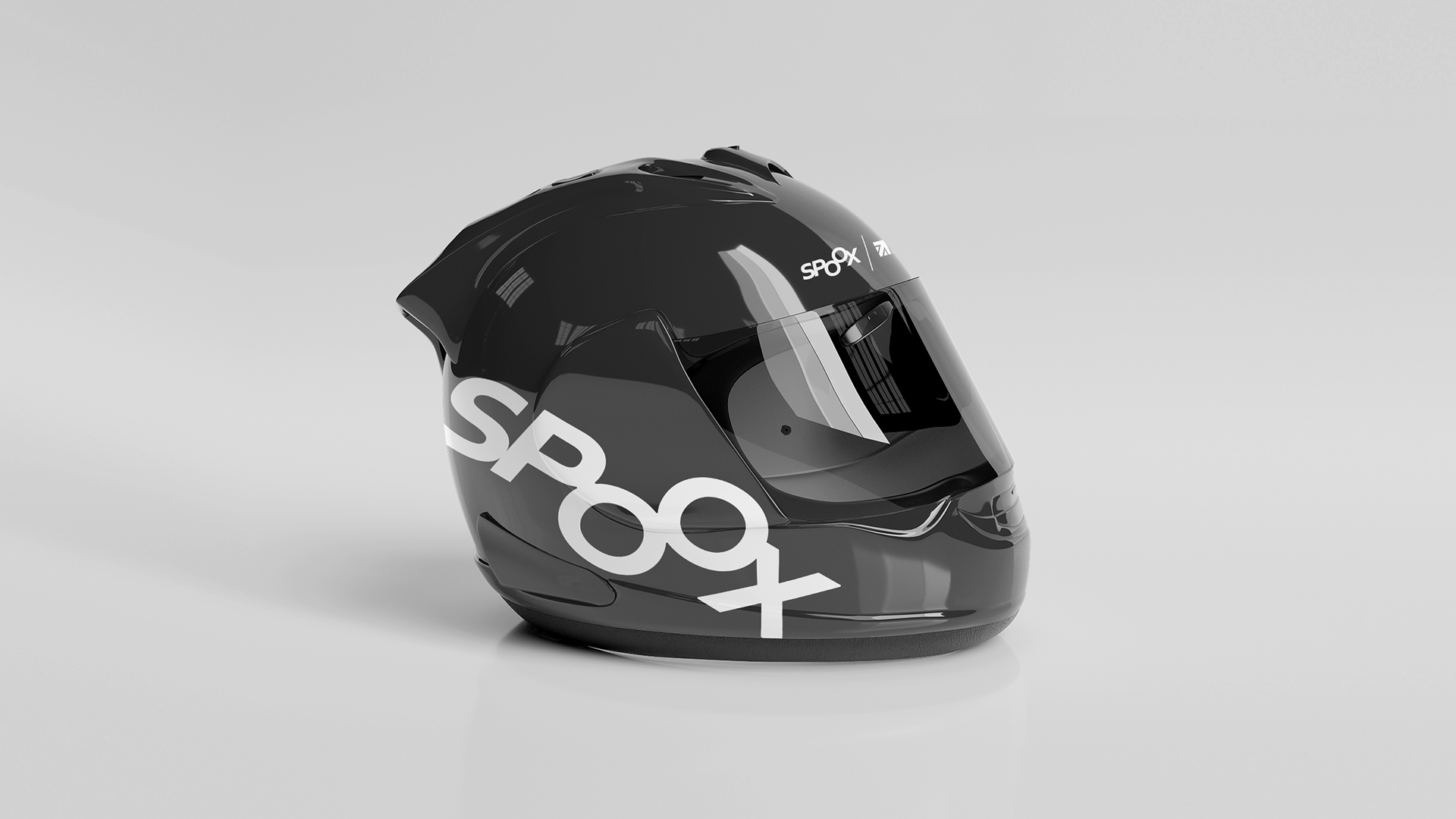
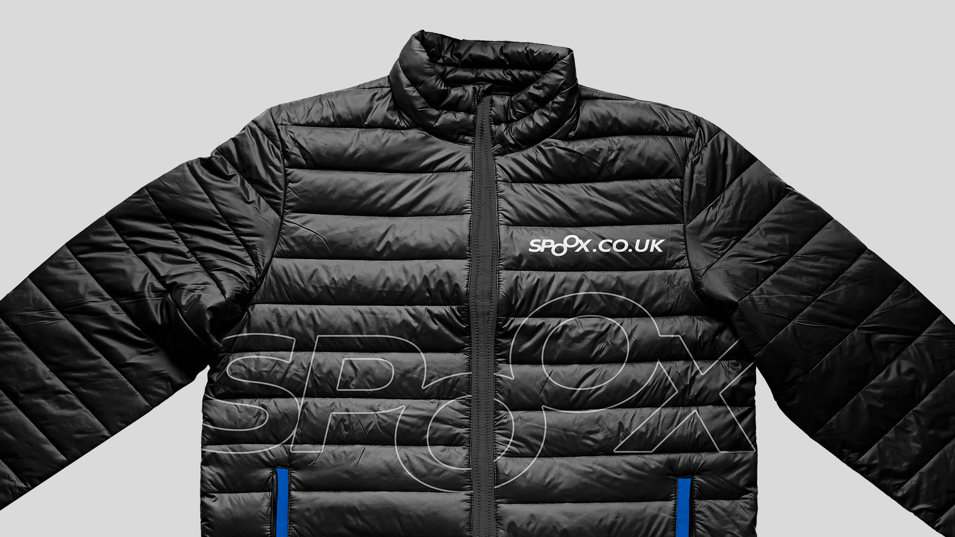
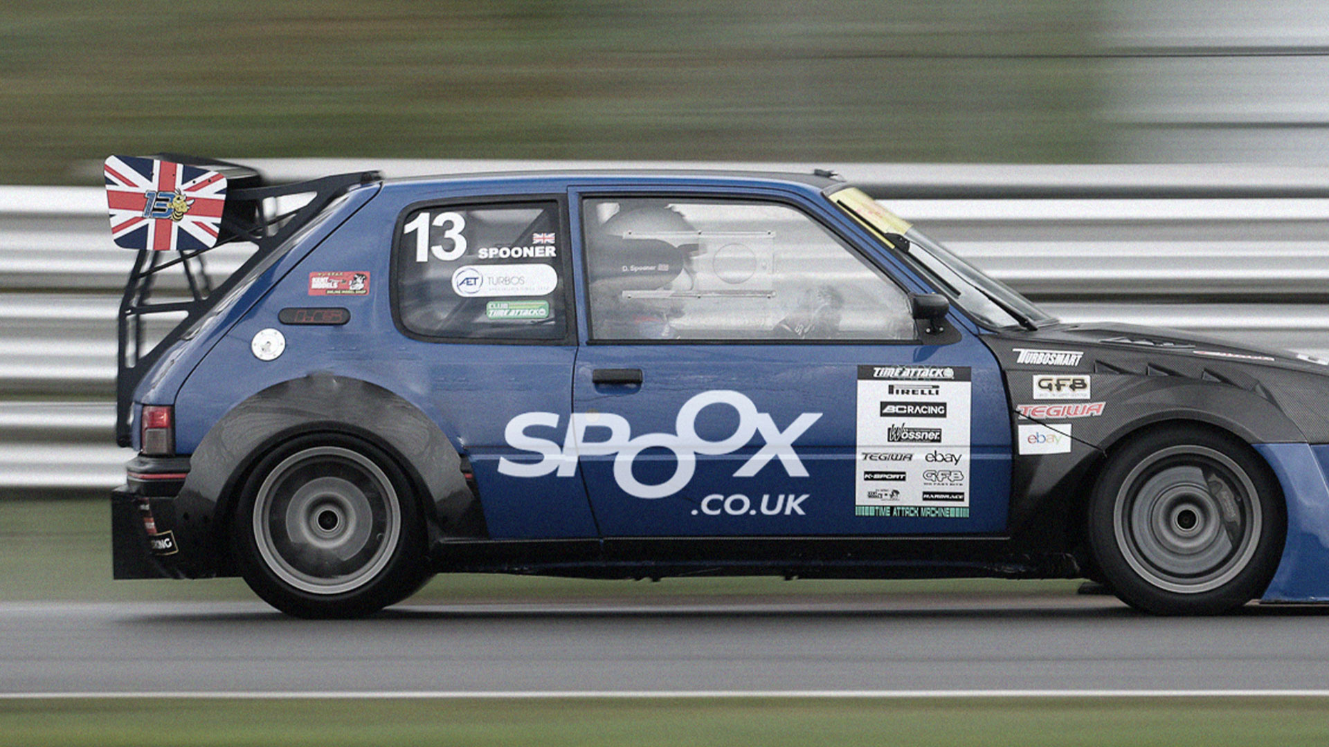
The branding to date has been applied to touchpoints such as branded merchandise, social media channels and the Car 13 livery.
We also designed and developed a new e-commerce website that which you can view at www.spoox.co.uk.

CREDIT
- Agency/Creative: Intimation
- Article Title: SPOOX’s New Brand Identity by Intimation Showcases Motorsport Precision and Style
- Organisation/Entity: Agency
- Project Type: Identity
- Project Status: Published
- Agency/Creative Country: United Kingdom
- Agency/Creative City: Intimation
- Market Region: Europe
- Project Deliverables: Art Direction, Brand Creation, Brand Design, Brand Guidelines, Brand Identity, Brand Strategy, Branding, Creative Direction, Graphic Design, Identity System, Lettering, Logo Design, Rebranding, Typography
- Industry: Transport
- Keywords: Branding Strategy / Brand Development / UI/UX / Website Development
-
Credits:
Branding: Intimation


