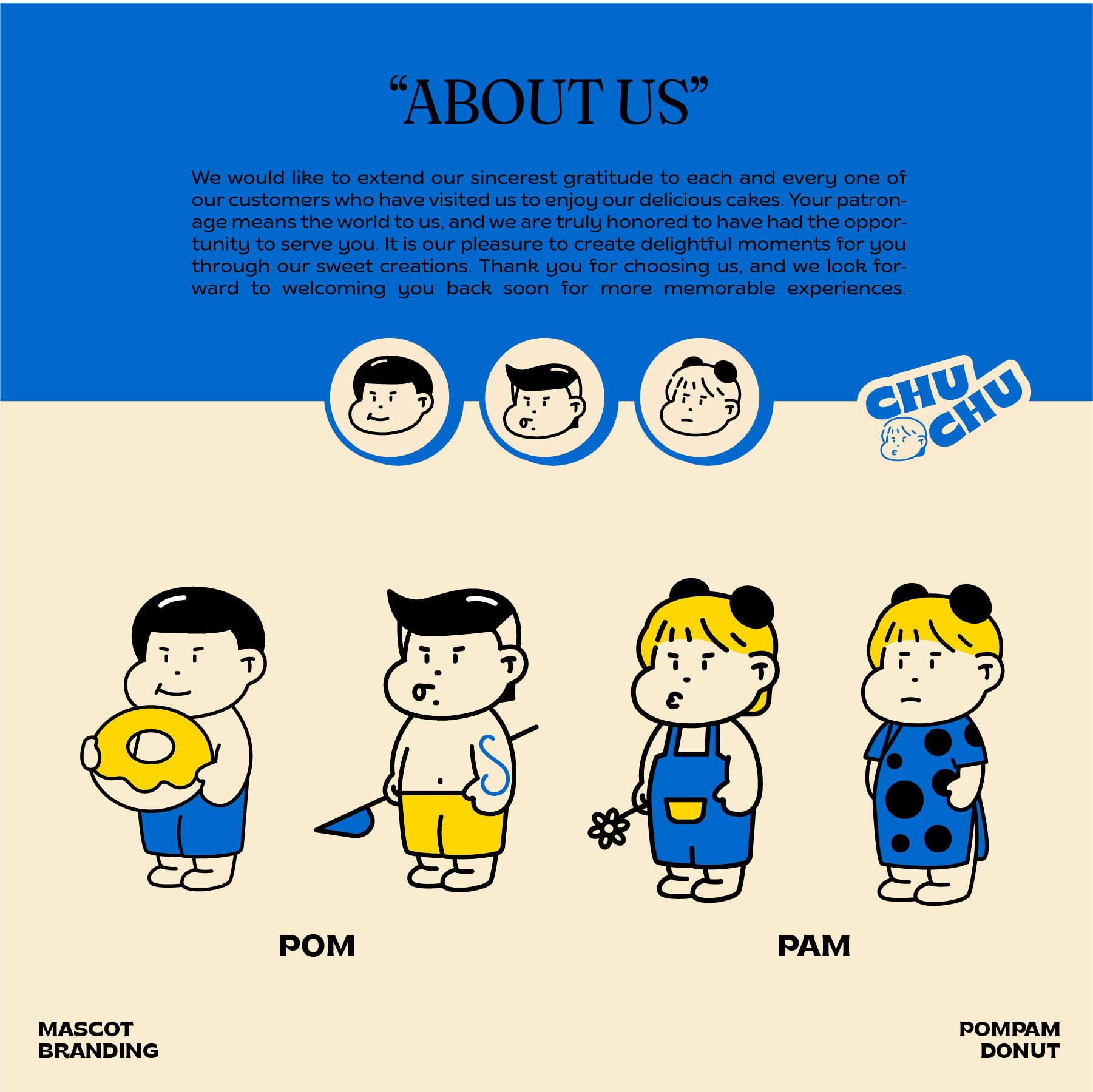
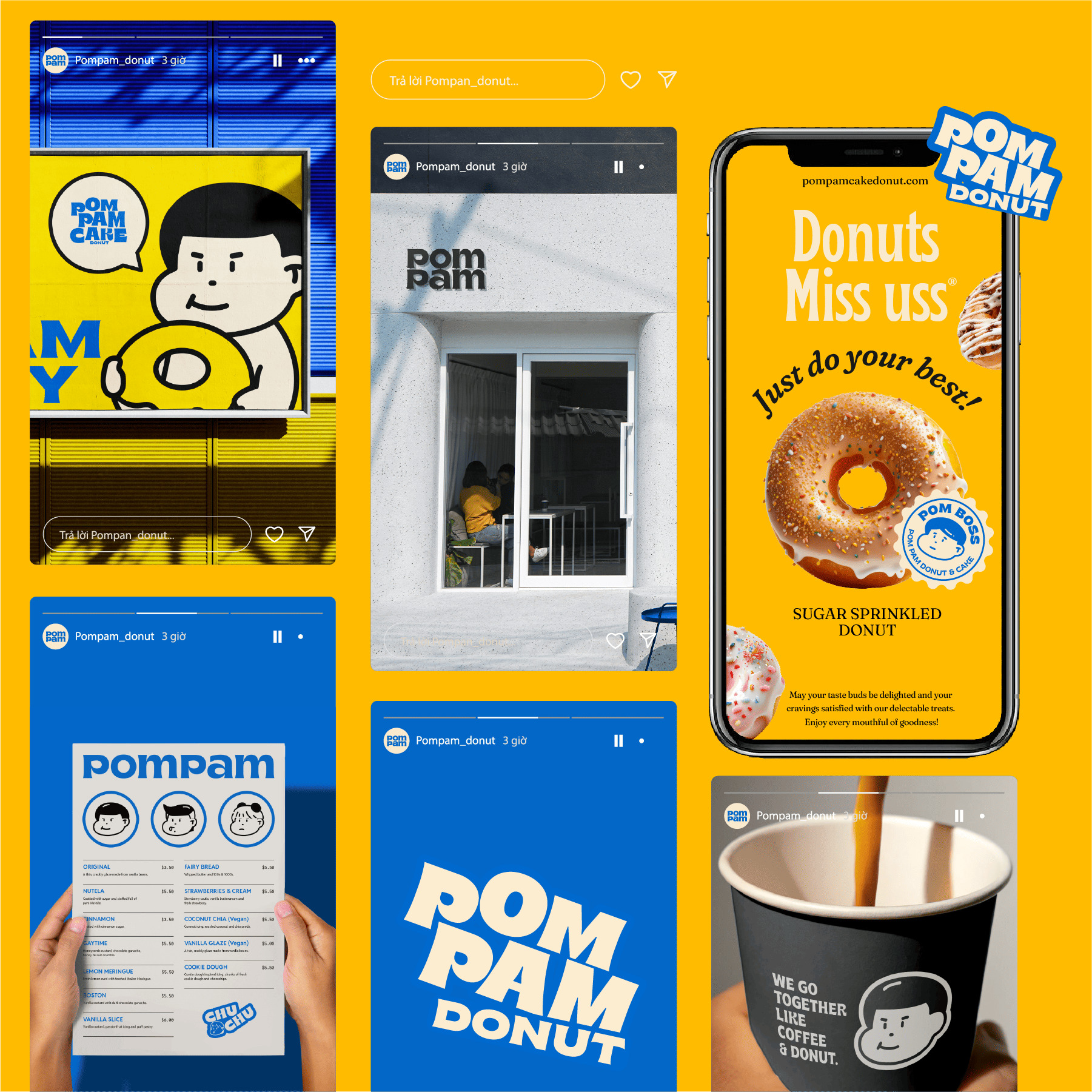
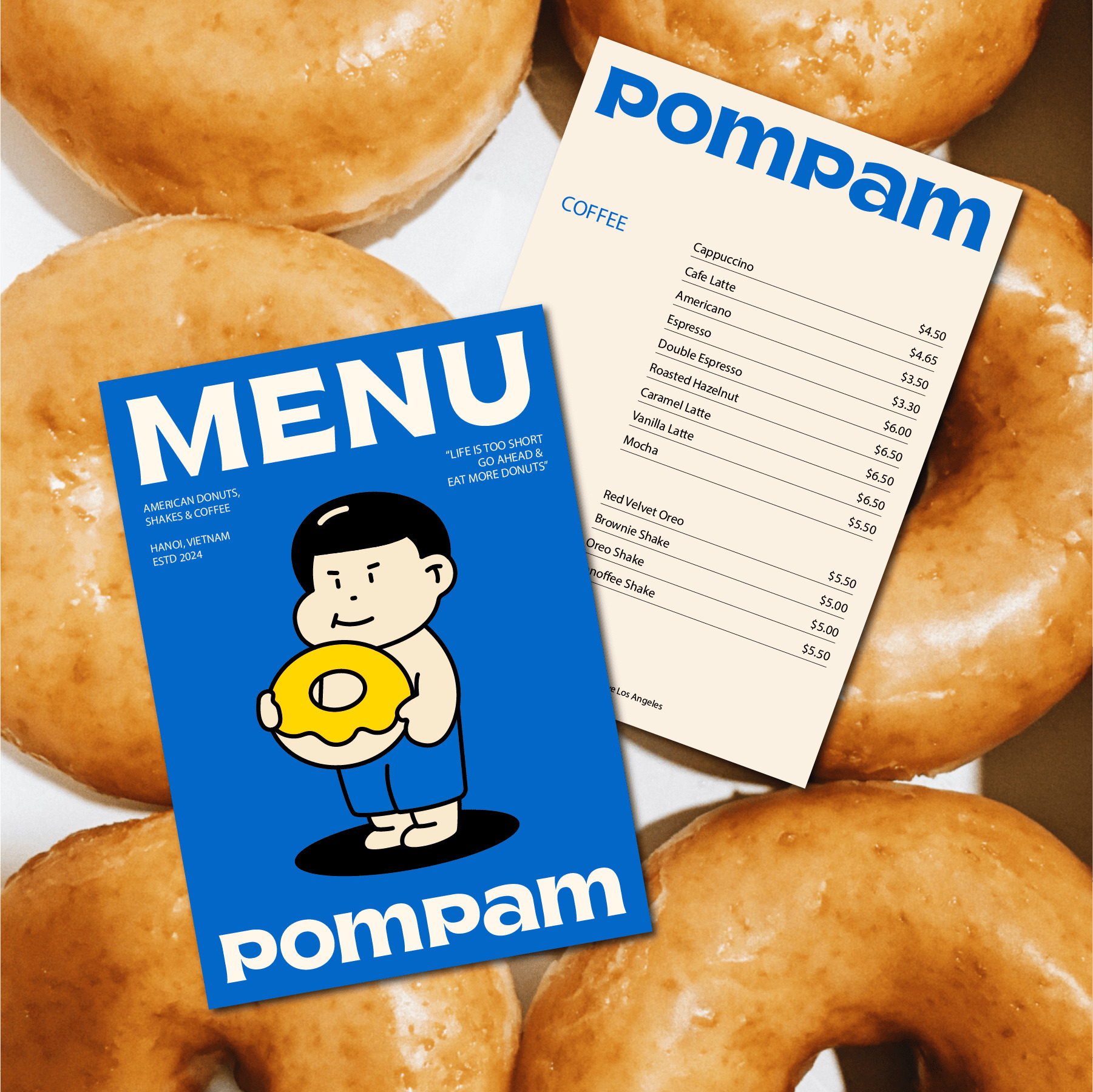
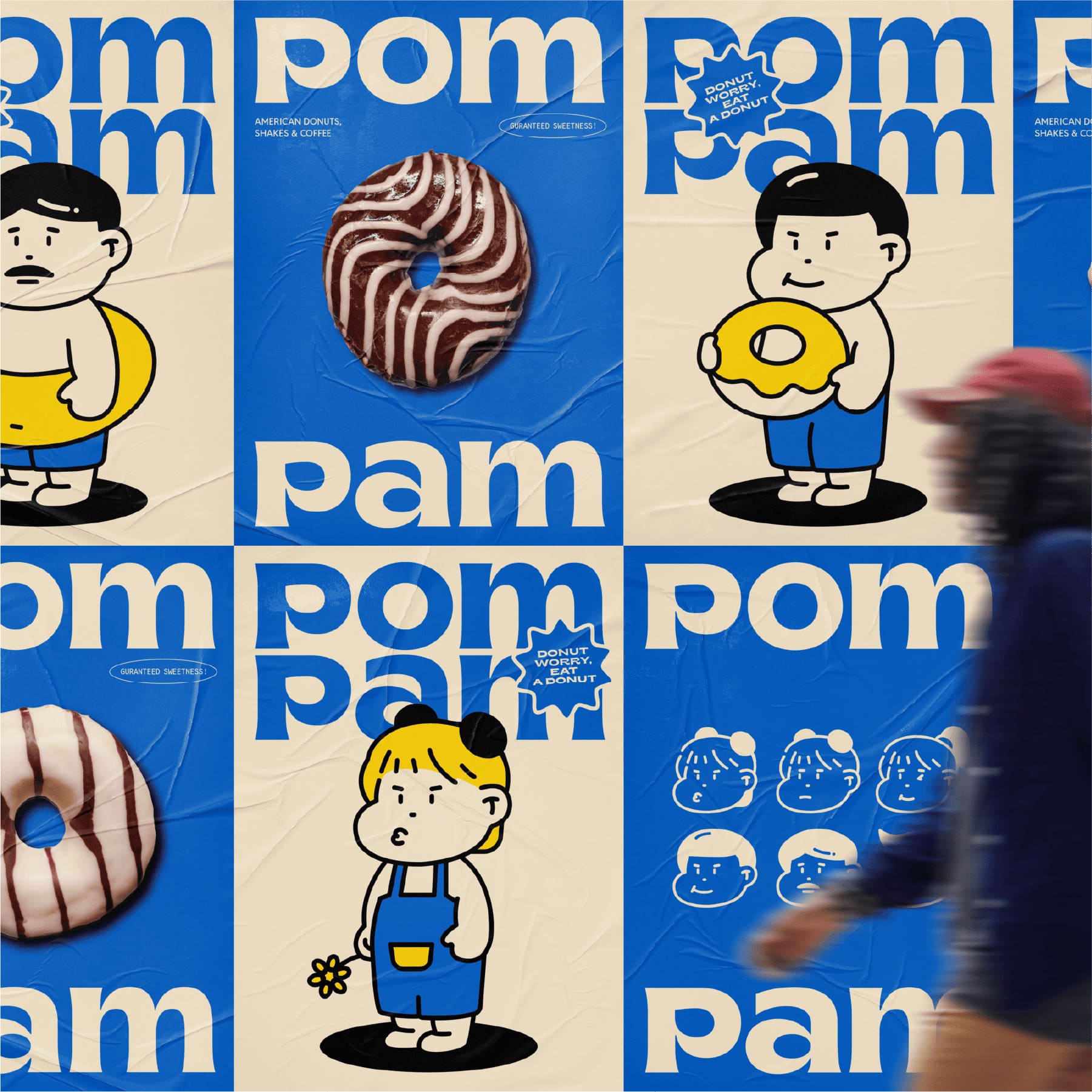
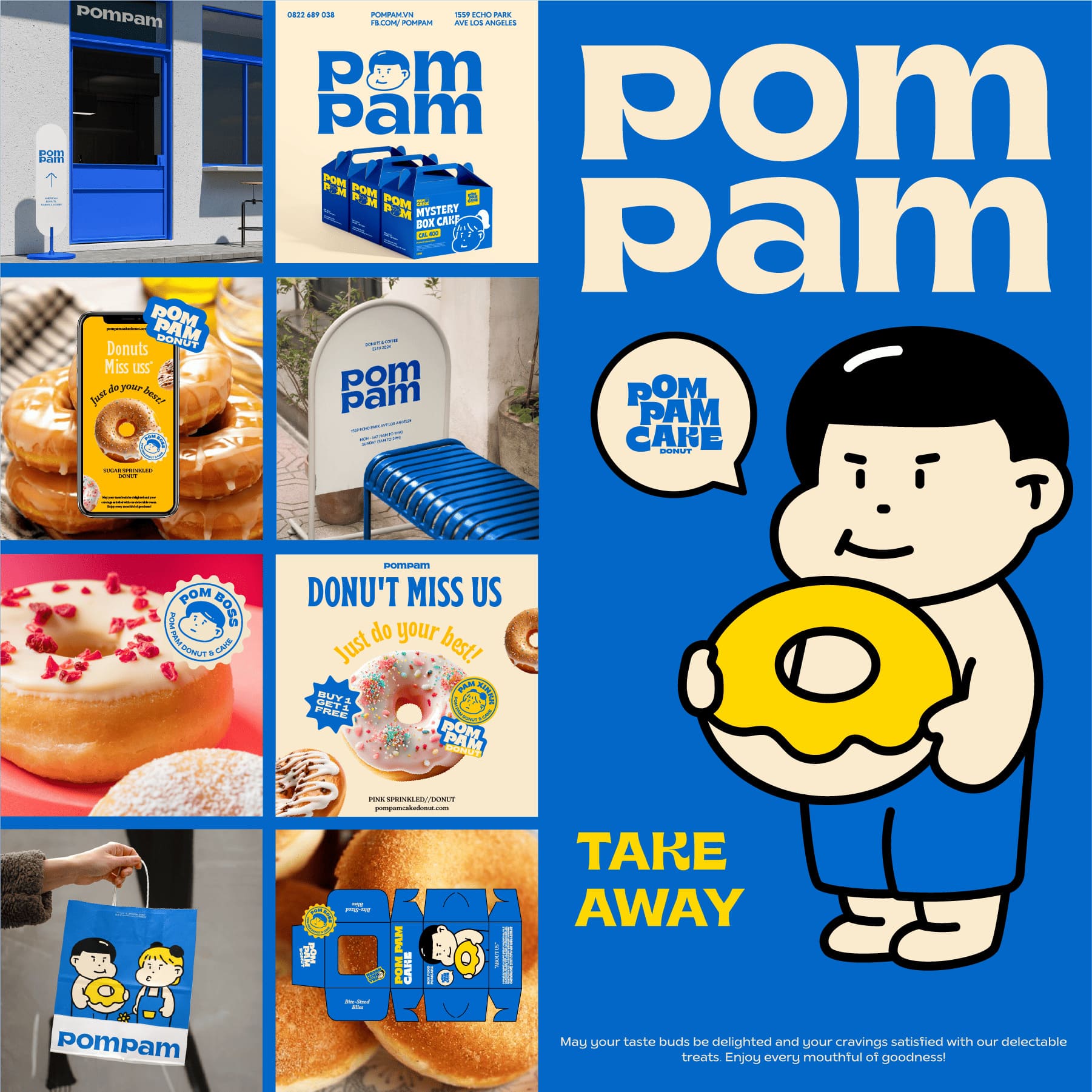
Merdes Creative has brought a delightful twist to branding with Pom and Pam, mascots inspired by the adored Vietnamese baby, Pamyeuoi. Pamyeuoi’s charm lies in her chubby, joyful face—a trait that Merdes has cleverly embraced by giving Pom and Pam chubby, round cheeks that resemble delicious donuts. These mascots are more than just cute additions; they’re symbols that embody Merdes’s commitment to warmth, playfulness, and positivity, creating an emotional resonance that goes beyond mere visual appeal.
Pom and Pam are designed to be approachable, drawing on the universal allure of donuts to add a layer of sweetness and joy to their faces. Their rounded cheeks and wide-eyed expressions bring an element of innocence and charm, making them feel like little companions rather than brand mascots. This thoughtful design choice is central to Merdes’s philosophy, emphasizing the importance of creating visual identities that feel personal and relatable. For customers, Pom and Pam aren’t just logos; they’re familiar, friendly figures that bring a smile and an uplifting energy.
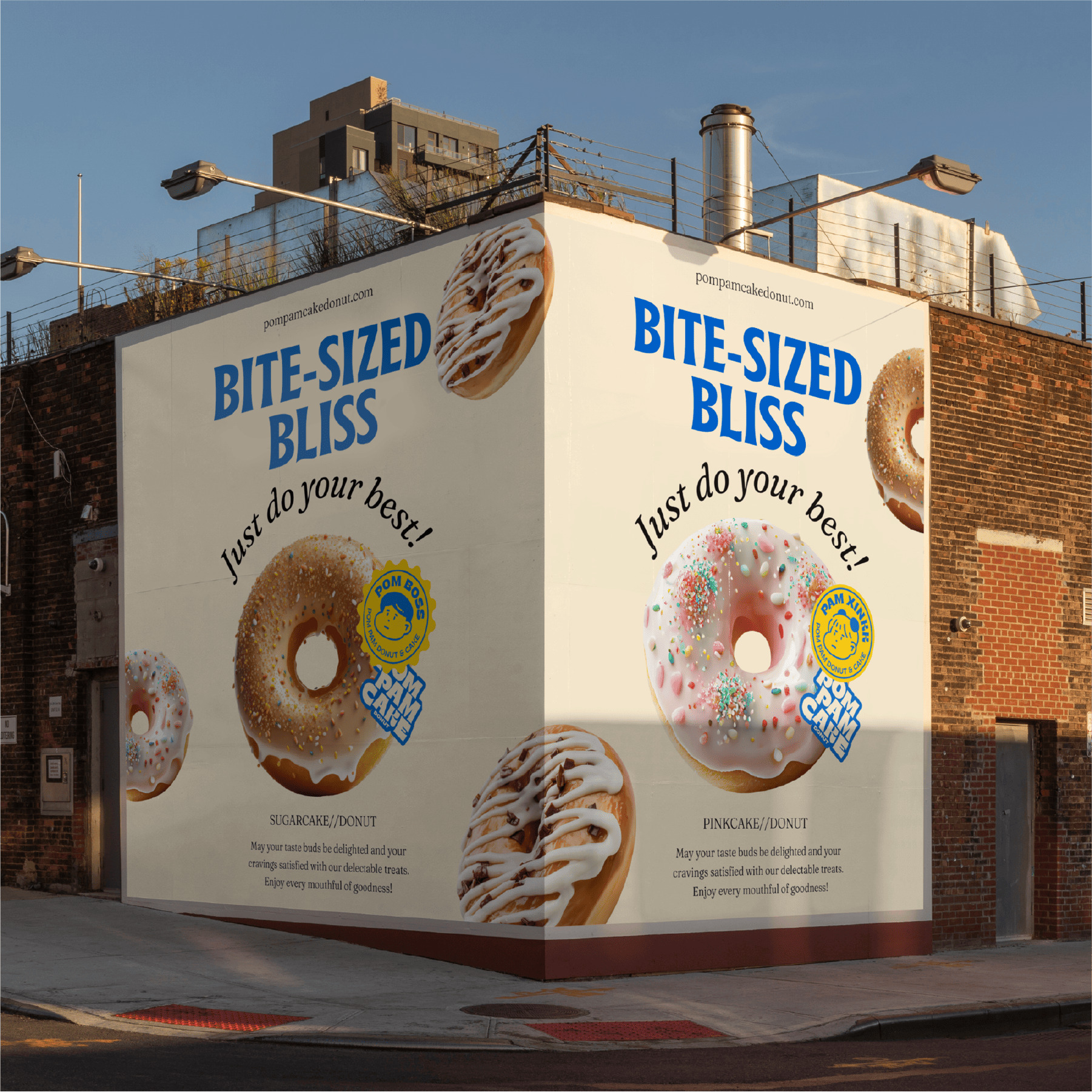
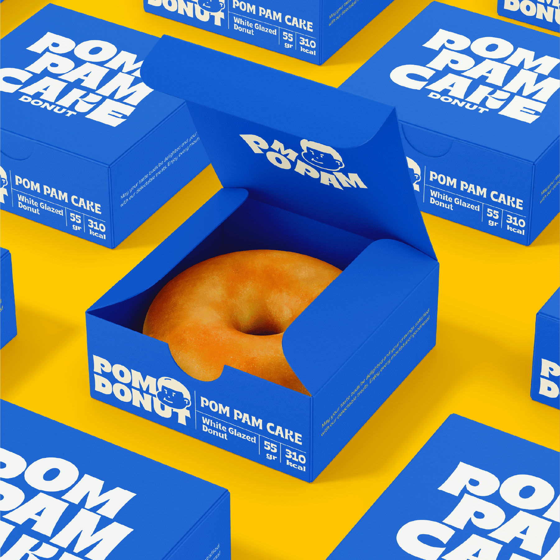
The integration of Pom and Pam into the product packaging is equally meticulous. Merdes’s design team didn’t simply place these mascots on the packaging as an afterthought; instead, they carefully incorporated them in a way that blends seamlessly with the brand’s visual language. The use of bright Pantone colors, with a signature yellow and green, ensures that Pom and Pam’s presence is eye-catching yet harmonious. Yellow evokes feelings of warmth and happiness, while green adds a fresh, revitalizing contrast. Together, these colors create a vibrant, cheerful palette that enhances the mascots’ appeal, drawing customers to the products with an energy that’s impossible to ignore.
Pom and Pam also embody what Merdes calls a “healing” vibe, a concept that aligns with the brand’s mission to bring positivity and joy into everyday life. By crafting mascots that radiate this vibe, Merdes has transformed the act of purchasing into something more—an encounter with warmth and playfulness. In a world where people often seek small sources of joy, Pom and Pam provide a moment of brightness and comfort, making Merdes’s products feel more like happy little gifts than mere items.
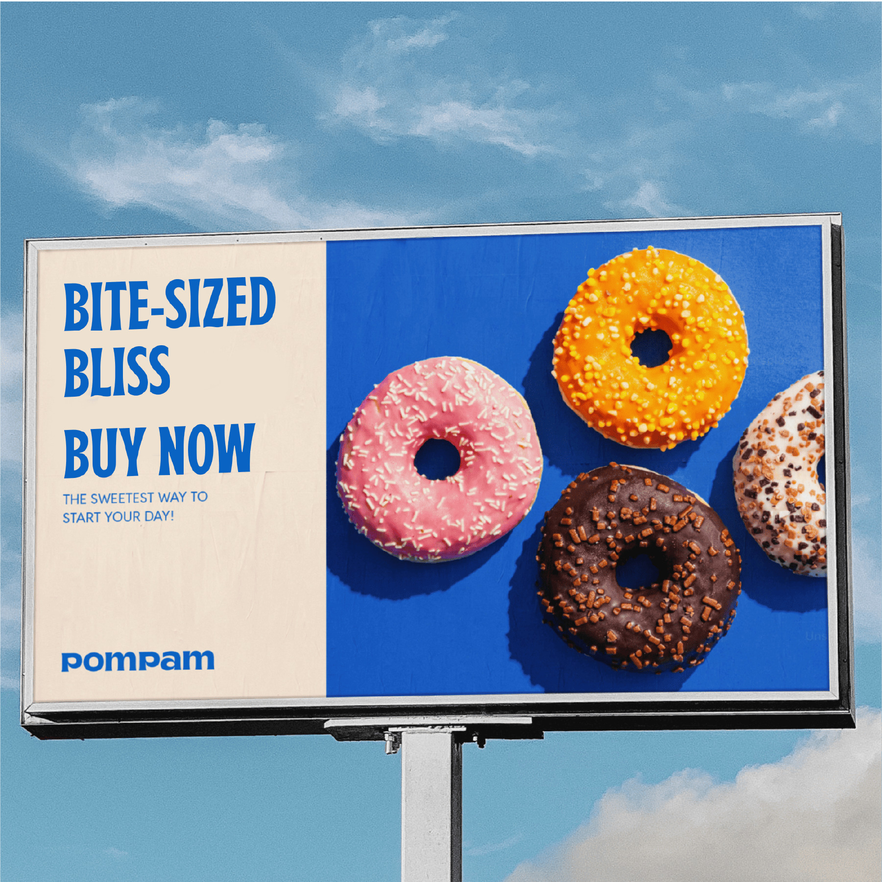
The impact of Pom and Pam extends beyond the shelves, as their appeal resonates with customers across demographics. These mascots have become powerful brand symbols, drawing attention on social media and encouraging word-of-mouth promotion. With their joyful, healing vibe, Pom and Pam have elevated Merdes’s brand to a new level, where every purchase becomes a colorful, positive experience. The mascots are a testament to Merdes Creative’s commitment to creating not only products but also an emotional connection that makes life a bit more vibrant for every customer.
CREDIT
- Agency/Creative: Merdes Creative
- Article Title: Merdes Creative’s Sweet Branding for PomPam Donuts Brings Joyful Mascots to Life
- Organisation/Entity: Agency
- Project Type: Identity
- Project Status: Published
- Agency/Creative Country: Vietnam
- Agency/Creative City: Ha Noi
- Market Region: Asia
- Project Deliverables: 2D Design
- Industry: Food/Beverage
- Keywords: donut, viet nam, fnb, showcase, branding, visual identity
-
Credits:
Art Director: Santype
Project Manager: Minh Hieu


