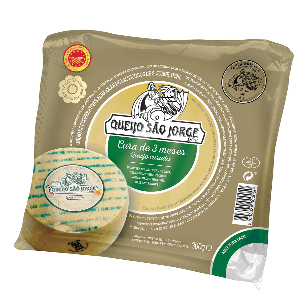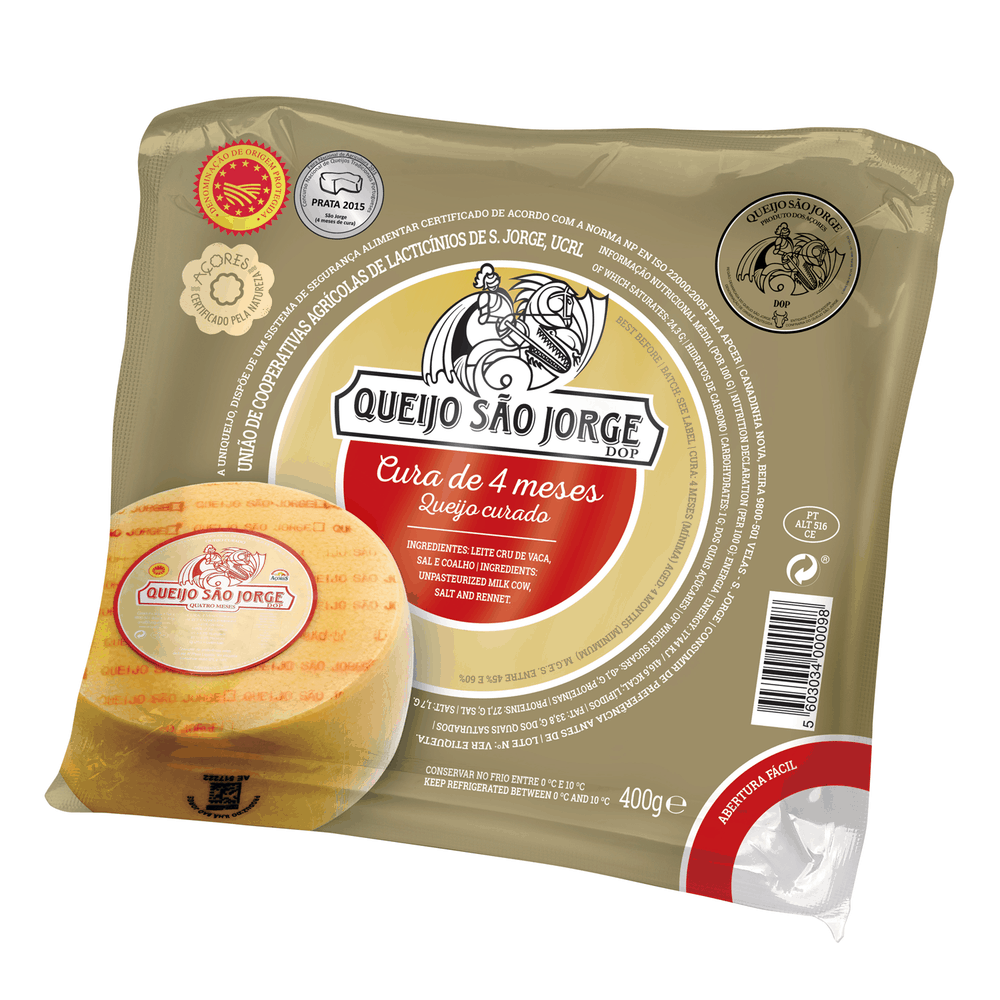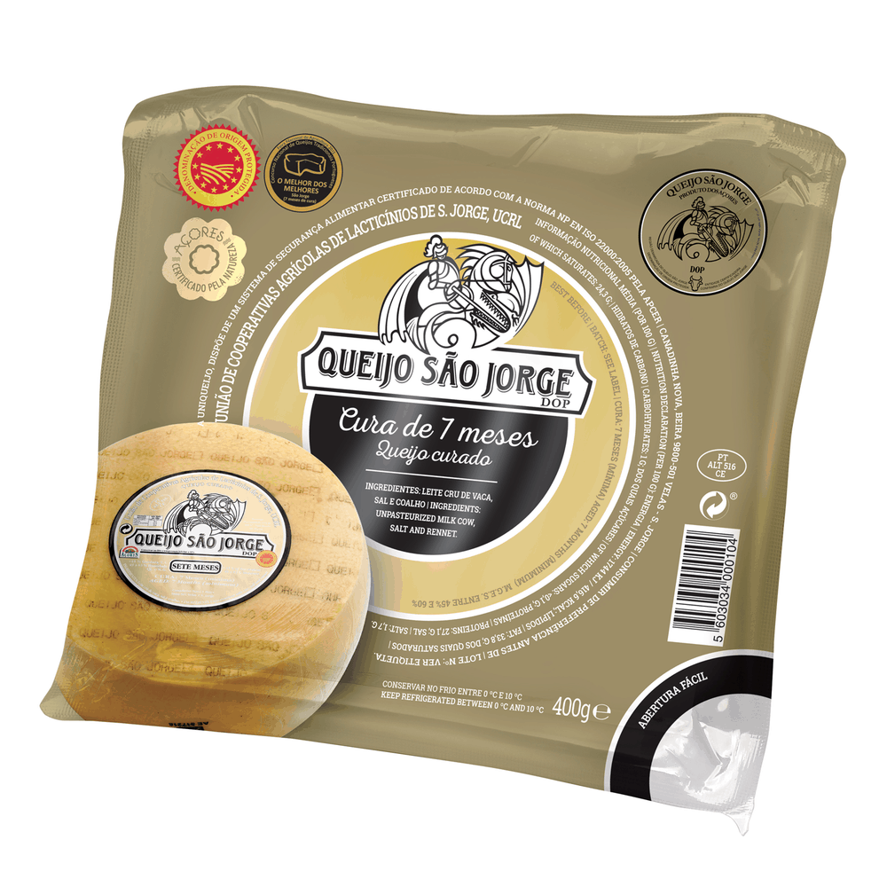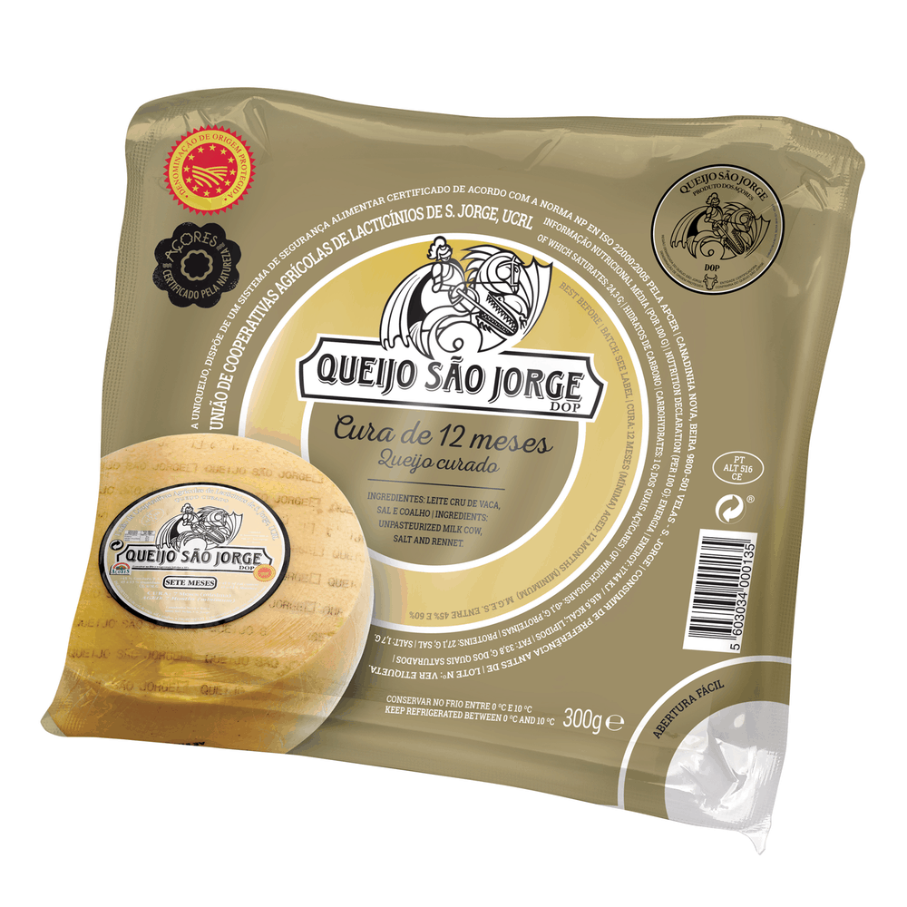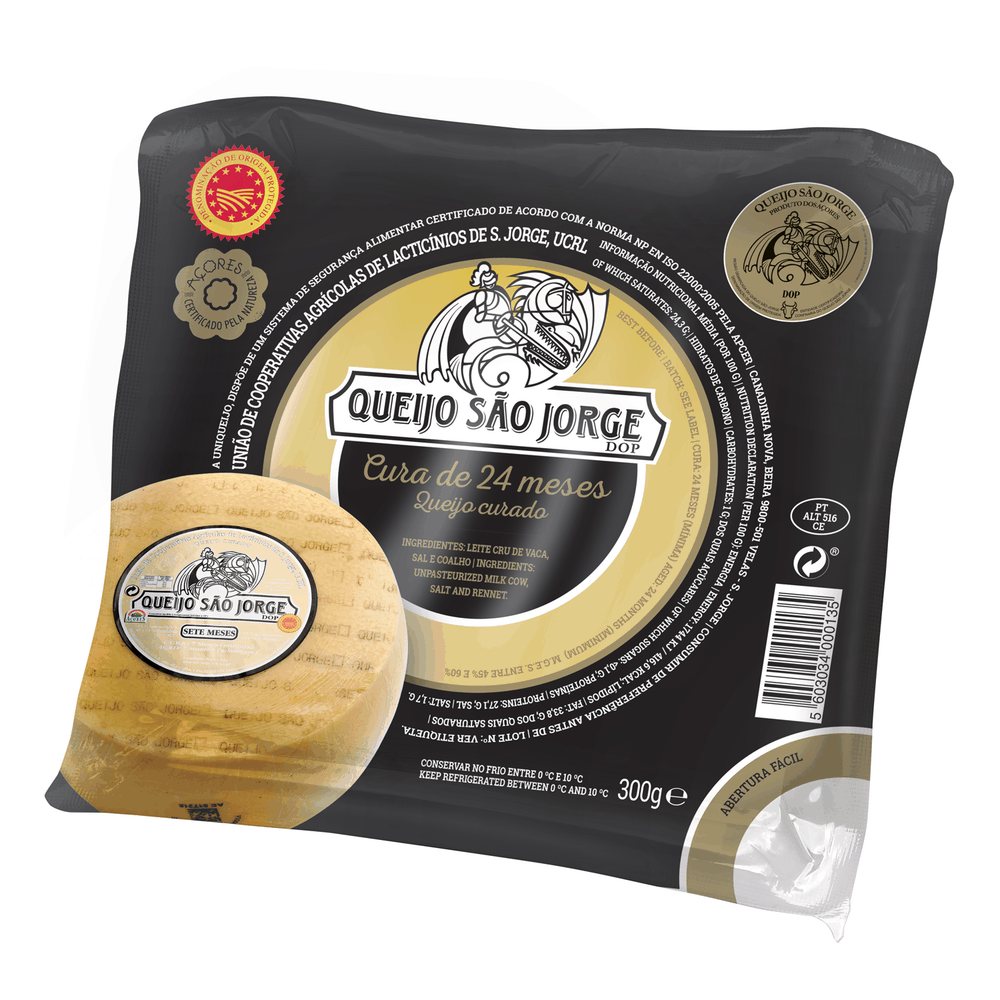
” ‘The gold or gold color is symbolically linked to gold, wealth, something majestic.’
The quality ‘majestic’ of cheese slices S. Jorge PDO is here represented by the involvement of color. Keeping the connection to the original labeling present on the whole cheese. Representation through the wheel image of cheese, provides consumers with the guarantee and the identification of its origin. The differentiation between the various cures is made, in addition to the appointment, by creating a color zone associated with the original whole cheese colors.
The premium cures of 12 and 24 months, are represented by the use of a different color – black – instead of gold on the outside of the label positioning this product in a higher category. The interior follows the time of their healing, making the necessary differentiation. The language used makes a clear distinction between the cures of 3, 4 and 7 months. The logo in all references retains its identity and comes in a single color.
Valuation of a product which in itself has a higher quality by using a new package. Reinterpretation of graphic language keeping traditional features but investing in a more contemporary look.”
