A new brand identity and design system for ERMC – Balancing expertise with their culture whilst highlighting collaboration, agility and environmental consideration.
Project Overview:
ERMC offers multidisciplinary services in Architecture, Surveying, Estate and Land Management, Cost Consultancy, Project Management, and Net Zero Building Solutions. Their vision is to lead as a comprehensive practice that provides full-circle services for people and places. They are known for an evolving and fluid approach, with a strong commitment to those they serve and the world they inhabit. Functioning as a seamless ecosystem, ERMC integrates the skills and expertise of diverse professionals under one roof, fostering a collaborative culture that truly sets them apart.
Our Deliverables:
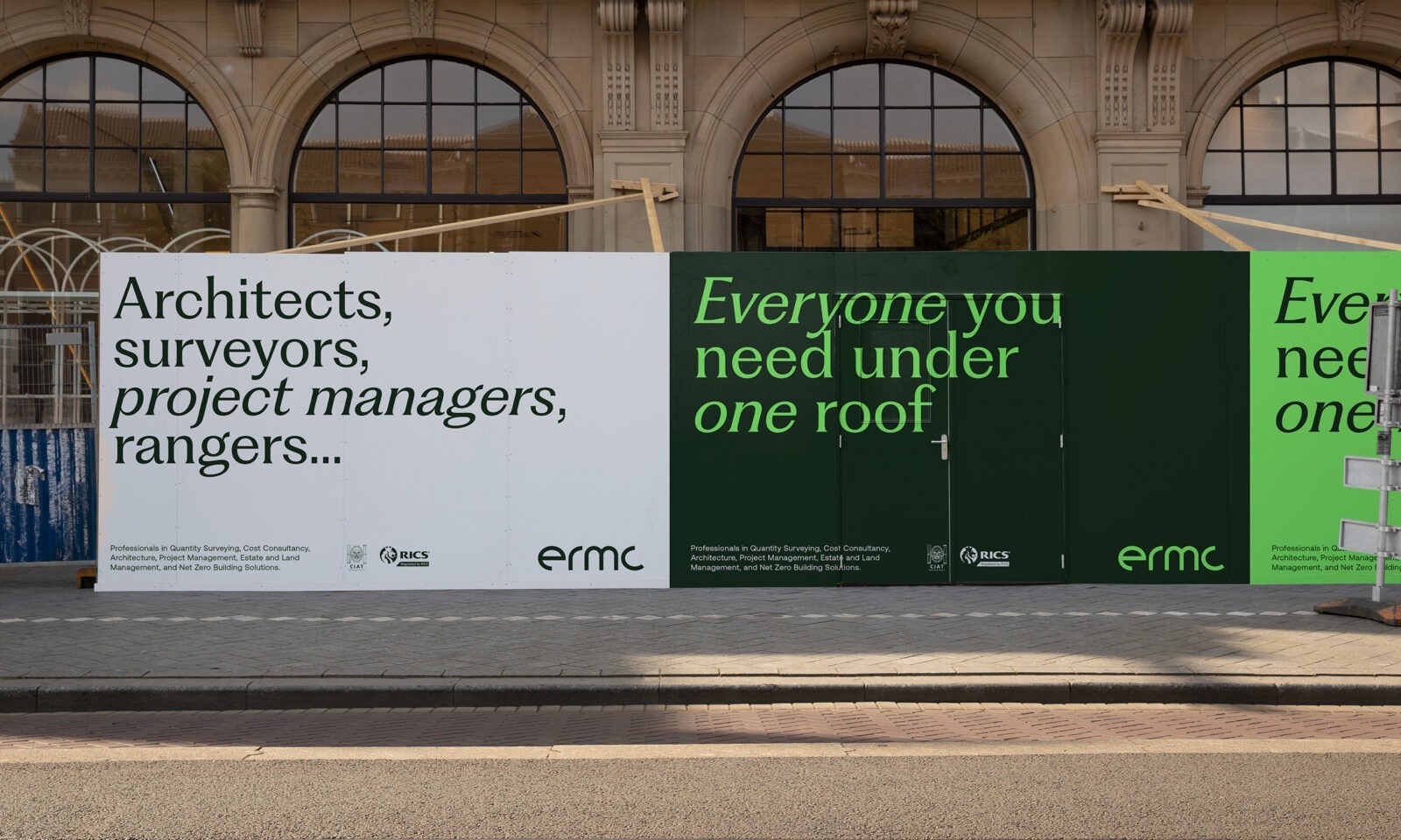
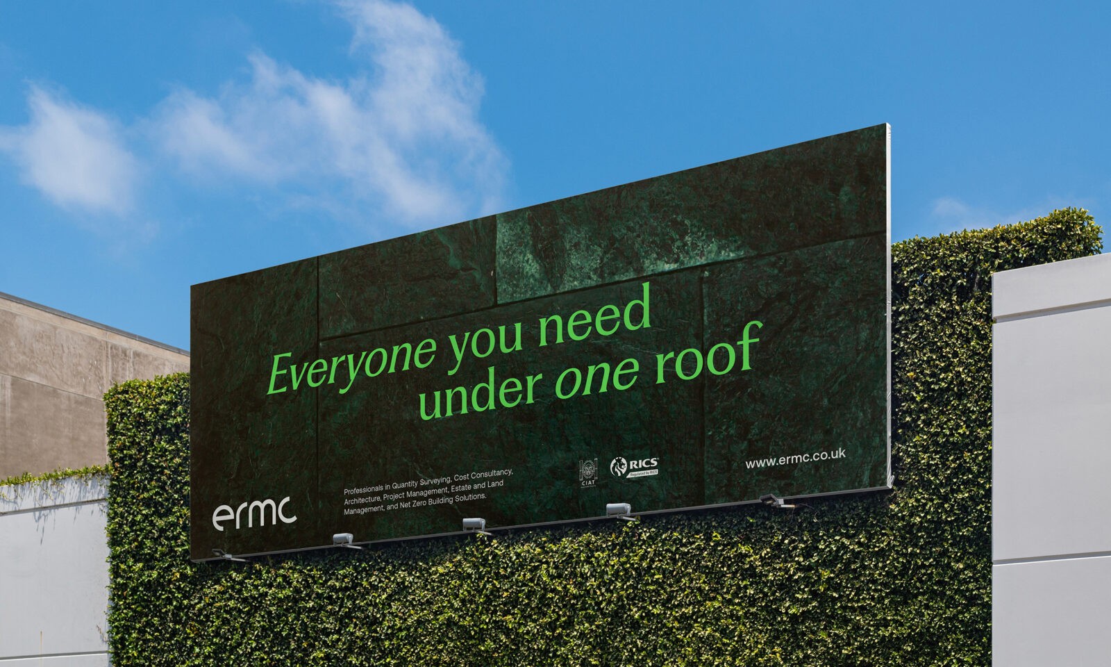
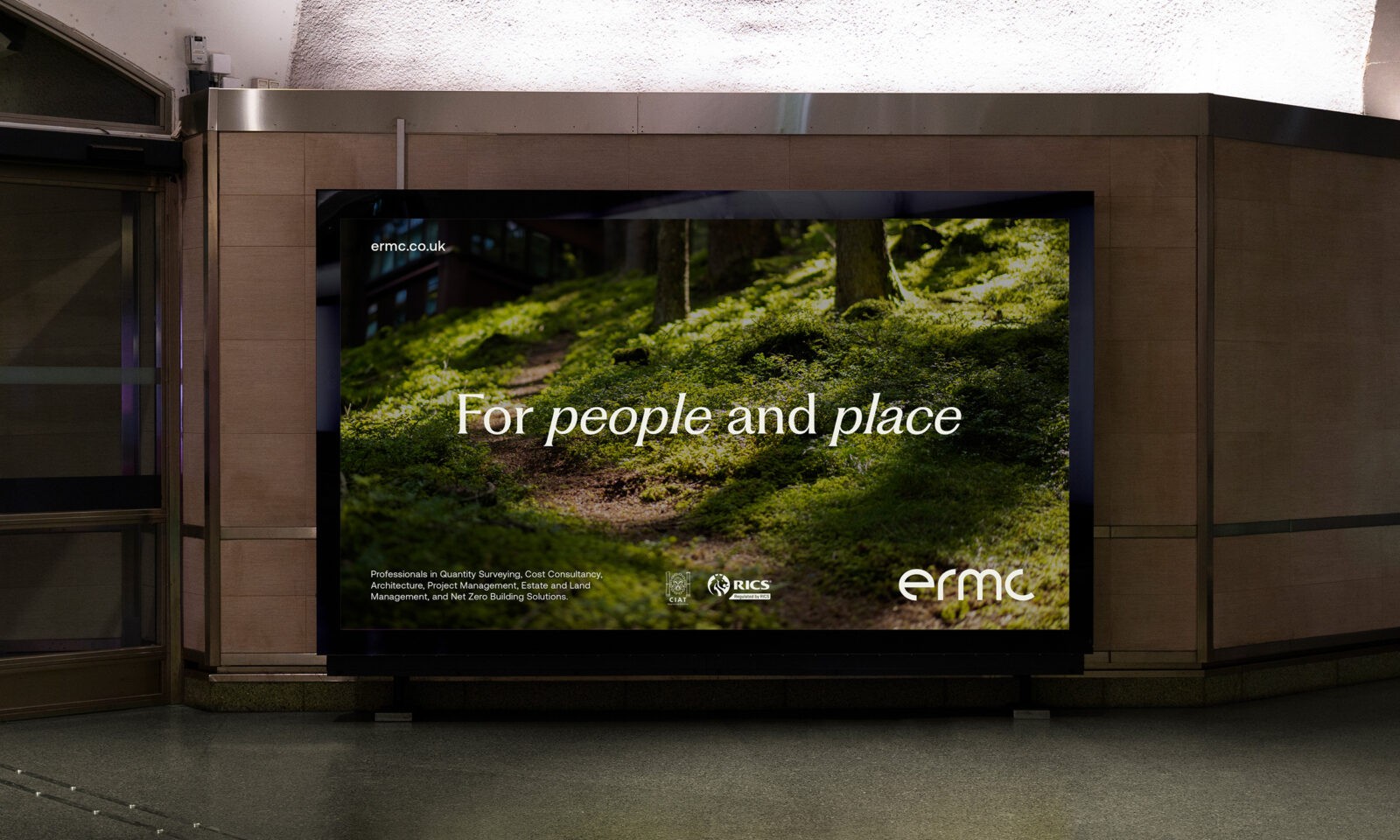
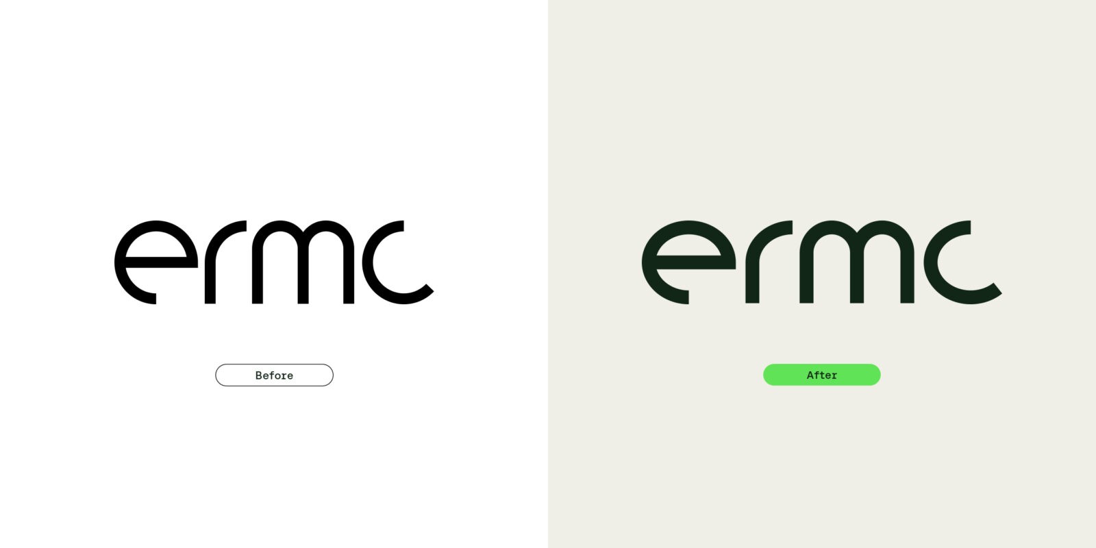
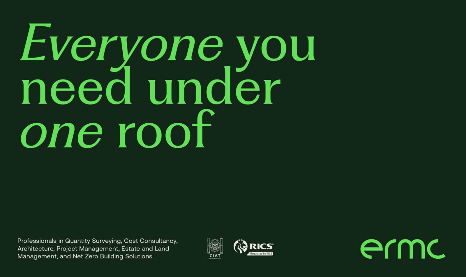
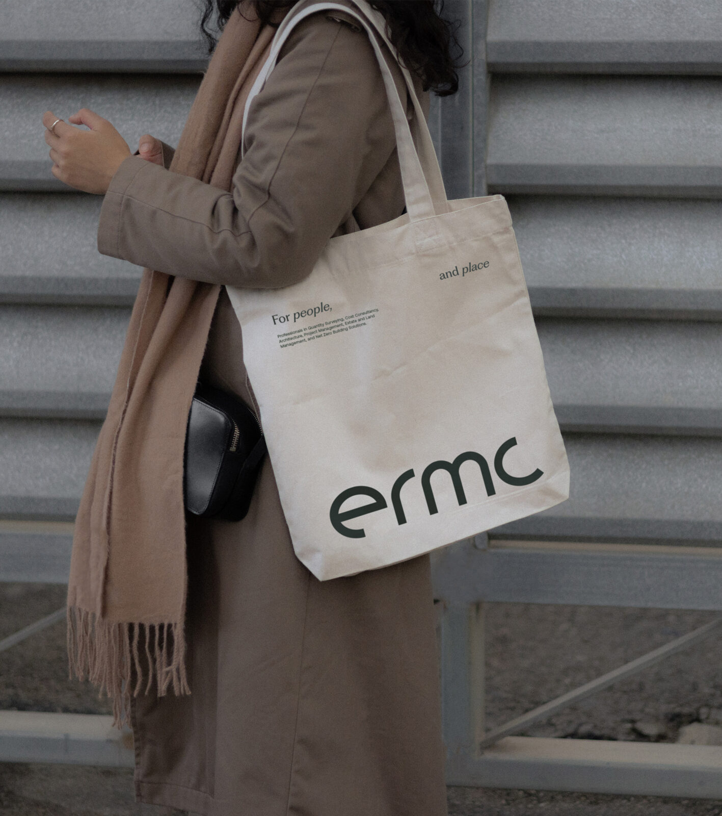
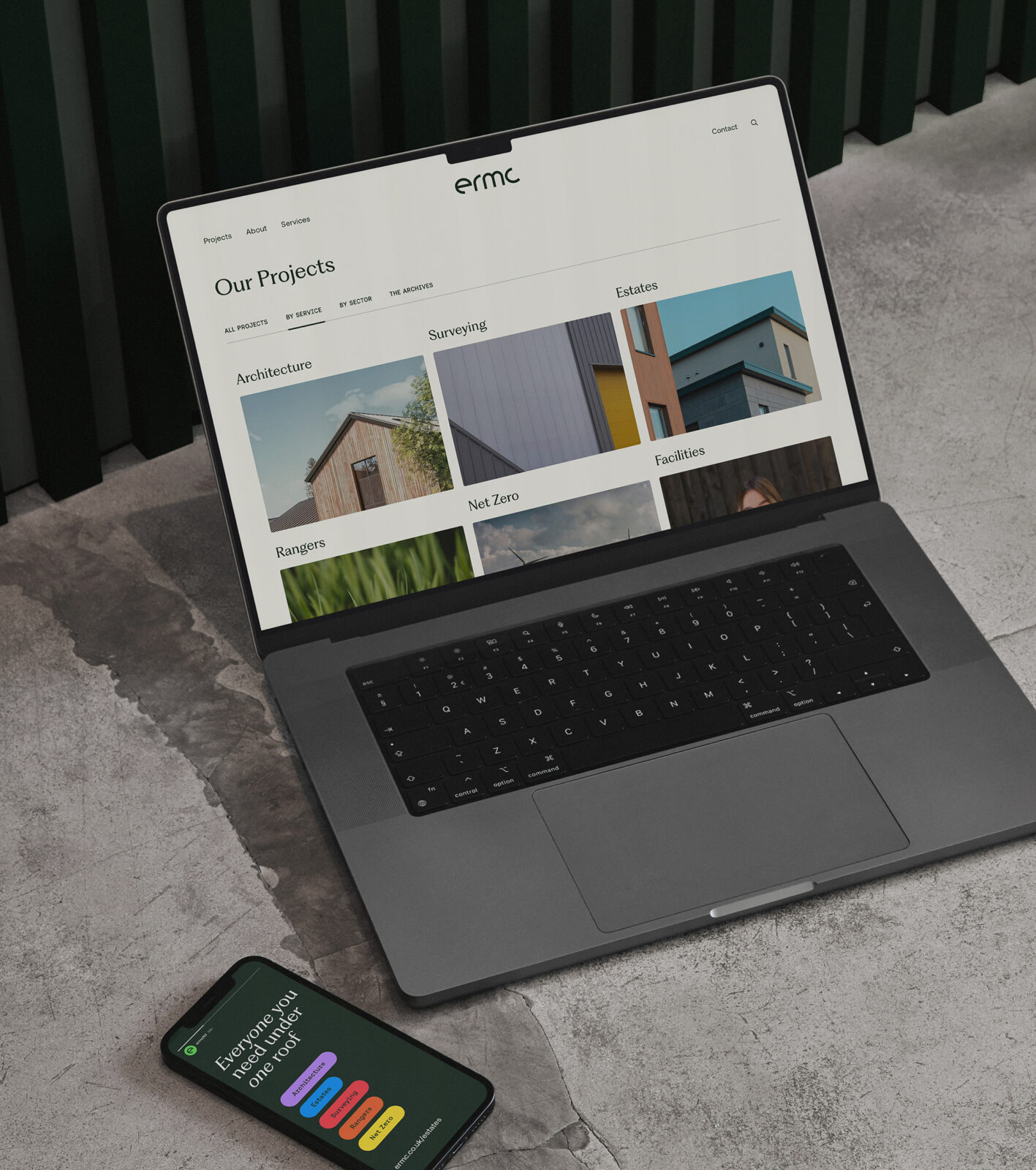
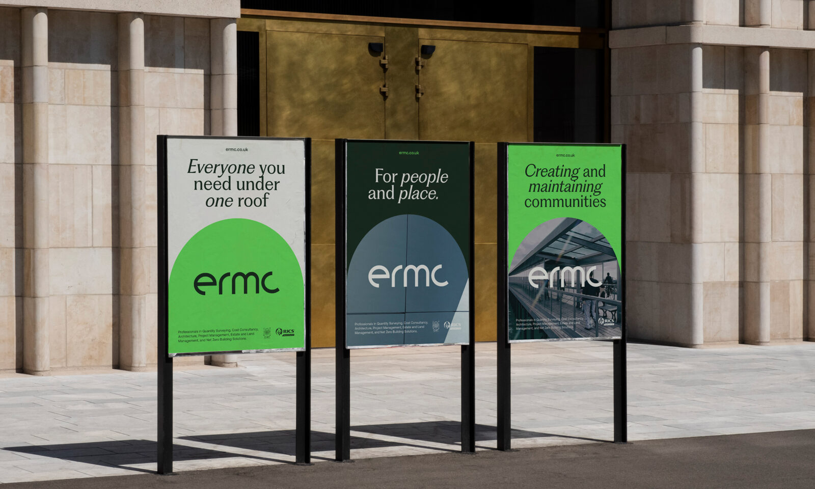
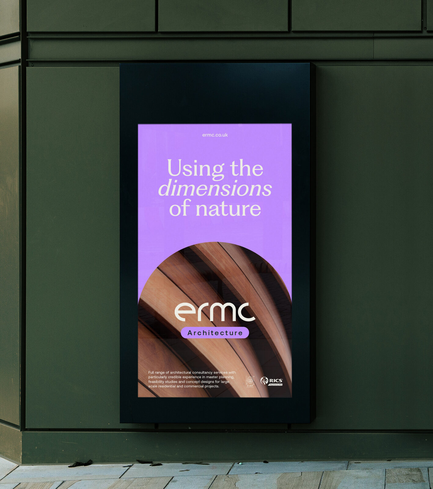
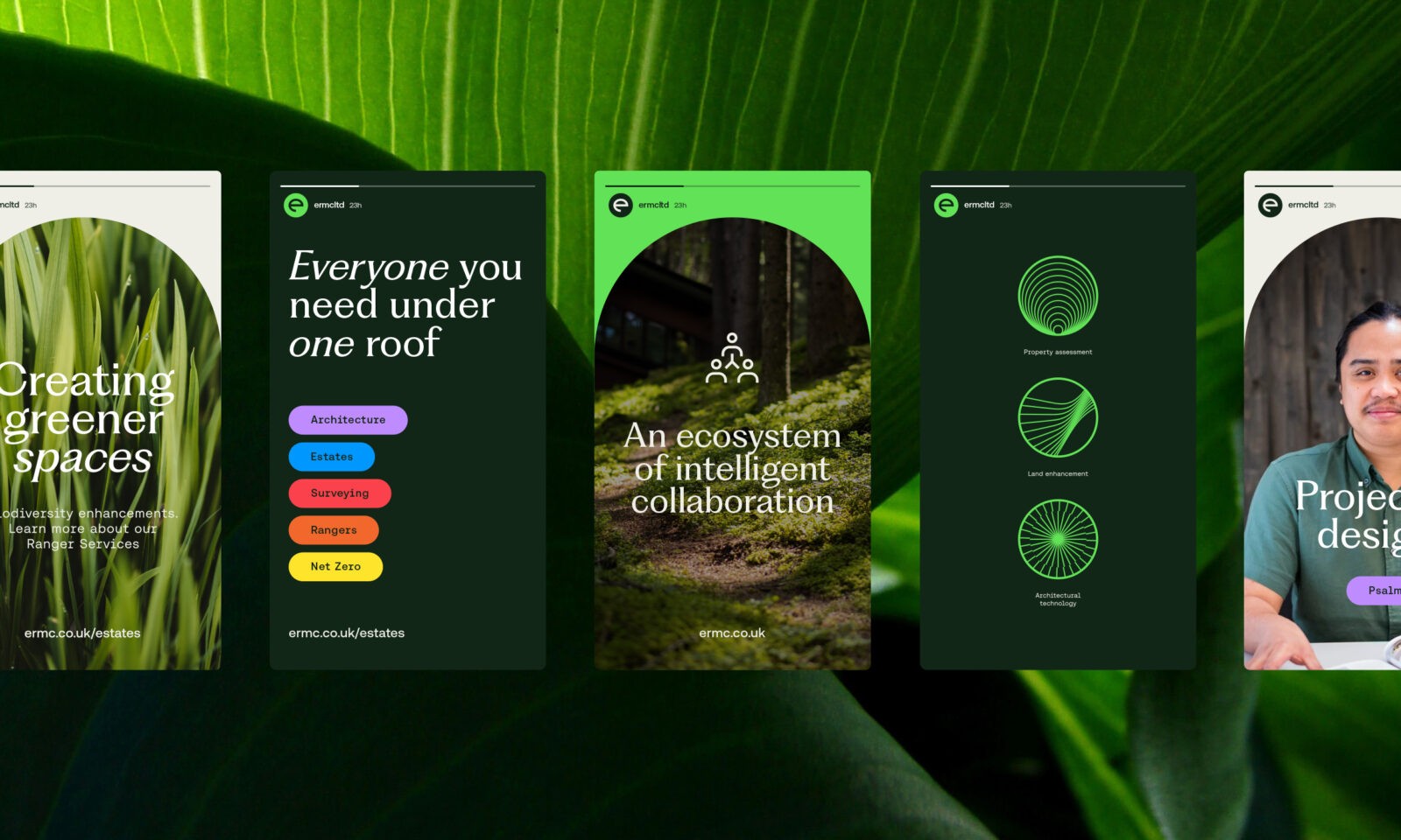
In close partnership with ERMC, we created an authentic brand identity that consolidates their three previously separate businesses. To clarify their extensive service offerings, we established six defined business sectors. The new brand speaks directly to their audience, using messaging that is both purposeful and engaging. Alongside a refined logo, we developed a cohesive design system including a nature-inspired color palette, typography, photography style, iconography, and web design—all reflecting ERMC’s core values and culture.
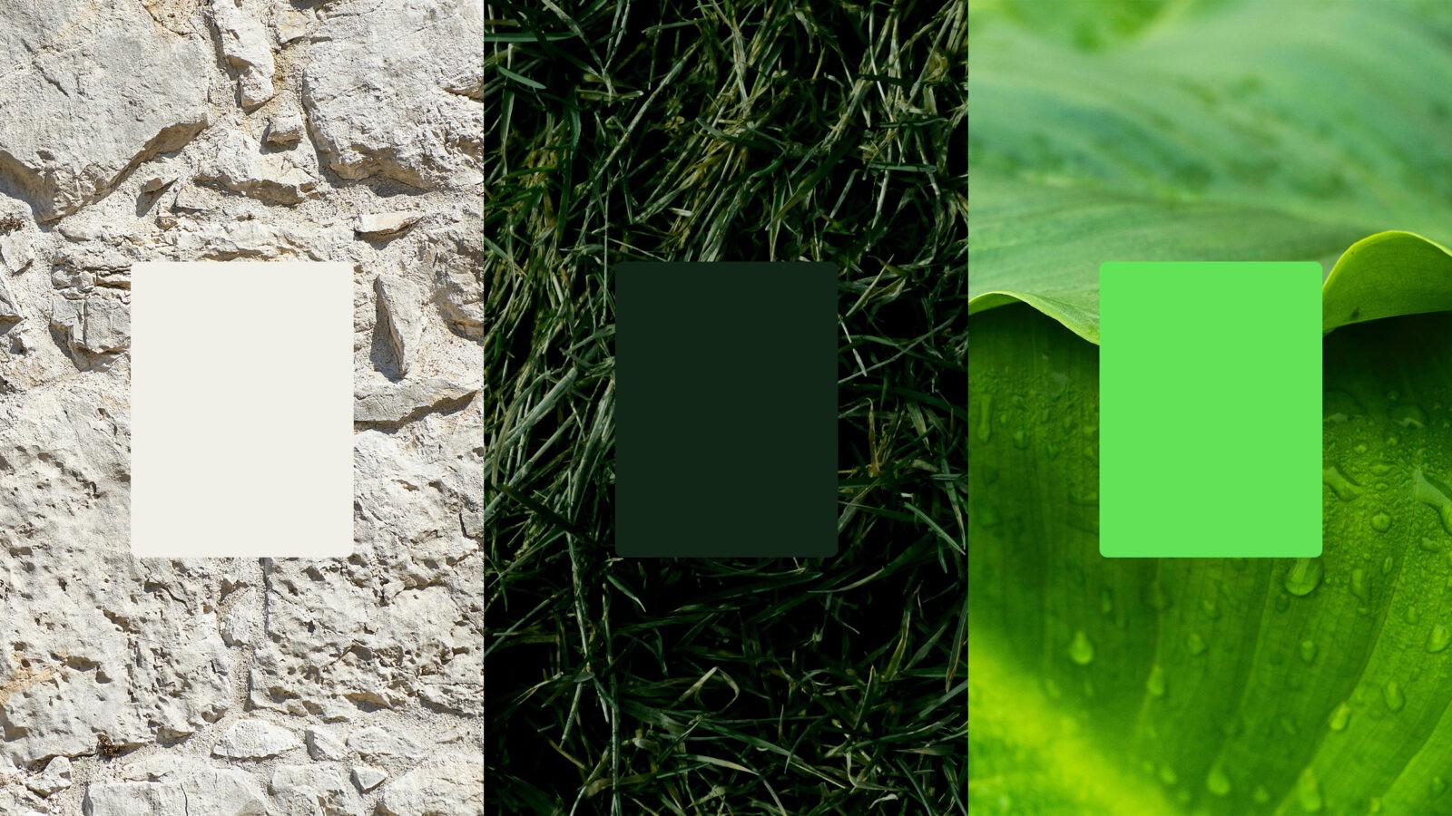
A significant influence in this indentity was biophilic design, which ERMC actively embraces. This approach—integrating natural elements like light, greenery, and organic materials into spaces—enhances well-being and productivity. ERMC’s dedication to sustainability and environmental stewardship inspired us to curate a color palette rooted in natural tones, reinforcing their ‘for people and place’ ethos.
Visual Composition – The Arch Design System:
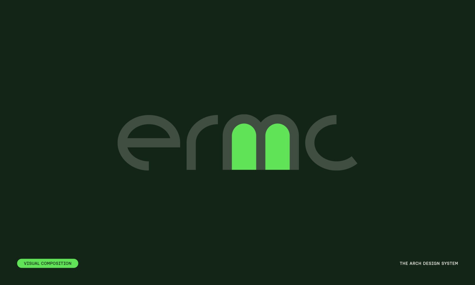
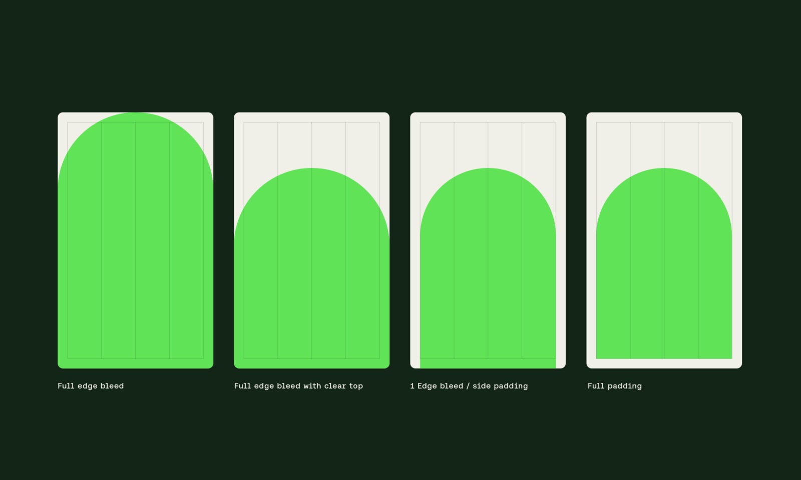
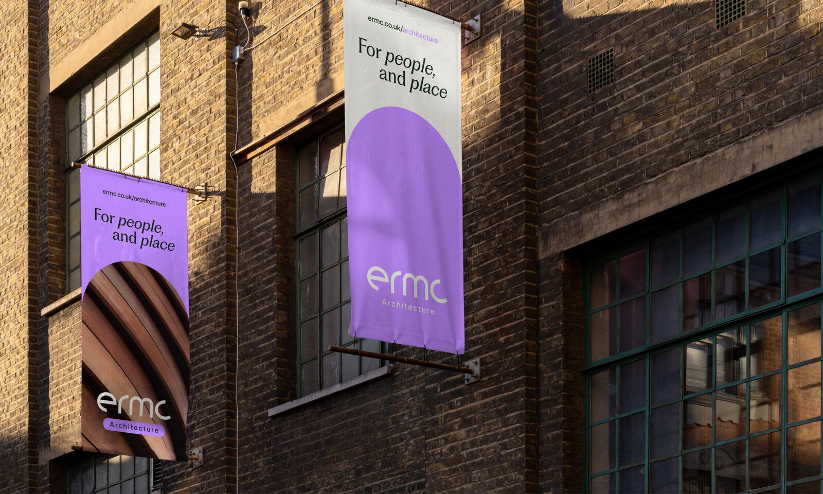
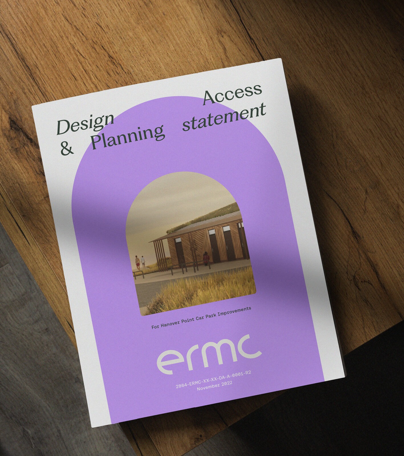
Inspired by the strength and support of architectural arches, we extracted this form from the ERMC logotype and incorporated it as a graphic device within the brand’s design system. This symbolic arch now acts as a central visual anchor across ERMC’s identity, enhancing both aesthetic coherence and meaning.
Sector Distinction – ‘Everyone You Need Under One Roof’:
Each of ERMC’s six sectors is distinguished by a unique color, complementing the core palette while facilitating navigation. These bright, sector-specific colors ensure clear identity within a unified system. Consistency is further maintained through a robust design system, with each sector featuring three adaptable logo variations to enhance brand cohesion across platforms and applications.
This brand repositioning has empowered ERMC to advance with clear messaging and a growth strategy that fully aligns with their mission and values.
CREDIT
- Agency/Creative: Thump Studio
- Article Title: Thump Studio Redefines ERMC Branding with a Nature-Inspired Design System
- Organisation/Entity: Agency
- Project Status: Published
- Agency/Creative Country: United Kingdom
- Agency/Creative City: Isle of Wight
- Project Deliverables: Brand Redesign
- Industry: Professional Services
- Keywords: WBDS Agency Design Awards 2024/25
- Keywords: WBDS Agency Design Awards 2024/25


