Corentinus is a Hungarian brand that focuses on the production of herbal tea mixtures made entirely from dried herbs. The brand offers a variety of mixtures, each carefully formulated to address specific health concerns. For instance, there are blends aimed at strengthening the heart and supporting cardiovascular health, while others are designed to alleviate stress and promote relaxation. These mixtures are thoughtfully crafted to ensure they meet the unique needs of different individuals.
The brand’s name, “Corentinus,” is inspired by Saint Corentin of Quimper, a Breton saint revered for his selflessness, humility, and deep connection with nature. These values resonate strongly with the brand’s philosophy, as Corentinus also emphasizes natural remedies, compassion, and a harmonious relationship with the environment. In addition to these virtues, the brand integrates medical and apothecary expertise, ensuring that each blend is both effective and safe for consumption.
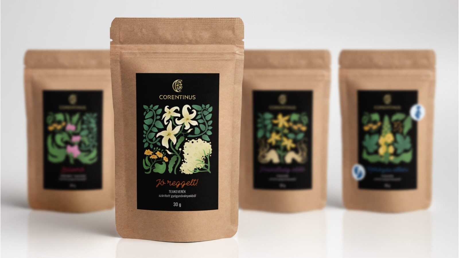
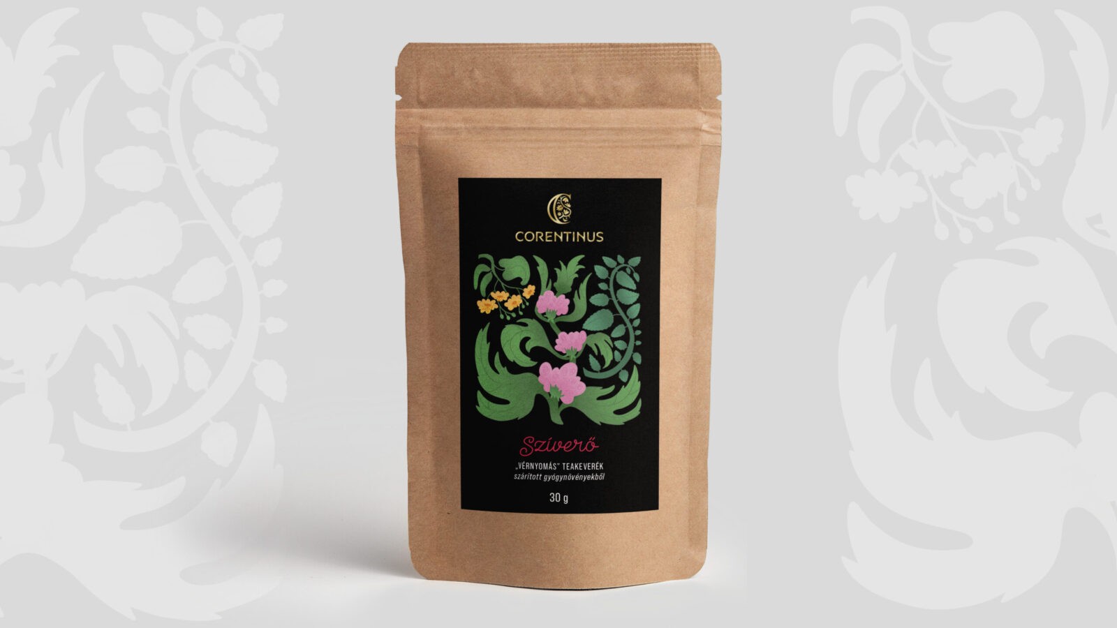
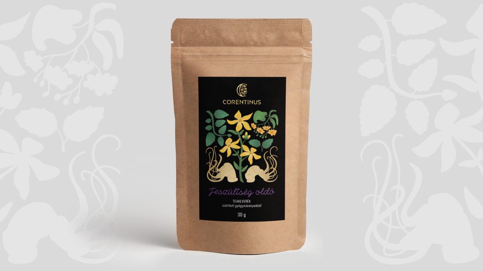
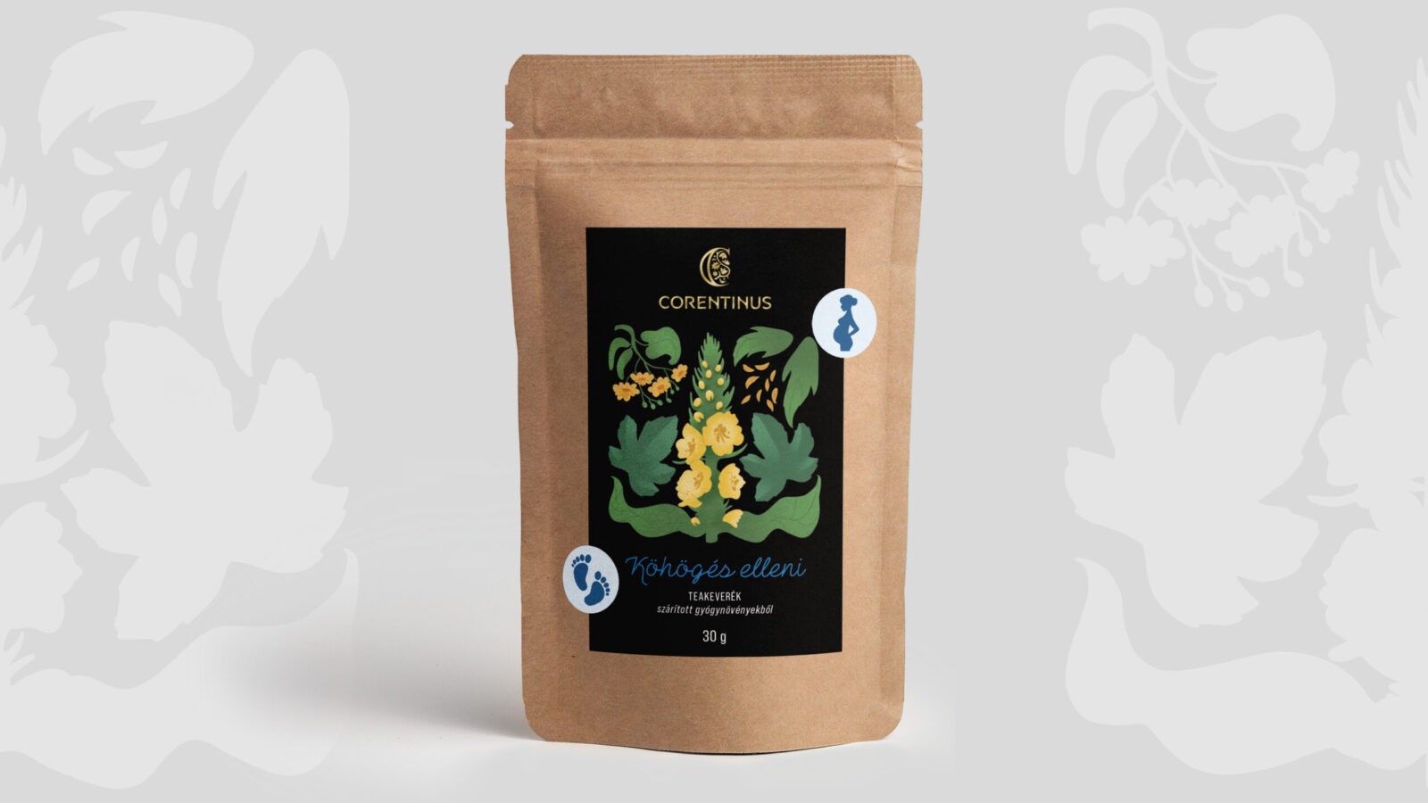
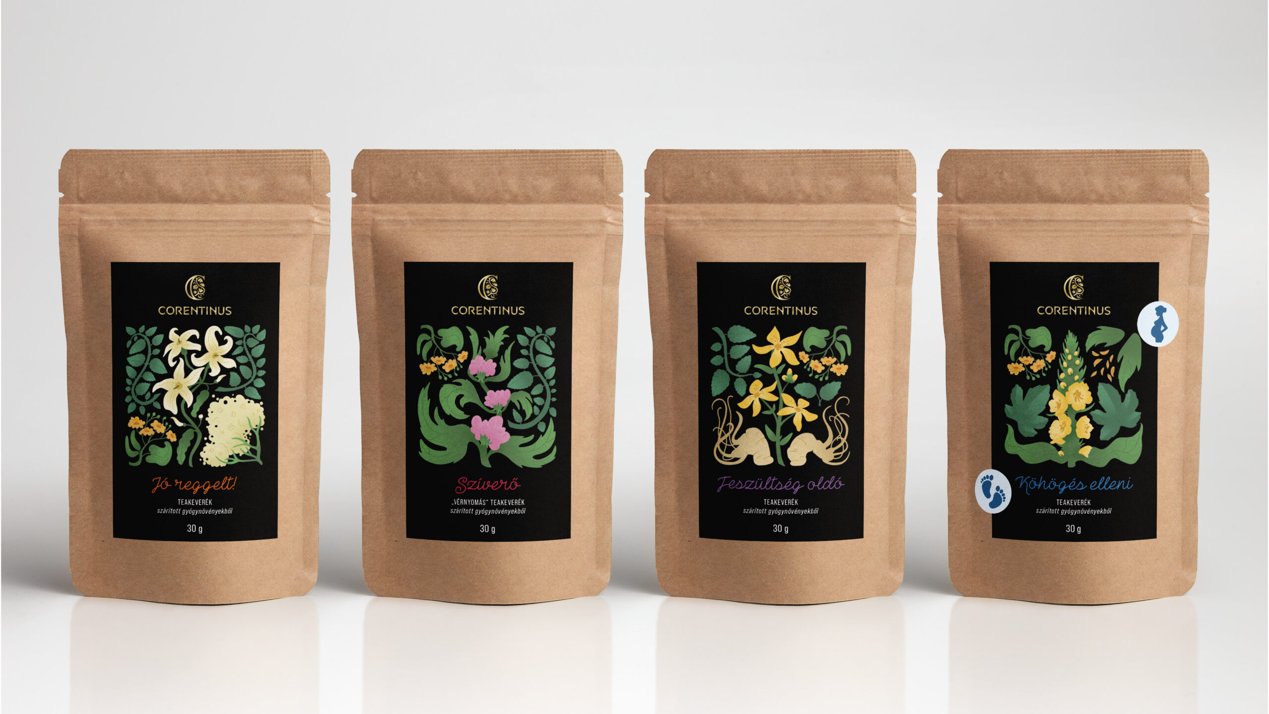
To make the product range easily identifiable, Corentinus has developed a color-coding system for its tea mixtures. Each product is categorized by color, with specific shades corresponding to different health benefits. For example, products designed to address heart and vein-related issues are marked with magenta text. This system simplifies the selection process for consumers, helping them quickly identify which blend is best suited to their needs. Additionally, the brand has taken special care to develop certain mixtures for specific groups, such as children and pregnant women. These mixtures are clearly marked with special icons to indicate their suitability for these populations.
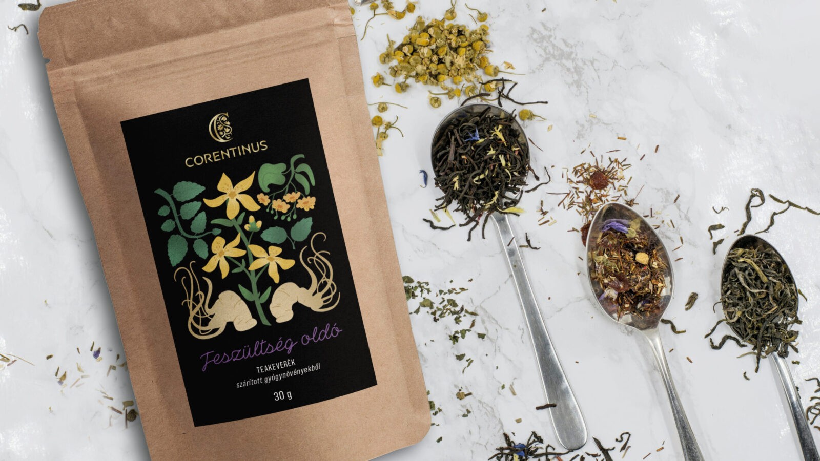
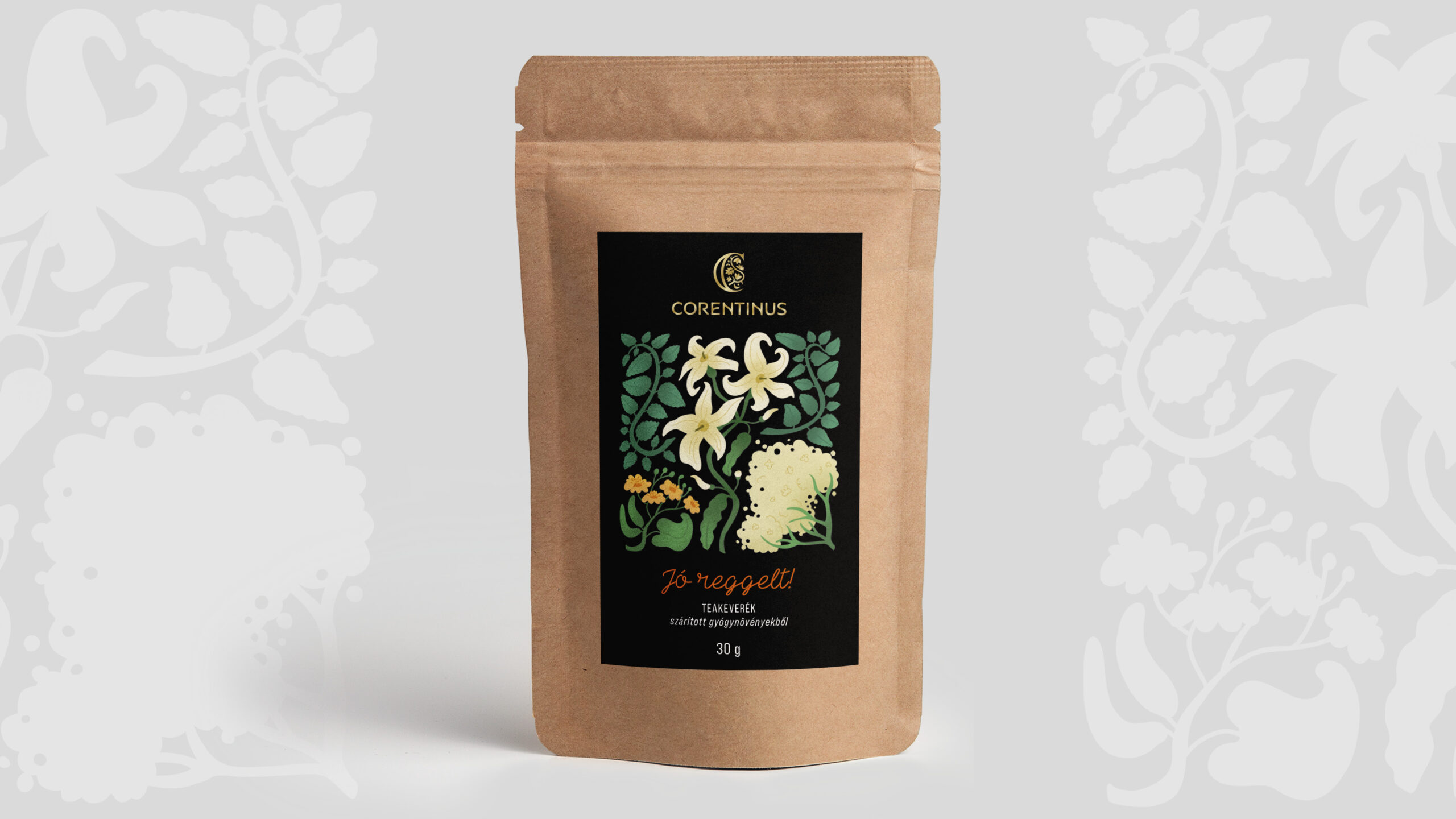
The packaging design of Corentinus products reflects the brand’s professionalism and attention to detail. The sticker labels are predominantly black, symbolizing elegance, while the brand’s gold logo adds a touch of luxury and sophistication. At the same time, the nurturing and caring nature of the brand is reflected in the playful and friendly illustrations that adorn the packaging. These illustrations also serve a practical purpose, depicting the various herbs and ingredients contained in each blend. The tea is packaged in resealable paper bags, which are not only convenient for consumers but also environmentally friendly, as they can be recycled after use.
Through this thoughtful combination of design, natural remedies, and medical expertise, Corentinus stands as a brand that values both health and sustainability, offering products that reflect its commitment to nature and well-being.

CREDIT
- Agency/Creative: Laura Filipovics
- Article Title: Corentinus Tea Packaging Design by Laura Filipovics
- Organisation/Entity: Student
- Project Status: Non Published
- Agency/Creative Country: Hungary
- Agency/Creative City: Budapest
- Project Deliverables: Packaging Design
- Industry: Food/Beverage
- Keywords: WBDS Student Design Awards 2024/25
- Keywords: WBDS Student Design Awards 2024/25
-
Credits:
Creative Director / Educator’s Name: Attila Simon
Educational Institution: Visart Art School Budapest - Visual communication - graphic and digital design


