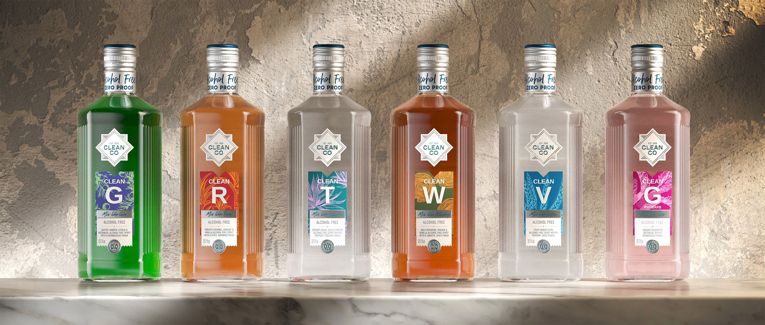
CleanCo’s award-winning non-alcoholic spirits have thrived despite fierce competition from mega-brands, resulting in an expanded range and exciting opportunities in new markets. To take on the challenges of scaling up and standing out, CleanCo partnered with independent brand design agency Knockout. With a revitalised new look that delivers strong shelf impact and spirited personality, the design solidifies CleanCo’s position as the go-to choice for a quality, uncompromising drinking experience.
Co-founded by Spencer Matthews, British TV personality and entrepreneur, CleanCo has made significant strides in the non-alcoholic spirits category with its commitment to innovation and its promise to “Skip the Hangover, Not the Fun.” Though it began as a non-alcoholic gin alternative, it has since expanded its range to include non-alcoholic whisky, rum, tequila, vodka, and more. To support this impressive growth, CleanCo enlisted Knockout to revamp its bottle design, enhancing shelf appeal and product clarity for easier navigation. The range moved from 0.4% ABV (non-alcoholic) to 0.0% ABV (alcohol-free), and as such, clearer consumer communications were vital.
Dom Burke, Founder and Executive Creative Director at Knockout, comments, “CleanCo’s expansion has been remarkable, yet it presented the challenge of distinguishing between the variants. Each of these spirits categories, from gin to tequila, carries its own distinct semiotic codes and visual languages. Our task was to create a design that showcased the unique personalities of these spirits while ensuring the brand powerfully pops on the shelf.”
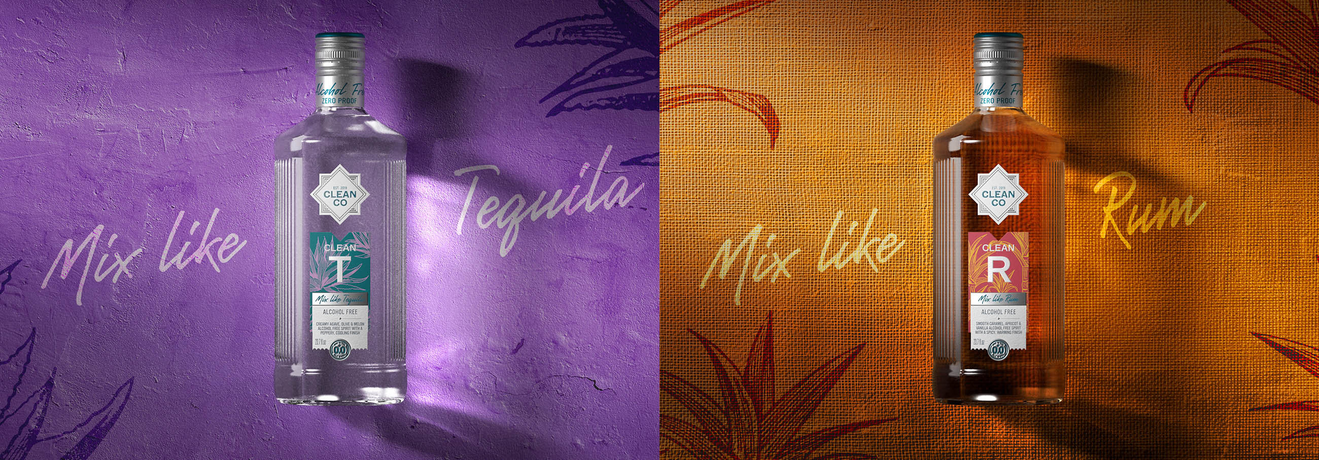
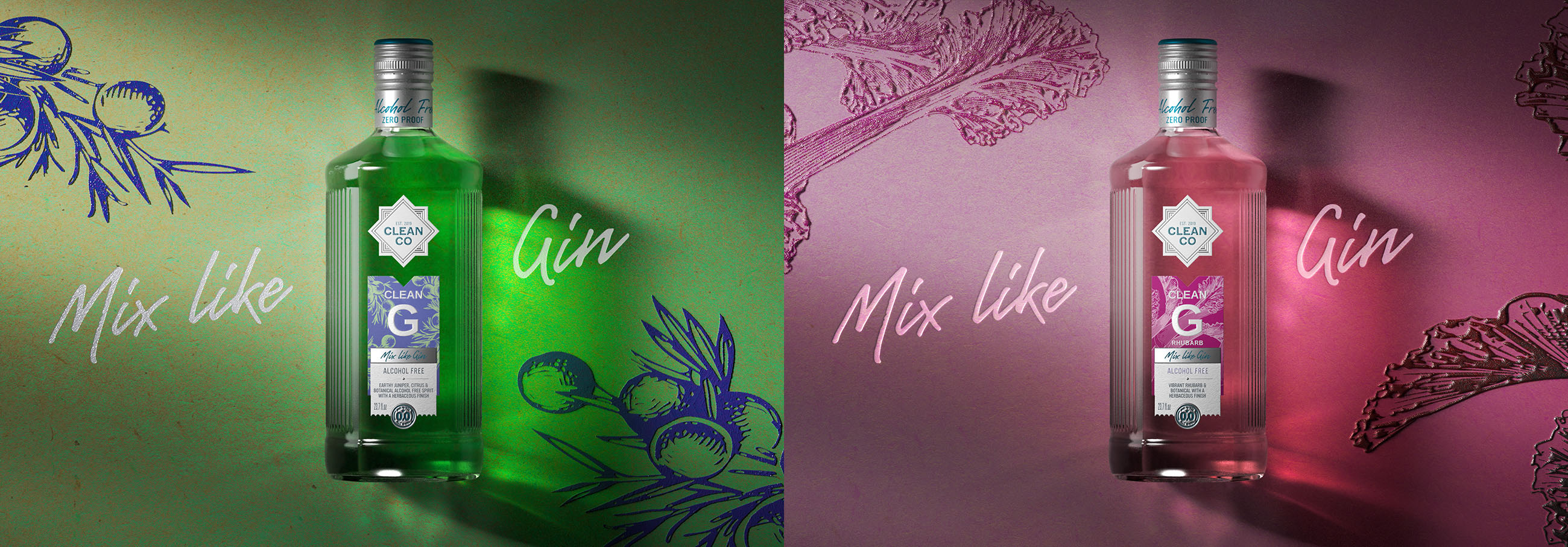
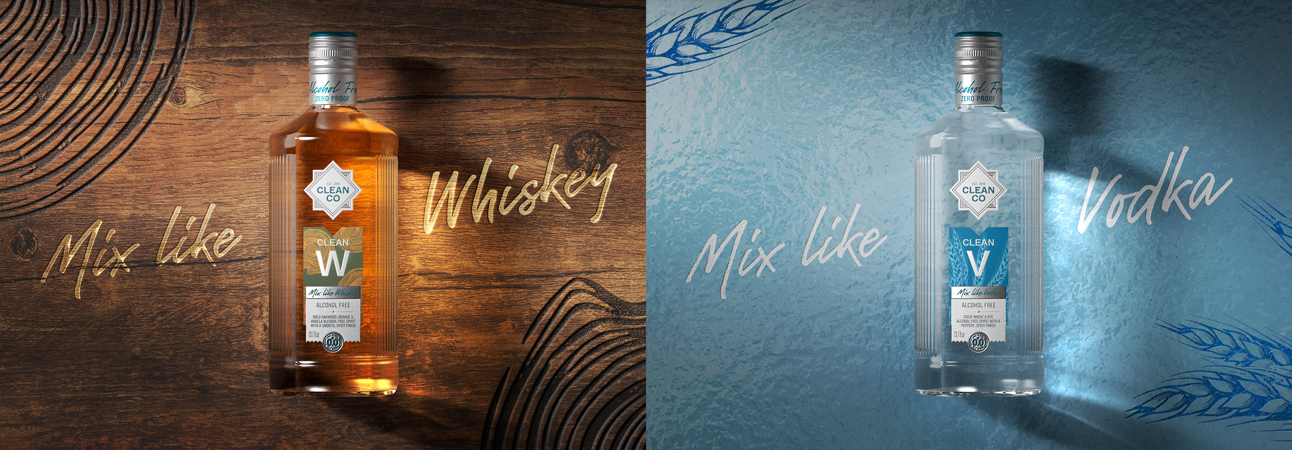
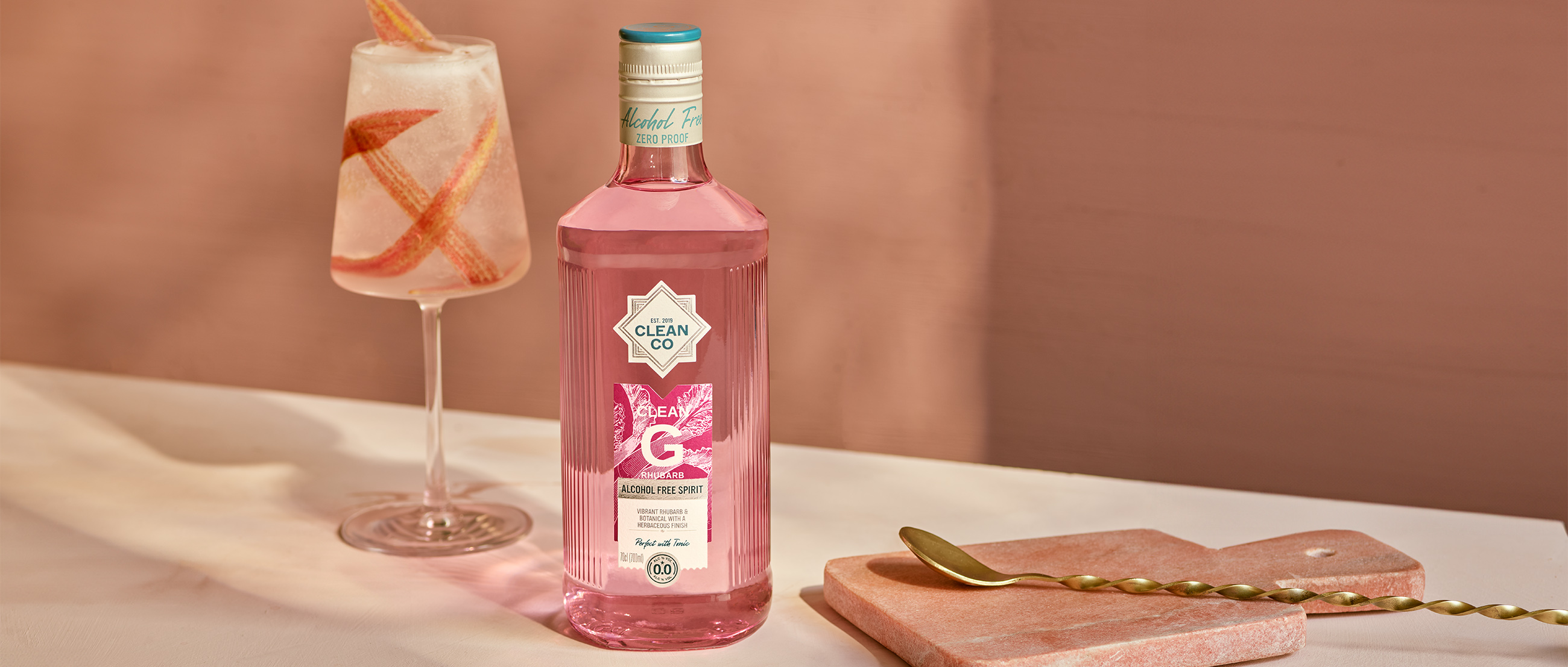
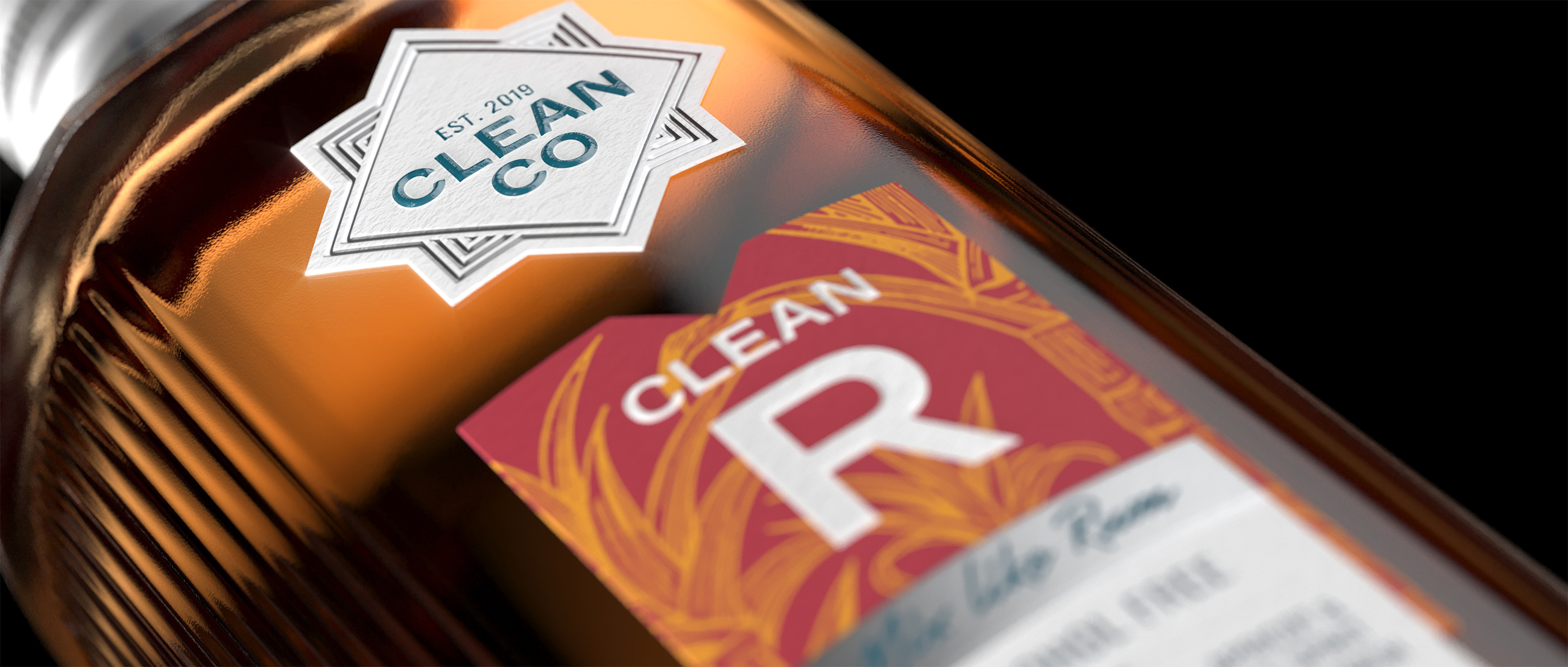
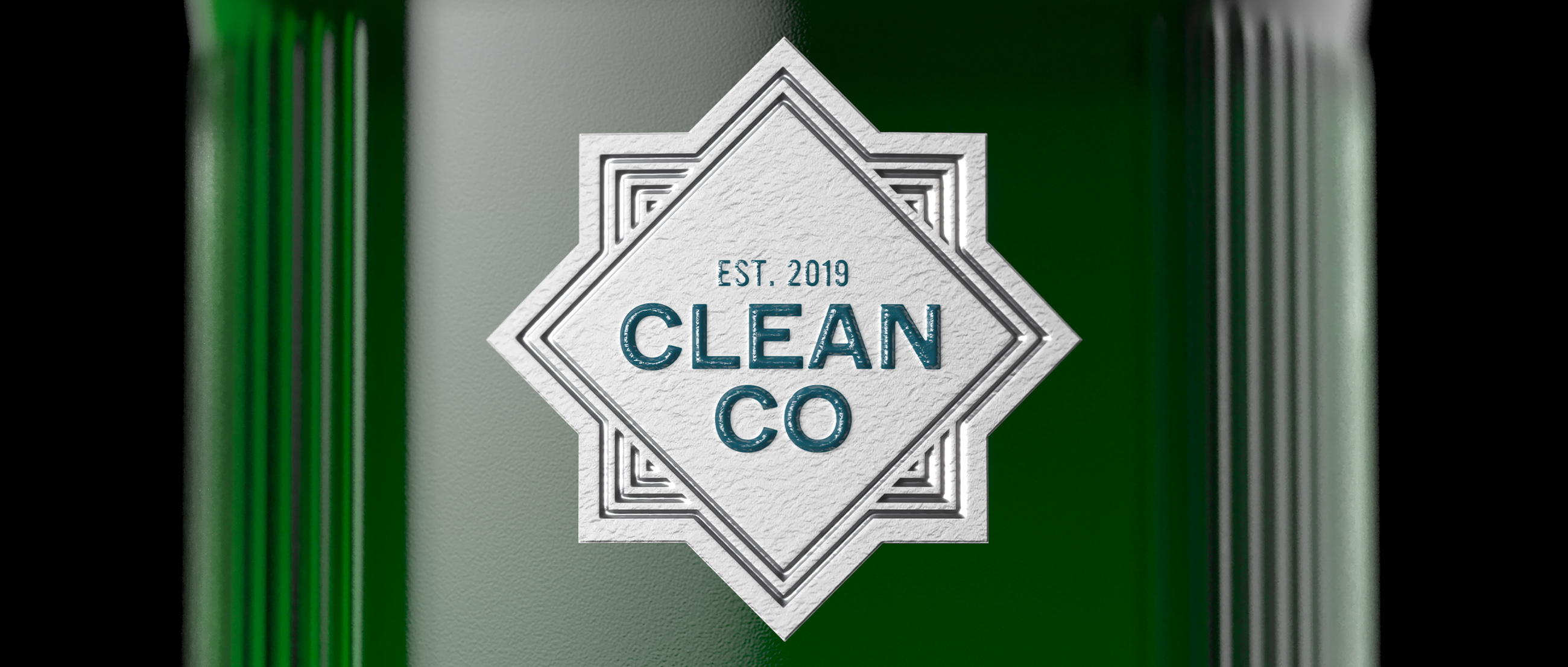
CleanCo’s new labels feature hand-drawn illustrations highlighting each spirit category’s unique traits and supporting navigation. A vibrant colour palette with contrasting hues helps to further differentiate the variants, making the packaging visually striking and easy to navigate. New typography boosts readability and the brand’s modern aesthetic, while a refined brandmark ensures stronger visual impact wherever it appears.
The bottle structure has also been reimagined to address practical considerations such as weight. As Burke explains, “The new bottle has an irregular hexagonal shape that preserves the beauty and integrity of the original while expanding the front face for more impactful branding and communication. It’s a subtle trick of the eye, but ultimately highly effective.”
Matthews comments, “The new bottle and labels are beautiful. Knockout did an amazing job keeping the elegance and premium feel of the original bottles, but now they’re bursting with personality and energy. It captures the essence of CleanCo perfectly, while boldly showcasing our dedication to quality and innovation.”
CREDIT
- Agency/Creative: Knockout
- Article Title: Knockout Revamps CleanCo with a Splash of Personality and Punch
- Organisation/Entity: Agency
- Project Type: Packaging
- Project Status: Published
- Agency/Creative Country: United Kingdom
- Agency/Creative City: London
- Market Region: Global
- Project Deliverables: 2D Design, 3D Design, Packaging Design, Structural Design
- Format: Bottle
- Industry: Food/Beverage
- Keywords: WBDS Agency Design Awards 2024/25 , Non-Alcoholic, Spirits, Redesign, Structure, Sustainability
-
Credits:
Executive Creative Director: Dominic Burke


