Hartridges’ Rebranding Brief
Hartridges, a brand with deep roots in the rich tradition of British soft drink craftsmanship, recognised the need to realign its brand image with the evolving dynamics of today’s marketplace. The company sought to rejuvenate and modernise its visual identity while maintaining the essence of its historic British excellence. The challenge was to create a refreshed brand identity that would captivate a contemporary audience, appealing to both long-time customers and new consumers who value a combination of tradition and innovation. Hartridges’ enduring narrative of quality and tradition needed to be communicated effectively through a modern design approach that honours the brand’s storied past while positioning it firmly in the present and future.
Approach
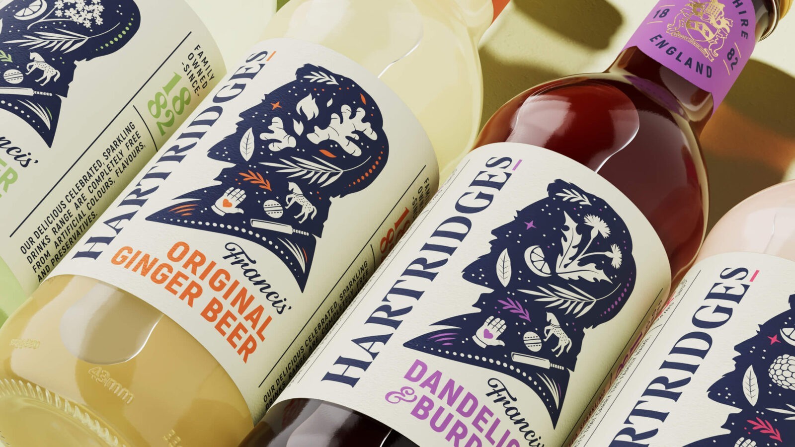
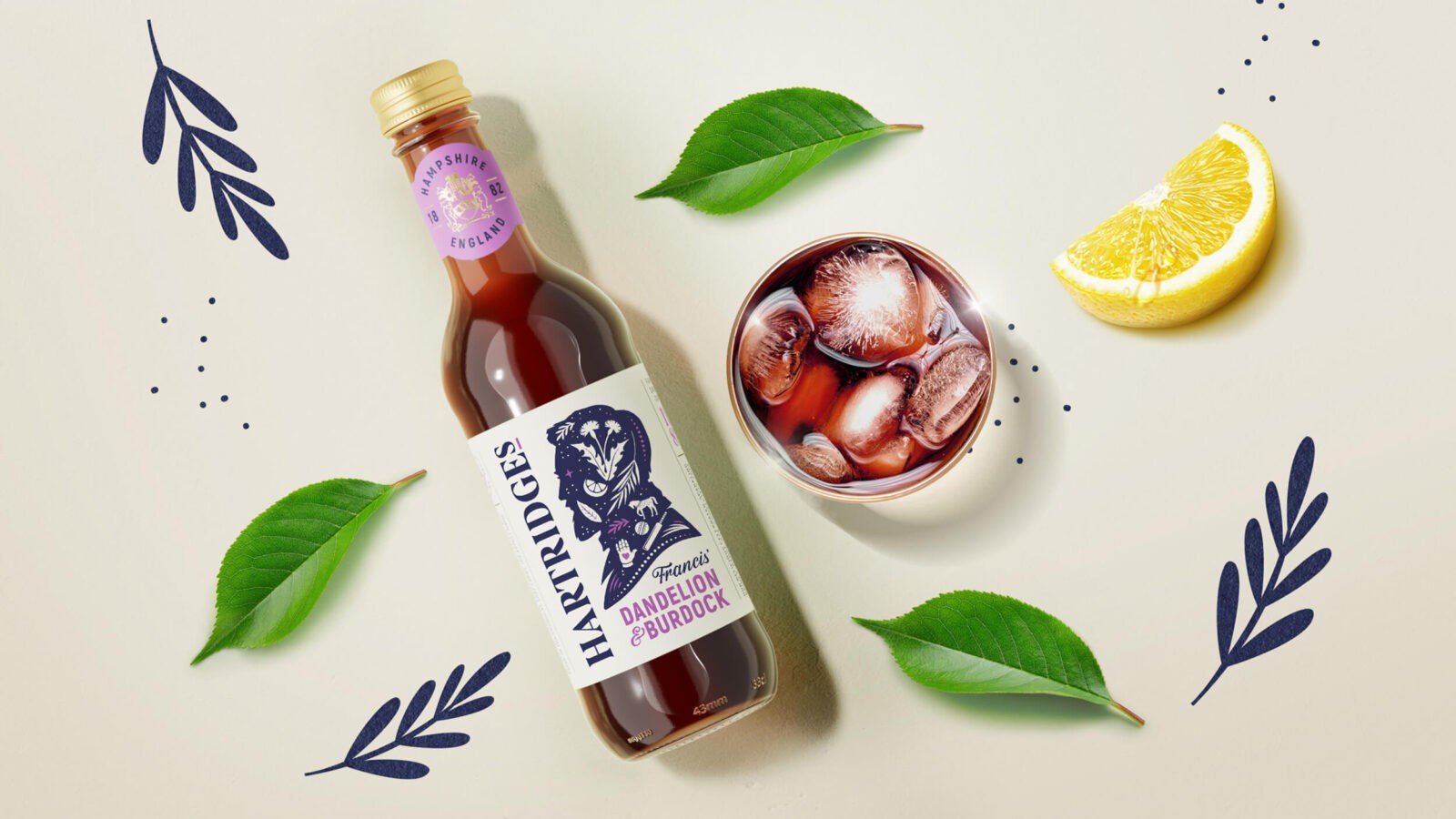
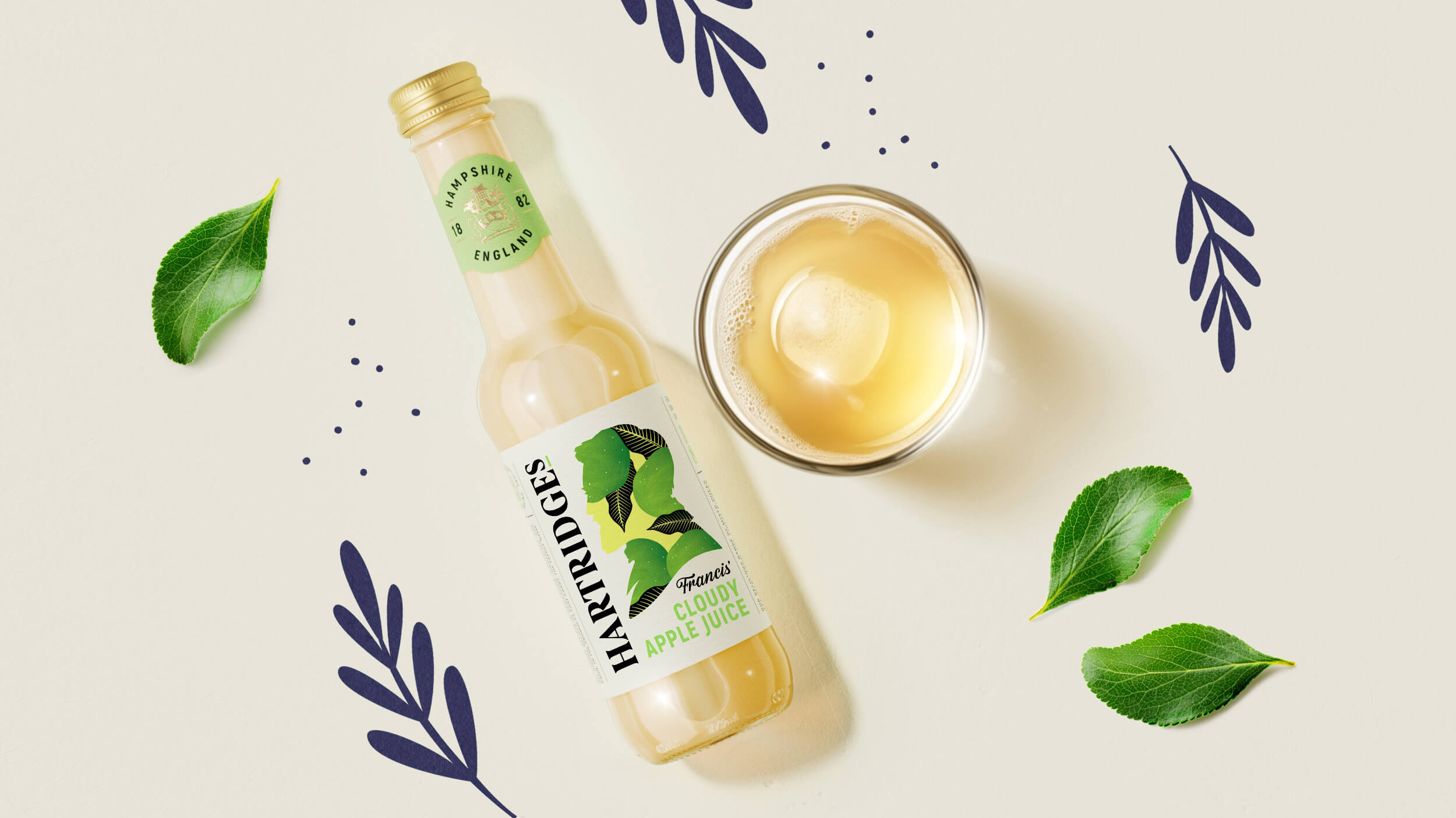
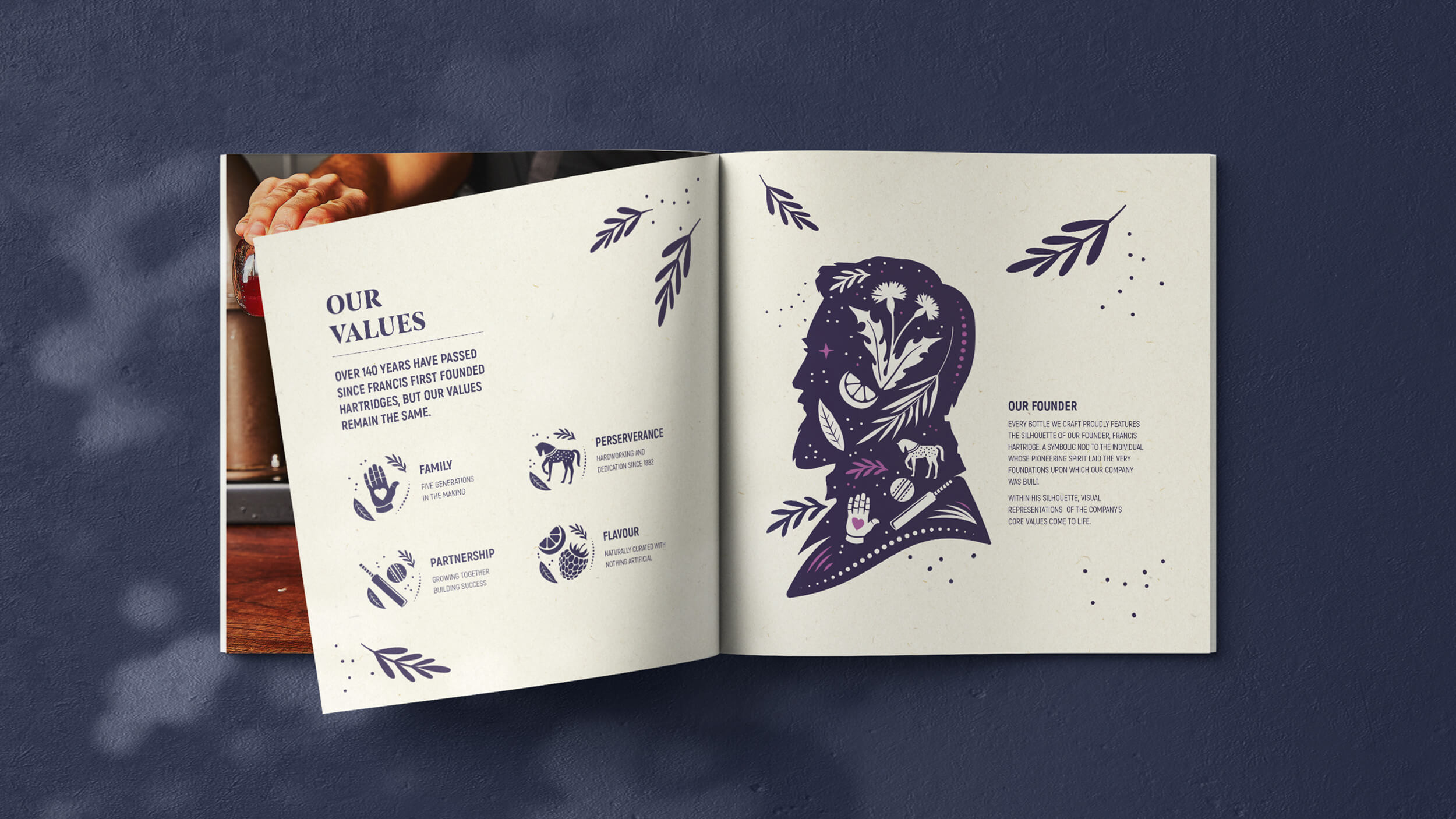
Our design strategy carefully balanced the brand’s rich history with a contemporary look and feel. We crafted a visual identity that seamlessly integrates Hartridges’ legacy with modern aesthetics, ensuring the brand’s deep heritage was not only preserved but also highlighted in a way that resonates with today’s consumers. Central to this approach was the incorporation of traditional elements, such as the image of Francis Hartridge, the company’s founder. His image serves as a bridge between Hartridges’ storied past and its present-day products, reinforcing the brand’s commitment to quality and tradition.
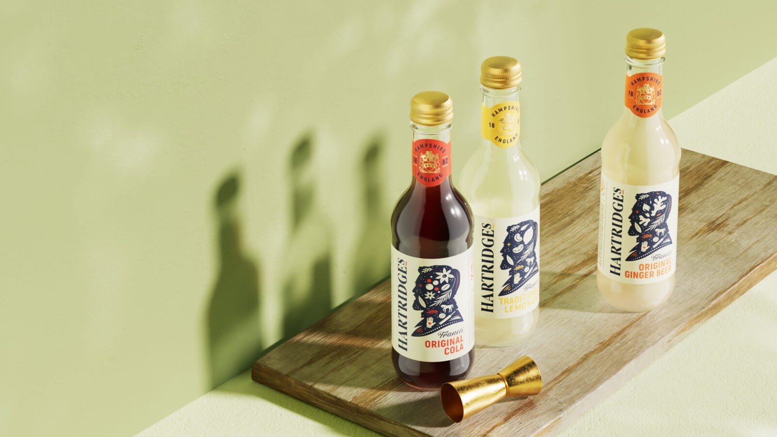
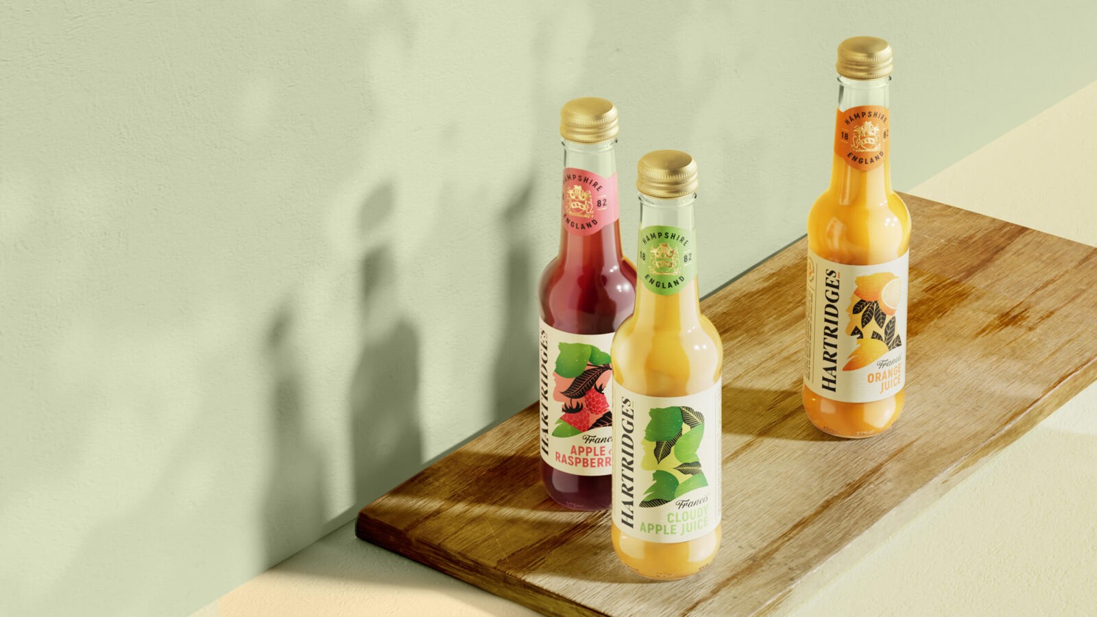
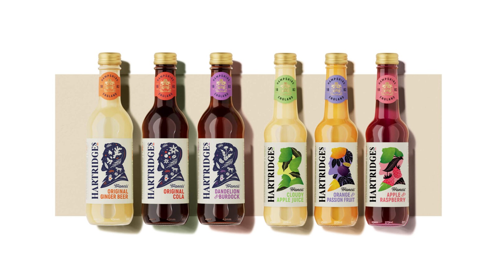
To further enhance the connection between Hartridges’ history and its future, we developed a visual style that blends classic charm with modern sophistication. Each product label features bespoke illustrations that narrate the unique story of Hartridges’ diverse range of flavours, inviting consumers to explore the brand’s rich heritage. These illustrations are not just decorative; they are a storytelling device, engaging customers by making each drink a chapter in the ongoing narrative of Hartridges.
The result is a new packaging design that presents Hartridges as a timeless brand with a fresh, forward-looking perspective. This rebranding effort respects the brand’s heritage while embracing the future, ensuring that Hartridges remains a significant influence in the soft drink industry for years to come.
CREDIT
- Agency/Creative: Design Happy
- Article Title: Design Happy Refreshes Hartridges Soft Drinks for Today’s Market with Classic Charm
- Organisation/Entity: Agency
- Project Status: Published
- Agency/Creative Country: United Kingdom
- Agency/Creative City: Kingston
- Project Deliverables: Packaging Design
- Industry: Food/Beverage
- Keywords: WBDS Agency Design Awards 2024/25
- Keywords: WBDS Agency Design Awards 2024/25
-
Credits:
Design Partner: Adrian Turnham
Design Partner: William Jones
Design Partner: Richard Bray


