Color is More Than What Meets the Eye
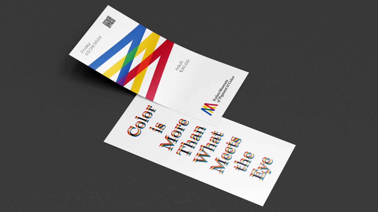
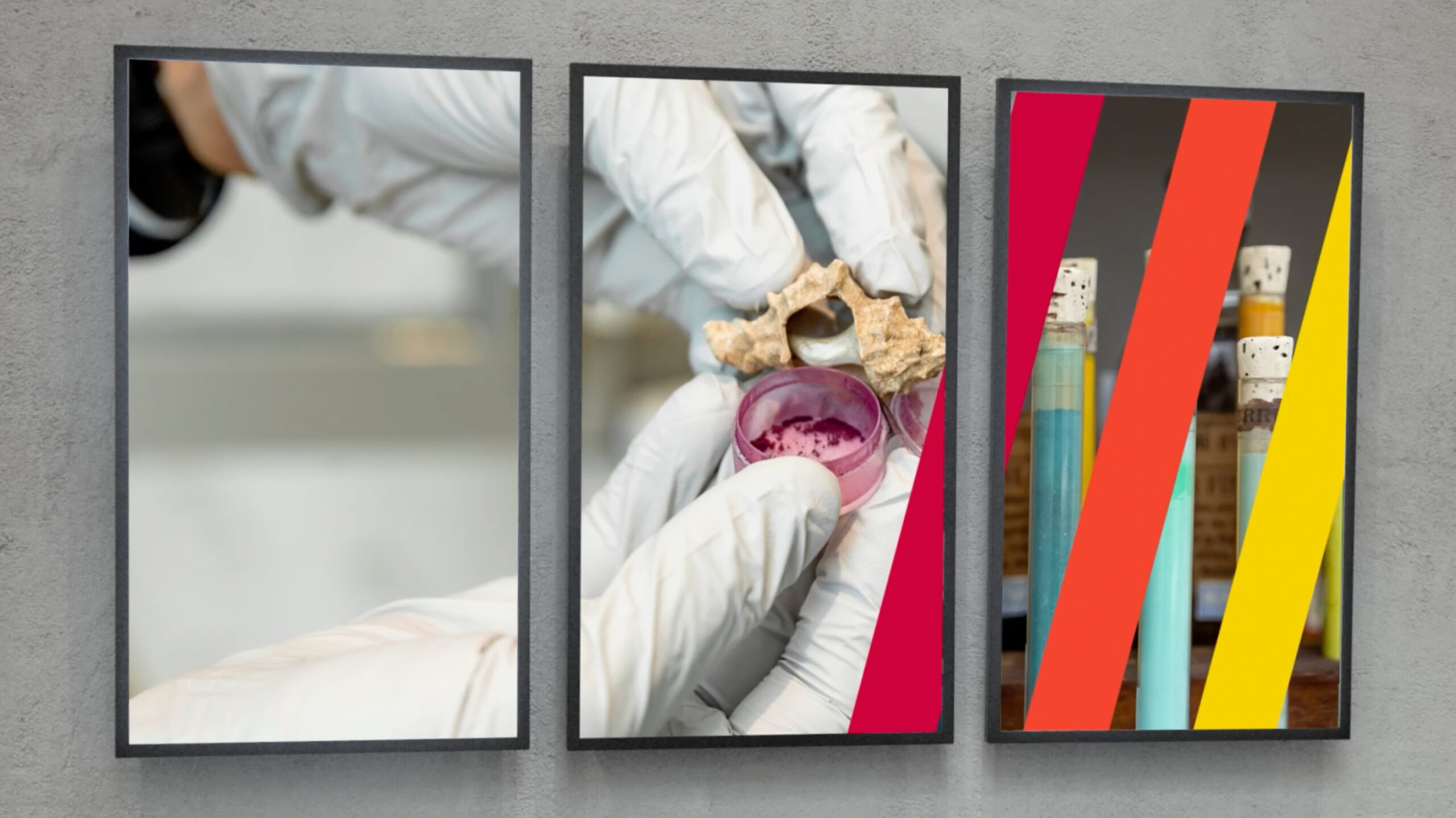
I have designed a new museum centered around the theme of the Forbes Pigment Collection, one of the collections housed by the Harvard Museum of Art. The museum’s design philosophy revolves around the concept of ‘overlapping colors and meanings.’ It aims to offer visitors novel experiences with colors and dyes, prompting them to contemplate how the meanings of colors shift and evolve over historical trends. The museum’s primary objective is to explore and showcase diverse perspectives on color.
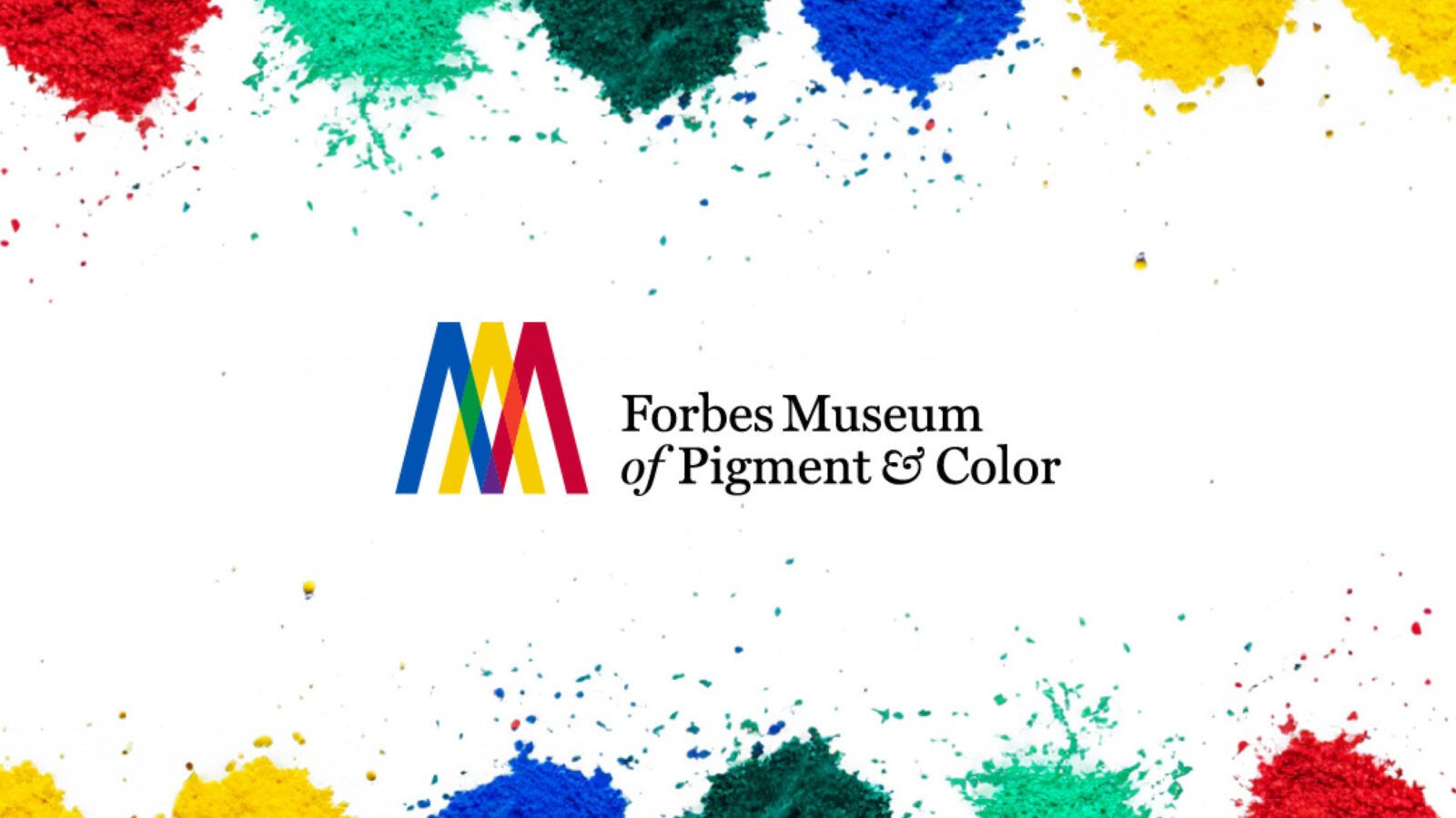
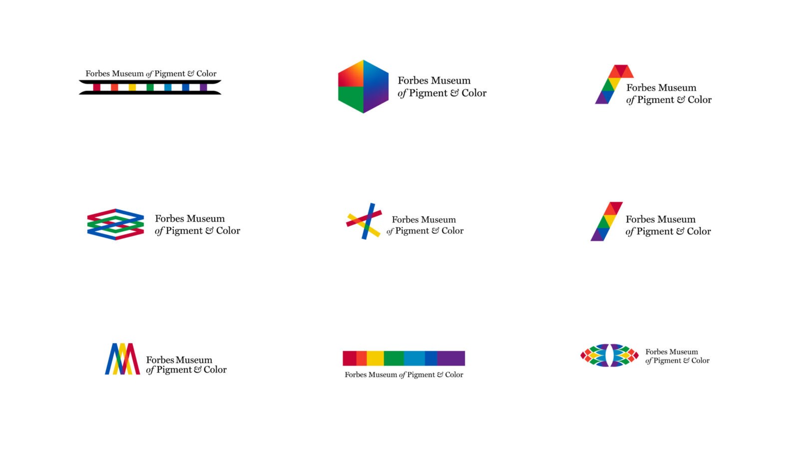
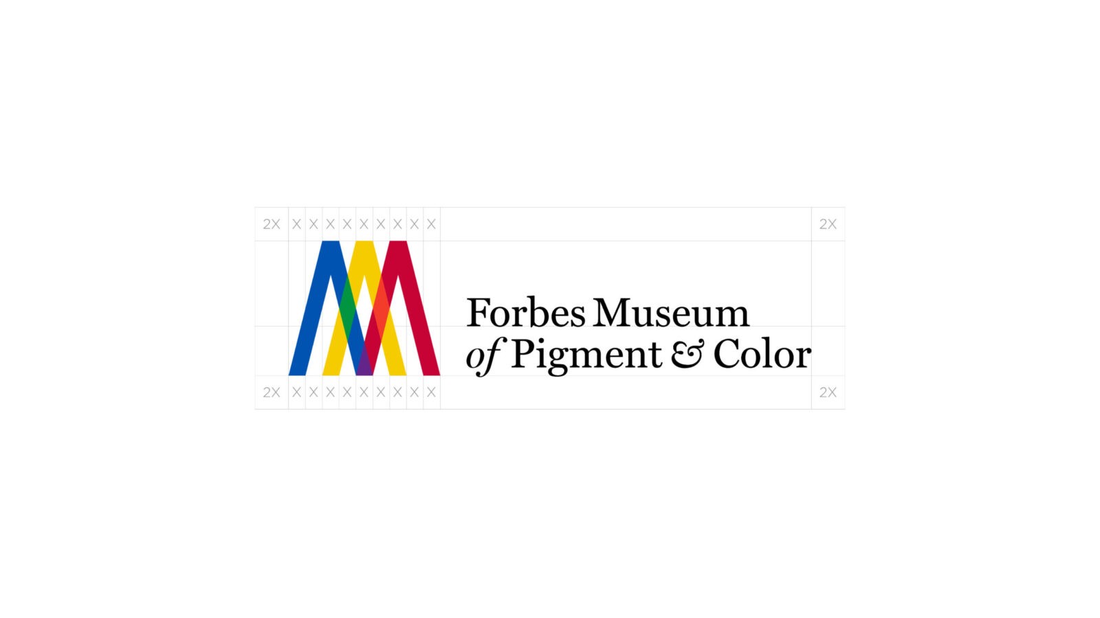
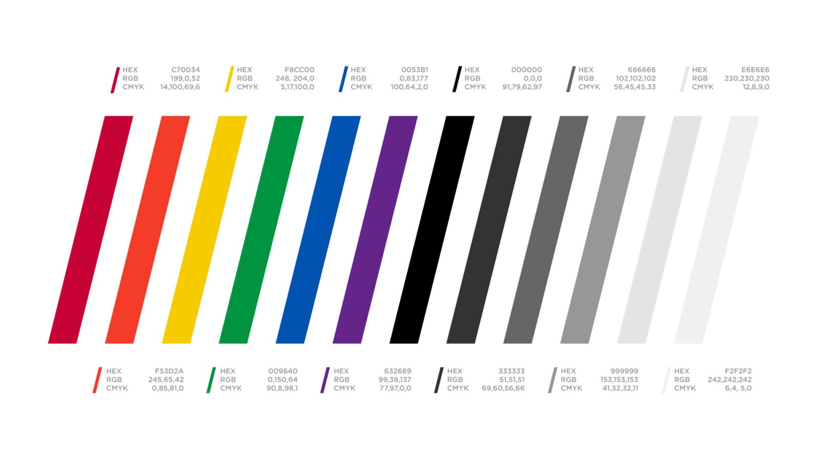
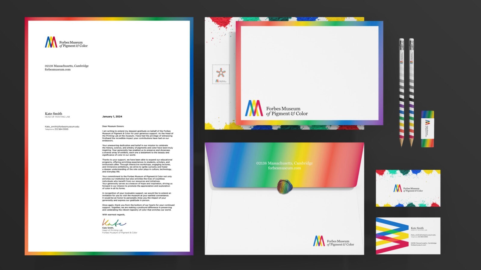
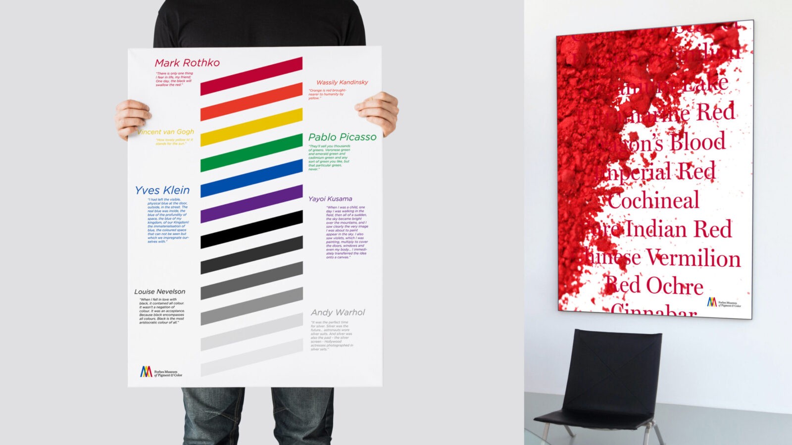
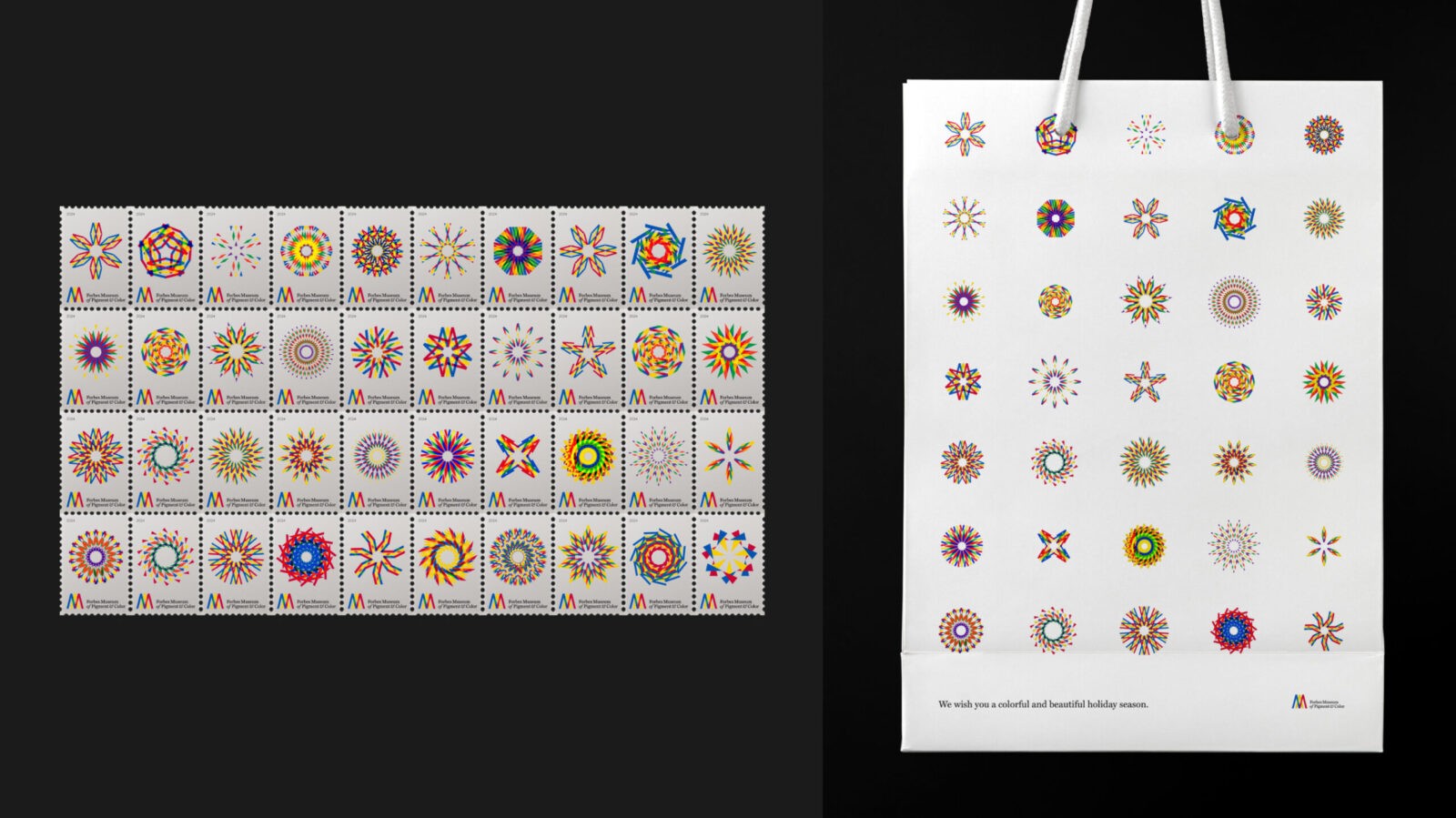
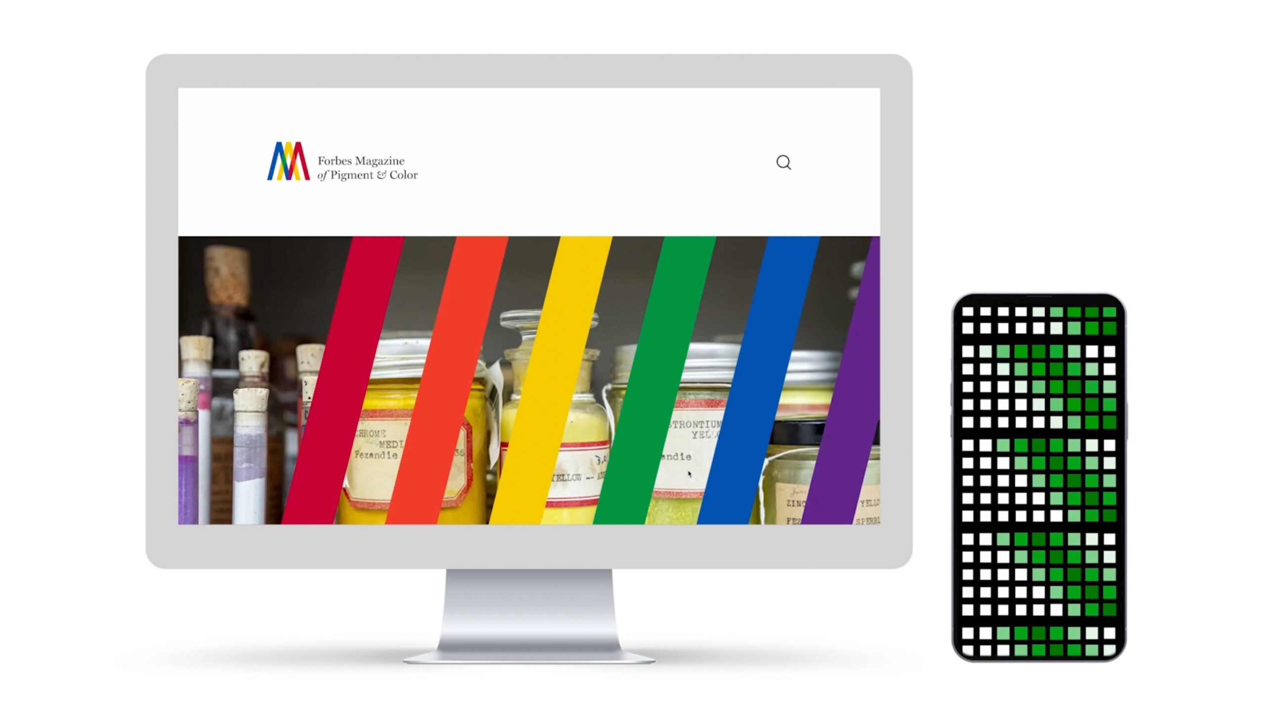
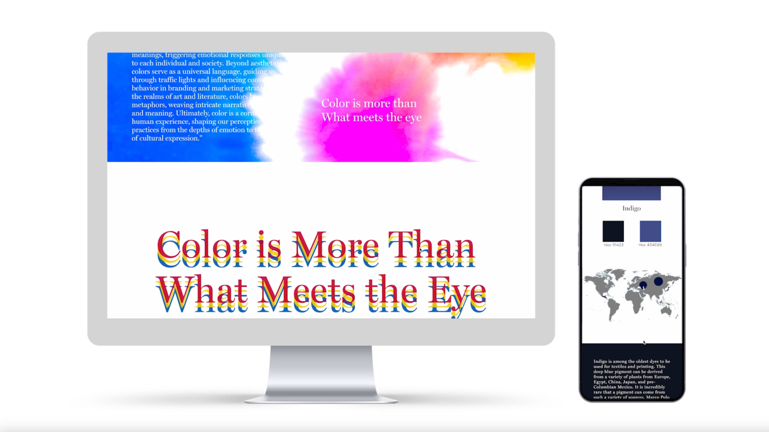
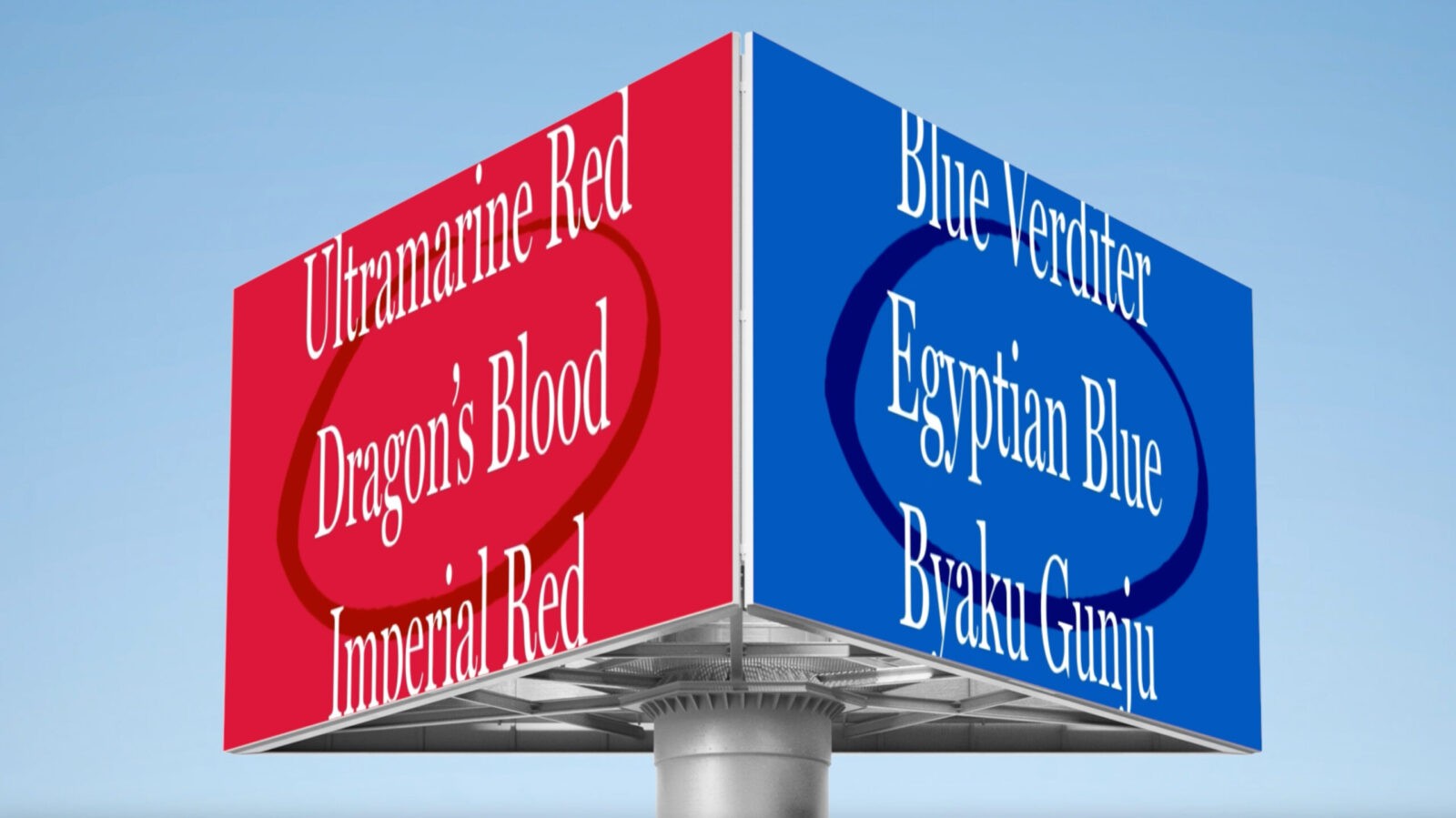
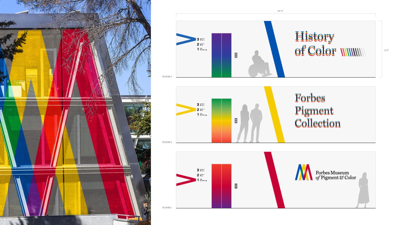
My design expands from the new logo and brand system to various graphic elements, motion posters, UI/UX, and interior design. The logo design features the letter ‘M’ formed by the overlapping of red, yellow, and blue spotlights, creating green, orange, and purple accent colors. This concept was created based on an art direction that reflects the museum’s diverse identity. In line with this vision, the museum’s slogan is “Color is More Than What Meets the Eye.” I developed the brand’s color guide by utilizing the ‘angles’ of the colors used in the logo design. This color guide is applied to motion posters and graphic visuals for the museum. Additionally, I deconstructed and recombined the logo to create 40 patterns that represent the sparkle of colors, which are used in merchandise designs such as museum envelopes and stamps.
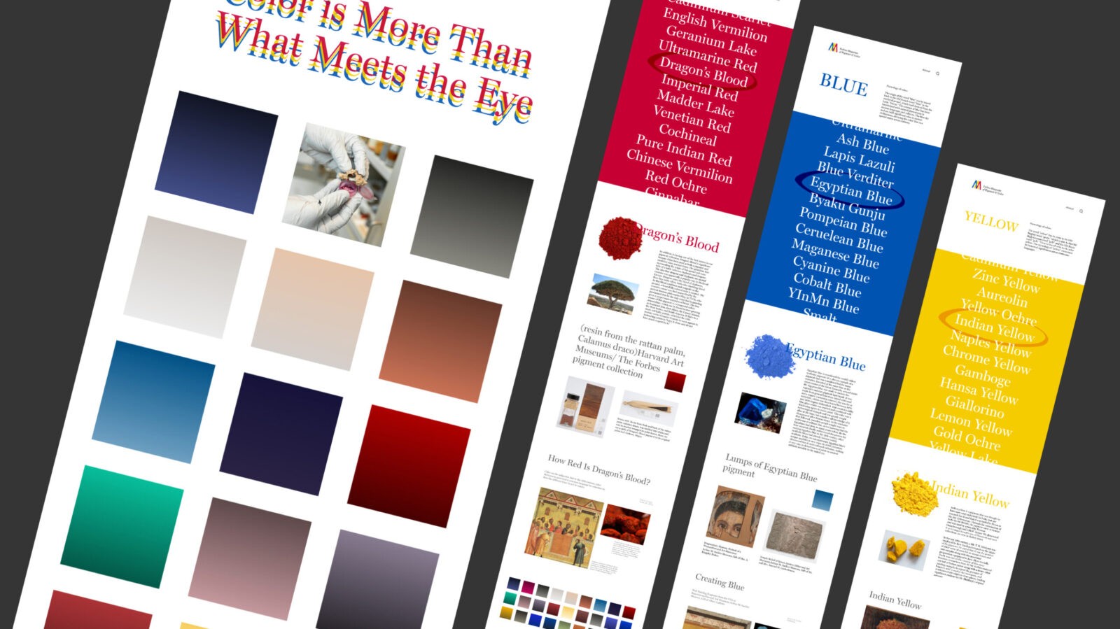
To express the coexistence of classical and modern aesthetics, I used Miller and Gotham for the typography. These typefaces were selected to harmonize with the museum’s design philosophy, blending traditional and contemporary elements in the visual identity.
The UI/UX website and mobile app are named after the museum’s sub-brand, Forbes Magazine of Pigment & Color. The website focuses on archiving dyes that produce various colors, covering their sociocultural roles, historical stories, and related artworks. The mobile app allows users to photograph objects in their daily lives, providing information about the color names and the dyes that create those colors. The goal is to extend the knowledge of colors gained at the museum into the everyday lives of the visitors.
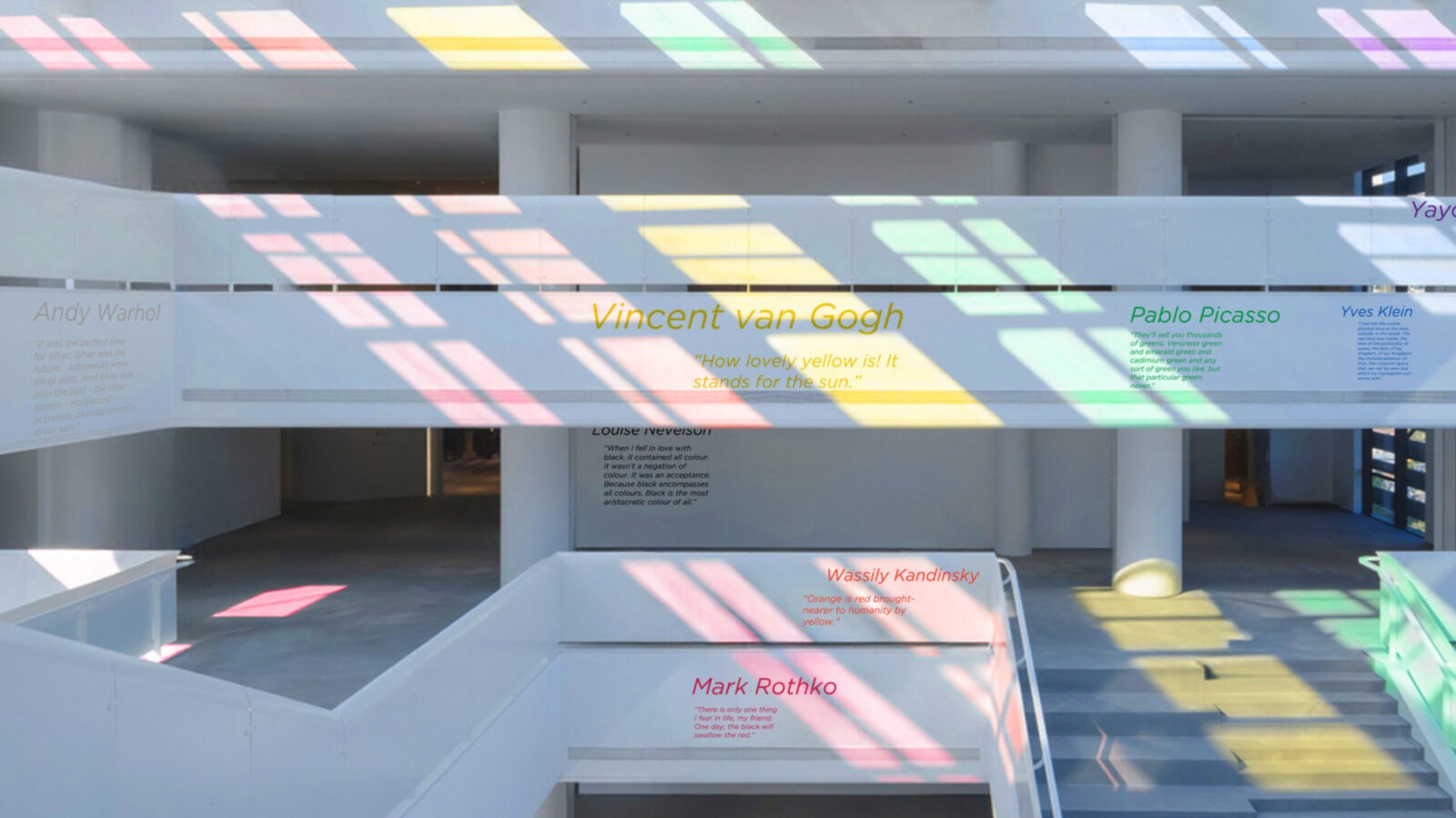
The main concept of the motion graphics and interior design is to showcase the dynamism of color. This reflects the idea that color is not a fixed concept but one that can change and be perceived differently depending on the individual, society, and time period. To convey this, I incorporated graphics and lighting in the museum’s interior, allowing visitors to observe the movement of colors in elements such as elevators, murals, and windows.
CREDIT
- Agency/Creative: Dong Hyun Kim
- Article Title: Student Dong Hyun Kim Creates Forbes Museum of Pigment & Color Branding
- Organisation/Entity: Student
- Project Status: Non Published
- Agency/Creative Country: United States of America
- Agency/Creative City: New York
- Keywords: WBDS Student Design Awards 2024/25
- Keywords: WBDS Student Design Awards 2024/25
-
Credits:
Educational Institution: School of Visual Arts
Educator's Name: Eric Baker, Livia Ito, Chatdalin Sinthorn


