Introduction
Ben is on a mission to transform global employee benefits and compensation. Headquartered in London, we are pioneering a comprehensive tech platform that revolutionizes the way benefits are managed and delivered. By seamlessly connecting employers, employees, brokers, and providers, Ben aims to redefine the benefits landscape. Our platform is designed to make benefits not just accessible but also impactful, moving beyond traditional models that often fail to meet modern needs.
In today’s diverse and dispersed workforce, traditional benefits models are increasingly outdated. Companies are struggling with inflexible systems that do not cater to individual needs or geographic diversity. Ben seeks to bridge this gap with a modern, tech-driven solution that provides tailored benefits for employees, irrespective of their location or personal circumstances. Our vision is to elevate benefits from mere perks to essential tools that empower individuals to lead fulfilling lives, both professionally and personally.
Background
Supporting and empowering employees is crucial for maximizing productivity and fostering a positive work environment. Companies recognize this and allocate a substantial portion of payroll—between 5% and 30%—to employee benefits. These benefits fulfil various roles: meeting statutory requirements, attracting and retaining talent, enhancing productivity, and promoting diversity and inclusion. However, as the employee benefits landscape evolves rapidly, companies face significant challenges.
The rise of global and hybrid work models complicates the delivery of personalized and meaningful benefits. Organizations must now cater to a diverse, geographically dispersed workforce, each with unique statutory requirements and cultural expectations. At the same time, cost pressures force companies to make difficult decisions about benefits budgets, often resulting in billions of dollars spent on benefits that go unused or fail to resonate with employees.
The traditional one-size-fits-all approach is no longer adequate. Employees today expect benefits tailored to their individual needs and circumstances. Companies that fail to adapt risk losing their competitive edge in the talent market. Ben addresses this challenge with a tech solution designed specifically for global benefits sourcing and management. Our platform offers a broad range of benefits, from core insurance and retirement plans to lifestyle products, allowing employees to choose what works best for them.
Ben’s platform integrates with HR, payroll, and accounting systems, streamlining benefits administration and reducing the burden on employers. This comprehensive approach simplifies the complex global benefits ecosystem, valued at over $1 trillion, which remains inefficient and fragmented. By providing a centralized solution for benefits sourcing and management, Ben addresses the pain points experienced by companies, employees, brokers, and providers.
Challenges
To become a leader in modern global benefits—and eventually, in compensation as a whole—Ben needed a powerful and distinctive brand. The current market is characterized by a lack of dominant digital brands. Existing benefits providers are often perceived as either overly corporate and uninspiring or tacky. Most strong brands in the space belong to brokers and providers with long histories and traditional legacies.
Differentiating in this crowded space is challenging, as most players position themselves similarly as ‘global employee rewards & benefits’ providers, despite offering varied solutions and approaches. Our existing brand, developed three years ago, did not resonate as strongly as anticipated. With minimal brand guidelines, it was crucial to establish a consistent, compelling brand identity as we scaled.
Brief
To address these challenges, we sought the expertise of a creative agency to help redefine our brand. Our goals were:
Mission, Vision, Positioning: Refine our core statements to ensure alignment with long-term goals and resonance with our target audience.
New Brand Platform: Develop a metaphor-driven brand platform that effectively communicates our value proposition. This includes updated logos, colours, typography, and graphic materials such as illustrations, photography.
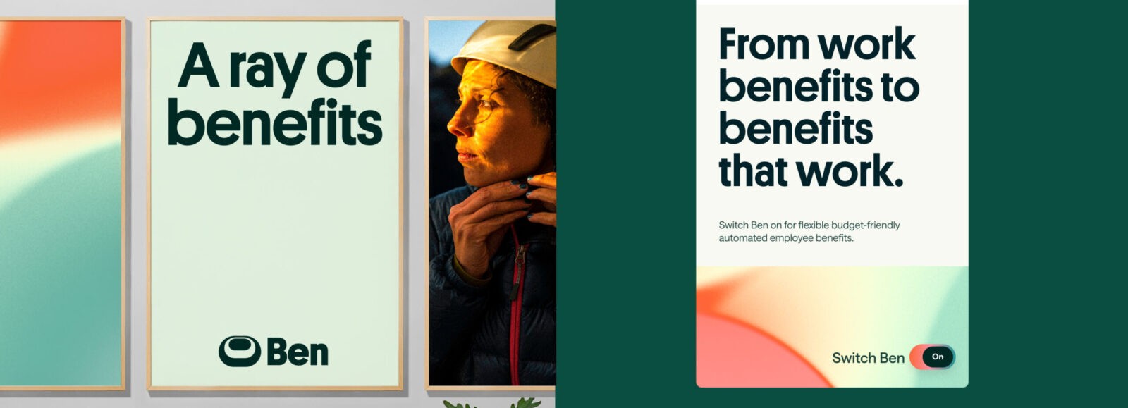
Visual Identity Guidelines: Create comprehensive guidelines for maintaining brand consistency across different environments, including our website, product interfaces, print materials, social media, presentations, and ad campaigns.
Accessibility: Ensure the new design meets WCAG 2.1 AA standards, making our platform accessible to all users.
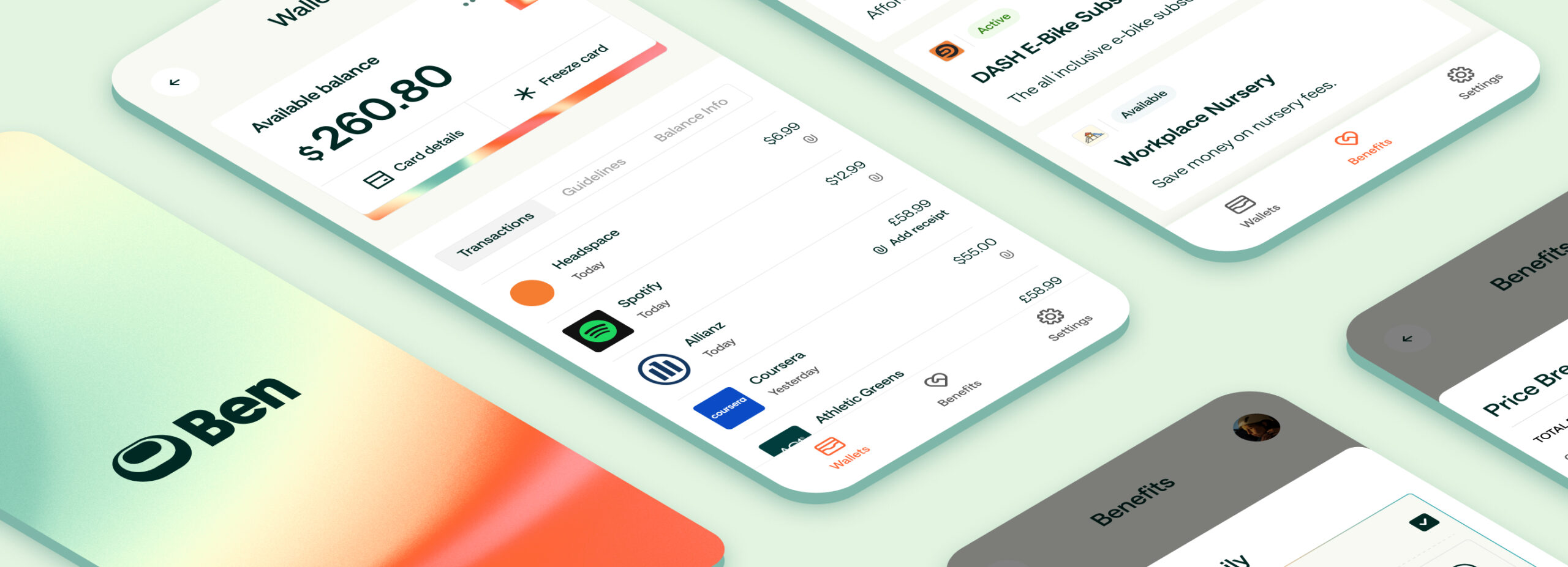
Product Application: Integrate the new brand seamlessly into our product without requiring significant adaptations for accessibility, legibility, or user experience.
Strategy
Our rebranding process was divided into three distinct phases: Strategy, Identity, and Delivery.
Strategy Phase:
The Strategy phase involved extensive research and analysis to gain a deep understanding of our audience, market trends, and competitive landscape. We conducted interviews with key stakeholders, including customers, employees, investors, and industry experts. We also reviewed our current brand and analyzed competitors’ design strategies. This thorough approach revealed insights that shaped our rebranding direction.
A key insight was that we are not merely providing benefits; we are transforming how people experience work and life.
“Workers ceased defining work-life balance as equal time spent in each place, or equilibrium between personal and professional pursuits. Instead, they began to embrace a kind of work-life integration that acknowledges the two are inextricably entwined, and endeavours to make the relationship between the two a healthy one” (BBC, 2023).
Traditionally, benefits have been viewed as safety nets or supplementary perks. However, we believe they should enhance employees’ lives, fostering a deeper connection between employees and their work. This perspective influenced our approach, aiming to empower employees to take control of their benefits and align them with their needs and aspirations.
Identity Phase:
In the Identity phase, we focused on translating our strategic insights into a compelling brand identity. We began with a Creative Workshop, collaborating with the agency to explore various concepts and ideas. This was followed by a Concept Session, where we developed three distinct brand ideas and visual directions.
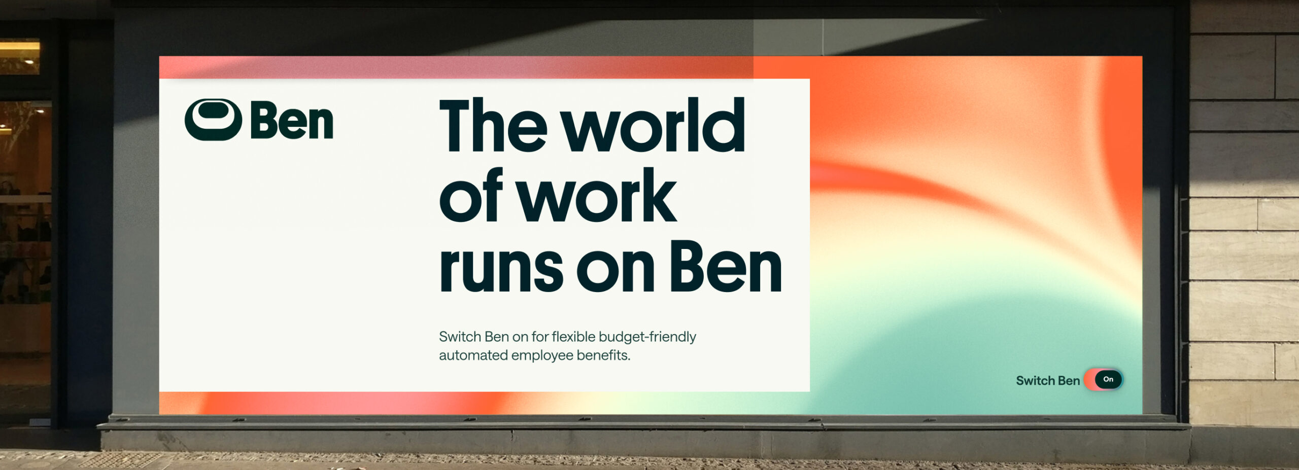
The chosen brand idea, “Ben is the energy source that fuels people to shape their lives. Switch it on,” became the cornerstone of our new identity. We wanted to create a vibrant, dynamic brand that resonates with our audience and reflects our platform’s transformative power. The new identity included a logo, typeface, color palette, and graphic system, all designed to embody this concept.
We tested and refined our ideas in real-world scenarios, applying different elements from our design system to assess their effectiveness. This iterative process ensured that our brand identity was both impactful and practical.
Delivery Phase:
The Delivery phase involved finalizing brand assets and constructing a comprehensive style guide. This guide includes detailed instructions for implementing our brand strategy, tone of voice, visual identity, typographical hierarchy, color usage, and photography and illustration direction. It serves as a blueprint for maintaining brand consistency across all touchpoints, ensuring that our new identity is effectively communicated in every context.
Design Process
Our design process was driven by the metaphor that Ben is “the energy source that fuels people to shape their lives.” This guiding idea influenced every aspect of our brand identity.
Visual Exploration: We explored hundreds of images of sunrises, light, and energy sources to capture the essence of this idea. The chosen colours and unique gradient patterns were designed to be immediately associated with Ben. We aimed to create a visual language that conveys warmth, refreshment, dynamism, and empowerment.
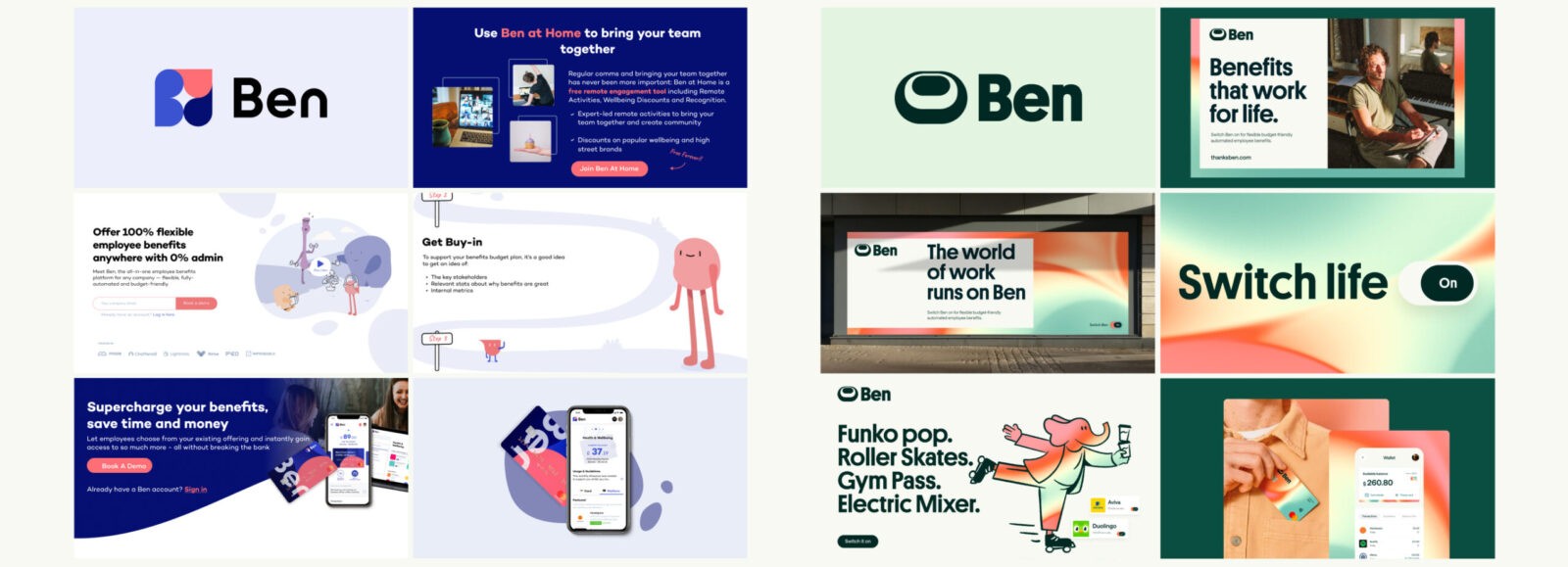
Logo: The logo is a central element of our brand identity, representing the dynamic energy, switch, hierarchy of needs, and platform we lift employees up on. We treated the logo as a component within our design system, testing different variations to see how they interacted with other UI elements. Some logo variations worked well in presentations but were too distracting in the product interface. Through testing, we determined the optimal dimensions and placement for the logo to ensure it complemented the overall design layout.
Gradient Patterns: We developed unique gradient patterns to symbolize movement, change, and the dynamic nature of our platform. These gradients became a key element of our visual identity, creating a sense of depth and energy across our materials.
Colour Palette: Off-White and Black-Green is how people will most often see our brand. We can bring in hints and highlights of colour with our Benergy Orange, Pink and Teal. As we have no black in our brand, Black-Green becomes the default colour for text.
Initially, we selected bright orange as our primary brand colour to represent energy and vibrancy. However, we aimed to meet WCAG 2.1 A and AA standards, which required careful consideration of colour choices and other design elements. Although our original bright orange did not meet AA standards, we adjusted it to create a compliant version. However, this colour no longer conveyed the energy and joy we intended. We revisited our colour palette to find an alternative that met accessibility standards while aligning with our brand vision.
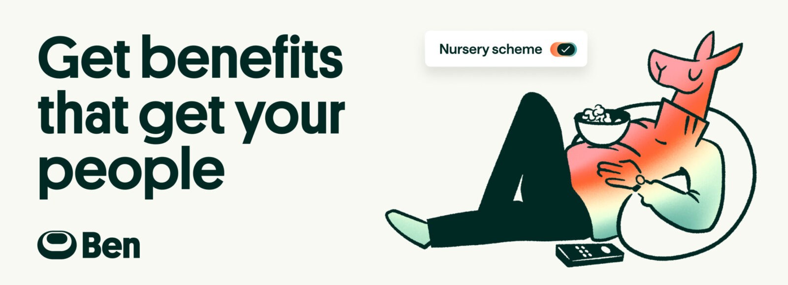
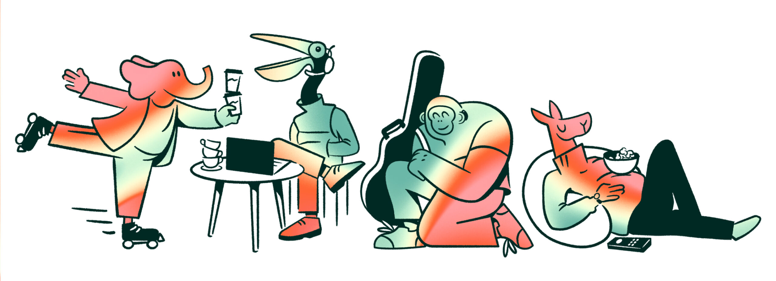
Illustration Style: We developed a distinctive illustration style, combining human and animal elements in a gradient with pencil drawings—a concept not seen in the market. This unique blend symbolized the diverse, multifaceted nature of our users and added a personal, approachable touch to our brand.
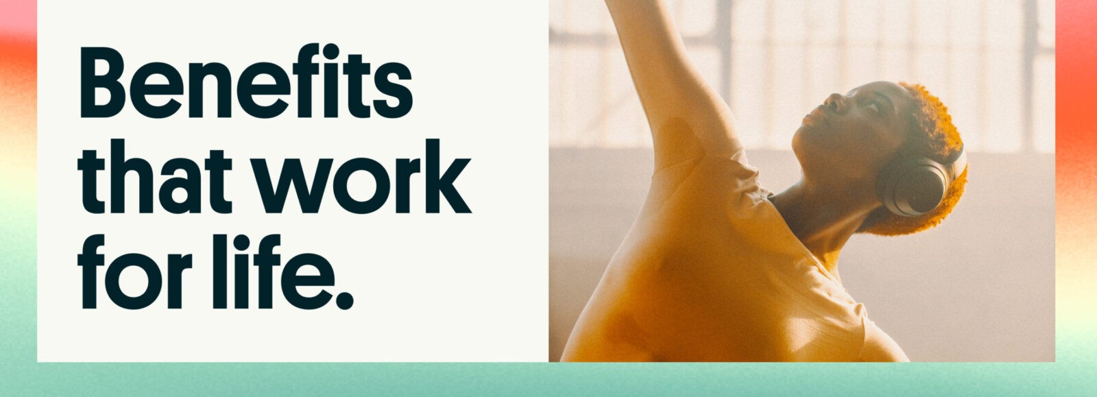
Art-direction: Our photography shows the diverse circumstances of people living with and connected by Ben. Capturing intimate and often fleeting moments creates authenticity and emotion in our photography. We want to reflect the diverse community that uses Ben every day. We should always aim to show our users in the most real way possible. This extends beyond race and gender. Show diversity in ability, life stage, interest and circumstance too.
Typography: Typography played a crucial role in defining our brand’s tone and readability. We experimented with different font styles to find one that was both visually appealing and easy to read on text-heavy pages.
Implementation
The implementation phase was a major undertaking, involving updates to over 500 web pages, hundreds of presentations, social media and ad materials, print materials, and merchandise—all within a tight 30-day timeframe.
To streamline the process, we built a design system that allowed for quick and efficient updates. By changing variables like colours and logos in the system, we could apply these changes across the entire website and digital assets with minimal effort.
We worked in parallel with the agency, focusing first on updating colours and logos and leaving placeholders for unique illustrations and photography. This approach enabled us to launch the rebrand in a single day with no bugs or issues, showcasing the effectiveness of our design system and careful planning.
Results
The rebrand has had a profound impact on our business. Since the launch, we have seen an +830% increase in organic social traffic, reflecting the success of our new visual identity and messaging. Additionally, we’ve doubled the number of applications from potential candidates, indicating that our new brand resonates with top talent and positions Ben as an employer of choice. Furthermore, we’ve experienced a significant surge in app downloads, demonstrating that our rebranding efforts have effectively captured the interest of users and driven engagement with our platform.
These results validate our rebranding efforts and highlight the success of our strategic approach. The rebrand has strengthened our position in the global benefits market and paved the way for continued growth and innovation.
Conclusion
The Ben rebrand represents a comprehensive transformation in how we communicate our mission and values. Our new identity embodies the vibrant, dynamic energy that defines our platform and reflects our commitment to empowering employees worldwide. By redefining our brand, we have not only enhanced our market presence but also positioned ourselves as a leader in global benefits and compensation.
As we move forward, we remain dedicated to driving innovation and delivering solutions that make a meaningful difference in the lives of employees. The success of our rebranding initiative reaffirms our commitment to shaping the future of employee benefits and solidifying our place as a transformative force in the industry.



CREDIT
- Agency/Creative: Ben , Ragged Edge
- Article Title: Ben’s Dynamic Rebrand Empowers Employee Benefits Worldwide
- Organisation/Entity: In-House
- Project Status: Published
- Agency/Creative Country: United Kingdom
- Agency/Creative City: London
- Market Region: UK, Europe, Global
- Keywords: WBDS In-House Design Awards 2024/25
- Keywords: WBDS In-House Design Awards 2024/25
-
Credits:
Brand Design Lead at Ben: Iuliia (Juliet) Faldina
Ex Product Design Lead at Ben: Paul David Price
Co-founder & CEO at Ben: Sebastian Fallert
Co-founder & COO at Ben: David Duckworth
Senior Growth Executive at Ben: Charlotte Blair
Ex Low code developer at Ben: Jimmy Elphick
Product Designer at Ben: Harriet Atkins
Junior Product Designer at Ben: Stefania Ciardiello
Co-founder at Ragged Edge: Max Ottignon
Business Director at Ragged Edge: Anna Yateman
Associate Creative Director at Ragged Edge: Jessica Bong-Woon
Strategy Partner at Ragged Edge: Laura Stepney
Executive Creative Director at Ragged Edge: Matt Smith
Senior Account Manager at Ragged Edge: Abi Nkrumah
ex Senior Designer at Ragged Edge: Callum Richards
ex VP Growth at Ben: Lukas Roth


