Nana
Fusion Restaurant
Overview
Nana is a fusion restaurant that merges the vibrant, rich traditions of Mexican cuisine with the refined and delicate techniques of Japanese cooking. The name “Nana” is deeply symbolic, representing a harmonious blend and mutual respect between these two distinct culinary worlds. The restaurant’s signature dish, birria-ramen, perfectly encapsulates this fusion by combining the hearty, flavorful essence of Mexican birria with the comforting, umami-rich allure of Japanese ramen noodles.
Solution
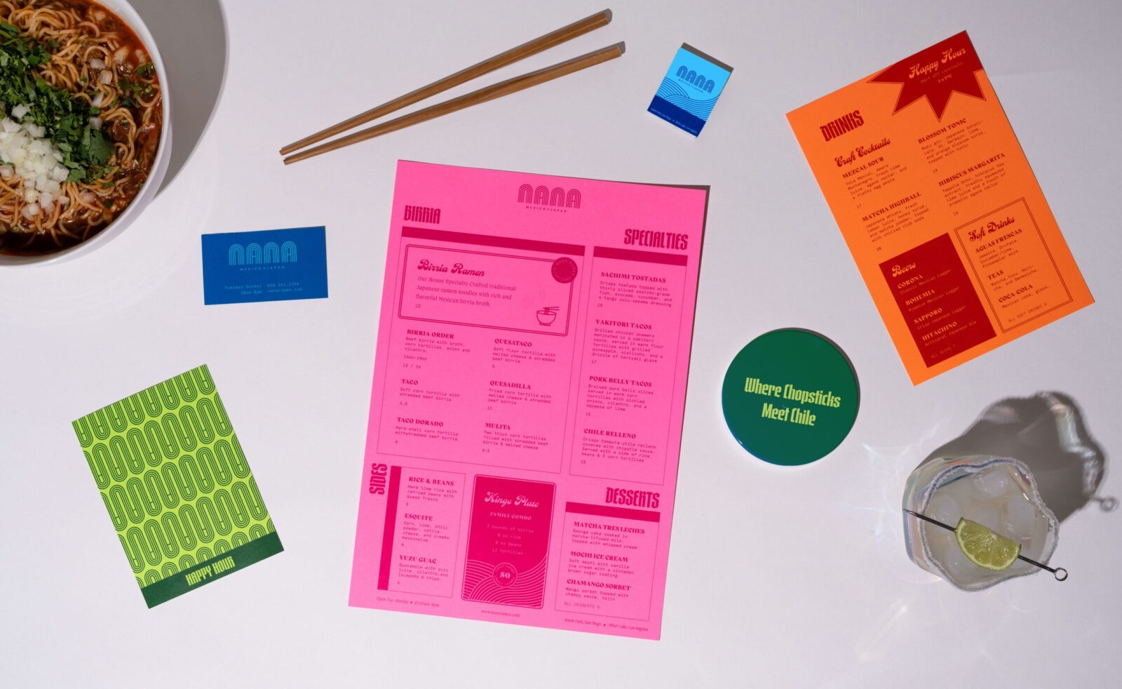
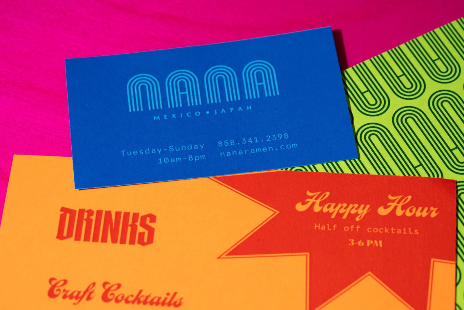
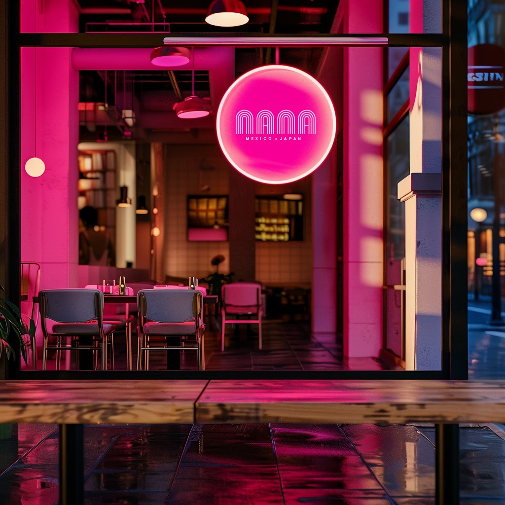
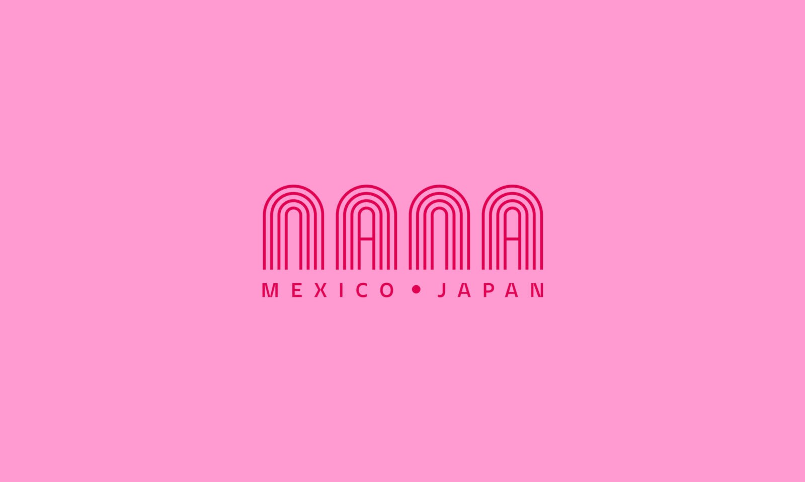
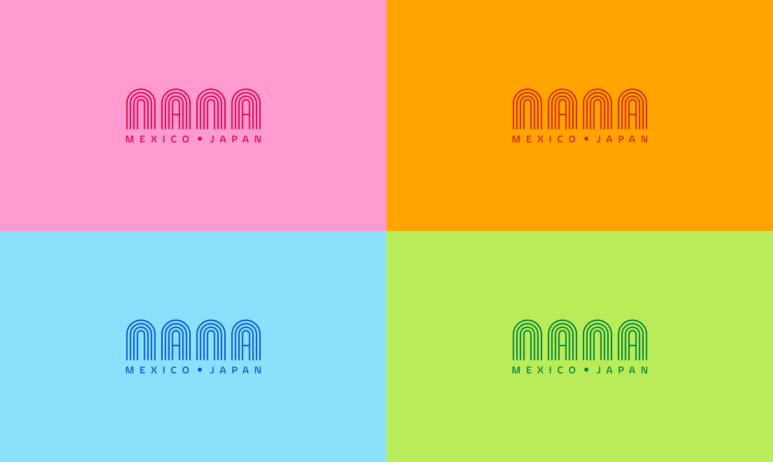
The branding for Nana is minimalist yet vibrant, reflecting the restaurant’s commitment to both authenticity and innovation. The hand-lettered wordmark is inspired by the art-deco architecture of Mexico City, a nod to the rich cultural heritage that informs the restaurant’s identity. The multi-line construction of the wordmark also serves as a repeating pattern that is applied on a large scale across various branded materials, including the menu system, creating a cohesive and recognizable visual language.
The color palette is unapologetically bold, drawing inspiration from the vivid hues of Mexican houses and the iconic works of Frida Kahlo. Neon colors dominate the palette, making it ultra fun, flashy, and just a bit over the top—perfectly embodying the vibrant energy that Nana aims to bring to the dining experience. This bright and lively color scheme ensures that the brand stands out and leaves a lasting impression.
The menu layout is a blend of multiple display typefaces, creating a highly eclectic and bold system that mirrors the fusion concept of the restaurant. The typeface Gandur New was chosen for its angular, condensed forms and chisel-point construction, reminiscent of traditional blackletter typography. This is contrasted with the Casey typeface, a curvy script that exudes joyfulness with a touch of vintage flair. For subheads, PP Migra was selected for its stylish contrast and unique details, adding another layer of visual interest to the menu.
In addition to its typographic diversity, the menu layout features a wide variety of rules, boxes, icons, and special details that keep the design engaging and unexpected. This approach not only highlights the diverse offerings of the restaurant but also reinforces the brand’s commitment to creating a unique and memorable dining experience.
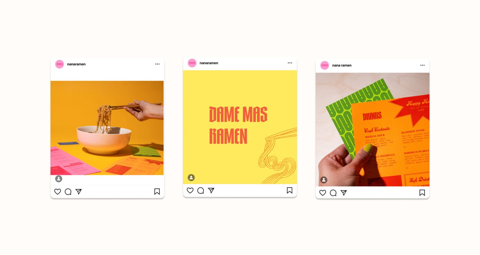
Social media plays a crucial role in Nana’s branding strategy. Posts are shot with hard shadows and bright backgrounds, balancing clean lines with chaotic elements to reflect the fusion of cultures. The messaging style is bold and dynamic, mixing Spanish and English content to appeal to a diverse audience while staying true to the restaurant’s roots.
Overall, Nana’s branding is a vibrant celebration of cultural fusion, bringing together the best of Mexican and Japanese culinary traditions in a way that is both visually striking and deeply resonant.

CREDIT
- Agency/Creative: Fernanda Martinez
- Article Title: Fernanda Martinez Creates Vibrant Brand Design for Nana Fusion Restaurant
- Organisation/Entity: Student
- Project Status: Non Published
- Agency/Creative Country: United States of America
- Agency/Creative City: San Diego
- Keywords: WBDS Student Design Awards 2024/25
- Keywords: WBDS Student Design Awards 2024/25
-
Credits:
Educational Institution: San Diego City College
Educator’s Name: Sean Bacon & Bradford Prairie


