Overview
Concorde is a unique and sustainable leather shoe company targeting individuals who love to wear bold statement pieces and aren’t afraid to stand out. In a post-pandemic world where online shopping has become the norm, having a strong and captivating website has become crucial for maintaining customer engagement. My solution was to design an interesting and sophisticated layout that highlights the shoes without overshadowing them.
Problem
In the competitive fashion industry, especially in the realm of bold and statement footwear, creating a brand that stands out while fostering community and presence is vital. Concorde’s main goal is to create a voice within the fashion industry that speaks without sound—to write people’s fashion stories through their products. The challenge was to design a digital experience that reflects the unique look and feel of Concorde’s products and provides trust, security, and a strong sense of personality for the customer.
Solution
The Concorde project began with an in-depth strategy and research phase. This included a creative questionnaire to understand the brand’s target audience, competitive analysis to identify gaps in the market, and persona development to guide the design process. Sitemapping and wireframing were also key steps in planning the website’s structure and flow, ensuring a seamless user experience.
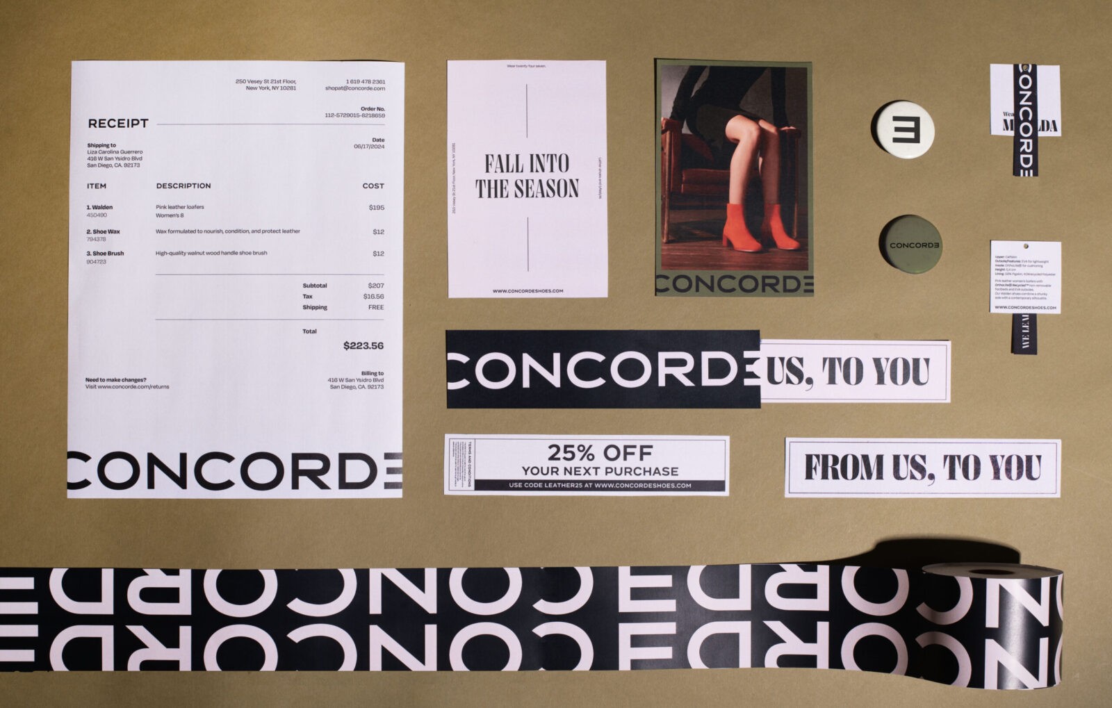
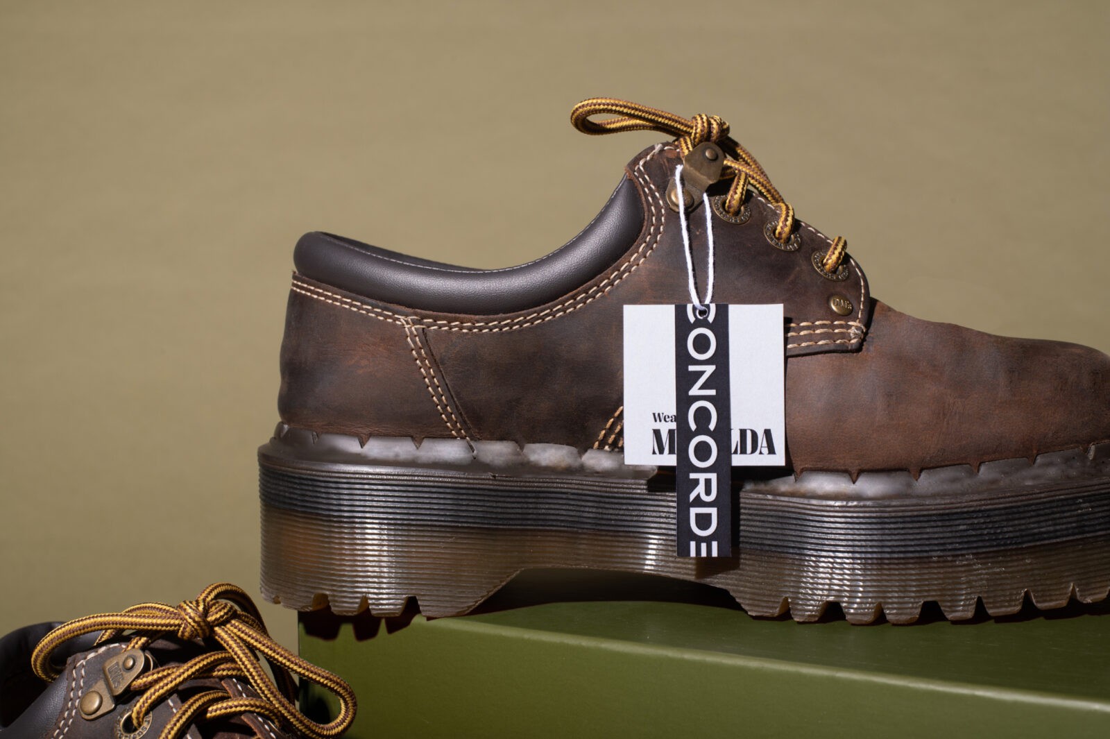
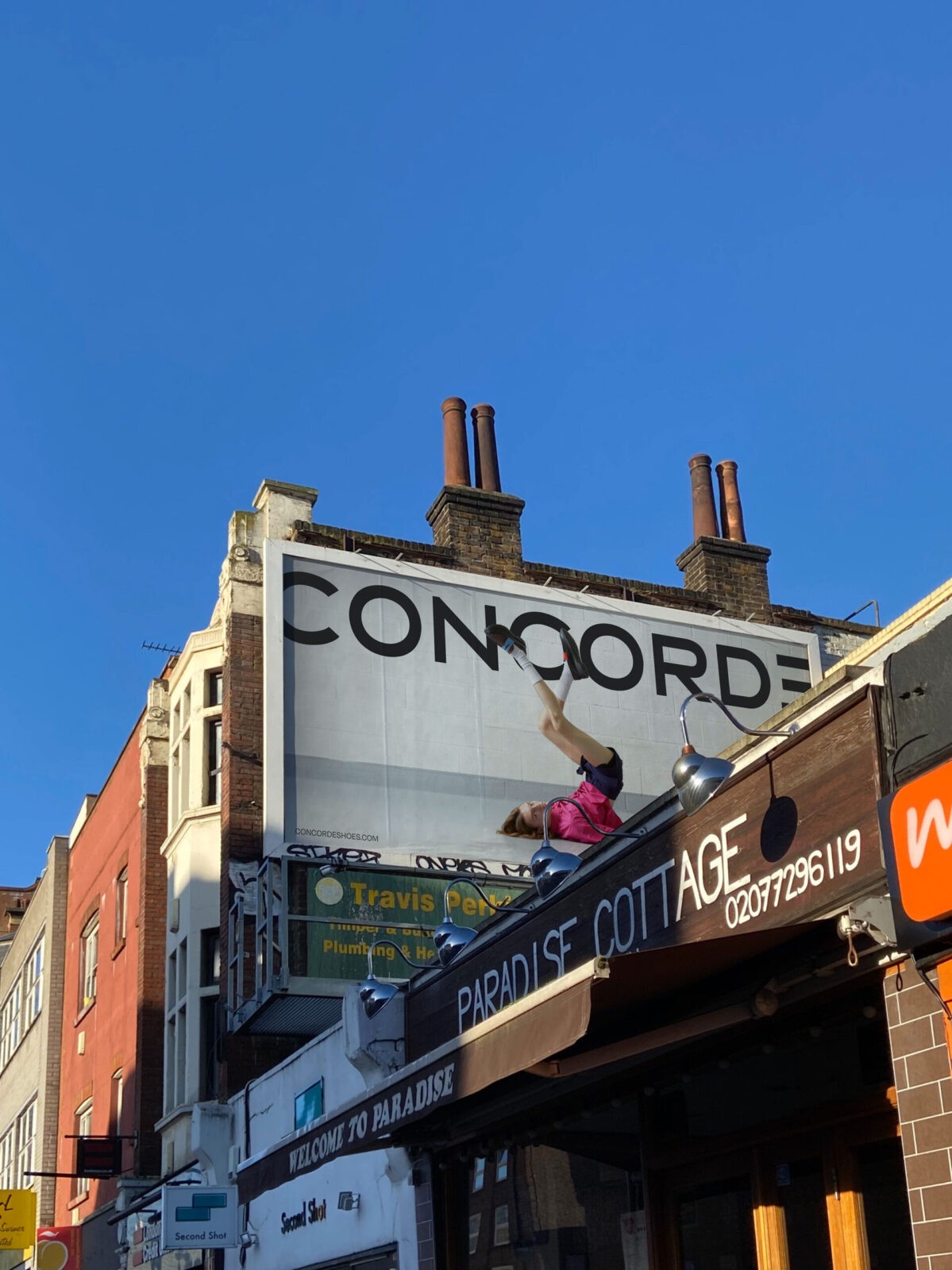
The Concorde identity is anchored by a simple yet impactful wordmark. The typography is extended to give a luxe and bold appearance, perfectly aligning with the brand’s high-end, statement-making products. The ‘E’ in Concorde is flipped, expressing the brand’s alternative personality and rebellious spirit. The logo is applied in an oversized format across both print and digital applications, ensuring strong brand recognition. As part of the branding project, an extensive print system was developed for promotions, packaging, shipping, and invoicing. This system is designed to maintain a cohesive and luxurious brand image across all customer touchpoints.
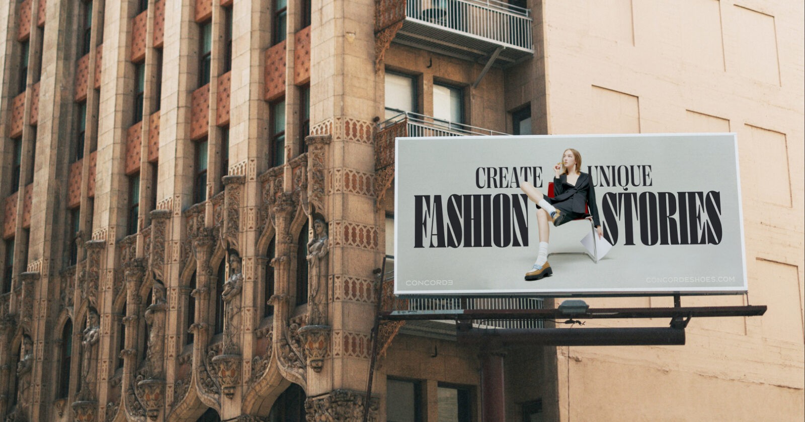
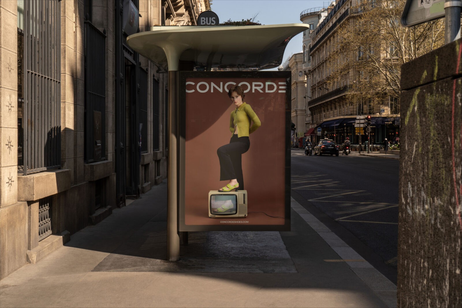
A comprehensive marketing campaign was also launched, which included social media and out-of-home advertising. The campaign juxtaposes models with unique and creative styles alongside the oversized wordmark logo, reinforcing Concorde’s commitment to boldness and individuality. These marketing efforts are designed to resonate with Concorde’s target audience, creating a strong brand presence in the fashion industry.
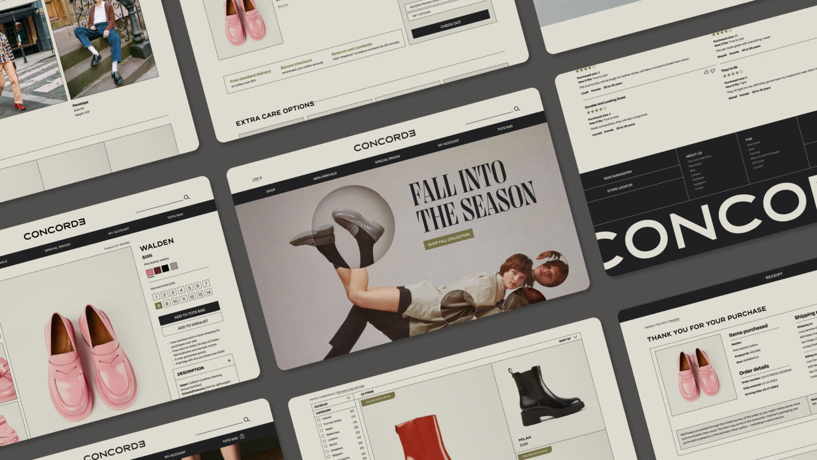
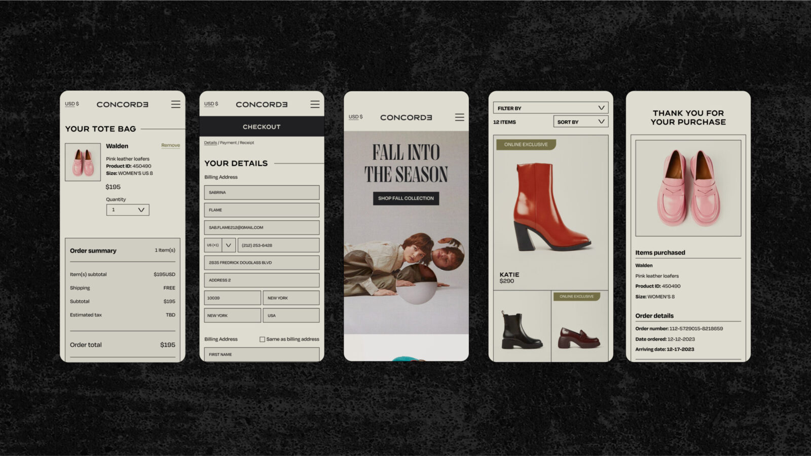
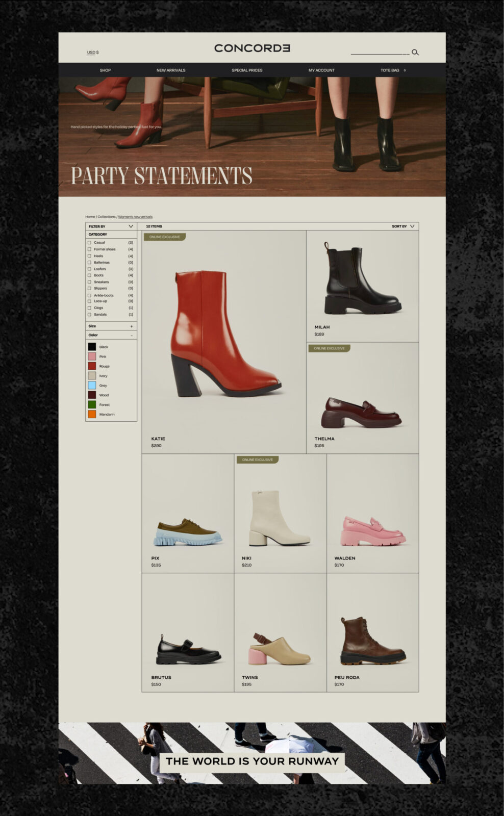
The website I designed for Concorde embodies these principles, offering a convenient and visually enticing shopping experience. Key features include a wide range of filters on the category page, allowing customers to easily navigate the product offerings, and hand-selected recommendations based on past purchases to enhance personalization. The overall design ensures that the shoes remain the focal point while creating a journey that is both engaging and seamless for the customer.

CREDIT
- Agency/Creative: Lina Guerrero
- Article Title: Digital Design for E-Commerce Concorde by Student Lina Guerrero
- Organisation/Entity: Student
- Project Status: Non Published
- Agency/Creative Country: United States of America
- Agency/Creative City: San Diego
- Project Deliverables: Digital Website
- Industry: Fashion
- Keywords: WBDS Student Design Awards 2024/25 , Digital Design: E-Commerce
- Keywords: WBDS Student Design Awards 2024/25
-
Credits:
Educational Institution: San Diego City College
Educator's Name: Sean Bacon & Bradford Prairie


