Overview
Nexus is the rebranding of the Blockworks conference, a premier event focused on decentralized finance and blockchain technology. The conference attracts prominent figures in the industry and provides a platform for like-minded individuals from around the world to come together, network, and learn from one another. Nexus aims to elevate the conference’s identity, creating a professional and clean environment that reflects the exciting and rapidly emerging nature of the decentralized finance industry.
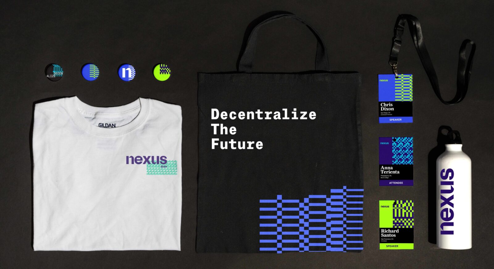
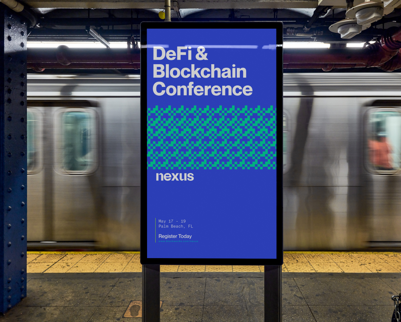
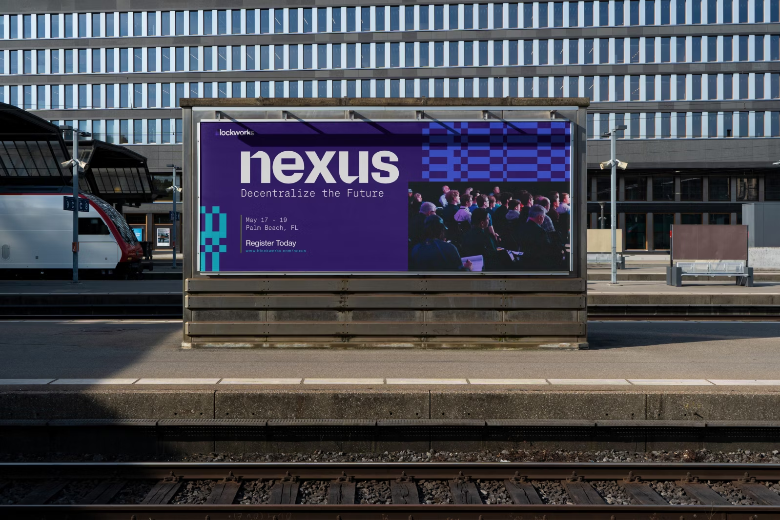
The branding for Nexus employs a unique color palette and an array of patterns designed to stand out in a crowded market. These patterns are inspired by the concept of blockchain, featuring interlocking and repeating motifs that symbolize the interconnectedness central to decentralized finance. The goal was to create a brand identity that is both professional and visually engaging, highlighting the innovative spirit of the industry.
Solution
The Nexus brand wordmark is characterized by squarish counters and apertures, referencing the digital pixelation that is synonymous with modern technology. This design choice is mirrored in the brand’s graphic elements, which feature pixelated constructions and a glitchy appearance, reinforcing the conference’s focus on cutting-edge technology. The color palette for Nexus includes dark neutrals and blues, accented with a neon green, creating a bold and highly technical visual identity that stands out while remaining true to the industry’s aesthetic.
Typography plays a significant role in the Nexus branding, with the Neue Montreal type family used extensively throughout the brand in both its monospace and proportional variants. This typeface was chosen for its clear readability and neutral personality, making it ideal for conveying complex information in a digestible manner. To add typographic texture and balance, the serif typeface Fragment is also incorporated, giving the brand a sophisticated and polished look.
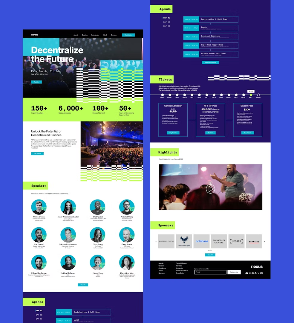
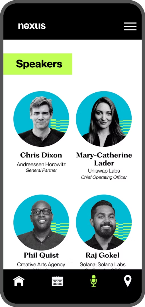
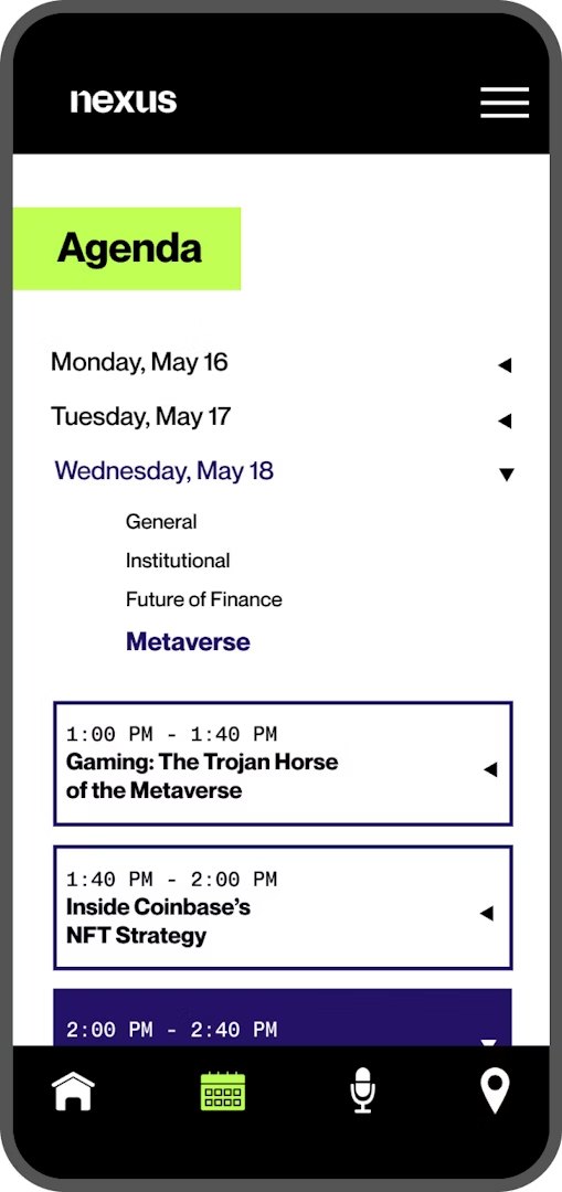
The Nexus website was designed to embody a clean and modern aesthetic while integrating key elements of the brand’s visual language. The layout ensures that information is easily accessible and clear at a glance, making it straightforward for users to navigate and understand. This balance between form and function was crucial in creating a digital presence that reflects the sophistication and forward-thinking nature of the Nexus conference.
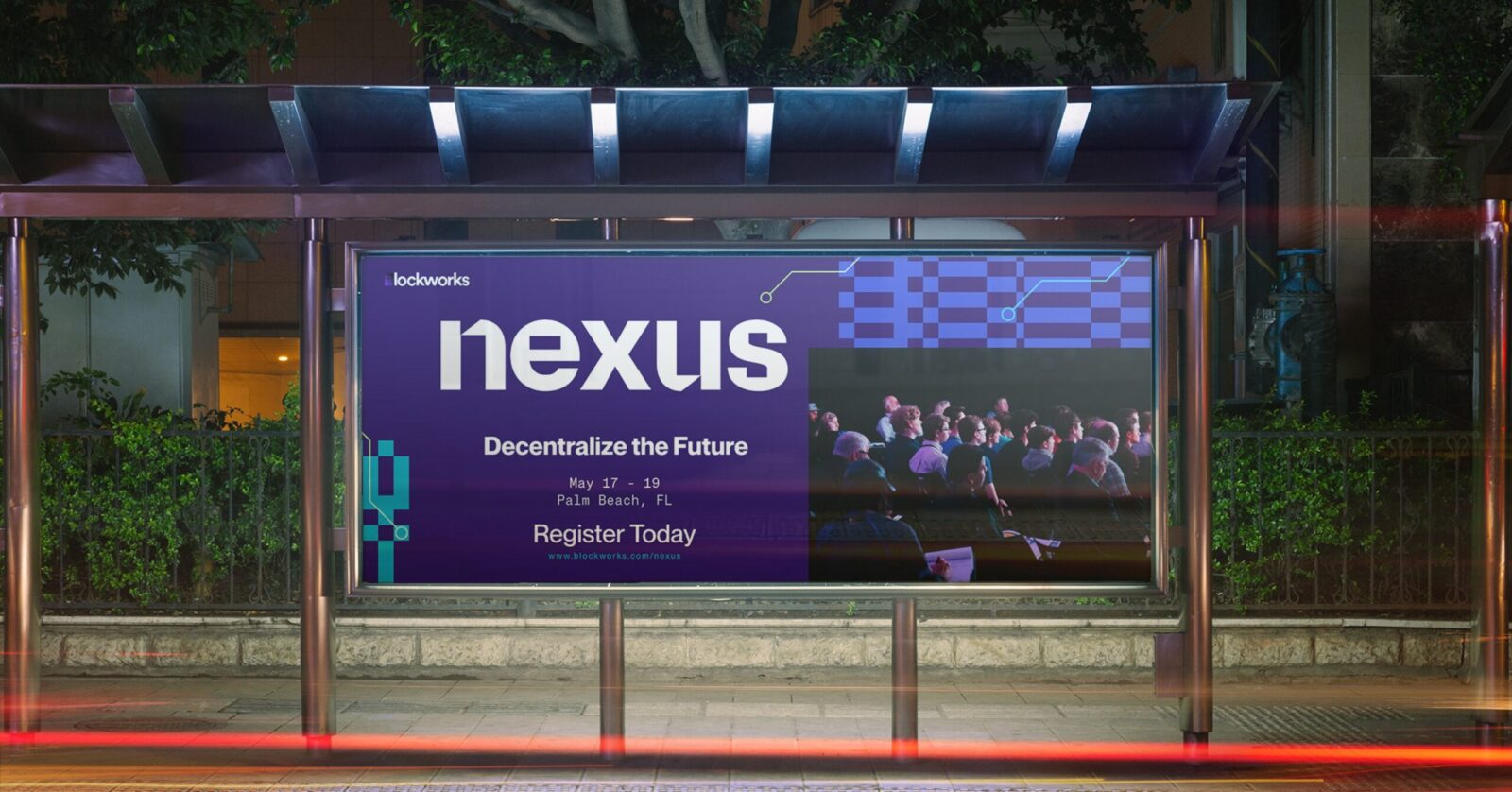
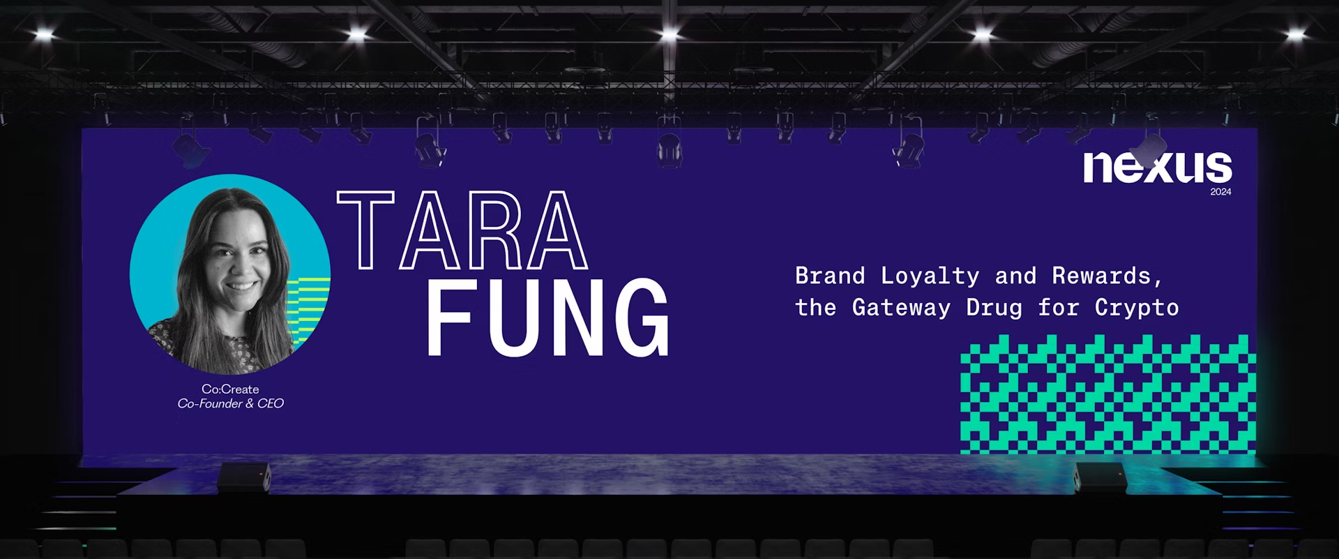
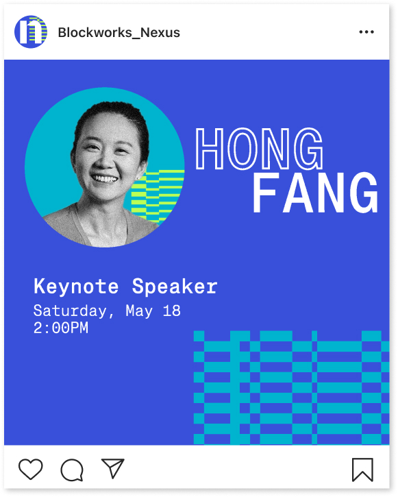
Nexus’s branding extends beyond the visual identity to an extensive digital-first marketing campaign. This campaign leverages the brand’s distinct visual language to highlight speakers, promote conference content, and share inspirational messaging about the future of decentralized finance and blockchain technology. By maintaining a consistent and striking visual identity across all digital platforms, Nexus effectively communicates its position as a leader in the blockchain conference space, attracting industry professionals and enthusiasts alike.



CREDIT
- Agency/Creative: Tim Burke
- Article Title: Student Tim Burke Elevates Nexus Conference with Cutting-Edge Graphic Design
- Organisation/Entity: Student
- Project Status: Non Published
- Agency/Creative Country: United States of America
- Agency/Creative City: San Diego
- Keywords: WBDS Student Design Awards 2024/25 , Graphic Design
- Keywords: WBDS Student Design Awards 2024/25
-
Credits:
Educational Institution: San Diego City College
Educator's Name: Sean Bacon & Bradford Prairie


