Overview
DistroKid is one of many options available for independent musicians seeking digital distribution services. As a platform that helps artists distribute their music across various digital channels, DistroKid is highly regarded in the industry. However, despite its strong reputation, the current branding lacks visual cohesiveness and a distinctive identity that sets it apart in a crowded marketplace.
The Problem
While DistroKid is widely respected, especially among its competitors, the existing branding and user interface design do not fully capture the creative spirit of its user base—musicians, who are inherently creatives by nature. The user experience and interface design are crucial to this audience, and the current design fails to fully resonate with them. To maintain DistroKid’s trusted brand equity while refreshing both its desktop and mobile sites, a comprehensive rebrand was needed. The goal was to grow traffic, increase engagement, and create a more cohesive and visually appealing brand identity.
Solution
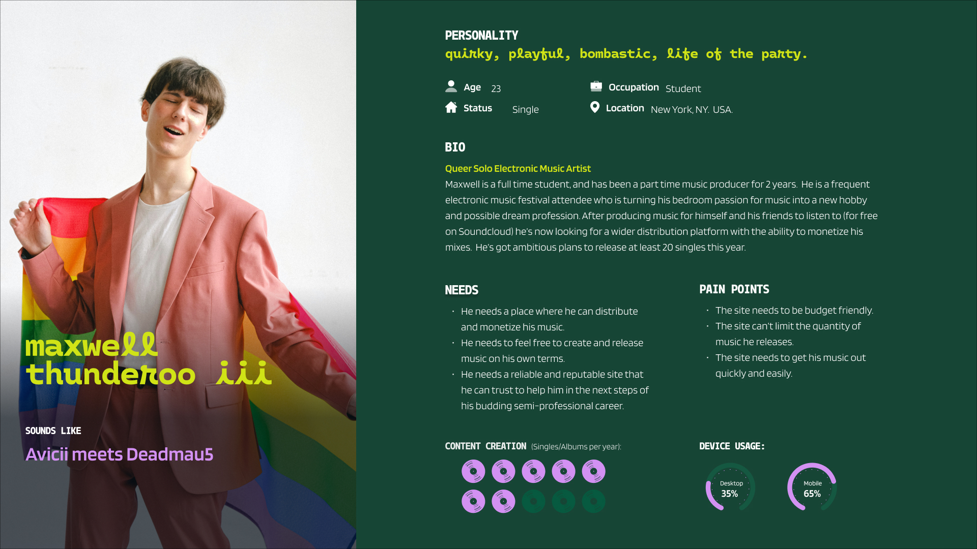
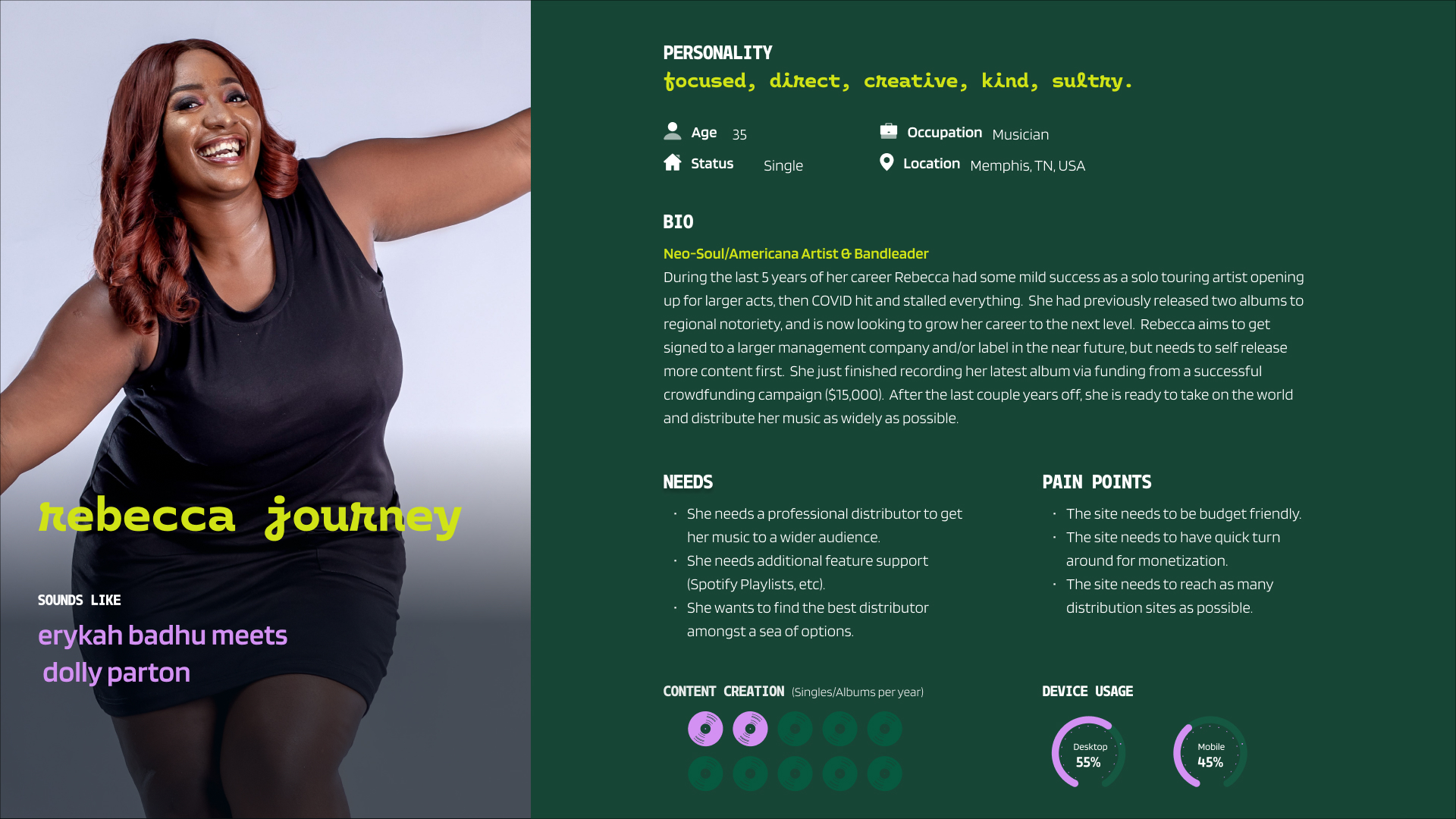
The rebranding project for DistroKid began with thorough discovery, research, and strategy phases. This process included conducting a creative questionnaire, auditing the existing site, and performing a competitive analysis to understand the landscape and identify opportunities for differentiation. Additionally, personas were developed to outline key user archetypes, ensuring that the redesign would meet the needs of DistroKid’s diverse audience.
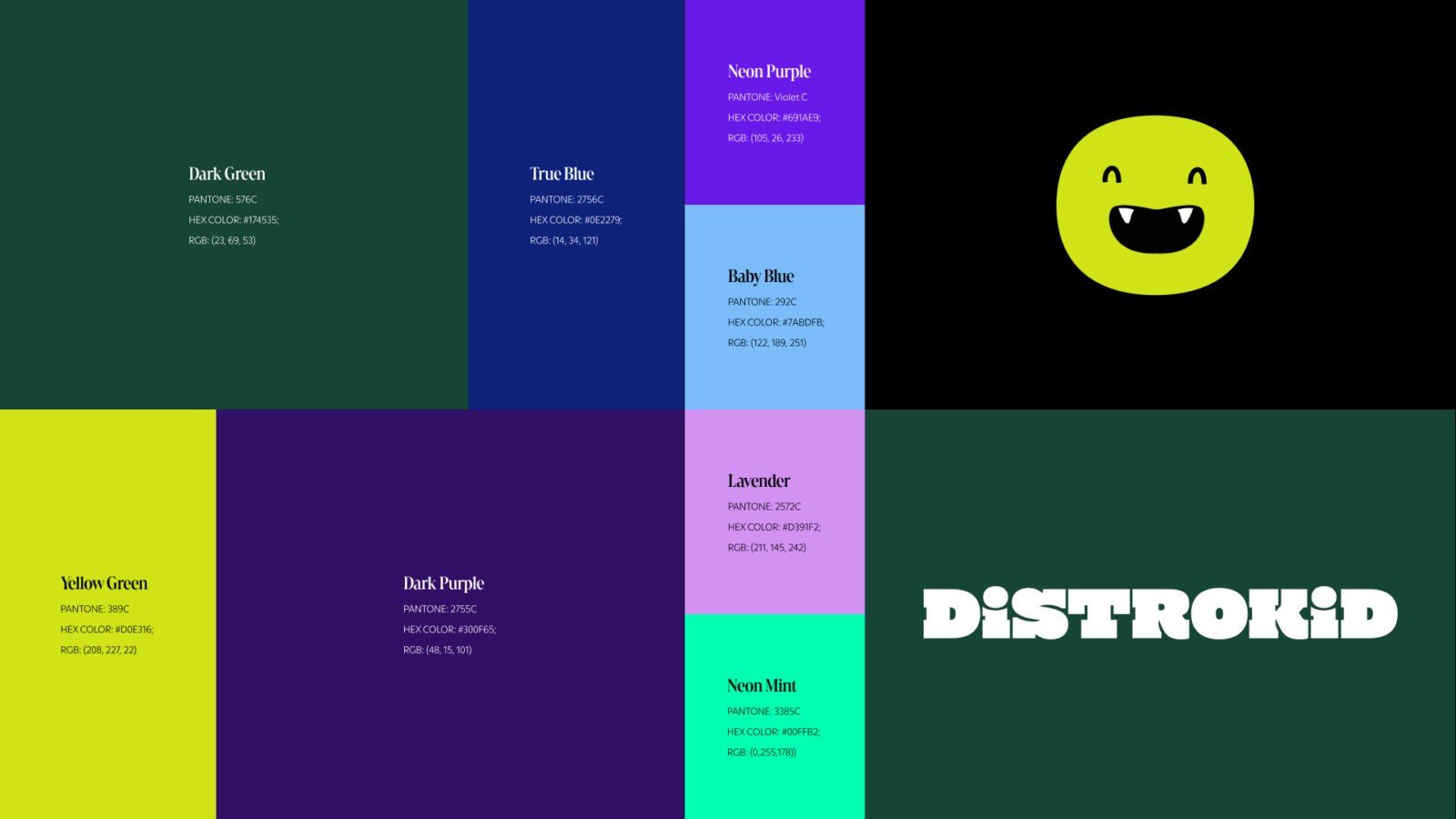
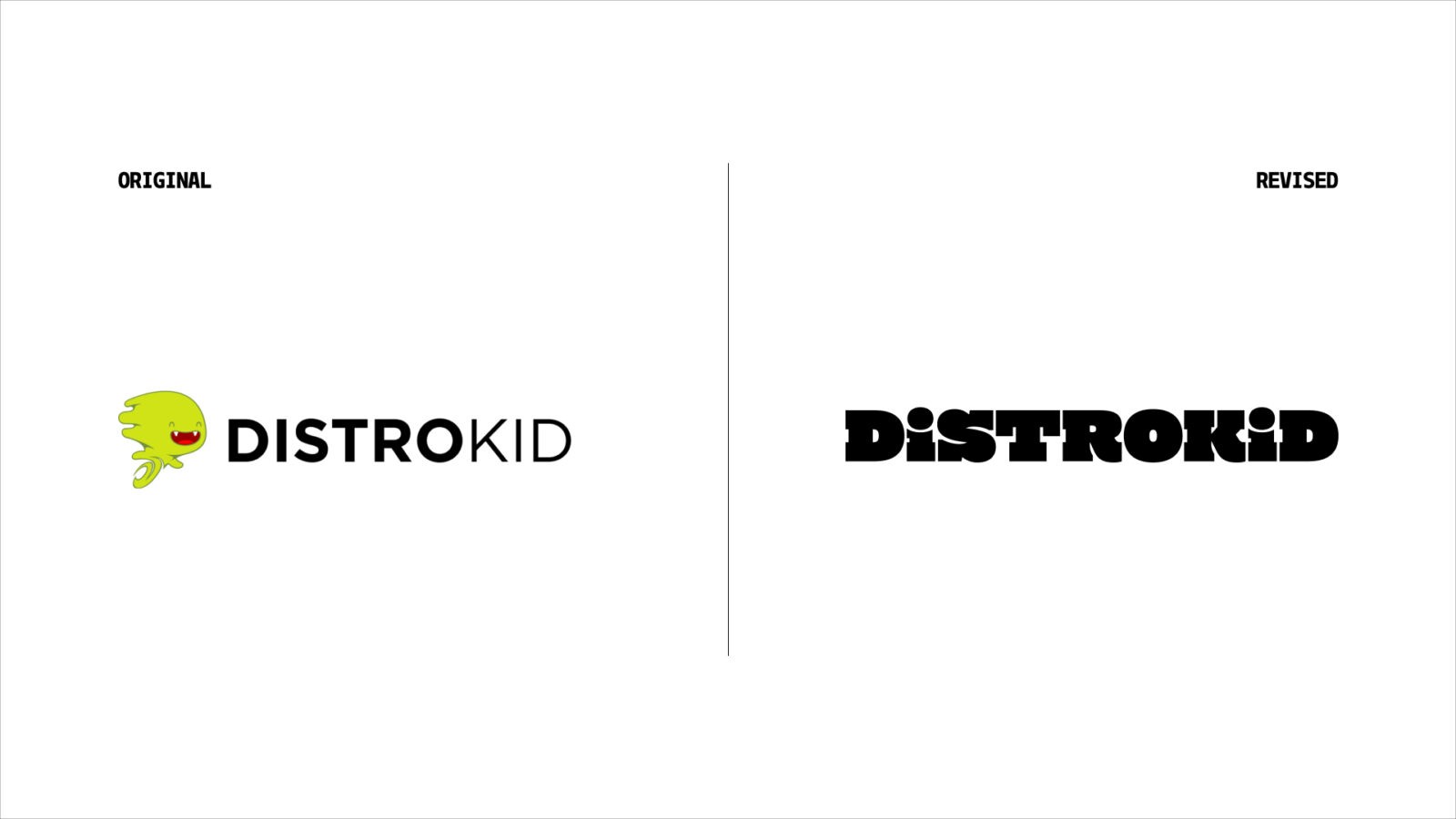
A significant change in the rebrand was the simplification of the existing ghost mascot, which was previously too cartoonish. The new logo retains the essence of the ghost but streamlines it, creating a cleaner and more versatile design. The mascot is also separated from the logo, allowing it to be used as a standalone element in key situations without overwhelming the overall brand identity.
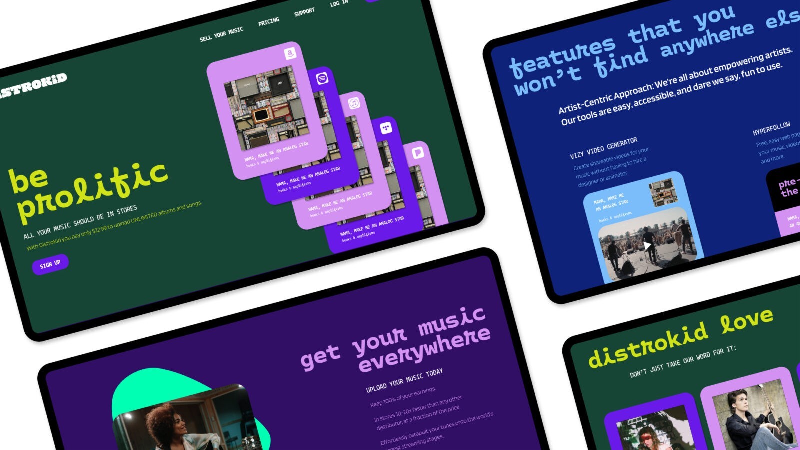
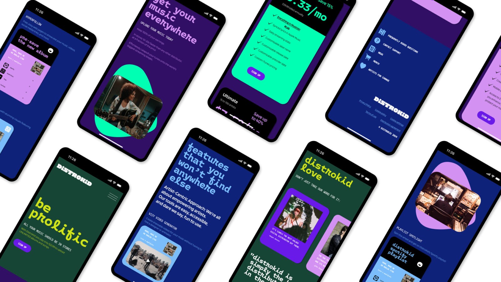
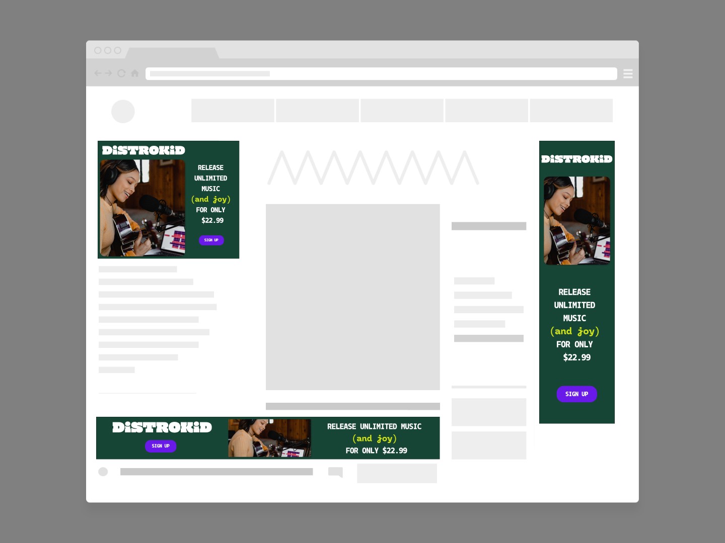
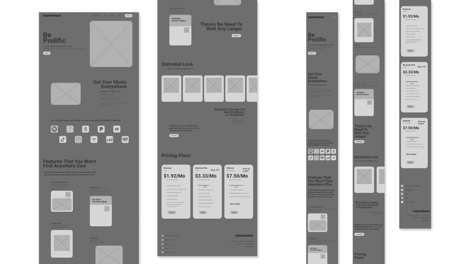
The new website design is characterized by bold blocks of color, playful typography with alternate characters, and inspirational messaging. These elements work together to convey the product’s key value propositions in a more engaging and visually striking way. The overall design system is punchy and modern, with improved hierarchy, a better layout, and more intuitive directional CTA buttons, all contributing to a more seamless user experience.
By refreshing the visual design system and improving the website’s usability, the rebrand successfully enhances DistroKid’s appeal to its creative audience, positioning the platform as a partner in their musical journey.
CREDIT
- Agency/Creative: Whitney Shay
- Article Title: Student Whitney Shay Revitalized DistroKid’s Digital Design for a Creative Audience
- Organisation/Entity: Student
- Project Status: Non Published
- Agency/Creative Country: United States of America
- Agency/Creative City: San Diego
- Keywords: WBDS Student Design Awards 2024/25 , Digital Design: Website
- Keywords: WBDS Student Design Awards 2024/25
-
Credits:
Educational Institution: San Diego City College
Educator's Name: Sean Bacon & Bradford Prairie


