


Overview
Sexual wellness is a market segment that intuitively aligns with the direct-to-consumer (DTC) model. The experience of shopping for such products in physical stores can often feel uncomfortable or “slimy,” even when undertaken for research purposes. Recognizing this issue as an opportunity, Bontemps was created to join the ranks of new DTC companies in the sexual wellness space. The brand is crafted as a luxurious, pleasure-focused experience, utilising a limited colour palette, elegant typefaces, and sensual—yet not overtly sexual—imagery to establish a refined and approachable identity.
Positioning
In the luxury segment of sexual wellness products, Bontemps faces a crowded market with numerous competitors offering similar lines of products, including condoms, lubes/serums, toys, and occasionally supplements, wipes, STD tests, and menstrual products. To effectively differentiate Bontemps within this competitive landscape, extensive research was conducted to categorize competitors based on their visual identity (y-axis) and brand voice (x-axis). This analysis pinpointed a unique positioning for Bontemps that emphasizes luxury, sophistication, and inclusivity, setting it apart from other brands in the space.
Website Design
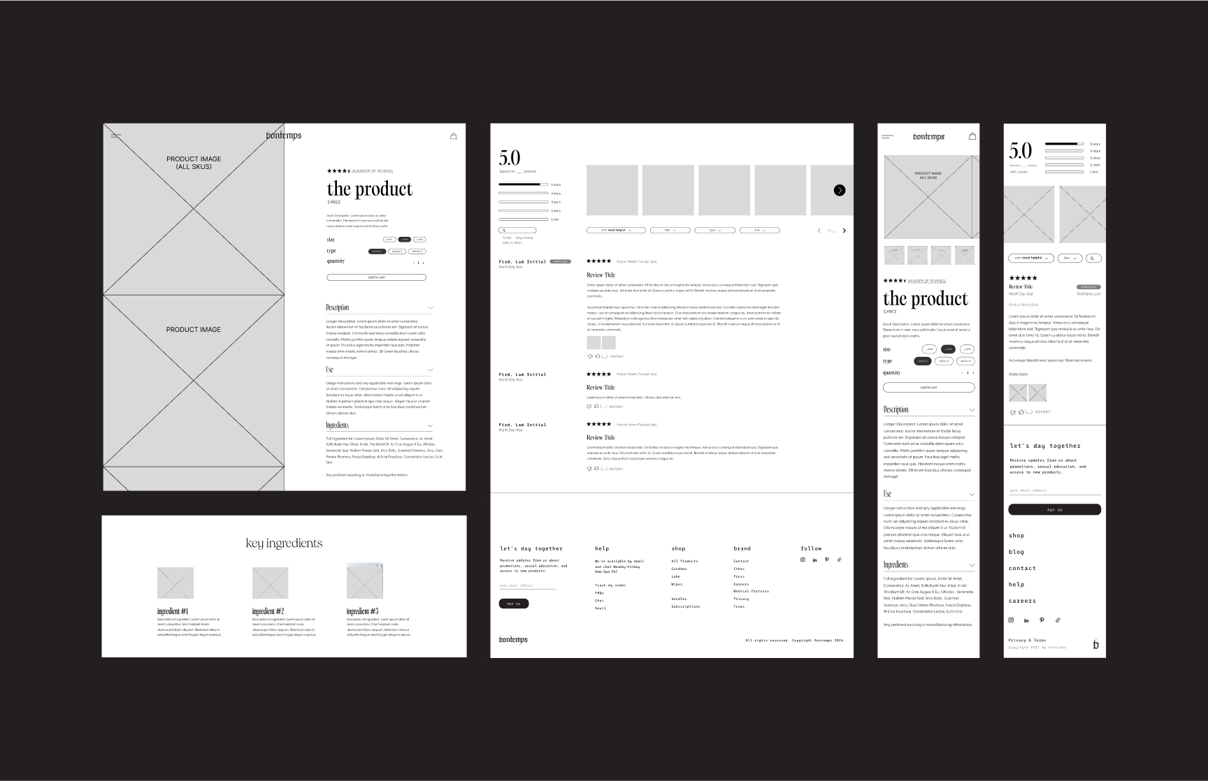
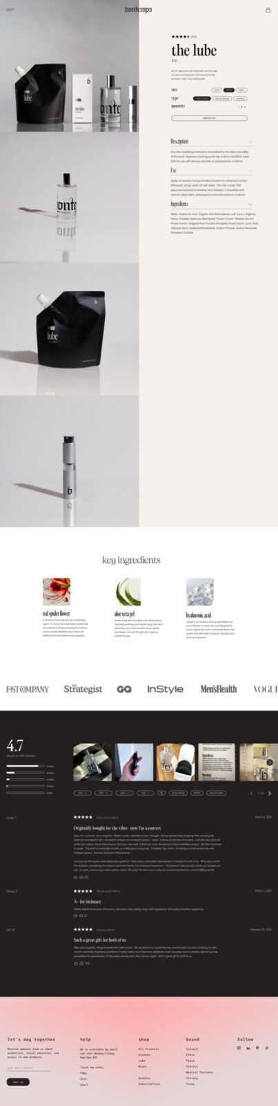
The Bontemps website is designed to embody the brand’s luxurious and refined identity. Neutral colors, smooth animations, and carefully selected typography contribute to a digital experience that feels both elegant and immersive. The homepage includes sections that allow users to explore the ethos of the brand, enhancing the perception of Bontemps as a lifestyle brand rather than just a retailer of sexual wellness products. The use of inclusive, high-quality photography and the integration of a blog further enrich the user experience, offering valuable content that resonates with the target audience and reinforces the brand’s commitment to luxury and authenticity.
Identity
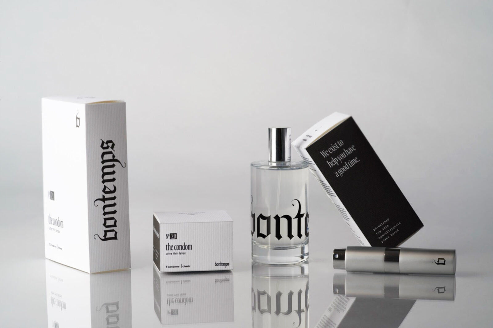
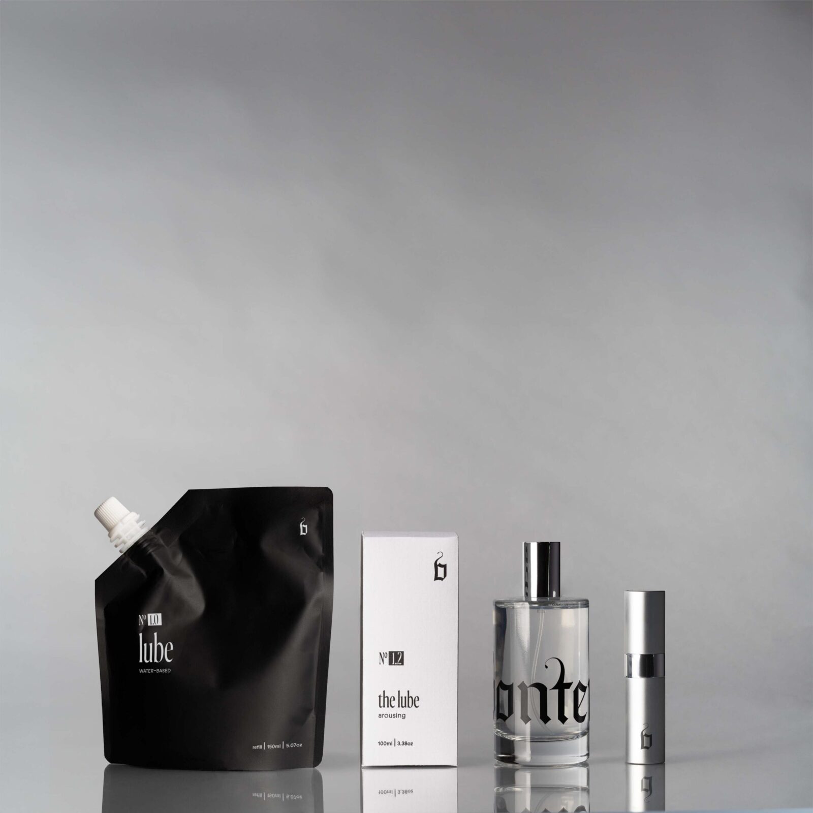
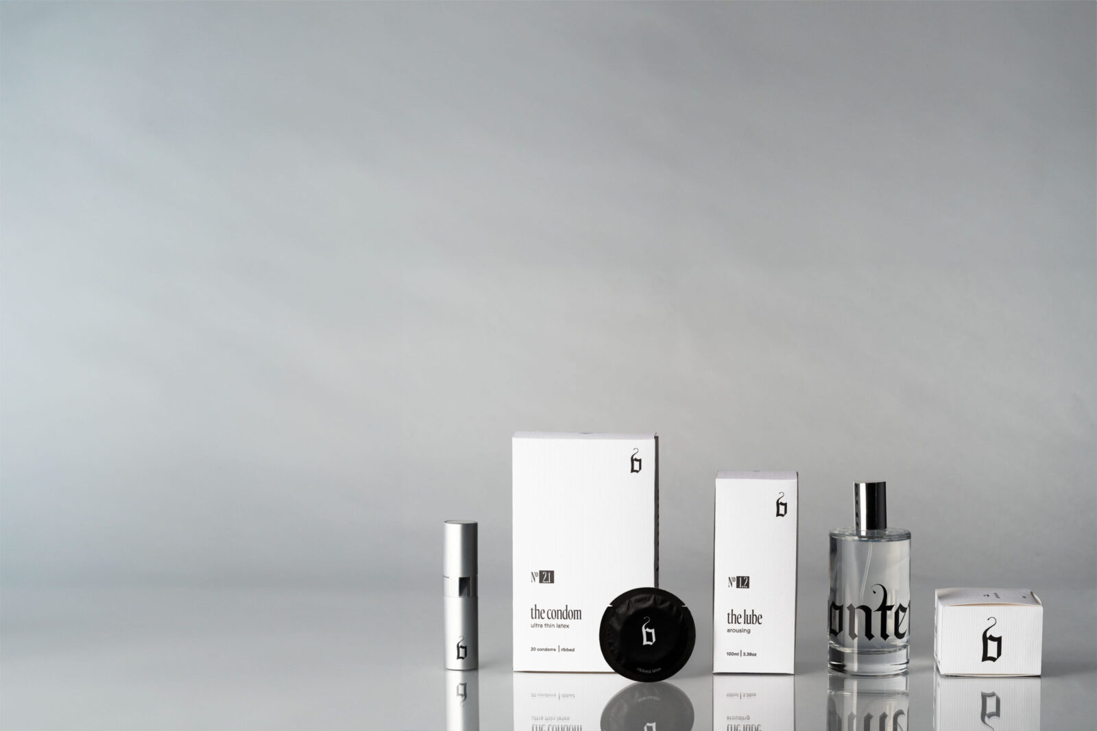
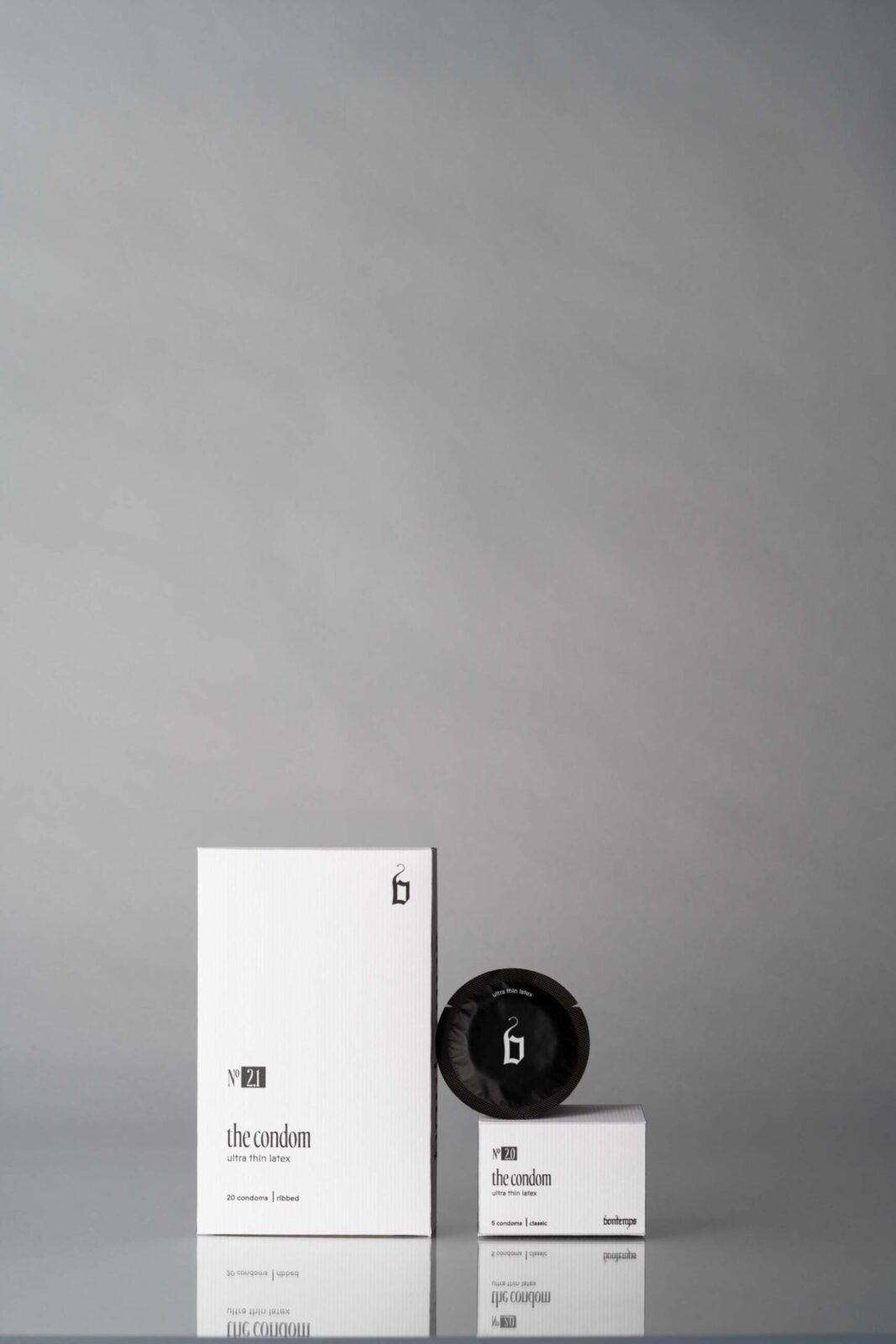
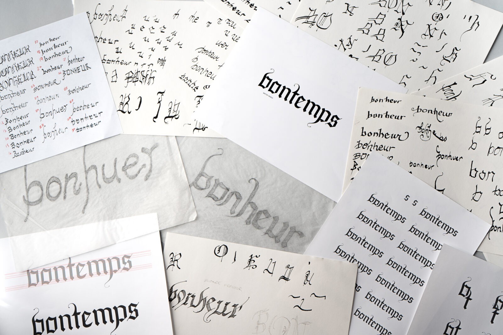
The Bontemps logo is a central element of the brand’s visual identity, hand-lettered and inspired by modern blackletter typography and gothic letterforms. The development process involved an extensive sketching phase where the composition of the logo was carefully crafted. After numerous rounds of refinement, both by hand and digitally, the final vectorized wordmark was created, representing the brand’s sophisticated and elegant personality.
The brand’s messaging is suggestive, carefully balanced to maintain authenticity without becoming overt. The refined neutral palette is accented with a subtle blush, which adds warmth and approachability. This color scheme is paired with delicate gradients and graphic shapes that introduce depth and interest to the packaging designs, further enhancing the brand’s luxurious appeal.
CREDIT
- Agency/Creative: Emma Davis
- Article Title: Emma Davis’s Packaging Design for Bontemps
- Organisation/Entity: Student
- Project Status: Non Published
- Agency/Creative Country: United States of America
- Agency/Creative City: San Diego
- Project Deliverables: Packaging Design
- Industry: Beauty/Cosmetics
- Keywords: WBDS Student Design Awards 2024/25
- Keywords: WBDS Student Design Awards 2024/25
-
Credits:
Educational Institution: San Diego City College
Educator's Name: Sean Bacon & Bradford Prairie


