Overshare
a print magazine for the chronically-online
Overview
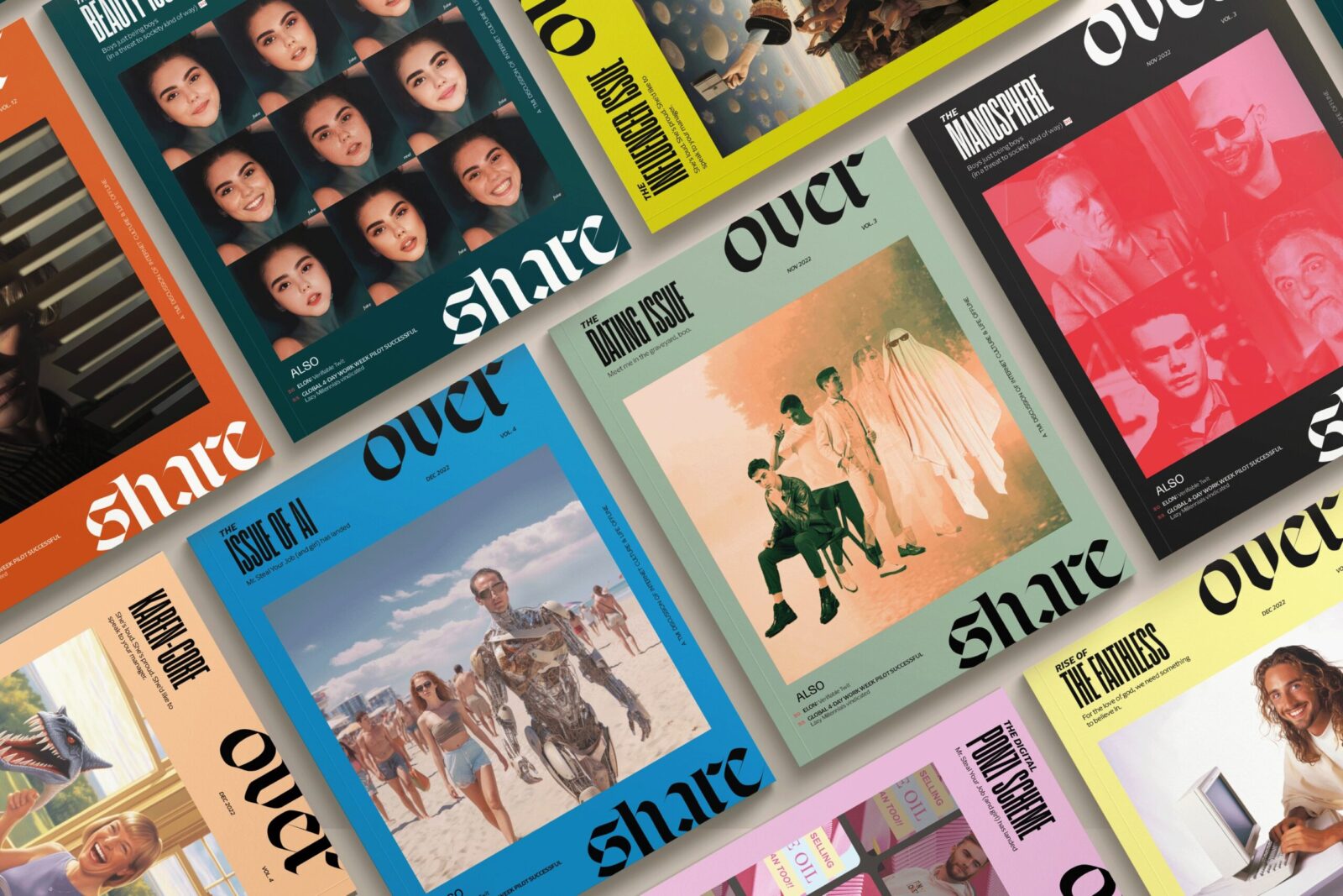
Overshare is a magazine for those who are keenly aware of the steady encroachment of digital culture into offline life. The branding of Overshare mirrors the often chaotic and unpredictable nature of the internet, utilizing bold display fonts, compelling imagery, and bright, attention-grabbing colors to captivate readers in an age where distractions are rampant and our attention spans are increasingly fragmented.
Personality
Overshare is characterized by its irreverent, witty, meta, and alt personality. The magazine doesn’t shy away from pushing boundaries, offering content that is both thought-provoking and unconventional. It occupies a unique position at the intersection of tech-focused and culture-focused content, but with a distinct emphasis on off-beat and insider stories that appeal to readers looking for something beyond the mainstream.
Design
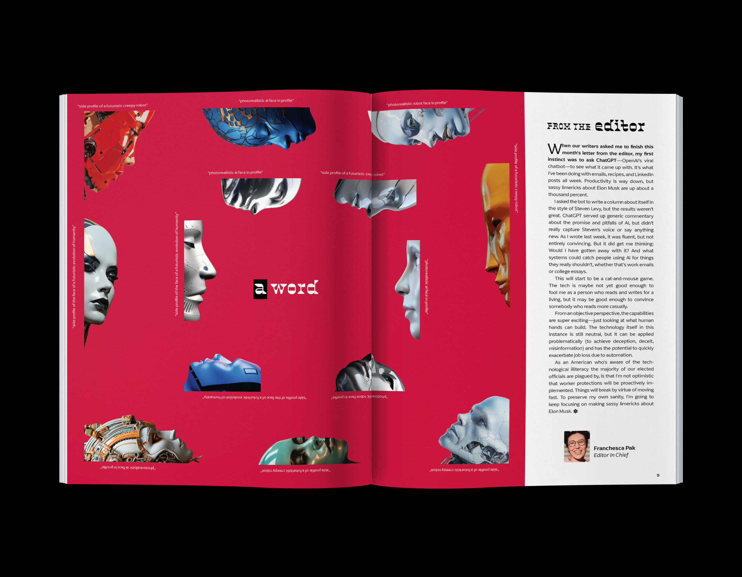
The theme of Overshare’s color palette is chaos, perfectly reflecting the magazine’s embrace of the unpredictable and the eclectic. Each cover is a visual explosion, using a wide array of colors combined with over-the-top, busy, and often strange imagery. This bold approach ensures that the magazine stands out on the shelf and immediately draws the eye of potential readers.
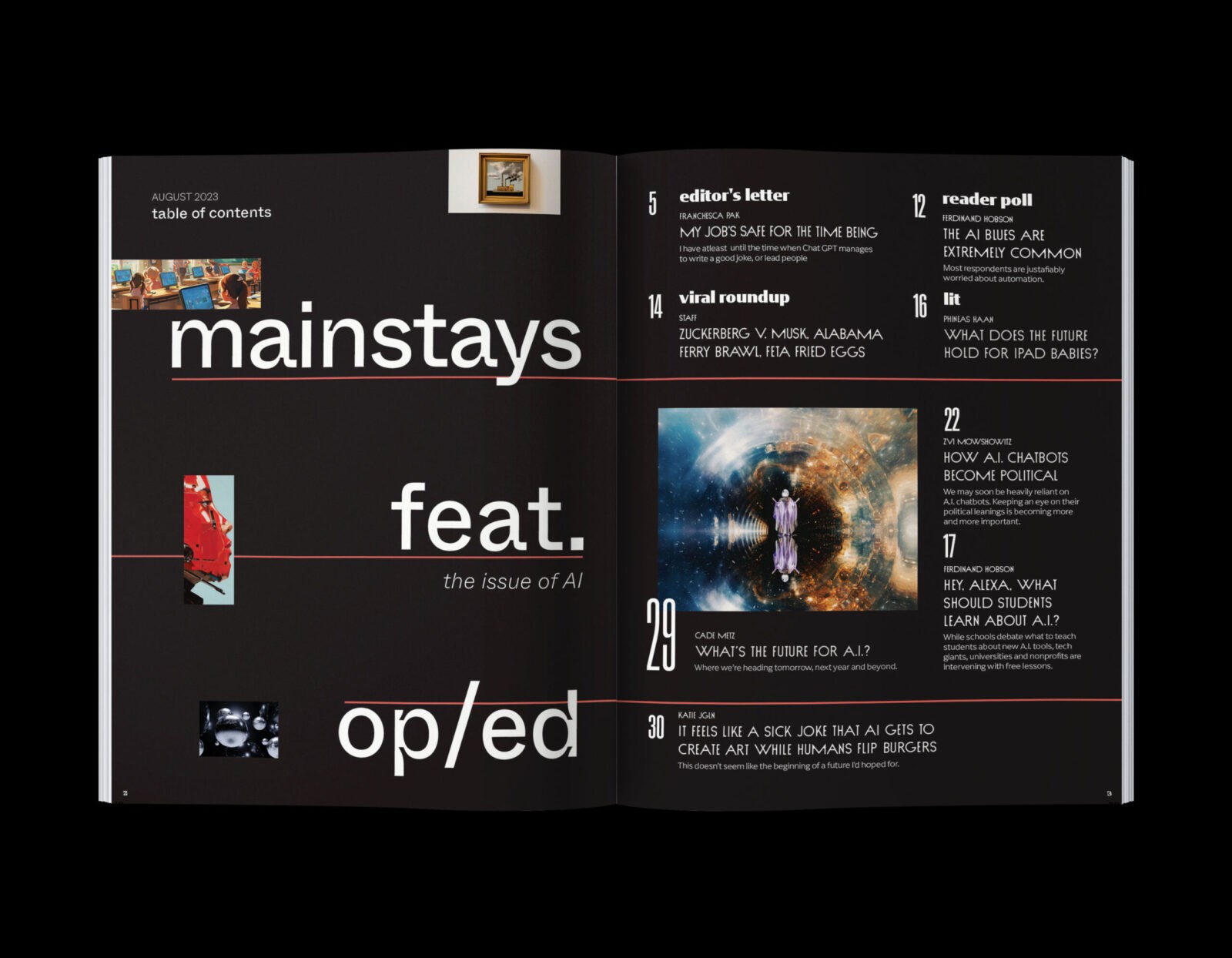
Typography is similarly eclectic, with typefaces such as Nord, Sud, Coign, and Arpona chosen for their quirky proportions and distinctive features. These fonts add to the magazine’s unique visual identity, offering a mix of styles that reflect the diversity of its content. The high-contrast blackletter-inspired logo adds an element of elegance amidst the visual chaos. The logo is split across the header and footer of the cover, integrated with various stories and design elements to create a dynamic and engaging composition.
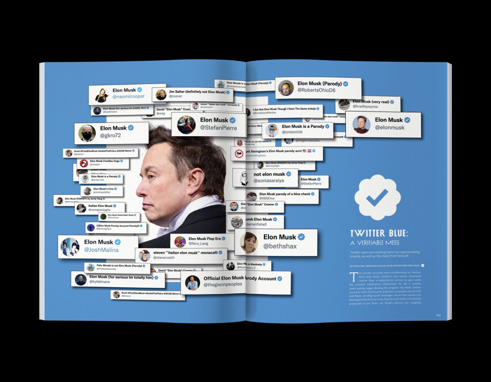
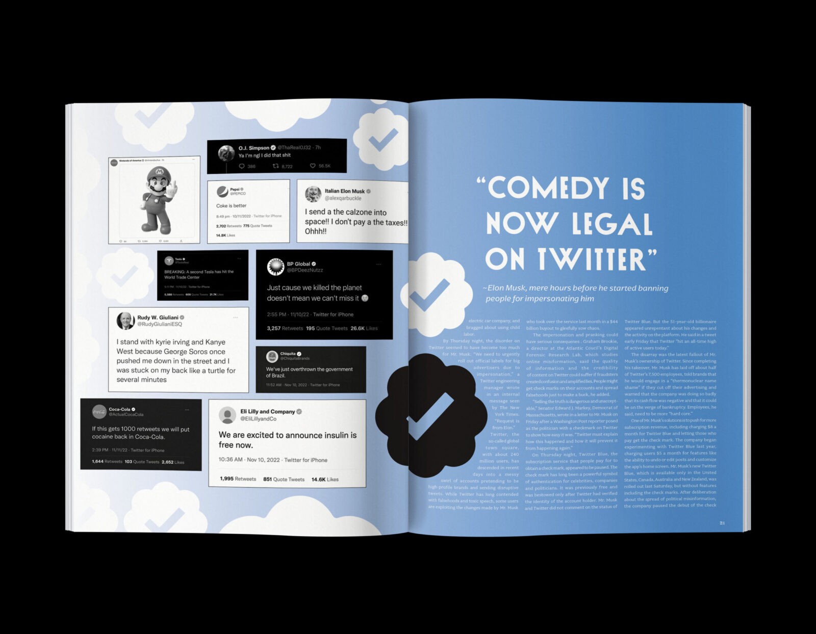
Feature stories within Overshare make heavy use of conceptual imagery, with visuals that are designed to be loud, grotesque, and unapologetically bold. This approach aligns with the magazine’s thematic focus on the intersection of digital and physical realities, using striking and sometimes jarring visuals to communicate its message effectively.
By embracing a design language that is as chaotic and diverse as the content it presents, Overshare successfully captures the essence of our digital age, offering readers a magazine that is as visually stimulating as it is intellectually engaging.
CREDIT
- Agency/Creative: Emma Davis
- Article Title: Overshare’s Bold Typography and Chaotic Colors Redefine Digital Culture Magazines by Student Emma Davis
- Organisation/Entity: Student
- Project Status: Non Published
- Agency/Creative Country: United States of America
- Agency/Creative City: San Diego
- Keywords: WBDS Student Design Awards 2024/25
- Keywords: WBDS Student Design Awards 2024/25


