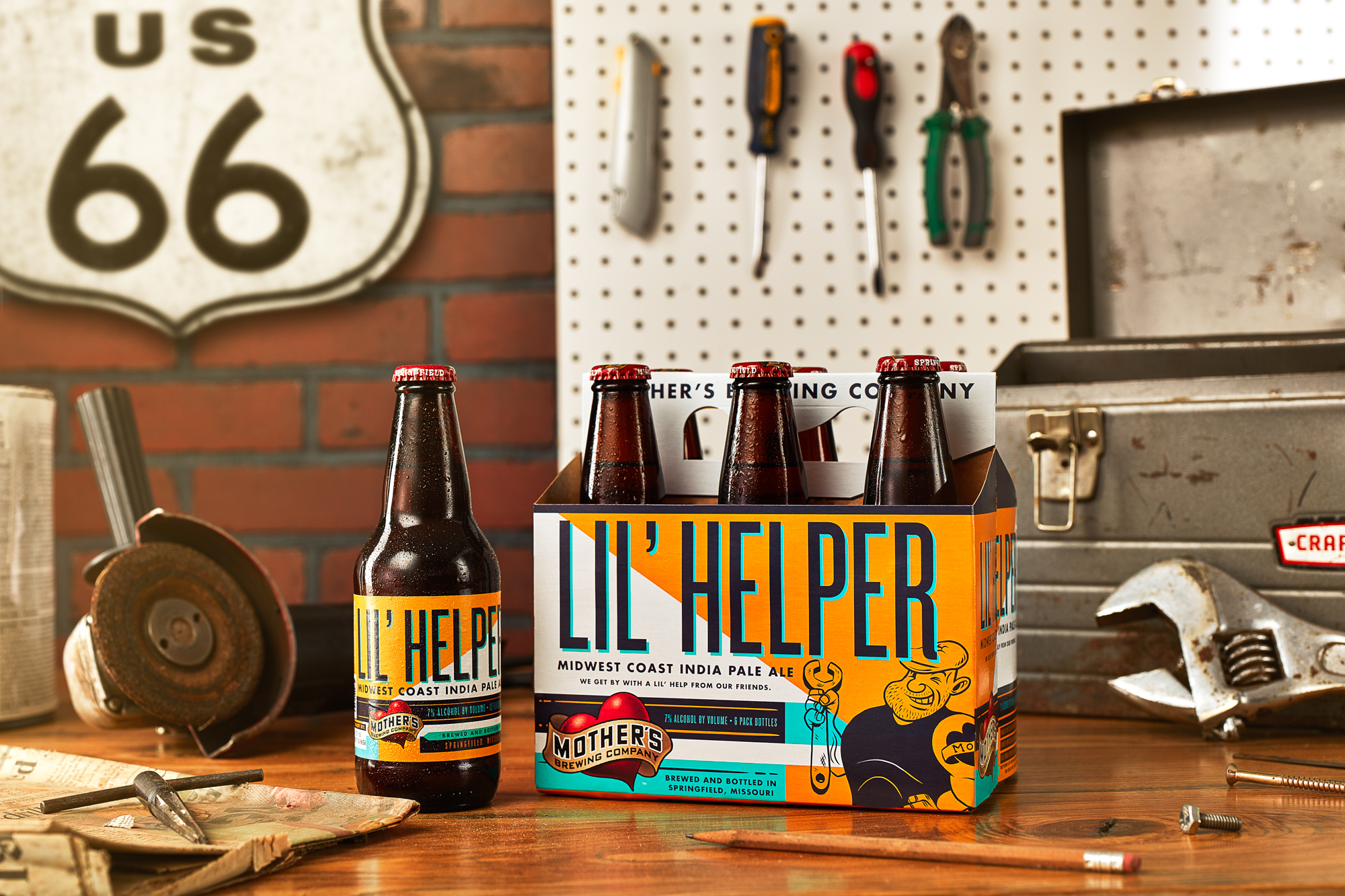
Fried Design Company – Mother’s Brewing Company Package Re-Design
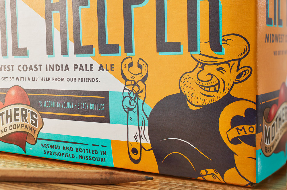
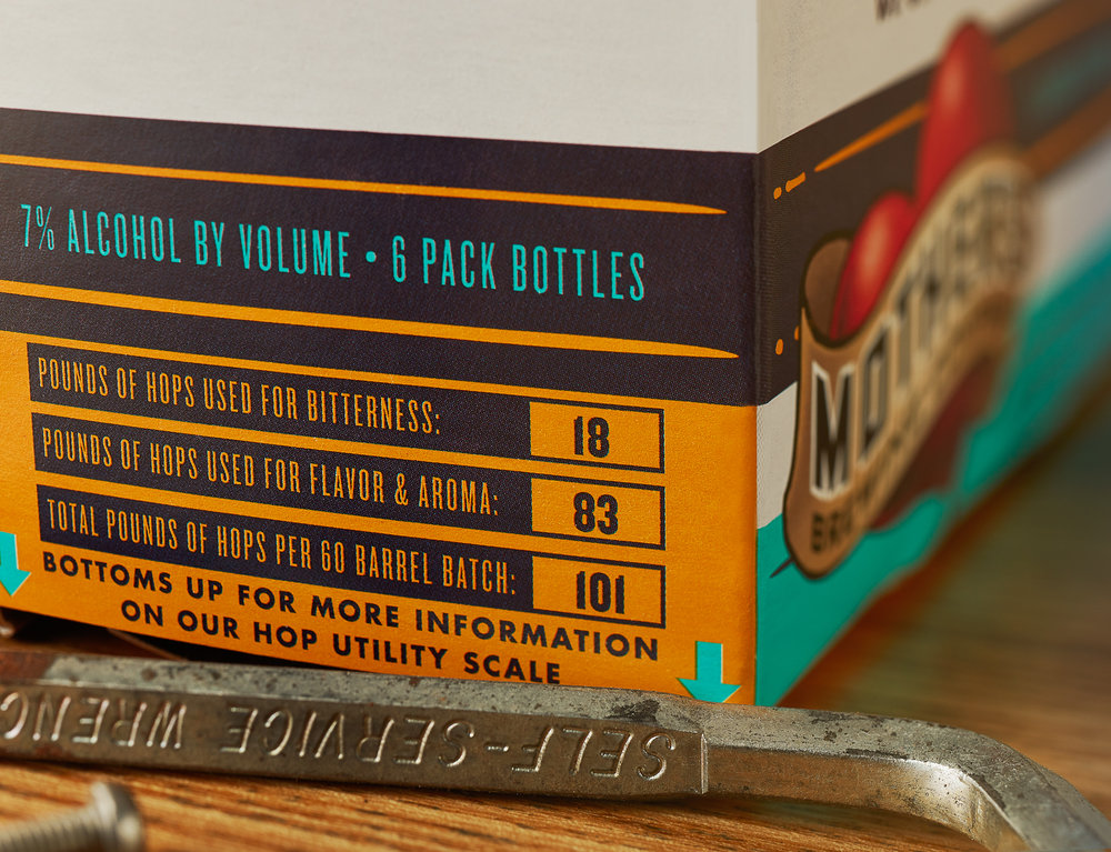
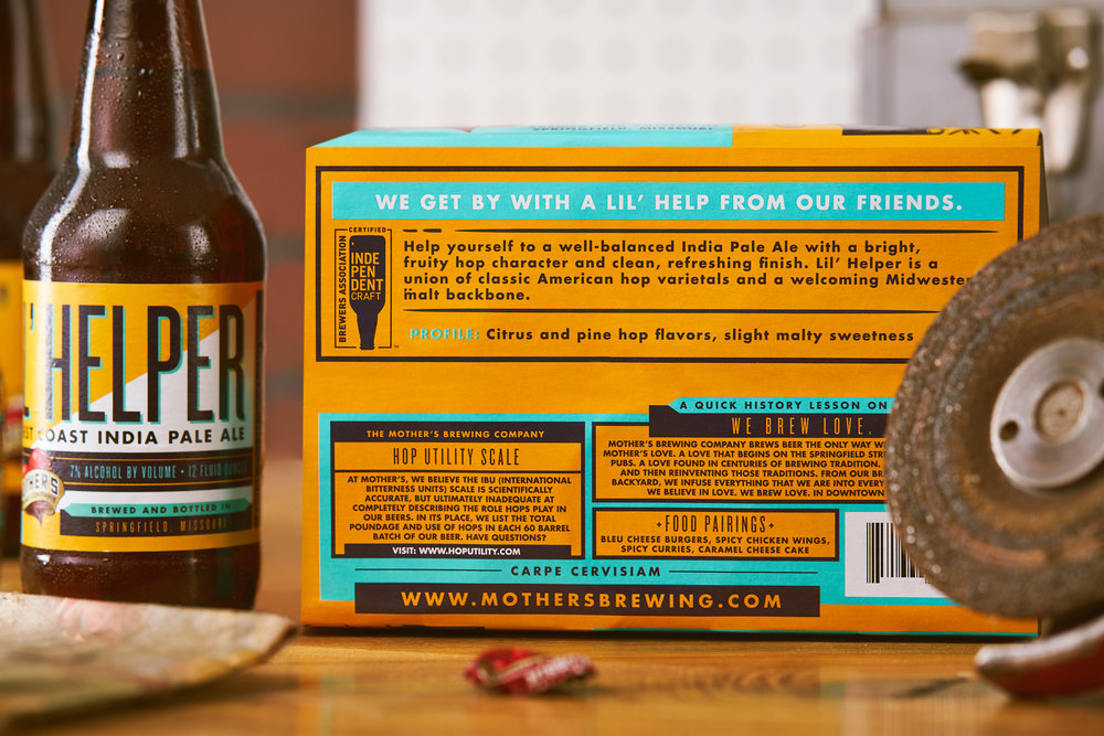
“When we started on the Mother’s Brewing Co. packaging design, what stood out the most was just how many types of beers there were. Each one has a different personality that comes along with it — some more assertive, some more delicate, and some just plain wild. We developed an illustration system that allowed us to pay tribute to every beer’s sensibilities. Education is key for Mother’s — and each beer has a new lesson. The bottom of every 6 pack is customized with information on the recipe builds, tasting notes and food pairings. In meeting after meeting with the Mother’s crew, one thing became apparent: they had little patience for the infamous ‘IBU Scale’ or ‘International Bitterness Scale’ that has terrorized the craft beer industry for years now. We helped develop a new way of determining the hop flavor in each beer that was more accurate for Mother’s.”



CREDIT
- Agency/Creative: Fried Design Company
- Article Title: Big Personalities Shine through on Mother’s Brewing Company Packaging Re-Design
- Organisation/Entity: Agency Commercial / Published
- Project Type: Packaging
- Agency/Creative Country: United States America >
- Market Region: North America
- Format: Bottle, Case
- Substrate: Glass, Pulp Carton, Pulp Paper


